
1995.
The San Francisco 49ers trounced the San Diego Chargers to win the San-per Bowl.
The Houston Rockets swept Shaq’s Orlando Magic to win the Jordan-less NBA Championship.
Greg Norman was the PGA money leader, but continued to fall short when it counted, as he won no major events.
Stefi Graff nearly wins the entire Grand Slam in tennis, only losing in the Australian Open.
The Atlanta Braves beat the Cleveland Indians to win their only World Series in an otherwise dominant decade. Tom Glavine won the WS MVP instead of the guy featured below.
And in 1995, card manufacturers released 160 cards of Greg Maddux that I deemed worthy of my collecting efforts.
Thanks to the generosity of reader Jeremy, originally mentioned in our landmark 500th post (and in my 1993 Overload post, and 1994 post), I now have over 40% of those 160 cards.
1995 Before Jeremy – 31/160 cards – 19%
1995 After Jeremy – 65/160 cards (including 5 upgrades) – 41%
1995 is where inserts and parallels start to get a little out of hand. Most of what’s left would be these parallels and inserts and parallels of inserts. Oh, and a surprising amount of Pacific and Pinnacle cards are absent.
Since Jeremy’s package, I’ve only acquired 3 more 1995 cards, so there’s plenty of progress yet to be made. For now, let’s focus on what I do have. That’s more fun anyway.
Don’t get me started on the backs
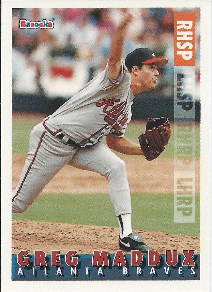
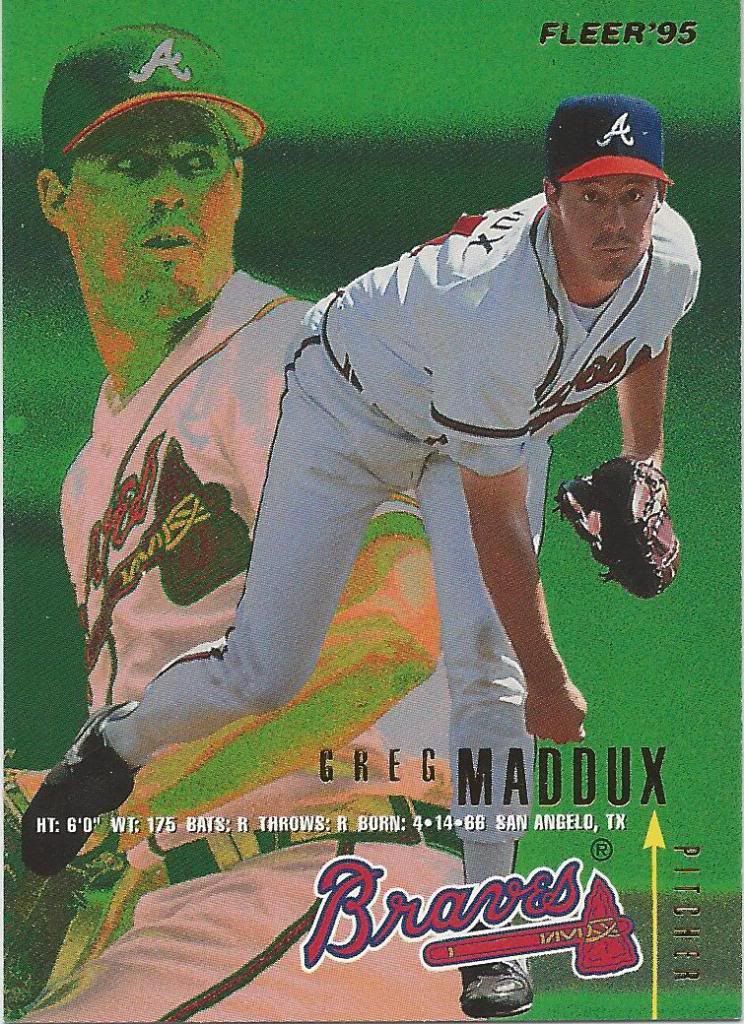
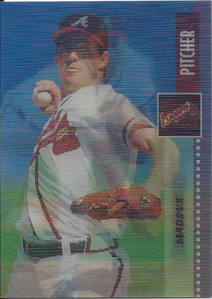
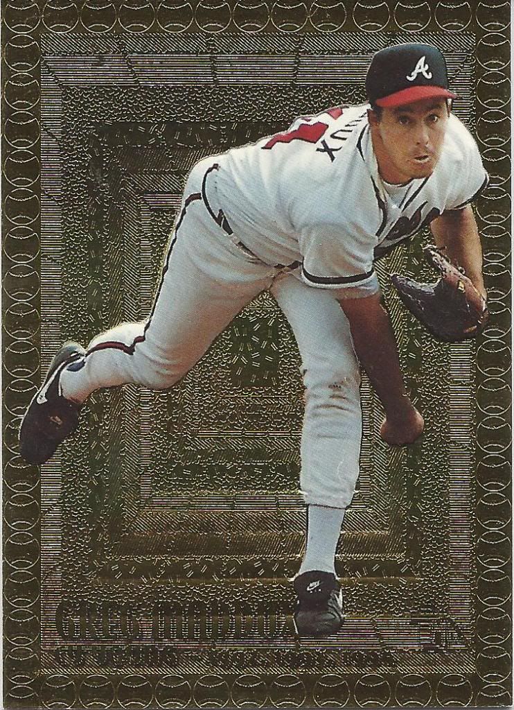
Our journey begins with what appears to be a surprisingly complex “kids” card. Throwing all of those acronyms at children without explanation, even if they are similar, is an odd choice. I’m probably the only one, but the four rows remind me of a pinball machine, and Maddux threw it down the Right Handed Starting Pitcher slot. With a little bumper luck, he’ll trigger multi-ball.
How and why and how?
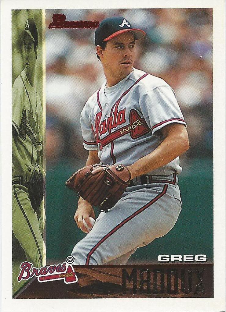
Holy cow is this ugly. It’s so ugly that I blocked it out of my memory and audibly said “yikes” when I came across it again in my scans. How the hell did Bowman survive this grotesque mirror image debacle? Well, I guess when you compare it to Fleer from this year, it looks tame.
Bowman’s Dust
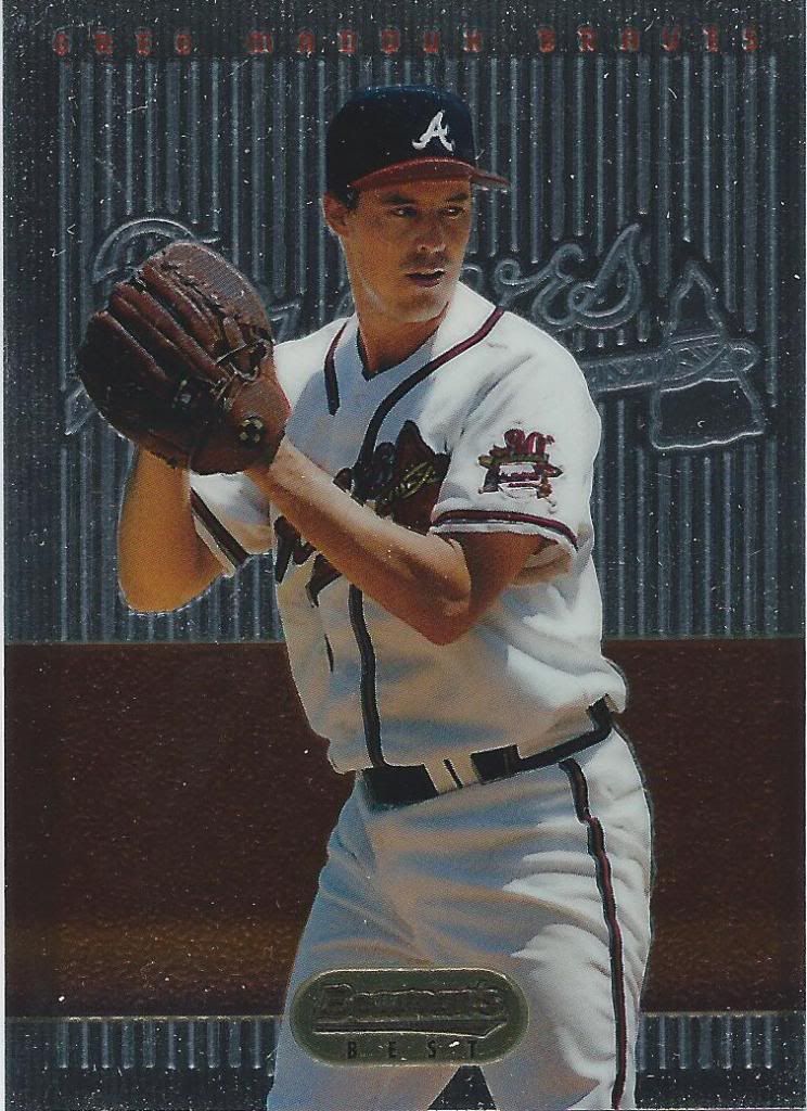
This is actually much, much better. The only potential drawback I see to the Bowman’s Best design here is that the bottom looks like a card that got caught in the packing machine, but I’m okay with that. Can’t wait to get the refractor version of this.
Remember this doofy picture
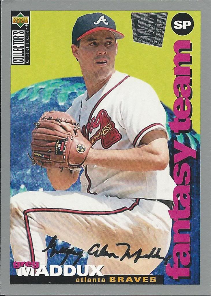
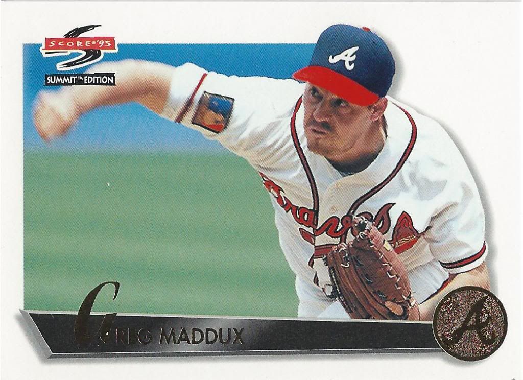
Collector’s Choice was my jam back in the day. I bought more of those sets (basketball, not baseball) than any other. I’m sure part of that was the price point, but I also enjoyed the simplicity of the design. It’s a kids product without the kid feeling most of the time.
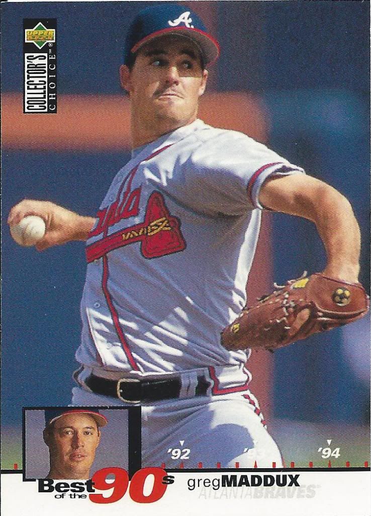
someone wasn’t ready for his inset pic to be taken
Collector’s Choice also had a bunch of subsets, so there was variety in your packs. If I could choose to have a product make a comeback, it would be this one…in a non-high end reboot, thank you very much.
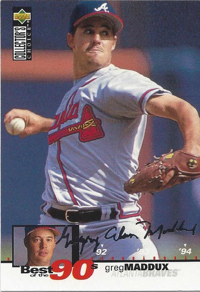
Silver Alan
You also got a silver signature parallel per pack. I see too may ebay sellers pawn these off as real autos in their auction titles. Side note: That’s kind of a lot of hash marks in-between each year. You don’t need one for each quarter.
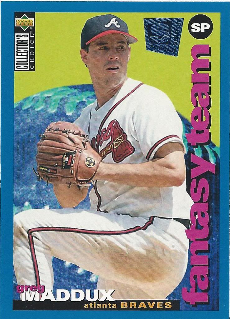
Yeah, I think he’d be a good addition to a fantasy team
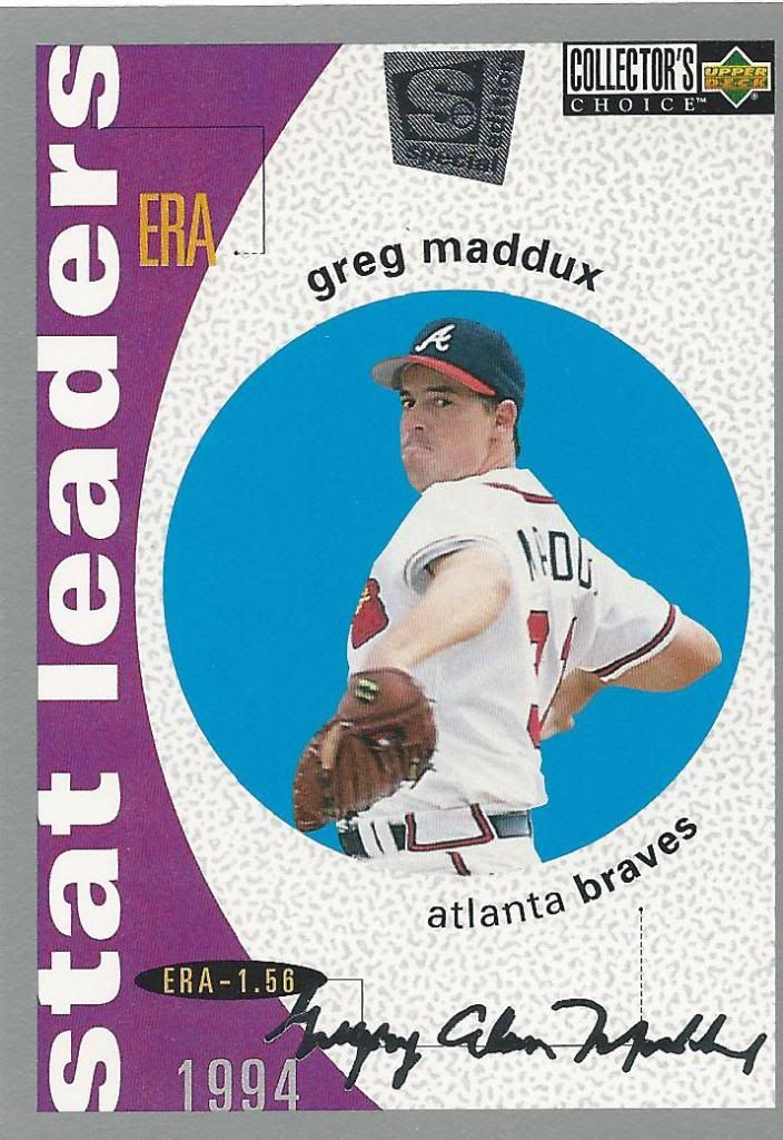
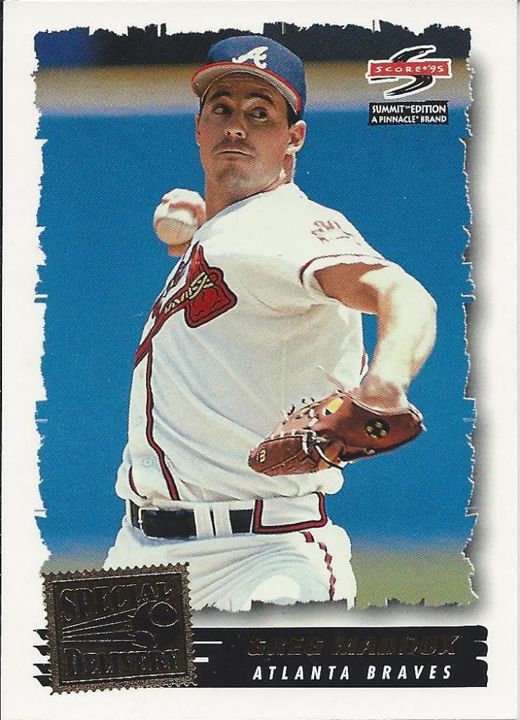
I don’t recall this Special Edition set being release in basketball. When I first encountered them, I thought it was a separate parallel set with a stamp and a blue border.
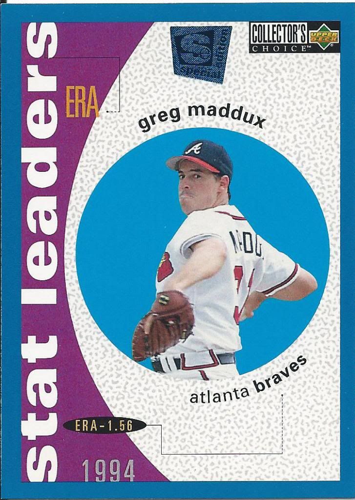
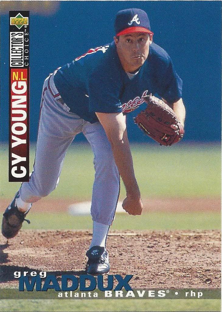
I know it was a strike shortened season, but wow! 1.56 ERA
I mean it clearly wasn’t unheard of to have multiple parallels in a certain year. And with the subsets, some stars had 3 or 4 cards in a set, so it could be true.
Fantasy team card forcing me back to reality
Then my confusion got even worse when I saw the silver signature parallel of what I thought was a parallel. That’s when I forced myself to do some research and found that this apparently is a separate set entirely.
Pitch it right through the circle
If you’re keeping track at home, this is 3 silver signature parallels. The gold version falls 1 per box. Oh, and my scanner cut off the right side of the picture, it’s not off-center.
Same doofy face, different uniform
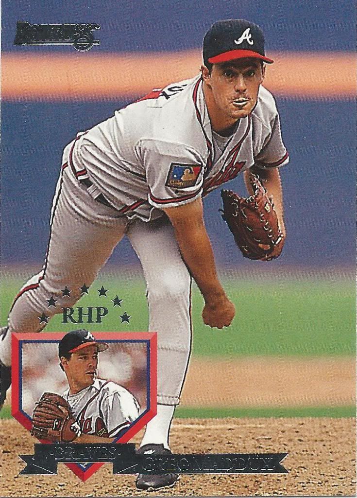
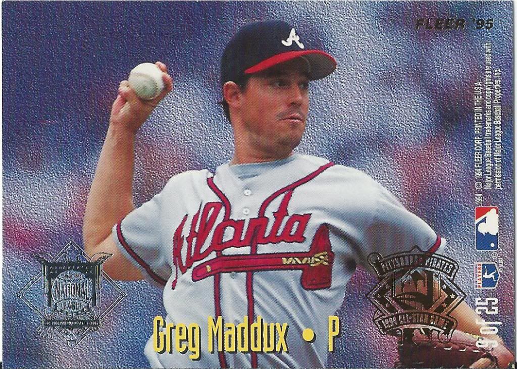
I don’t remember seeing so many cards in one year that were obsessed with indicating more than just “P” for pitcher. Although to be fair, I never really researched the issue before — and don’t plan to ever do so.
Should be all AL or all NL
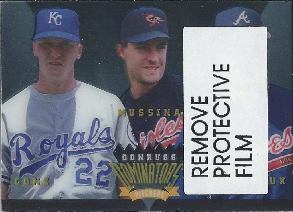
I promise this is a Greg Maddux card. No, I will not be following the orders to remove the protective film to prove it. I’m firmly against the “Free the Finest” type campaign where collectors peel the coating. I prefer my cards to be in the same condition as they were when the pack was opened. Manufacturer’s intention be damned.
The arrow lets you know where the pitcher is on the card
Yeah, this is much worse than Bowman. What makes ’95 Fleer even horrendous-er is that there are 4 dissimilar, yet equally vomitous designs. Who was asking for a poor man’s Predator heat vision effect on their baseball cards? No one, and they wouldn’t want to either.
He deserves the front
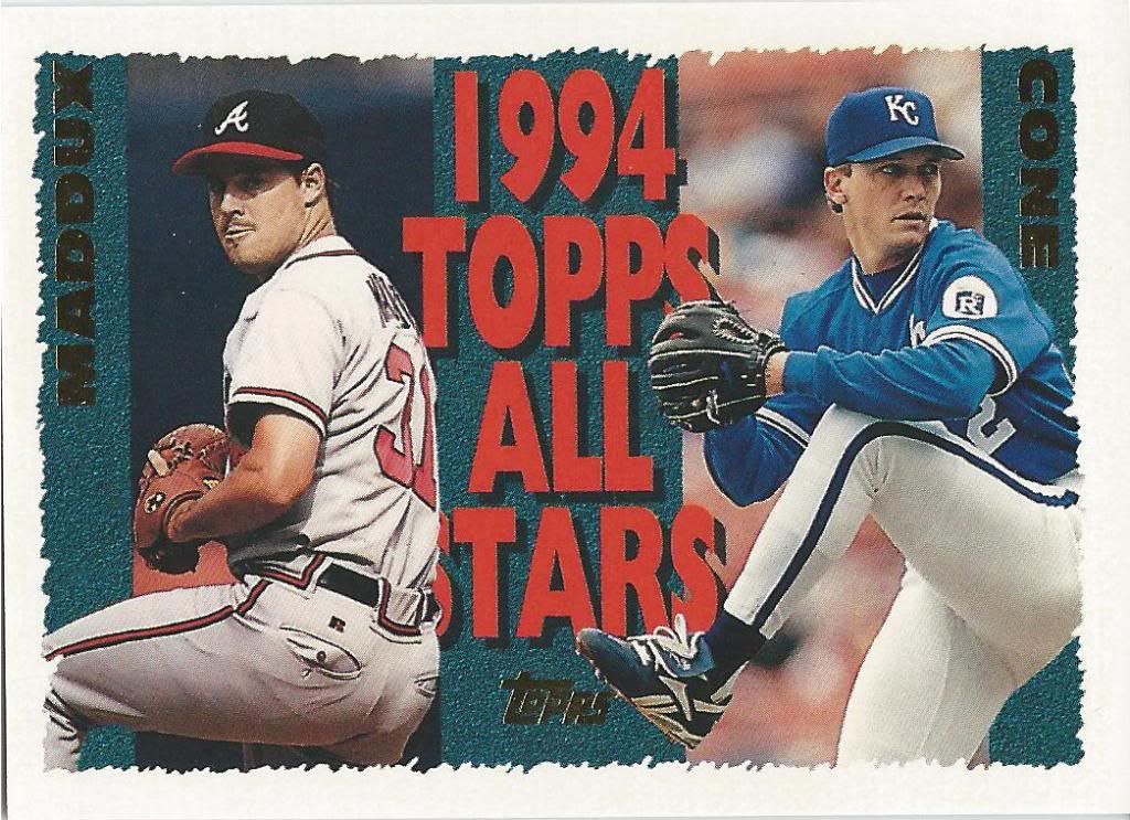
This is better. Still a little loud on the eyeballs, but not entirely obnoxious. Jimmy Key is on the other side of this AL/NL All-Star card, which is something I miss. There should be more All-Star inserts and some of those should be double-sided.
Fake shiny next to foil
Well, clearly not every card is going to be in pristine condition. Or dynamically interesting. Yup. Some non-diamond gem like shape with some…let’s call them..olive branches sticking out.
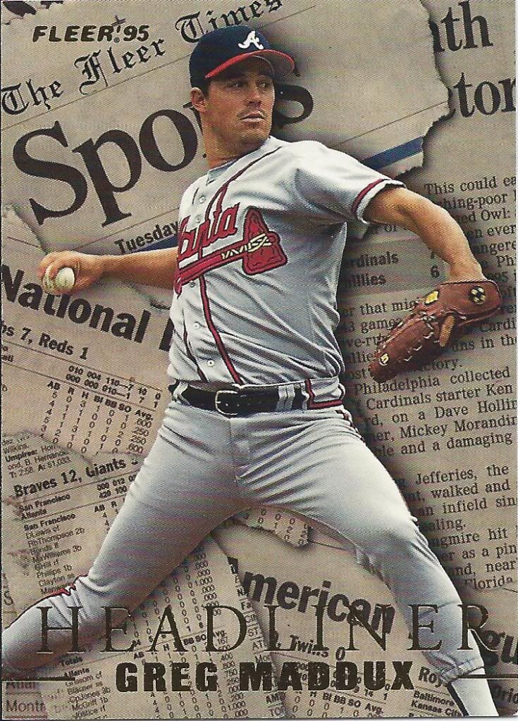
I love the Spo section
The Fleer Times: another victim of the transition to digital media. Well, not like there were too many fans of it. Look at how this guy tore up the pages.
Someone went crazy with the eraser on the upper right
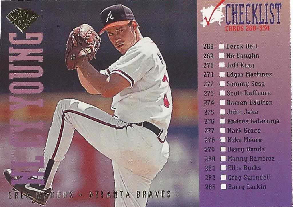
Now we come to the first of three checklists on the docket for today. That’s another thing that’s missing too often in contemporary sets. Topps flagship still does it, but I can’t think of too many others that do. Throw a player picture on the thing and let us have it available in hand instead of making us look it up.
The “L” stands for “Love”
Here we have a shiny card back when shiny cards came at a premium. It still looks pretty cool, what with the cursive text and the rays of light flying up his ass and whatnot.
Big and bold and beautiful
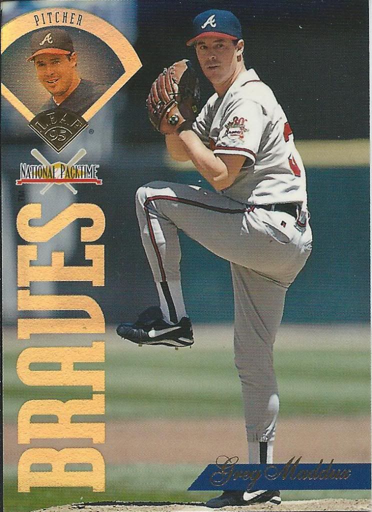
According to that little logo in the middle of the left hand side, this is a National Packtime card. I don’t really know what that means other than it’s a variant or promotion of some kind that was apparently affiliated with Leaf. No clue how one might have obtained them. I got mine for free.
Doofy face volume three
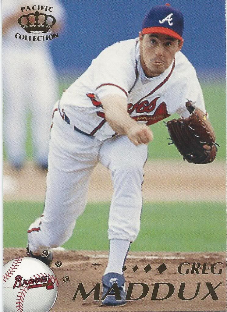
Oh Pacific. How low rent you always appear. That crown logo isn’t fooling anybody.
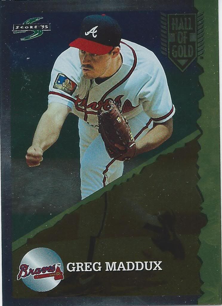
Evidently only his legs were first ballot Hall of Golders
Little known fact: Once the Atlanta Braves had a Broadway Night and in the middle of the inning a dancing fight broke out between the Sharks and the Jets.
Pitching faces aren’t pretty
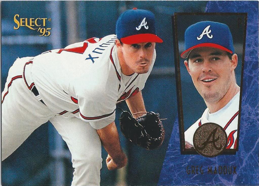
1995 was the year that Select tried to be the Ultra of the Score world. They even went so far as to take the marble slant thing. It still works. In fact, the way the picture inset was handled is really nice. I just wish the main photo was a little less neanderthally.
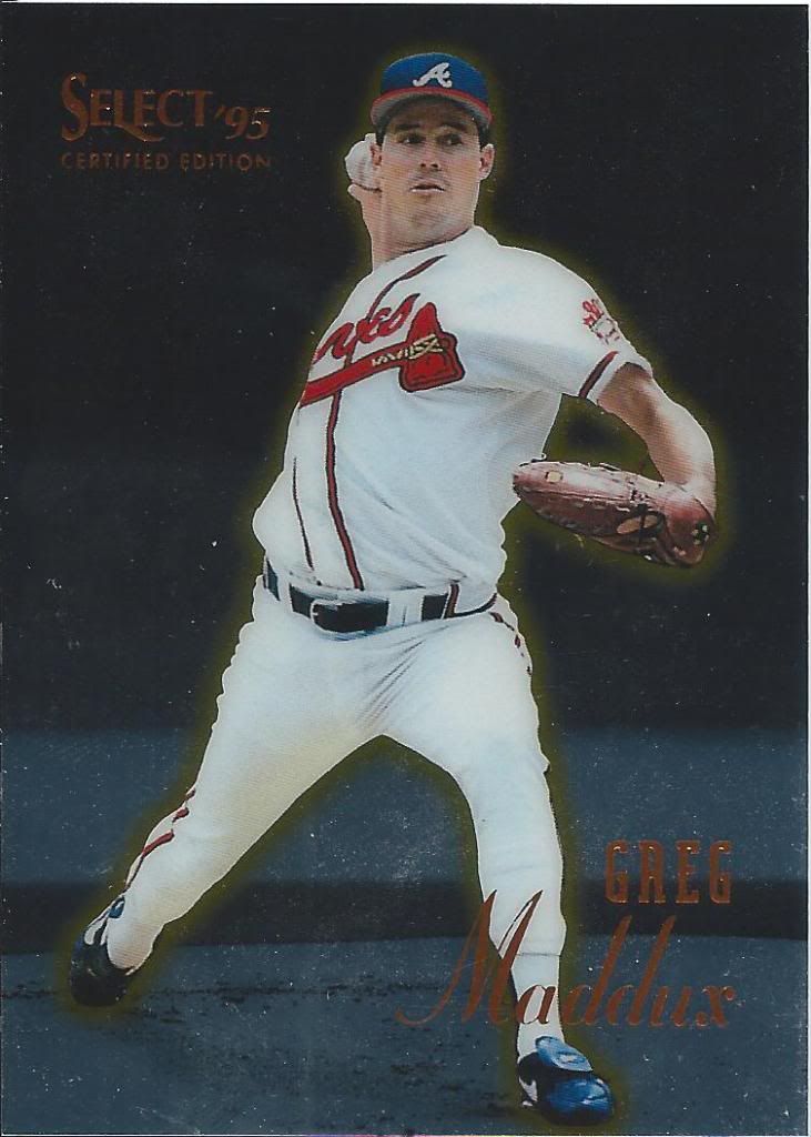
Certifiably shiny
How many of you baseball card folks know of early Skybox cards? In all of those, they had some digital effects and put an orange halo around the basketball. This is kinda like that, but it needs some cheesy computer graphics.
boring picture, exciting card
Oh man, some of these cards really feel special to me. I remember how incredibly expensive a pack of SP baseball cards were. I remember how few cards were in a pack. I would try to buy 1 or 2 packs of what was then “high-end.” So, to have a silver parallel of a high-end product is extra special, because I know how impossible it would have been back before the internet made everything worthless.
I miss these
What are the odds that Sportflix will come back in some form? I know Topps has made some similar looking cards, but really nothing fully lenticular. I think it would make for a good insert. Maybe with a “Then and Now” or “old team/new team” theme or one of those current player vs legends things or even a league leader card with three players.
Haymaker. Maybe. I don’t know boxing
It’s a little disappointing to see the gold foil logo coin used in both Score Summit and Select in the same year. It looks so nice, I can’t stay mad at it, Kevin Nealon.
Your letter’s been ripped by the processing machine.
Hmm. How odd that the logo added “A Pinnacle Brand” to some cards, but not others. That’s a lot of branding. I do like that stamp stamp, though. Score did a good job with their foil. Would be nice if there was more to the mail theme.
This letter, too, was ripped
If you thought this was a Topps gold parallel, I wouldn’t blame you, but you’re wrong. 1995 saw the Cyberstats partial parallel instead, which look absolutely terrible. Not that these look much better.
I think we’ve both been hypnotized by the gold vortex
Now, THIS is a gold parallel. From the higher end Embossed set. The regular ones are silver and I think these fell one per pack.
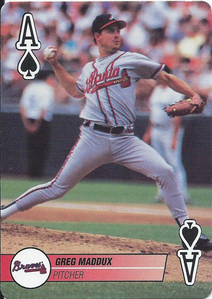
I wasted all my good references in the paragraph below
As a kid, I tried several times to make games out of my baseball cards. Well, here’s a playable baseball card for you. Motorhead’s favorite pitcher – Greg Maddux – coming through in spades.
Still looking for the gold medallions
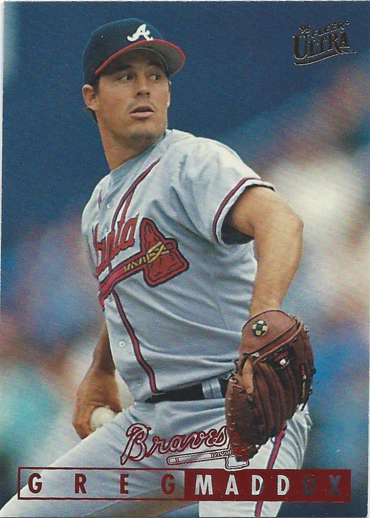
Here’s another effective foil logo. The red is an interesting divergent choice. I would say this is probably one of the last good designs that Ultra had for a while.
Don’t look to your right
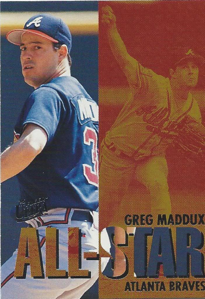
I’m okay with the split-screen, but I don’t understand the color choice. Mustard yellow does not a good card make.
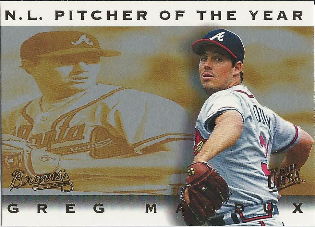
Not the Cy Young award. No, this is much more prestigious
Another strange choice on this insert. Why would they feel the need to stretch the background image.
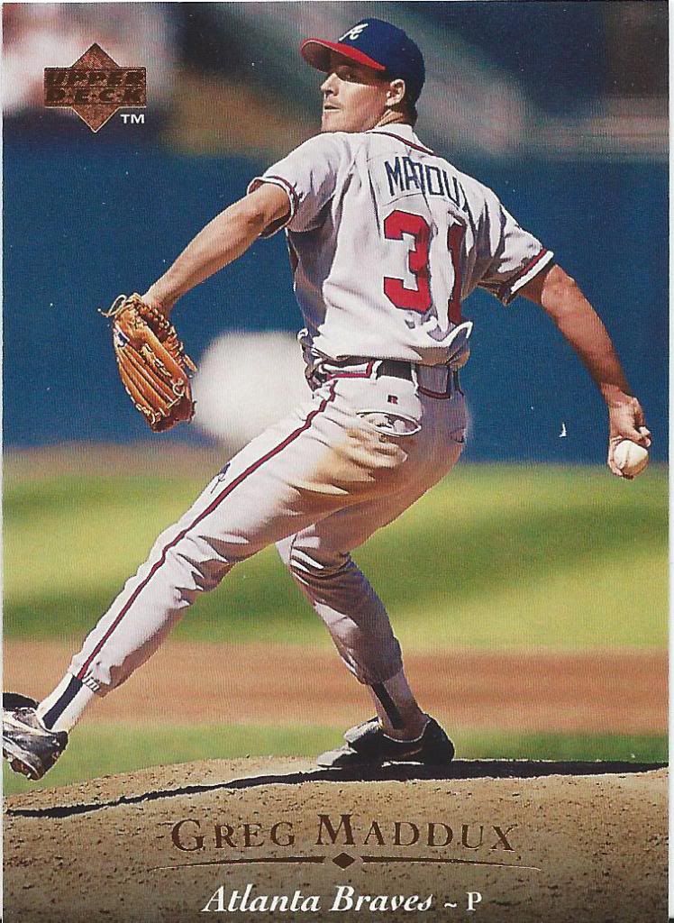
Awesome
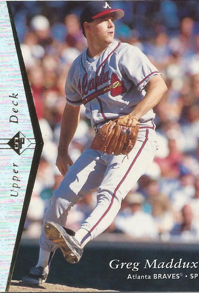
1995 Upper Deck. This has to be one of the most beloved Upper Deck designs of all time, right? 1989, 1993 and this? From what we’ve seen on other cards in this post, could part of the reason be that it acted as an antithesis to the rest of the cardboard world? They were all so consumed with throwing borders and unusual quirks at us, and then Upper Deck goes full bleed with a little vignette touch at the bottom with simple elegance in the name and team.
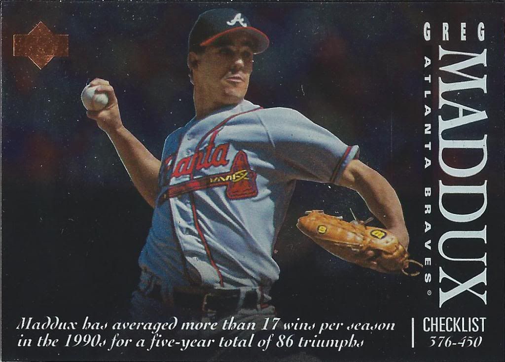
Triumph.
And then after all of that explanation, here’s a glitzed-up checklist, of all things.
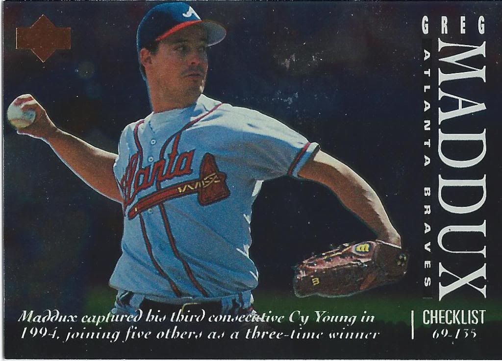
Don’t you mean “NL Pitcher of the Year” winner?
I know the picture looks identical, but it’s actually a different card. It’s an odd choice to make checklists an insert, and an even odder one to feature the same player on two of them. There were plenty of stars that could be used.
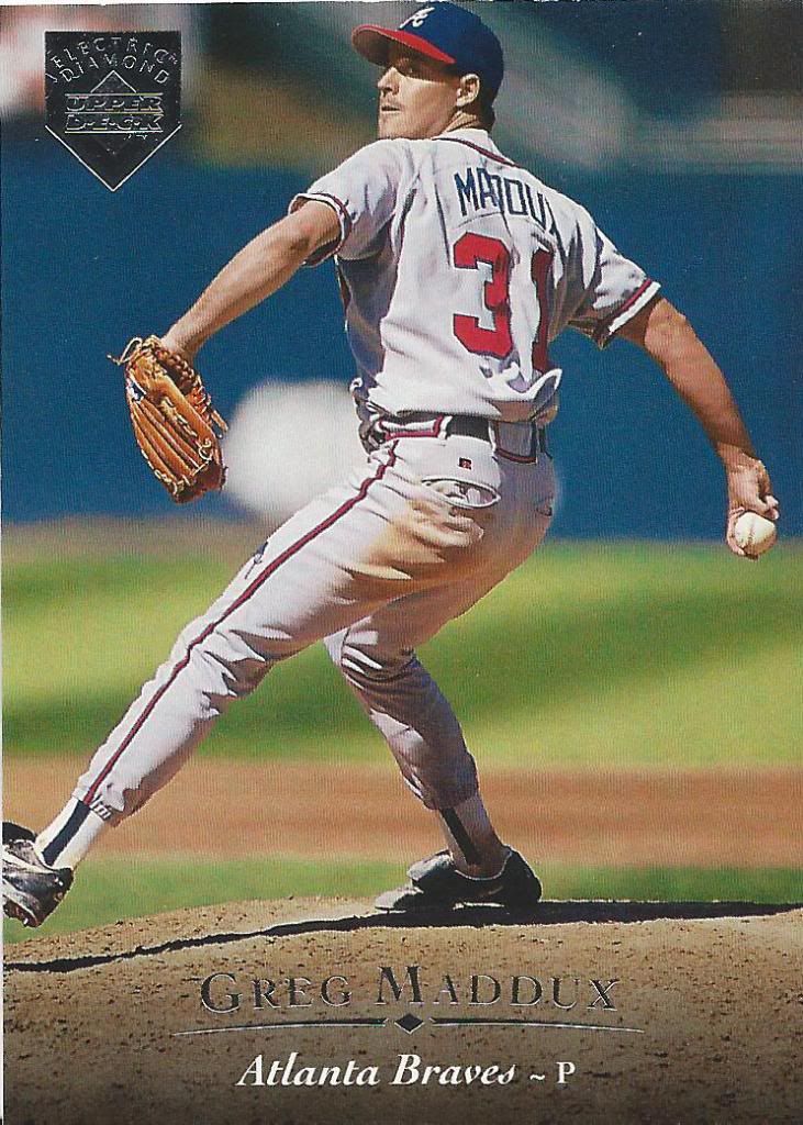
Uh, that’s an electric home plate, sir.
Lastly, we have a parallel of this great set. There are also gold versions of this electric diamond thing. All that really means is that my 1995 quest is not finished.
The good news is that thanks to Jeremy’s unbelievable kindness I’m over 2/5ths done.
Recent Comments