
I know I’ve been questioning whether or not to continue the blog, but I can unquestioningly say that I’ve been extremely lucky with the bloggers and readers I’ve “met.” It’s a great community, and I highly recommend it to people that have the time. I’m very sorry that I haven’t for a while.
Nick M is one of those long time blog readers that I’m very happy to have “known.” I don’t know if he’s come back to the blog since I half-assedly returned, but either way you’ll be seeing his name quite a bit in future posts. This is only one part of one trade. I’m saving the Maddux and Thomas cards from this massive trade for a later time. And then there’s the fact that I received another couple packages from Nick shortly after this.
I tried to find enough Griffey and Ichiro cards to make it worth his while, but I doubt I’ve come close to paying him back for this. I don’t think I deserve to have such great readers and trade partners, and maybe I don’t have as many anymore, but I’m very happy that I at least did at one time.
Look out for “The Fog”
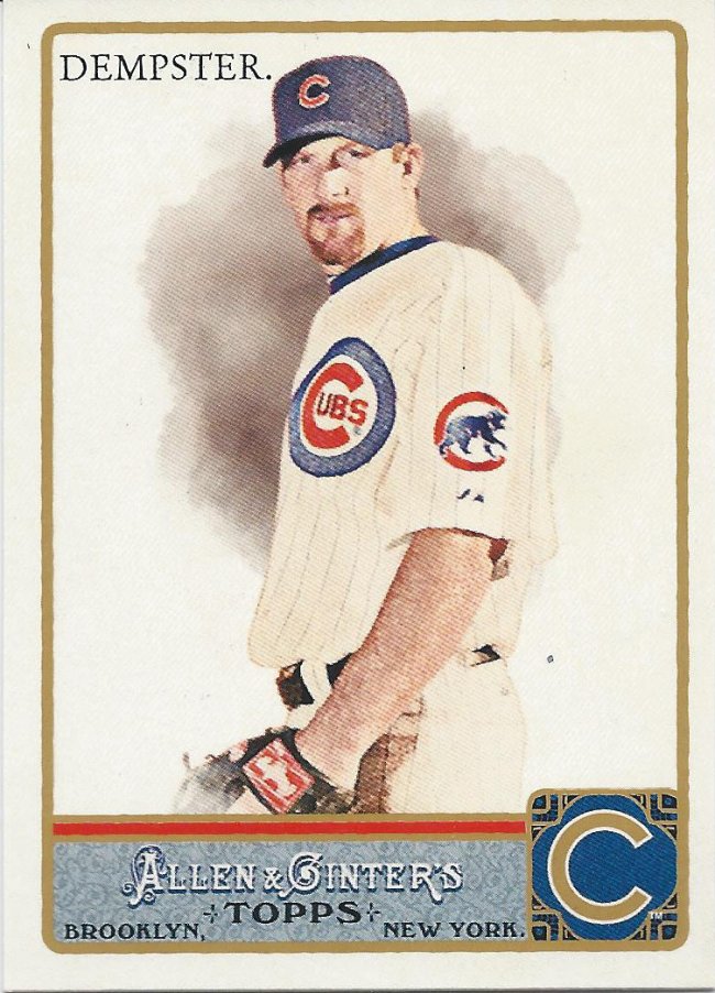
I love getting new Dempster cards. I don’t want to say that Maddux/Thomas/Gwynn are expected, but they’re understandably the most common. You’d be surprised at how many non-insert, non-parallel, non-hit Dempster cards I still need. You too may be able to help!
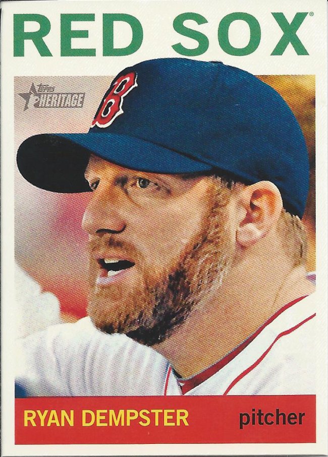
I guess the Sox match the beard
Heritage and A&G brought me back into collecting in 2009. Now, since I don’t focus on sets anymore, and because I don’t really collect many current players, I don’t buy that many packs. That just means that your dupes are appreciated.
The Cubs will someday win the pennant again
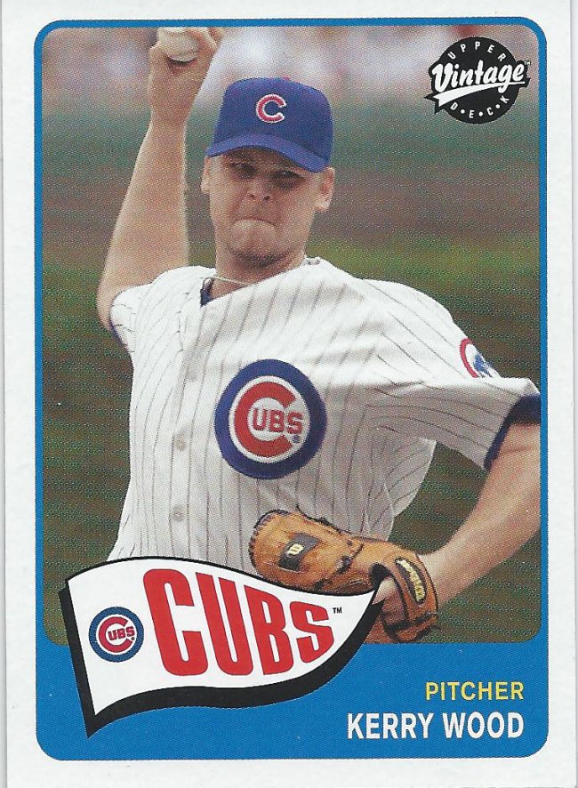
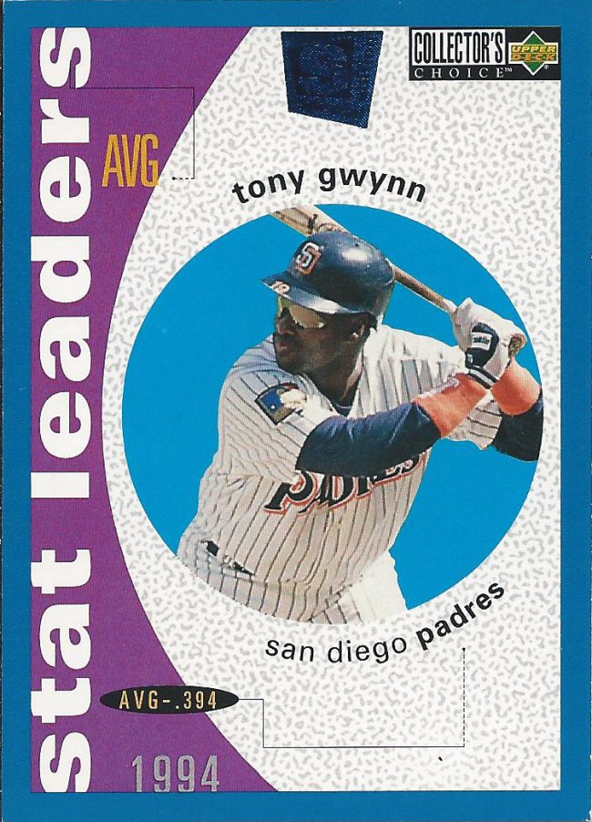
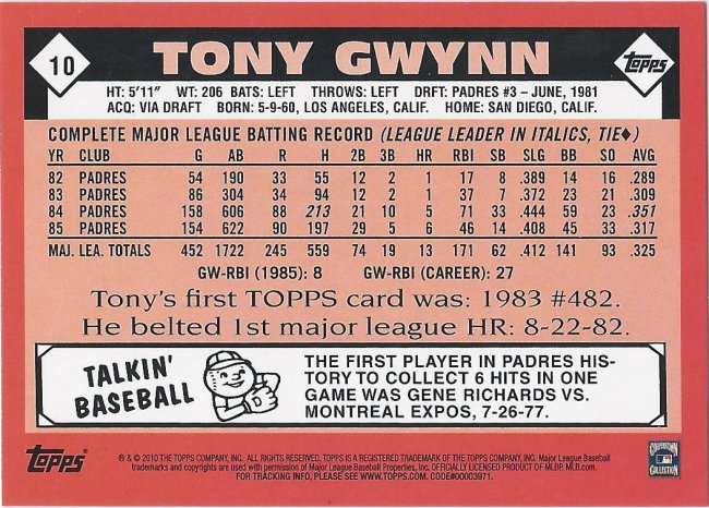
We go from real H to fake H. My Kerry Wood collection has been bolstered quite a bit and is making a run at the big boys number-wise. 492 Kerry Wood versus 502 unique Gwynns and 621 Big Hurt. That ain’t bad.
Unpunched variation
I’m so afraid to handle these die cuts. That “waist” is so tiny that my stupid grubby hand will probably snap it in two or turn it into a tent.
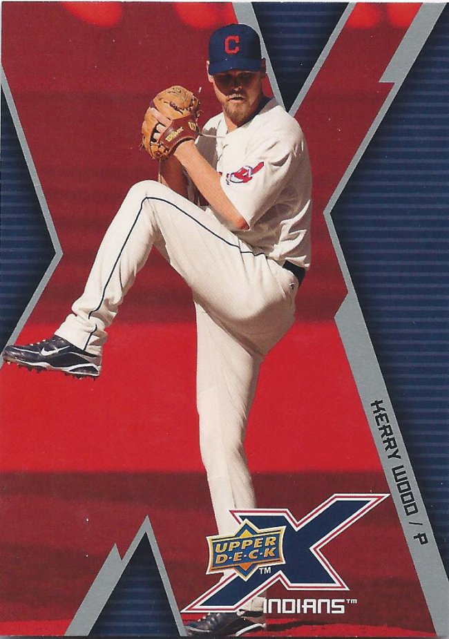
Wrong C on the cap
This is safer, but terrible looking. I don’t understand the awkwardly thick “X.” It’ really more of a diagonal “T” with a knife in its head.
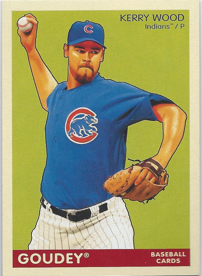
Goud oudda here
So, it’s a semi-art card (assuming the uniform is real picture, but the body was manipulated for some reason), but yet they couldn’t change it from Cubs to Indians to match the text?
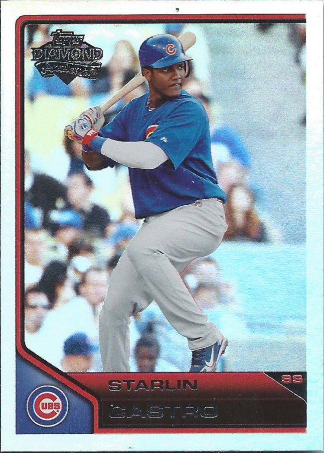
Still missing the Venezuelan, sparkle, and Mini versions
This is the Diamond Anniversary Refractor variation from Lineage. Not to be confused with the Diamond Anniversary Platinum Refractor version which is more of the sparkly one. If you didn’t know that ahead of time, you’d have to look it up. I hate crap like that.
Grit. Not the photo filter — the teeth.
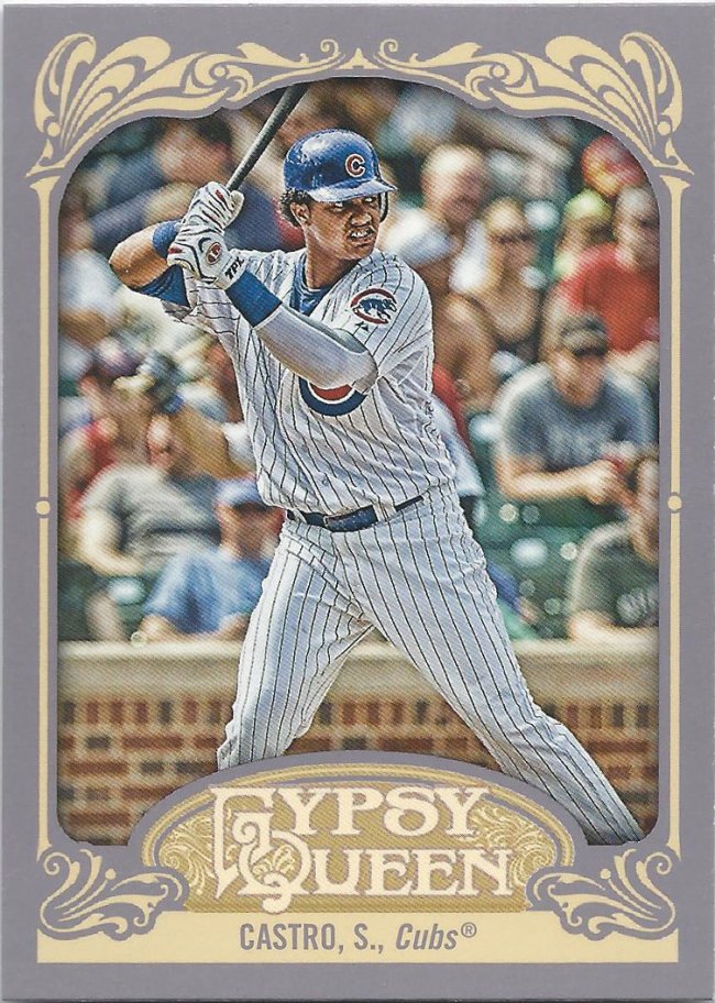
The second and last Castro card from this bunch is your simple Gypsy Queen from some year that I should probably know by now. As long as my checklist is accurate and as long as it’s safely in my binder, I tend not to care too much.
Man on a mission
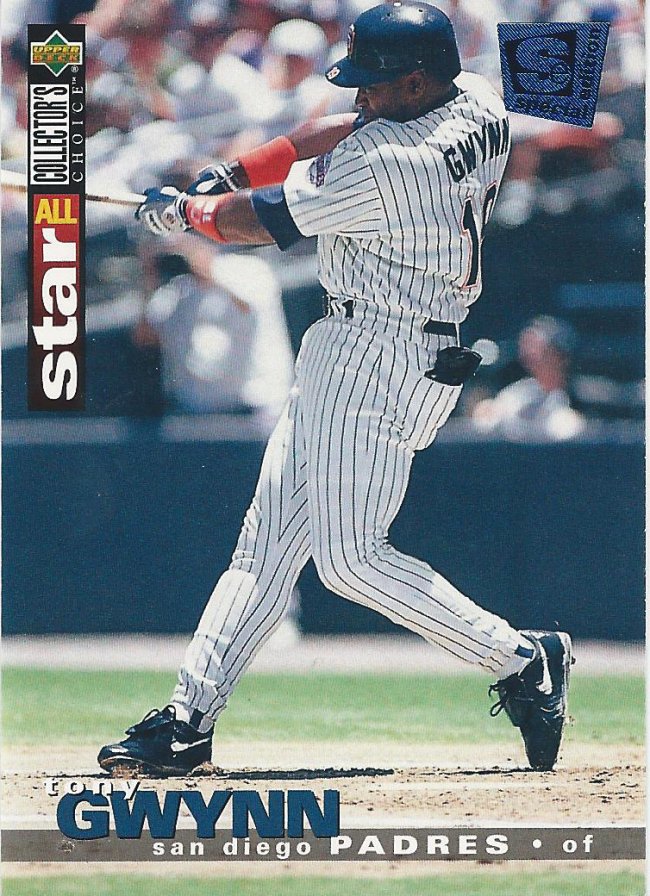
The rest of this post will be All Gwynn, All The Time. We start this segment with what is now a somewhat iconic design in the All-Star Glossy. I certainly dig it.
Wristband leaders
I always thought the helmet on Benito looked a little strange in this picture. I understand it needs a mask in front of it, but without he’s more prepared for a war bunker than a baseball diamond.
That is a skinny dude
Without looking at the back, I’ll guess this is for batting average.
No parallels necessary
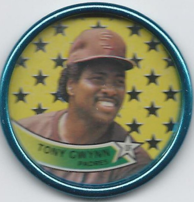
This generation has Chipz, and we had Coins. With an “S” because we weren’t that cool yet.
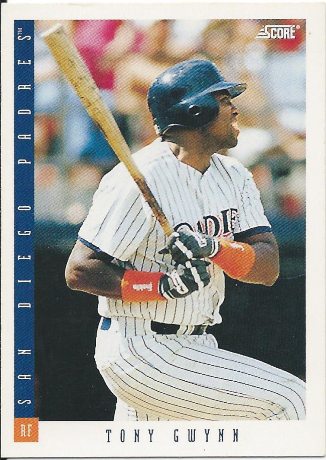
Not hardcore. S-core.
Really not much to say about this one. The bland before the storm.
Someone spilled something on the baseball bible
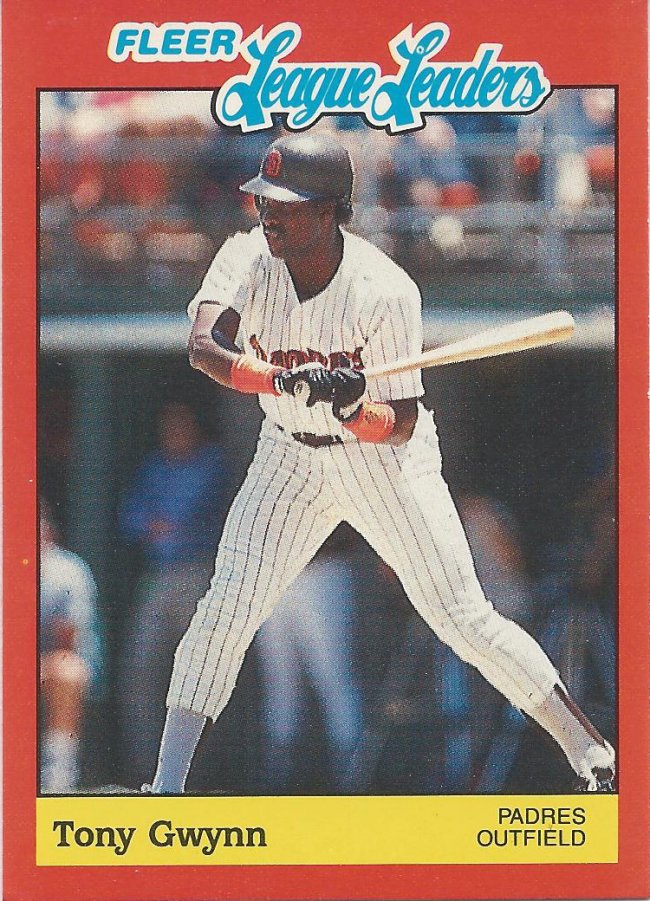
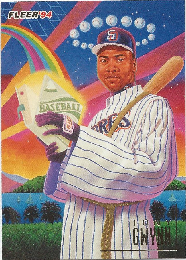
I miss ProVision cards. They were the biggest highlight of the Fleer year, and even if they weren’t particularly rare, they were still special.
I think I see Mufasa in the background
The tribute is really to all those baseballs that Tony Gwynn killed in his career. All three of his home runs. Not a power hitter.
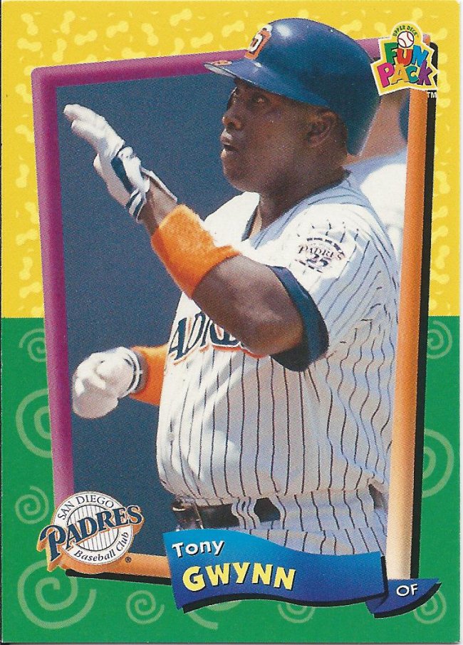
What a “fun” border
Okay…so then I raise my hand up all the way? Then you slap my hand with your hand? Hold on, hold on, hooooolllld on. Let’s go over this again.
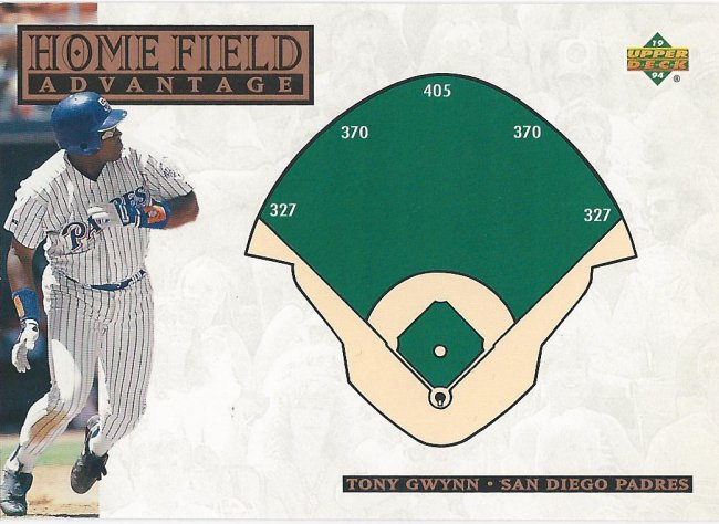
It would be nice if they put the stadium’s name on the front
It’s okay, Tony. It’s just a diagram of a stadium’s dimensions. Nothing to be afraid of
The blue foil means it’s special
All Rats. What’s that? I’m supposed to read the second word bottom to top? That can’t be right. Tony Gwynn hits All Rats.
Even more blue
Here we go again. Sredael Tats. So, this is a German tattoo design? Okay, fine, but what does that have to do with baseball?
Someone’s high school photo is cooler than yours
I give up on reading this one. You’re on your own. Be sure to “pace” yourself.
Not exactly a ProVision
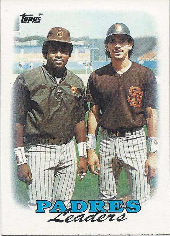
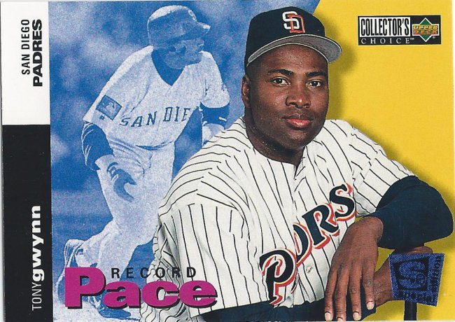
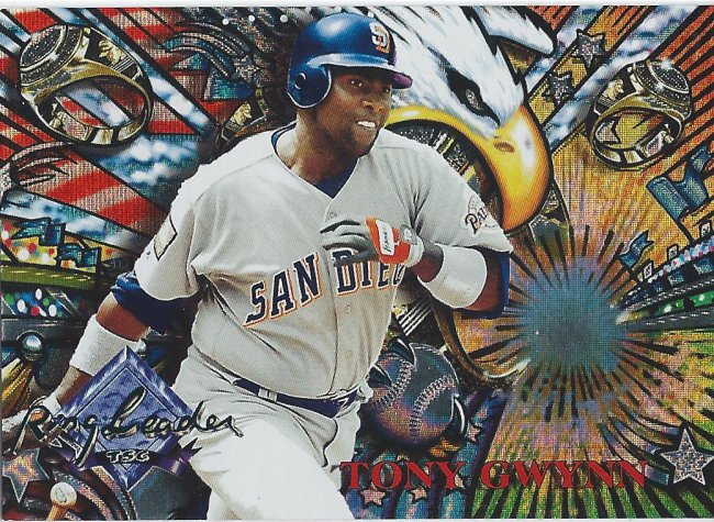
Sadly, Tony never won a ring. A leader in many senses of the word, but this one never quite worked out.
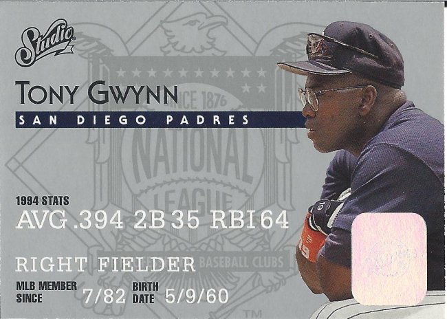
The Member Since thing is a nice touch.
I can’t say I understand the reason behind the credit card motif, but I can say I like it.
Back to the sideways text, I see.
Tony is coming for those two players. He has that look of vengeance in his eyes.
Yeah, sounds about right
Hooray for subsets. I miss subsets. Foil subsets are pretty good too. Except when they don’t scan.
More foil! Tons of border, too!
Here’s a good example of how the hobby changed. Donruss Elite started as a premium, rare insert and then became this as of 1997. It’s a nice looking card, but the end of an era.
No gold border variations here
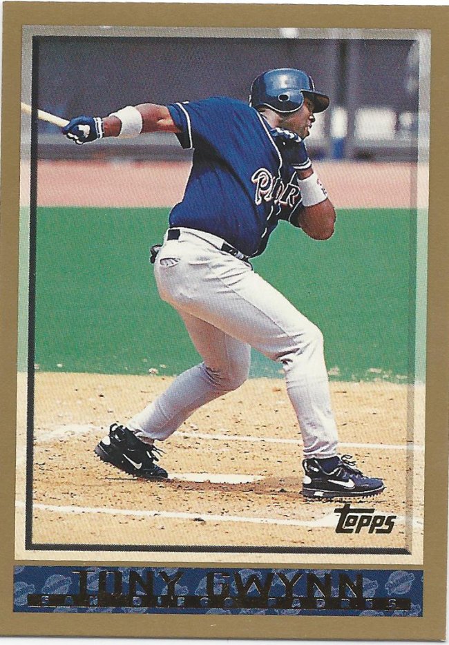
There’s a large dead zone in Topps sets for me. I know they existed. I know what they look like, but I can’t for the life of me, even after 6 years back into this hobby, tell you which year is which. This one is somewhere between 1997-2001. I could look it up. I had to in order to scan, organize, and digitally organize my scan, but I still don’t know the real answer.
Nice framing there. Perfect ball placement
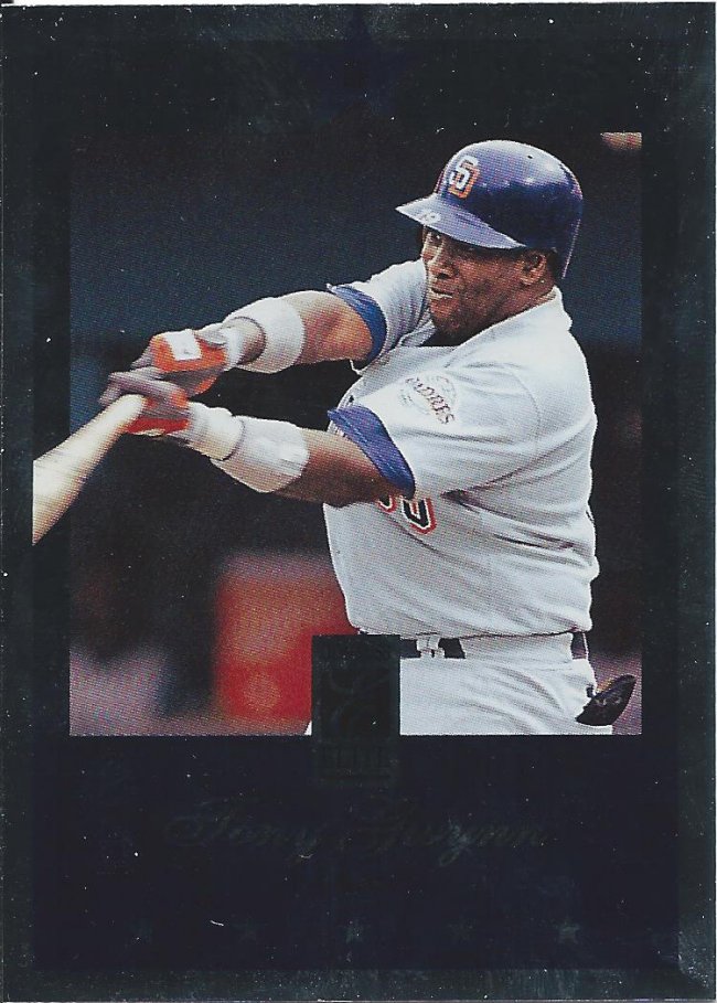
I kind of have the same problem with Ultra sets too. Several sets in a row are too similar to identify right away. Again, I’ll guess 1998-2002.
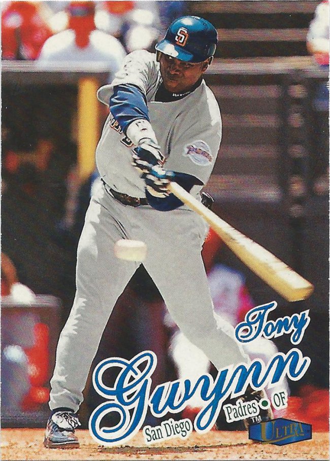
Perfect bat placement
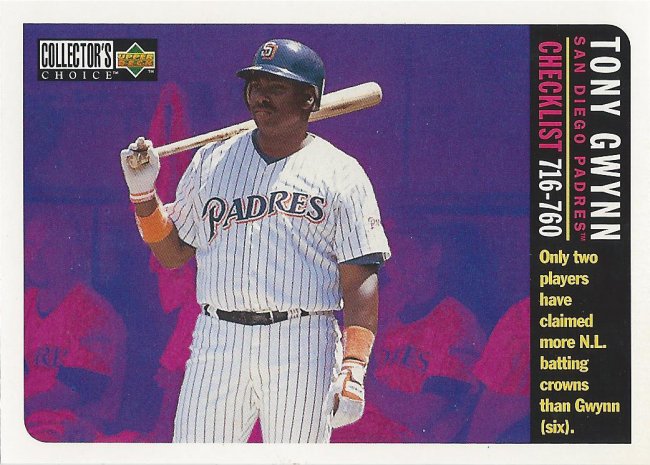
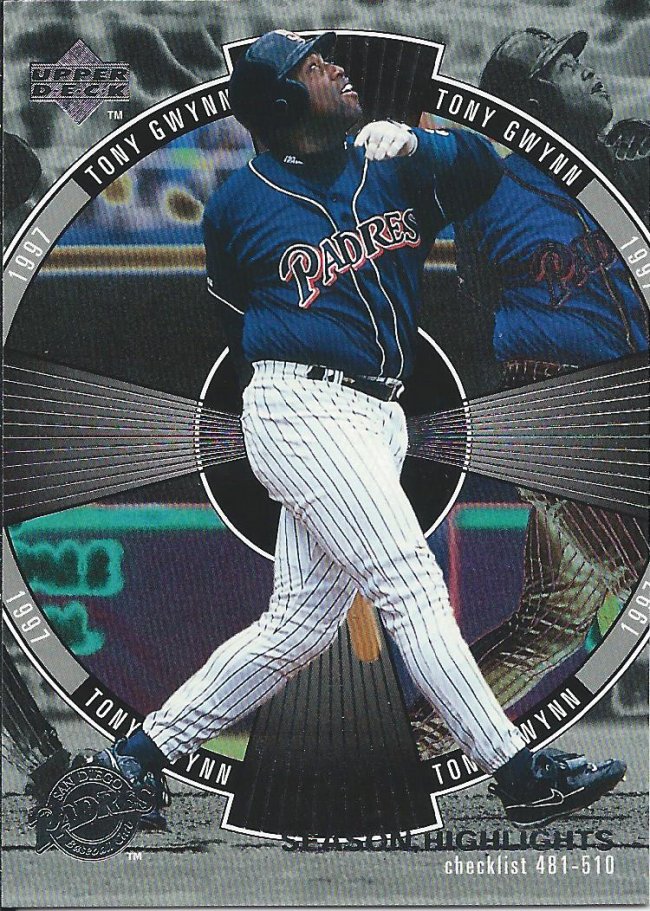
For a checklist, it sure doesn’t list too many cards. 29?
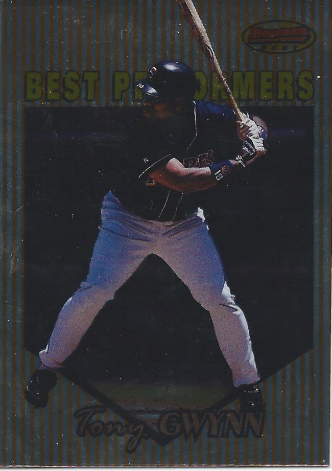
Not Best Designs, that’s for sure
I’ve asked this before, but why bring Bowman’s Best back? This stuff never intrigued me.
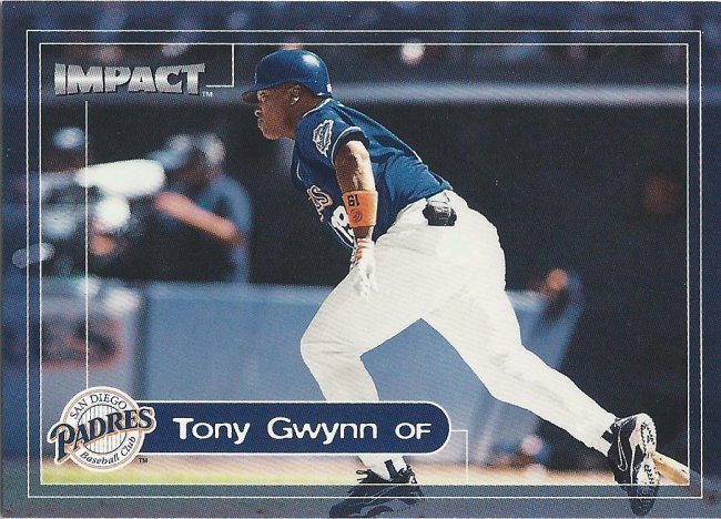
Not making much of one
I guess it’s better than bringing back Impact. This looks cheaper than Pacific cards. I feel like it belongs as an insert in a magazine.
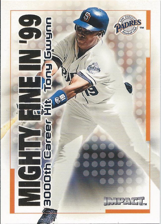
2 Cool 2 B 4 Gotten
I…I…Just don’t get it….
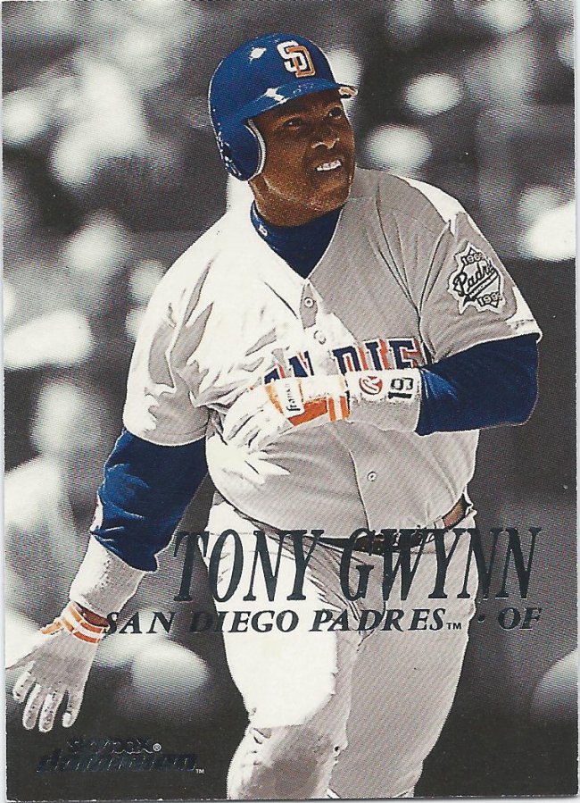
Kinda like a poor man’s Ultra
Sorry everyone. Not all of the cards can be extremely exciting. Well, unless you imagine that Tony just dropped his dance partner on the floor.
The future is then
So, there’s no cursive handwriting on this, but that still doesn’t help me figure out what year this is. Whatever. It’s a decent picture at least.
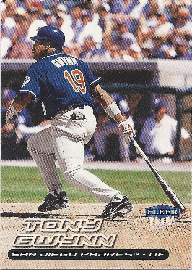
Fleer Halo Effect
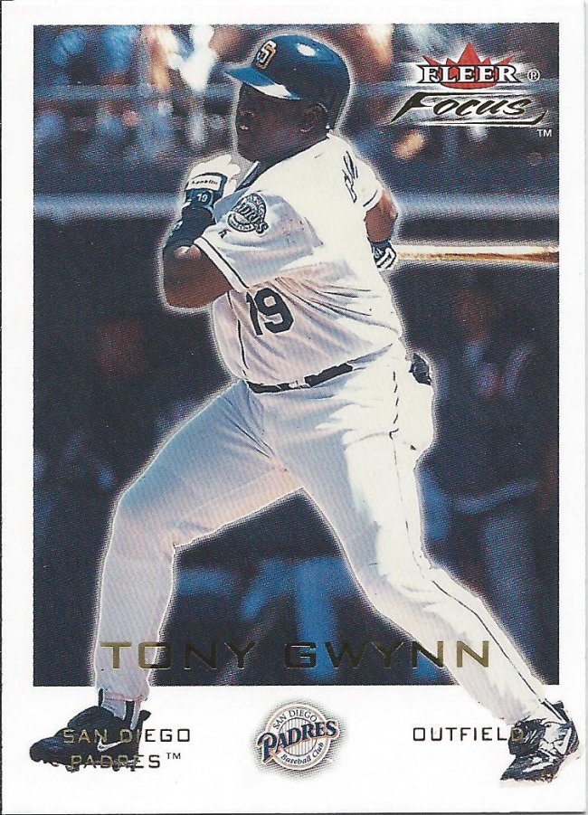
Fleer Focus lasted more years than expected. I don’t know what the “focus” was, but my guess is to pad the release schedule.
Precursor to a future, better, product
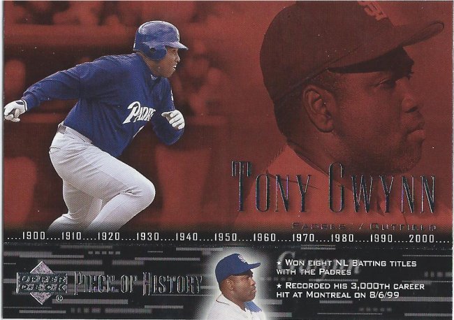
Here’s another card that I don’t mind. It took a few. I like the motion lines at the bottom with the timeline and having two pictures. Not bad.
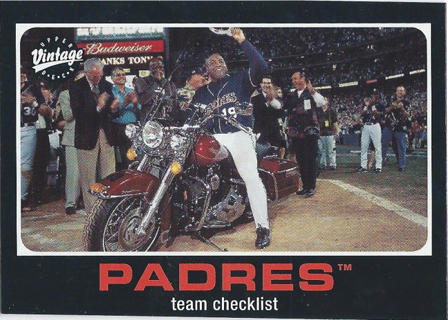
Call him “Captain Chopper”
I like the Vintage cards too, but that’s because the 1971 Topps set is badass. Besides, how can you not like that picture?
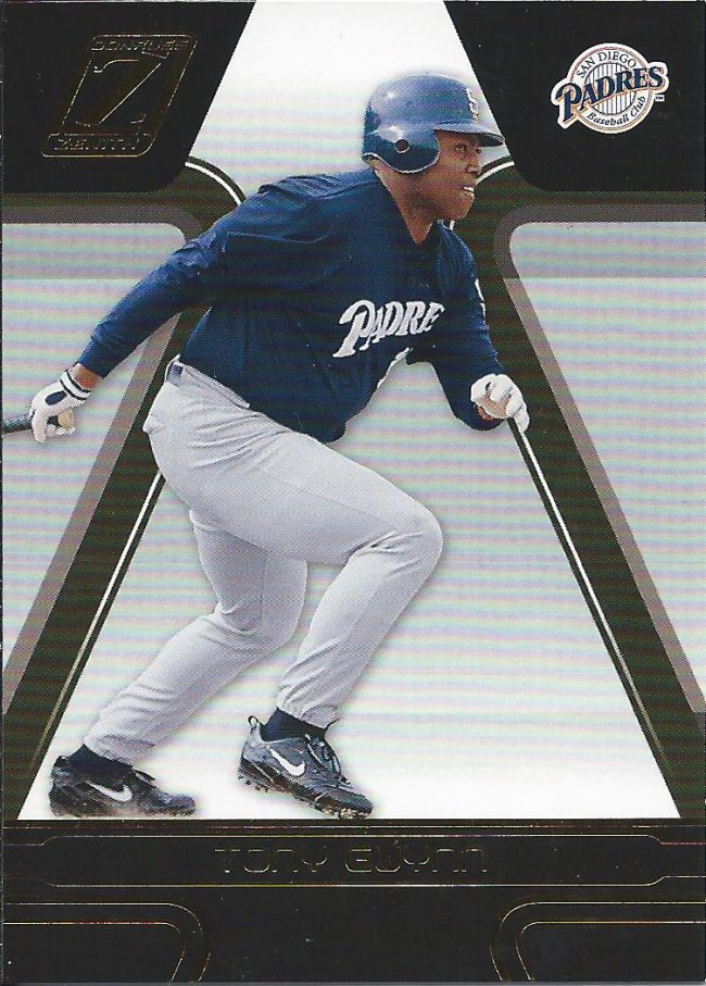
Higher end than years past
I never posted it, but I opened a box of 1997 Zenith. One day I hope to rip a box of the 1998 Zenith dare to tear cards. This 2005 card is much fancier than those.
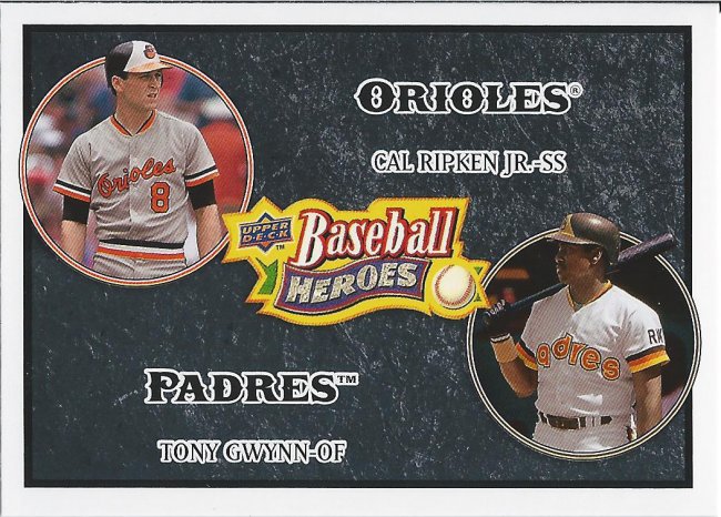
Forever linked in baseball history
This is another box I want to rip. I need a ton of Baseball Heroes cards. Tony Gwynns especially. He has solo cards along with these tandems.
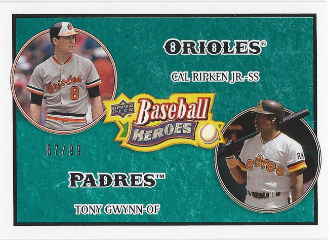
The oft-used Sea Green parallel
But thanks to Nick, I have one of the tougher parallels already. Only 23 more cards from the set to find!
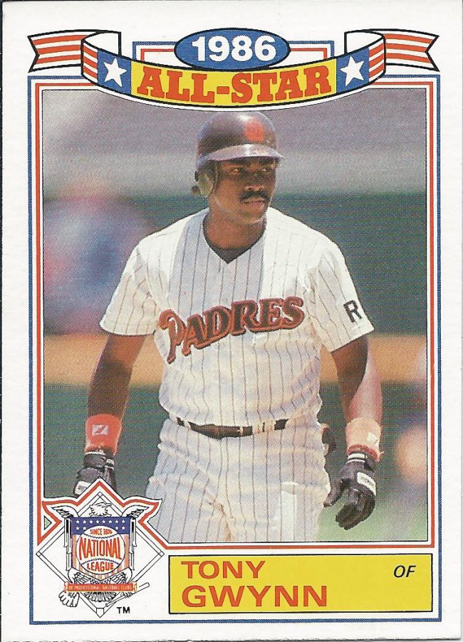
Yay! 1986 was my first baseball card experience
It’s great to have this original back version of the CYMTO insert. I know they exist, but tend to ignore them overall. There are so many reprints, that it’s tough to keep track. Glad someone else is willing to do the groundwork
No crazy SP on this picture.
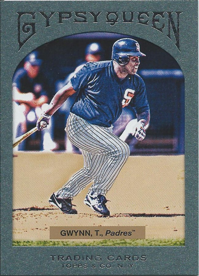
To round out just this first “half,” we have the green paper parallel of some GQ year. I think these were the rack pack exclusives. I buy very little retail anymore, so these retail exclusives are a pretty easy way to make a trade happen.
As you can see from this “half” of one trade from one person, I have to thank Nick once again, as I’ve done several times in the past. It’s an amazing feeling opening an envelope with this kind of care. I hope everyone who reads this gets to experience it.
[…] little over a month ago, I posted the first part of a very large trade package I received from reader Nick M. It’s taken a while to find […]