
Ebay can be a beautiful place sometimes. Sure, it can be the home of scam artists and price gougers, but so can virtually every marketplace. Sure, it may have single-handedly caused the devaluation of everyone’s baseball card collections, but that just means I can pick up a bunch of cards for my collection on the cheap.
Real cheap.
A lot of 70 Kerry Wood cards for $1 +s/h cheap.
Now, some of those 70 cards were doubles, but I still wound up with 32 new cards (or 45.7% of the lot – hence the title). That ain’t a bad price per card and it ain’t a bad ratio.
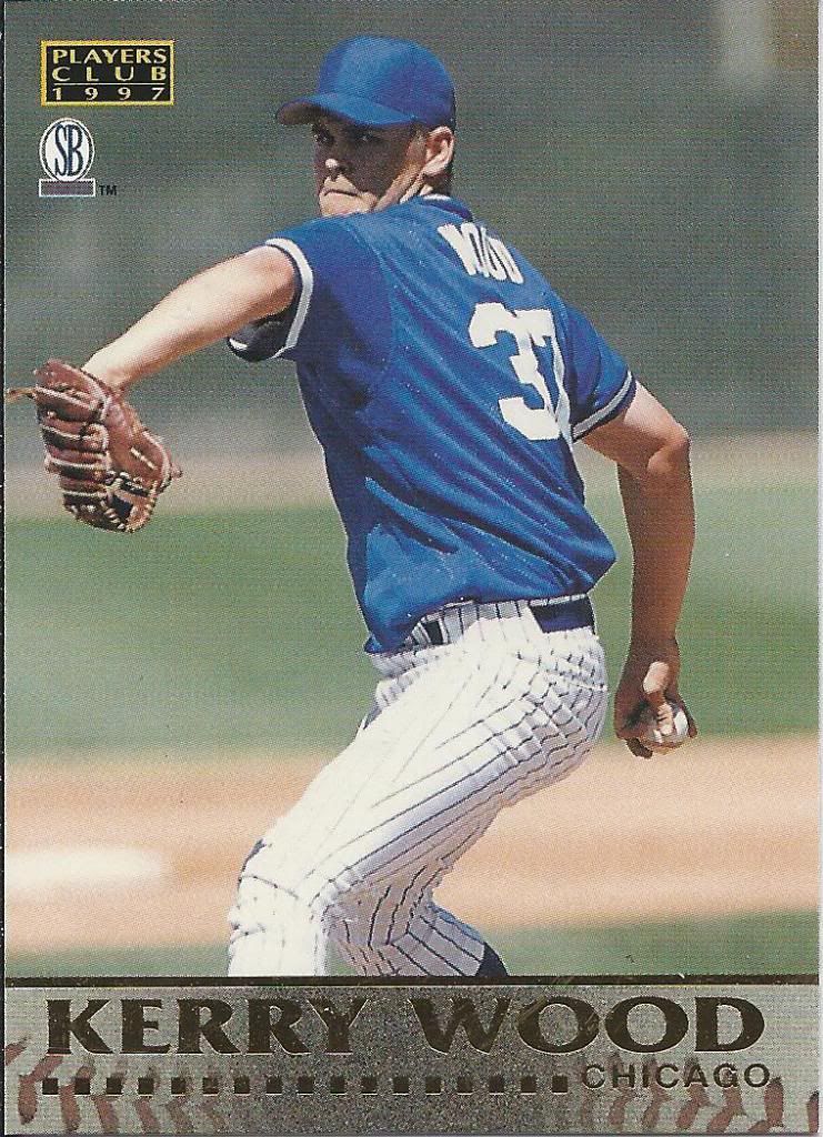
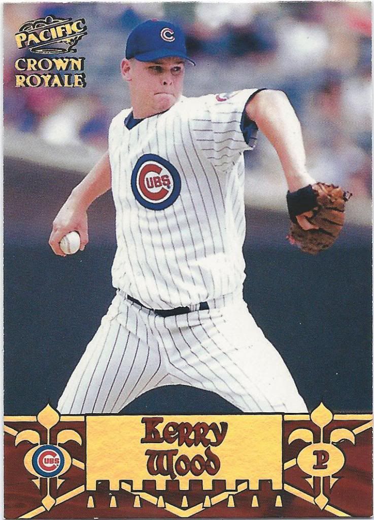
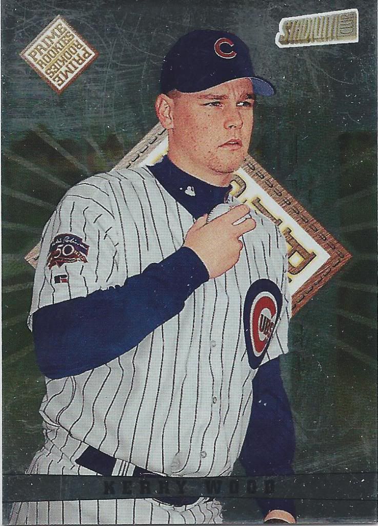
Pre #34
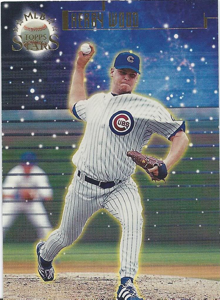
This is the one 1997 card I needed. Almost all the others were from 1998. I don’t mind these unlicensed cards, but they also don’t draw me in. I like gold foil, but I can’t help but feel the card is bland. I don’t know if I would “play” in that “club.”
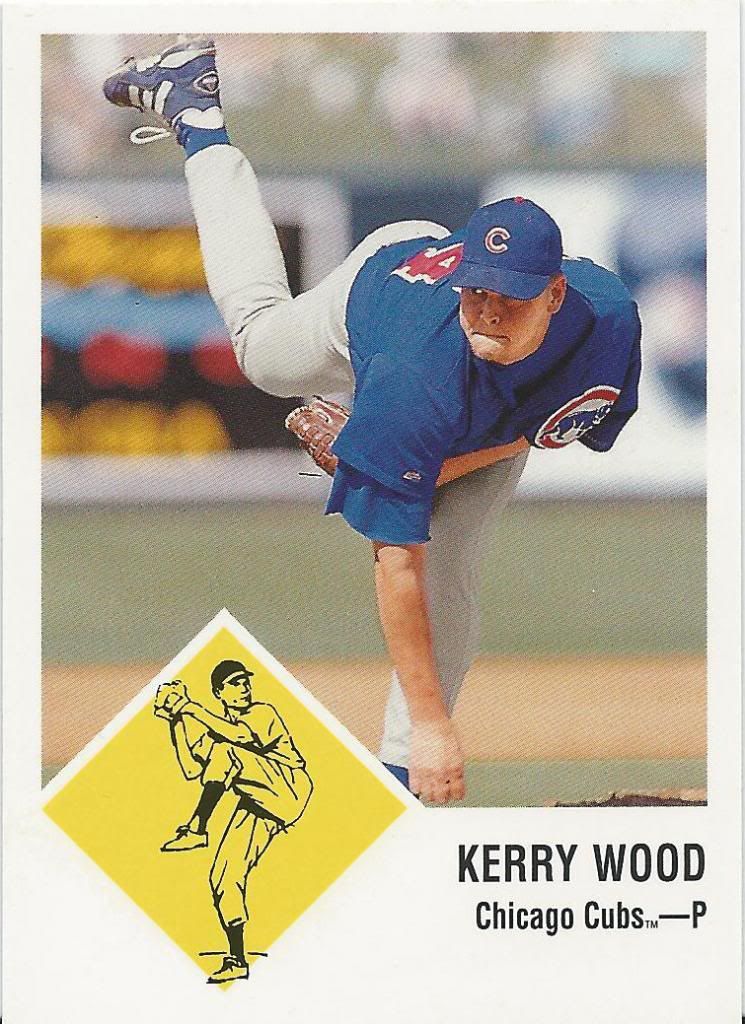
The “P” does not stand for “Proactiv”
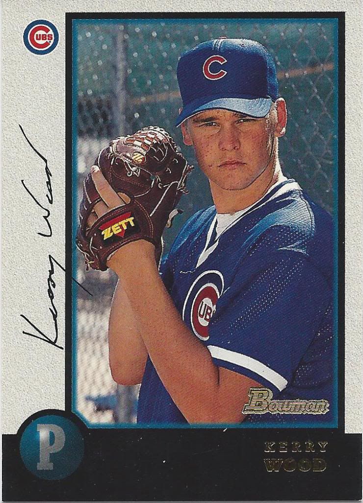
Let’s start the second year card parade. We begin with ’95 Windows computer graphic Bowman.
A lot of Zetts on his face
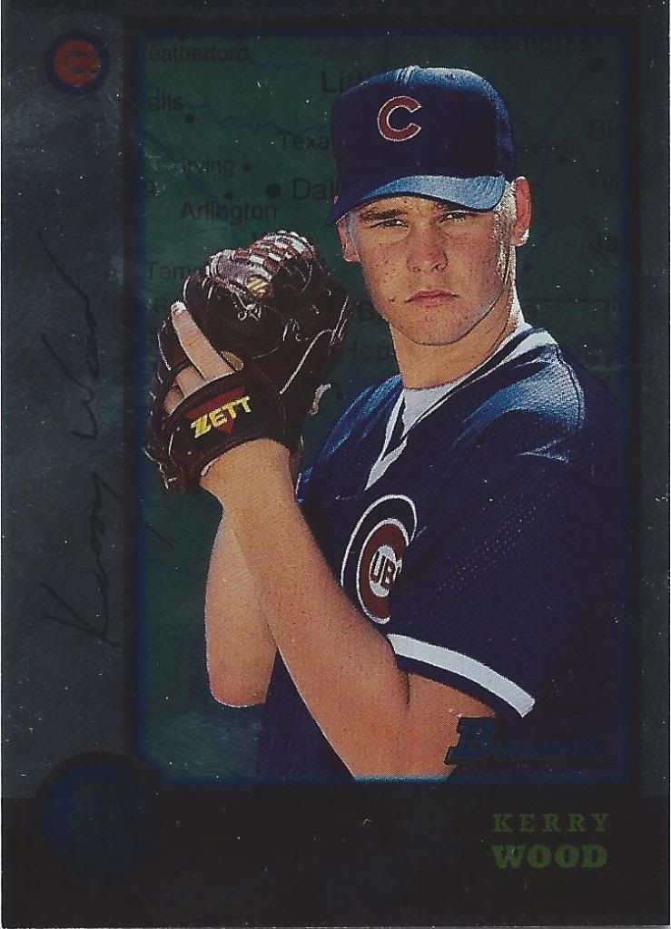
And another one, except this is that International version made all shiny like. It’s hard to see, but I’ll assure you that it’s a map of Texas back there.
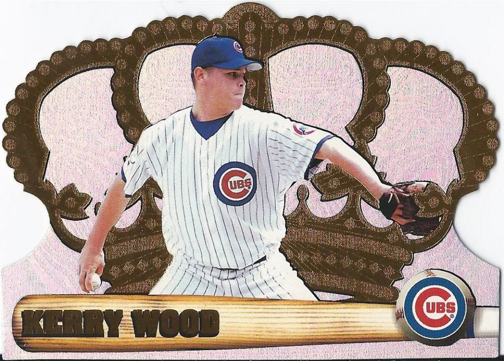
Not exactly hitting it with the barrel of the bat
Gotta love and hate Crown Royale. Love the look and the glimmer, but hate how I feel like they’re going to crumble in my hand and that one dinged ridge can just about ruin the card. So much opportunity for disaster.
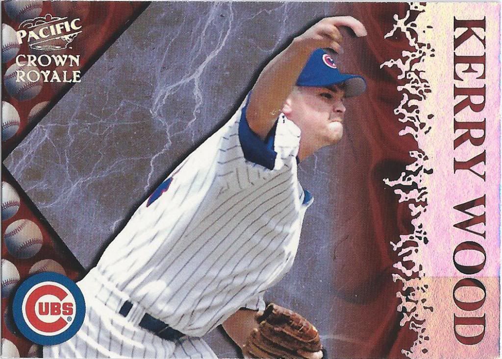
Unintentionally disturbing
Here’s some crazy non-die cut Crown Royale card. I don’t know what the hell is supposed to be happening here, but it looks like it could double for the cover of Heavy Metal if only there were a scantily clad viking woman somewhere on here.
Sir Wood
This insert is called Diamond Knights. Tell me if you get that impression. Maybe there’s some Ren Fair type stuff happening, but not unless you’re told to look for it.
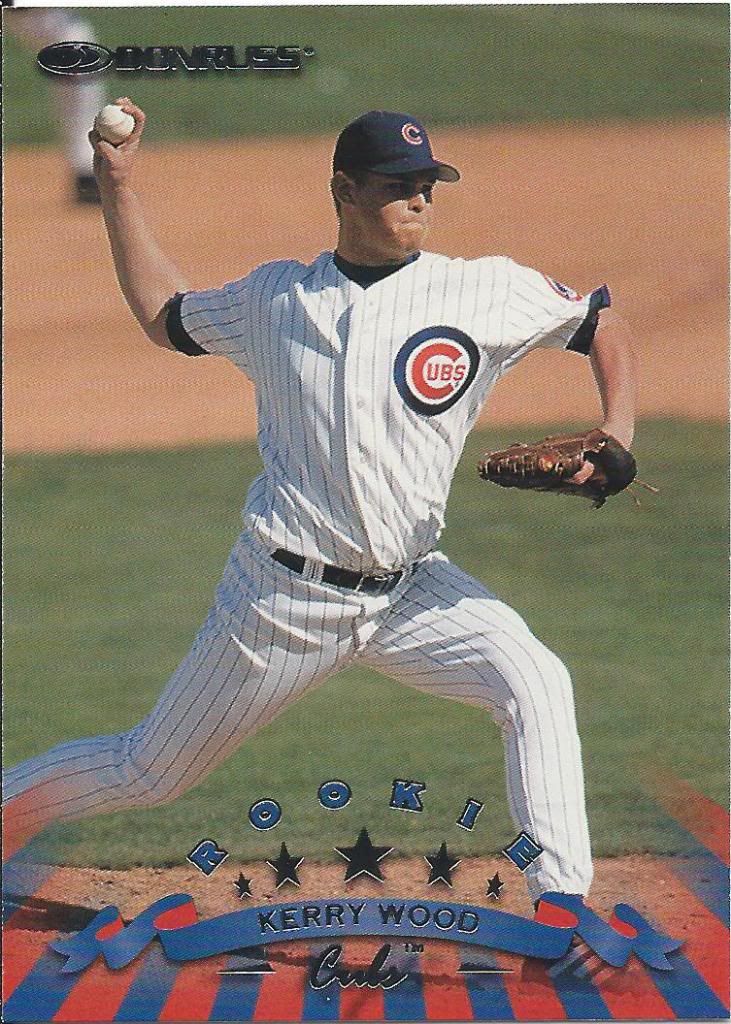
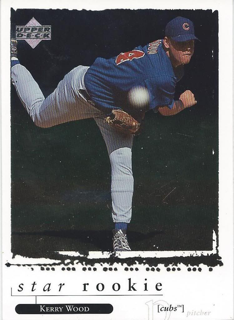
America’s Rookie card
For a lot of companies, 1998 is considered his RC. Not exactly as iconic as a Don Mattingly, is it?
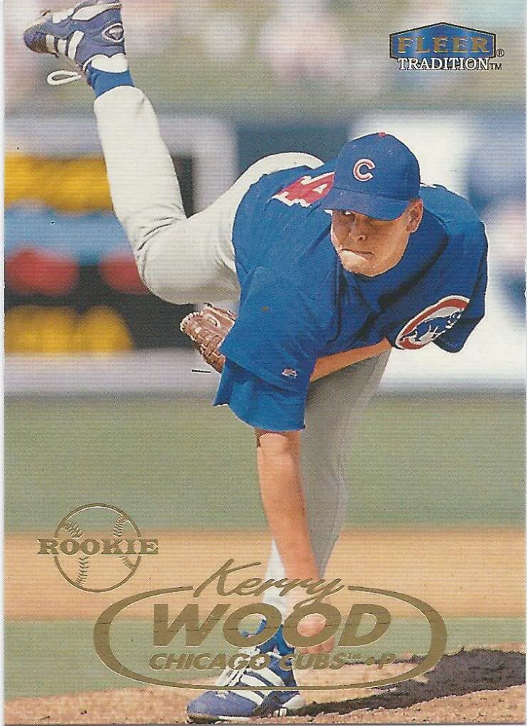
Could easily be a Fleer Ultra card
You know, I wish card companies were allowed to create their own rookie logos again. Not that this is the greatest looking logo, but at least it fits with the design of the set.
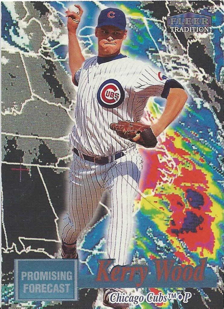
Goddamn Fleer getting lazy with their goddamn monopoly
Hey, wait a minute…. That guy in the giant yellow box doesn’t look anything like Kerry Wood!
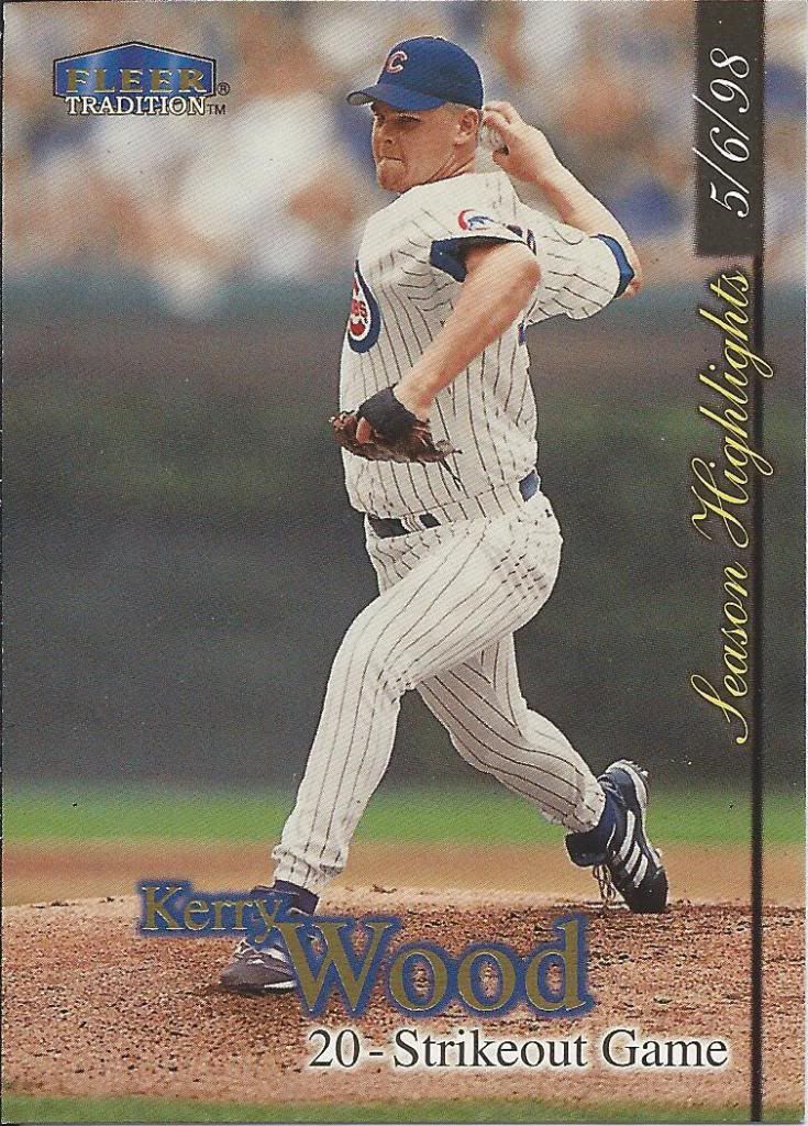
Oh, now you use a different photo
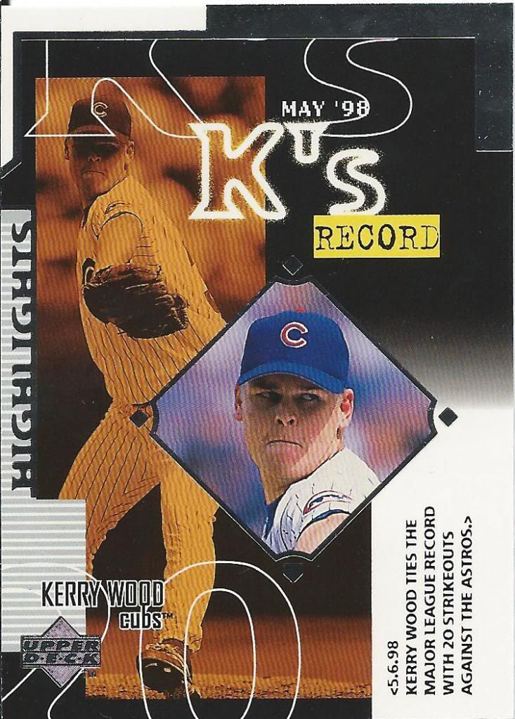
I think MLB required every 1998 set to have a special card devoted to the 20 strikeout game. I’m pretty sure that’s the only reason Fleer Tradition made an Update set.
Another Ultra-esque card
This is an interesting concept for a prospect based insert, but I think they needed to wait for Doppler to reach 3000 instead of just 2000. Also, if the forecast is so promising, why is there a hurricane heading towards the coast?
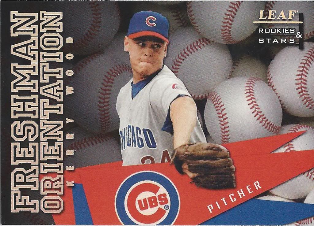
Part of his hazing is being forced to pitch behind a fake pennant
Rah! Rah! Sis-boom-balls!
Droopy Wood says “I’m happy.”
I’ll never get sick of that expression. The dude had to have been dead tired, probably thrown to all the media hounds, hasn’t had a chance to do his normal post-game rituals to unwind and they drag him off into another corner to take this picture.
Take that Topps sparkle variations!
It wouldn’t truly be a Pacific card without sparkle shiny, shiny sparkles all over it. And if they can’t make the holograms and foil sparkle enough, why not print a few more on there?
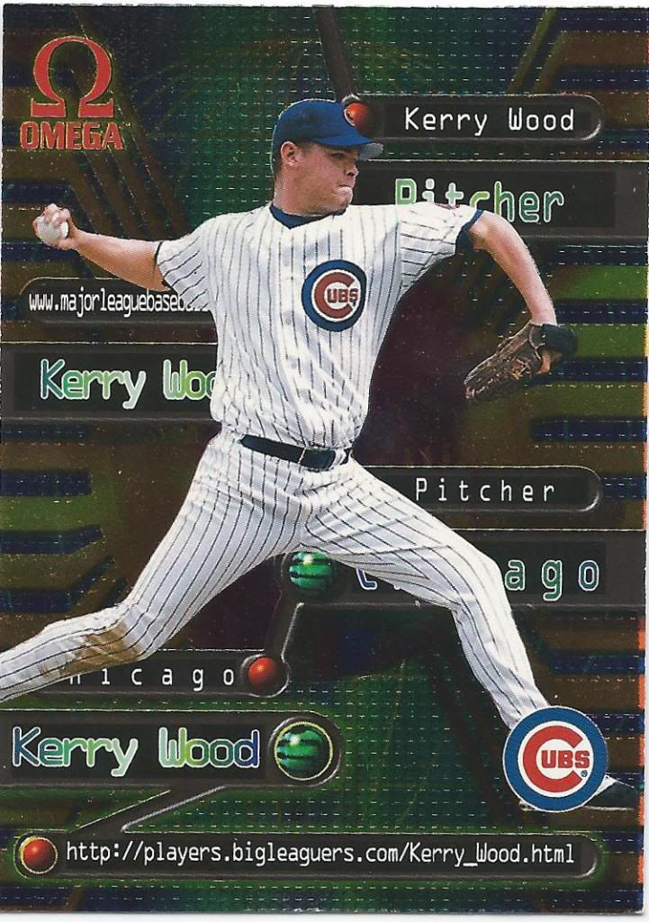
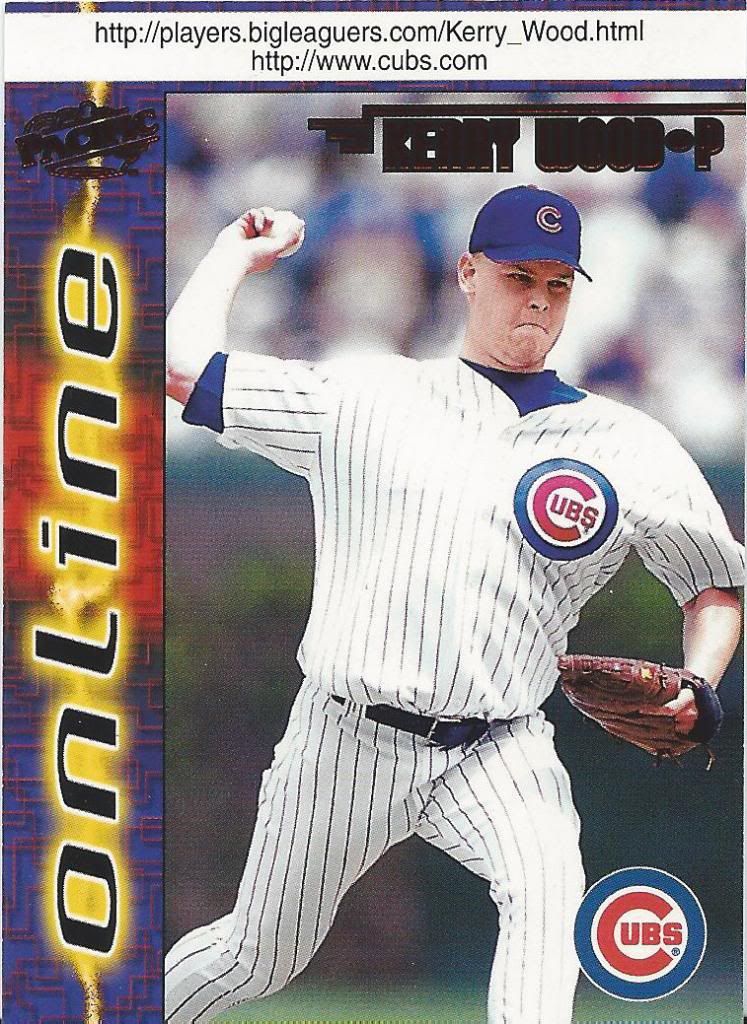
Pretty sure this is an actual shot inside the series of tubes
Here’s a less bright, but not less gaudy Online insert. People were going nuts for the internets back then, what with their geocities and their prodigies and their Net Zeroes. Porn took too long to download, so they had to search for something.
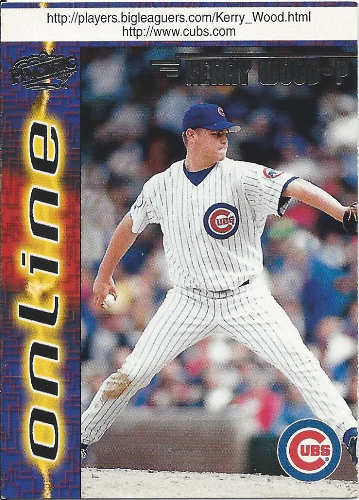
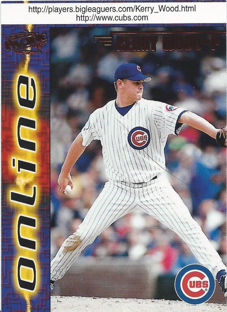
Version A. Or is it B?
Which is why they made a whole set devoted to websites. Don’t forget the underscored, or else it won’t work.
Okay, it won’t work anyway, but you get what I’m saying.
This is considered the “Close-Up” version
And just like there’s a www2, there are two versions for each player. Oh, and there are also parallels. These are the Red foil versions that apparently were retail exclusive.
Another freakin’ hair. Just go bald already, me!
Here’s another red. It doesn’t show well on my scanner, but it pops in person. There are also “Winners” versions as well as “Web Cards” versions. I’ll assume they replace the player with a giant backslash and an under construction gif.
Wood grain on a Wood card. I get it. Or is it supposed to be metal?
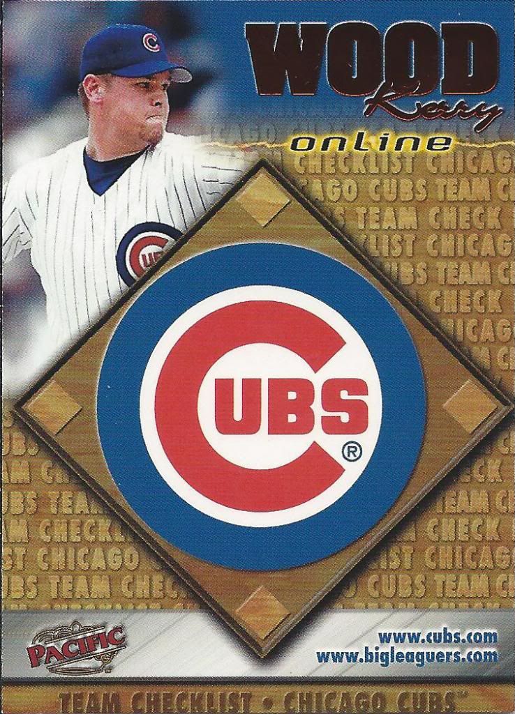
To round out the Pacific cards, we have a red foil checklist. I bet you can’t guess which team.
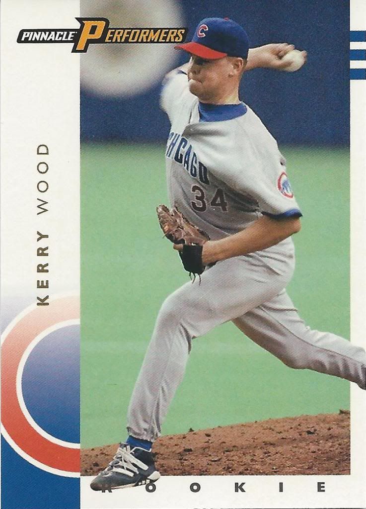
Ookie Ard!
We’ve escaped “The Net” and we’re back to real civilization thanks to a decent looking Pinnacle Rookie. I still prefer the 1992 (and actually the 2013) looks, but this ain’t bad.
Now, what the hell am I supposed to do with this thing? Do I…Do I eat it?
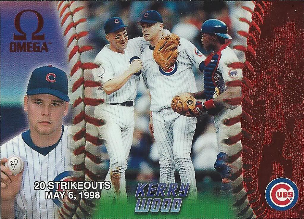
It probably isn’t true, but my imagination wants to believe that this is right before he took that picture used in the Omega 20K tribute card.
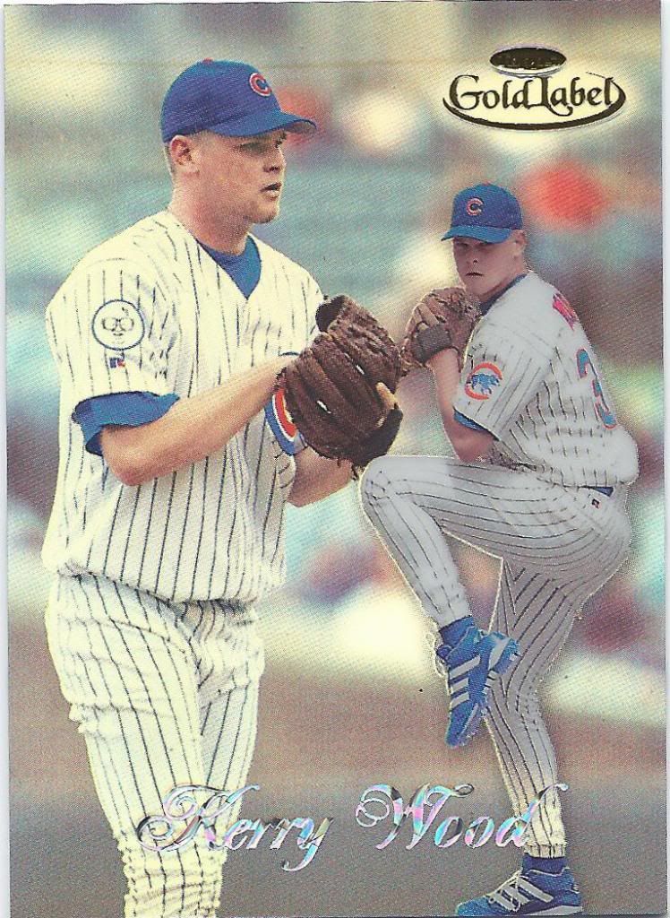
Class something. 1, I think
I think that background image may be the scariest face I’ve seen on a Kid K card so far. It’s not as creepy as the pitch black eye sockets we’ve seen on Greg Maddux in the past, but it’s close.
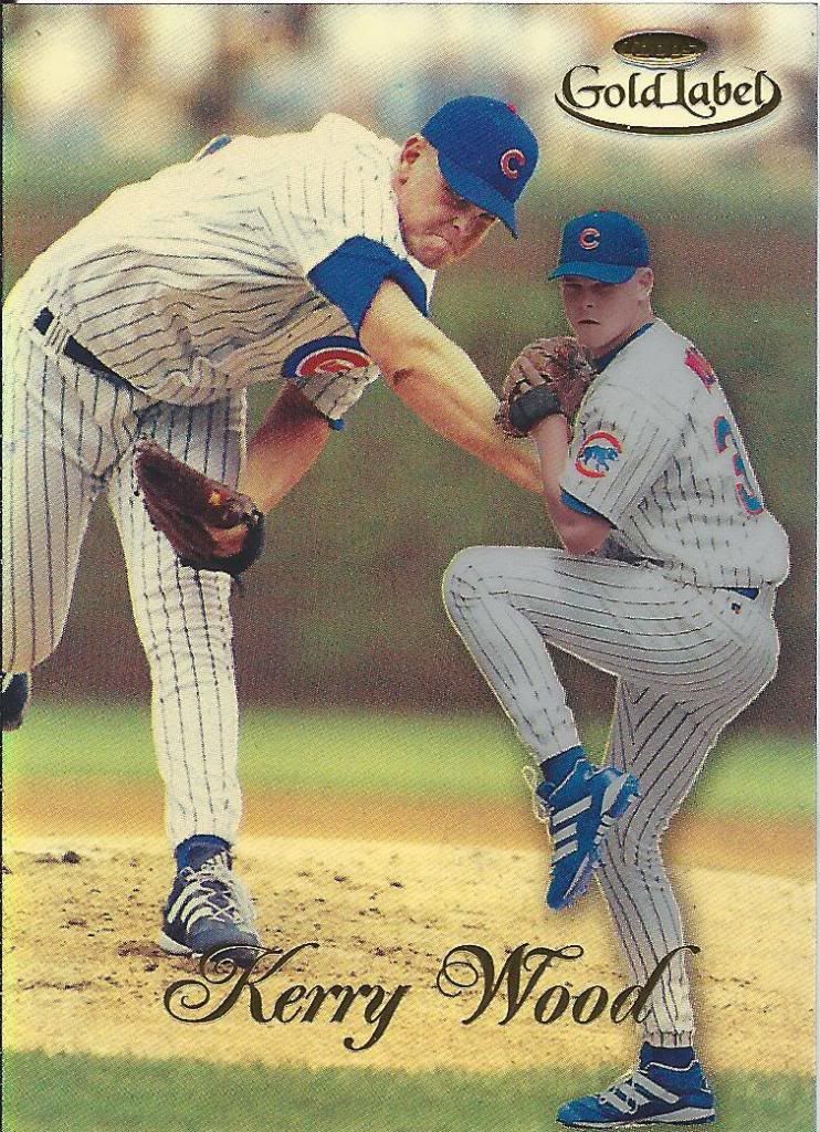
Same foreground picture, but oooooo sparkles!
When I saw this card in the package, it threw me for a loop. I know the different classes in Gold Label have different pictures, but I didn’t know 1998 used different materials for the names, too. I thought I got lucky with a crazy parallel, but I just got lucky with a regular Class 2 that I didn’t have yet.
Trust me, it’s bronze foil
Speaking of crazy parallels, I wound up with a few Topps Stars cards. All of these are numbered. Tom from The Angels, In Order gave me the Red foil (#/9799) one, but this lot brought me the Bronze you see here (also #/9799)…
They totally look different!
…and the gold foil one #/2299. I’ve also since acquired the Silver through another trade, so all that’s left is the Gold Rainbow and all of the rare Supernova versions.
An unhappy sandwich
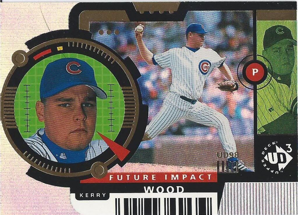
I follow up that confusion with even more. Here’s a UD3 card. There are three different cards that look quite a bit like this, but aren’t. You’ll see those in a future post. There are also die cuts of all three cards. I don’t understand how it works or what makes them special, but we’ll see later, I guess?
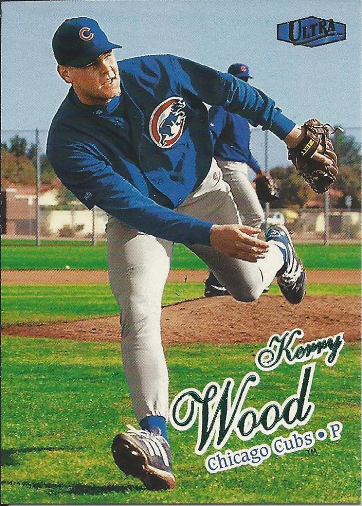
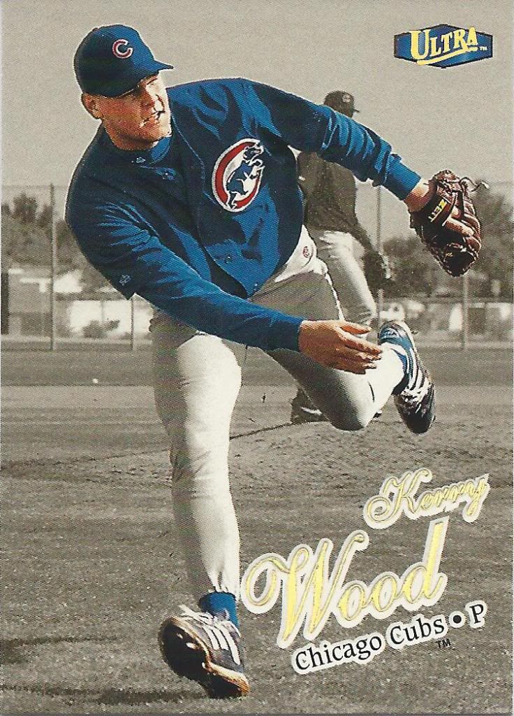
Ultra, you’ve done it again
Spring training action shot! This is a great picture. It’s dynamic and fluid, works well with the name placement, deviates from your standard wind-up or throw image. How could it get better?
Anyone have the Platinum Medallion?
By making the whole thing gold, that’s how! Back when gold medallion actually meant something more than a weird die cut pattern. Good stuff.
Look out, it’s coming right for us!
This apparently passes for a base card in the 1998 Upper Deck set. I know that this isn’t the normal design you’re used to, but I wish it was. Judging by that Morse code near the bottom, I think it’s sending us a message Something like IE IE IE IE IE IE IE IE.
Destination Stardom? Not exactly
Someone needs to invent a scanner that can deal with foil in a better way. Behind this dark mess of colors is a pretty cool looking card.
Picture-in-same-picture
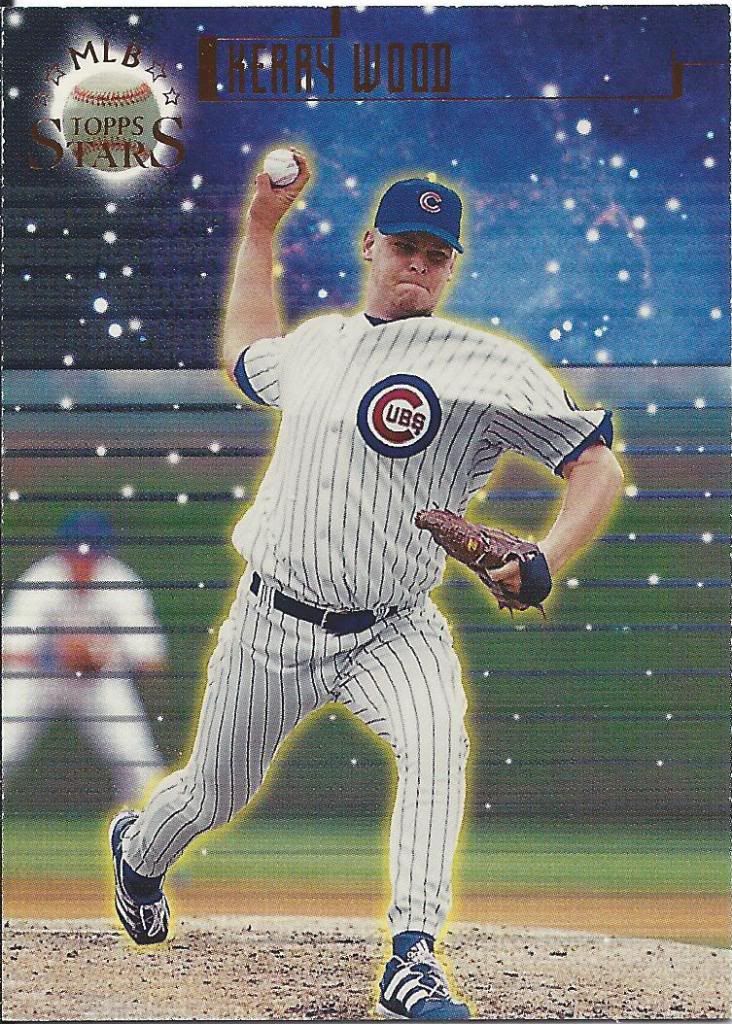
And lastly we have the sole 1999 card. Oh, and guess what? It’s about the 20 strikeout game. Yeah, there were two years of those.
I’m sure there’s a lot of just those cards out there on ebay somewhere. Maybe another time.
It’s hard to top the Gold Label cards, but I think that Ultra gold medallion takes the cake. Nice haul!
Every now and then, I’ll pick up Tony Gwynn lots off of eBay. But I’m lucky to bat .100 and when I do, I’m still pretty excited. Great lot of cards. It took me back to a different era of cardboard. My favorite is easily the Topps Gold Label in the lot. Great looking cards.
Great deal ! I love the ’90’s baseball inserts.