
If you missed part one of the loot I received from Kyle at Nolan’s Dugout, then click on this link. If you missed part two…here.
As a quick recap, I sent him some Topps online exclusive code giveaway die cuts, and he sent me stuff I could actually use. A lot of stuff. So much stuff that this still isn’t going to be the last part.
Today is part one of the Kerry Wood barrage. KW made up the bulk of the package and you can’t go wrong with that.
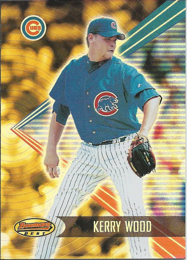
On the radar
We’ll start off with a nice, shiny card of what appears to be one of the better Bowman’s Best designs. Typically those sets are too gaudy and busy. This weird bullseye/radar thing doesn’t bug me.
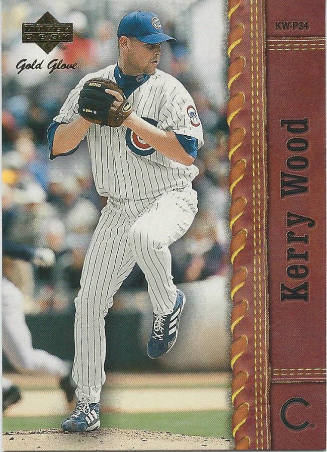
He never won the Gold Glove
I know this is supposed to be a leather glove, but it gives off more of a book vibe to me. Perhaps it’s just a bit too straight. Looking at it, though, I think it would be really interesting if a card would replicate something like this with in depth texture or faux-leather on the side.
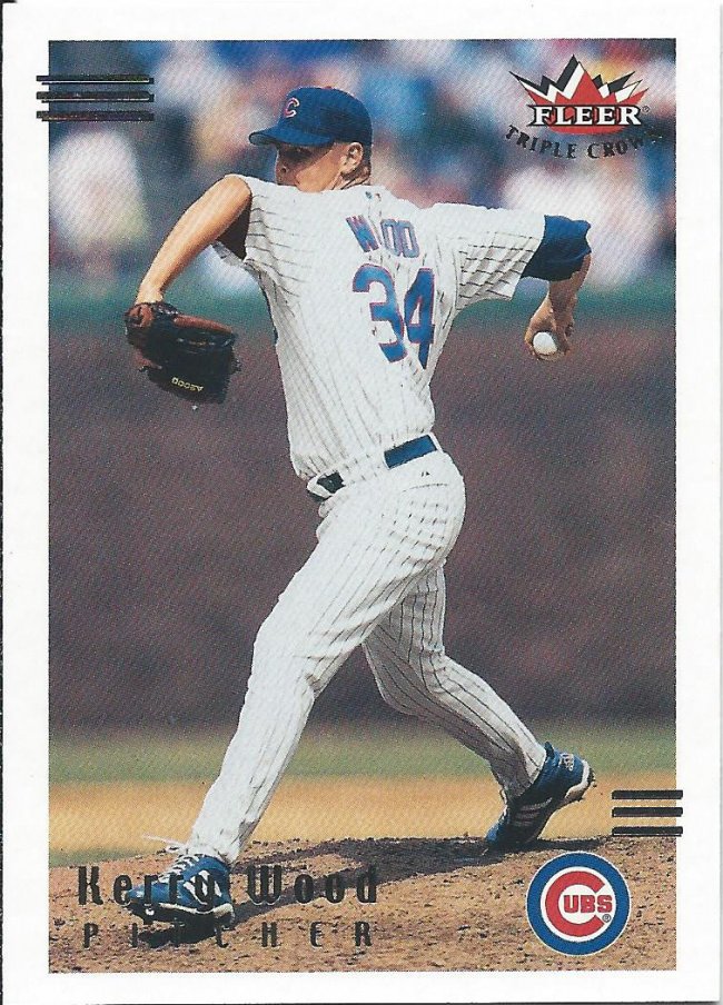
Also never won the triple crown
Some 2000s Fleer is fantastic, but some of it is also lazy throwaway stuff like this. That’s why limiting the number of licensed products per year (one way or another) is key.
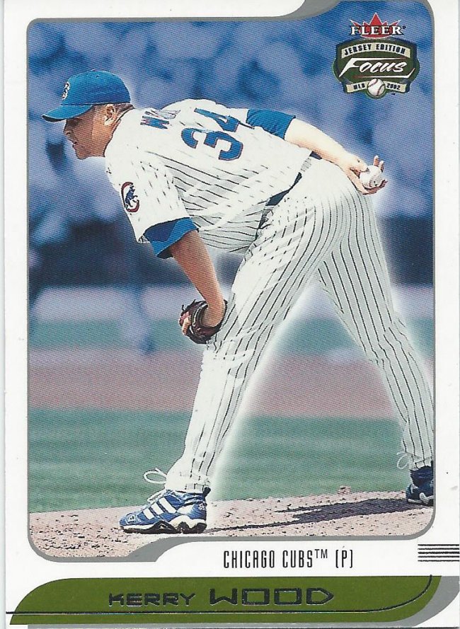
Decent background effect
This one is a bit better, although I can’t exactly articulate why. I mean, it is more than just a couple foil lines. We have some color and some curves. And a confusing set name.

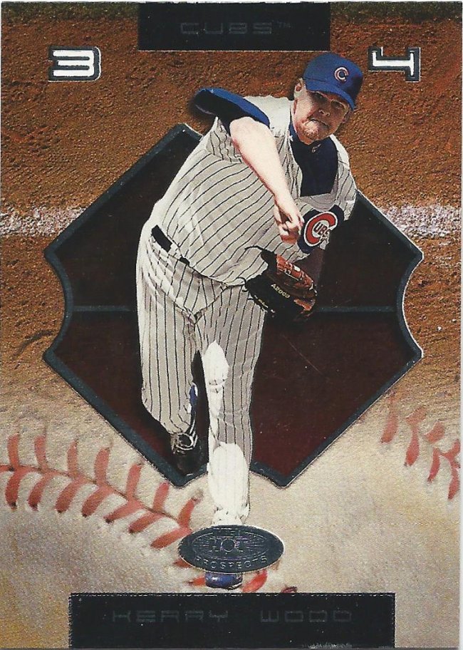
I like the use of uniform numbers on cards
I’ll propose the same here as I did with the leather, except let’s get some cheapo wood on the edge. Obviously not game used, but just to be different and unique.
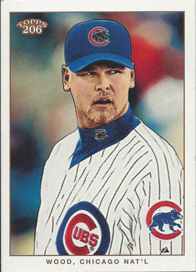
I think we need a fifth Cubs logo on here
I didn’t realize how long the 206 brand was out there. This is from what I believe is the initial reboot in 2002. Riding that fresh Heritage retro high from the year before, I suppose.
An example of uniform number use that doesn’t work well
Remember that conversation about throwaway sets from Fleer? I have no idea what is really supposed to be going on with this thing.
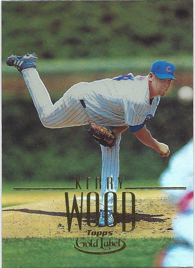
Aaah, much better and easier on the eyes
I’m not wild about what Topps did with the recent re-branding of Topps Gold Label. I’m not sure why it has to be reconfigured to be a one-pack gamble thing instead of a smaller box like Finest. Not my choice, of course.
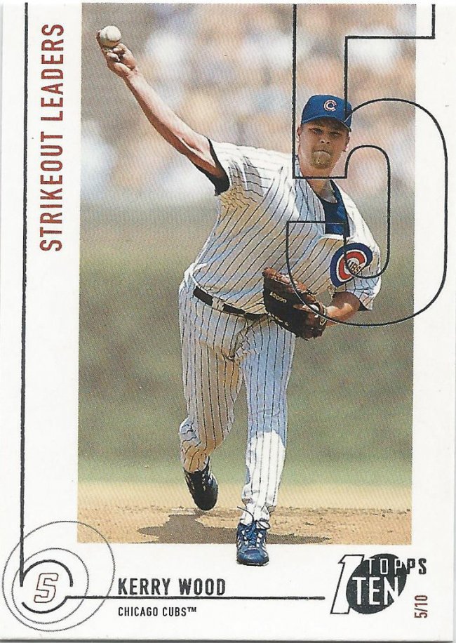
Looks like an Upper Deck card
We’ll end today’s post with a set I know very little about. I vaguely remembered the set existed, but that’s about it. I see there’s a die cut version I need. Very curious to see how that will look.
For now I’ll enjoy this and the other cards that Kyle has sent over to me in the past. Stay tuned, because we’re still not done.
Recent Comments