What can I say? I was buying some licensed cards (I’ll let you guess which ones), and these little trouble makers were just staring me in the face.
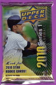
How could I NOT look for 2010 star rookie cards. Shiny, logo-hiding profile Jeter says I must. I’ll go through these quickly because they really don’t warrant much time spent.
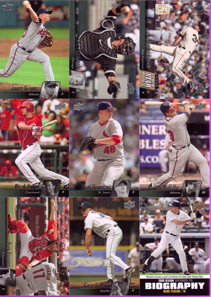
Man these cards are brutal. The design looks like a Chyron graphic some low-rent sports broadcast would use for player profiles. Upper Deck chose a nice, safe forest green gradient scale. Good that they got that color scheme out of the way before the Montana Tree Dwellers expansion team enters the league. This “Biography” insert would worry me if I had any intention of collecting this set. Again, really bland design. Got one rookie and one pitcher shown batting (Micah Owings). I love cards of pitchers hitting. I especially love it in this set because you can avoid cards like the following.
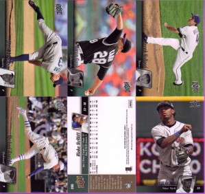
Notice a boring pattern? I can only imagine there are about 100 more like it. 4 nearly identical cards in a row = snooze city. I also show the back here. I know they don’t have a license, but I believe they are allowed to have a design or color or something. Even if it was just a low-opacity close-up of a baseline or a piece of equipment.
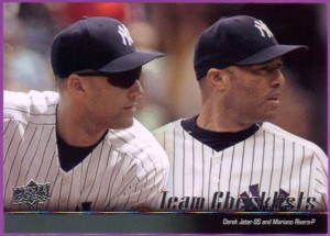
I figure the last three cards deserved their own pictures. Something either mildly amusing or befuddling is happening to the right, right now! Also, I don’t know why they felt the need to photoshop these two on top of each other. This obviously isn’t a game shot. I wonder if the background actually belongs to either of those photos. Couldn’t we get Jeter without shades, or did Upper Deck lose the rights to show his eyeballs too?
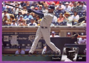
Easily the best card in the pack and the best looking picture (although the play at the plate above is good). I also like the fact that this was taken in interleague play (Padres logo in the background). I don’t know why it makes it better, but it just does.
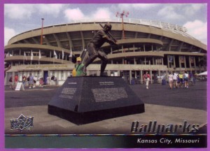
Last card in the pack shows the outside of Kauffman Stadium, home of the Royals. The George Brett statue is nice, but I’d rather see a good shot of the fountains and whatnot. I do like the concept of highlighting ballparks as they are just as much a part of the game as the players. This photo just ain’t hitting home for me.
So…that’s the pack. Tell me, Upper Deck — what happened between Ultimate Collection and these? Those looked so good. These cards are bad and ass and far from badass. I have another pack waiting unopened. Unless I pull a hit, I won’t burden you with more blandness.

Yeah I got myself some when I was picking up some licensed cards. I have yet to open either. UD’s looks sooooo bad though. I dunno why I was tempted.
Other than the hilariously obvious logo-obfuscation, I don’t mind the design of the fronts of these so much. But I’m a sucker for full-bleed, so sue me. The limiting factor on the photo selection is a deal-breaker though. Pretty weak.