
I don’t remember who re-kindled the discussion recently (I think it was Night Owl), but a couple blogs ran with the differences between the 60 Years of Topps/Cards Your Mother Threw Out reprints versus the original cards.
The general consensus from the comments was that Topps is lazy and why the heck can’t they match the look and fonts exactly with these reprints? They should be able to get it right.
I theorized in a post back in March that perhaps, just perhaps, Topps was messing with the fonts and such on purpose. Now, after seeing this card come out of a pack of 2011 Series 2, I’m more convinced than ever that the tweaks are intentional.
It's Game time!
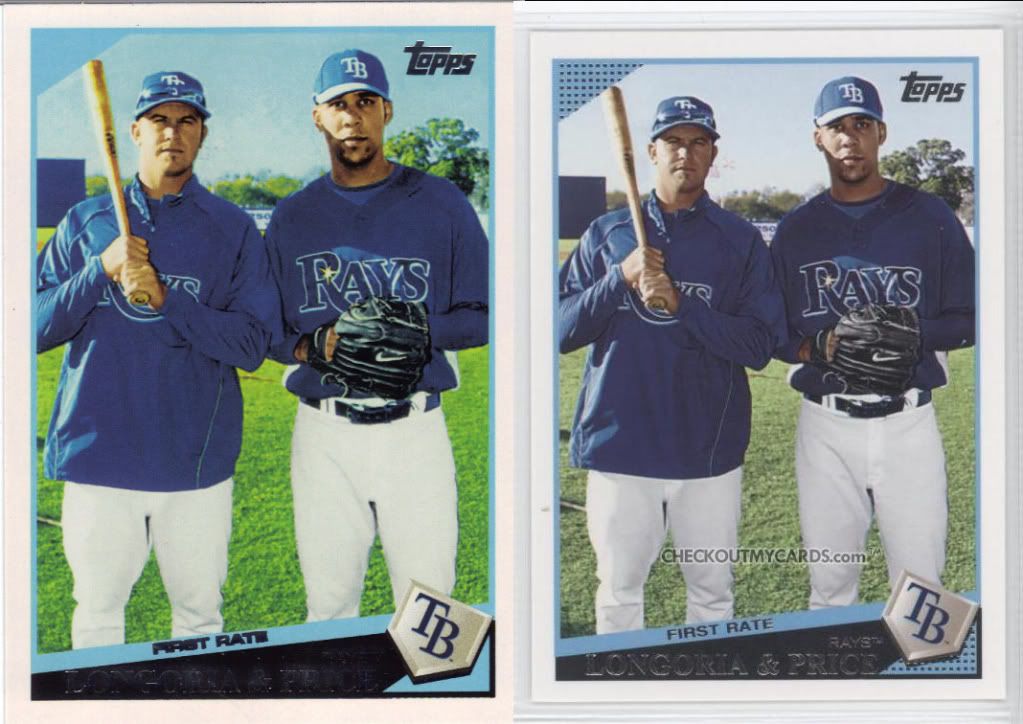
Can you spot the glaring omission in this reprint? I’ll give you a hint. Look in the blue corners of each card. Surely they didn’t forget such a key design element on a reprint card. This has to be by choice. Also, the photo has been manipulated a bit more to bump the color contrast and make it look hideous. Thanks to checkoutmycards.com for “letting” me use scans as comparison pieces.
This card got me wondering. Did they change all the cards? I won’t go through all the 60 Years of Topps cards I’ve acquired from series 2, but here are 3 more from the most recent year cards. These are the ones that should be spot on – more so than the junk wax, in my opinion.
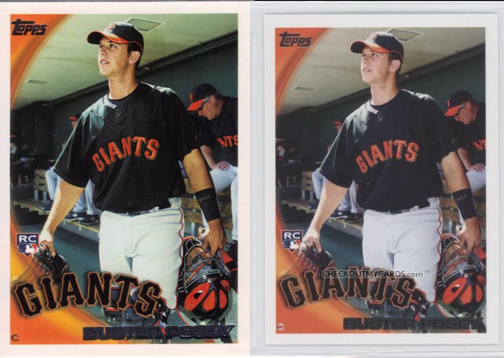
As he's known in our house: Buster Posey Posey Buster
This is the toughest to decipher. I had a hell of a time finding any sort of difference between the original (always on the right) and the new (original back) version on the left. I thought my theory was ruined right out of the gate. The fonts look solid. The foil looks consistent. The swoop gradation holds up. RC positioning is….wait! The RC logo is on the same spot on the swoop, but not the same on Posey’s hand. The whole image has been shifted over to the left for some reason. And moved down slightly. The foil name positioning isn’t exactly in the same spot under “Giants” either, but that’s near nitpicking.
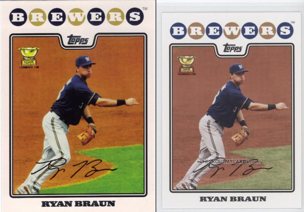
Exhale, fish face!
Another toughy. The font is dead on in both accounts from what I can tell. This is another positioning change. Brewers has been shifted up to give more white space. Topps shifted down into the pit more. The facsimile auto now crosses his legs more and the grass less. Also, they manipulated the photo to mess with the coloring again. It looks like a photocopy rather than a photo. Lack of printing plate perhaps? (I doubt it – I don’t buy the printing plate thing).
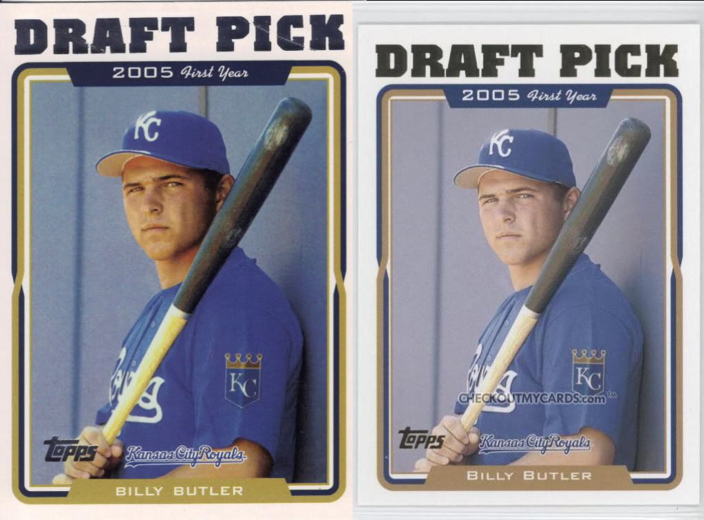
I'm not counting the scratches on the foil
Last one. I don’t know for sure, but the original looks like it has gold foil. That could be enough right there if that was standard (I don’t know 2005 Topps). Assuming both silver, the foil on the new card is thicker. Look at the “F” in Draft and the space in the middle of the “A.” The white border immediately surrounding the picture is much thicker on the sides. The fonts on the top look fine (although they expanded the blue space on either side), but the font on the bottom is different. It might actually be the same font, but the B is slightly raised on both the first and last name in the original and it’s a straight line in the new. Once again they’ve scaled the picture differently as well. It’s slightly larger.
I have no idea why this is being done. Perhaps it’s some weird copyright thing, even though they should own the designs. Maybe it’s a legal thing to protect them if someone tries to pass off the reprints (especially the original backs) as originals. I don’t know the answer, and I doubt if Topps will tell.
They’re a big enough company and the design is something that likely is months worth of discussion. If I was a card manufacturer, you’d better well believe I have records of all the variations and deliberations that led up to the ultimate design. I’d know the font, spacing, thickness of borders, picture positions, etc. I’d have records of all of those things so that they could be related to the printers and layout people. Especially on the new stuff just a couple years old.
I’m not saying it’s right or good that they’re changing the look, even slightly. Honestly, I don’t care as much if it’s perfect. A 1988 card isn’t going to look the same even if the font is right because the card stock and gloss levels are different. So, I’m cool with it not matching, because it’s a reproduction -a self-serving homage- and not a second pressing.
Maybe I’m wrong. Maybe they really are just that bad at recreating their own stuff, but I kind of doubt it. Who’s with me?
I’ve also thought that there might be a “method to the madness,” but outside of some strange attempt to prevent people from suing them because they were deceived into thinking they had the original, I can’t come up with anything.
Mostly it looks sloppy. Really, really sloppy.
(Except for some of the examples you cite, which I’d never notice in a kajillion years).
I agree, I can’t for the life of me understand why there would be differences. I tend to agree they just aren’t very good at recreating the old stuff. You’d think this would be more of an issue with old cards instead of recent products that should theoretically be files on a designer’s computer.
Looks like the Topps logo is closer to the border on the new Posey card as well. Subtle differences make sense if you’re trying to reproduce vintage cards on the cheap, but there’s no excuse for this.
[…] […]