
How many of you out there played Little League baseball? How about High School baseball. AYSO Soccer? Any sort of team sport? If so, then you may have received your own trading card. Or at least dreamed of having one.
Most of us have seen those trading cards. They’re flimsy, boring, and the same thing year after year. They’re little more than glorified class pictures.
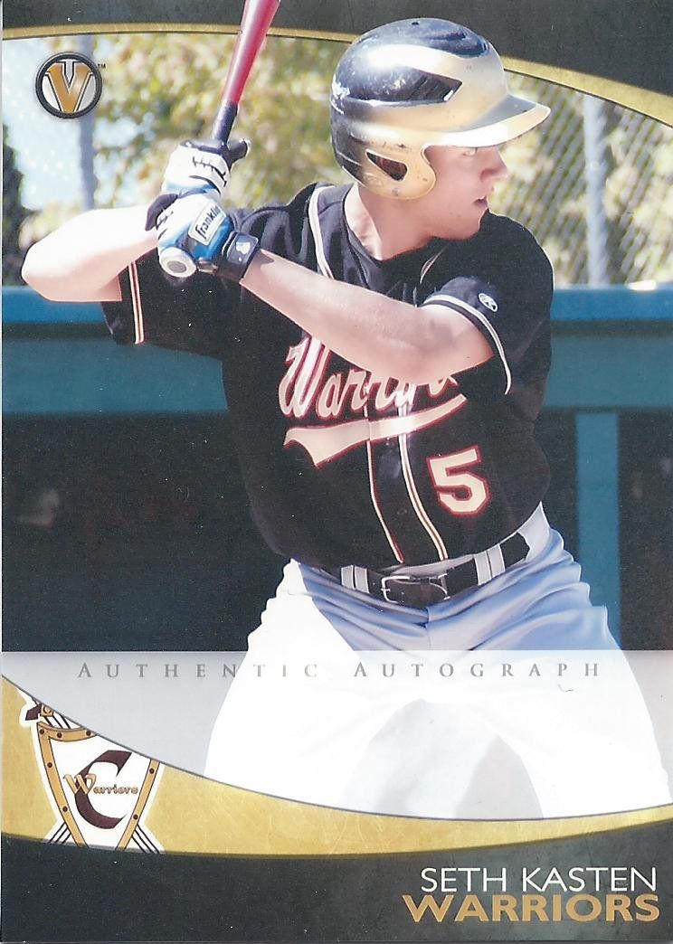
What if your High School baseball team card looked like this instead?
I was a Warrior in Middle School. Not the same school, mind you.
Varsity Trading Cards is hoping that you’re screaming “YES! I want that!” And I think you’d be right to think that.
These handcrafted prototypes feature a sleek, modern design scheme that brings a strong element of class and professionalism in what is normally a very boring and, let’s be honest, embarrassing amateur/childhood card.
Let’s compare an example, shall we?
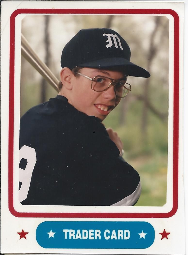
My old neighbor. If he finds this and wants it removed let me say "Hi! and no problem"
See what I mean? A stark and vast improvement. Now let’s take a look at the back.
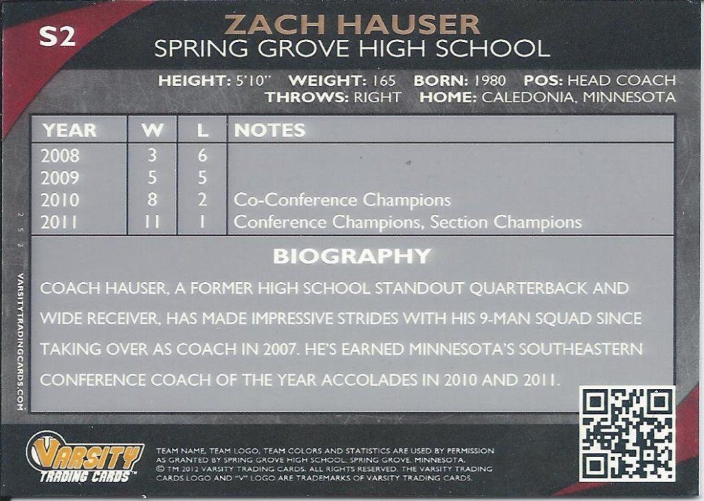
Maybe he'll hit the elusive HR in his senior year
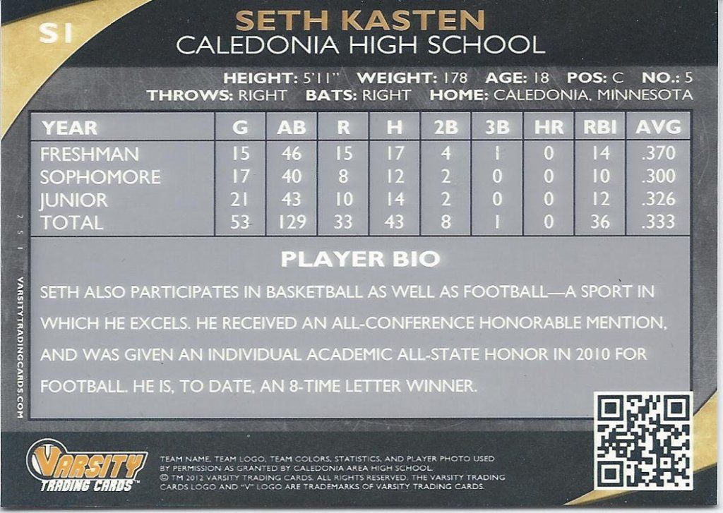
You can see the theme translates well into a horizontal format and it looks very similar in layout to the baseball cards we all grew up with. There’s full stats and demographics, a nice little write-up on each player and it’s all printed in large, legible text. I think the QR code is a nice touch. I don’t have the capability to look it up, but I can imagine that it could be used for a variety of different things such as leading to the school’s website, or a highlight video if some of these players are ambitious (although I imagine customization like that might cost a bit extra).
I’m not going to show you my old neighbor’s card back for privacy reasons, but it’s a yellow sticker that he had to self-apply and fill out himself. He may have had fun doing it, but it looks terrible and I bet he’d have more fun giving a card company some biographical info for a real write-up.
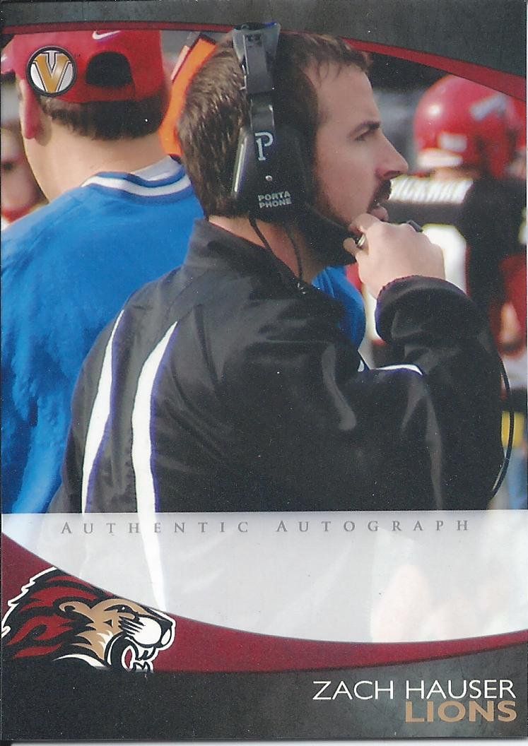
I was never a Lion. I was a Saluki, however.
Here’s another example. You can see how the team colors are incorporated. The choice of the black marble on the top and bottom ensures that you won’t run into too many conflicts or awkward color clashes.
I think the team logo is well placed, but having it partially cut off bugs me. Also, the Varsity Cards logo popping up on the back of this guy’s cap makes me think it might be better served someplace else, like the upper right hand corner in the marble. Then again, that might look like a hole punch. Perhaps it’s the cropping of the photo for this one card.
I also have to make mention of the autograph space. It’s a nice, large area without compromising the overall image or card space, however I wish it was a tad less opaque. Slightly more transparency might not benefit the coach and his jacket, but could easily be better for player action shots.
I know there are also game-used versions that can be made, but I don’t have an in-hand sample. The pictures I’ve seen look nice with very large swatches.
Same age as me. Wait? We're supposed to be making something of ourselves by now?
There isn’t much more to say about the backs that I didn’t say before. You can see the slight variation in the coach cards. I worry that coaches without awards or accolades may be left with some noticeable empty space.
Pose for the fences
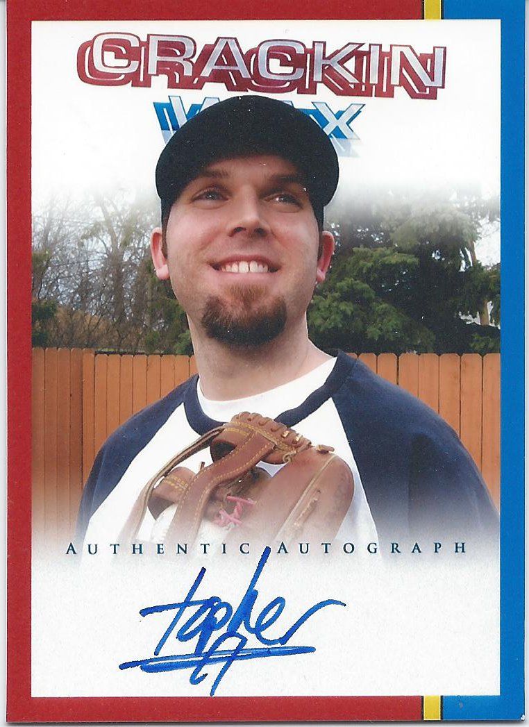
And lastly we have a creator card variation. Topher of Crackin Wax and BoBuBingo fame is the entrepreneur behind Varsity Trading Cards. If you didn’t know what he looked like before, you do now!
This design is obviously more playful with bright primary colors, but also more generic. As you can see, his blog’s banner is prominently featured in the background (and kind of giving him inadvertent devil horns), so I believe the intent is to show you that cards can be designed for any occasion.
I would have liked to see this structured more like a business card. A horizontal card with business info that someone involved in sports marketing or memorabilia, etc could use to make a memorable impression.
Were you aware of it?
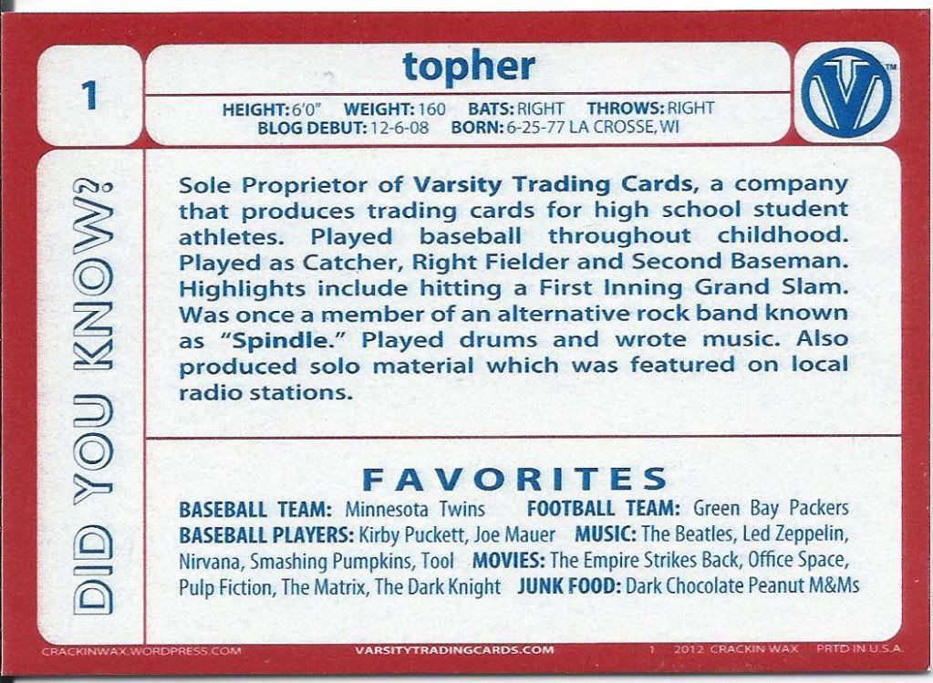
And here’s a variation of the back. Again, it carries over the style from the front nicely (even without the yellow) and it does what any good card back should do. It teaches you things. Check out the multiple facets on this guy.
He has a good thing going here. If I were running an amateur team, I’d certainly be interested in getting some of these cards for my players. There’s a lot of potential here, and I don’t think limited to pre-collegiate sports.
Thank you to Topher for sharing his work with us. We wish you luck with what should be a promising business.
Anyone interested in ordering from Varsity Trading Cards should go here.
Thanks for the great write-up! Much appreciated!
[…] had to say about my product, please visit the following reviews by: Plaschke, Thy Sweater Is Argyle Community Gum Electric […]
[…] a game run by Crackin Wax (who you may remember from my product review back in October). He opens a box of cards and you follow along with a bingo card he created […]