I’ve delayed it enough. It’s time to get a little in-depth with the Community Break boxes. No more wasting time. I’m just going to get right into it. Run through it real quick. So, here’s my review without further delay. Get your coffee and grab a seat. There will be no commercial breaks. Time to jump right in. Here we are.
Right now.
For reals this time.
20 packs per box, 4 cards per pack
Main Set
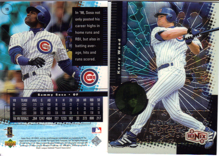
These are the only two Cubs cards I found from the main set in my packs. Slightly disappointing there weren’t more in my box, but I can’t be upset with that Kerry Wood batting card!
My immediate first impression was that these are just Upper Deck’s attempt at Topps Chrome, except without recycling the flagship design. Then the busy-ness of the card begins to overwhelm the senses. Where do I start? How about the “borders.” UD evidently felt the need to throw up two different patterns, and I do mean “throw up.” There’s the ruler in the upper left hand corner, I assume so you can measure how many yards the player’s name is. Then there’s the bubbly checkerboard half border. Better king that puppy quick, because the board is disintegrating from the metallic power of cardboard!
The inside could be less confusing, too. The star burst emanating from the groin would be plenty of etchings. I don’t see the purpose of the background outlining, especially if there’s no effort to outline the featured player. Maybe if there were discernible figures or shapes, it would make sense, but to randomly squiggle some lines here and there? The positioning of the second picture is a little unusual as well, don’t you think? It would be better served sitting in the bottom right hand corner, then moving the logo (and making it smaller) to the upper right.
The card backs pull off the design theme a little better. The borders get extended, but the picture is huge. I don’t know why, but the hyphenated blurbs bother me. Space management is not the strong suit of this set all around. Look at all that blue under the condensed stats bar.
The pastel coloring works for me. The non-shiny picture on top of the shiny card is good stuff. Oddly, all the wacky eye-candy stuff slapped together randomly gives you enough different things to look at, that you’ll never get bored.
Inserts
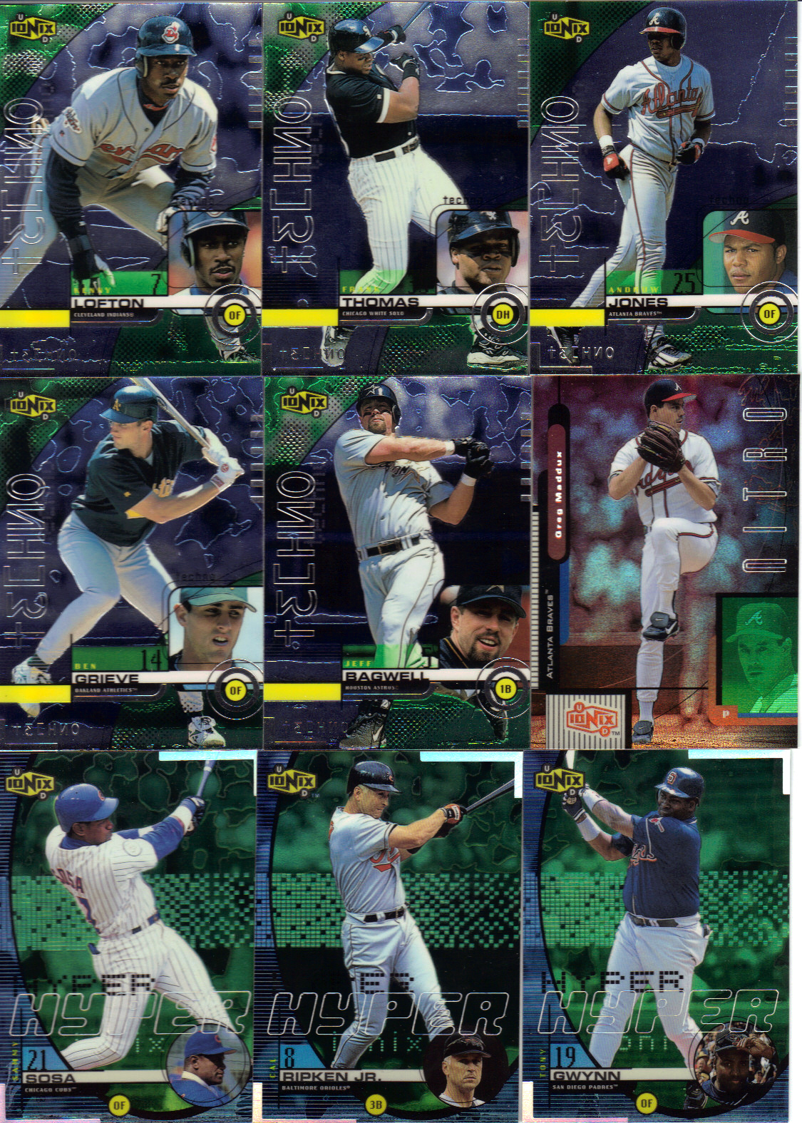
Above, you see all the inserts to come from the packs. The first five are all Techno “subsets,” which fall at a rate of 1:4 packs, which really means they’re just easy to identify SPs. In case you can’t see the names for whatever reason, they are Kenny Lofton, Frank Thomas, Andruw Jones, Ben Grieve, and Jeff Bagwell. Following that is a Greg Maddux Nitro (1:18). Then three Hyper cards (1:9) of Sammy Sosa, Cal Ripken Jr. and Tony Gwynn. Not included were Cyber (1:53), Warp Zone (1:216) and HoloGrFX (1:1,500) and any numbered parallel cards (no odds given), even though I thought we might have in the video.
Those techno cards just scream late 90s. A nice mix of lower and upper case letters, a backwards 3 for the three. Is this the first appearance of hacksaur in card history? Is that one of Upper Deck’s revolutionary additions at that time? Also, I didn’t realize SPs were starting that long ago. It’s a shame, really. It means you’d need 6 boxes with perfect collation to hope for a complete set. For a higher priced product like this (in those days), it makes collecting anything but players or teams pointless.
It’s sometimes tough to distinguish the inserts from the rest of the set. After all, they follow the same multi-border, random squiggle background patterns as the rest of the cards with the little picture in the circle. I’m looking at you Hyper. Nitro, however, looks nice. The red foil sticks out from absolutely everything else, and it’s more of a refractor than anything else in this box. So, there’s that.
Hits
N/A – which is fine by me, although I’m sure that’s a big reason why the price dipped from SRP of $4.99/pack to the fraction I paid.
Conclusion
Well, this certainly was an interesting product. I would have liked to see some more variance in the cards’ designs. I would also say that the price I ended up paying for what was still too much for something this old with tiny amount of cards. It also would be nice if I walked away with more than 3 Cubs and 1 Maddux as my take from the Community Break. But, the good news is that means there’s more left to trade to you!
Most of the teams weren’t taken in the break, so if you’re interested in anything you see, or stuff from a team, inquire within. I can give you a list of a team’s cards if you’d like.
Design – **
Set Collecting – ***
Inserts – **
Hits – N/A
Overall – ** (0ut of 5)


Kerry’s really goin’ for it in that shot…
I’m thinkin’ it was Upper Deck’s answer to topps Finest. Good effort, but poor execution.
Yeah, good call on the Finest over Chrome. I guess I was fixated on the “shiny, 4 cards per pack” aspect. I think the execution was alright. It wasn’t great, but showed promise. It just tried too hard.
Err, good *idea*, but poor execution.
[…] parallel is huge. I opened a box of 99 Ionix a while back, and there were no odds given for the reciprocal parallels. They did give odds for a […]