
I know people are probably anxious to see posts recapping my adventure at the 2015 National Sports Collectors Convention, but that’s going to wait a bit longer as I organize more stuff. For now, here’s a package that basically feels like a mini-National.
Brian from Play at the Plate has always been a great supporter of the blog. He was one of the earliest trade partners, he’s supported the case breaking days several times, almost always joined the group breaks (if not always, and sometimes picking up additional teams). Packages flow to and from Texas on a regular basis. It’s a great pleasure sending things he needs, and its people like him that made me want to come back to the blog instead of abandon it completely once work starting letting up.
This package, which I think was part of a trade, but it was so long ago that it really could have just been a random bubble mailer and I don’t remember, is a great example of his generosity and of all the cool stuff he knows how to find.
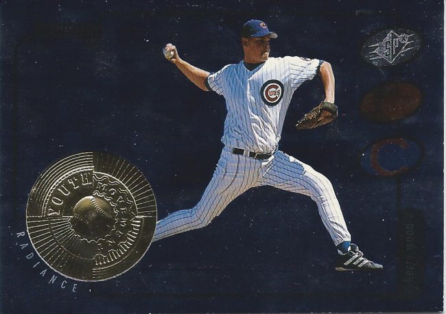
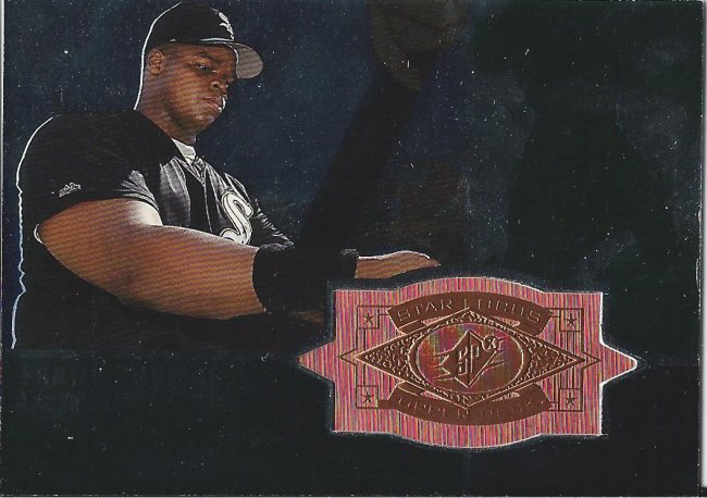
Not too radiant, but I’ll allow it
I’m going to start things off with a bang. How about a Kerry Wood SPx card with a big ol’ medallion numbered to 2500? I’d say shots have been fired.
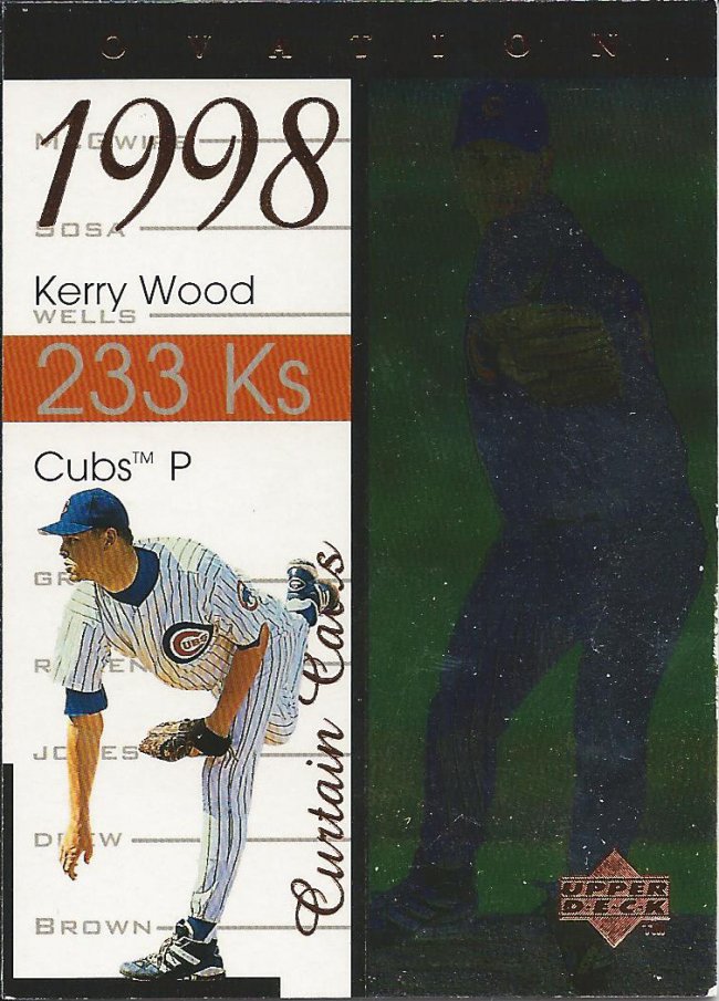
Is that the list of people in the set on the left?
Feel free to stand up for the Ovation, but wait for your eyes to adjust before moving. It’s pretty dark in there.
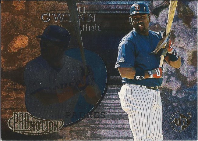
Back to back like a wacky sitcom opening
UD3 cards are dang cool. They better be for a late ’90s product that retailed for several dollars per 3 card pack! Odd that we don’t have the same expectations anymore. Anyway, this insert set is very reminiscent of Flair. (Side note: I bought a box of this for $12 at the National, and hope to have a post up soon.)
I JUST realized that there’s a big “G X” in the back. I thought it was “C” or “O”
On the flip side of this is Jose Guillen and a serial number of 2700. I’m not really sure what the two players have in common. Maybe at the time there was some crazy comparisons happening, but ultimately it’s another example of prospecting not working out.
Someone is thrilled.
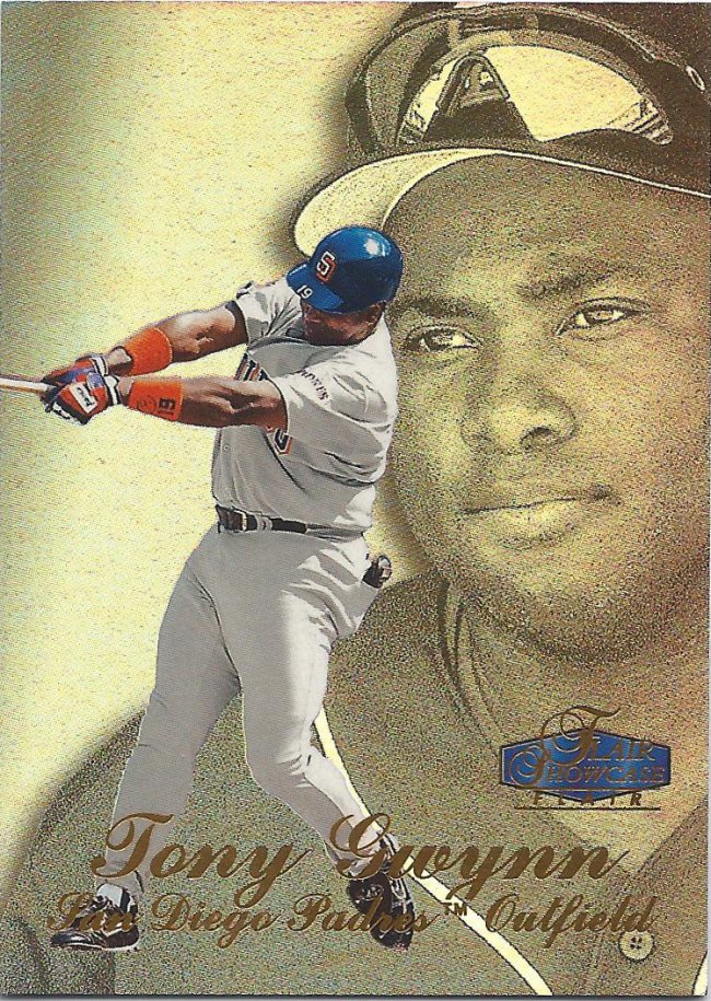
Hey, look at this. It’s an actual Flair card. Okay, a half-Flair, half-Showcase. It’s not incredibly exciting, either.
I don’t got it.
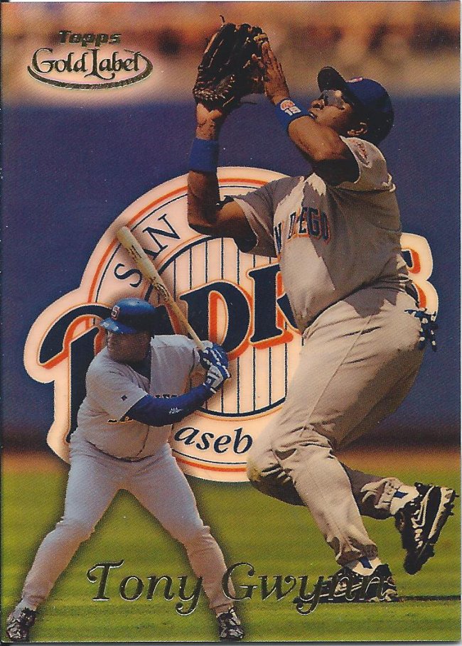
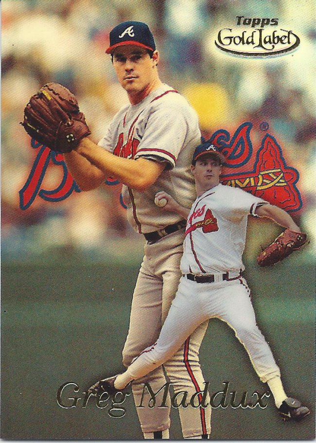
I’m sure I’ve mentioned this before, but this Gold Label set is deceptively complex. Each player has three cards for some reason. Here’s the “Class 1” version.

He looks skinnier here
Here’s Class 2. The logo in the left hand corner is shiny, but there’s also a black version that you have to look out for. Not very classy, if you ask me.
Open up the sky
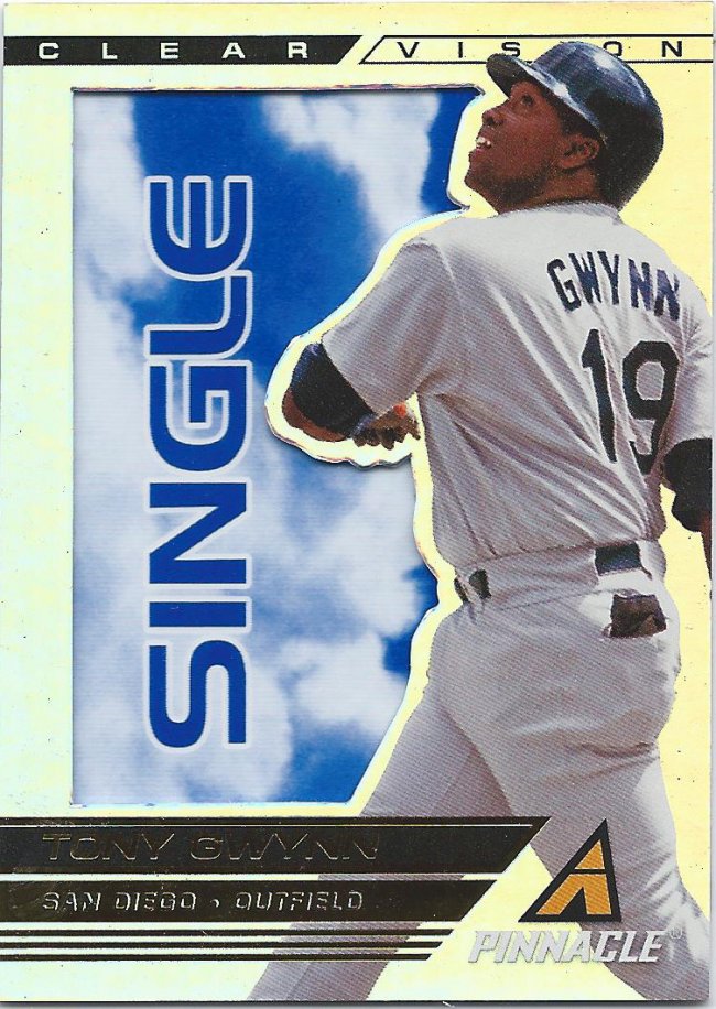
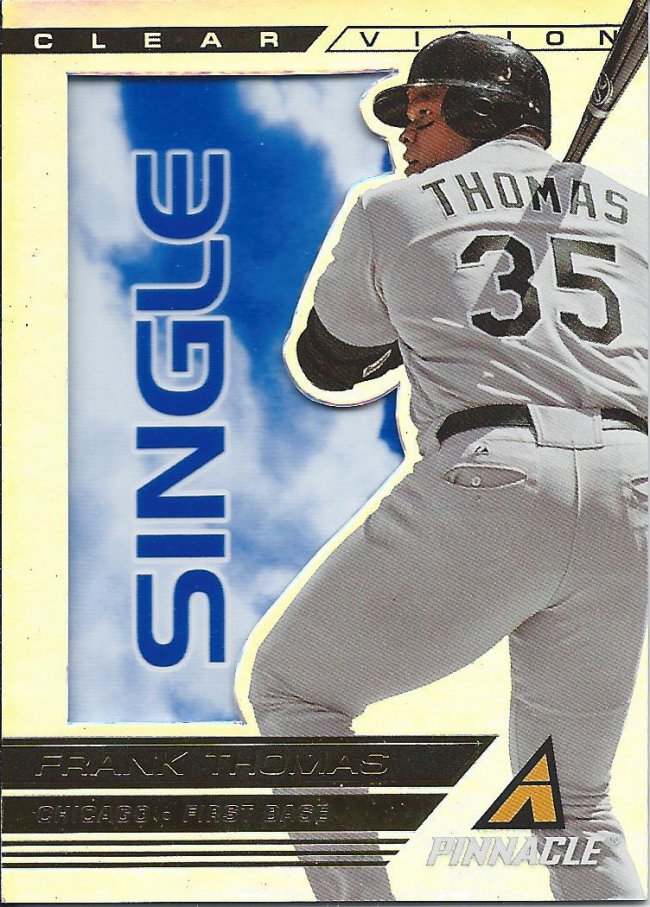
I really like the Pinnacle set, and a large part of it is the inserts like the see-through beauty you see above. This is multi-tiered insert and this Single is theoretically the easiest to find. But when there are 100 players in the set with 4 tiers per player, none are going to be all that easy.
Don’t worry about me, I’m golden
The scan doesn’t show it very well, but this is the gold signature version. I hold these in high regard, because they are 1:36 odds, and a full set parallel. Coming at it from the mindset of a 13 year old kid opening these packs, I can’t imagine anyone would give these up, let alone make them essentially filler in very large trade package.
Don’t look now but there’s a giant you behind you
So, yeah, after a brief respite, we’re back the Gold Label. Maybe one day I’ll take the time to figure these out more.
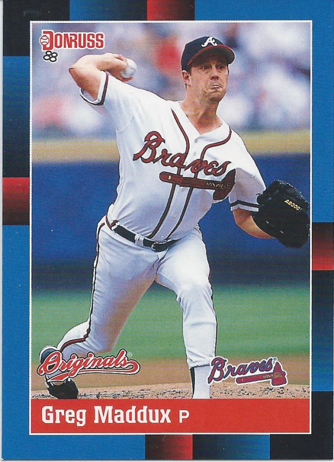
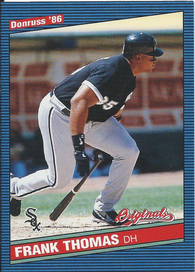
Originals? False Advertising
This is a decent reproduction of the 1988 style. The font of the name is quite different and the inner white border is about half as thick as it should be. Oh, and Maddux isn’t listed as Cub, but that’s not really Donruss’ fault, now is it?
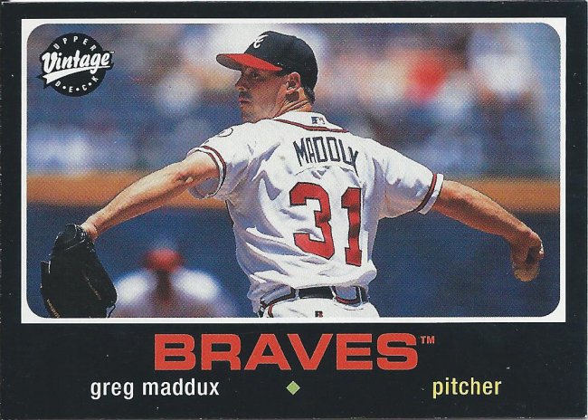
Wingspan
So, has anyone ever answered the question about how Upper Deck was able to get away with using old Topps designs for their Vintage cards? Would love to see a link on that.
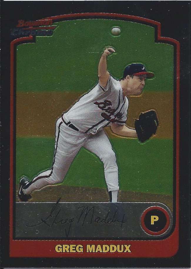
That “P” is slightly off center. Kinda bugs me
You know how much Bowman runs together? I could have sworn this was 2001 Bowman (the Pujols year). Nope. This is 2003. Who knew?
I see what you did there with the “A” in the star.
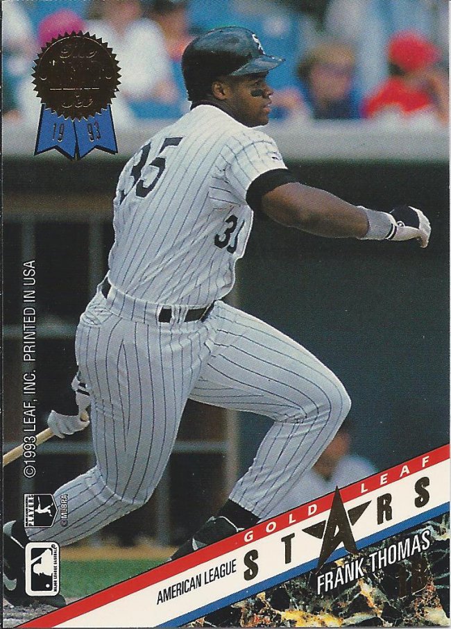
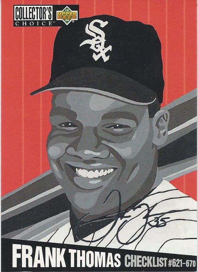
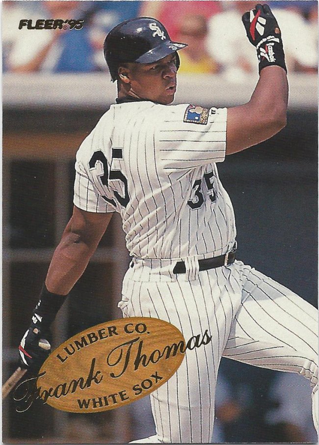
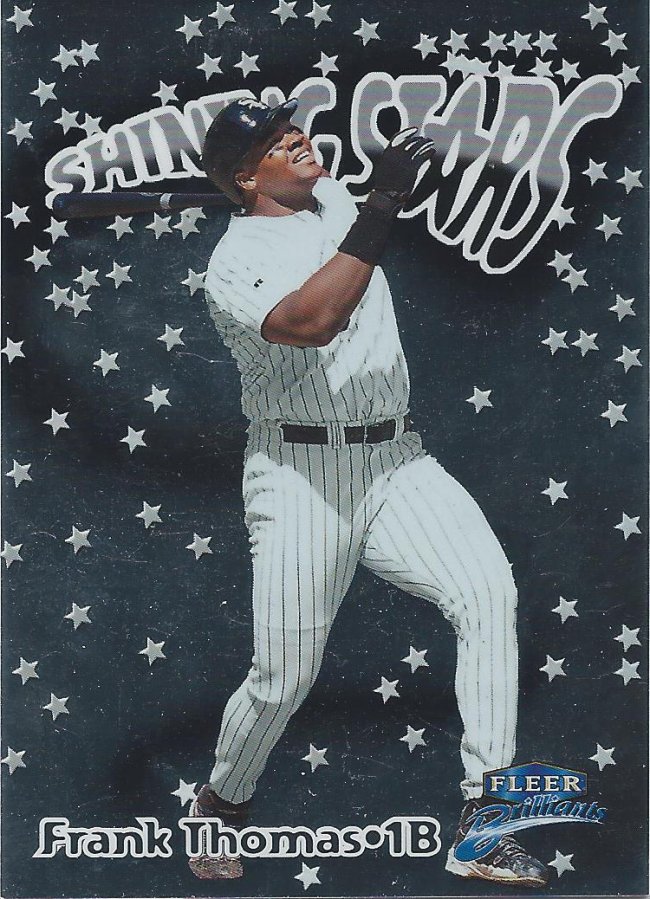
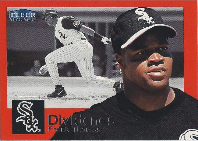
We’ve covered two Hall of Famers so far, got one to go. Frank accounts for the bulk of the cards this time around. Here’s a double-sided All-Star insert card, of which I’m a huge advocate. Not pictured is Mark Grace.
Looks more like Sosa to me
You saw the gold before. Here’s the silver signature. Or one of them. Stars like Thomas have 4 cards in the set, so there’s more work to be done.
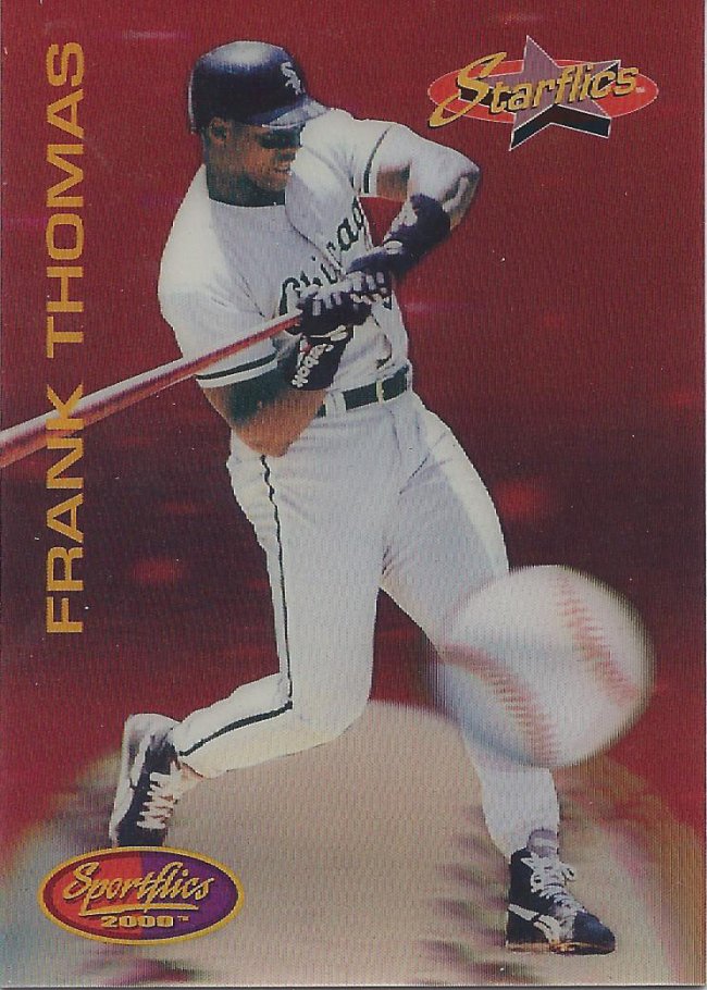
I think that ball is a bit outside
Sure that baseball is really big and should be easy to hit, but you know what would be easier to hit? That bigger baseball you’re standing on. Swing, down, Frank! Swing down!
Can you smack some of this text out of the way?
Imagine if newspapers tried to report events like this. Some websites already assault the eyeballs with similar clutter. What a stupid mess this is.
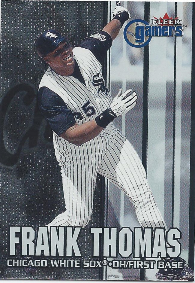
Flexin’
That’s better. See how effective a simple logo can be? Frank is obviously pumped.
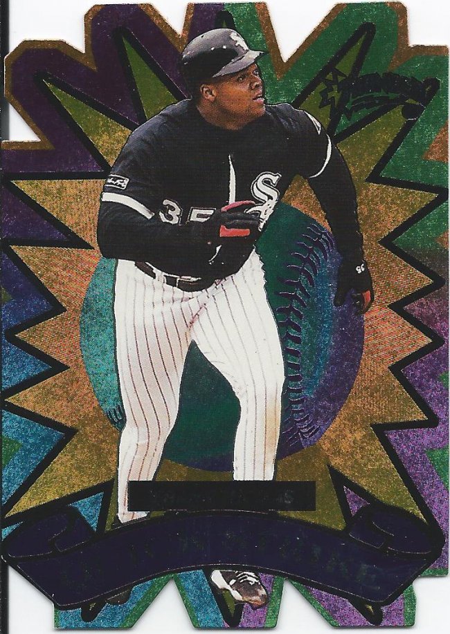
Since you can’t read it, it’s Circa Thunder Quick Strike
I love cards like this. Not only do we have a die cut, but we also have a ton of colored foil etching. Not too many things are cooler than that. If this was a die cut hologram, you’d have to hold me down.
If you build it, they will see
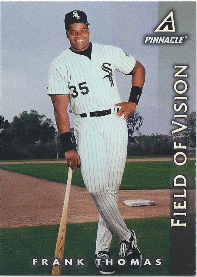
You would think that a subset call field of vision would be horizontal to get more of that peripheral action. You’d think it had more to do with vision in general, really.

Dark in scan, but light in my life
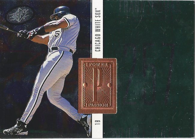
We started the post with a couple serial numbers, and it’s time to get back to that. This SPx Finite set was all about them. Let’s count backwards starting with the “base” card at #/9000.
So good I could eat it
Now we have the Power Passion subset thing with a different foil stamp that really looks like a fancy chocolate. That’s sitting at #/7000
Make it out to Mr. Focus
And then we have the Star Focus, which is also at #/7000, but has a cooler picture and a bigger foil inset. What makes this set fun is that there are also Radiance and Spectrum parallels of all three of these cards, but I’m very happy to have these three to kick things off. They look great in person.
This should have glow in the dark stars, or little holograms
In space…you’d have much bigger problems than a bright sun in your eyes.
10 out of 10 stars
Swung so hard, his handkerchief flew out of his back pocket.
someone visited the mystery spot
It’s been a while since I’ve looked at these cards, so I had to make sure it wasn’t the super chrome version. Big Hurt really makes cards look bigger.
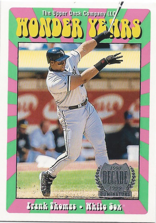
I “wonder” what the parallels look like
What a great show Wonder Years was, right? The opening credits always confused me, because I thought Winnie Cooper was missing. They showed this girl with glasses, but Winnie didn’t have glasses. Where did that girl go? Why wasn’t she on the show?
Oh, here’s a card.
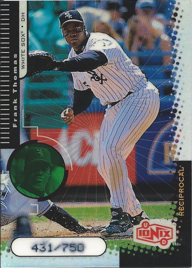
next time, use waterproof dot matrix printing
This parallel is huge. I opened a box of 99 Ionix a while back, and there were no odds given for the reciprocal parallels. They did give odds for a 1:1,500 pack insert, but not these. So I’m pretty sure these are even more rare. The numbering isn’t standing the test of time, but the card still looks sharp
rounded corners = guaranteed psa 10
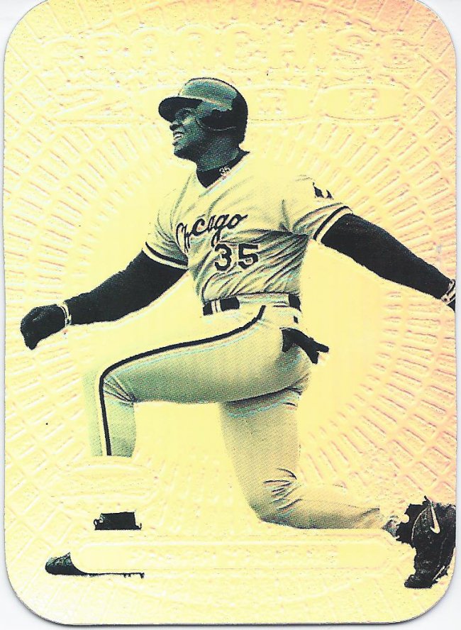
This sucker looks really cool. I love the black and white photo against the uber-shine. It has an old photo quality to it with a modern feel. I don’t like most of Bowman’s Best, but this works.
Yup
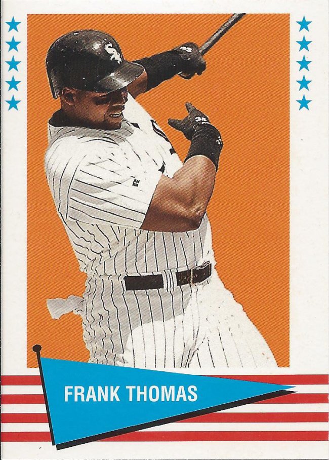
Sure, I could have put all the good stuff at the top or at the bottom, but I like to mix it up. Actually, I just go in chronological order, so stuff like this gets shown after cooler cards.
Stocks and Bonds
Another semi-boring card. It’s reminiscent of some of the older Fleer All-Star sets, but the red border kills it for me.

warp into another dimension
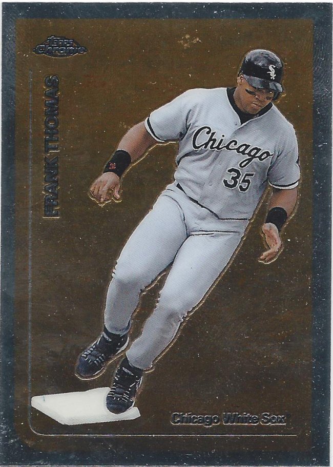
Yay, back to crazy color explosions! Here’s the Topps Chrome version

Rank Homas
And this is the non-chrome version. Which do you like better? I prefer RC to Coke personally. I probably wouldn’t like the refractor version as much as the regular Topps either. Time will tell.

That looks like an awkward swing
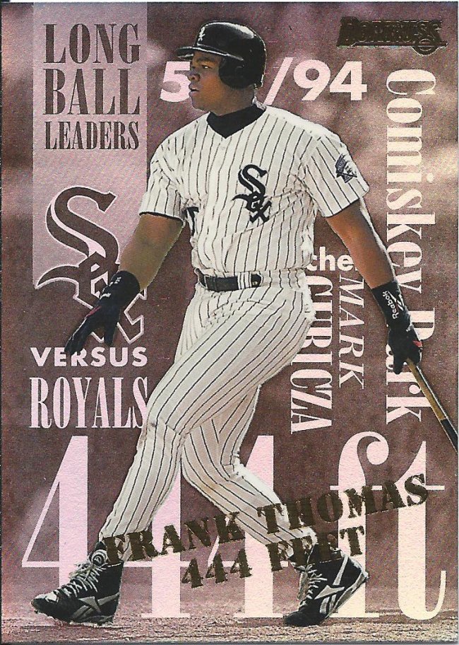
My White Sox history isn’t very strong, but Comiskey was built in 1991? Didn’t realize it was that new.
35 divided by 1b = foil?
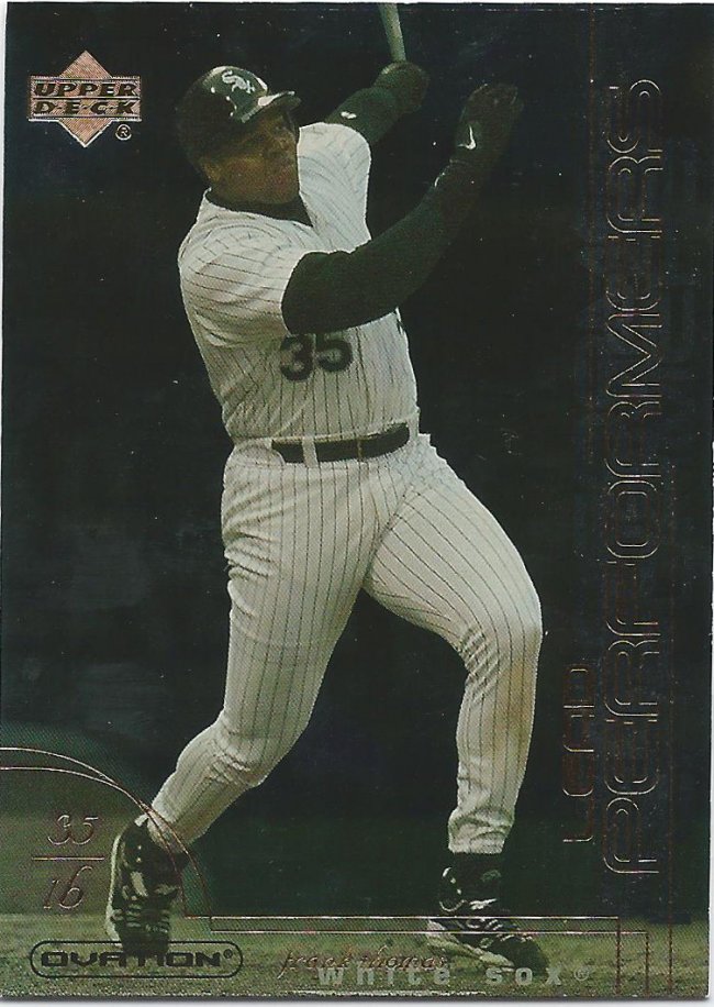
The foil outline on the side says “Lead Performers.” I’m not sure if they’re trying to play up the foil and associate it with the metal lead, or if they mean lead as in first. Either way, I just found a way to manufacture a sentence out of this card, so I’m happy.
Don’t touch that dial
Well, I don’t have a Frank Thomas 1986 card to compare this against, since he didn’t have any cards from that year. Maybe he had a high school or middle school card that some local photo studio made. Either way, just know that this is close enough to the decidedly MTV ’86 set.
What are you smiling at, Frank?
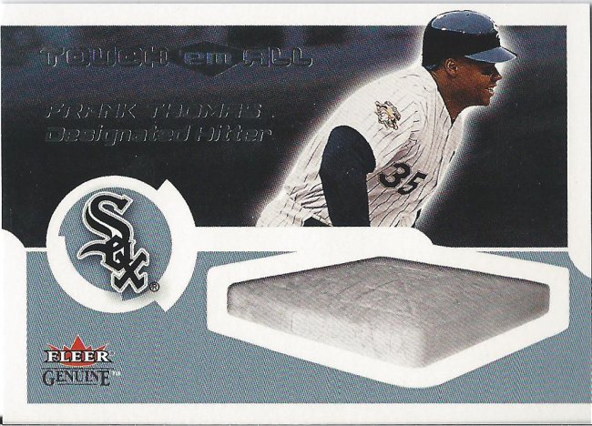
I really want a card with a game used base. I know they exist. I’ve seen them in person. This card is just taunting me. “Touch ’em all.” I WOULD LOVE TO, you sick bastard.
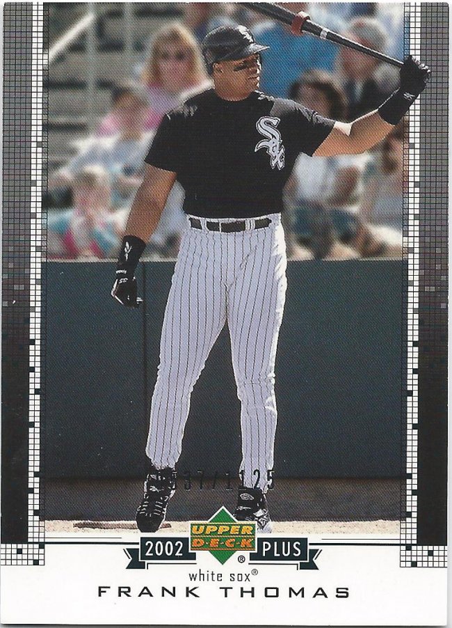
For the record, it’s the Hobby one. Almost positive
Packages from Brian almost always contain these random surprise cards that force me to research sets I never knew existed. This Upper Deck Plus set came in both hobby and retail versions. To complicate things further, both are equally serially numbered and card numbered. I’m very glad the internet exists to help me check off the right row on the want list spreadsheet, because this stuff gets oddly confusing.

Gonna be tough to catch the ball with a black hole in front of you
You know a package is really good when an older relic card isn’t even the best one. We have a short walk to get there, still. I love my relics, though. I know they’re bountiful. I know they’re probably fake, but I still enjoy the look of them.
I honestly don’t remember what year this is from
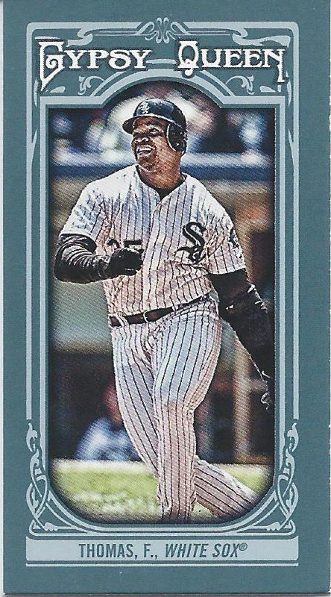
Minis on the other hand, I could leave pretty easily. I finally bought special pages to house them in my binder appropriately, but man am I sick of them and their unwanted parallel friends. With that said, please trade me minis I need so I don’t feel the urge to buy them with my actual money.
clear, blue skies
Yes! Another shiny card with acetate windows. Now I have the Gwynn and Thomas singles. Will gladly welcome the double, triple, and home run variants. These cards look great to me. It really brings me back to the mid-90s collecting days.
Focus
Thanks for bearing with me so far. We’ve now come to the final portion of our post. I really enjoy the Panini Prizm set for unknown reasons. One day I’ll put words to it, but for now it’s just a gooey feeling.
check, but not check swing
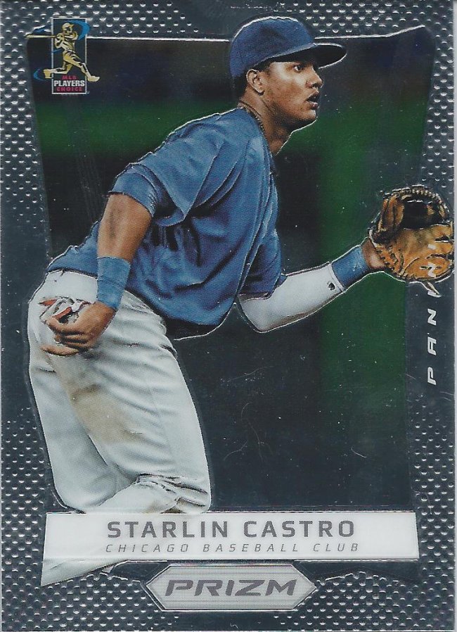
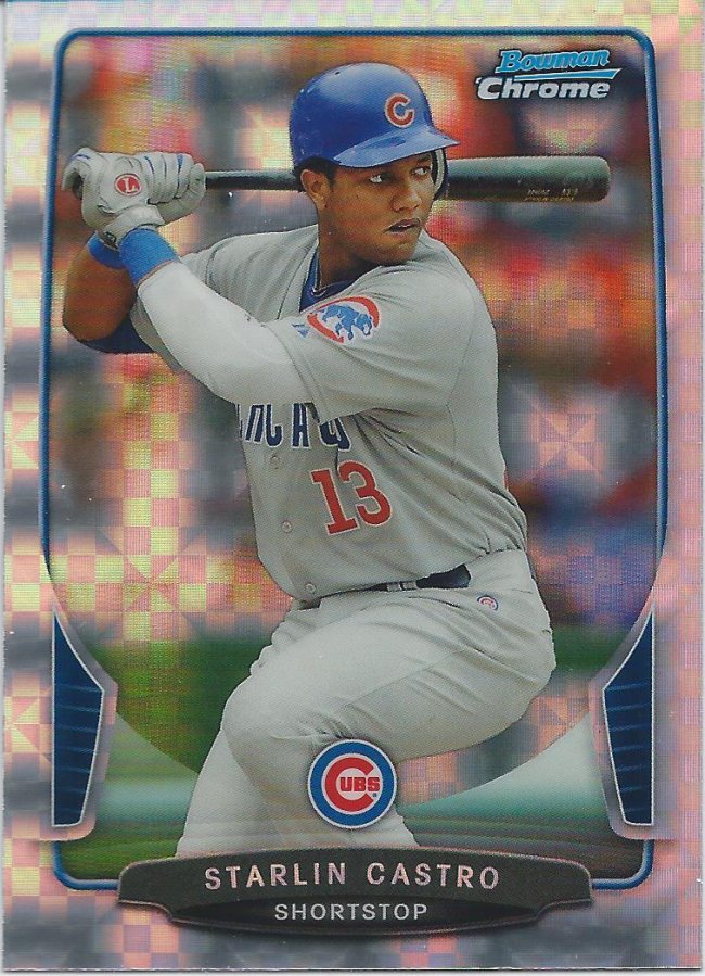
The parallel game was quite strong with the Castro cards. Next to the blue refractors, I think the x-fractor is my favorite chrome parallel year after year. I like that they always find a different presentation for the same theme, and it’s easier for the people that can’t see the refraction as well to tell what they have. Look at the checkered star bursts. That’s just cool.
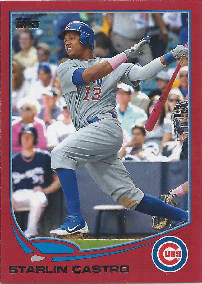
Are we sure that’s Castro?
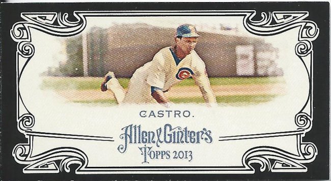
Yay, a black bordered mini! That means another one I don’t have to buy, and it’s one of the tougher ones. Holy cow, horizontal minis don’t work well with Ginter. Castro takes up about 1/8th of the real estate.
Still not sure what year, and don’t feel like looking it up. Really, they’re all basically the same
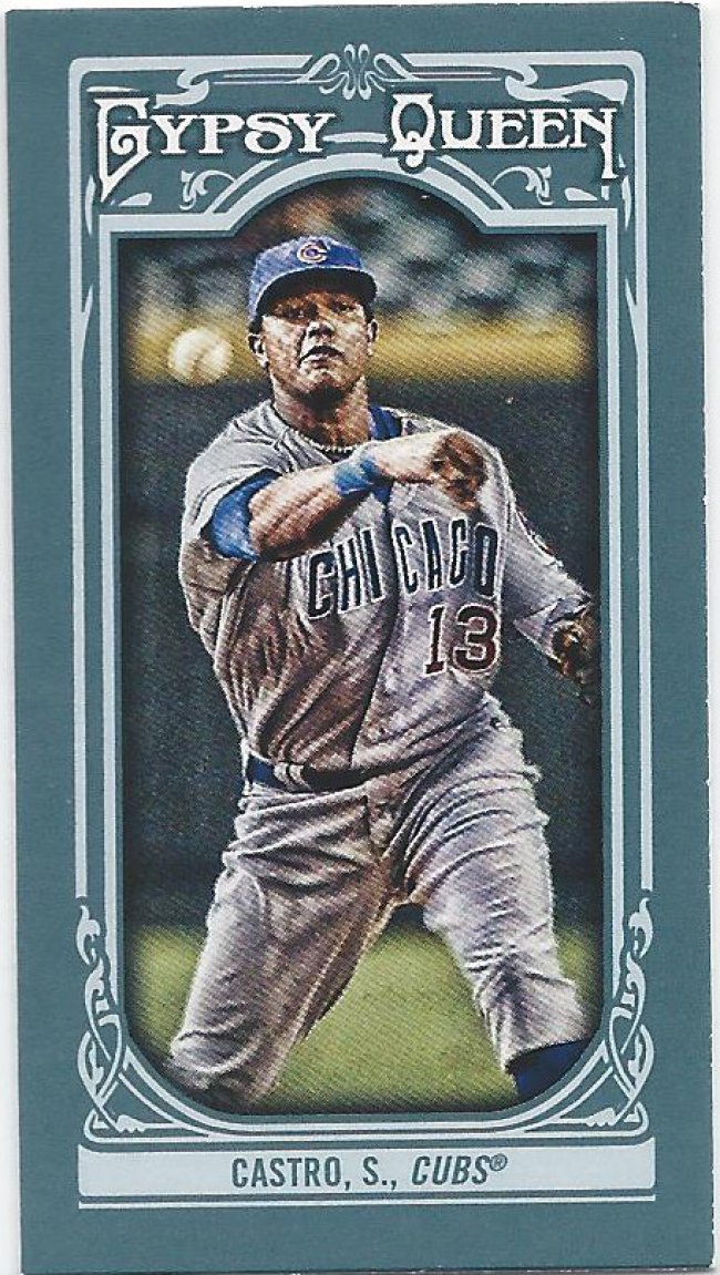
And another mini! I love the out of focus ball. Speaking of focus, let’s hope all the trade talk is just the kick in the ass Castro needs to snap out of this funk. He’s definitely better than this year has indicated.
The blue border is a good look for an otherwise drab set
Retail parallels are another special, very much appreciated treat in trade packages. I find myself buying less and less retail. Mostly that’s due to only collecting (which should now be in air quotes) one active player. I know these aren’t crazy rare, but any time I try for the suckers, I lose. I’m sure Wal-Mart and Target plan it that way.
More of a Maroon. The color. Not the player.
Speaking of Target, here’s the red border. Did I mention that I love getting retail parallels in trades? Because I do. The pink on the card makes for some interesting contrasts. For instance, I think the combination is off-putting and ugly here.

Nurple
But when paired with this purple refractor, it looks quite pleasant. I think this is another retail thing, from rack packs? Maybe from “hot pack” blasters? I’m not sure, but I’m digging the purple. And, I don’t have to personally dig for it. Ya dig?
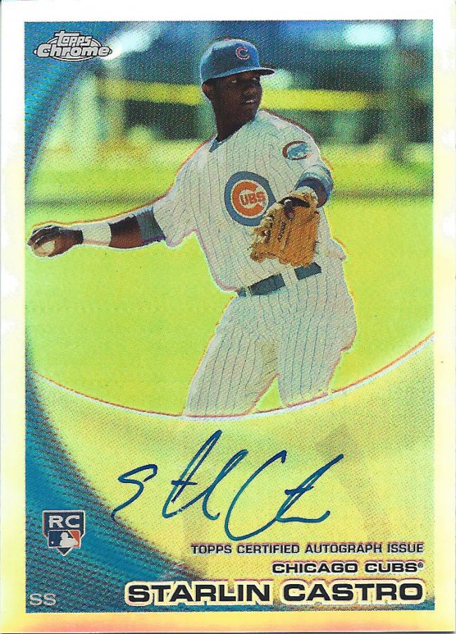
I need to do a Card-ography post on him
We come to the last, and in my opinion, best card of the post. Yes, this is a Topps Chrome Rookie Refractor on card autograph #/499. Out of nowhere. Unprovoked. Unmentioned. Just…here.
That’s the kind of guy Play at the Plate is. Extremely supportive. Extremely generous. Extremely happy to know him, even if just through blogs and emails.
Thanks a lot, as always. You know we’re doing this again soon.
Recent Comments