In an effort to reclaim my mojo for baseball card collecting (in a time when my wallet has also lost its mojo), I thought I’d take a look at the offerings of The One True Card Manufacturer for this coming year (only 3 weeks until 2011… can you believe it?!). First was the flagship:
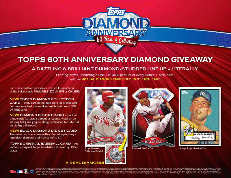
Real diamonds! My first thought was some disappointment that Topps has resorted to putting things of actual real world value in their product that, legally, has to state will never be valuable ever again right on its packaging. But then I let my cynicism fade a bit and I got kind of excited. Not about the BS diamond gimmick or the MCG Redux (but a different site and system? Why not just make it ongoing?) but about the product itself. The design is clean and pretty and some of the inserts seem not entirely lame. And, I’ll be honest, I really like the manufactured 1-per-box pseudo-relics. They usually look really cool. Oh, sure, the 3 Andrew Carpenter autos I pull from our case will be a bummer, but this looks like a rollicking romp through a relatively cheap forest of cardboard. Series 1 of Topps is always weird because it comes out not that long after Update and doesn’t really have much to offer except some airbrushed uniforms of winter trades (Kerry Wood in a Cub uniform again at a RIDICULOUS home town discount? Hendry just got his Christmas gift early). All the RCs are in Series 2, sans the Red Hots. We pulled the redemptions for Castro and Boesch last year and they look pretty cool (Castro is already on his way to Iowa for $5.99 plus shipping) so that’s a plus for Series 1.
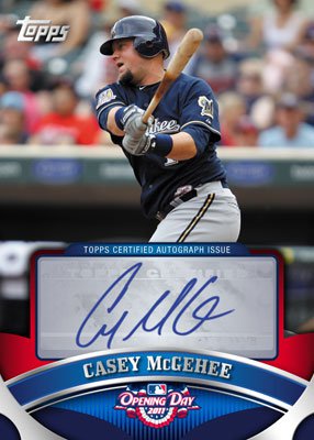
More relatively forgettable announcements of the usual suspects followed. Opening Day’s announcement was met with a universal “Meh” as, even after all these years of it, I still don’t understand why it exists. I don’t hate the design… well, the parts of the design that aren’t identical to the normal issue. Take a look at the autos:
See? Not so bad, right? I get what they’re going for… the price is right, even without the hits and it’s an easy set to put together. But I just can’t get into it. I know Jon bought some looking for Marmol and Dempster and I’m sure team set collectors want their teams from the set but I just don’t hear anything from people buying this stuff. Anyone out there a bigger fan than me? Anyone care to explain why I have no interest in it (aside from the obvious cash-grabbiness of the concept)?
Speaking of no interest, it looks like Topps’ minor league set is coming back next year. Maybe it’s all those old Mother’s Cookies Modesto A’s cards I saw at shows as a kid, but minor league cards may always have the smell of “oddball” to them for me.
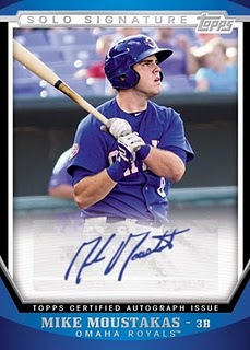
Another clean, basic design similar to that of the flagship. Not terrible or anything, but certainly not enough on its own to drag me into the minor league mire. I know it’s en vogue to bash Topps for its sticker autos (I’ve certainly done my share) and, even though I’m getting sick of the complaints, I do have to say that sticker autos on a minor league product is truly weak. A Topps rep could go to Omaha and get Moose here to sign the 1500 (or whatever ungodly number of auto cards they’ll put in this set) in the dugout before the game. These guys are VERY accessible and that Topps didn’t bother to have the cards ready to go in time to send off to these guys in time to get them hard signed strikes me as truly lazy. Not getting Pujols and A-Rod cards hard-signed? Sure- there are some seriously expensive logistics involved in that… probably far more trouble than any of us collectors realize. But Lil’ Iron Mike (aka: Three Nickname Mike) here should not present that type of problem. Make it happen, Eisner! To be fair, Topps’ “competitor” in the minor league market (In the Game) is releasing something early next year and they’ve got sticker autos as well (and some truly hilarious canceled check cut autos from all your favorite single A stars!). So much for the theory that competition in this industry equals positive changes.
And, of course, there’s the old standby: Heritage. I wonder what it will look like this year!
Oh, right.
Apart from the news that everyone’s favorite southpaw of Jewish heritage will be signing some Real One autos this year, there’s absolutely nothing to see here. I’ve said it before and I’ll say it again: Heritage got me back into the hobby. And my waning interest in Heritage is indicative of my waning interest in collecting any modern baseball cards. I don’t have a problem with consistency (inserts, SPs, predictable design)- in fact, I love that stuff. But somewhere along the way, Topps lost the plot with this product. Early years of Heritage were a blast- modern players on old designs and the satisfaction of completing a tough set (plus variations to hunt down!). But overproduction and completely useless additions (Heritage Chrome? Panel cards?) have made for a set I don’t want to collect. Plus the past few years have really been a swing and a miss on the photography style and aging effects on the images. This year appears to be no different, as Topps is seemingly afraid to go the distance and really make these cards look like they’re from another era. That Cabrera up there shares nothing in common with the real ’62 set, save the border and the font. I won’t be buying any of this.
On the high end, we’ve got Topps Tribute. This year, Tribute is… oh forget it. This set is so depressingly bad and so indistinguishable from Triple Threads that I won’t bother showing a photo.
So, moving on-
Okay, I’ll just show one photo because it’s so confusing.
What do you do with this thing? That would take more space on a shelf than school photos of all my cousins. It reminds me of those sweet Chinese Yo-Yos I had as a kid. We called them “clackers”. This is one stickery clacker you will spend several hundred dollars for a chance to own. If you’re the kind of person who spends hundreds of dollars on material objects that don’t even look cool.
And now, just the other day, Topps announces a brand new product– the first new entry of the new year!
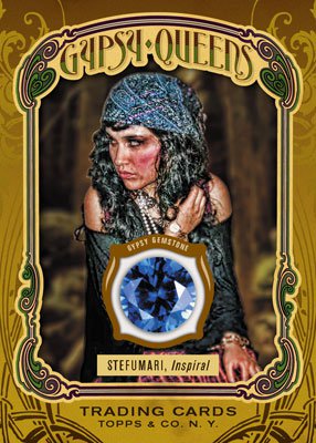
Now, to me, Topps Gypsy Queen is just another retro tobacco rehash that I won’t be interested in. No big deal. But, judging by the comments over at the Blowout fora, which range from the kind-of-angry curious to the pretty-much just plain homophobic, this product will not be a hit. It may be destined to be this year’s Chicle- the one everyone bashes (including us) but that sells just like all the rest of them do. The name doesn’t bother me like it does lots of folks who are complaining (I mean, it’s just the name of the damn set they’re copying… I don’t get the uproar). The wacky gyspy gem inserts are par for the course in the A&G world, but it seems like Topps is trying to repackage A&G’s quirkiness here and that speaks to a much deeper ignorance than “Don’t they realize that name sounds gay?” The unending parade of nearly-indiscernible retro sets smecks of desperation and the over-saturation of that market will eventually cause some problems for Topps. It reminds me of Michael Scott- having gotten a legitimate chuckle out of an impression or a joke, he immediately goes back to the well and poisons it.
To be honest, I think some of the cards look pretty cool- probably a Chicle-level ratio. The on-card autos sure look nice and the artwork could be kind of cool if the hyperrealism isn’t too obviously a ‘Shop Job the way that Ginter’s is. The artwork does make me wonder why they bothered using the Gypsy Queen name… they bear no resemblance to the originals (in an even more obvious bastardisation than Heritage) so why bother with the charade? I’m reminded of the warnings we were given by our tour leader in Italy: “Watch out for the gypsies… while one is distracting you with a dance or music, another will sneak up behind you and pick your pocket.”
Anyone else’s pocket feeling picked?


I have a feeling I will be buying fewer current cards than I have in five years. But I might actually end up buying more Opening Day than anything else because I want ALL of those Under the Lights insert cards.
http://nightowlcards.blogspot.com/2010/10/ok-opening-day-you-have-my-attention.html
I saw your post on those and got stoked remembering the Iooss Collection cards from 1993 Upper Deck. Why can’t more new cards be cool?!
I think you underestimate the logistical challenge of getting the minor league cards signed. You know Albert Pujols will be on the Cardinals all year; the minor leaguers will move around all season. Unless you get the minor league cards signed during spring training, you don’t have that certainty.
So if you opt for on-card autographs, you’re probably looking at a later release date (or redemptions). I think it’s far more important to have the set out for minor league opening day than it is to have on-card autographs.
I could get excited about Opening Day if Topps used different photos or a full checklist, but a “greatest hits” version of the base set really doesn’t do anything for me.
An excellent point, Paul. I hadn’t considered that. However, aren’t most players pretty easy to find for about 4-5 months out of the year? Why not get your designs done early and have big auto sessions in all major cities in February. Sure, you’d muff some of the players (major or minor league) team affiliations, but we’ve forgiving that in early series more than once. Schedule a 2nd sessions for the All-Star Break for the 2nd half of the year.
Obviously I’m simplifying it a great deal. I don’t actually think you can get all several hundred subject to sign on two or three days out of the year. I’m just saying there are ways to make it happen. Hell, I’d take an auto road trip to the farm teams and make a video series about the trip! Just an idea… (Topps, are you listening?)
I understand if you don’t like the new topps tribute, but I think its far and away going to be better than the 2010 Topps Tribute. The base cards alone look 100x better than the last two years. I was also interested in the Gypsy set, but agree that i’m tired of all the wierd cards similiar to A&G. Enough with the worlds greatest yo yo player card… just stick to baseball players please.
Perhaps I’m too harsh on the high end stuff because I’ve never opened any of it. I’m sure pulling a big hit out of this coming year’s Tribute would be pretty exciting but, alas, I will likely never know. Perhaps I am, as Donnie was, out of my element.
[…] we’re almost halfway through the year now and that means it’s time for an update to my last preview post that made some hilariously off-base comments about how Gypsy Queen wouldn’t be a hit. Now, in […]
in the past 2 weeks i started collecting baseball cards again. i left off in 1992 when upper deck was new (est. 1990). whu?? i felt like a complete a-hole at the card store when i asked for a wade boggs rookie!? whatever happened to the honesty in card collecting??? i bought a becketts, and that read as well as sumarian to me?! what the hell is a topps tribute autographed triple relics black?? is that better than a tribute autographed triple relics green??? now cards are classed like that of aged scotch? who the F is bryce harper??
how come a 2011 ryan howard (any brand) is worth more than my ’73 topps pete rose?
i like buying a pack and wishing i got a michael jordan on the white sox like back in ’91 er ’92 (upper deck)! but now i guess ill adapt and wish for a “adam warren chrome, green back, half lutz (with a twist), gerbil in the heiney! just like everyone else! oh and glossy oh-pee-chee made outta balsa wood!
put the gum back in the packs!!
simplicity is fun!…and honest
go phillies!
[…] Card Preview By Andy Last year (miraculously before 2011), I mustered up the wherewithal to post a 2011 Baseball Card Preview. It immediately became the most popular post we ever done posted (at that time and still today) and […]