
We did it for series 1, so you know we had to do it for series 2. 5 whole cases of the stuff. That’s a lot of wrappers, a lot of cards, and a lot of work. Something tells me 2 will be our limit going forward.
Let’s dispense with the pleasantries, shall we? Everyone knows why you’re here. You want to see the good stuff. First, a word from our sponsor (aka us, aka our box break video, aka hit play and have it run in the background while you do other things to get our views up).
If you’re wondering why the light of god is shining down on Andy and not the both of us, well, let’s just say that this is what happens when you use only natural light in the afternoon for your box break video. Who had time to set up the ARRI? We had 5 cases to rip fer cryin’ out Pete!
But before we dive into it, I wanted to let you all know that we currently have team sets available for sale! Starting in the next day or two, you can pick ’em up cheap and easy at our ebay store here, or you can email us to avoid all those pesky ebay fees. All 30 teams available, and the more you buy, the more you save!
Main Set
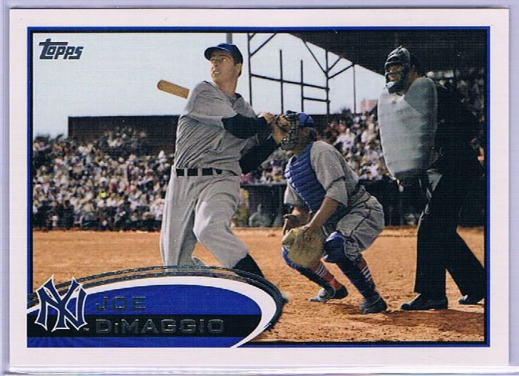
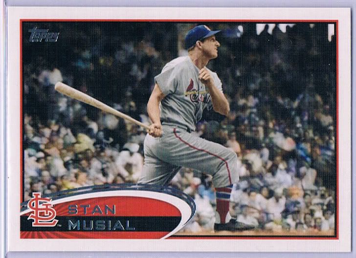
Joltin' Joe. Now in color (where available)
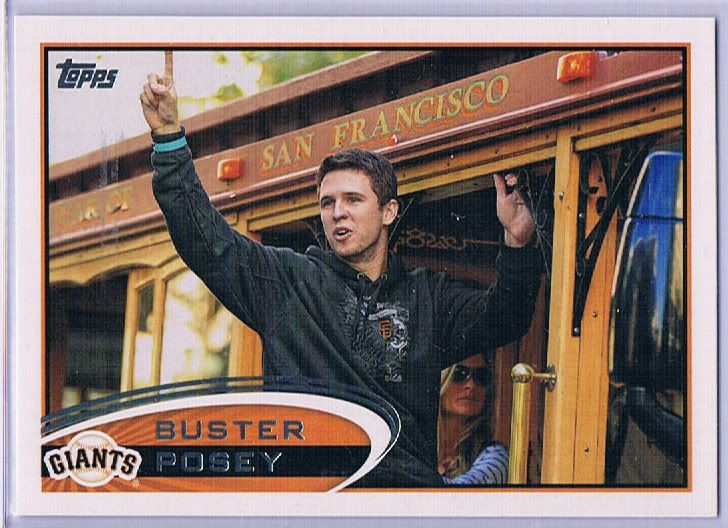
I'll assume this is from a couple years ago, based on the finger. Is that Elin in the background?
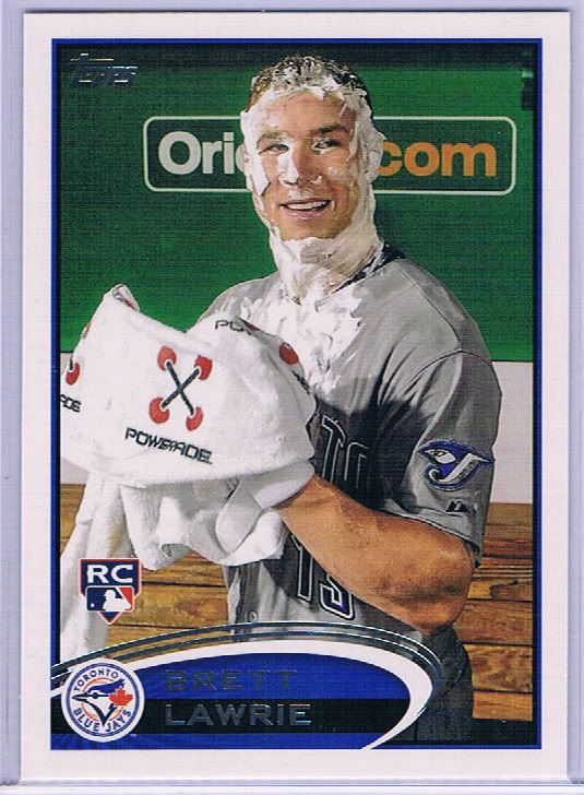
Am I alone in thinking this is a little creepy?
Just a really cool SP
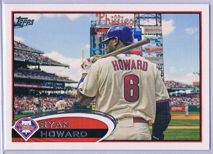
Where's the phone booth?
Another weird colorization
Not as popular as that other Rally Squirrel
Parallels
Those lamenting the loss of the Gold bordered parallel still won’t find them here. Lucky for you, the full 990 card set will find their way into Update. We’re stuck with same Golden Moments parallel – the ones we dub “Golden shower” in the video.
I don’t have a scan ready to go, but you know which ones I’m talking about. We have a U-pick running on ebay for those interested types (the plugs will keep on coming!)
Why couldn't you be having a better year?
Why couldn't you be having a better career?
Why can't you be on a better team?
Why?
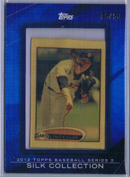
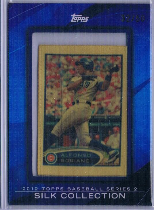
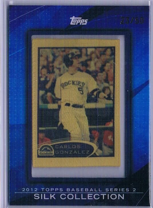
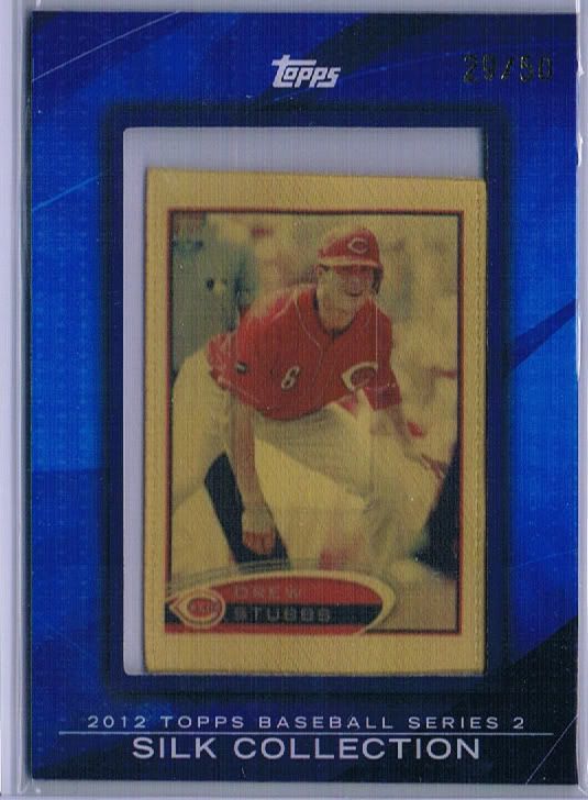
While our series 1 batch of cases yielded a whopping zero gold silks (which are /50, since the stamp is a little tough to read), this batch gave us 4. Hooray! Unfortunately, they continue the soaked in pee theme of the parallels. Boo!
These aren’t full on parallels, as only 100 players make the checklist (probably for the best). Some of the choices can still be iffy, but the appeal isn’t the player, it’s the material. Silk cards look cool. The only way they wouldn’t be cool is, oh, I don’t know, if someone tinted them some crazy shade of yellow in order to wedge a tie-in to a purposeless theme. That’s off of the top of my head, though.
He's still popular, right?
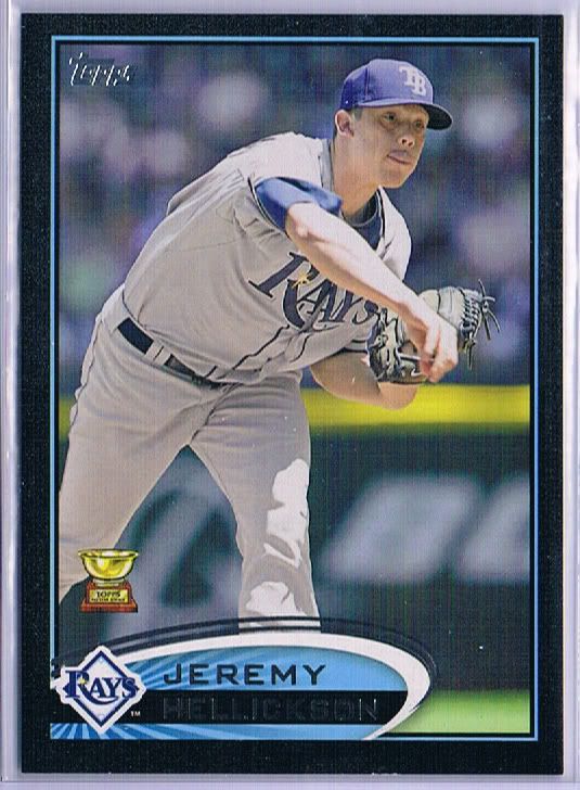
ROY
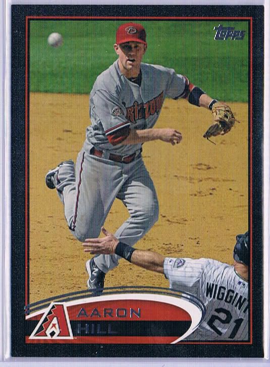
Hit for the cycle! Wait, what?
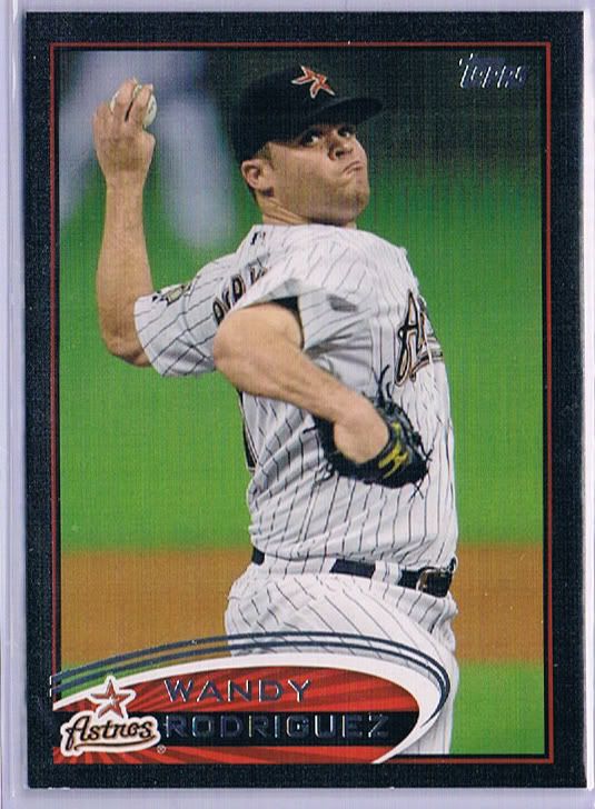
Named Wandy
We have/had others, but you get the idea. You know what they look like, and you know that you like them. Sometimes I wonder if Topps is avoiding a colored bordered main set, because they’ll lose a popular variation level. Of course, they could simply pick a different color, but people are afraid of change. For the record, 5 cases yielded 15 black borders.
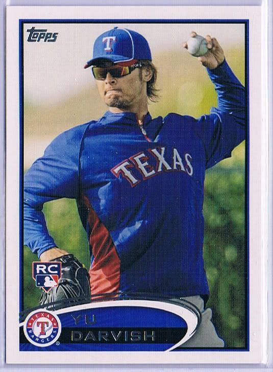
His left hand starring Daniel Day Darvish
I was complaining about the 22 SPs in series 1, but this time, there are 26 of them! Luckily, none of them seem to be any more or less rare than the others. Thank you for that! I’m also glad that there’s no crazy sparkle gimmicks or Abe pie faces anywhere. It’s just straight-up easy to spot photo variations. If they have to exist in that manner (they don’t), this is the way to make and distribute them.
He needs to sign a card in eyeblack
This one’s cooler. Well… worth more. Well… sold for a higher price.
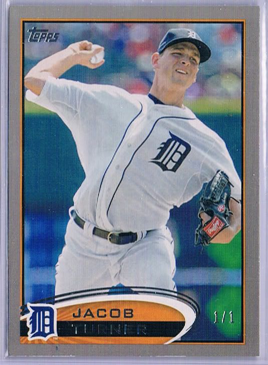
I found this puppy and nearly glanced over it. I was in pure pack ripping mode and so my excitement was a delayed reaction, much like a dinosaur getting bitten in the tail (or so I hear). Once Andy smacked me upside the head, we immediately rushed to ebay before the market dipped any further. What could have been a $3-7 SP ended up being over $150.
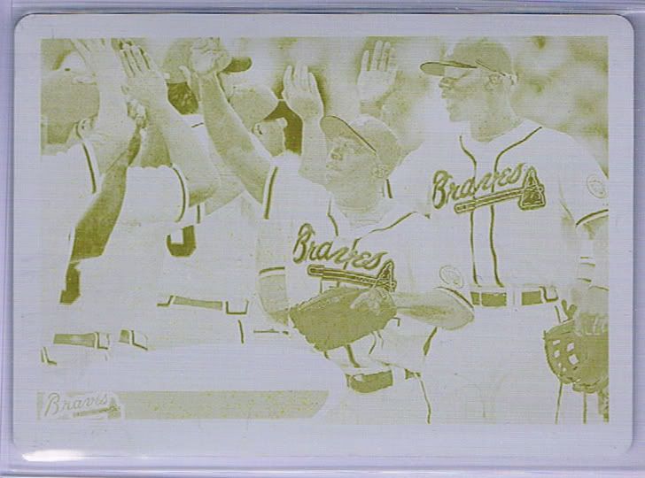
Michael Bourn Yellow Plate
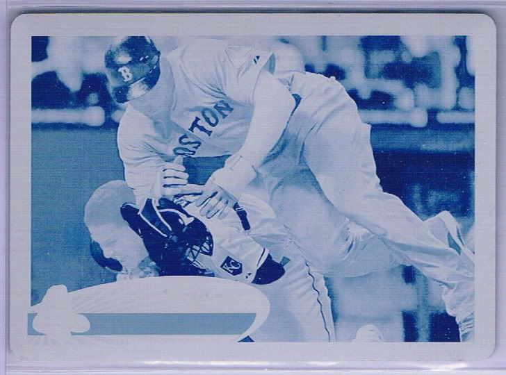
Carl Crawford Cyan Play at the Plate Plate
Our first platinum. Awwww
The Platinum cards are surprisingly unassuming. One could almost grab a gray crayola marker, buy a 1/1 stamp and do it themselves. Not that I would condone such behavior. I’m saying they’re plain looking, even compared to the black borders.
After 10 cases, we still don’t know what a Wood card looks like in person. Remember how those supposedly exist? I’m sure they’re not “real” wood, but it would be “real” nice to see one just the same.
Some of these insert sets are continuations of series 1 inserts, and in all honesty I have no problem with that tactic. Take out some dredge, sprinkle in some new crap to get the people talking and keep a common thread with the rest. Works for me…in concept.
Returning to the fold are the Gold Futures, Gold Standard, 1987 Minis, and the Golden Moments sets. All of them except for the last one continues the numbering where it left off. It may have been a simple oversight in somewhere in the process, but now if the whole Golden Moments label isn’t confusing enough (remember that the parallels, and the die cuts found using code cards — ahem, which you can buy at our ebay store — are BOTH called Golden Moments officially), we now have another set using the same 1-50 numbering. Better complete it now, because good luck figuring out which is which when you’re scrounging the quarter boxes in a year or two. It’s…not upsetting per se, but rather disappointing.
Gone from our packs and collective consciousness are the Classic Walk-Offs, Golden Greats (no 75 card insert sets!!!), and Timeless Talents. No dual player inserts. Where does one buy ticker tape? We need to throw a freakin’ parade!

This guy is in Topps stuff a lot now

This guy is always in a lot of Topps stuff

What? Did you honestly think they wouldn't throw Jackie into the mix?
Ah! Redemption. Not literally a redemption card, but you know what I mean.
The Cut Above insert is such a welcome addition to the line-up. Just about any die-cuts are appreciated, no matter how random the design may be. The lightning bolts along the top and left work well enough for me, how about you? In fact, the only thing that may be considered a negative is the big block for the team logo. Honestly, that’s only because I’m studying the card. The die cut trumps anything bad.
Everyone loves Hall of Famers, right?
How about 2 Hall of Famers?
Well, to spice things up a little bit and infuse life into what has already become “old hat,” we’re treated to the possibility of these sparkly variations numbered to /99. These have the same finish that the set parallels have, with the added benefit of serial numbering.
Not a HOFer
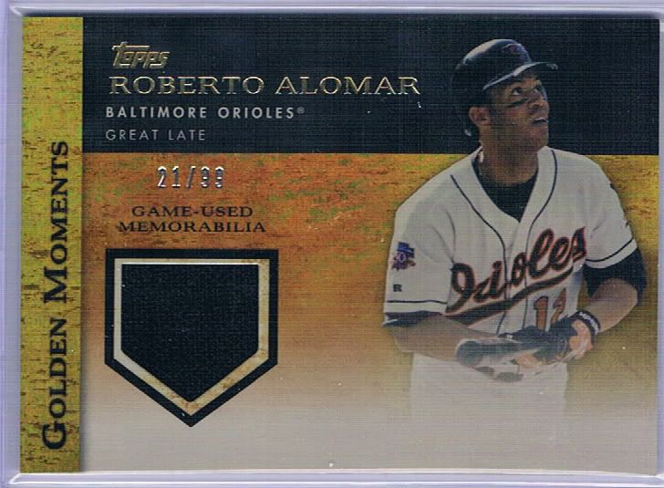
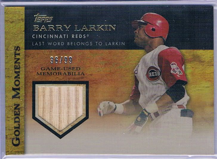
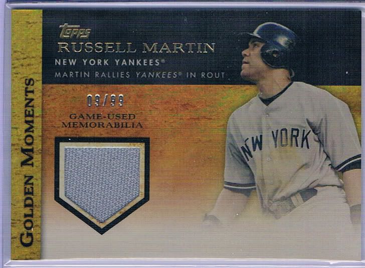
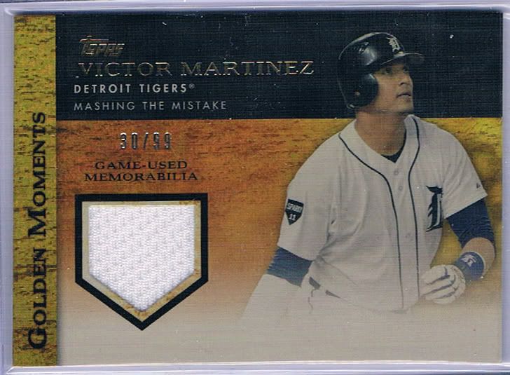
3 of our cases were hobby boxes, not jumbos. That means that most of our 1 hits/box were going to be relics. If anything was going to save us from that mess of a situation, it’d be these. Ultimately we found 7 of these.
Probably better than he is in my mind
I’m showing you the four best of the seven. I believe everyone that has a relic in the set (and some players have two…ugh) has a parallel version to be found. Let me tell you, the relic checklist is absolutely massive. Why, I don’t know. But it is.
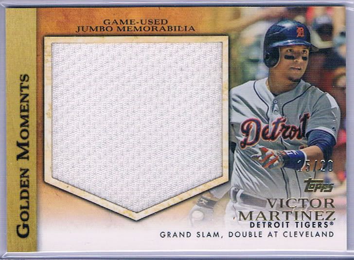
You know what the say about a man with a big jersey? Me either!
Our Victor Martinez luck didn’t end with the sparkle jersey. Oh no. How about a jumbo jersey /20? These are actually kind of cool. No chance for wasted space here. I wonder if a card company will ever have players autograph jumbo jerseys instead of manupatches? Maybe they have. Maybe they shouldn’t.
If he had his choice, he'd appear as a Devil Ray on this card
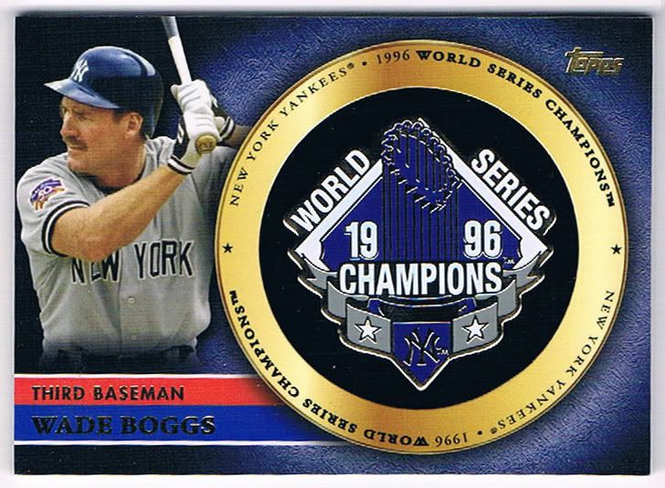
The World Championship Pins are back and they look just as cool as they did before. But they also look exactly the same as they did before and thus quite redundant. They also look unnumbered, and that’s because they are. While Series 1 were limited to a paltry /736 copies, these have no limits!
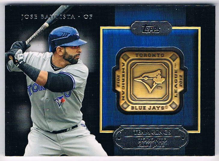
Same go for the new, but similar team rings.
He's still good, right?
This is one of the minuses in my mind. I know some people complained about the high numbering. “736? Why even bother numbering them at all?” They’d say. I did not agree. I was in favor of knowing the limit. Without the numbers, I would easily assume the print run was well over 1,000 and even though the actual difference is relatively small, it would mean some real drops in the ending price for those that choose to sell (like us). Well, now we get to see this theory in practice and unfortunately for us, I was right. The lack of stamps means assumptions of high print runs and less willingness to pony up the $25-50 Series 1 rings and pins saw.
Of course not everyone’s concerned about how well they sell. From a collecting standpoint, they look just as nice as their Series 1 counterparts (if not nicer on the ring front) and there’s no question that both the pins and rings run circles around the standard jersey relics – even the sparkly version. I think they look nicer than the autographs, too, but I know some people think autos > any type of relic. I’m not of that opinion. It’s all about the overall composition.
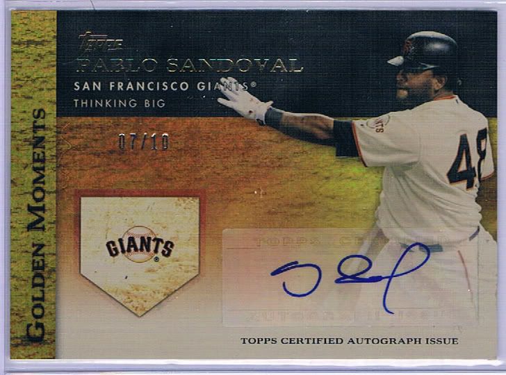
An actual panda could sign better
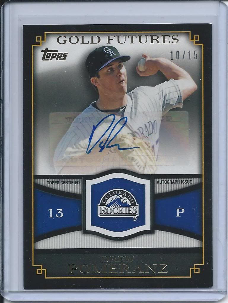
I’m only going to show two autos. You’ve basically seen what they look like at this point. Same as before. Unfortunately, some of the players on the checklist are the same, too. That’s not only disappointing and confusing for player and team collectors, but it also comes across as a sticker dump product saturation. This is exactly why I hate promised hits, because the card companies now have to fulfill those promises with 3 different Trevor Cahill autos. I’ve said it before, but I’d happily give up a guaranteed auto/relic to avoid this.
Might as well put the sticker over his face
What makes matters worse is that these Gold Futures cards in general are condition sensitive, thanks to the black border, and this is no different. There’s some obvious edge wearing/chipping issues. It’s a far cry from a Willie Mays auto/relic or the Carlton Fisk patch/auto. But, as they say, them’s the breaks.
Conclusion
I’m only changing one score in my review, and that’s for the parallels/inserts. The addition of the cut above and the deletion of the 75-card insert set boosts it up a little. The rest is essentially unchanged, because the second series is largely unchanged. No reason to shake things up ratings-wise, right? I’m not going to discount the overall product because our batch of cases were a little less-than optimal.
By the way, if you’re interested, you can check out the scans of all the hits, SPs, and other goodies we scanned on our Series 2 photobucket album found here.
Design – ****
Set Collecting – ****
Parallels/Inserts – ***
Hits – ***
Overall – ***1/2 out of 5
We are going to have to talk about some Rockies gentlemen.
Jon forgot to mention that the light of God is shining on me because I am a pious and just man. Must have slipped his mind, for which he will be punished. Justly.
hiflew- Any and all remaining Rockies can and should be yours. Hit us up via email and I’ll let you know what’s left. I could’ve sworn we emailed you a list but maybe it got lost in the shuffle. The literal shuffle of the 10,000 baseball cards we had to sort.
PATP- We weren’t sure how interested you’d be in a PATP plate so didn’t put it on your list. Sorry for the oversight but your cards shipped yesterday!
Scott- There was a Magic: The Gathering Unglued card called “Confetti” where you were just meant to rip it up in front of your opponent. I volunteer a monster box of 1992 Stadium Club doubles for the parade.
On the Cut Above insert it’s the old “wait, you wanted the team logo on the front too?” decision made by a bad design team.
Let me know when the parade is. Confetti is very easy to find. What you do is you cut up all of those dual player insert cards from the last 3 years that everyone has 5+ copies each of. Add in some 1991 Fleer for a little color.
Not sure what’s available Dodger-wise, but I’m interested in them! I’ll email you when I can.
A Play at the Plate plate? Sweet. I may have to break down and make an ebay purchase…
[…] I would review them formally, but I’ve pretty much summed it all up in my Series 1 & Series 2 reviews and with what we say as we […]