
Ginter! Gint-A-Cuffs! Fighting! Ripping! Ripping Packs! Packs of Ginter!
Video! Finally!
Slow on the draw as usual getting our video and review up for everyone to enjoy and/or summarily ignore. Then to make matters worse, we forgot to shoot our card close-ups! Shoddy craftsmanship. Just you wait. As soon as blogging becomes our full-time job, we’ll be right there with all the box breaking news you can handle. Until then, we’ll work our suddenly customary 12 hour days and pass out on the couch. Just you wait.
Okay, stop waiting. The review and case breakdown is here. We opened a case of the stuff (and sold another case to Gint-A-Cuffs participants as official retail sponsors), so we got to see plenty of the goods. And the bads.
Main Set
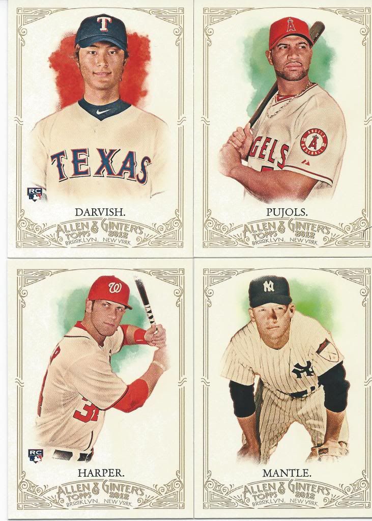
As you can see I used our ebay scans with all the popular names
I know Allen & Ginter has only been around (in modern cardboard form that is) for less than a decade, but I feel like the product is entering it’s late teens in dog card years. What I mean by that is the product has gone from it’s start as a cute popular little baby and eventually morphed into this awkward thing with strange blotches of color that pretty much looks like it used to, but obviously hadn’t grown its own design. These past couple of years A&G has started to become an adult. It’s breaking away from it’s father’s tobacco roots and finding a unique identity.
That’s the long-winded way of saying I like the new direction. Sure there’s still the splotchy spots and the old-timey photo effects, but look at the ornate border and compare that to the relatively bland sets of the past. No contest in my mind.
What I don’t like about this year’s set is that there are no non-human subjects in the 1-350 card set. There are also no people that weren’t born before the advent of baseball as has been the way in the past. No Area 51. No X-Ray. No Copernicus. Just a bunch of modern dudes in hats and ladies in dresses. I know they’re available in the inserts, but that fun mix was part of what brought me back into collecting in 2009.
You'll see a lot of lazy cropping. Sorry.
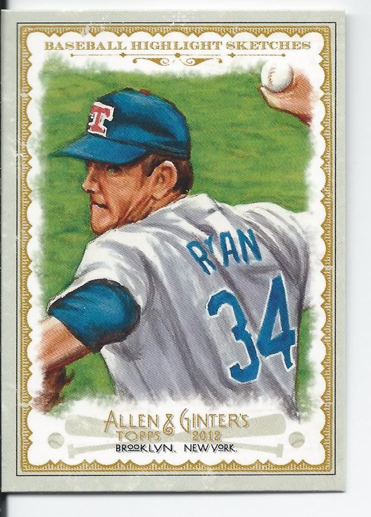
The baseball sketches return as a full-sized insert and for good reason. A couple of the drawings aren’t the most photo-realistic I’ve ever seen, but they get the job done and I’m much more inclined to sit and look at a sketched or painted card than a regular old picture.
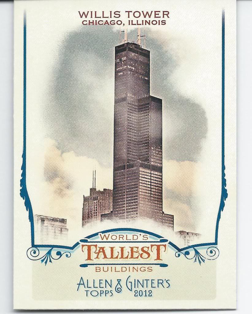
If only I could photoshop "Sears" into this thing.
I didn’t scan any of the What’s In A Name inserts. I’m sure you’ll see a ton of them on other blogs anyway. It’s a neat concept, and again, anything that intrigues me to spend more time with the cards is a good thing. The problem is the set is absolutely massive. The checklist could (and should) have been limited to those people with truly unusual or unique names.
Meanwhile the Tallest Buildings is far too short and far too prevalent and not quite interesting enough. I’m interested in the Sears Tower card (don’t correct me!) for personal reasons, but otherwise I could give a gargoyle’s teet.
Oh… I forgot to scan a Historical Turning Point card as well. That was simply because I forgot all about that set. Probably enough said, then.
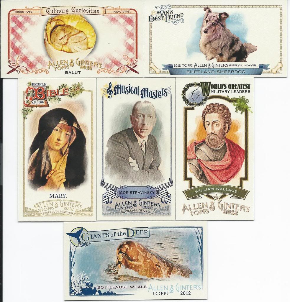
There's probably some common thread amongst all of these people and foods I'm missing.
Then there are the mini inserts. Everybody goes crazy for the minis. Everybody loves the minis. Except me. I know I’m the weird one.
Look, I think it’s really cool to pull a Braveheart card out of a pack. Or a Beluga. Or Balut (which a co-worker of mine has tried and told horror stories about). I personally would prefer that they be in a size that’s conducive to normal card storage methods and that don’t feel like they’re going to break when I touch them. I don’t want to buy special equipment for my cards, nor have them rattle around in the stuff I do have. But hey, I’m obviously in the minority.
This review isn’t about my beef with minis, it’s about the content on those minis, and this truly is where Ginter shines the brightest. We’re talking light of God stuff. Nearly literally thanks to the People of the Bible set. Each insert keeps in line with the overall design, but has it’s own unique flair. The themes that Topps chooses each year are interesting and varied and usually contains something for everyone. Some may not like the lack of sports figures on these, but I welcome the respite especially when it’s brought about by including a set of puppy cards!
Seriously, I’m buying all of the dog cards we found in our case and I have a want list up for the rest. I may not like minis but I loves me some puppies.
What's missing from this picture - besides Old Planter and proper cropping?
Of course kooky, crazy, mixed-up looney minis aren’t the only small inserts you may find in your packs. Each year, A&G offers up a variety of mini parallels to the 350 card set. There’s your standard mini, your Ginter back (which looks mostly like the one above), the Ginter Red backs (which are hand numbered out of 25), the no number minis (which looks exactly like the one above), and the black bordered ones that look like this Bryce Harper you see below.
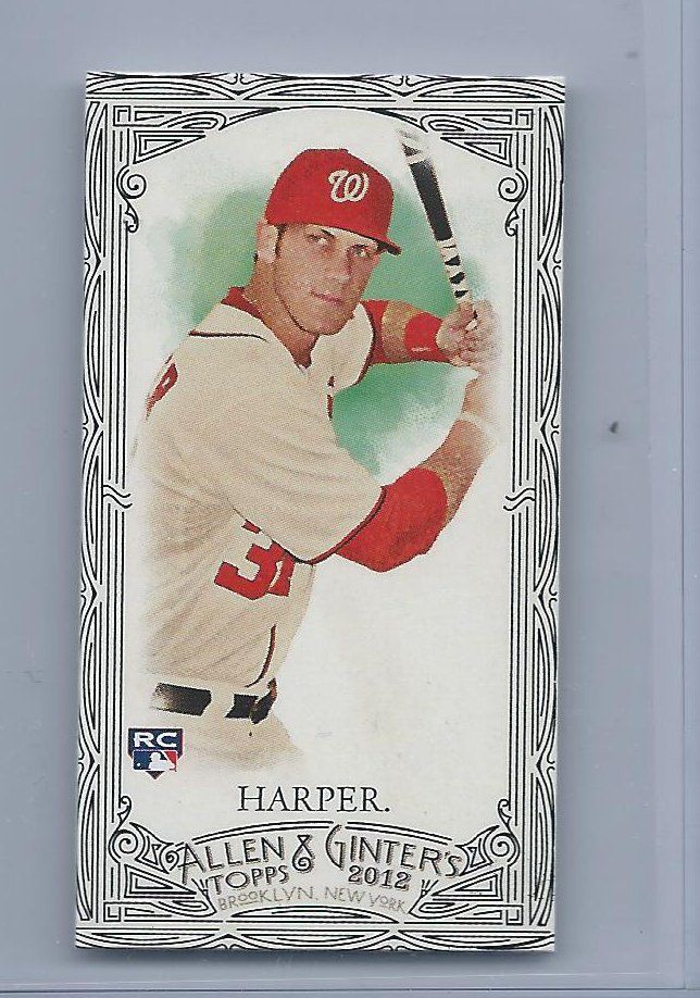
Cha-Ching!
I believe this is the first set in which Bryce was not a short print or late addition. Despite that, he only showed up 5 times in our case. 3 cards which went into sets, an A&G back mini and this black border.
I know it’s not going to happen, but I’d love to see fewer mini parallels. I’d love to see fewer parallels in general, but it gets to be a bit much. If I had to choose, I would choose the black bordered ones. I’m in favor of easy to spot variances. I shouldn’t have to scour the back, or even turn the card over. It’s far too easy for things to get lost in the shuffle (especially years down the line when people forget what’s in the product). The black borders this time look okay, but feel incomplete. It’s like an outline of a tattoo that’s clearly meant to be colored in as soon as you work up the courage to go back into parlor. Speaking of tattoos, it does give off that tribal arm band vibe, and that’s not a good thing.
Hits
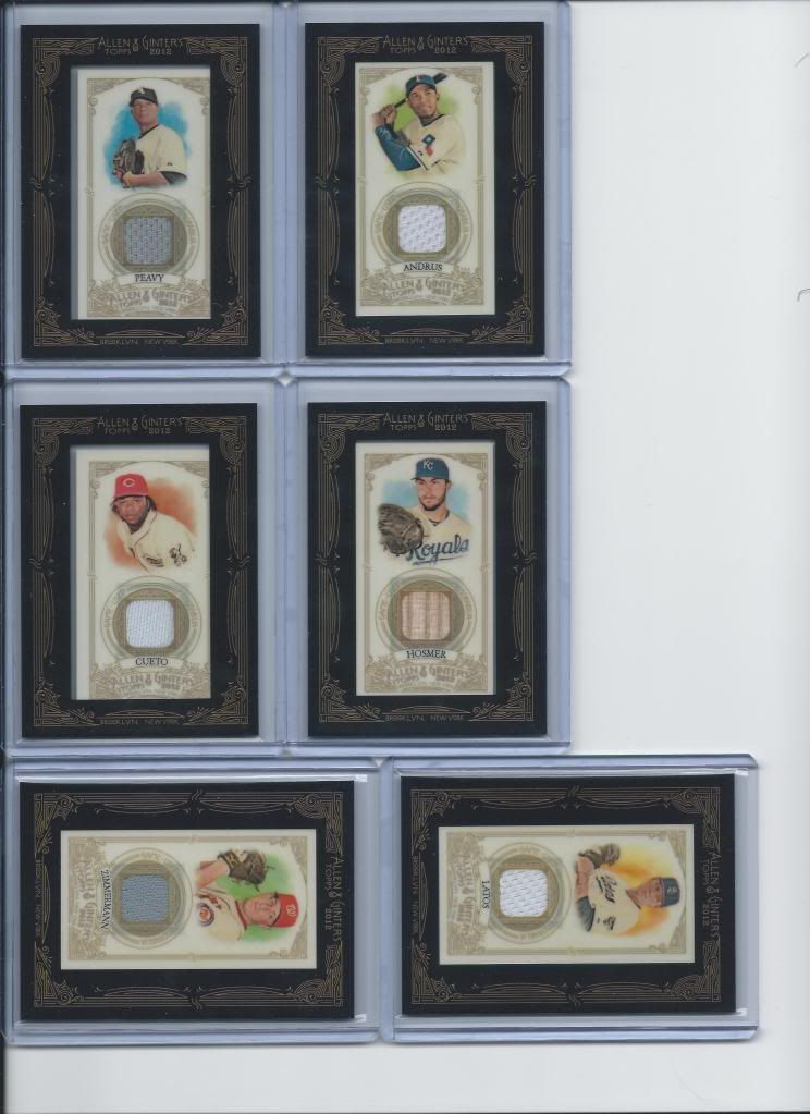
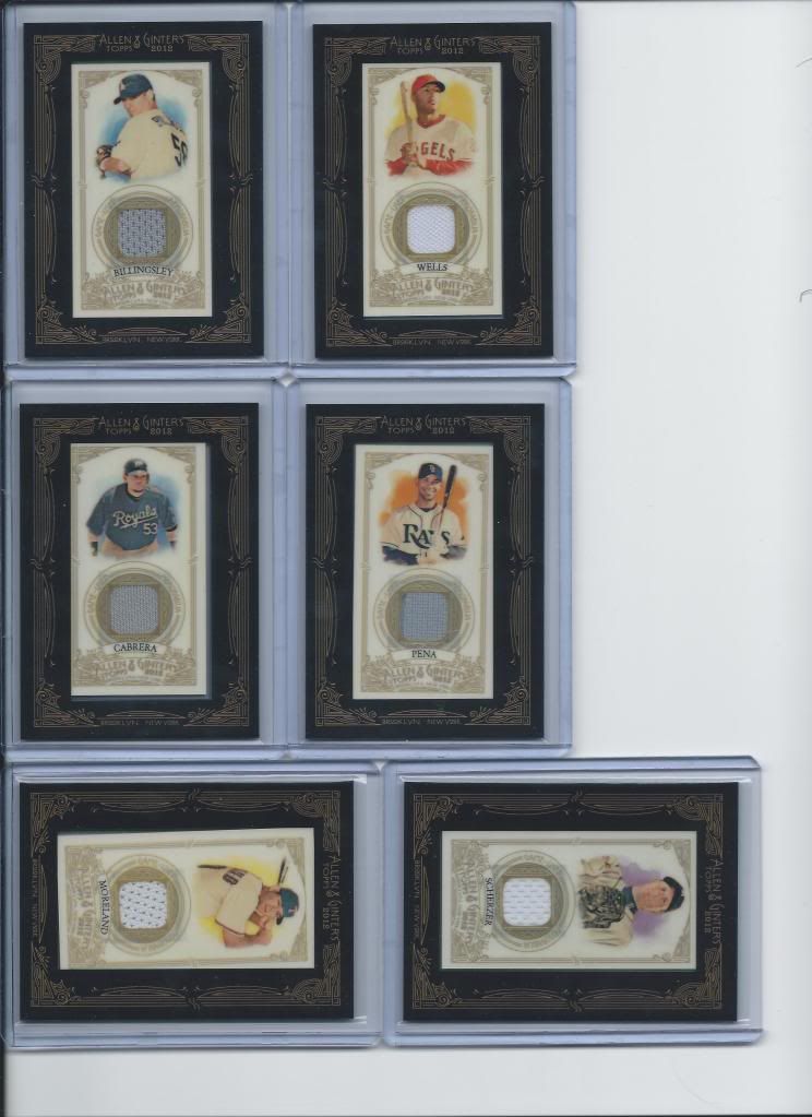
Lots o' relics
This is what you’re all here to see, I’m sure. Several of these relics you’re about to see are still available for sale if you’re interested. Ask and ye may receive (if in stock).
If only my scanner bed was slightly larger
Did you know that many players have multiple relics in the product? And did you know that the only real difference is the card number on the back has an extra letter added and the background color on the back is different? Now you do!
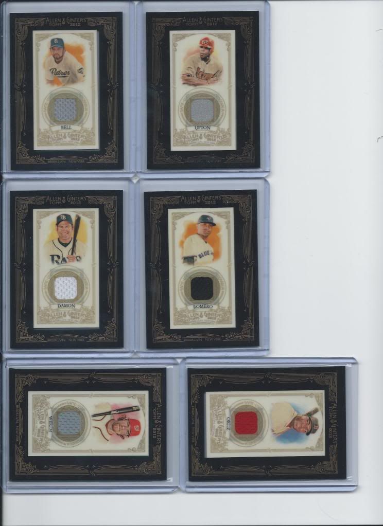
So much fabric
We learned that because we found 2 different Evan Longoria relics in our case.
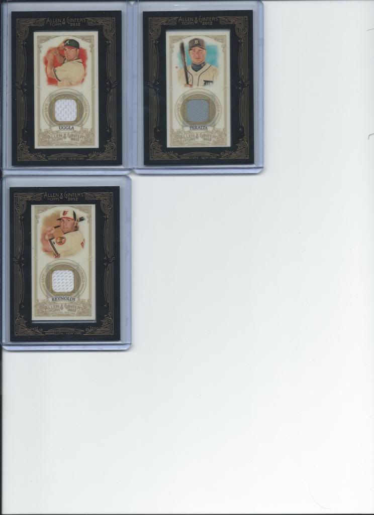
again with the cropping
I should probably say something about the hits, review wise. The black border is a nice touch. I can’t decide if I’m sad about the tropical flower border leaving us this year or not. I liked the consistency over time, but this style has a simple elegance going for it.
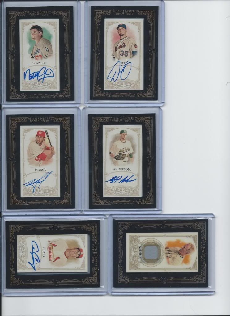
Autos and a McEnroe
From what we were hearing from the big breakers, autographs fall roughly 6 per case. Those don’t sound like outstanding odds overall. The relics get old fast, so I’d love to see Ginter give us 1 per box next year, assuming they feel the need to keep 3 hits. Our case saw 7 autographs, and none bigger than the red ink auto.
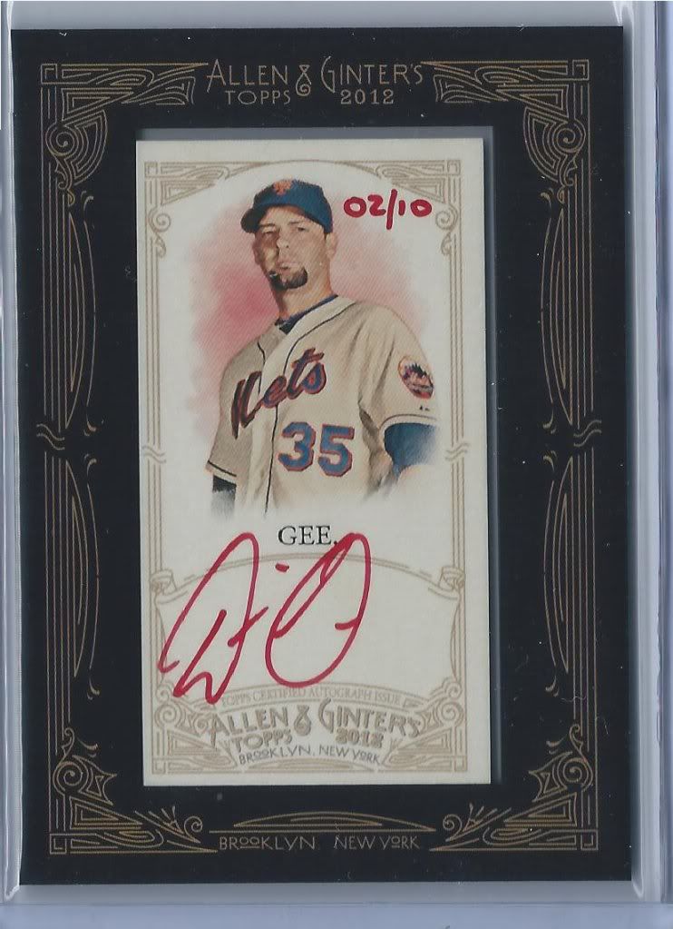
Gee Wizz
Boy, what horrible timing to find this. Still, it’s a red ink auto #/10, and that’s pretty dang cool. Some of these are only found inside of rip cards, so who knows if all 10 of your favorite player will ever be found. Assuming you collect such things.
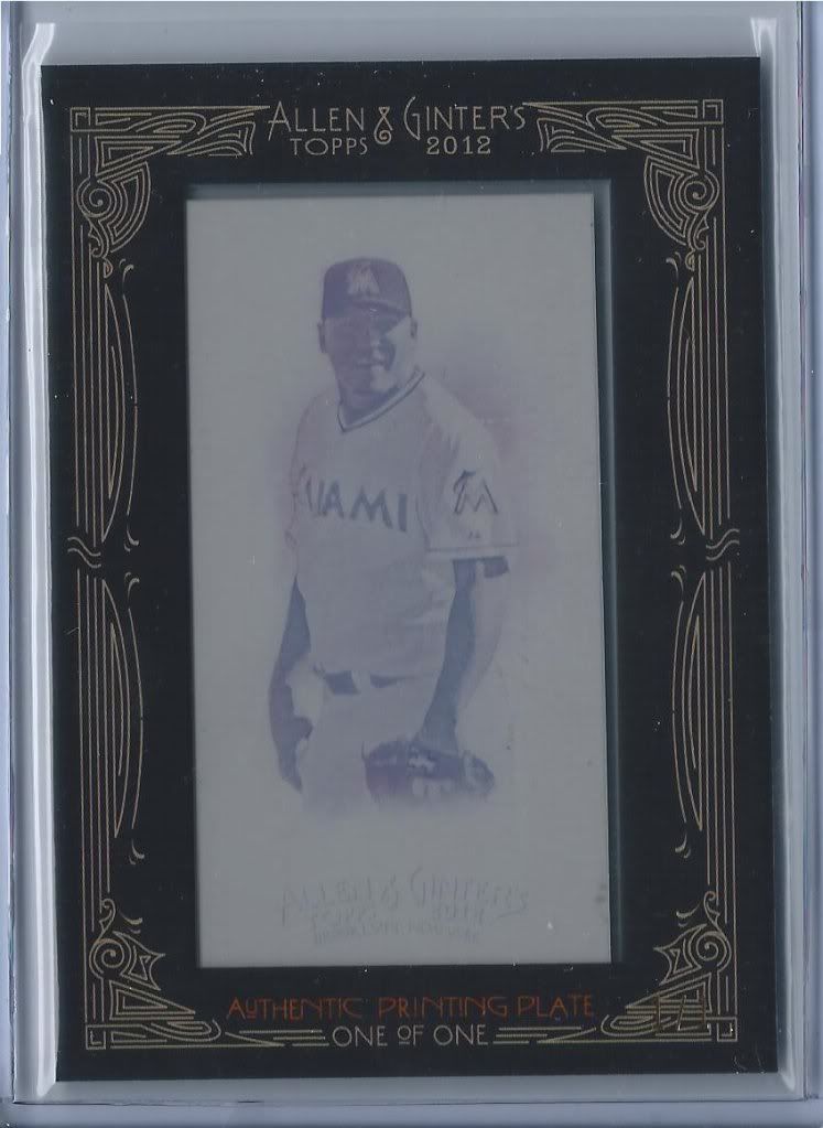
We need a water cooler in the background
It’s possible to find limited silk cards, but we didn’t. I don’t know if this printing plate was an “instead of” situation, but I kind of think so. I’m okay with that. What’s interesting to me is that only the minis have printing plates, not the full size cards. Let the presses run on those bad boys!
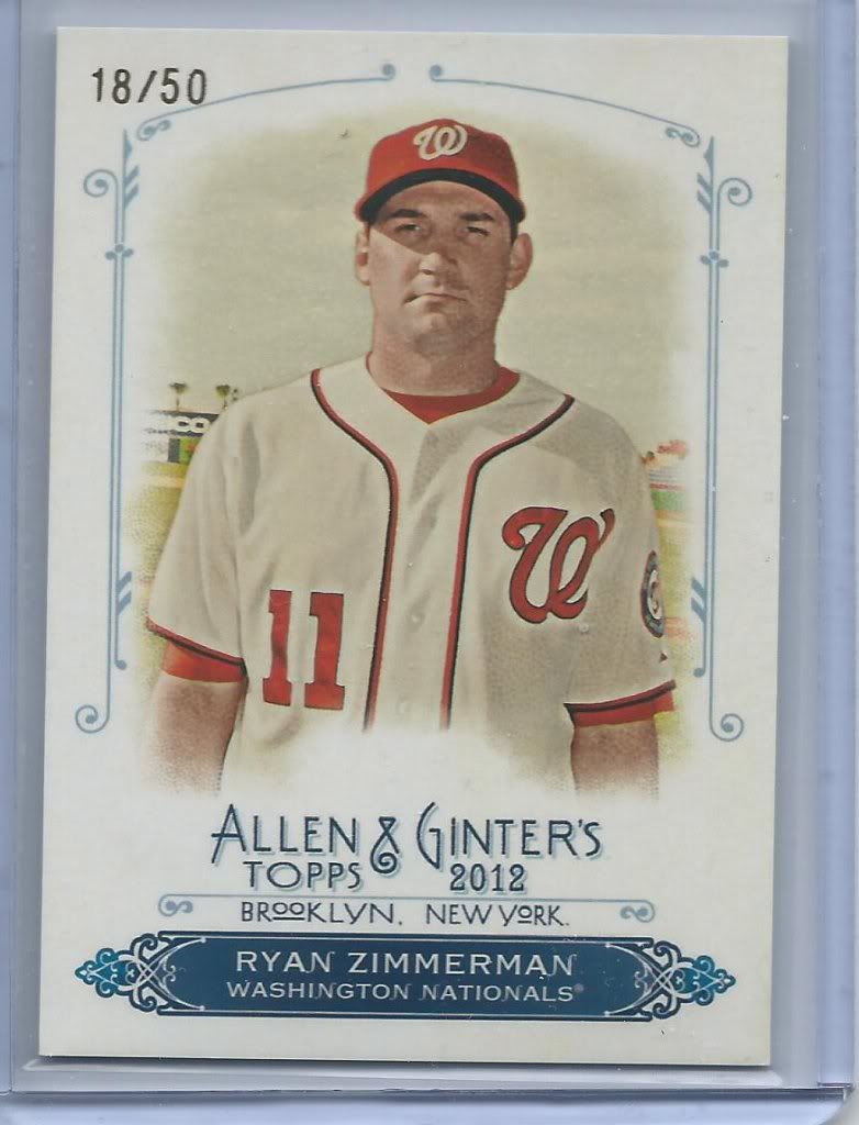
"If you rip me, I will rip you" -- Ryan Zimmerman in my head
Hey! A rip card! Every case is supposed to have one, but we’ve heard stories that a good chunk do not. Luckily, Topps customer service was on top of it and those same stories concluded with quick rip card replacement turnaround.
By the way, these could include the unframed red inks, an exclusive mini #351-400, or a faux-wood 1/1 parallel inside. Would you rip it or not? We decided to sell it intact and let the buyer decide. If I found this in my own pack, I’d probably rip Zim. It all depends on the player on the front and rarity for me.
I love the concept of the rip cards and I wouldn’t mind seeing more products utilize them in the future. And yes, I know that’s somewhat hypocritical since the only thing that could be inside is a hated mini.
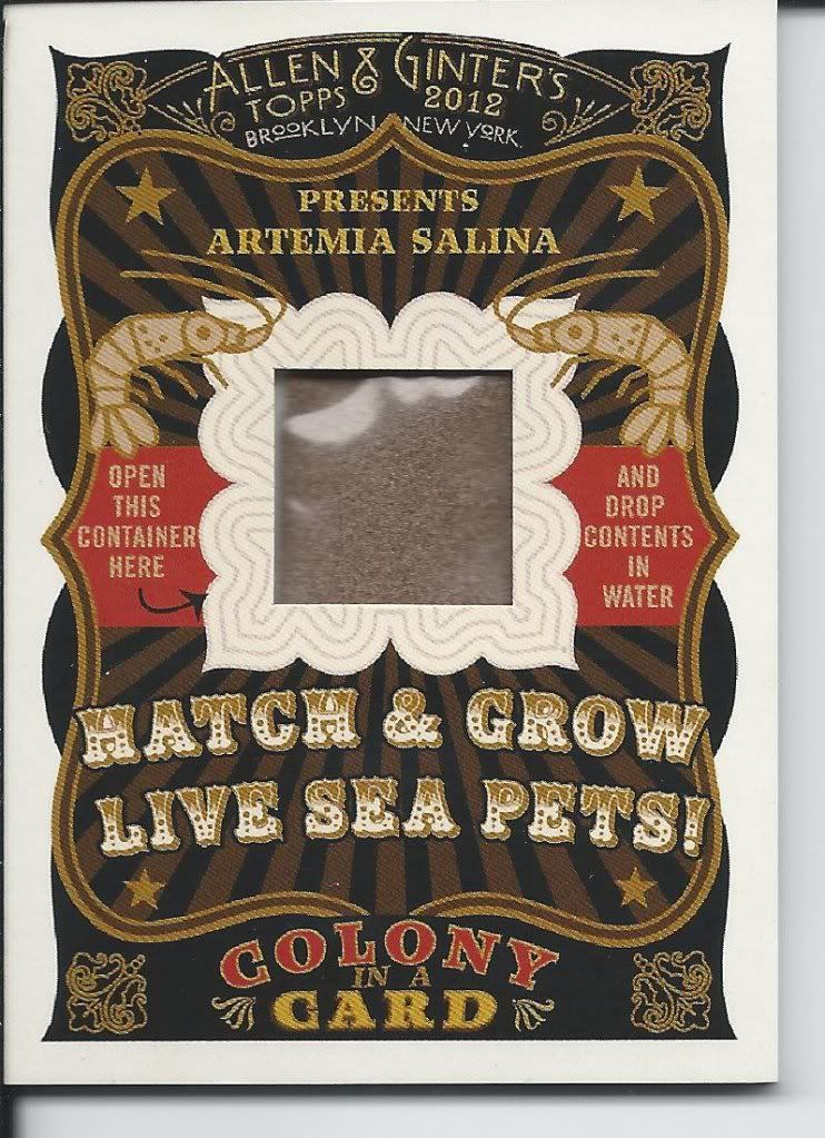
Vacuum sealed for freshness
Sea monkeys! What a cool inclusion these are. Each case has a card of sea monkeys that can be opened and grown. There should be enough of these floating around in the secondary market that kids can get their hands on some and start growing civilizations full of our new cardboard overlords.
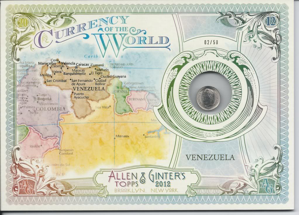
Cha-Ching. Literally. Okay, not literally. How about Cha-Change!
Last one. How awesome is this? There are other types of boxtoppers to be found, but nothing that hasn’t been done before. We have some baseball highlights, your smaller N43 style cards that seemingly no body gives a flip about, and cabinet cards of roller coasters which sounds like a good subject but are quite boring to look at. Then we have these Currency of the World toppers. Found one in every two cases, it is exactly what it looks like. Great design with the changing color palate and fonts to emulate paper money across the globe and a nice detailed map of the country featured instead of a generic regional blob really makes this baby pop. If there’s any drawback, it’s simply the size. It’s very thick and the cabinet card size would make storing it kind of a pain. Still, it’s a great concept that’s very well executed.
Conclusion
A strong design element throughout and intriguing and unique insert sets make this a box that virtually anyone can enjoy. I hesitate to call anything with SPs a set-builders product, but when there are so many different ways to collect Allen & Ginter, it’s hard not to.
It’s easy to see why this is one of the most anticipated products year in and year out in the baseball collecting world. I’m already looking forward to what new surprises will be awaiting us in 2013. Until then, I have a few Man’s Best Friends cards to track down.
Design – *****
Set Collecting – ****
Parallels/Inserts – ****
Hits – ***
Overall – **** out of 5
I love the currency cards – been trying to pick them up on the cheap whenever possible. Easily my favorite part of the set this year (with the dogs being a close second).
Do you have any Ginter Bible cards for sale or trade?
Thanks,
Kyle