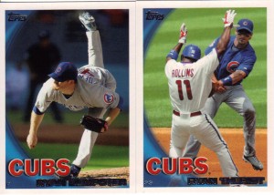
Not too long ago, I picked up the Cubs team set at Target. The only real reason I bought it was to obtain these two fellers for my player collections:
Sure, they look like 2010 Series 1 base cards (non-Lincoln, of course). They feel like 2010 Series 1 base cards. They smell like 2010 Series 1 base cards. But, brother, it ain’t 2010 Series 1 base cards.
At $5, I figured the price was a little steep, but better than trying to remember to pick them up at another time. I mean, let’s be honest. If I were at a card show and I saw these, I would pass them up with a mental “got it” while looking for the “need it’s.” Besides, I figure I can always trade and/or sell the rest (whichever comes first – would rather trade!!) to recoup cost.
While I was looking at these, I wanted to see how many of these turned out to be different than their in-pack counterparts. I’ll focus on series 2 (review and video coming soon!), because I know other Cub blogs have outlined the differences from series 1 (just the Derrek Lee has a new picture).
Team Card is always on the left on these scans. Let’s keep a tally as to which are better, shall we? The team card doesn’t give us much besides an over-exposed pseudo action shot. The set is a decent in motion photo. TC – 0, S2 – 1
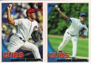
Tough call on Big Z, the newest member of our rotation. These could be from the same game. Hell, they could be the same pitch for all I know. The ball is hugging the swoosh in both, which is bad. I guess main set gets the edge due to better lighting. TC – 0, S2 – 2
It kind of bugs me that we don’t see Soto in catcher’s garb in at least one of these. I know he’s still kind of known more for his offense, but I want more variety. Again, the main set gives us a better action shot. TC – 0, S2 – 3
The perfect picture for Marmol would be one showing that stupid stare of his. I don’t like the red caps, but I like that I can identify the game and I like the visual pop it provides. TC – 1, S2 – 3
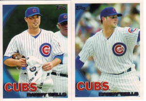
This one’s tough. On the one hand, you have a pitch being thrown, but you can’t see a damn thing. On the other hand, you have him holding a flippin’ towel and pitching coach Larry Rothschild is lurking in the background. I’m going to give it to the team card, because I want to imagine that Randy is collecting the towel and embarking on a quest that the troll Larry is making him complete in order to stay in the rotation. TC – 2, S2 – 3
Honestly, this is no contest – just like that play at second. TC – 2, S2 – 4
If Fukudome was diving for that ball, I would give it to the main set, but since in the team card he appears to be running home to score a run (something we don’t seem to do well this year), I’ll give it to the optimistic team card. TC – 3, S2 – 4
As you can see, I added a third card to the mix. I’ll explain shortly. First there’s a winner to announce. As you can tell, both pictures are the same, but one is merely zoomed in. I would have given it to the team card (and created a tie), but I like that the bat is fully visible in the regular version. The framing is more dynamic because of it. TC – 3, S2 – 5
For the record, Soriano’s picture is the same in both.
Now, back to that Byrd photo. You can tell your photoshopping is sloppy if I can notice it. I’m pretty dense about such things. So, what’s wrong with Byrd? Well, for one, his name on the back is still sporting the lettering found on the Rangers uniform. You can see the little spikes in the middle of the letters. More glaring, however, is the work done on the pants. For starters, Cubs wear gray pants with the blue tops. Second, they aren’t pinstriped. See the Zambrano pictures above if you want to confirm that.
What makes this job more curious is that the Rangers uniform I included above shows that they too wear gray pants. The Rangers pants only have a single stripe running down the leg. I know I’ve seen other cards with the Blue tops and gray pants, so I’m sorry this isn’t the best example, just the most handy. Anyway, had the photoshop artist done a tiny bit of research, he could have saved some trouble and just painted that stripe gray and this would have been much tougher to spot. So, your lesson for the day kids is: Do your research.


Good eye on the Byrd! I love photo-shopped cards. I’ve never really understood why the companies have felt the need to do it, since they don’t do it across all brands or for all players. It’s fun to spot, though.
I agree. A simple “Traded to/Signed with ____” is a-ok with me!
I forgot about the old “Traded to…” notes. Nothing wrong with those at all! How else would I have gotten the news that Oddibe McDowell was no longer a Ranger?!