
Why, yes, I am still behind in my trade posts. Thank you for asking. What’s that? You want to see one? Oh, I must have misheard. No one said anything. Well, since no one took me up on either of my recent trade bait posts, the punishment is to read an incoming trade. I’m sure that’ll get the comments rolling in!
These come courtesy of Derek over at Tomahawk Chopping. I sent him some Topps Chrome cards to help finish his set and months later I posted these cards I got in return. And yes, we have traded again since. ‘Tis almost always the way.
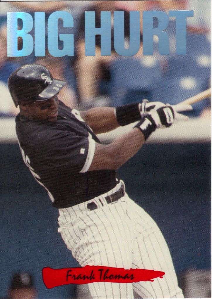
The Big Hurt deserves a Big Scan
People like to poop on Triple Play for being some of the junkiest junk that ever junked out of a junk hole, but I don’t mind the stuff. It reminds me of a time when card companies were starting to try something different that was also affordable. Plus, it resulted in some decent looking insert cards such as this Nicknames card. I know it’s not incredibly fancy, but nothing about Triple Play was. That was part of the point. Simple, yet collectible.
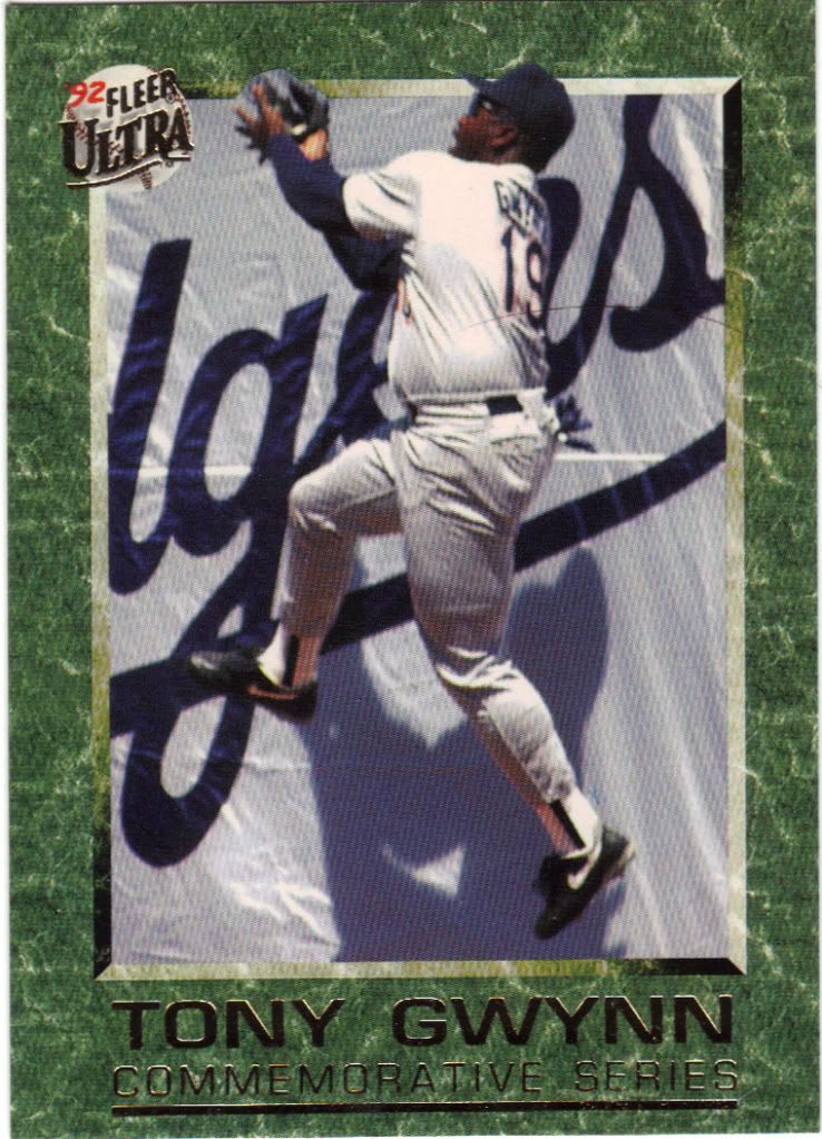
Attack of the stray hair. Tony runs up the wall in horror
I had completely forgotten about Ultra’s living tribute set until this card arrived. There are 10 in total and this is number 1 (I’ve since got the rest). I guess this is Fleer’s attempt at Baseball Heroes. I don’t know if it works on the same level when celebrating an active player. The border is nice (especially for the time), but obviously doesn’t have that iconic feel that the Heroes circle does. The front shows him sticking it to the Dodgers, literally and cleat-ally. The back details how much of a gamer he is by playing the end of a lost season with a terrible knee when everyone wanted him to quit. TG don’t know the meaning of the word.
Ooo, you do NOT want to face that look in the batter's box
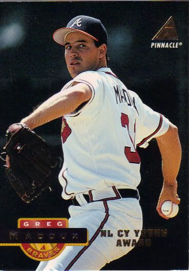
This is the second time I’ve received this card, but since I don’t always show every card from each trade, I’m showing it off now. I kind of miss Pinnacle. Aside from can cards, I liked a lot of what they put out. Their subsets were some of the best in the business. Shades, anyone! This is not a subset, despite the foil reminder of the Cy Young Award. This is the regular ol’ issue, and it’s not one of Pinnacle’s strongest offerings. What really ruins it for me is that weird semi-circle graphic. I can’t tell what’s really going on in the background and the confusion turns to hate which turns to anger which turns to suffering. Or so I’m told.
F-f-f-f-f-f-f-f-f-u-u-u-u-u-u
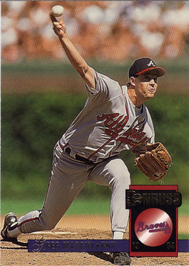
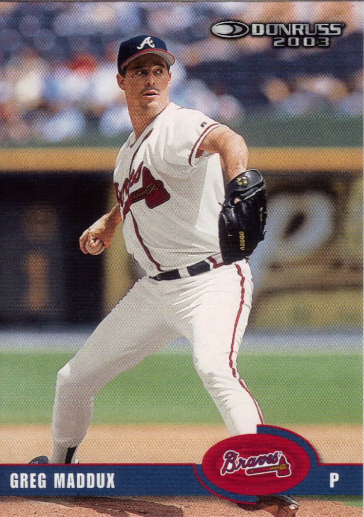
Donruss gets it right. At least in that there is a full circle and you know what’s happening within its confines. That’s a logo being crossed out a la Ghostbusters. Yes, Donruss is biased against the Braves. Or maybe they were just that eager to get Maddux back in the Cubs uniform. He is pictured at Wrigley, after all. Give it time boys, give it time.
Parallel F-f-f-f-f-f-f-f-f-u-u-u-u-u-u
Hmmmm, this looks familiar, but also awesome. Kind of like that nerdy girl you went to elementary school with and didn’t see again until high school after she became rebellious and hot. Unlike that girl, this card will give me the time of day. I don’t completely know what the deal is with this, but I do know that it’s not a full-on parallel set since this is number 100 and the card above is 380. I enjoy simple, but obvious foil variations much more than the border variants that have overrun the hobby today. I would prefer neither exist, but if I must pick, I say do more of this stuff.
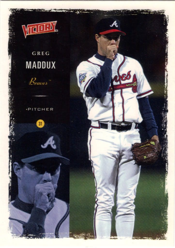
<cough>My team choked<cough>
Sure the set is called Victory, but Greg and the Braves would lose the 1999 World Series to the Yankees in 4 straight games. Maddux pitched game 1 (where this picture was taken as evidenced by the logo on the sleeve), and did very well until the 8th inning. Greg was out-pitched by Orlando Hernandez and would not get a chance to try again. There’s one specific element about this set that does not work, and that’s the paint brush border. I expect Victory to be crisp and clean and striking, not an unfinished slap dash.
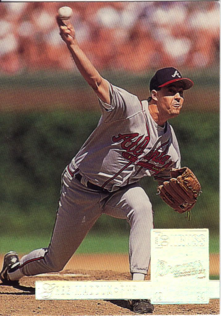
My radar is picking up a strong Braves signal, captain
More Donruss, nearly 10 years later and I must say it devolved. It looks like a bad photoshop custom creation. Like if Big D suddenly decided to give up, or design something with his eyes closed. Sure it could be worse, but it could also be less of a news graphic. This is also one time where foil is called for. That Donruss logo needs to be shiny to add a little legitimacy to the offering.
Thanks again to Tomahawk Chopping for the very nice trade. Please check out the blog and send him some Braves and Martin Prado love, will you?
Trade bait post? Did I miss something?
The camera adds 20 pounds, just ask Toney… Seriously that has to be the fattest picture of Gwynn I have ever seen.
The gum! You know we all come here for the gum!
The Lead parallels (not sure what their exact name are) were pretty awesome when they came out. Not many companies were putting foil on their cards yet, yet alone shiny foil! I remember getting a Jack McDowell Leaf shiny and really being in love with that card.
sorry, Leaf*
Proofread, dammit.
My evil plan worked. By the way, I know it’s hypocritical of me to complain about no comments when I rarely get the opportunity to comment on anyone else’s.
PATP – the trade bait posts were the repack box breakdown (hoping to get rid of some of that stuff) and the stickers post right below this one.
Lost Collector – I think that’s a big reason why I loved the 92 Topps gold. It was a minor change, but felt very special.