Hench. The Henchmeister.
The Henchback of Notre Dame.
Turner and Hench.
Hench.
Sorry, I’m sure he gets that a lot, but I couldn’t resist. And yes, I copied the text you see when you roll over his link on our blog roll (if anyone even notices that exists), but that’s only because I’m not creative enough to think of any others. I guess I’m no Rob Schneider. I guess I can’t “do eet.”
So, yeah. It’s trade time. Can you guess my trade partner?
I sent a few Tim Wakefield and Series 2 set needs and got a nice little mix of my guys back.
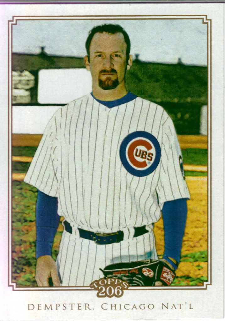
Once again, Dempster in a field
The only other version I have of this card so far is the Cycle back mini, so I haven’t seen the write-up until now. Turns out its more about Eric Gagne than Dempster. Ryan is one All-Star invitation short of the record for a Canadian pitcher. What a pointless stat.
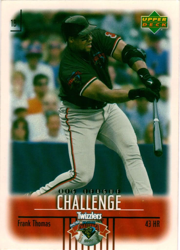
Shouldn't something be twisting in this design?
You guys know I like cards you find in food, right? Hell, it’s really the only reason I bought or ate Cracker Jacks. Who wouldn’t like opening some Twizzlers and finding a Frank Thomas card in there? I don’t know anything about the Big League Challenge, but the photo looks highly photoshopped so I’m led to believe this may not have been an actual thing. Still…card from food!
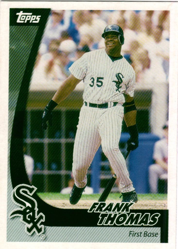
Swoop it up!
Hey, it’s another one! I see the comparison between the 2002 Post you see here and 2010 Topps, but I’ll allow it. They’re different enough, no? This is a 30 card set, but I’m not sure why they included Frank since he was hurt most of 2001. They probably wanted one player from each team and he was still the one that would move the most cereal.
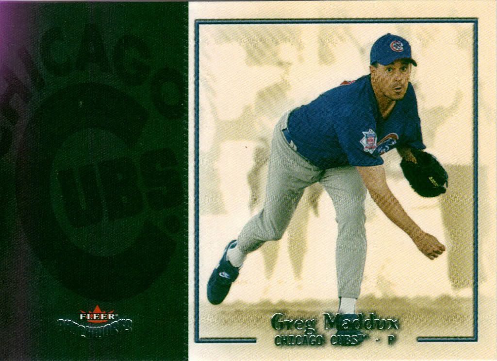
Even Maddux is shocked this card looks like it does
What an odd-looking set. Nothing about this design should be appealing. Poo on one side, crap on the other, but somehow it’s not a shit sandwich when you put the sides together.
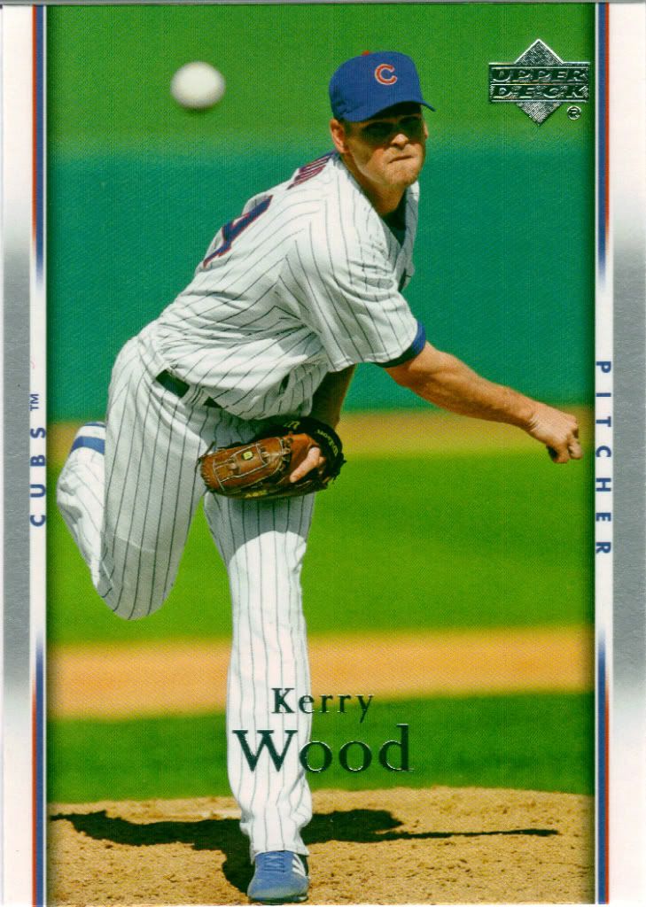
Gray = drab
Has Night Owl named this set yet? Can I suggest “The Closing Elevator Doors Set?” Kerry is dead set on making sure that ball makes it to the lobby. I know many people don’t like this set. I can understand why, and feel it’s an easy fix. Take the gray on the borders and make them team colors. Switch the tiny strips of team colors with gray and you’re good. Or, at least marginally better.
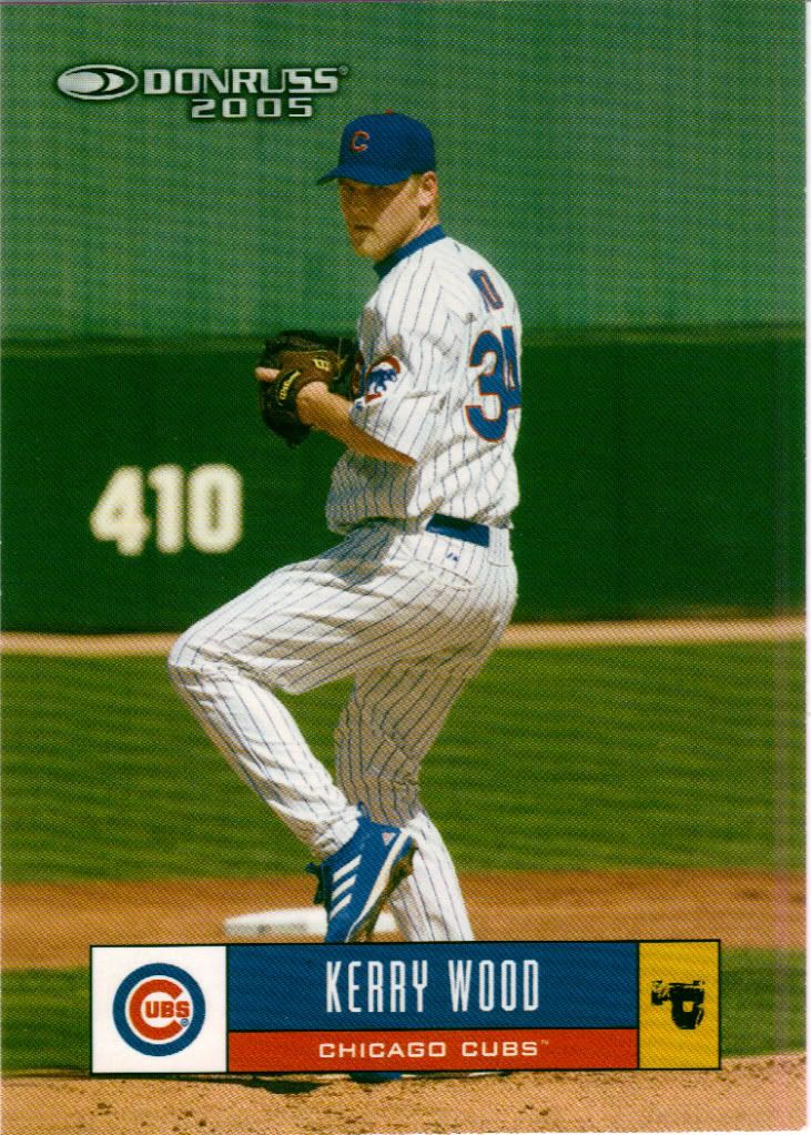
Worse than gray
If you want hideous, don’t look to 2007 UD. Look instead to 2005 Donruss. Maybe other teams and their color schemes look okay, but this sucker does not. Mustard yellow should not be on a card. One thing I will say is that foil would not help this card. Perhaps that’s a sign of how unnecessary it is overall.
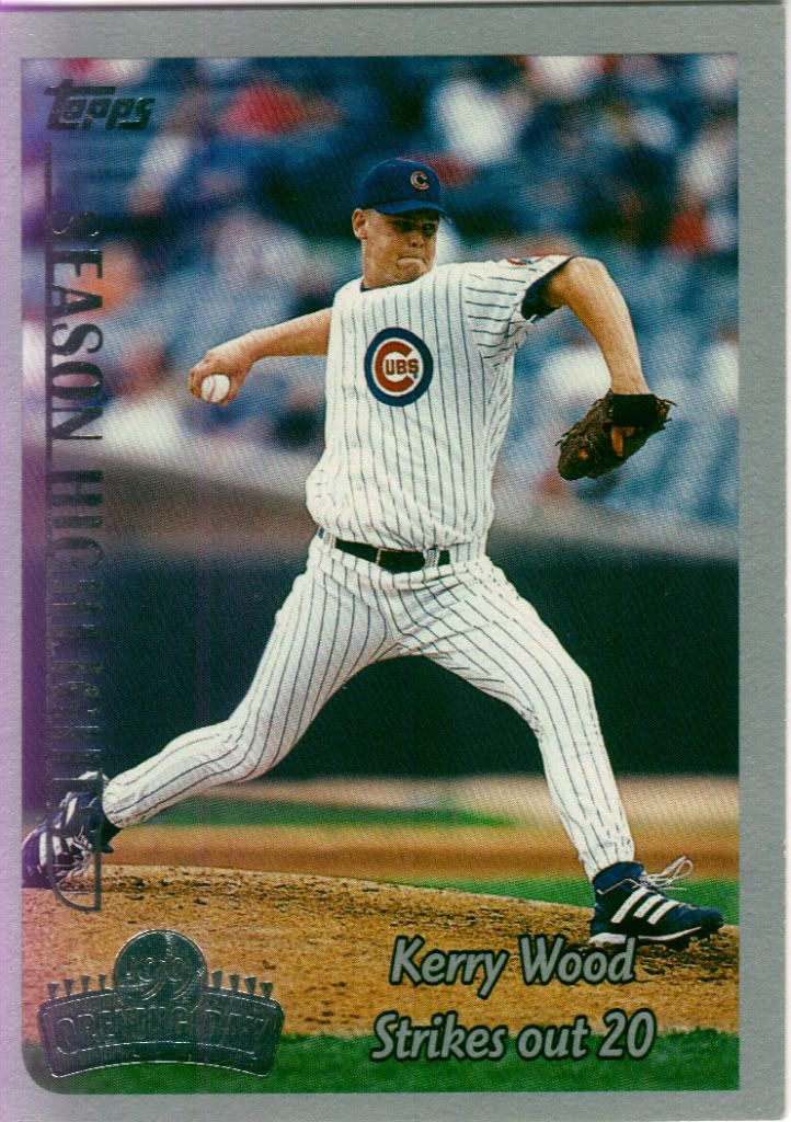
There will be a lot of cards about this accomplishment
Remember when Opening Day cards had the year as part of the stamp? Nope, me neither. If they’re going to have foil, that’s not a bad way to do it. I’d be lying if I said the 20K performance wasn’t a reason I started my Kerry Wood collection. Even as a person not following baseball at the time (or any sport by that point), it was big news and made me happy it happened to what was becoming “my” team.
Thanks again to Henchmeister’s Junk Blog for the quick and easy trade. Please, if you have any spare Wakefields or Ryan Kalish or Ellsbury cards in your possession, consider sending them his way won’t you?

Kerry Wood is a local guy…for my locale that is.
Sorry, that’s all I have to say and I hate to see a post without comments!