
There hasn’t been much movement on this blog for a while. I don’t like to see it sit and languish like this, but sometimes you have no other choice.
I could go through all the reasons why the posts each week have been slim-to-none, but why bore you with the same old stuff. You people understand. Most of you have down spells, too. Ours has just been prolonged comparatively.
I’m sad to say that chances are the down spell for me personally will be continuing for a while longer. Most of the reasons for the blog absence are positive ones including (but not limited to — sorry, I get caught up in lawyer speak sometimes with my job) business opportunities or holiday gatherings or my upcoming 10-day European honeymoon. These obstacles won’t last forever, and I promise we’ll get to a day where we do something other than play catch up with our trade posts.
There’s a lot going on in Cubbie-land right now, and in the hobby, and I’d like to get back to diving into some of that stuff and giving my perspective, which I’m sure you’re anxious to hear.
But if you the desert of more reviews, box break videos, hobby analysis, and other randomness that made us famous well-known one of many obscure blogs, you have to eat your trade post veggies.
The mountain of brussel sprouts on your plate tonight comes courtesy of Tom from The Angels in Order. And I do mean mountain. By the way, I legitimately like brussel sprouts, so this is a fantastically mouth-watering mountain to consume.
It’s such a large portion, in fact, that it can’t be digested in one sitting. With 58 different Frank Thomas cards I didn’t have before and 33 new Greg Maddux cards, I’ll have to freeze about 2/3rds to thaw out another time.
Ready to dig in? Don’t be shy, it builds character.
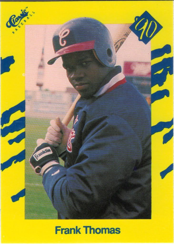
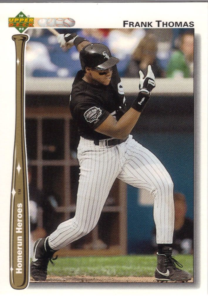
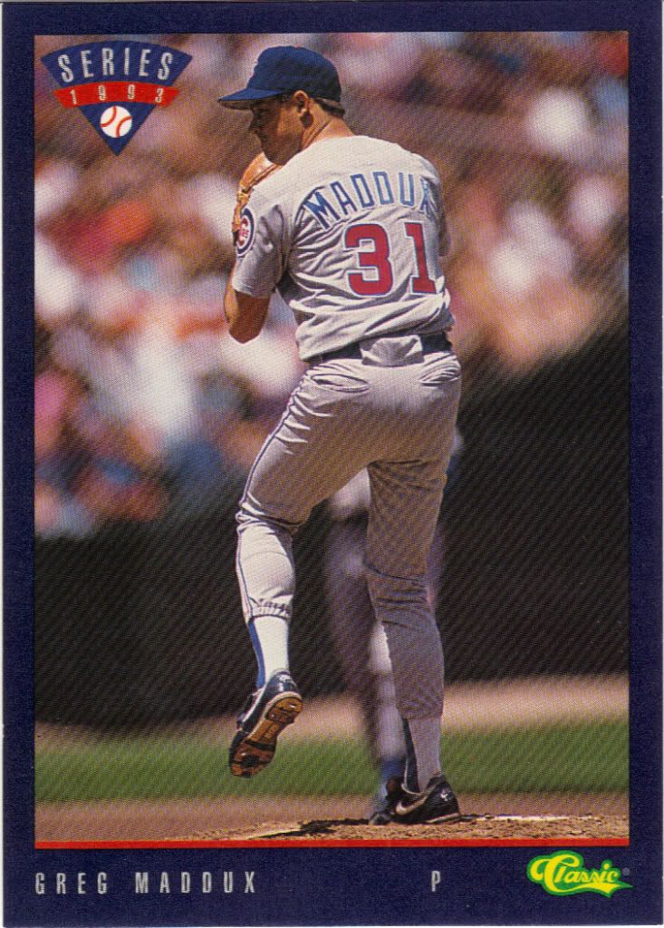
Starring Frank Thomas as A.C. Slater
Wake your lazy eye-holes up! You need to be alert to make it through my mostly coherent ramblings. I love the “Saved By the Bell” borders from these classic Classics. You know what else is classic? That cursive C on the ol’ noggin. Too bad no one is being taught cursive anymore. I know I forgot how to write using it by the time I hit middle-school.
Bright primary color back-to-back-jacks
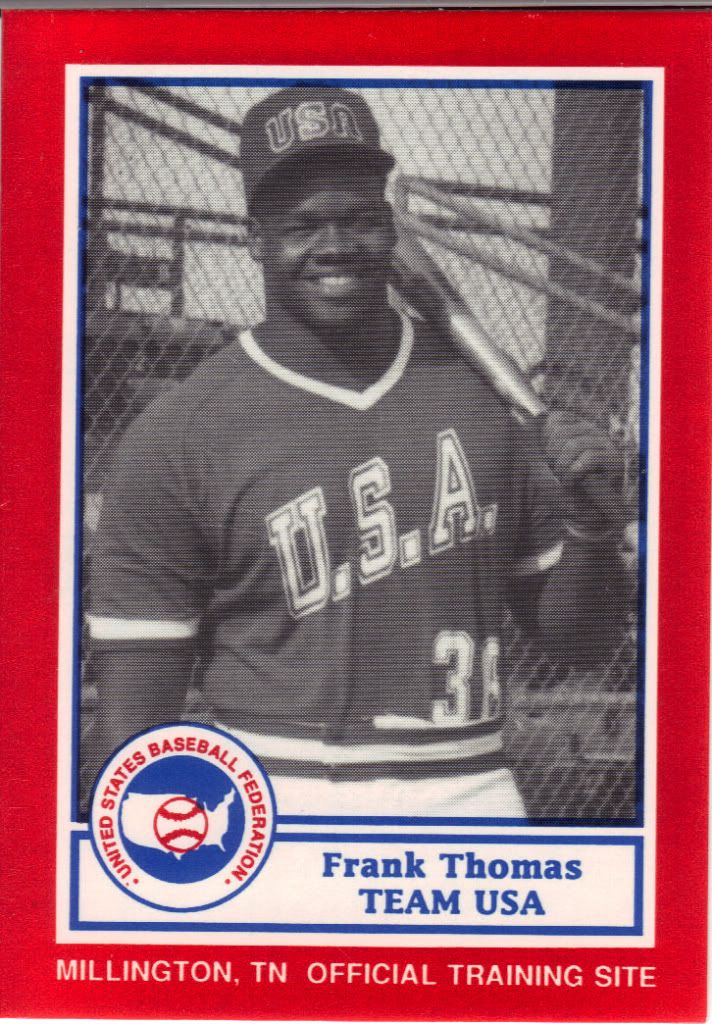
Tom had mentioned he found a couple cards that weren’t on my list (which was assembled using Beckett’s database). I know there’s some stuff in the SCD catalog that’s not in Beckett and vice versa, but naturally I assumed he meant there would be a couple broders in the mix. Instead I find this awesome pre-MLB beauty and another one you’ll see later. This card was on there, but may have been one he was talking about. According to my research, this 1990 card is a red bordered reprint of a 1987 (or ’88 depending on your source) set that originally came with a blue border. Also in the set is Jim Abbott and Tino Martinez.
Worked up a sweat climbing to high heaven
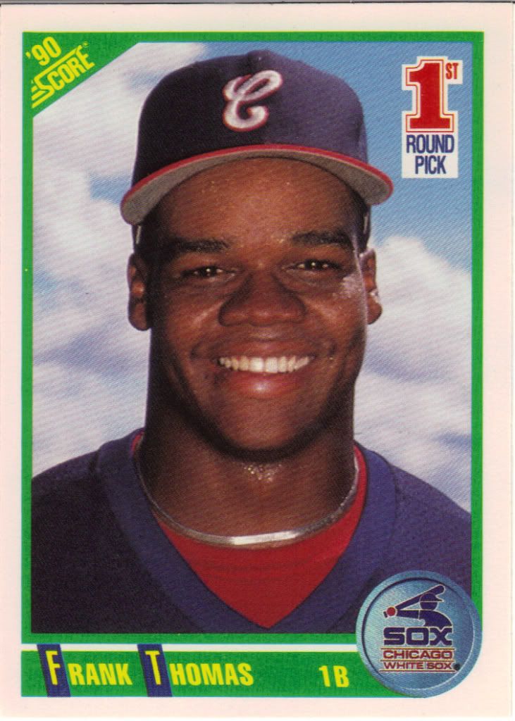
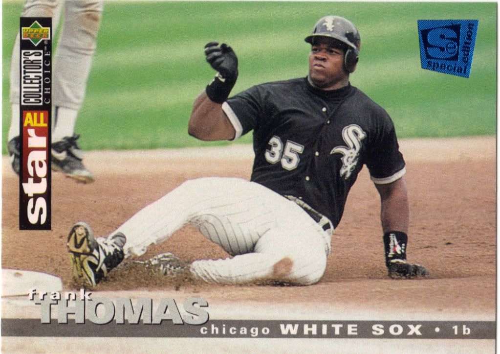
The first three cards I’ve shown today are my current 1-2-3 in the top row of my first page. Not a bad start to the binder, right? Frank was the 7th pick in 1989. The best name to go ahead of him was #1 overall pick Ben McDonald, but Frank was the highest pick to eventually end up an All-Star selection (and will be in the HOF). Also picked in the first round was Scott Burrell who ended up having a 8-year career in the NBA including a championship run with the Bulls.
These are not the minis Night Owl is looking for
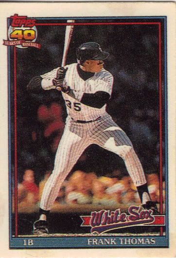
No, I didn’t size this scan wrong. What we have here is the Cracker Jack version of FT’s 1991 Topps card. I was never a big fan of the snack, but I remember going to Cubs games and buying Cracker Jacks at Wrigley only because of these cards. We bought them away from Wrigley too, so I probably should have gone with the hot dog or ice cream with wooden shard/spoon. These are about the same size as the Topps Mini sets, but maybe a little bigger. I’ll have to do a comparison sometime if I remember. Even so, the Cracker Jack cards have a distinctive back, whereas the minis completely mirrors the set card.
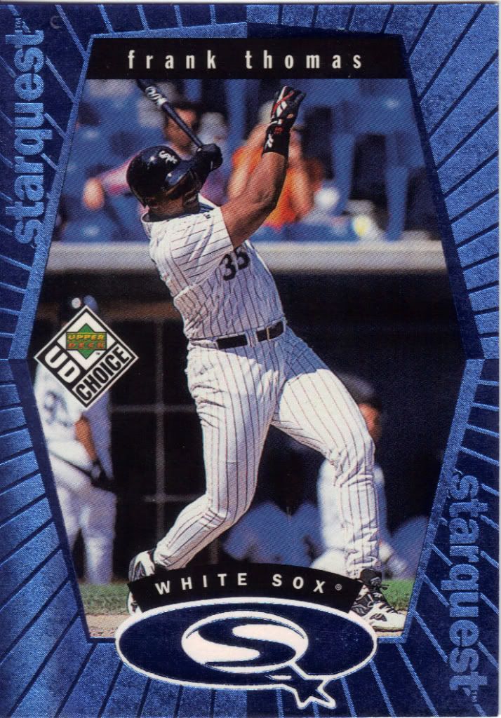
Is the insert name trademarked or the gold bat logo? If it's the name, UD may have a revenue source to chase
This goes to show how cynical I’ve become. This card is from 1992, which means Frank has had 1.5 years of experience and 39 career home runs to his name at this point. The 12 year old me that might have found this in a pack would be excited by the shiny gold bat and wouldn’t question the idea of the Big Hurt being included on that list. The 31 year old me seeing a similar type set today would see a second year player and scoff “Hero? We’ll see Mike Stanton, we’ll see.” Damn life, ruining simple things like optimism.
Don't it make you want some Ho-Ho's?
Hostess cards were prevalent in our house. I’m sure I have this back in the parents’ basement along with 3 full sets. What can I say, we like our snack foods. Still, I’m happy to not go searching through old bins to find it.
Summoning the mystic power of himself
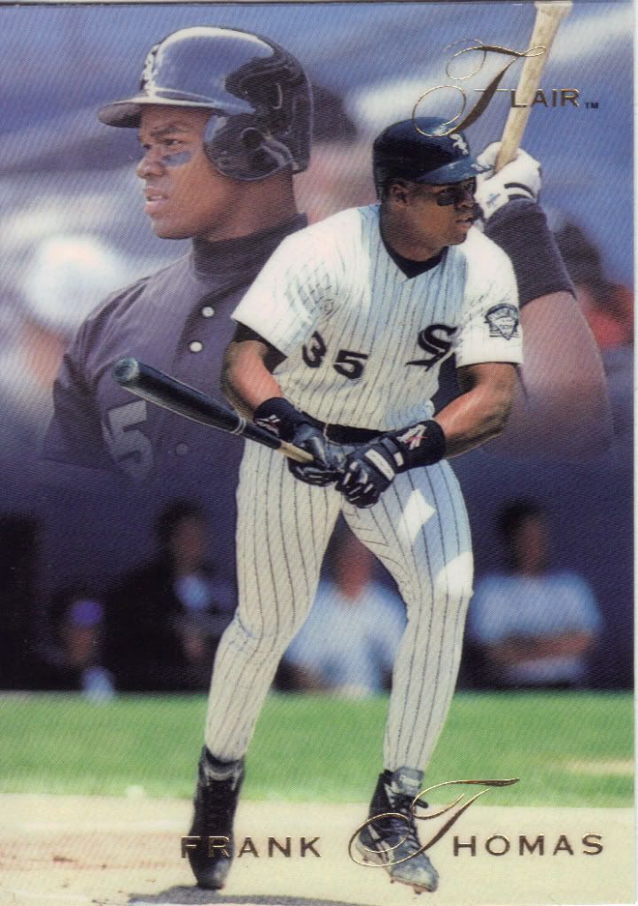
Aside from Sportflics, I think Flair would be my next choice for brands to revive. Of course, I say that now knowing full well I’d be disappointed with how the card companies ruined the brand and would be ranting like a lunatic about how they never should have brought it back! For Shame! <intense teeth-gritted finger wagging>
You're the best. Around. Something gonna something something down.
This is the other one I think “wasn’t on the list.” That’s because it is a broder (aka unlicensed “promo” card). Still, it’s on the list now and I have no qualms about putting the unlicensed varieties in my binders. They’re part of cardboard history too, after all. I tried to find more info about this but came up short. The back says it’s from the 1993 Chicago National and only 7,500 were made. I know from card show experience that they usually sold at random tables for $.50-$1.00 and I may have one of these hiding back at home too, even though I didn’t go to any National. By the way, I think more cards need to incorporate neon signs. That is not sarcasm.
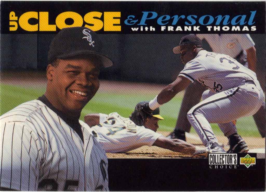
Maybe a little tooo close. Yeesh, what's with that picture?
Sounds like a talk show title, doesn’t it? On today’s episode of Up Close & Personal, we chat with Rickey Henderson about getting picked off like a mub. The back details how he has “DBTH” on the inside of his cap. It stands for “Don’t Believe the Hype” which means he was either trying to stay grounded, or he’s just a huge Public Enemy fan. On the inside of his waist band it says “Elvis was a hero to most…”
Oh glove, you so funny! When did you get so hilarious?
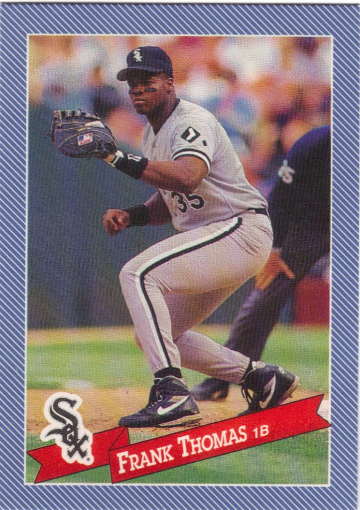
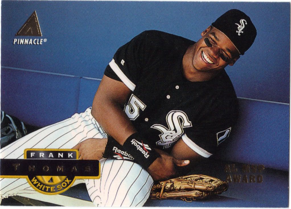
May I present to you Mister Grounded. Your AL MVP for 1993. 13.4 AB/HR. Now I think you can call him a Homerun Hero.
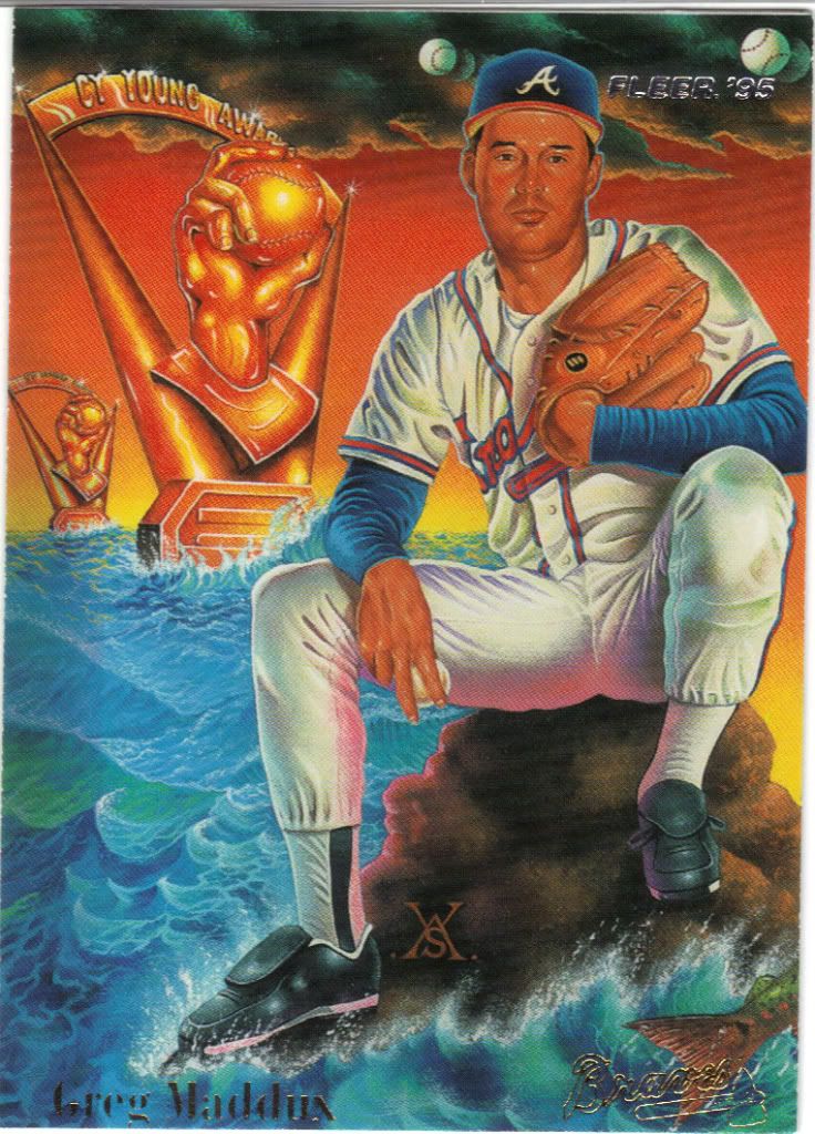
That award he won? Oh, just another AL MVP. That's all.
I still don’t get how the set can be so hideous while the inserts are so sweet. Raised silver foil accented with a fake metal rivet? Who wouldn’t like that? This is back when a large amount of foil was still reserved for inserts or classier sets. Let’s go back.
Have you seen this boy?
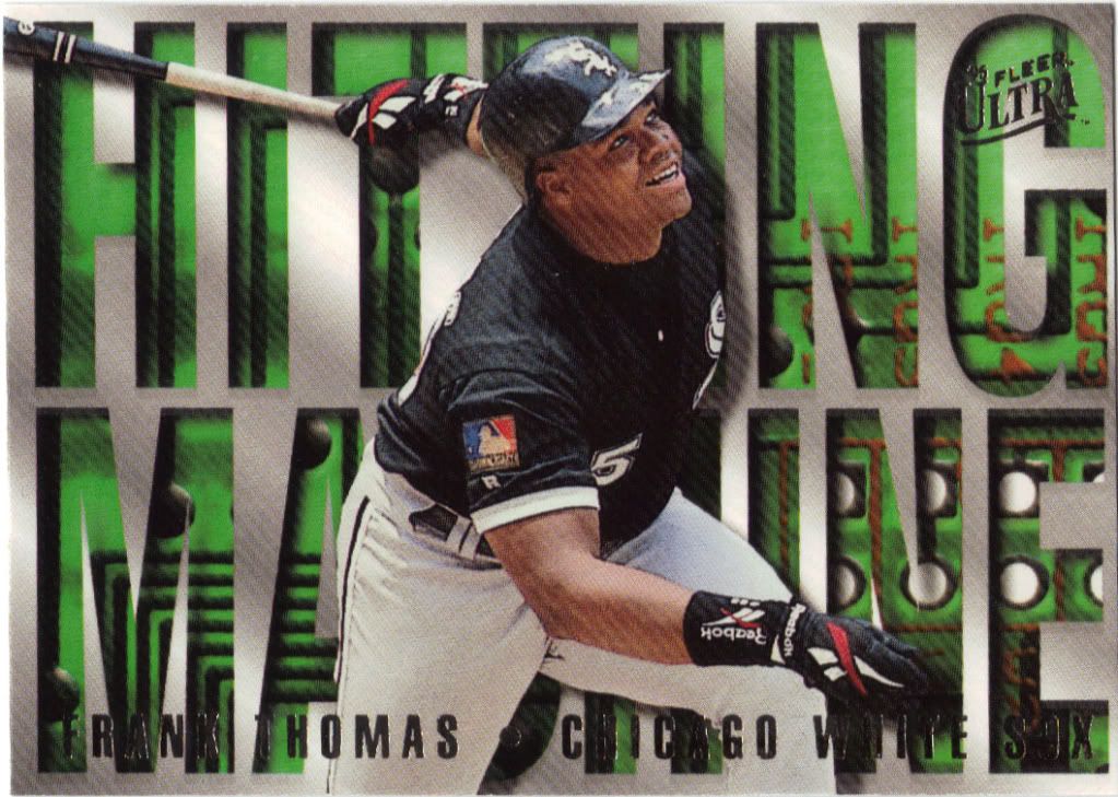
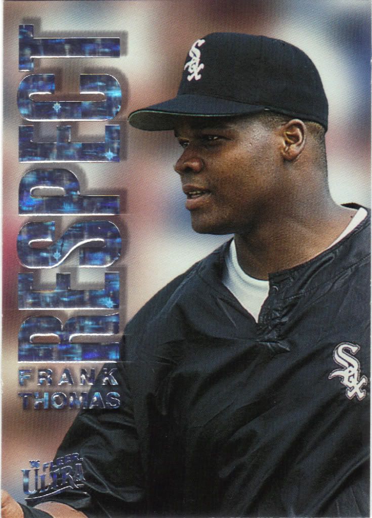
Ultra on the other hand didn’t so that well on some of their inserts. That’s supposed to say Hitting Machine. I get what they’re going for, but it’s way too big and missed the Terminator 2 boat by about 3 years. Smaller, readable text and more flash & sparkle along the circuits would have been awesome.
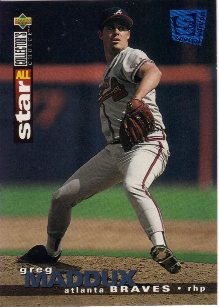
Evidently the SE was a separate set
This picture is awesome. It’s probably just me, but I think it makes him look British. Can’t you imagine him saying “Now see here, my lad, I shall take my tea at third base today.”
Is that a 1990 Topps card I see leaning up against his hand?
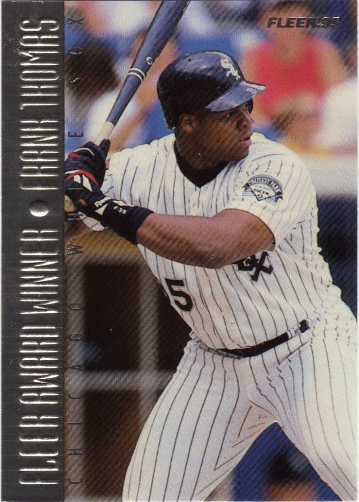
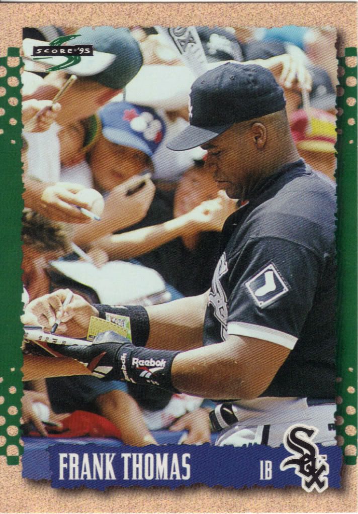
Here’s something you don’t see a whole lot: 1995 Score. Later years of Score were kind of forgotten and I can see why. Doubt you’ll ever see a blog dedicated to this set. You also don’t see many pictures of Frank not swinging a bat. Maybe ’95 Score isn’t all that bad after all.
Nah, still bad.
Should have used this stuff on the Hitting Machine insert
Respek!
Hmmm, photoshopped the Reebok off the gloves
This looks like a food issued card (similar to the Hostess card above). Congrats if that’s what Topps was going for. If not…. The back is extremely spastic. Spastic to THE EXTREME! There’s Bazooka Joe in an Expos uni, crazy colors everywhere, something that looks like a joke but clearly isn’t (In green text – “Metal Dude’s Mom calls him to dinner:”, in white text “Metal Dude is discarded.”). What can I say, adults know what kids like.
Could they maybe put the Ultra logo somewhere other than the armpit?
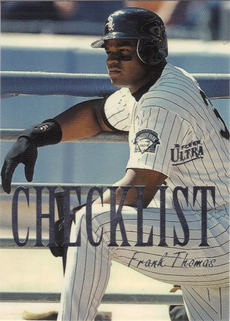
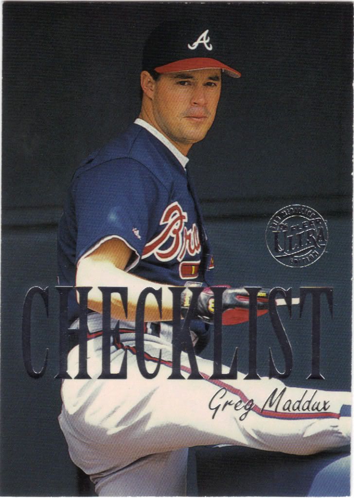
Here we have the perfect checklist card, because you can tell he’s making mental checklist of people to destroy on the diamond. And he’s got them all.
I can see panty lines half way down his thigh
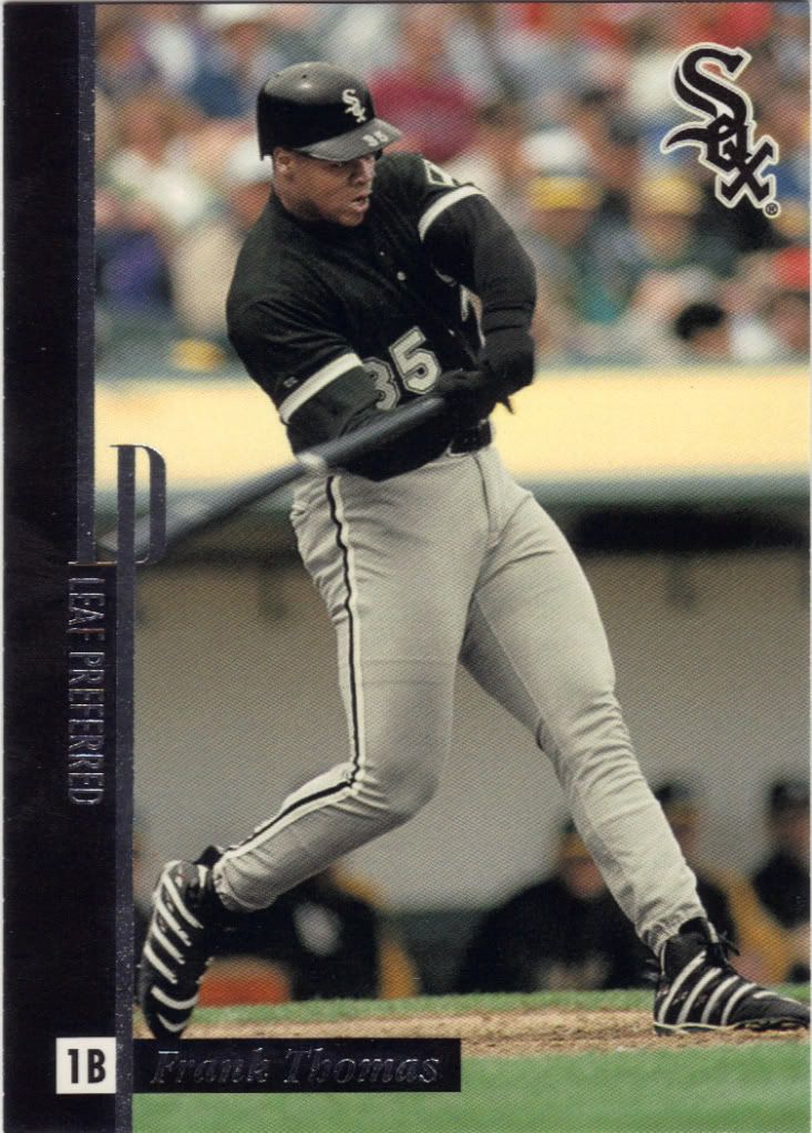
I’m not sure if I prefer Leaf Preferred. The front is nice enough, I s’pose, but the back offers little more than a single line of stats and a different picture. By this point, I expect an attempt at a blurb. Is that asking too much? Even a tiny write-up shows effort. This feels empty.
Love the mini Sox logos in the name box
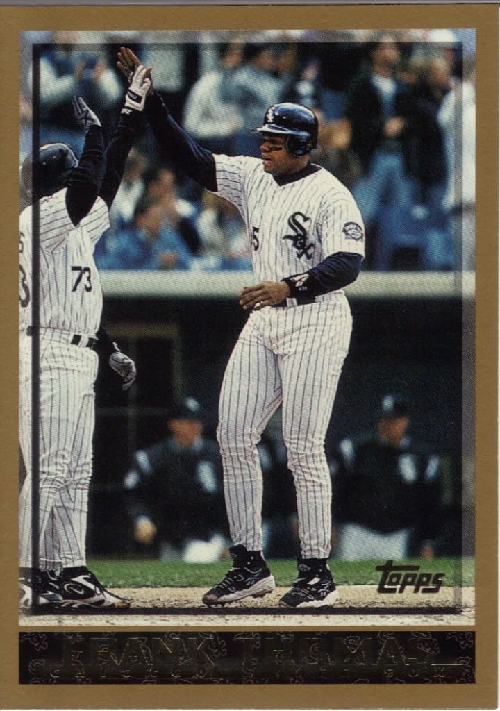
Sweet, I got the gold border! What? They’re all gold border? Well then how did they do the parallels? What? There are no parallels? Yes! High fives all around!
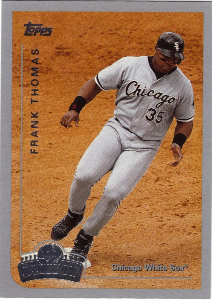
Don't step on the Opening Day logo!
You know the rule by now. If there’s Opening Day, it must be shown. Obviously the set is lucrative enough to last this long. It makes me wonder why they aren’t trying another low-budget kid friendly release mid-season. That’s probably a post for another time when I have time to expound on such thoughts.
What a marvelous scan
I started to dislike Collector’s Choice because of their StarQuest nonsense. What they fail to understand is that budget releases start to move away from that when you have parallels of inserts like this. When you start including rare cards, the product goes to hell. Speaking off, I still need gold, green, and red versions of this card and the next one.
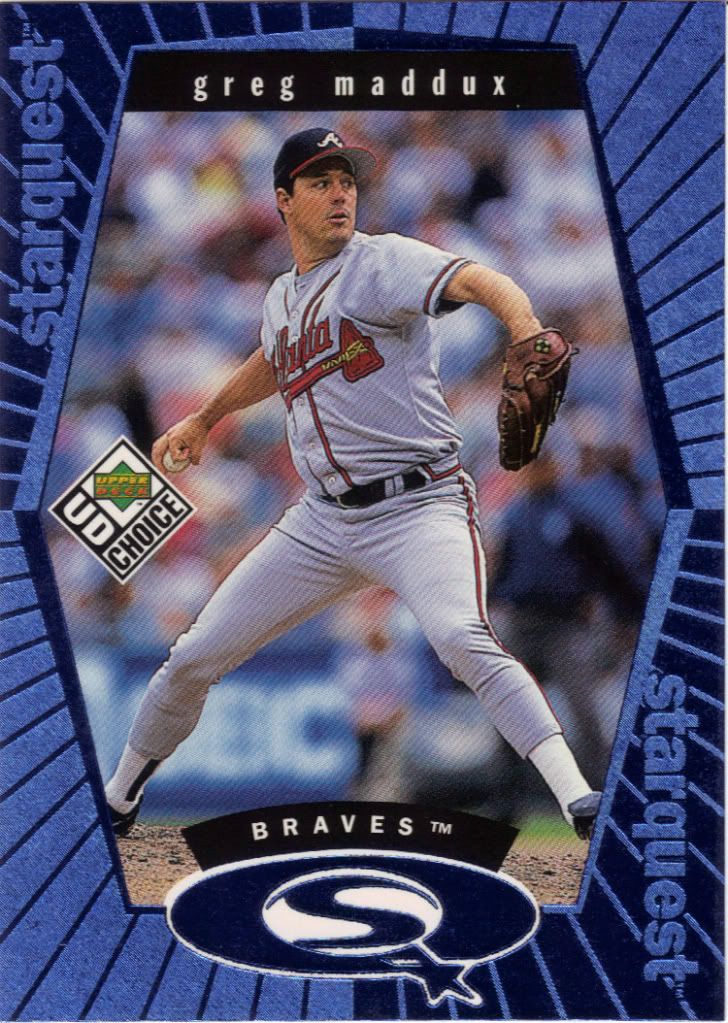
Would look even better in a Cubs uniform
I figured this would be a nice transition to the Maddux portion of the trade. Of course, by announcing the segway, it loses its effectiveness.
Hey look, more cards!
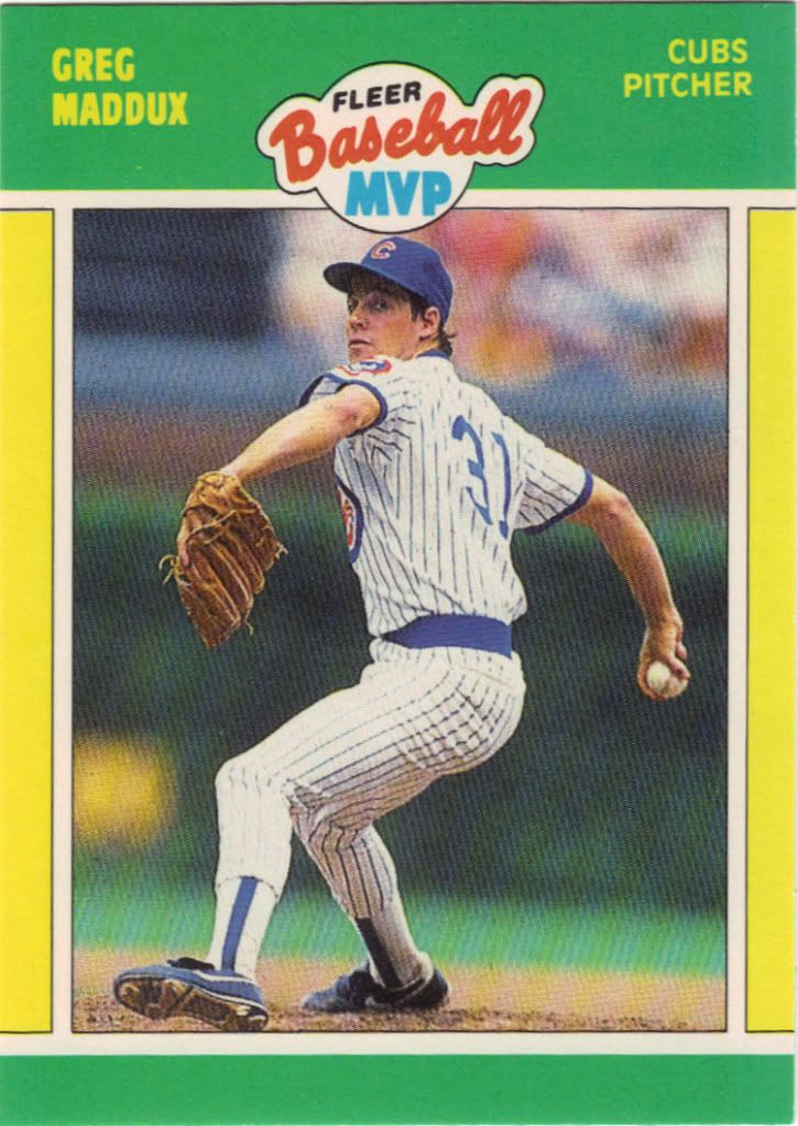
Bland upon pukey bland
What an odd little set this is. Even in 1989 I would have thought this was disgusting. Take the pissiest yellow you can find and mix it with the most vomitous green available and surround your subject for now reason. I feel this is the sperm that reached Fleer’s 1991 egg.
Where'd he go?!?
Remember when we were at war with Iraq? What silly times. I don’t know exactly where this card came from, but the Desert Storm theme is strong with this one. Even for a 1993 release. The back indicates a tie-in with Coke, but I refuse to do further research because I’m an ignorant American, dammit!
Classic = Forgettable
Classic isn’t as fun without the wacky borders. I don’t care if it still has the trivia questions on the back, I don’t feel wild and care-free anymore. You’ve changed in your old age, Classic. Now you’re all grown-up and reading the paper and talking about the stock market and listening to Jazz and Big Band. What happened?
Also available in signature formats
What made the Special Edition so special? I think I need more of the non-SE Collector’s Choice to find the answer for myself. If it’s the same picture with a different card number and a foil stamp, I’ll be disappointed.
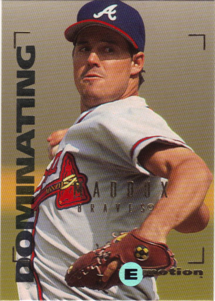
Always thought these cards should have movement
I love Emotion cards for the simple fact that very few of the emotions cascading across the card are emotions. I’m amused by the confusion between all verbs and emotions. Sure, you can feel dominating, but let’s be honest with ourselves here. It’s a stretch no matter how you slice it.
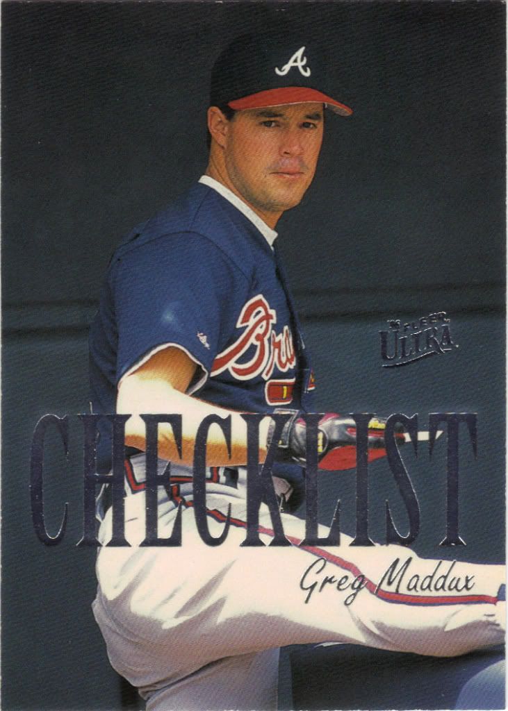
Emotion: Embarrasing
This isn’t as intimidating as the Frank Thomas checklist above, but at least they kept the theme of placing the player’s name on their leg. Why do companies tend to pick dugout and other down-time pics for the checklists?
Emotion: Confusion
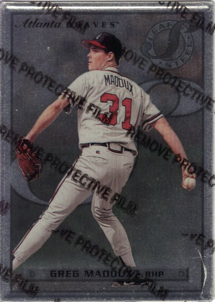
You may think this is a double. I know I initially did. Look at the Ultra logo and you’ll see it’s the Gold Medallion parallel. You’ll also notice that there’s no gold to be found on the card. Just a tiny bit more foil. Yes, they paralleled all their inserts. Yes, the checklists are considered inserts. No, I don’t know why any of this paragraph is true.
Real Steel starring Hugh Jackman
I better not touch this card, because this insert is made of actual metal, and its getting cold out, and my tongue might stick to it! What am I doing pressing my tongue to cards? What aren’t I doing is the real question!
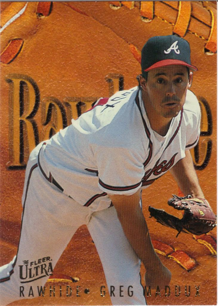
Bonanza! Ponderosa! Yahtzee!
Textured cards was always a strong suit for Fleer. The Rawhide card may not feel like a glove, but at least it has ridges and bumps and feels different and special. What’s still visible in the word Rawhide in the background is even raised on top of everything. It’s a really cool feature for a 1996 card.
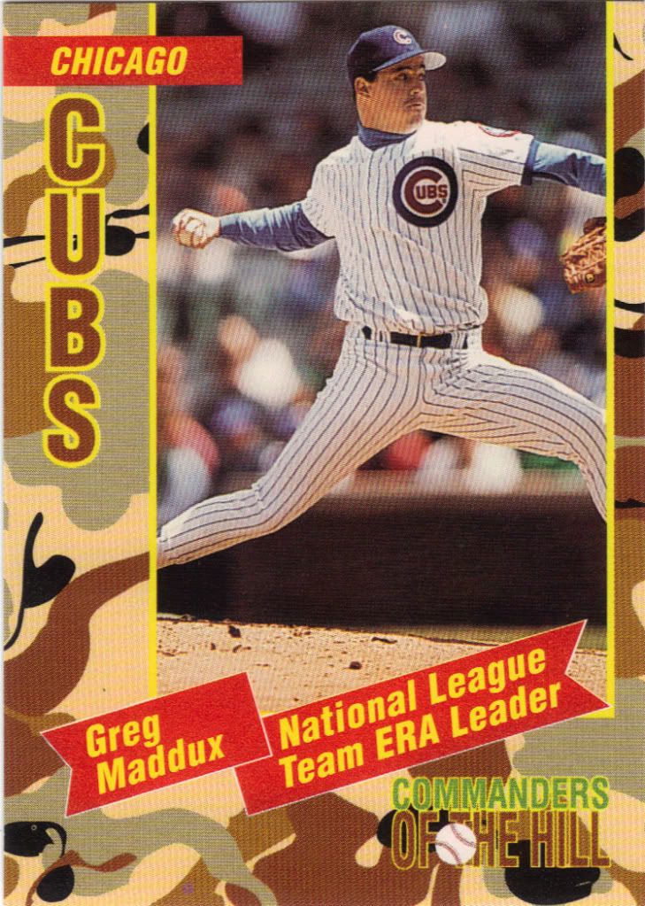
Well...yes and no...
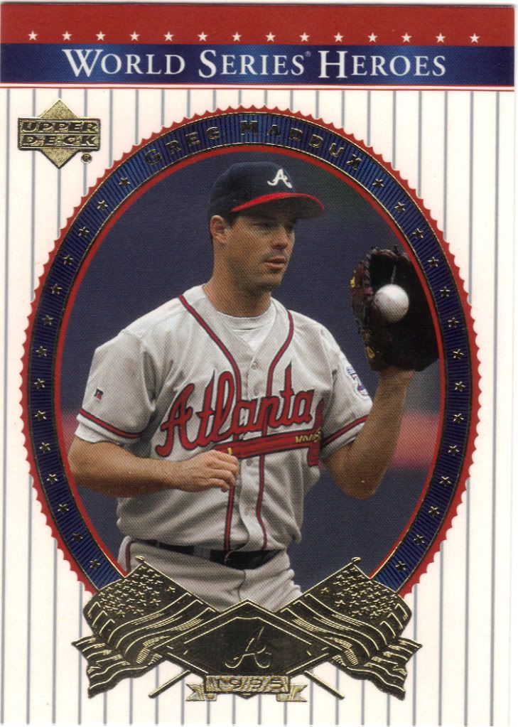
Game 1, sure. Hero to the Braves. Got it. Game 5 didn’t go exactly as planned. Yeah, he pitched well, but not well enough for the win. The Braves still beat the Indians in game 6, so it’s all good Mad Dog.
Like any other drawing would make sense
I figure I’d leave you with this. Does it really need explanation? All you Evolution of Man fans from 2011 A&G will remember that this Provision insert set forms a loose puzzle itself. Feel free to debate the bad-assery of each in the comments below as your prize for making it this far. Personally, I think the choice is clear.
A huge thanks again to Tom of The Angels in Order! I’ll have blog fodder for days with all the stuff that wasn’t shown tonight. Please dump all your unwanted Angels upon him. I have plenty more after my recent group break that I can send his way, but we’re all in this together.
Now let’s have some pie!
Cannot. Stop. Laughing. (At that last Maddux card)
Brilliant writing, you must feel DOMINATING. Glad you enjoyed the cards.
[…] the Frank Thomas cards coming up are from a previous trade with The Angels, In Order completed in late 2011. That trade just happened to be so massive that I couldn’t possibly have posted them all in […]