In the spirit of catching up on unfinished business, here’s a belated review of the case of 2011 Topps Finest we broke back in October or so. I’d really like to get at least one review up a month since I personally enjoy reading other reviews, so someone hold me to that please. Anyway, as you may recall from that there breakdown and our lovely video of the proceedings (visible below), this was the first Finest I’ve ever opened. But you’ve waited long enough (like 4 months), so let’s not delay any further!
Main Set
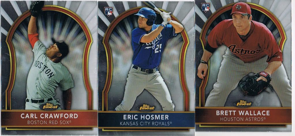
Topps Iconography
The base set is rookie-heavy. Like, as in, most of the checklist. I included the Crawford up there specifically because there’s some serious Catholic imagery going on here. Someone in the Topps design shop grew up with icons on the wall and that Crawford is the most saintly of them all. That being said, I don’t really hate this design. They’re all very shiny and crisp (a touch of bowing) and, while I much prefer a card with a full photo on it, the conceit of the Finest design doesn’t really bother me. I will say that, if I were the type of collector who collected a certain player or team, these cards would not be my top priority. Each and every one of them just smacks of superfluous. As if, in 10 years, we’ll see cards like this and say, “Oh right. There’s that base set I thought was an insert set that I didn’t particularly care if I completed.” Of course, I am notoriously hard on base cards, so take that with a grain of “to each his own” if you’d like.
One of the real problems of the base set is the time this product was released. Other than Hosmer there (who, as of a few months later, would be similarly overexposed), the checklist is a whole lot of guys with cards in other products. How many RCs does Brett Wallace have? Alex Cobb? And Mike Moustakas was in 2008 Bowman Draft so even he seems unnecessary. I know that’s a common complaint- and one that’s often dismissed as nitpicking. But if the recent explosion in mid-to-late-90s inserts has taught us anything it’s that cards with legitimate scarcity will always hold the most value. With no clear “one RC to rule them all” for these guys, the value of all their rookie cards is diluted. All I’m saying, Topps, is be mindful of overproduction. A long time ago, I called this current era of collecting the Junk Prospect Era. I stand by that. And rookies with a dozen different RCs (and parallels and First Year cards) just confuse and annoy collectors. Well, collectors like me at any rate.
Inserts and Parallels
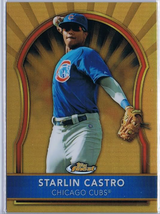
Golden Boy.
Speaking of parallels, Finest has them in spades. And they are confusingly numbered. See this Castro up there? He’s #/50. When I think of “Thee Refractor” I, of course, think of Chrome. Bowman Chrome and Topps Chrome set the standards for refractors and colored refractor parallels. So, for some reason, I expect everything called a Gold Refractor to be #/50. Is that so unreasonable? More on this in the next section.
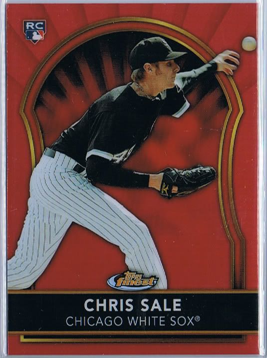
"Sale"d for $2.
Anyway, we pulled a ton of color of course. Apart from the usual refractor (#/499) and x-fractor (#/399) versions, this product has green, orange (#/99), gold (#/50) red (#/25), die-cut mosaic (#/10) and purple (#/5) versions. This year they added canary superfractors to the usual superfractors (both #1/1) and there are printing plates as well, making for quite the rainbow. We were lucky enough to pull this beauty, a canary superfractor of Kevin Youkilis:
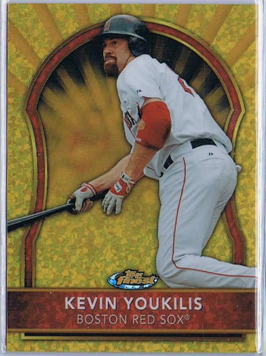
You killin' us!
I was surprised not to see a purple or mosaic in our case. I guess they can’t all be winners, but the die-cuts look pretty sweet.
I was also surprised to find that there are inserts in this set. It seems like people who collect this sort of stuff wouldn’t be that interested in another version of essentially the same thing, but there they are.
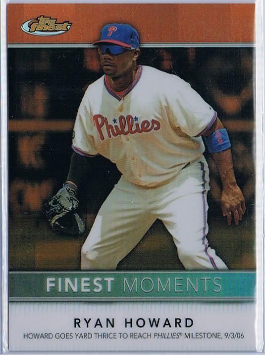
In The Godfather, oranges usually mean someone's gonna die. In this case, it means someone's gonna snap his achilles tendon. Too soon?
I actually like a couple of the insert sets. I do not, however, like these orange parallels of them. When we’re getting parallels of inserts, we’re really nuking the fridge. What’s more, this particular insert set has not only orange parallels, but also an auto/relic version which function as kind of bonus case hits. I’ll show that one below in the section called…
This one is #/24 which, as far as I can tell, is totally arbitrary. Which, to me, says, “value-added sticker leftovers.” But then, I’m the cynical one.
Hits
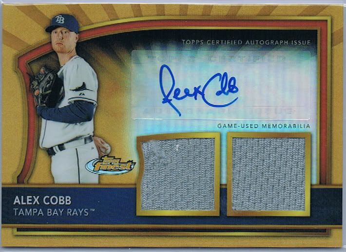
69, dudes.
This set has only two types of hits: autos and dual relic autos. No regular relics, no single relic autos, no triple relic autos. That’s fine by me because, as you’ll likely be able to tell from my forthcoming rant(s), all I really want out of life is some consistency so my OCD mind doesn’t blow a gasket trying to figure out what the hell comes out of these boxes.
See that Gold Refractor up there? It’s even better than the Castro because it has two jersey pieces and a (stupid sticker) autograph. And it’s #/69. Apart from being a hilarious number, it’s also annoying that it’s not just numbered to the same thing as the other Gold Refractor. And the gold refractor autos with no relics (we didn’t pull any so no picture for you)? #/59. That’s just an example, but the point is that the idea of “I got his Gold Refractor” should mean something across the board or you should call these parallels something else. Maybe only Chrome gets to call things “Refractors.” Maybe only Chrome gets Gold. I think that would increase the value of refractors all around. It makes them special. Putting them in every product every year and picking half the numbers out of a hat makes for lots of $1.89 + $2.50 s/h sales on eBay for cards like this. My point is that those inserts that people chase (the Star Rubies and Valiants of our youth) hold value because they have what we in the marketing biz call “brand recognition.” Chrome has that for now- but every year Topps releases 10 products that piss in Bowman Chrome’s Kool-Aid, that brand recognition dies. I predict that, someday very soon, the tide will turn on Bowman Chrome. It may take another manufacturer to step up and provide the Young Guns of the baseball world, but it will happen. /rant (for now).
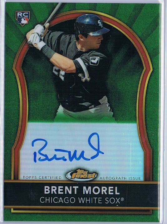
If this guy doesn't get called "The Mushroom" at some point, I will lose all faith in baseball.
Autos come in the same configuration as the base cards when it comes to color, except that there are no base autos and the numbering is different for no reason at all- the scale starts at refractor and goes from there. Which means each auto in the set has a refractor (#/499), x-fractor (#/299), green (#/149), orange (#/99), gold (#/69), red, die-cut mosaic (#/10), purple (#/5), superfractor and printing plate. No canary autos. And only some of the numbers match the base numbers. And, as the example with Cobb shows, not the same as the auto relics, which play out as refractor (#/499), green (#/199), orange (#/99), gold (#/59), red, die-cut mosaic (#/10), purple (#/5), superfractor and printing plate. No x-fractors. So you’ve got three things in this set called gold refractors, each numbered to different numbers. I know it seems like a minor gripe, but I truly believe that Topps is damaging their own brand values by assigning what seem like arbitrary numbers to these parallels. #/50 seems like it means something. What, I don’t know. But something. Stick with it is all I’m saying.
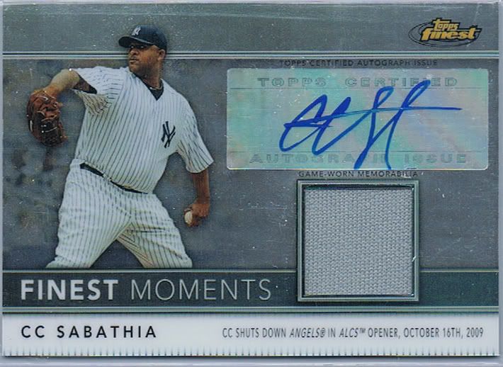
- Bonus sticker dump!
Speaking of sticking with it, here’s that Finest Moments auto/relic case hit I mentioned earlier. And speaking of not sticking with it, it;s numbered to an arbitrary /24. Which seems to say to me, “value-added extra stickers” or whatever. For the most part, this checklist delivers though- some really top names for these. And they have parallels of their own. So, if this were the orange, purple or superfractor version of CC up there, it would be a parallel of an insert that is essentially a parallel of the base set. We’ve gone to plaid. What happened to simple insert sets like, “Grass Is Always Greener!” where it was Cal Ripken’s face on a background of cheesy grass clipart? Wait. I just made that up, but it dawned on me that it might exist. 1996 Fleer, maybe?
Conclusion
So it probably sounds like I’m pretty down on this set. And, really, I’m not. All the fun colors and inserts and stuff make for a fun and exciting break. And, ultimately, Jon and I almost broke even on this case- paying probably about $100 for the pleasure of ripping it once we sold everything off. If that sounds bad from a business perspective, well… that’s because it is. We open cases for the thrill of the hunt and to have stuff to talk about on the blog. I can’t complain that we didn’t get $700 worth of cards out of our $700 case of cards because, if it was that easy, everyone would be doing it. My point with all the criticisms about this set is that it’s indicative of where Topps is taking virtually all of their products each year. There’s no real continuity except in some super unpopular sets like Heritage and Allen & Ginter. Oh wait. Those are incredibly popular. They’re their own things. Yeah, Heritage has refractors, but nobody cares about those anyway. Point is, I think the hobby as a whole is growing tired of the verse chorus verse repetition of base/refractor/auto/auto-relic that is present in so many sets. I’d love to see them branch out a bit- Lineage did that to an extent, though it was still sucking on the nostalgic teat of famous Topps designs of the past. It’s time for something new, like A&G was in 2006 and Heritage was in 2001.
The question is: will Topps be the one to bring it?
Design – ***
Set Collecting – *
Parallels – ****
Hits – ****
Overall – *** out of 5

Finest is where refractors began and I think that they should stay there. Topps should cut back on using them in every other set out there though, I agree.
Chrome and Finest were good products this year because of the quality of the rookies, but there is less and less separating the who brands with each passing year. One comes in mini-boxes and the other doesn’t? There’s got to be more than that and the inserts that are different.
My thoughts exactly. And it doesn’t stop at refractors. Take a look at the Finest relic autos and the Marquee relic autos. They’re practically identical!
It’s hard to imagine a Chrome set without refractors. But we sure as shootin’ don’t need them in Heritage.