We’re here to quench your gruel-ing curiosity (I honestly don’t know where this metaphor came from and I apologize profusely). Come see what 5 cases can get you in our review.
By the way, if anyone out there has any desire to purchase a complete set from us, leave a comment or email us and we’ll get one out. Same goes for simple team sets, insert run-offs and golden moments parallels. We’ll have a ton of extra and we can send it for cheap.
Main Set

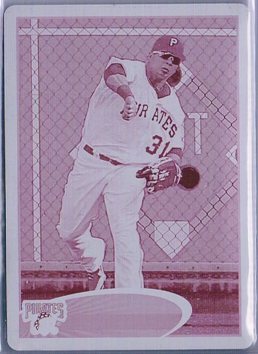
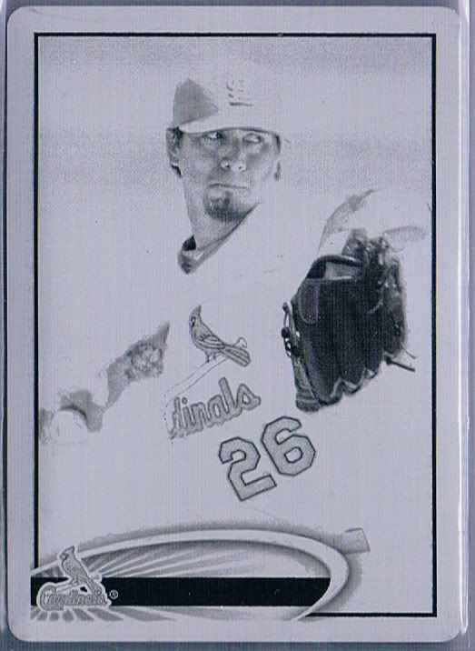
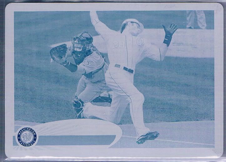
Yeah, I'm lazy with the scanning here. There's plenty of pictures later
The reactions to this years design are mixed. Personally, I like it for a few reasons. There’s some consistency between the flagship brand these past three years in my head. 2010 had the giant swoop. 2011 was dubbed the Baseball Comet set (you’re welcome), and this kind of has a rings of saturn vibe to it. I know most people say surfboard, and I don’t disagree. My point is they’ve all had circular or rounded elements and it feels like a natural progression.
The little starburst/sun rays within the colored oval help the cards feel a little less bland. The blandness seems to be one of the sticking points for those that don’t like the design. To that, I can only say that at least it’s not 2006 or 2008. This surfboard is unobtrusive but eye catching, simple yet effective. Thumbs up on this end. That sounds bad, but you know what I mean.
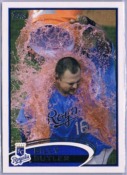
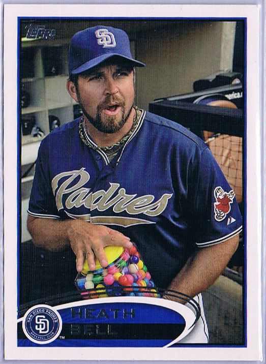
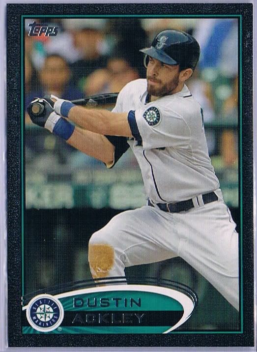
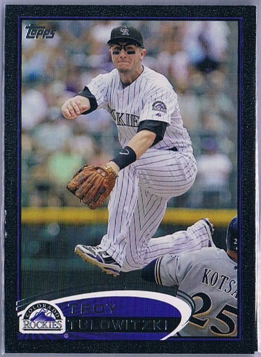
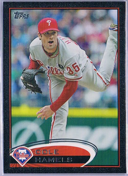
Even if you don’t like the main design element, I believe most of us can come to the consensus that the picture quality is improved this year. Sure, there’s still the usual suspects with mid-pitch or mid-swing poses, but there are more examples than in recent memory where the photographer captured a specific moment. The photography is quite dynamic, even if it doesn’t always translate (see Prospectin’ Ryan Roberts’ “There’s gold in them thar hills heel click” picture above). More often than not, however, the running theme of celebrations makes for some memorable cardboard. I can imagine the younger kids opening packs today growing up and talking about the iconic 2012 images of from their collecting youth. Scoff if you want, but there’s enough unique imagery here that it could happen.
So, is there a downside? Yeah, but for me it’s a small one. The player’s position isn’t listed anywhere on the front. I suppose it doesn’t have to be, but it’s odd not seeing it anywhere. They could have easily tucked it underneath the right side of the oval or above the team logo. Little things.

Let’s talk card backs and quality control. The upside is that the numbers are gigantic and surrounded by the dead of space. The upside is that we still get full stats, and they even go back and add a lot of minor league stats now when they can. The downside is that they changed the abbreviations for some of the well known stats for no good reason. “W” & “SP” show up for batters instead of “BB” and “SLG.” The downside is that most of the cards have 3B listed twice for batters. The upside is that this is the biggest quality control issue we encountered in our 5 case run.
The improved quality control was a big surprise. Especially in jumbo packs, we tend to encounter either badly miscut cards or several dinged cards. Almost everything came out unscathed. I think we tossed 10 cards total that didn’t meet our standards and there was 1 insert from the middle of the pack that was totally mangled. That’s it in 300 packs. I’d say they’ve stepped up the game this year. Or we got really lucky.
Parallels
I’m happy to report that the parallel levels have gone down in 2012. They only went down by one. And the one that’s missing is the Gold bordered version – in the Gold themed release no less. But that’s still one less version of the card collectors have to worry about.
Oh wait, there’s the new Purple border Toys ‘R Us variation this year. Long, audible sigh.
Replacing the gold bordered cards are these Golden Moments Parallels cards.
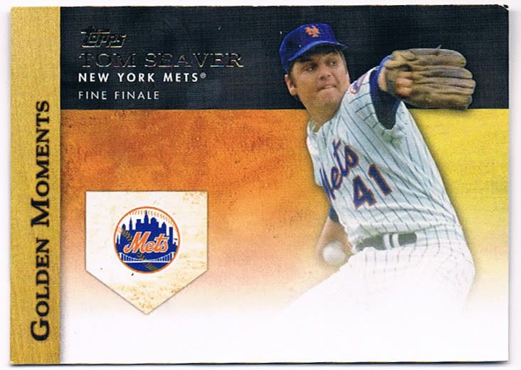
Now with a bottom fading into oblivion
Oh wait. These aren’t the Golden Moments parallels. This is the insert set with THE EXACT SAME NAME! What the hell is that all about? Did someone mess up on the packaging and copy and paste where they shouldn’t have and they ran with it? Or are they honestly trying to confuse collectors? It would be so easy to change the name of the parallel, especially when base cards have nothing to do with “moments.” Nobody calls the parallels by their right name most of the time anyway, so maybe I’m ranting over nothing, but I still don’t like the fact that a collector looking at a checklist months or years down the line will not know what’s what.
Oh, and you can’t forget the cards you unlock in this year’s online code program, which are ALSO CALLED GOLDEN MOMENTS! Pick. Another. F’in. Word!
Looks better in person. Promise.
This is the Golden Moments parallel. Imagine the Diamond Anniversary parallels from last year in a weird dark-yellow-but-not-quite-gold coloring and with smaller shiny separations. I know the scan makes it look like cascading urine, but believe me when I say that these look pretty and sparkly in real life. I like these more than the diamond counterparts from 2011. Some of you may find these look eerily close to the cognac/liquorfractor from Update, and I couldn’t fault your thumbs-down based on that. Still, I currently like them. Ask me in 2 more series and I’m sure my answer will change to “enough already!”
Just a reminder, we have tons of these, so if anyone needs a pile for a team set starter or is looking for a player let us know and we’ll quote you a nice low price.
Also reminiscent of cascading urine
Easily my favorite SP picture. I'm simple.
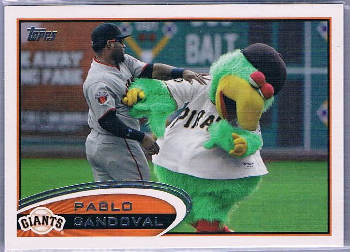
Settling the eternal question: Who wins in the battle of Panda v. Pirate Parrot
Let’s talk SPs, shall we? There are a whopping 22 of them to be found in your packs. 20 are “normal” short prints and the other 2 are super short prints of Pujols and Reyes. You already knew that. The SPs fall into a couple different categories: Dugout shenanigans, post-game celebrations/hazings, and mascot abuse.
In 5 cases, we found 10 including doubles of the Sandoval you see above (he also has one fighting the Padres mascot which we didn’t get). We found no rally squirrel, no Pujols and no Reyes. Don’t worry, the cases made up for it otherwise. In addition to the ones above, we also found the Hosmer (in the dugout), Bobby Abreu (dugout), Ian Kennedy (pie in the face), Ryan Roberts (pie in the face) and 2 copies of the Tsuyoshi Nishioka (dugout). Most of these would be better served as their base card, you know, to throw a little more pizzaz in the mix.
As a business, I like the SPs. I like being able to sell these for more than a typical base card, insert, auto, or relic would go for. Whether people are buying them out of legitimate interest or out of some sort of obligation to complete their master set or team/player collections I can’t say. I can say that people are interested and I like that.
As a collector, I hate the SPs. I’m glad that I don’t have to worry about any of them in this product for my guys (so far) and feel for those people who do.
You’ve seen my thoughts about how the whole SSP could be made slightly more tolerable, but as a whole I don’t see the appeal of picture variations. Can we get a rare insert instead?
#61/61, even!
Damaged on the left side, but something tells me hiflew won't mind. And that something is hiflew himself.
Even Cole is amazed at our luck
The Black bordered variations are back, and you’ll be happy to know the stamped numbering is too. No more printed/burned in/scratch off serial numbers (for now). The xx/61 is in foil once more. There’s not much to say about these other than to wonder out loud why they exist while the gold border does not. I could understand a little more if the sparkly parallel was numbered to 2012, but it’s not.
I will say that I’m quite happy they didn’t make the /61 parallel the gold border just to fit the theme. It would have been easy for them to do that, but would have ruined the consistency between years and no one would have been happy about that.
Our black parallels fell 2/case, like the SPs. I think we lucked out with our players. In addition to those three, we also found Alberto Callaspo, Allen Craig (WS subset), Casey Kotchman, Ike Davis, Jason Kipnis, Michael Young, and Pedro Alvarez. You really can’t ask for much better than that.
Jose Tabata Magenta
Kyle Lohse Black
Jayson Werth Cyan - SAFE!
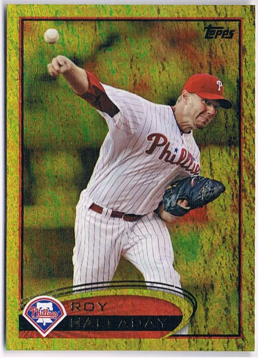
The product also has the gold silk parallels, but we actually didn’t find any in all the 300 packs we opened. That’s not really a bad thing, because this year’s silks look hideous. Imagine the silks you know from the past in some crazy yellow tint that makes you think the cones in your eyes have gone haywire.
If you’re going by the odds, we were “owed” only 1 printing plate at the most and probably about 4 silks (Platinum bordered 1/1 are much tougher finds). Instead we got 3 plates of, again, decent to really good players. I’ll take that trade off any day of the week. Printing plates may be over-saturated, if that’s possible for a 1/1 card, but I still enjoy looking at and holding these. It’s a rare experience and still feels unique for me.
It’s also pretty cool that we got three different colored plates (only missing yellow). As a collector, I despise the concept of 1/1 cards. Limited print-runs is one thing, but the mere existence of one-of-a-kind cards means that there’s no chance of a truly complete collection. It’s a sad thought and a reason why I limit my collecting to /50 and higher.
Inserts
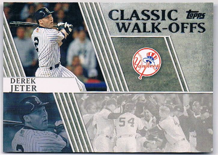
Go ahead and walk-off the inside of my packs, please
I already showed the Golden Moments insert above in my mini-rant. That one is this year’s equivalent of Topps 60 or Peak Performance of recent years. Not much more needs to be said about it that won’t be covered in my railings against the rest of the insert sets.
First up, the Classic Walk-Offs. My first complaint is that neither Kirk Gibson nor Bobby Thompson are included, but David Ortiz gets 2 cards out of 15. I understand rights to BT’s image may not be feasible (Kirk should be possible since he’s managing, right?), but there have to be enough licensed players to give us 15 different cards. And also from teams other than the Red Sox and Yankees.
My second complaint is one that runs through several of the sets and something
I talked about first back in September of 2011 when the sell sheets arrived. Topps has become Panini. I’m glad other people are seeing it and are equally repulsed. You can clearly see where the autograph and the relic window will go in the “hit” parallels. And if you can’t figure it out, you’ll see it soon enough (foreshadowing!)
This design approach is often seen as lazy, and I don’t completely disagree. At least for this particular insert the empty space is filled somewhat, but it still doesn’t work.
Let me be clear. My complaint isn’t that Topps is getting lazy with the insert design. It’s that they’re stealing Panini’s playbook. I want my manufacturers to be as different as humanly possible and as unique in their approach as possible. The more they blend together like this, the less brand identity they have and the less the company can offer consumers on the whole.
Bronze at best
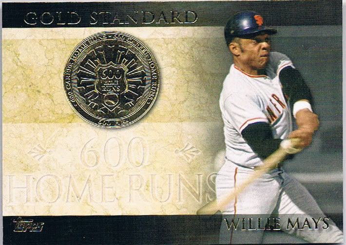
The Gold Standard insert looks like Panini and Fleer Ultra had a kid. The potential is here, but what ruins the execution is the faint text of the milestone achievement. You almost have to search for that “600 Home Runs” text in the marble. Not good.
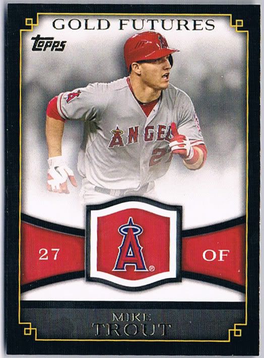
Tolerable. That's it.
Boy is that a lot of space devoted to non-player crap. Boy does this look an awful lot like a bowman card. Boy this would look better with gold foil around the border instead of a yellow line (think 1992 Fleer All-Star inserts). I will give the insert set its due for including the player’s jersey number on the front. I think that’s a key element that’s missing from far too many baseball cards. They also stand out more than other cards thanks to the black border, but really it just makes me miss Pinnacle’s Team 2000.
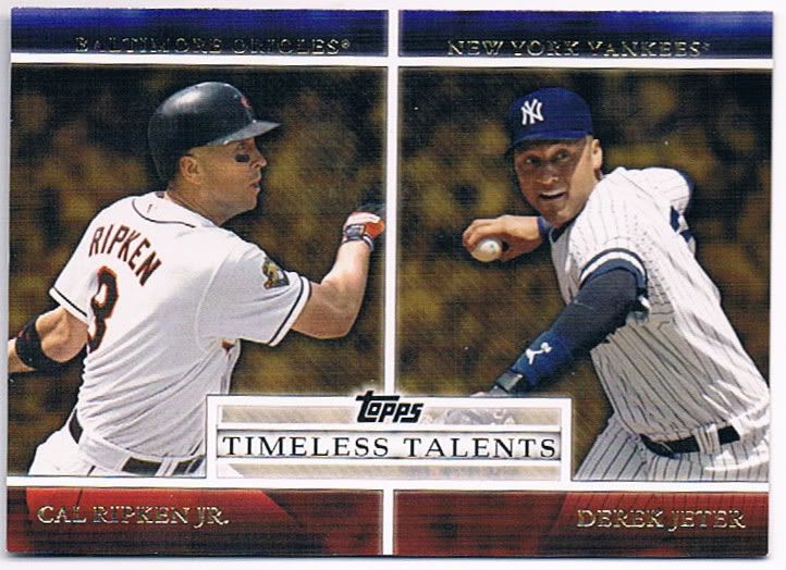
"Time" for a new idea!
You didn’t actually think you were going to escape the dual player insert card, did you? You may be missing a 60 years of reprints type of set, but the ridiculous pairing are here to stay. Jeter and Ripken? Enh. Okay. Willie Mays/Matt Kemp? Huh? Barry Larkin/Asdrubal Cabrera? Wuh? Ryne Sandberg/Dan Uggla? Uhguh? The worst part is that there’s no rationalization given on the back. It simply gives you their career stats, which obviously won’t compare. Really dumb.
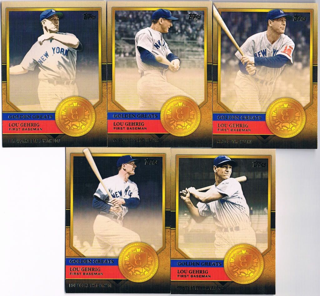
At least they used 5 different pictures
Golden Greats is a strange little set. Okay, not little. It’s 75 cards. What makes it strange is the 15 player checklist. Each person gets 5 cards. Again, think Fleer Ultra and their career highlights inserts of years past, but with multiple players. The design on these is semi-tolerable to me. You may not agree, but I think they would be better served with a gaudy foil medallion in the corner instead of that fake yellow coin. If you’re going gold, go for the freakin’ gold!
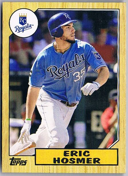
Love it or hate it, they recreated it pretty well
Ah, the 1987 minis. Easily my favorite insert of the bunch, and I’m not a fan of the minis. I think they executed these well. The backs look like 1987 backs. The fronts look like the fronts (although they’re missing the Future Stars rainbow for Hosmer and the like). The card stock is as close to authentic as you’re going to get these days. There are no classic players (so far) so it doesn’t feel like a straight-up retread but rather Future-Heritage-lite.
As a whole, the inserts are the most underwhelming part of the experience, which is sad. Although I will say that I’m pleased with the player selection. While it does get repetitive, I’d rather have repetitive hall of famers than a bunch of filler commons like we saw in the Peak Performance and Topps 60. And we can’t forget the lack of ToppsTown (so far). Most people would see that as a plus. I could go either way, since other inserts took over the shoddy design torch.
Hits
Why is he so popular all of a sudden?
Yes! Dirt!
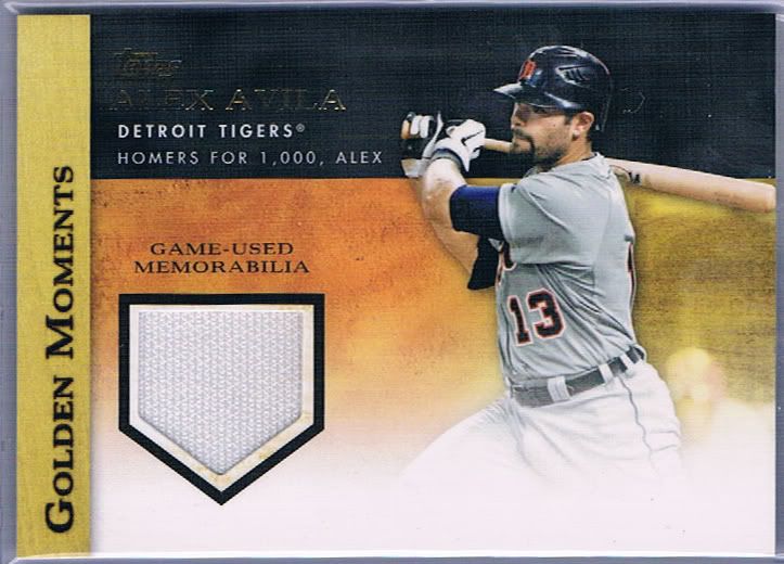
Did he hit 3 Post-Season HR's with this bat? Doubt it.
Did he play two with this bat?
First off, is there some news about Alex Avila that I missed? That relic has already sold, and it went for $10.50. The week before, it went for $.99. Anybody have any clue?
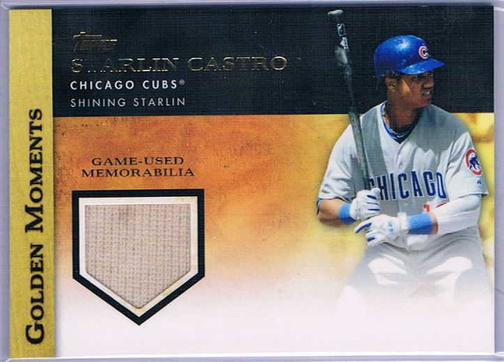
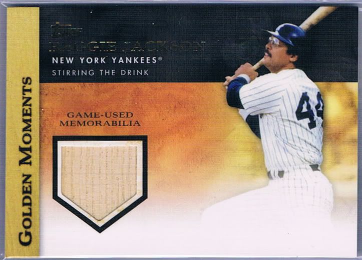
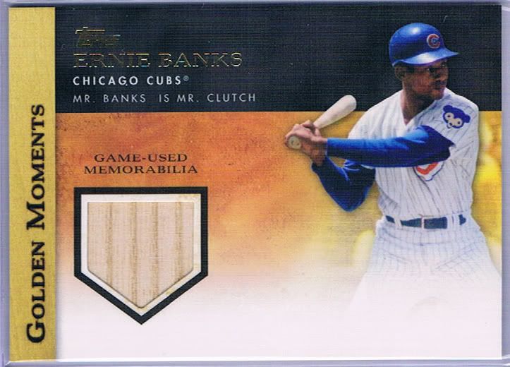
Second off, I’m really happy to see some dirty jerseys make their way into cards again. It feels like it’s been a while. The jerseys have gotten too sterile for my taste, making them seem much less authentic. I want dirt. I want grass stains. I want rips. I want character. That Starlin Castro and others I’ve seen online show that they do exist.
The relic checklist in this product is huge. They can’t all be Reggie Jacksons and Ernie Banks and most of them certainly aren’t. You’ll find a plethora of common and semi-star level players, which unfortunately is to be expected these days. We have tons of leftover relics so if anyone wants a player or team please feel free to inquire within. There’s a good chance we can accommodate.
Even with the Cy Young, I feel he's underrated
Tainted MVP
Really popular despite off-field troubles
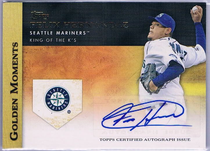
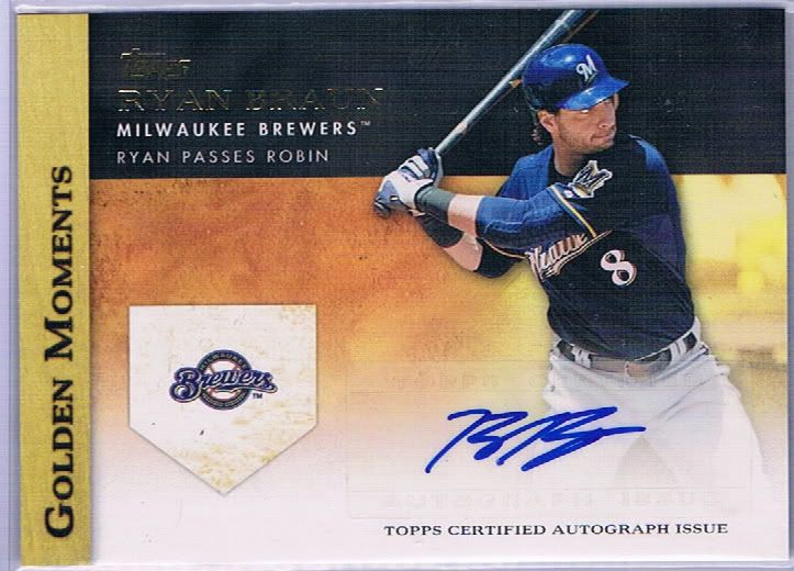
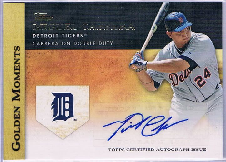
I don’t know if there is an autograph across the entire production run that isn’t on a sticker. Maybe some of the bigger hits, but I doubt it. That’s a shame. I guess they don’t want to spend the extra money it would take, and I can’t say I blame them. Topps flagship doesn’t need hits in general.
Above you see the three best standard autographs we found. I think the sticker really detracts from the overall appeal of these cards, especially when you have a big, honking logo staring you in the face and the sticker has to be slapped on top of the photo.
Not a fan of these. Total filler.
Got 2 of these
You won't find a Cubs pin...
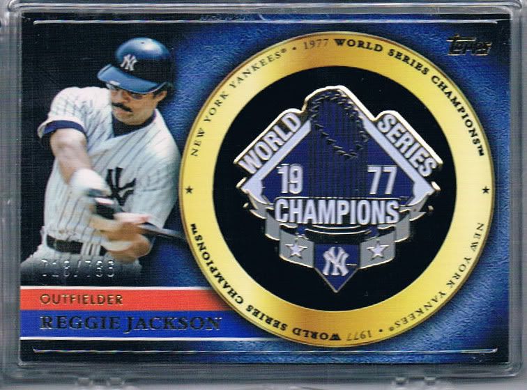
Reggie is everywhere
Oddly, the hits that should have value (the autos and relics) simply don’t, and the manufactured hits do. This isn’t just talking about the rising ebay prices, but also the fact that they are interesting and well-crafted.
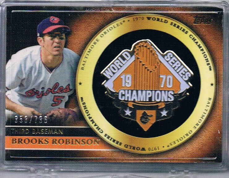
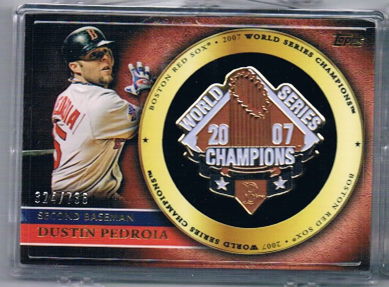
Manufactured “relics” can work and this is proof. These are the World Series Pins. Now, the odds of these being actual pins is virtually 0%, but that doesn’t make them less cool. The pins are made of metal and are placed in a recessed felt circle. It’s a very nice touch and you can tell that some legitimate effort and production went into these. It’s not just a straight up fake-stitched logo.
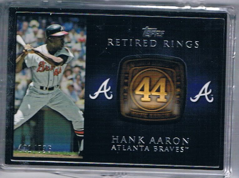
Heavy as a "Hammer"
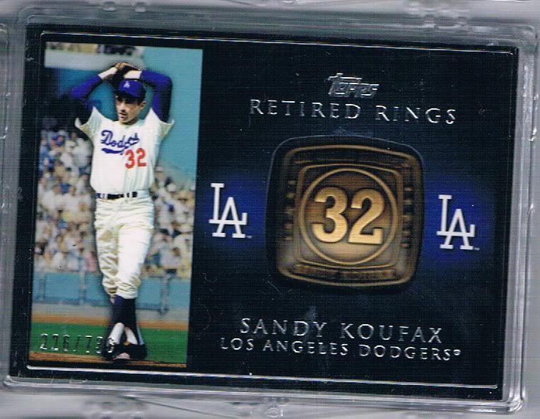
You knew he'd be on the list now that they have the rights
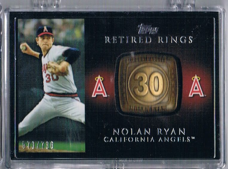
Nolan has a ring for multiple teams. We landed 3, all with the Angels
Then there’s the other manufactured hit in the form of Retired Rings. Since this features all retired players, you can be assured the checklist is good. I think that’s one of the biggest benefits of this year’s crop all around. I don’t like filler hits and these don’t feel like filler. They’re way too heavy for that.
You can’t see it in the scan, but these cards are THick with a capital TH. In fact, if you were to find one in a non-jumbo pack, it would be the only card in the pack. No toploader that we have will hold these. That’s a problem. Our solution was to use a 15-ct snap case. It’s not ideal, but it’s what you gotta do.
Once again, that’s real metal embedded into the card. They may not be real rings, but they do look awesome and won’t fall apart easily. I look forward to buying the Frank Thomas once the prices drop (we got one, but couldn’t buy it from ourselves yet).
People have said that it would be better if they weren’t numbered at all, since we’re staring down a /736 stamp. Not me. I think it would be worse. If there was no number, I would realistically assume more than 1000 of each were made (if not closer to 2K), and the value would be reduced. We’ll never know for sure, but I’m happy with the stamp.
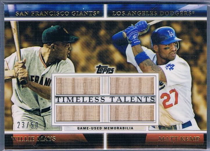
Giants/Dodgers. Will fans overlook the rivalry to appreciate the card?
Now we get to the big boys. We hit three big-time cards in our 5 cases. This one came out of the very last box we opened. Andy and I occasionally would have a battle of the boxes. I forget exactly what he got in his, but I thought for sure he was going to win that final round until I found this sucker.
The bat pieces make me wonder about the authenticity, however. I mean, the Mays and the Kemp chips look awfully similar…. Don’t get me wrong, I’m not complaining. It’s a damn fine card and it’ll make its eventual owner very happy.
A giant Giants card. Holy Mays!
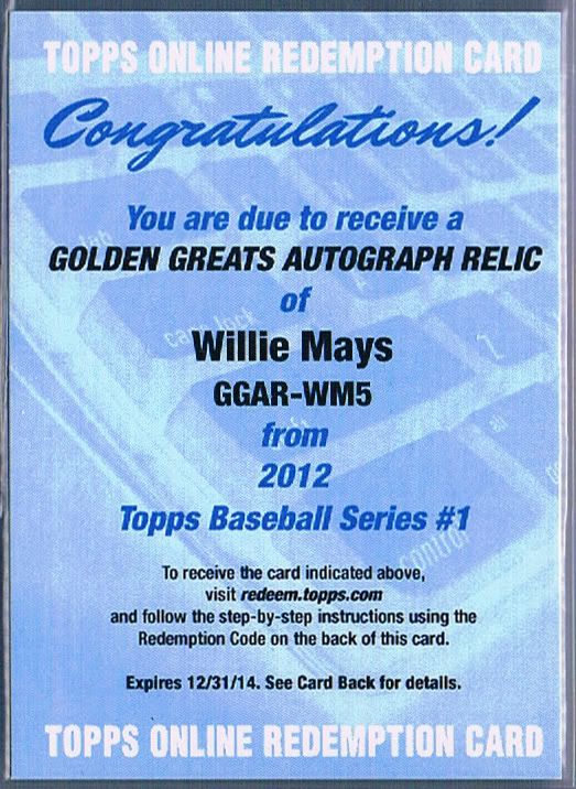
Andy found this puppy after I found some good autograph (probably the Cabrera) in this battle-round. His gasping, mouth-covering reaction is how any collector with a pulse would react to a card like this. Just imagine the insanity that would ensue if it wasn’t a redemption.
According to the sell sheets, this is #/5. Remember the Lou Gehrig set of 5 inserts I showed earlier? Imagine a Willie Mays version with a bat or patch in the coin circle and an auto in the faded to white area and this is what this will be in person. I’m glad Topps got away from the plain white redemption card with the homemade laser printer sticker slapped on. Amazing.
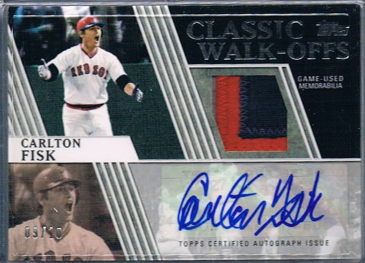
Nothing foul about this!
We’ll walk-0ff our recap with this. I know it was a long time ago now, but remember that foreshadowing hint I dropped in the insert section? Yeah, this is what I was talking about. How freaking insane is this card? Why do I always pull patch cards of Boston players?
You can see how well the design works when it includes all the elements, but it still doesn’t excuse the insert most people will only ever see. Enough griping. Let’s bask in the glow of a crazy three color, ultra stitched patch with autograph, numbered 09/10 of an iconic baseball moment.
We got really lucky with these three hits. None of them were close to guaranteed, even with the amount of packs we were opening. Even though we haven’t sold a lot of what we have yet, I can safely say that this was a successful venture. But does success mean it’s a good product overall?
Conclusion
Topps really doesn’t change too much year in, year out. You know what to expect going in and it welcomes you home like one of the few relatives you have left that you still get along with. It’s safe, rarely exciting, but still fun to be around and share. A lot of what I’ve said in this extremely scan heavy, long-winded review has already been said several times before, and will be said again next year. But that’s okay. Topps is different just enough to keep us coming back.
Design – ****
Set Collecting – ****
Parallels/Inserts – **
Hits – ***
Overall – ***1/2 out of 5


Wow….that Fisk card is awesome!
A very nice breakdown and lots of cool cards there. I guess you really can get some good stuff — if you bust 5 cases 🙂
I don’t know what the Koufax “ring” card goes for, but I might be willing to take a shot at it.
The Kemp-Mays card I know is out of my range.
N.O. – I thought we put ours up for sale right away with the rest of them, but it looks like we held it back. Shoot us an email if you’re interested. It looks like current ebay rates are about $10-20. The Kemp/Mays dual did sell. We got $75 for those that may be curious.
I think the typical five cases (whatever that means) probably wouldn’t get you most of that good stuff. We got really lucky and hit a few cards with odds in the 1:X,XXX range.
cynicalbuddha – I totally agree. They’re painful to look at unless they’re fully formed with the auto/relic. The problem is only /10 of each is ever going to be fully formed. It is kind of sad that the manu-relics are the highlight, but they are pretty awesome this year. Maybe it speaks more to the concept that regular autos and relics shouldn’t be so prominent anymore. Collectors want cool looking stuff and it doesn’t have to fit a pre-defined category or accepted box allotment.
I was just commenting over at My Cardboard Mistress about how the Classic Walk-Off is a terrible insert with out all the bells and whistles, but man it’s awesome with patch and auto, even if it’s a sticker auto. And the Timeless Talents relic is another insert that is really well done in the relic version, but not so much in the base version. And I totally agree about the Manu-relics being the highlight of the release. How sad is that?
Great review. thanks for the rundown
[…] from one series to the next. You can find all my compliments and complaints about the design here. My thoughts haven’t changed. Am I alone in thinking this is a little creepy? The […]
[…] two videos below! I would review them formally, but I’ve pretty much summed it all up in my Series 1 & Series 2 reviews and with what we say as we […]