
Now that “Conan” is over, I can write a quick little post.
One of my goals with this blog is to write a little blurb on each individual card from my player collections. Mostly, I’ve been accomplishing this through trade posts. On my trade posts, however, I mostly only feature some key highlights and not all of them at once. So, not only do I have quite a few from trades that have never seen the light of day on this blog, but I also have all the cards I’ve acquired through packs, online, card stores, card shows, and off the side of the road. Okay, maybe not that last one…yet. One day!
What I’m getting at is I have a bunch of card scans sitting in my folders and I’m going to pick a handful now and do my first official “non-trade player collection write-up thingy” (trademark pending). Today’s subject: Greg Maddux. Why? Well, because I have the most of him so his backlog is the largest. This is the “Relic” edition.
Most of these have actually been shown on the blog, but I never wrote anything about them, so I’m doing that now. Deal with it.

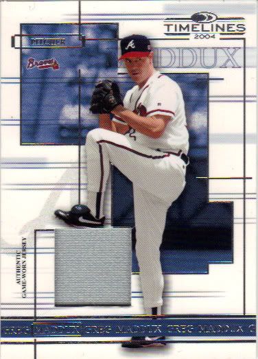
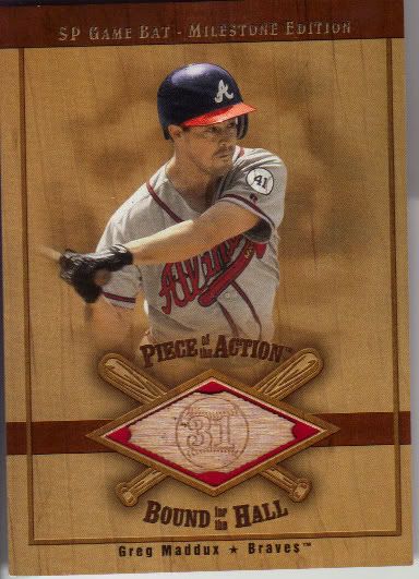
Maddux looks pissed, and I wasn't too pleased either
I’m saving the worst for first. Don’t get me wrong, the card is nice, but it looked nicer before I bought it. This was an ebay pickup, and the seller decided to put it in a toploader with no penny sleeve. Well, on top of that, the toploader wasn’t of relic size, so when I took the card out, off went some of the picture. See that big white spot on the left smack dab in the middle of his eyebrow? Yup, that’s picture that peeled off on the way out. There are tons of other little specks missing too. Luckily it didn’t cost too much, so it shouldn’t be hard to replace when I get around to replacing damaged stuff. Interestingly enough, this is the only bat card I have so far of Maddux where he is not holding a bat.
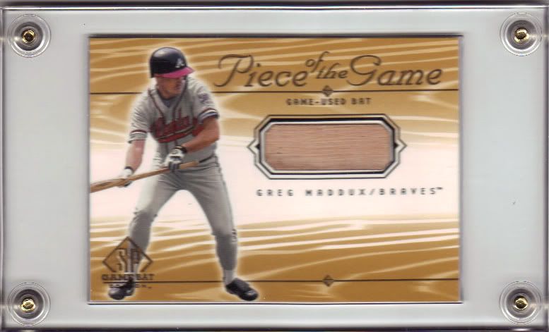
Do you think standing on his own jersey swatch will give him more velocity?
You’re looking at quite the thick card for such a thin piece of material. You can see the shadows in the box. I feel like these would get damaged very easily in the wrong hands. I guess this thickness and window really is designed for a patch and Donruss just made it “backwards compatible.” Typical. The design here is a little busy, but I like it. The jersey spot fits in perfectly with the overall theme. It could only be better if it was blue.
I see one major design flaw here.
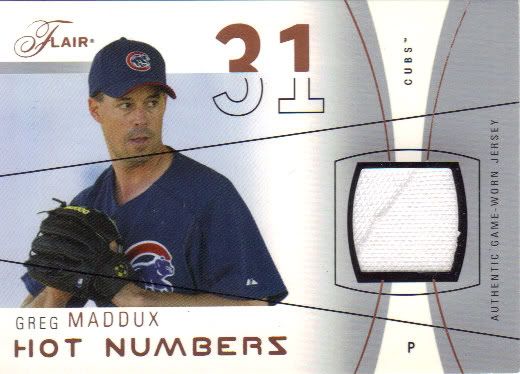
On to a couple serial numbered cards now. Here we have the Copper version of the Flair Hot Numbers. I have #59/75 (so if anyone else tries to claim that, they’re damn liars!). This is the only card show relic purchase to date. I’m not sure when I might attend another card show to see if I can change that. There is a little chipping on the jersey window, unfortunately, but to make up for it the jersey itself has a stitch running diagonally through. I generally like the look of the card, and it appears to be designed solely for game-used..use which is a huge plus. However, those two black lines bother me. Why are they there and why are they lopping off his head? The back is bittersweet because it says that stitchy piece is from a Braves jersey. Bitter because it’s not Cubs like the picture, but sweet because they were that specific with it.
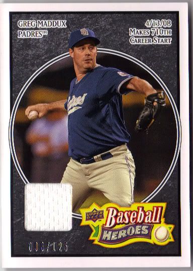
It looks like 006/125 but it's really 096 - in case you care
On April 13, 2008, Greg Maddux made his 710th career start. This jersey piece likely is not from that day, which is fine. I love the Baseball Heroes set. It’s just one of those now classic designs that I don’t get sick of. Sure they try to push my buttons by creating endless parallels, but I can’t stay mad at them. Just look at it’s face! I don’t think I’ll have much trouble collecting the Maddux jersey rainbow, but he’s also part of a trio jersey combo also comprised of Randy Johnson and Nolan Ryan. Yikes. Those might get pricey.
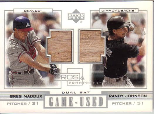
Speaking of Randy Johnson
This was not pricey. What strange looking bat pieces. It’s like they traced an Atari 2600 tank and glued some wood to it. Seriously, I expect a square pixel to shoot out at the two 300 game winners at any second. I just can’t get over that design. I feel like Maddux should be facing the other way to keep the symmetry in place. Then maybe he could look like a wind-up toy as Randy Johnson does.
Another odd looking piece
Welcome to the Circle 31 Ranch, kiddos! This design works much better, although it is still a little strange. I appreciate the uniqueness, but it’s not giving off the right impression. I know I should be seeing a baseball diamond, but all I see is a cut up bat with a branded circle in the middle embedded in a wood grain background. It’s all very western-y to me. I feel like I’m looking at a wanted poster, although it’s not a bad thing. I also like how tiny that bat is. Someone was able to fillet the lumber nicely (not a euphemism) so that the card is essentially a normal thickness. That’s impressive. It’s not like a thicker chunk of wood is really any better.
Maddux is about to beat up on that rectangle
Sorry about the blurry scan. It came in the screw case and I didn’t feel like taking it out. I probably will at some point when a more deserving card comes along, but not yet. I wish I would have scanned the back of this card. I also wish I wasn’t too lazy to go back and do it. On the back, there’s that rectangle sized frame with a picture of most of Maddux’s head in there. He looks like a Superman villain floating in space. Pitch before Zod!
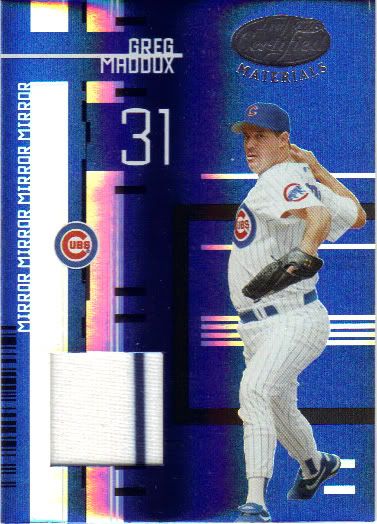
There's no doubting which team this jersey came from
Back to the serial numbered stuff real quick. Here we have #21/100, and boy does all that blue look nice. The rest of the card looks absolutely horrendous, but the blue doth shine. I have no clue what they’re trying to accomplish with this layout (“mirror mirror mirror mirror?”), but it looks like some weird bar code on acid. Someone grabbed a ruler, made some lines and boxes, made a few bold, made a few black and collected a check. What the hell? This is why people don’t like Donruss/Leaf/Panini. Because their cards look like this. Every. Single. Damn. Year.
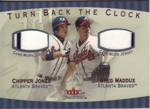
This is the strangest clock I've ever seen
Why is the 2 in the 7 position? Why is the 12 above and to the left of 11? Does Fleer know how clocks work? Despite that, I love this card. It’s the most I’ve spent on a single card in my early Maddux collecting adventure, but I had to grab it at this price. This little fella books at $100. Now, I don’t put tons of stock in BV, except that it is a guide to tell me what percentage of that value I should realistically expect to pay. I got this for less that $20 – complete with double pinstripes. I’ve seen another copy of this card floating around ebay with only one pinstripe for more than 3 times what I paid. I think 1/5 of book is doing pretty good for something this high. The downside, if you can call it that, is that there’s another Turn Back the Clock dual jersey card from this set featuring Maddux. I probably won’t be scooping that up anytime soon. I’m quite content admiring this for a while.
Recent Comments