I’m sure all of us have been in a budget crunch situation multiple times in our lives. It’s only natural to see cash ebb as well as flow. I’m in the middle of an “ebb” cycle, and I’m expecting to stay firmly there until at least after the holidays.
That means no buying new cards. Hell, I’m pretty much not buying anything that can’t be categorized as food, mortgage, gas, or bills. Which is fine. Again, I’m not alone in that, and I certainly understand and appreciate that I’m still much, much better off than many in this country. I’m at least fortunate enough to be able to plan and have an exit strategy.
All I’m really trying to say with all of this is that when you can’t buy anything new, the best thing to reinvigorate your hobby is to appreciate what you already have. And in this case, I have a trade from Tom at The Angels, In Order that we completed months ago. Actually it’s more than that, as you’ll see.
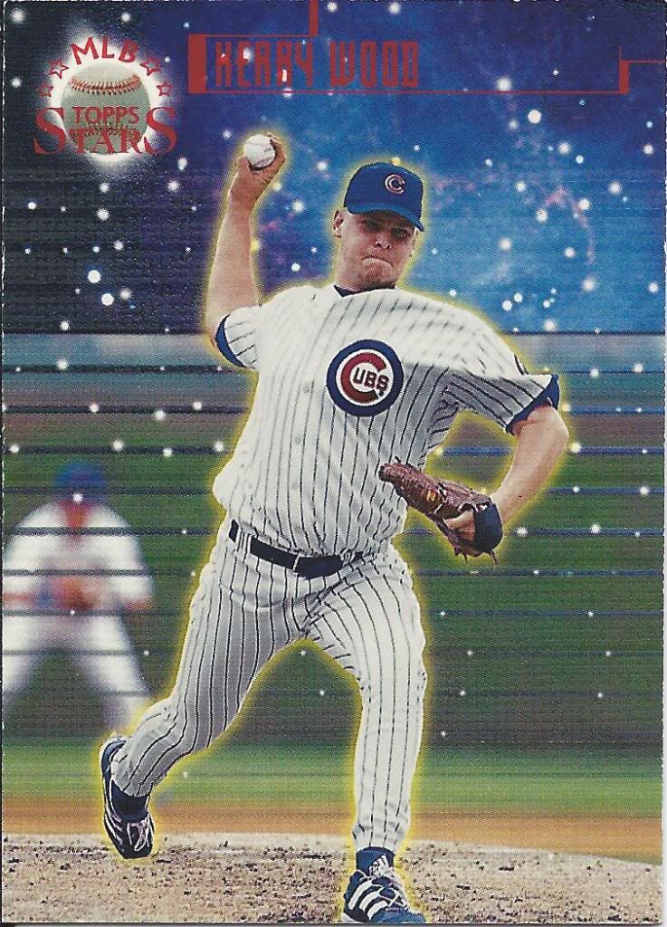
Haduken!
Did you know that there was a year of Topps Stars where every card was serial numbered? I didn’t until I received this red foiled regular version. Oddly enough, I won an auction for a lot of 50 Kerry Woods shortly after this trade arrived (more on that on another post) and I got about 3 more of these. Tom’s was first, so he gets the credit. Firsties!
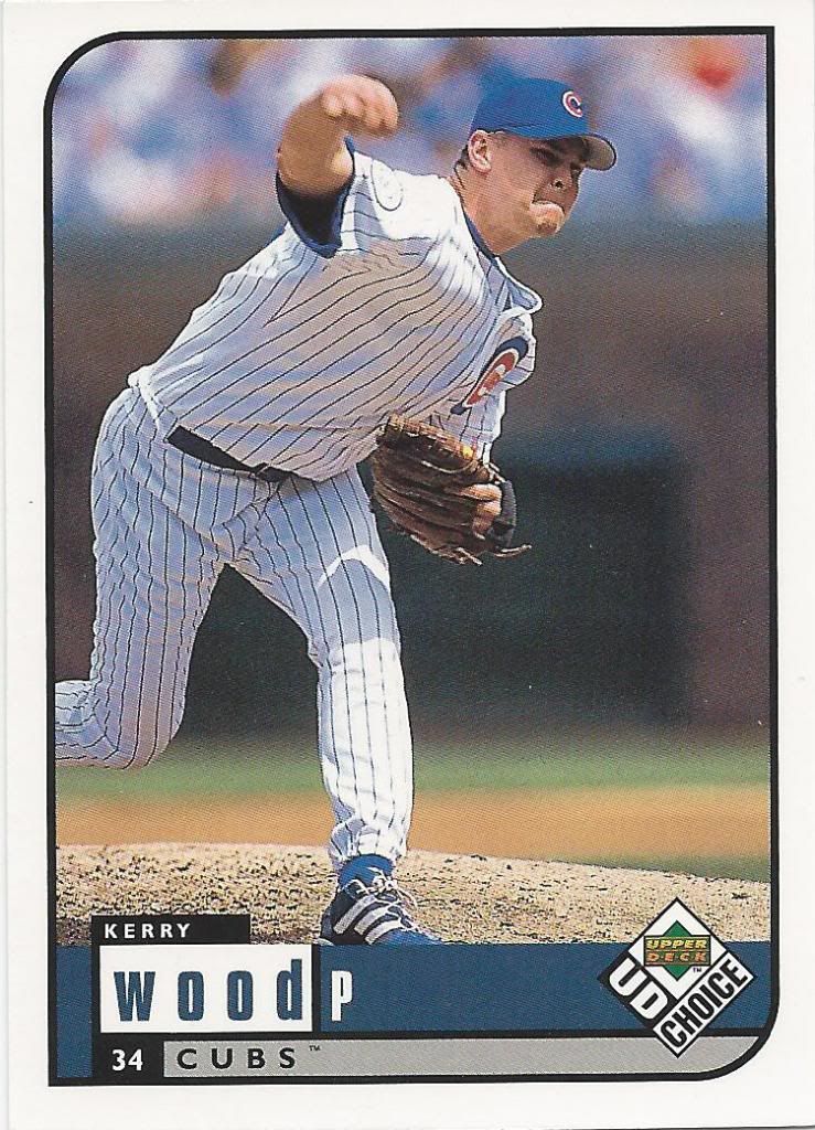
Even after the preview, they went with this design
I’ve shown off the UD Choice preview card before. Now, here’s the real thing. As you might imagine, the only important difference is the lack of foil stamping. The picture is the same. I’m too lazy to look, but I imagine the text on the back is the same. It would be cool if the preview only showed a small portion of the image and the rest was blacked out.
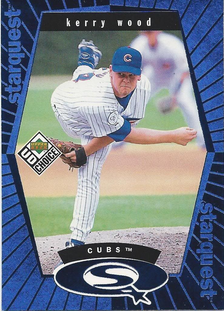
Starquest DSV starring Jonathan Brandis
I’m now 1/4th done with my quest for stars. You have to love the Cubbie blue on this thing. The other colors may not look as nice, but there’s only one way to find out for sure…. The quest continues.
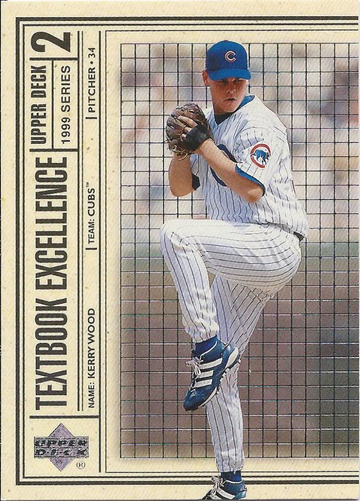
Caught in a '80s sci-fi movie scanner
I have a couple problems with this insert. 1) I feel like I’m missing the other half of the card. 2) This should obviously be called “Newspaper Excellence,” or some such thing, not “Textbook.” There is no similarity to a textbook here at all. It does, however, look remarkably like a sideways newspaper.
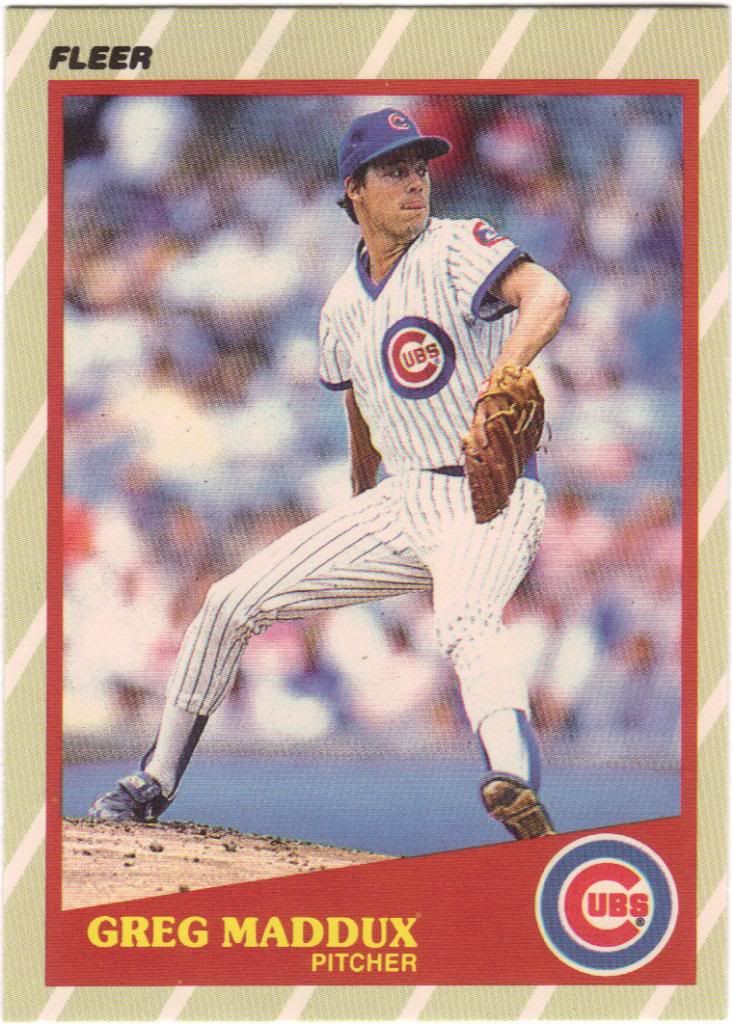
Card manufacturers loved diagonal lines back then
All the Maddux cards you see, and some of the Frank Thomas cards coming up are from a previous trade with The Angels, In Order completed in late 2011. That trade just happened to be so massive that I couldn’t possibly have posted them all in one sitting. And it turns out I can’t get them all in with two, either. There are a lot of cards from older trades that I haven’t had a chance to properly appreciate. I’m hoping to begin rectifying that as I move forward when possible.
Anyway, I’m always thrilled when I can obtain a new 1980s card. I have most of the big ones as far as Maddux is concerned, so if I get something I didn’t already have, that means it’s likely an oddball or other “rarity” (as much as something from that era can be called that).
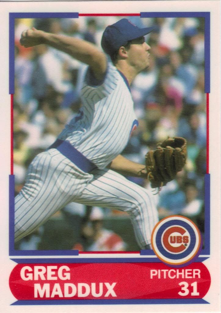
This should have been used in a full set
And here’s another one of those. I honestly didn’t know anything about this Score Young Superstars set before getting this card. I honestly still don’t. It’s cool, but there’s a very odd finish on it. I think it’s supposed to be a UV coating, but it’s more like an inedible donut glaze.
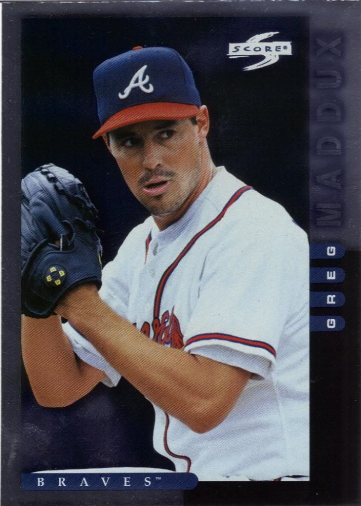
Oooh, shiny
Jumping ahead 9 years, this here is a parallel of 1998 Score called Showcase Series. Obviously it’s named for how well it showcases fingerprints.
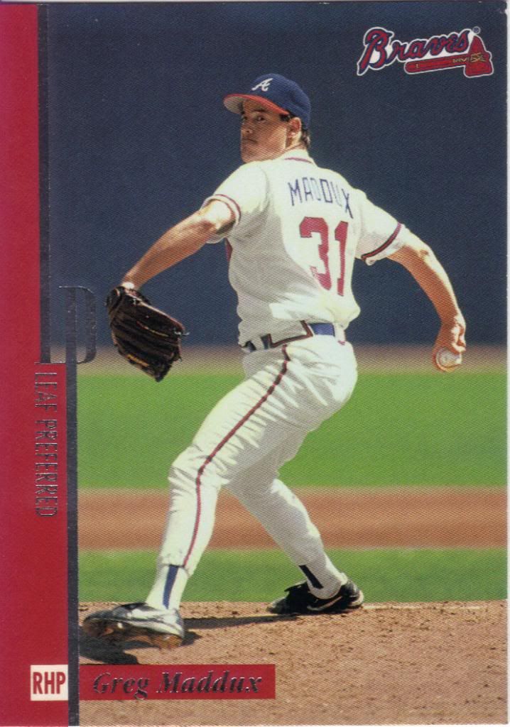
Isn't this supposed to be some sort of premium like card?
Leaf Preferred? Well, I would have Preferred if they didn’t use the initials in the border. Am I right? I’m right.
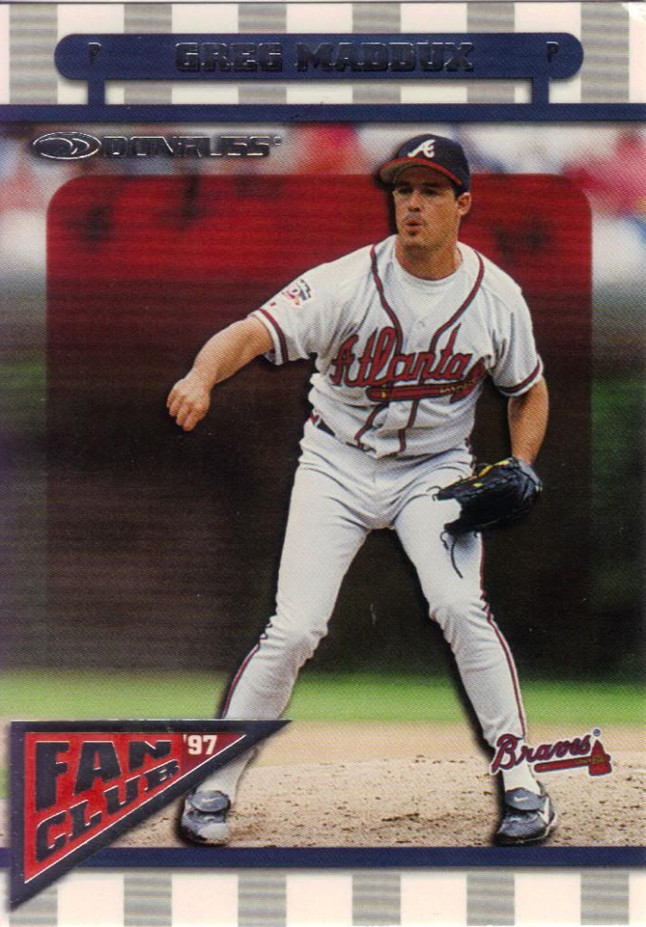
Even Greg is saying "Oof"
I have to say I had a hell of a time finding this on my checklist to mark it off. One would think that the ’97 would mean it was actually from 1997. Nope. 1998. And it’s a subset from 1998, too, which made it slightly more difficult. Not a fan.
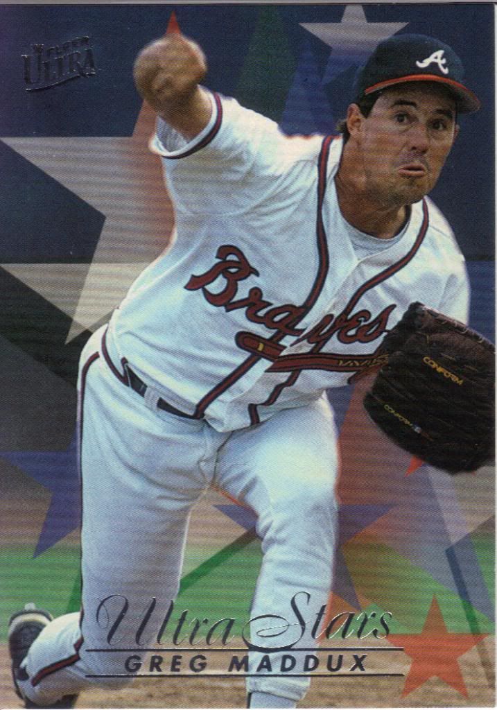
Tweety Bird hit him with a hammer before this pitch
Yay! Ultra inserts! I love Ultra inserts. It’s almost an irrational love. I mean, look at those stars that let you know this is an Ultra Stars card. The foil also does that. It’s wonderful.
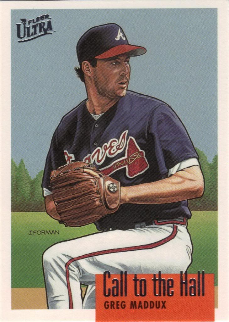
asd
Hey, it’s another one. It’s not nearly as cool, though. There’s not much that relates to calling or halling. Instead, I’m reminded of those 1989 Bowman art cards that started out fun, but then got really annoying.
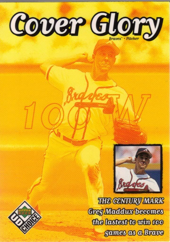
Shield your eyes
If I ever decide to rank the ugliest cards in my collection, this is likely to end up in the top 10. Or is it bottom ten? I’ve shown the Kerry Wood version of this subset before in my career retrospective post, but the format allowed me to quietly bypass the sheer disgusting-osity. Have I mentioned I do not like this. Glad to have it. Happier to shove it in a binder and hide it in the darkness.
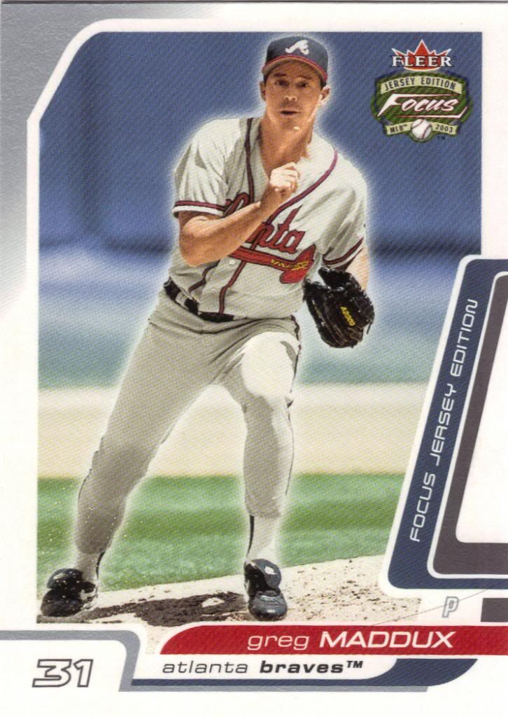
He's glowing more than a pregnant lady
Oh look, there are other colors in the world besides yellow, after all! I was worried I suddenly developed an eye condition. Actually, maybe I have, because I distinctly see the words “Jersey Edition,” but I ain’t seeing no jersey. Just another stray hair from my ever balding, graying head.
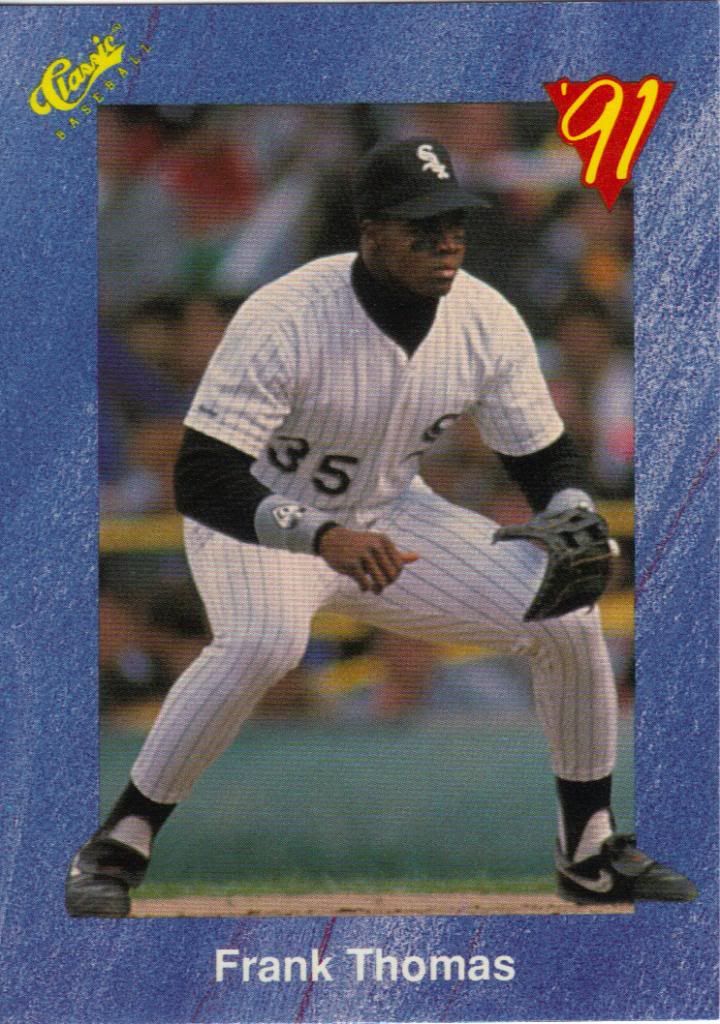
Perfectly straddling the corners of the border
We’re now entering the final leg of our journey. It’s all Big Frank from here on out. Everything you see from before 2004 is from the 2011 trade, and beyond that point is part of the 2013 blaster trade.
I don’t have the card in front of me and I’m too lazy to go get it. Otherwise I would ask you all a trivia question from the back of the card. It’d probably be either way too easy or way too obscure to be fun. That’s how Classic rolled, if I remember correctly.
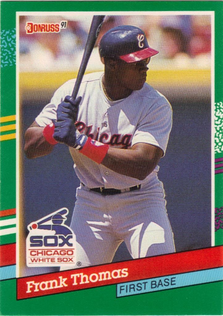
Saved By The Frank
There were a couple cards sent my way that I’m sure I have back in my parents’ basement. This is much easier than sifting through all sorts of junk wax. And I do mean junk. I know some people hate this design, but I love it for pure nostalgic reasons.
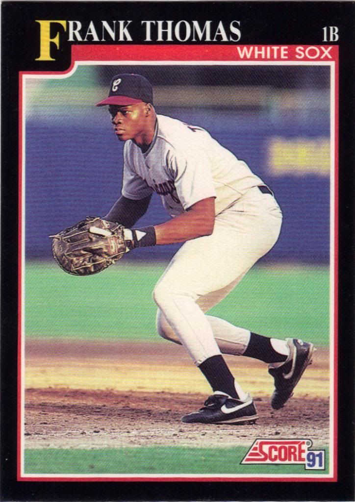
The best of the different border colors from '91
Here’s another one I probably have somewhere. Although, maybe not. Living not too far from Chicago, these second year Frank Thomas cards would have pulled in a premium. Those were the days.
Kind of.
They were days.
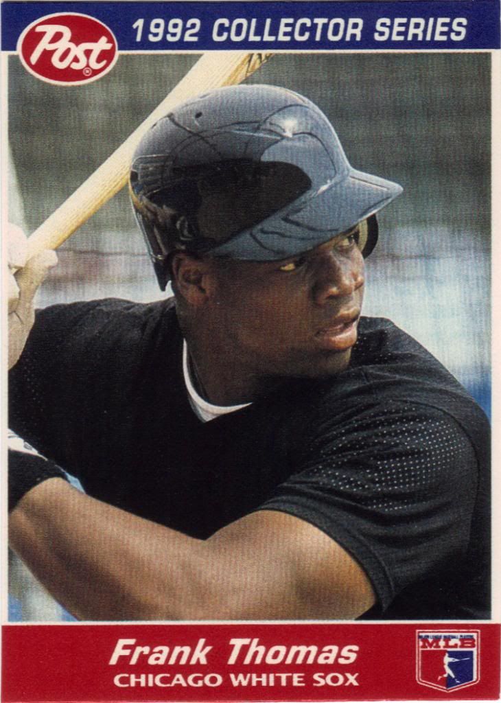
Pulled fresh from a box of Cocoa Pebbles
He’s just so focused on the baseball that he forgot to put his logo on his uniform. Remember when we used to not care so much about those types of things. All we cared about is that we could get cards out of cereal boxes! Let’s go back to that!
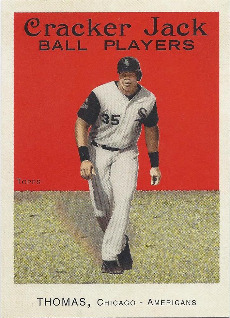
Nothing more patriotic than playing for the Americans
Here’s another food product that I wish still contained cards. I never really liked Cracker Jack too much, but I would buy a ton of them for the mini Topps and Donruss cards used as prizes.
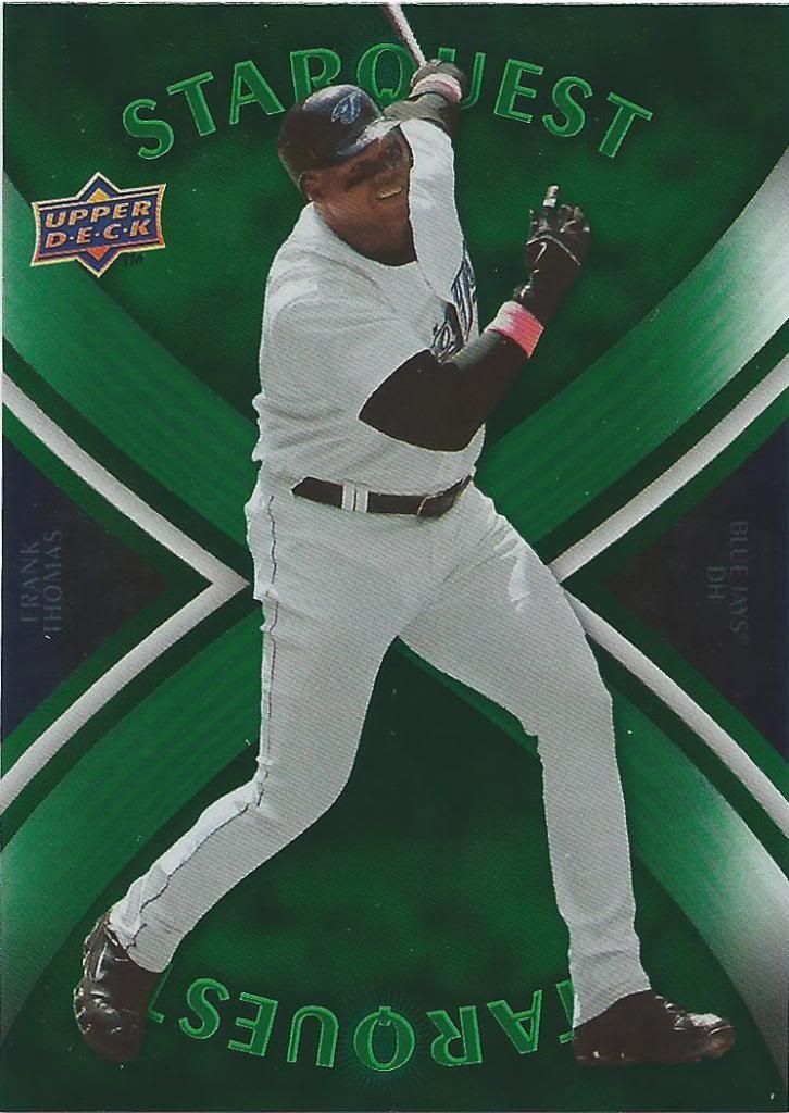
ArQues
To be honest with you, I have no idea what version of StarQuest this is. There are so many variations and some years even have multiple StarQuest inserts with their own structures. All I can say is this is a green Blue Jays card and I probably need other colors with the same picture.
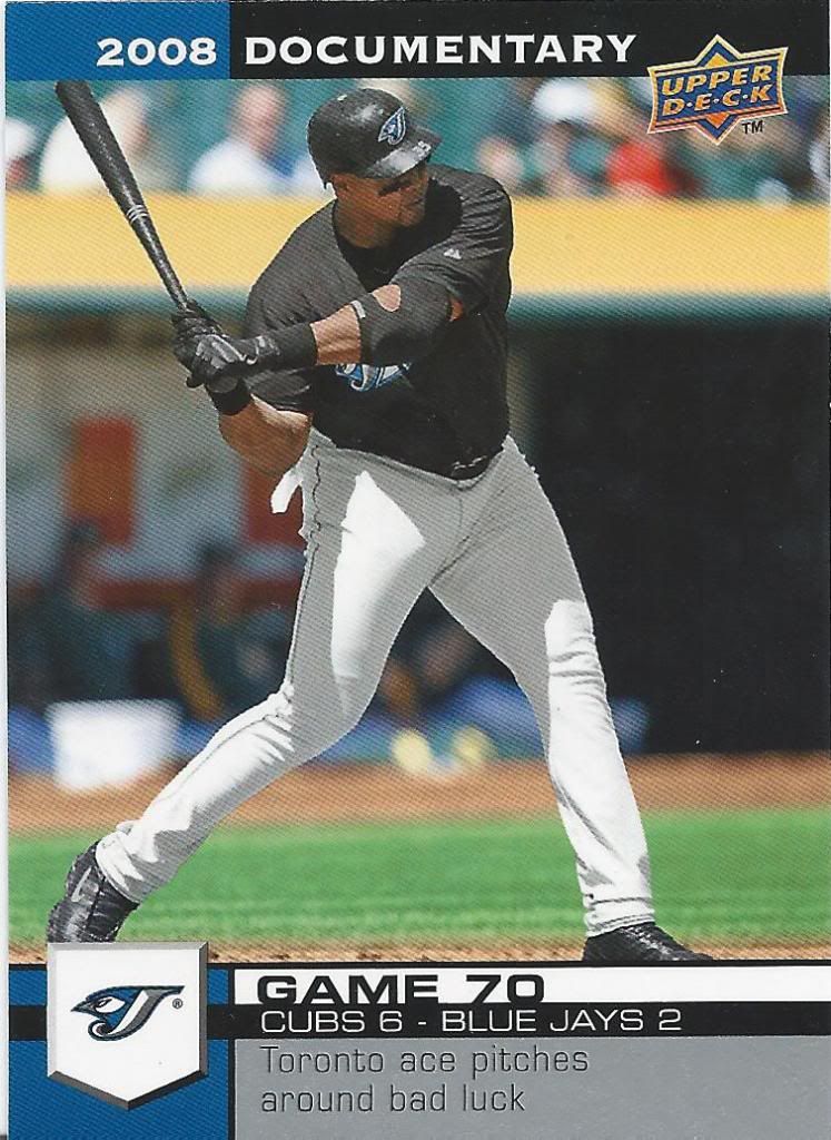
He doesn't look like an ace pitcher to me
It’s been a while since I’ve done anything on this blog, so I won’t fault you for not knowing how I handle the Documentary cards. I’m logging the team record on each of Frank’s cards to see if his cards end up with a winning record when all is said and done. Why? Just to do something with this slightly boring set. You can find the first set of FT’s log here.
Game 70 of the season sees a then kind of rare interleague game against my Cubbies. Hey, and we won!
Blue Jays card record: 2-3
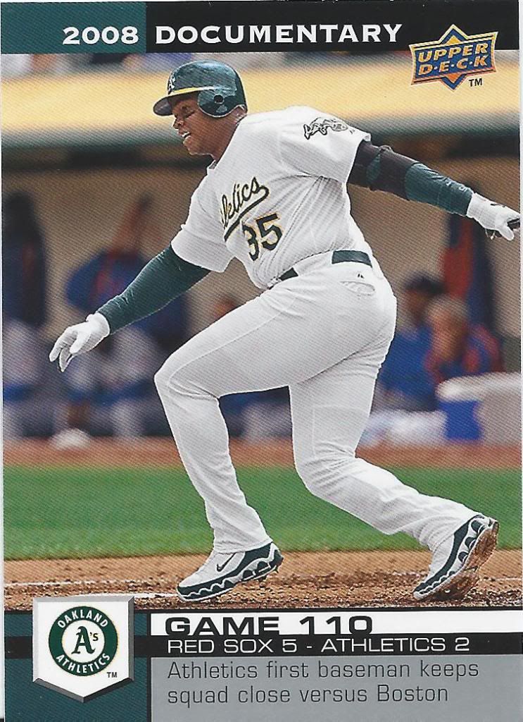
Closer. A's DH, not 1B
Awwww, shoot! I haven’t shown an Athletics Thomas card yet. I don’t think I even knew he was pictured with multiple teams in this set. Well, might as well keep a new, separate tally. Not a good start, methinks.
Athletics card record: 0-1
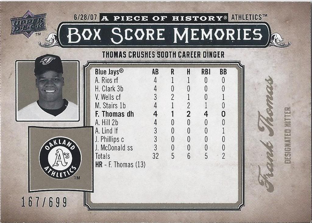
Ignore the Athletics part of the card, I guess?
So, we started with a numbered card, and we’re ending with one. The Piece of History set is one that I’ve seen on blogs many times but have very little experience with myself. Hopefully I can change that one day. I like the idea behind this insert. I think I’ll like the other color versions more. Hell, I just like celebrating 500 homers.
I like celebrating cards, too, and it’s easy to do when you get such a great selection from such a great trader like Tom. He’s been my #1 Angels trading ground and I encourage you to consider the same. Oh, and you can bet that you’ll be seeing his name in this space again down the line. There are still plenty more cards from him yet to be shown.

Tom’s a good guy. Hey, so are you.