
Alright, I’m back with the second installment of my giant trade with Fred. If you missed the first part, check out that post here. There’s some pretty fascinating stuff in there. Of course, there’s some fascinating stuff down here too.
The first round was mostly 1997 & 1998 cards with a couple ’99s sprinkled in. All of these will be ’99s and it’s not even all of them. Not even close. I told you this trade was huge. And amazing.
Enough talk, let’s dig right back in.
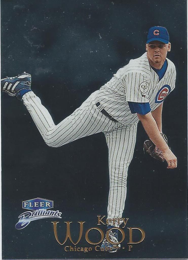
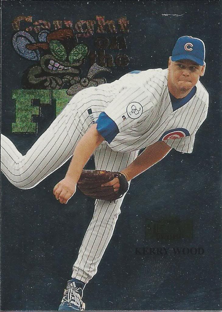
Fleer Fingerprints
Those Brilliants cards don’t scan so…brilliantly.
Haha! Yes! Starting off strong with the jokes.
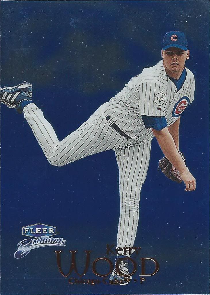
pitching in the clouds
The blue versions scan a little better, but the true glory comes in seeing it in person. I can’t wait to see the gold version.
could be a little brighter
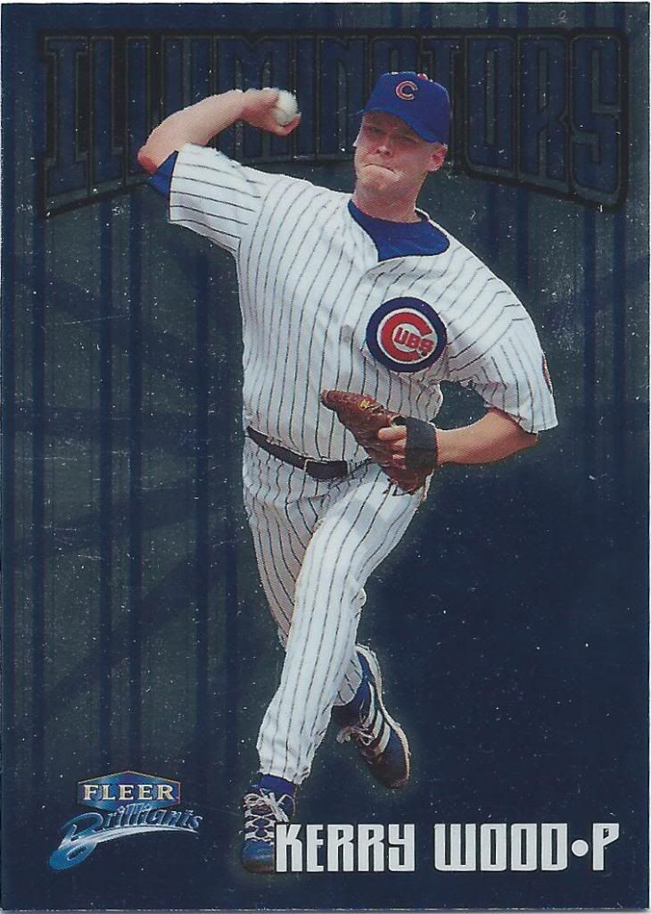
Illuminators? I prefer the Illusionators.
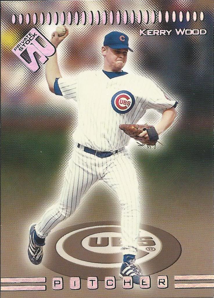
better than the existing RC logo
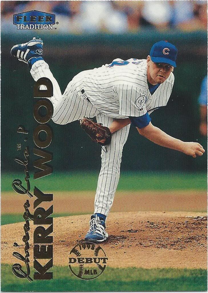
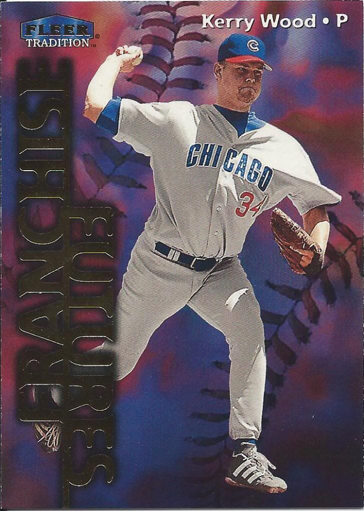
I really don’t understand the Fleer Tradition label. The name suggests they should be Heritage-like, but I don’t recognize this design from their history. Although it’s better than a rehash of 1991.
Topps Five Star? Pssh. Try Fleer Ten Star
Here’s a “Vintage ’61” version of the same card. I guess this is the Tradition part, but enh. An insert does not a brand make.
in the future, all text will be vertical
Franchise Future? We hoped. It looked that way for a while, but it didn’t exactly turn out the way we hoped. Still, he’s a fan favorite and that’s just as good if not better.
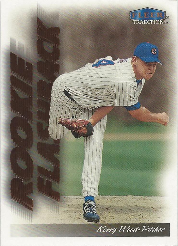
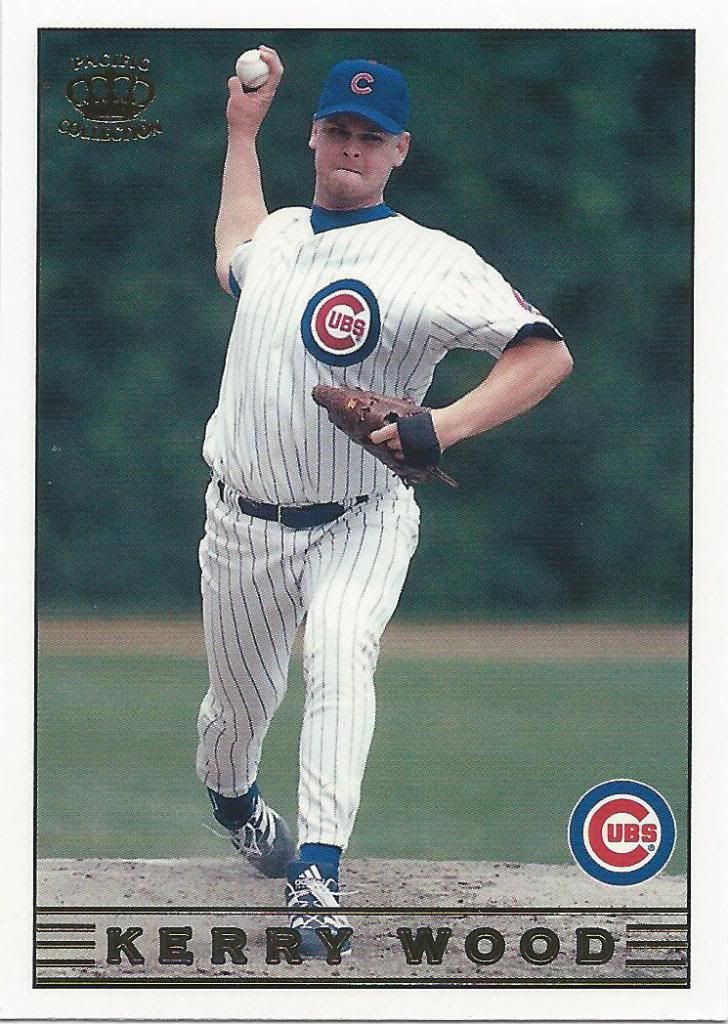
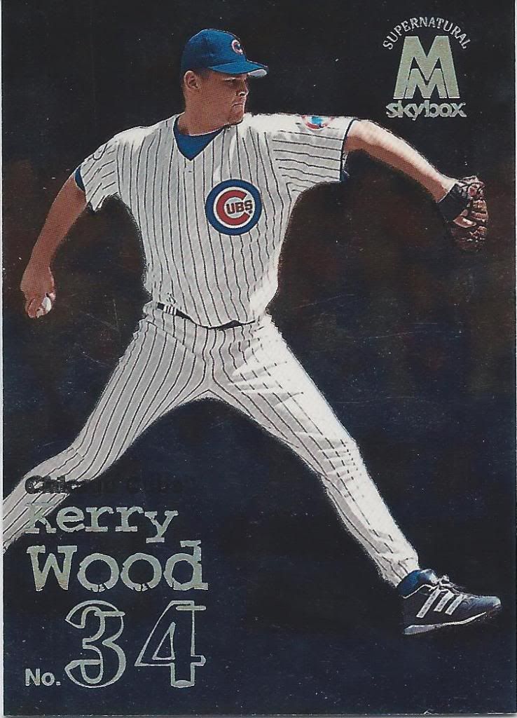
Gee, if only there were a card to highlight his 20K game
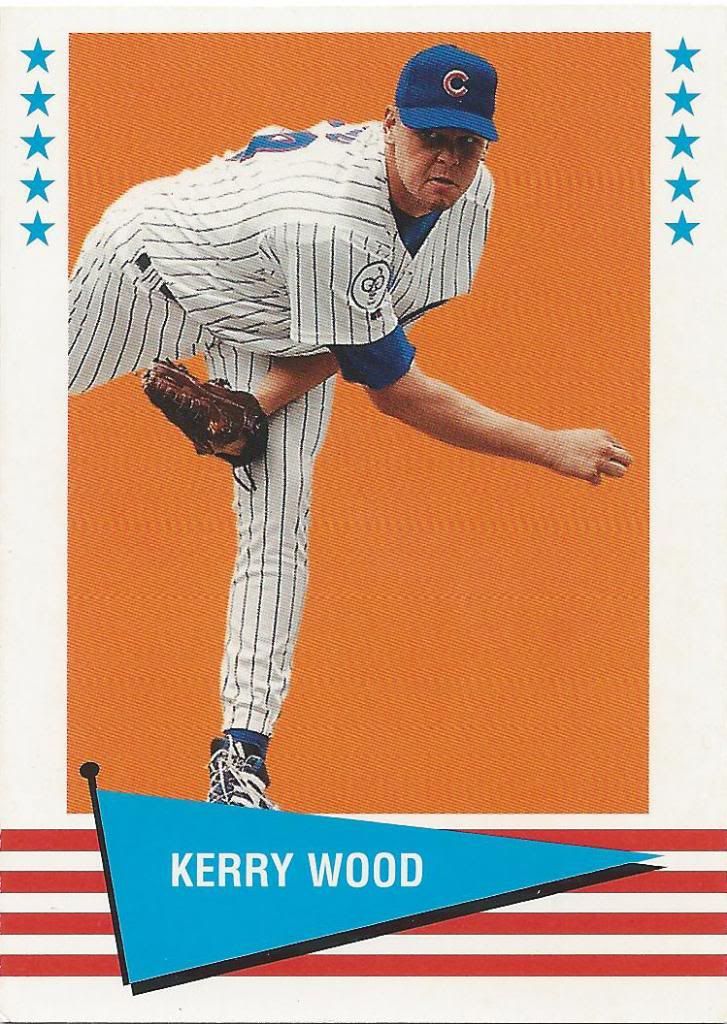
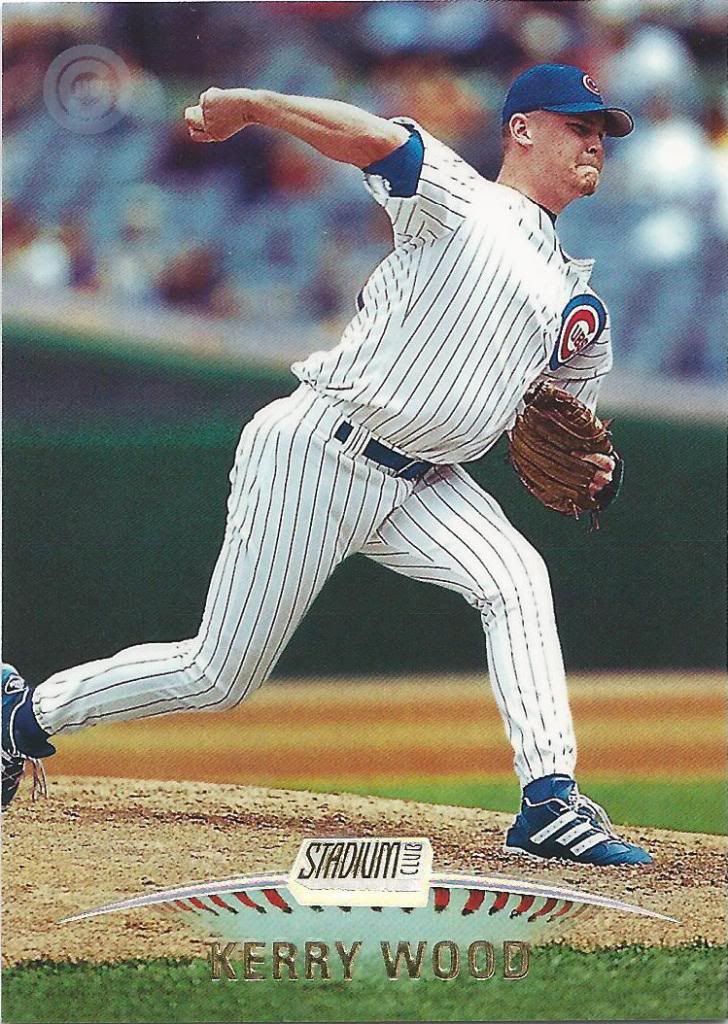
Hey fellow 1999 guys. Remember last year when Kerry Wood was a rookie? Let’s flashback to that time.
Pre-cursor to the Cheerio’s rap commercial
I know it’s a little hard to see, but yes, that’s a hip-hop fly. And no, I don’t get it either. I’m pretty sure the John Leguizamo “House of Buggin‘” fad was long-over by then.
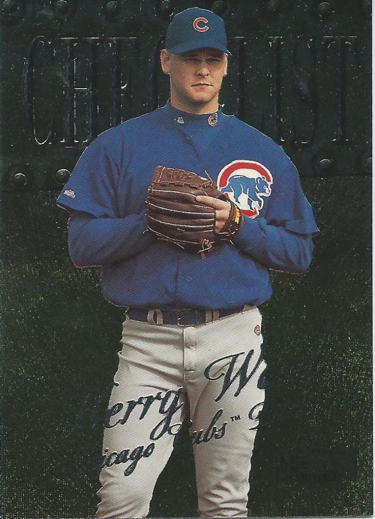
Erry W with the Icago Ubs
I love the Metal Universe cards. The only drawback I see is the super thin and super floppy card stock. Something with this much etching and pizzazz needs a Flair-like heft to it.
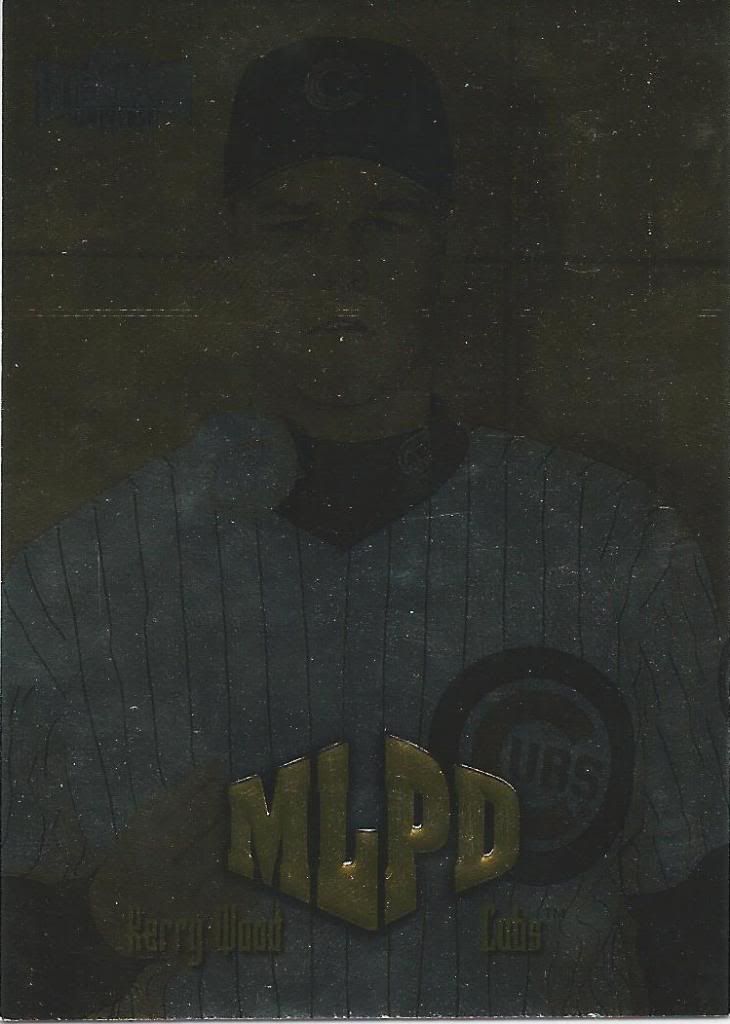
you’re under arrest for driving with tinted foil on your cards
Okay, I know you can’t really see anything, but I promise there’s a card there. This is from the subset called MLPD. I have absolutely no idea what that’s supposed to stand for. I checked the back of the card, but that gave me no clues either. “Metal League Police Department” was the closest I can come up with. What’s your guess?
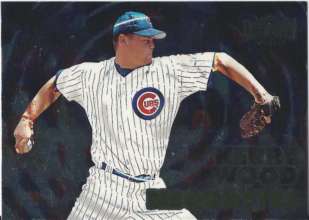
coincidence that there’s a hypnotic pattern?
Again, you likely can’t read it, but the insert is called Neophytes. I know that baseball is a religion to some people, but I’d still call that a stretch. Maybe the “cool” new pope can convince me otherwise.
The “P” stands for Pacific. Probably.
Moving away from Fleer and on to Pacific. What a drastically different approach to card making these companies had. On the whole, I like Fleer more.
By the way, smile count in this post is still zero
I like some of the stuff that Pacific did, but in general their product lines feel cheap. It could be the card stock. It could be something about the printing press. All I know is that there’s a certain polish that’s missing and it’s like I’m looking at elaborate broders most of the time.
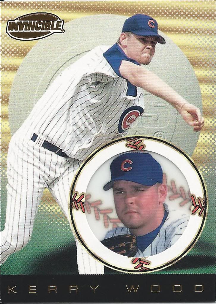
You spelled “Invisible” wrong on your see-through card.
Even with cool cards like this, where we have this acetate (?) circle and foil and whatnot going on, there’s this strange quality about it that tells my brain “unprofessional” instead of “fully-licensed, legitimate baseball card.” I wish I could put it into words.
Pacific Appropriate Name
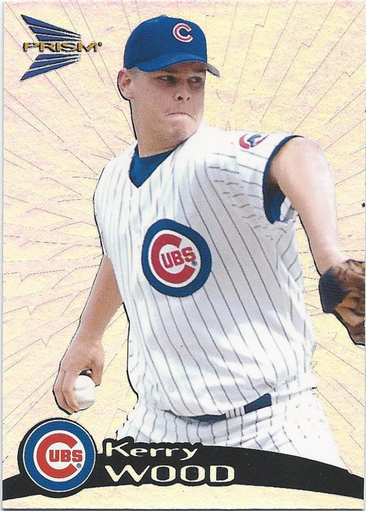
Prism is still cool. Hell, most of these cards are still cool. By the way, this is Prism before it got into the crazy pattern variations that are completely indistinguishable without a guide. All I have to worry about here are several colored variations.
Pacific 20th Century Fox
That nameplate makes me want to play some Rainbow Road on Mario Kart.
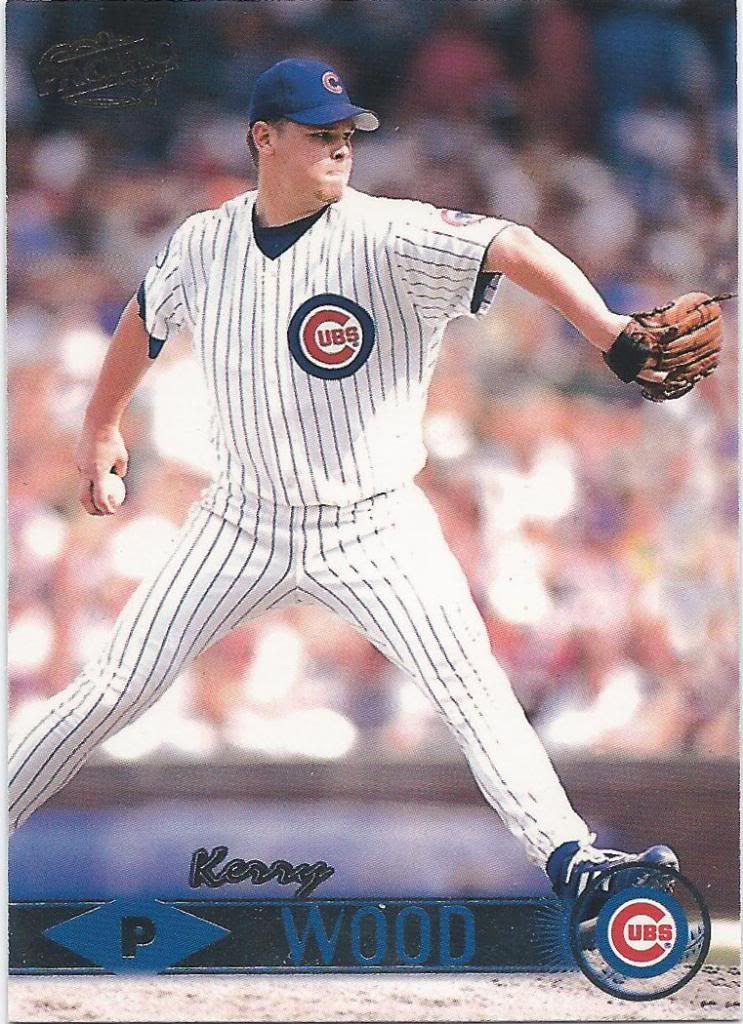
Sci-fi hologram Wood selected
And this one makes me want to play some scrabble. This rack is primed for a double-word score.
Get our your magnets
Card companies loved their metal tie-ins back then. Metal Universe. Molten Metal. Precious Metal Gems. Stars N Steel. This is a poorly scanned example of the second.
Blazing!
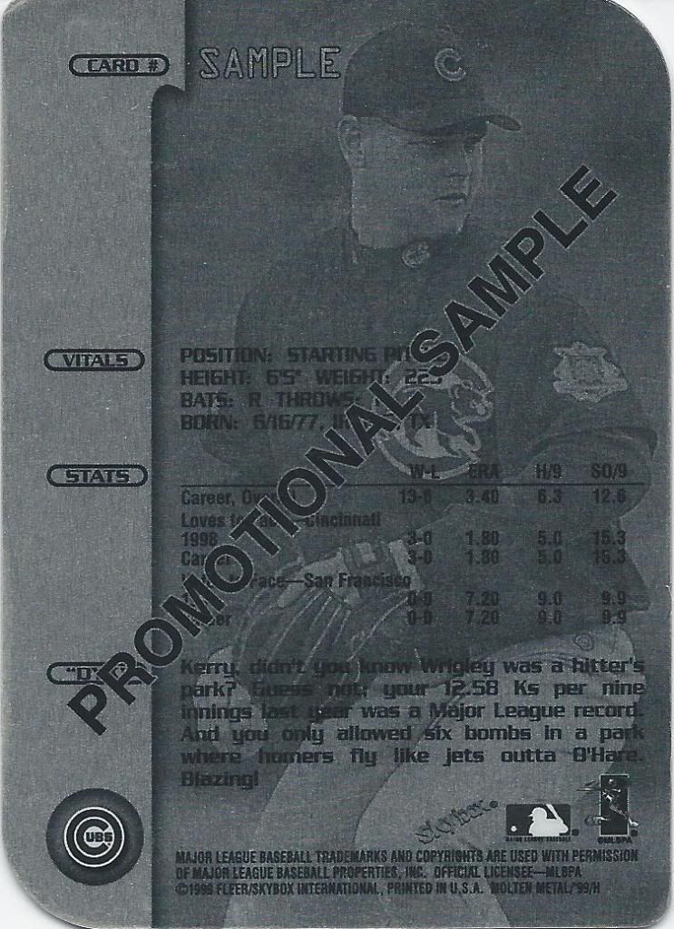
Some of those metal cards are actually metal. Like this promotional sample of the Xplosion parallel set. I love getting sample cards like this. It reminds me of my younger collecting days. Promo cards like this always felt more special, probably because of my perceived rarity.
What Wheaties font rip-off?
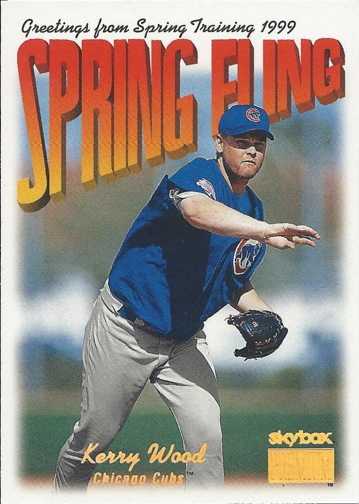
Well, for a postcard-themed subset, I guess they chose the best picture they could. It almost looks like he’s waving. Almost.
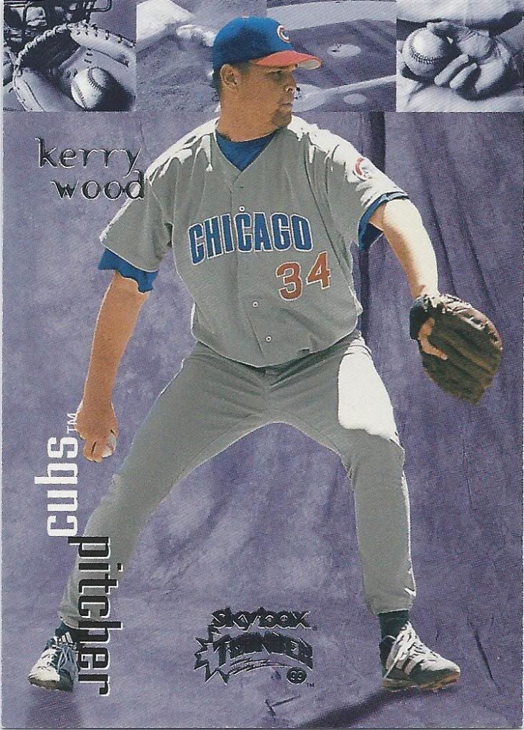
Since when did thunder = yearbook backdrop
Skybox bringing the thunder. That is the loud noise that actually in and of itself does no damage and can’t possibly hurt you. An omen void of much substance. Skybox was fond of thunder. They had a cool double-sided basketball insert revolving around thunder and lightning, too.
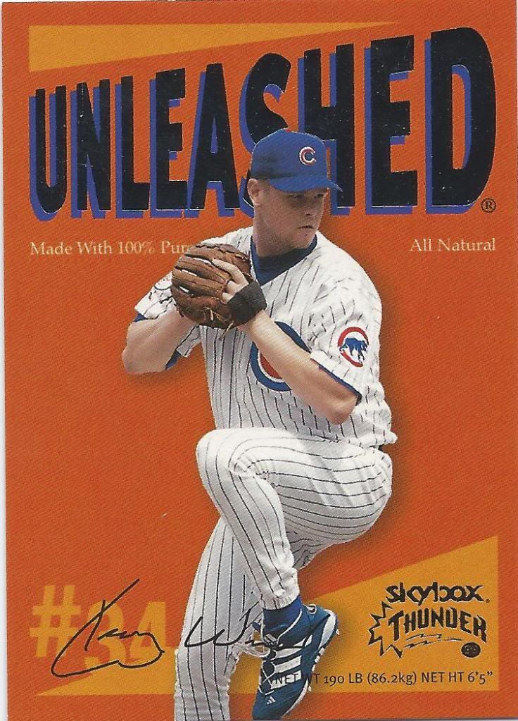
No, seriously, what Wheaties rip-off?
Guh? I wonder if the Barry Bonds card (if there is one) also says “All Natural.” It’s a nice touch putting the vital stats in the front like that, but why is this happening? Why “Unleashed” instead of, oh I don’t know, “Unboxed.”
Dirt color. That’ll draw them in.
We’ve seen this set not too long ago. Except there was some dude’s writing all over it. I think it looks better with a little penmanship. Otherwise, it’s just so..so..beige.
Just a rounded box
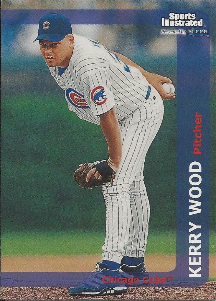
When you have a set married with a sports magazine brand, I expect something better than this. I expect something closer to original Stadium Club in photo quality. I expect a little bit of eye-catching in my design. I don’t expect this.
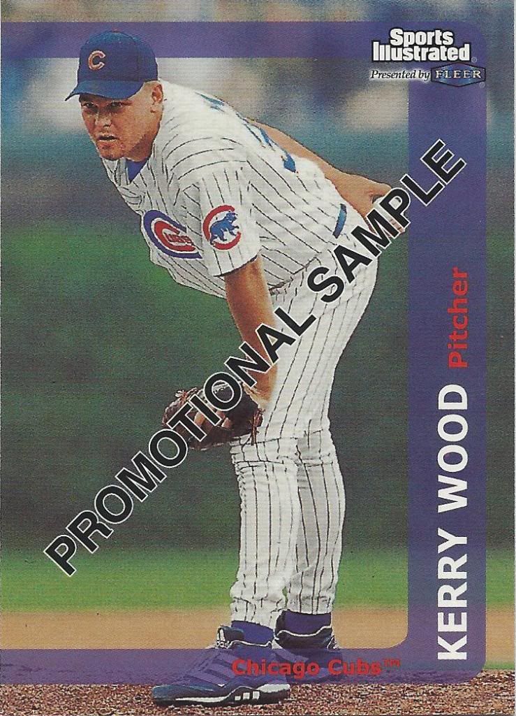
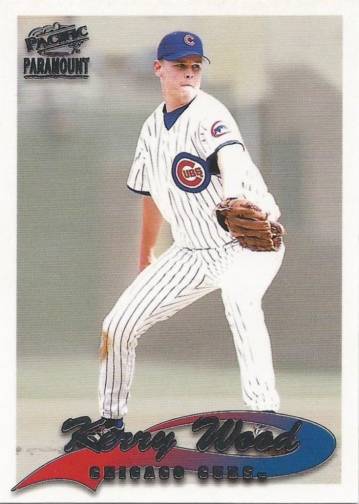
A sample rounded box
Kerry Wood was a popular choice for promotional samples back then. Remember, he was basically THE rookie in the NL. Or at least I assume he was. I could be wrong. I’m a little biased.
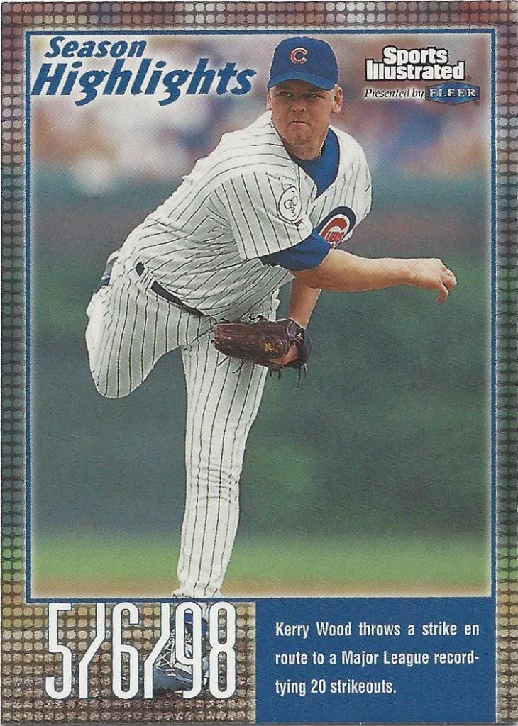
Obligatory highlight card
Yikes. I guess those dots are supposed to be lights from a marquee or something, but boy is it hideous. And again, not becoming of a professional magazine brand in my opinion.
Ball punch!
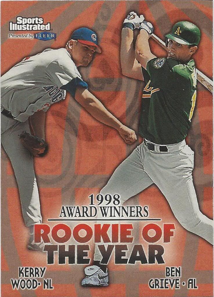
Here’s the other THE rookie paired with Kerry Wood. Neither had remarkable careers. I honestly don’t know what became of Grieve. Hell, he may still be playing and I wouldn’t know it if he’s in the AL. All I can say for certain is that he’s not a household name.
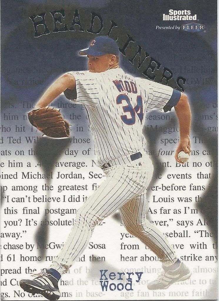
OoooOOOooo, Spoooky headliiines
It’s a nice touch to include a related article in the background. Related in that it appears to be about the Cubs, but likely not about Wood. I see Michael Jordan’s name in there and the rest may be related to Sosa and McGwire’s HR battle. Eh. Still Chicago.
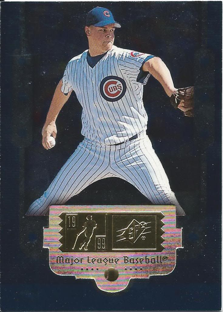
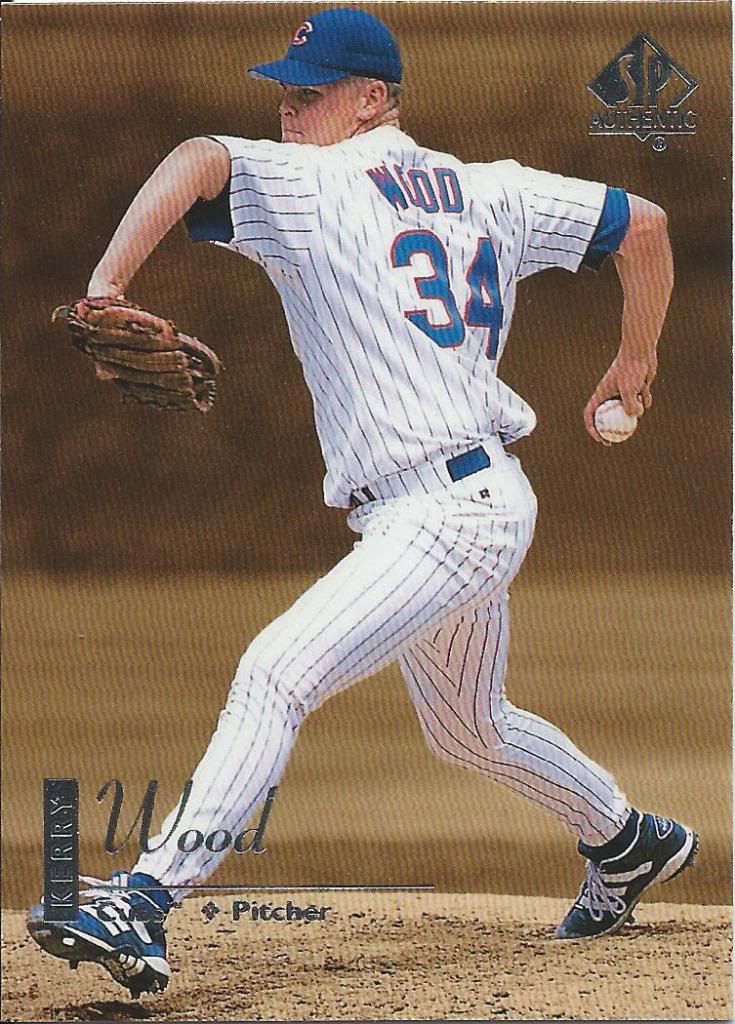
Would be better if the foil guy was pitching to match
Man, SPx cards look nice. Not every year, mind you, but when they get it right, they really get it right. Some of the best stuff that Upper Deck puts out. We’ll see more SPx in the near future from other trades, but this is a good example of a fancy foiled up card.
I’m not too familiar, but I enjoy
Here’s the last of the bunch. 30 was a nice round number and it just seemed like a natural idea to stop right before the major Topps & Upper Deck barrage.
Oh, by the way, the smile count for this entire post was zero. Better luck next time? There’s still plenty left to turn things around. Stay tuned!
Recent Comments