
Hey, remember how I still have a bunch of 18 month old trades to post? I do. The great Nachos Grande sent me some stuff a long time ago in exchange for some of the Topps online die cut thingies. The dude loves to trade, and he’s a great trade partner. You should all help him out with his want lists as soon as possible. Want to see what I got? I do.

I’ve never seen someone so confused that he’s sliding
The main thread of the trade was Allen & Ginter. Back when I could follow blogs on even a semi-regular basis, I remember Chris would buy a case each year. That is bound to produce some trade bait. I’m just glad there were a few pieces left for me.
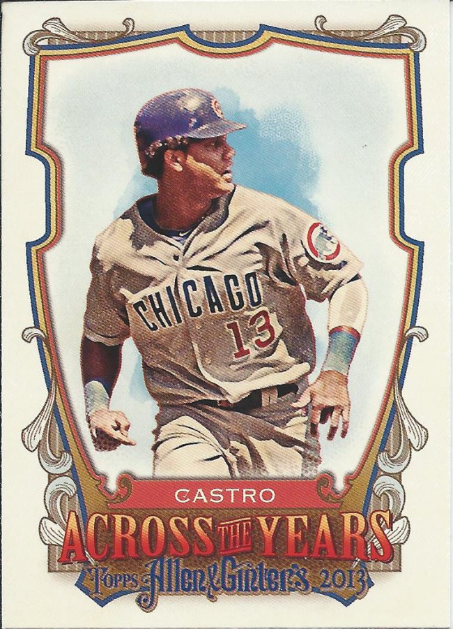
Should have one card for each day of the year
I didn’t buy and 2013 Ginter (that I can recall – maybe there was a blaster?), so I missed this insert. The back gives Castro’s birthday (3/24) and a random fact, along with a list of other celebrities born that same day. He shares his b-day with Houdini, Steve McQueen, and Peyton Manning. Pretty interesting. I share a birthday with Hillary Clinton and Cary Elwes (Princess Bride).
Ceee-raack
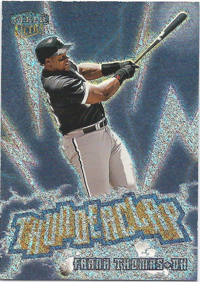
It wasn’t all Ginter, all the time. This is a badass Ultra insert. What more can you say? Frank Thomas is a god among men storming his homerun power down on the peasants below. Plus it’s shiny.
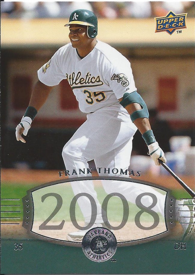
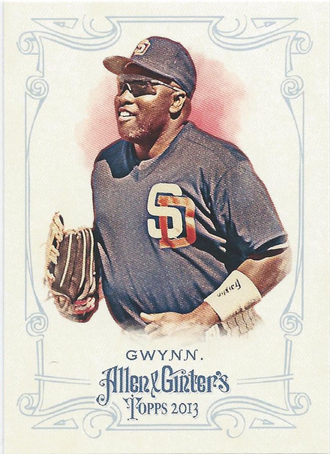
They did not win the WS in 2008
This is one of the short prints in the 2008 UD Timeline set. That set was pretty much all shortprints, really. I think they advertised that you would get 2 SPs per pack? It was kind of their Archives, because they stole some of their best past designs and made new cards out of them all. This is the Timeless Teams look, I believe.
Not the best border
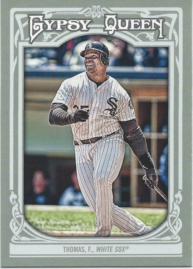
Gypsy Queen is kind of like Ginter. They’re both based on tobacco-era sets and both have mini cards. The biggest difference is that GQ is more confusing and convoluted. I’m pretty sure this set was mostly straightforward.
I can’t keep these designs straight anymore
I never noticed how similar the borders for 2013 GQ and 2013 Ginter were. Put some weird green/blue background on this and they’d be near identical.

Also, they didn’t need that “TM” back in 1990
I did a little research, and this Archives card is pretty close to the actual 1990 card. The picture is completely different, but the rest of the elements are okay. Major differences are that the solid corners should be on the opposite ends (and the dark blue at the bottom) and the Topps logo was black. The fading dots also were not this defined. They looked more like old comic book ink spots rather than this precise thing.
Boggs as a Ray still “bogg”les my mind
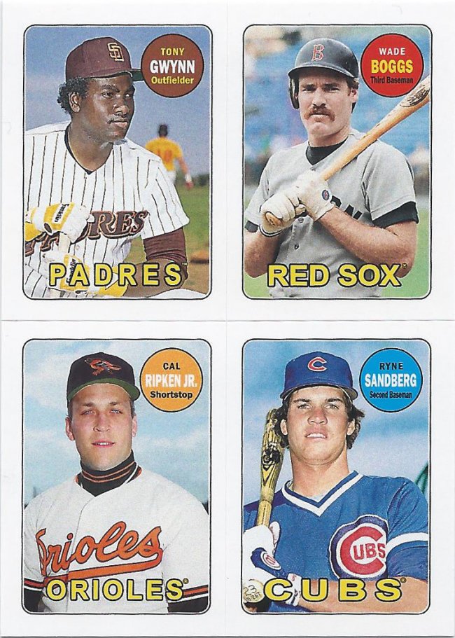
This is my second favorite card of the package. I could be wrong, but I think this was a retail exclusive insert. These are 4 tiny stickers for your locker or trapper keeper. There’s a lot of talent on this sucker. I really only need the upper left quadrant, but I’m not parting with the rest.
It’s like a card within a card — that’s not a rip card
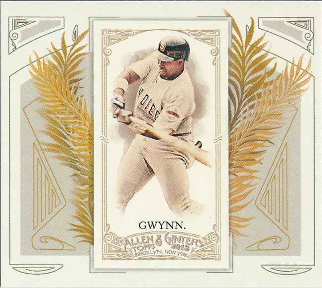
And this is my favorite card of the group. Here’s a Tony Gwynn N43 boxtopper. It’s slightly oversized, so I’ll need to find some special protection for it, but I’m happy to take on that challenge. I’ve always enjoyed the boxtoppers from Ginter. Both these and the cabinet cards feel like oddball sets packaged in with a real one, and I love the oddball stuff.
Thanks again very much for the quick and easy trade, Chris! Hope we get to do it again sometime.
Recent Comments