
I actually have a little time to write up a post tonight! Before the ghost of Community Break Present sweeps us off on our journey tomorrow, the ghost of Community Break Past is here. This ghost isn’t going to tell us what things would be like if gimmicks and SPs never existed. He’s not smart enough for all of that. He’s simply going to show you things that have actually transpired in the past.
Expect no self-realizations or bell-ringing at the end. This ain’t Christmas ya know.
Imagine if you will, a simpler time. The year was 2011. Some band I don’t care to follow was climbing up the charts. A crappy movie was number one in the box office because there was nothing better to see. I had (slightly) more time to blog.
And blog I did. You see, my first large Community Break had just taken place. A big honkin’ pile of Fleer products, not unlike the variety we’ll see in the coming days, was ripped like presents under the tree while the aforementioned ghosts creepily looked on. It was an exciting time.
It was so exciting, in fact, that in the fervor of posting pictures of Will Clark and Derek Jeter autographs, I forgot to ever show off the cards from the break that I kept for my own player collections. Good thing that ghost is whispering in my ear (and that he’s not evil…so far).
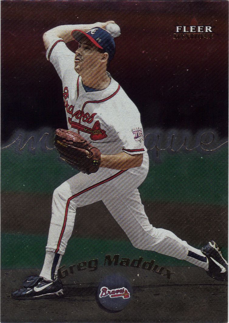
The mystique is in how to get it to scan well
This was a fun set. A lot of us get on the card companies for producing gimmicky cards, but when it’s this type of gimmick, then I’m cool with it. The peel away cards was such a unique and surprisingly satisfying experience. This particular card was not a peel away type, but still cool.
Where the hell are the fans?
Something really disturbing is happening just beyond the camera’s lens.
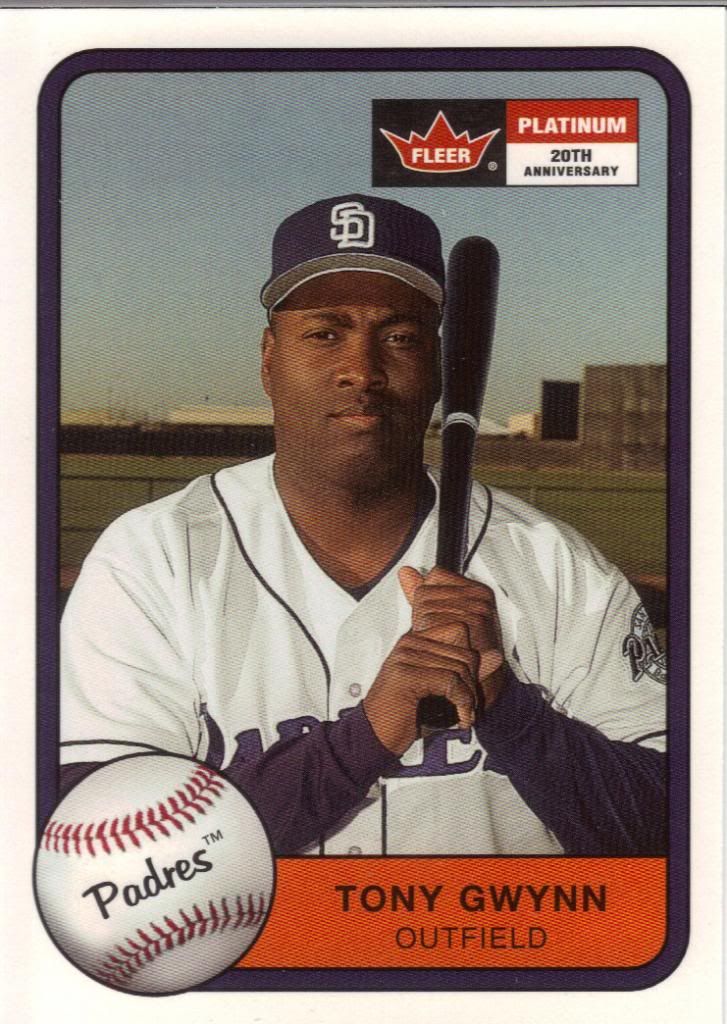
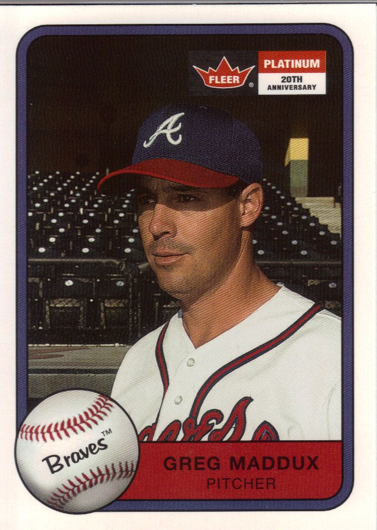
Tony Gwynn is not amused by this blog
Remember the days when a player would retire and then you wouldn’t see hardly any other cards of them? This was around that time. Of course, two years later that all started to change and people like Tony Gwynn was showing up in every set all over again.
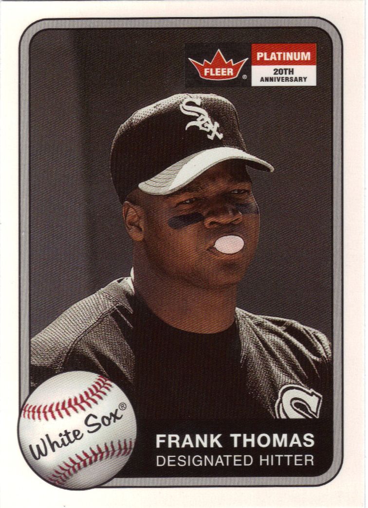
Super stoked to be blowing that bubble
I think something disturbing is happening in this picture too, but not so disturbing that the Double Bubble can’t be enjoyed. You know, it’s odd that no one looks happy in this set.
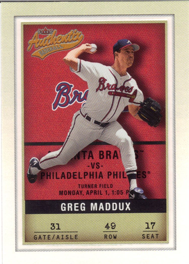
I don't think that's a real seat
It’s tough/impossible to tell, but the card has a little beveled edge action going on. I think that’s the only reason I like it. Sturdy card stock with some texture is all it takes, people.
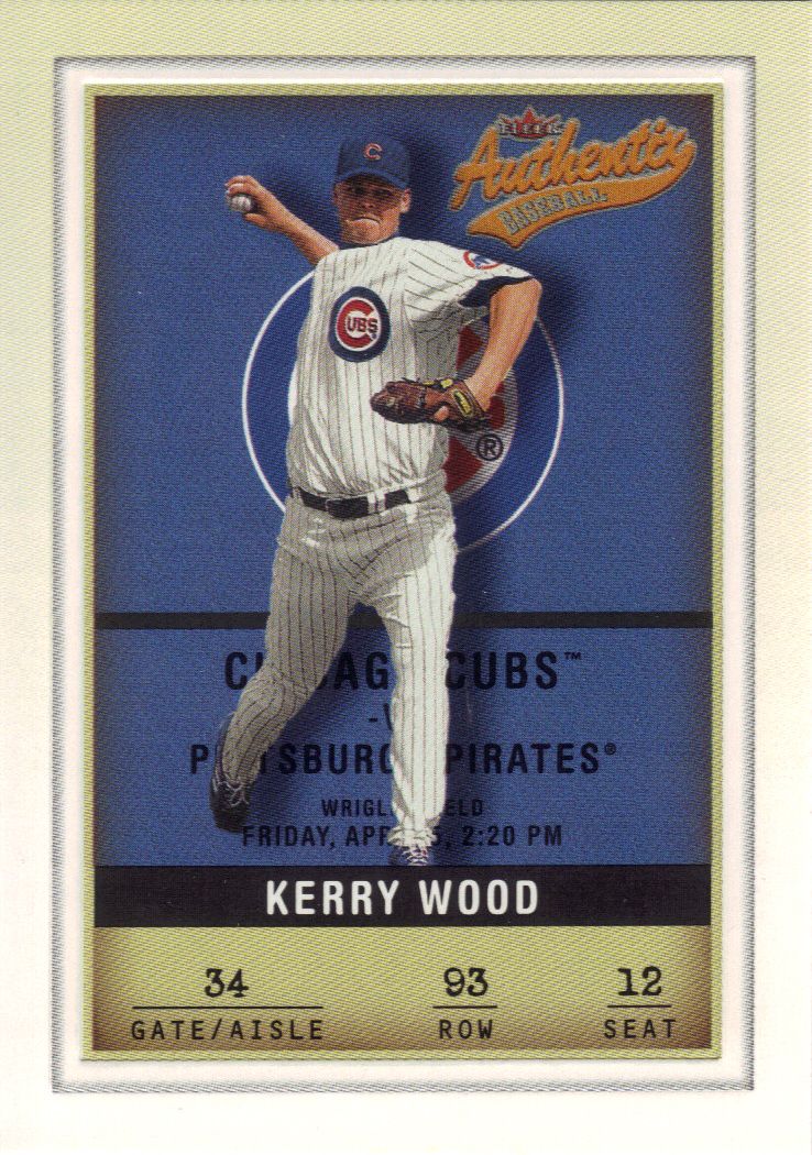
Ruffles have ridges
Knowing the Cubs, they probably lost that game to the Pirates. I could look it up, but…eh.
Someone smudged the background
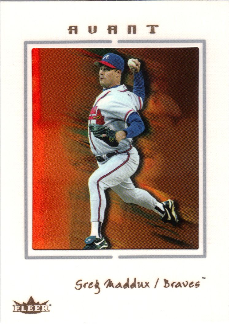
Speaking of texture and sturdy card stock. Avant has both. Each card congratulates you on owning their special technology, which I think means some blurry abstract color smears behind your photo.
Congratulations!
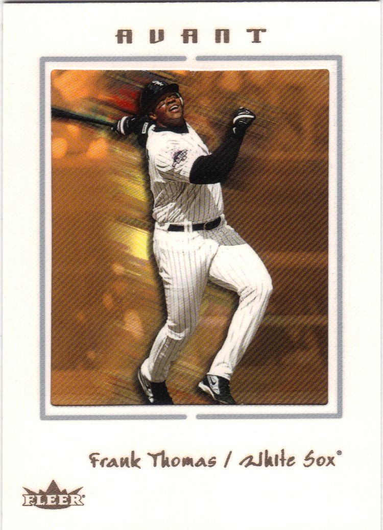
It’s like he’s jumping off the card! It’s actually nothing like that.
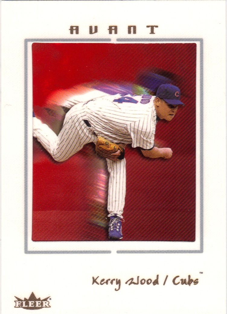
and the cards will run red with the blood of the strikeout victims
You know, these are sort of like Sportflics cards without the actual motion. or visual interest.
Back to the non-textured
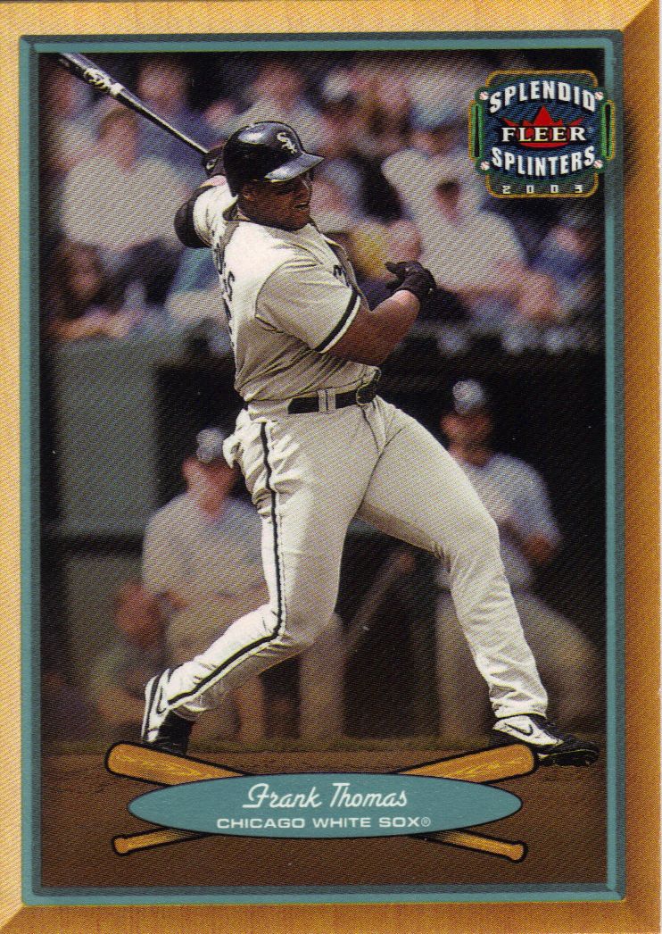
There’s no crazy bumps in these cards, but there is a gimmick to the set. Some of them are printed on actual wood. Not this card, of course.
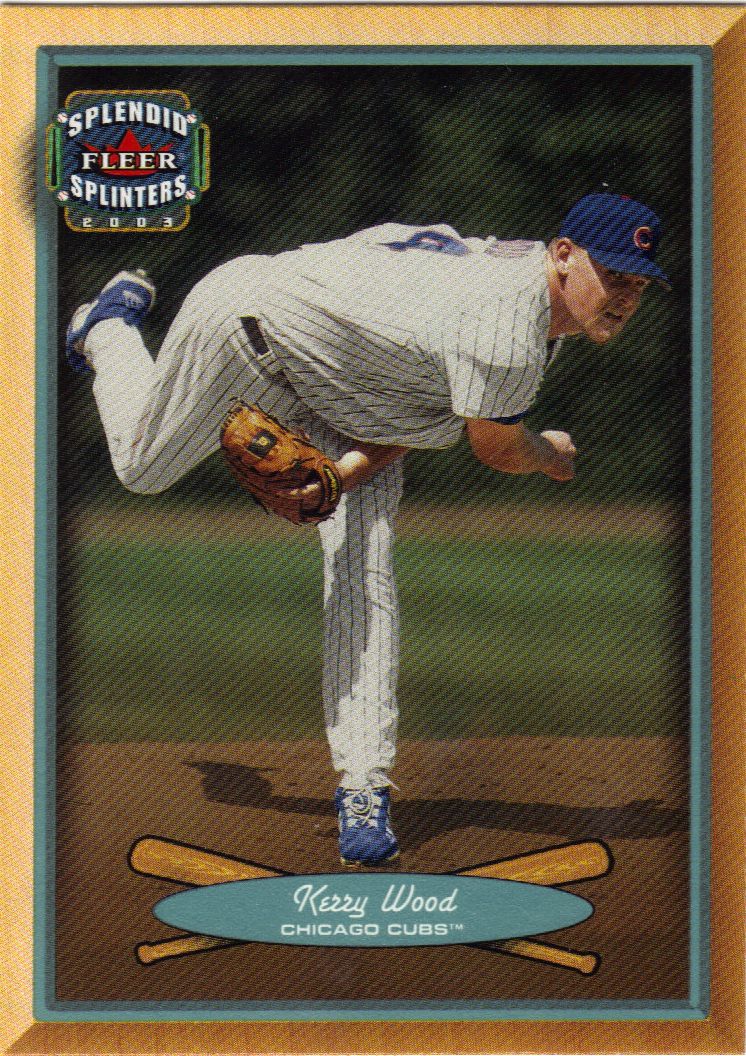
Pitcher in a bat oriented set
Neither is this card. We’re not talking the fake wood print that Topps has been using. Actual real-life wood. That’s cool even if these cards are kinda on the bland side.
Doesn't he look surprised that he's throwing a ball?
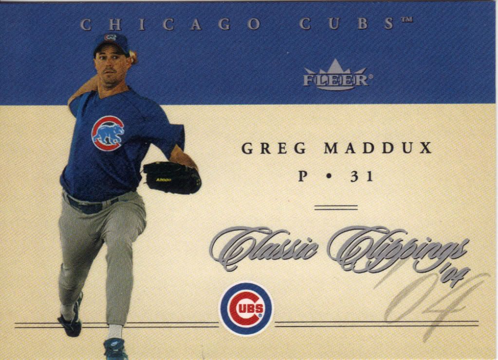
This set was a low point. How many ways can they fill empty space that probably doesn’t need to exist in the first place?
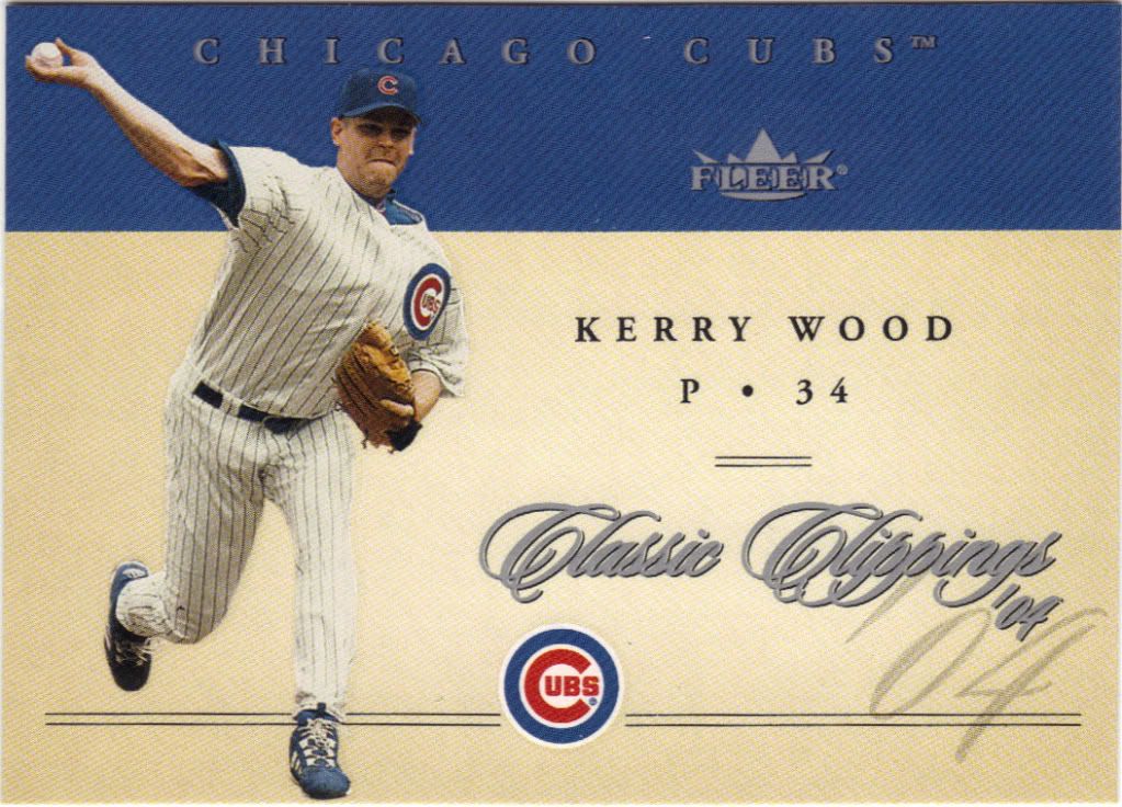
And that just looks painful
They could have made the set relate to clippings somehow, don’t you think? Or make it look more classic than just a cursive name.
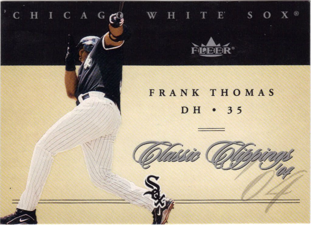
Frank is ducking the camera at this point
I’ll give them credit for including the player’s jersey number on the front. I think that’s a feature that belongs on more cards, but that’s a rant for a different day.
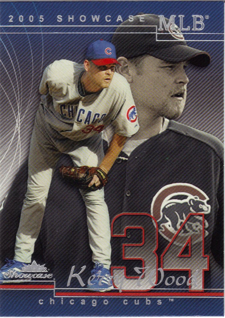
Kerry's sitting on his own shoulder & possibly his own hand.
Talk about featuring a jersey number! That’s what I’m talking about. Okay, that may be a bit too big since it overshadows the name, but it’s a good start. And a good looking card overall.
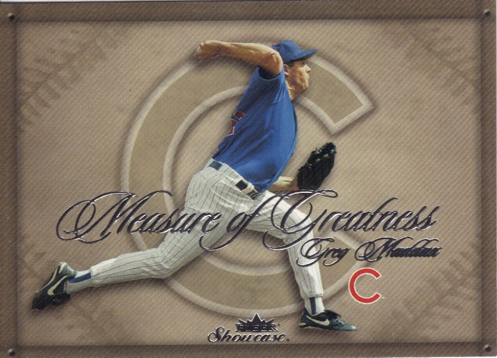
Shouldn't there be a measuring element on here somewhere?
You may think we’re going backwards to the Classic Clippings set, but nope. It’s simply more cursive writing on a oddly void insert set. Still, it was great to at least get one insert out of break.
There were several more inserts for my collection in the All-Topps break, however the ghost is tired and fading fast. Literally.
We found a lot of great hits in this Fleer break, and more than was promised. Here’s hoping the Upper Deck break will be just as good. Thanks to everyone that’s joined in and good luck to all!
Recent Comments