
Before my finances got all out of whack and I had a steady stream of disposable income, I was able to take part in a couple cheap group breaks.
Now, normally, I give each of these their own post, but I’m not going to. Neither resulted in anything for my player collections anyway, so each only gets one scan worth of space. Please don’t take that to mean that I didn’t have fun participating. It’s a time management thing.
The first was from back in February. I participated in one of Tracy’s Box Breaks. I got to know him through his twitter handle, @batcavelv. If you’re not twitter-savvy, you can also find him on his blog. He regularly has decent, very cheap breaks and he handles them quite well.
I picked up the White Sox in a 2012 Opening Day retail box and a I honestly am blanking on the year (1998? 96?) Topps Chrome in hopes of landing some Frank Thomas stuff in Chrome. The Opening Day would be purely bonus.
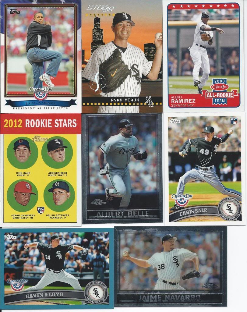
Not a bad haul for the price
So, no Franks for me from either series. I did get a blue parallel from OD and that Obama insert. The other three you see were some of the freebie throw-in’s that Tracy sent my way. All of this is for trade (and more if you have White Sox needs from either of those sets).
The second break came courtesy of SportsCardBlog. He was opening an entire case of 2007 Ultimate. A whole case!! I again grabbed Blue Jays in hopes of landing a Thomas hit at a low single digit price point. Maybe I paid $10? I can’t remember, but I know it wasn’t more than $10 for my slot.
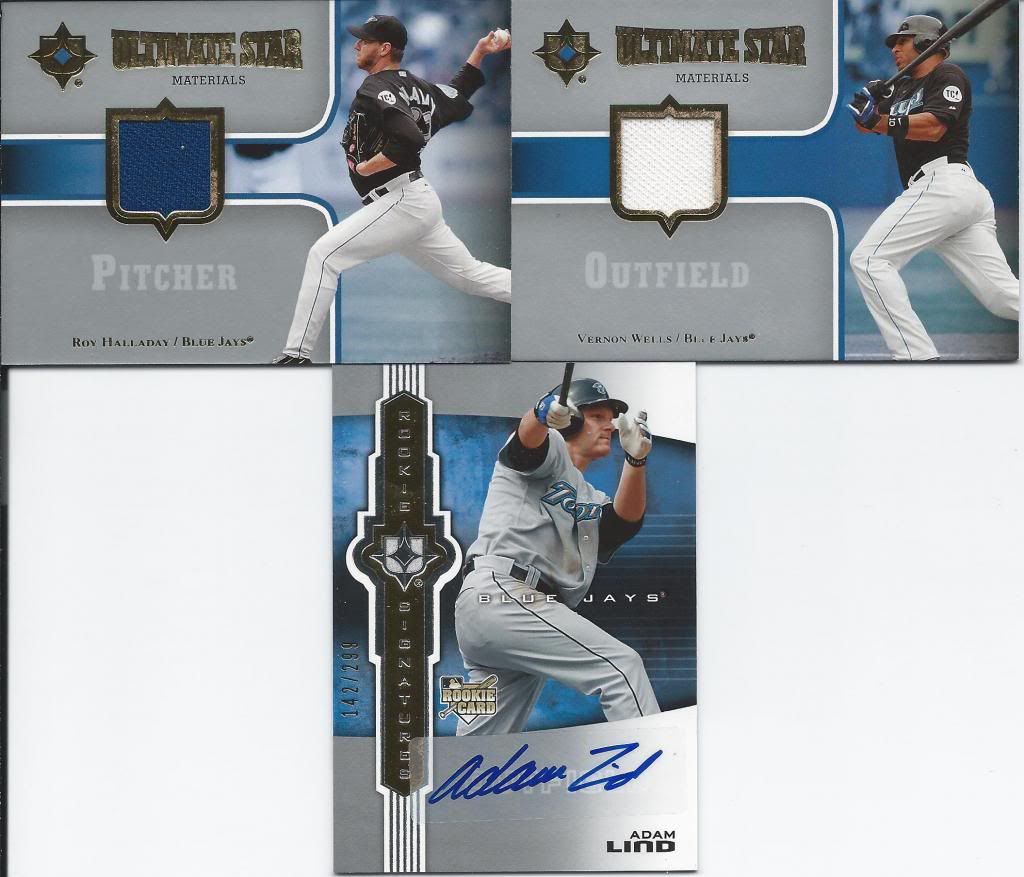
I'll buy that for 7 to 10 dollars.
Well, I wound up with three hits, but none were the Big Hurt. That’s quite alright, because these hits don’t hurt at all. I feel like I walked away with a very nice package. The Lind auto is numbered to 299 and is a sticker. The Halladay and Wells relics are not numbered and all three are for up for trade.
See? That was short. So, why not show off some goods from one of my own breaks? Remember my old All-Topps break? Yep. I never posted my personal haul.
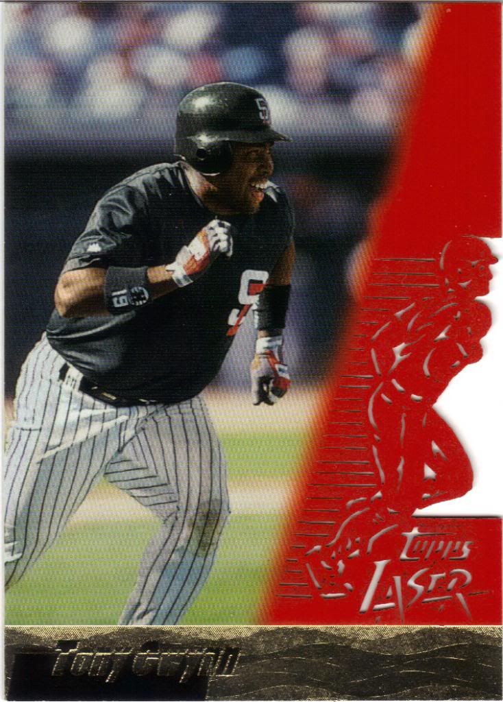
Hey guys, I think a piece of my card is missing...
Run, Tony! Run from the lasers! They’re cutting everything!
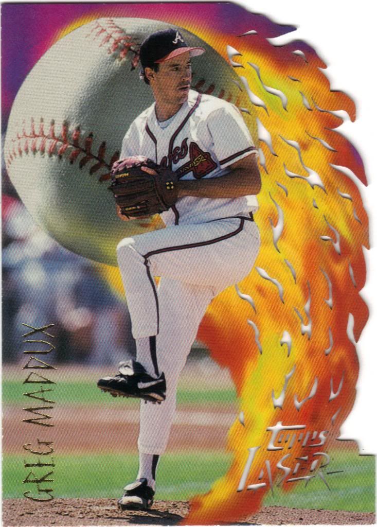
Great ball of fire
Is it safer to pitch into the flame or away from it? Should he be dropping and rolling?
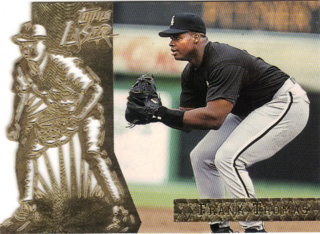
The laser cutting is quite amazing, no?
Who’s copying who in this picture?
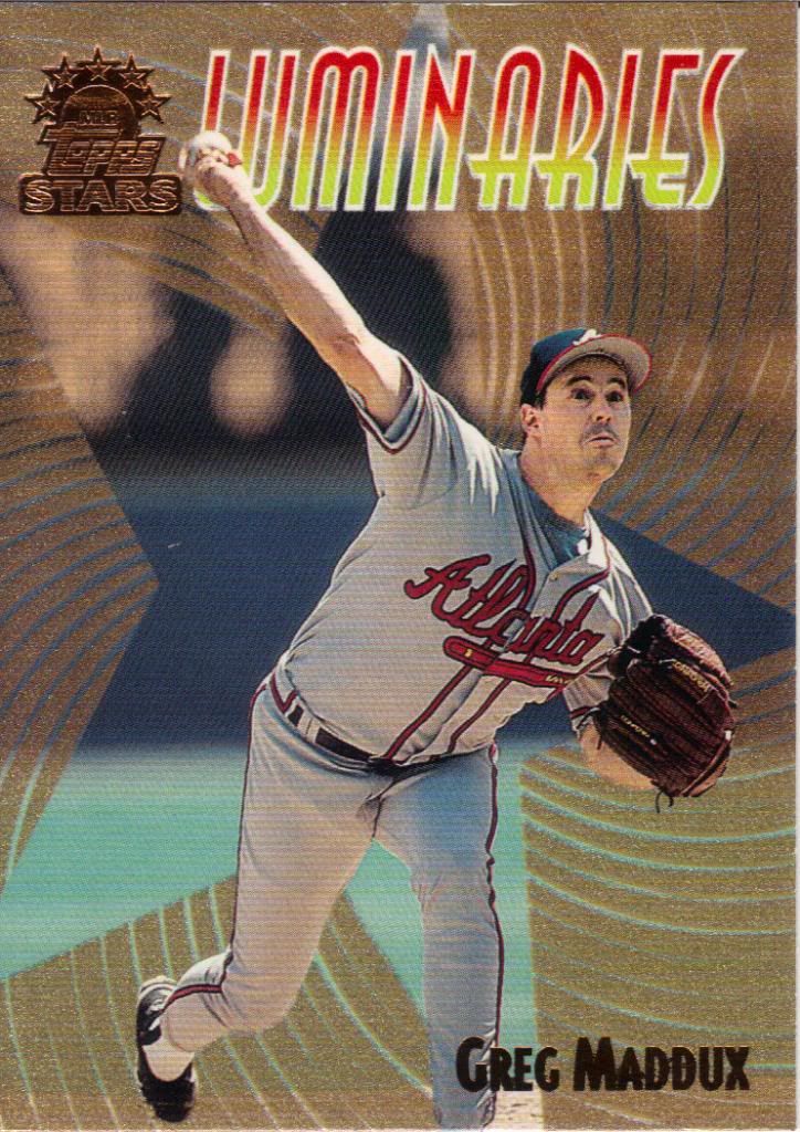
Luminating.
The trip through 1996 Laser was quick. We’ll be staying with 1999 Topps Stars for a while. First up is this subset of the Mad Dog. I love the swirling foil star in the background. Very cool look.
Far
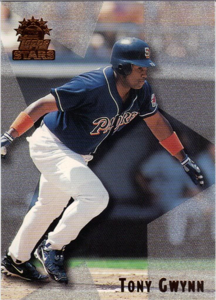
The regular cards get the star, but not the swirl. As a consolation (?) prize, they do get parallels.
Not as far
Like this. Each star level zooms into the photo to a degree. I think there were two one-star parallels per pack so it’s not that amazing I landed this.
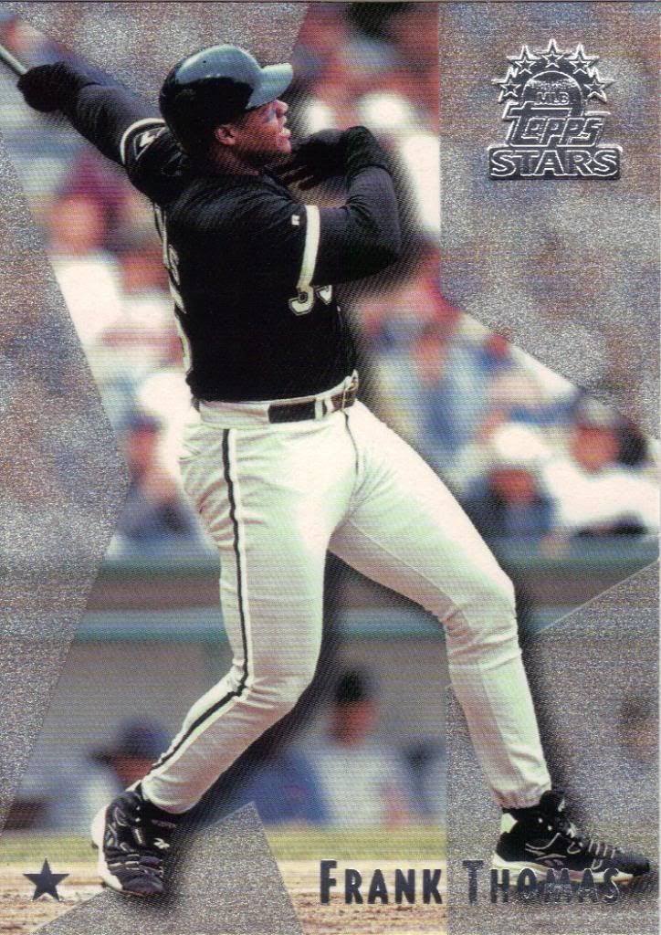
Not as far
What may be more amazing is that I didn’t see a non-starred Thomas. We jump right to the one star.
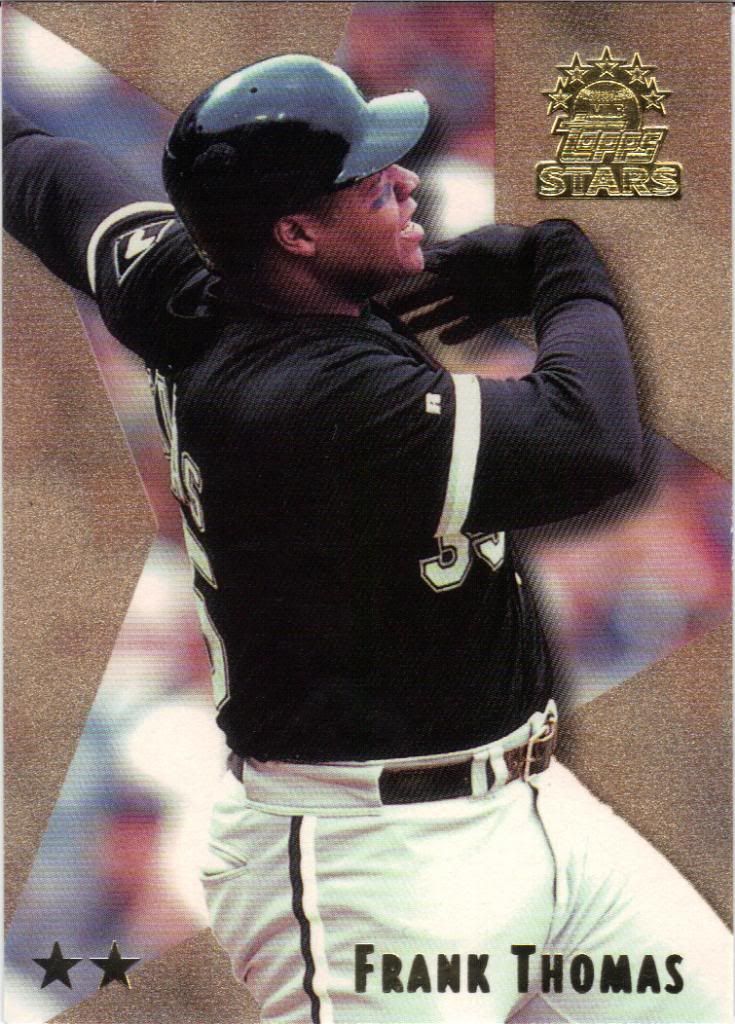
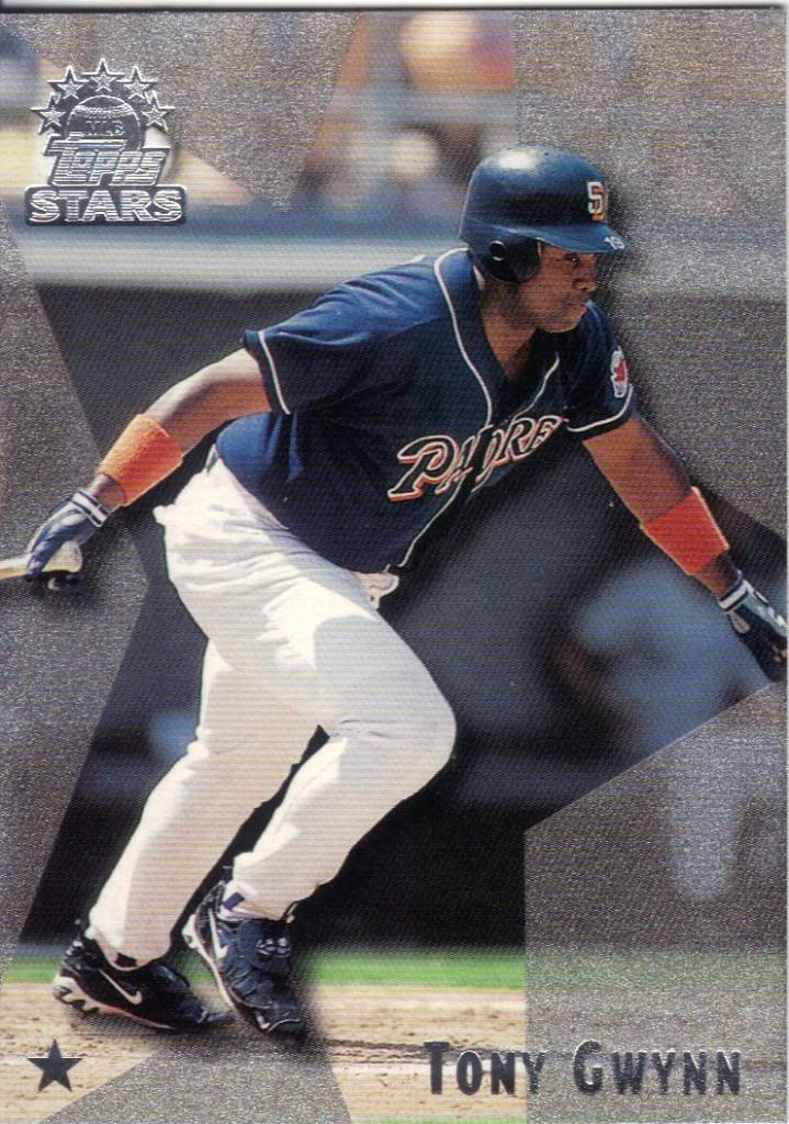
Near
I was lucky enough to gain this two-star version as well. There are 4 levels, increasing in rarity, but not every player has all 4 star versions. Sadly, FT is one of them.
Far
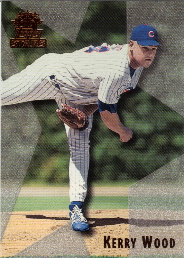
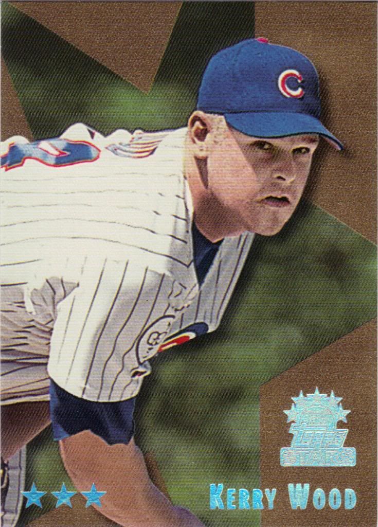
Kerry Wood is another. Just my luck.
Not as far
Well, my luck is improving. Two down. Not counting the foil parallels
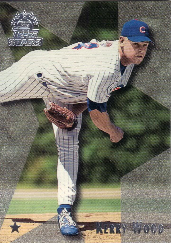
Quite Near
Hey, alright! Luck was in my favor, nabbing this three star. I think the 4 will be half-way up his nostrils at this rate. Too bad I didn’t find out.
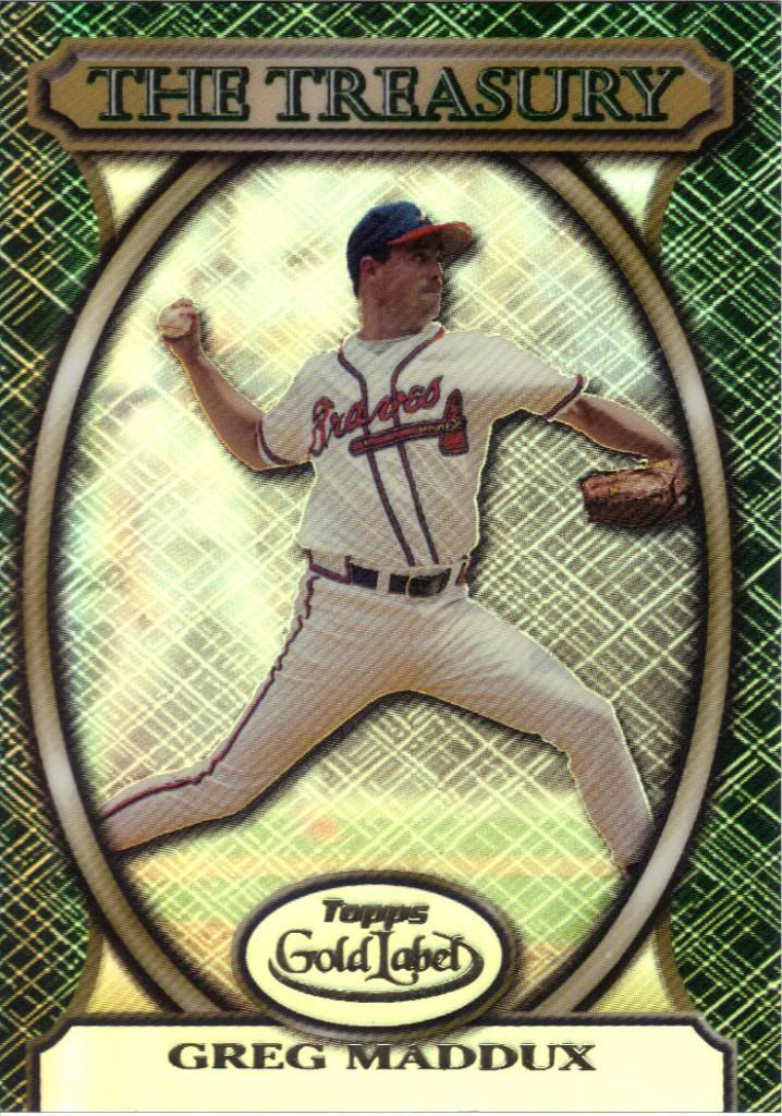
Topps should make a Treasury baseball set like they did for Basketball
The Gold Label box yielded a couple good insert cards. I’m only showing the one, because the other actually has left my possession. I’ll talk about the circumstances surrounding that eventually, but for now, we shall marvel in the shiny stupor caused by the Treasury card.
2000 #4
Time to do another round of “Name the Pattern”
Pattern #4 – The Press Conference
All it’s missing is some random corporate sponsorship peppered in.
2000 #5
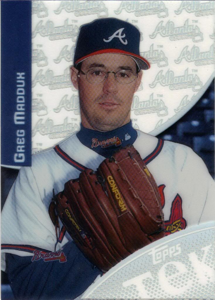
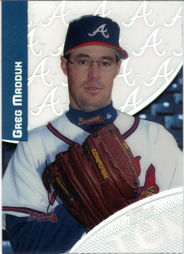
Pattern #5 – Logo Stalkers
Look out behind you!
"B" is for "Buh??"
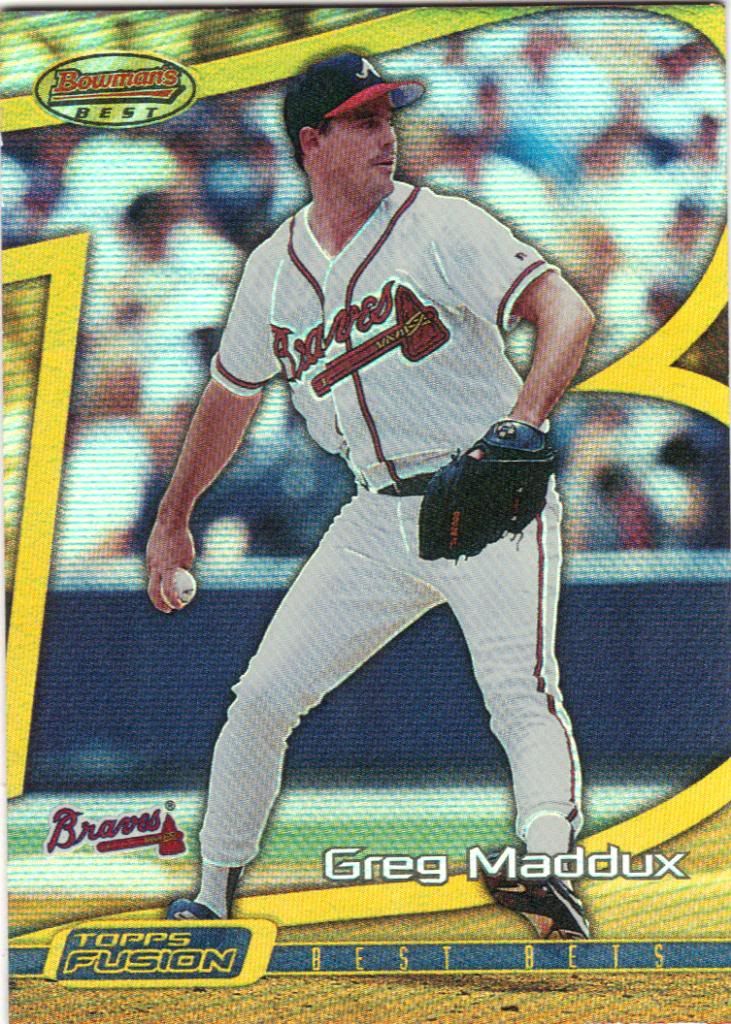
Topps Fusion may get the award for most confusing Non-Bowman release. The concept is to make something of a greatest hits album and then proceed to take a dump all over it. So, within the set there are several subsets covering a few of their most popular releases, like this Bowman’s Best type card.
"Why aren't I painted?"
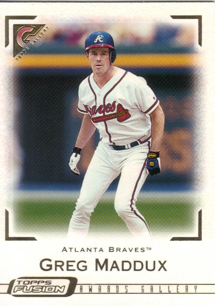
And here’s a Gallery. Except it’s not a Gallery. It’s a Fusion. But it looks like a Gallery and has the logo. But it’s not. Oh, and while trying to decide, Greg gets totally confused and is tagged out in a rundown. The set also has Stadium Club and Finest themed cards. Some players get them all, some only get one. It all depends and none of it really matters.
I guess the Braves are winning
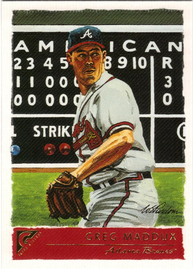
Here’s a real Gallery card from the same year. I don’t know if the scoreboard is trying to indicate a real game, but if so I have no idea which one it might be. There’s not nearly enough info to work with. And too much eyebrow to distract me from the mission.
I like the background effect here
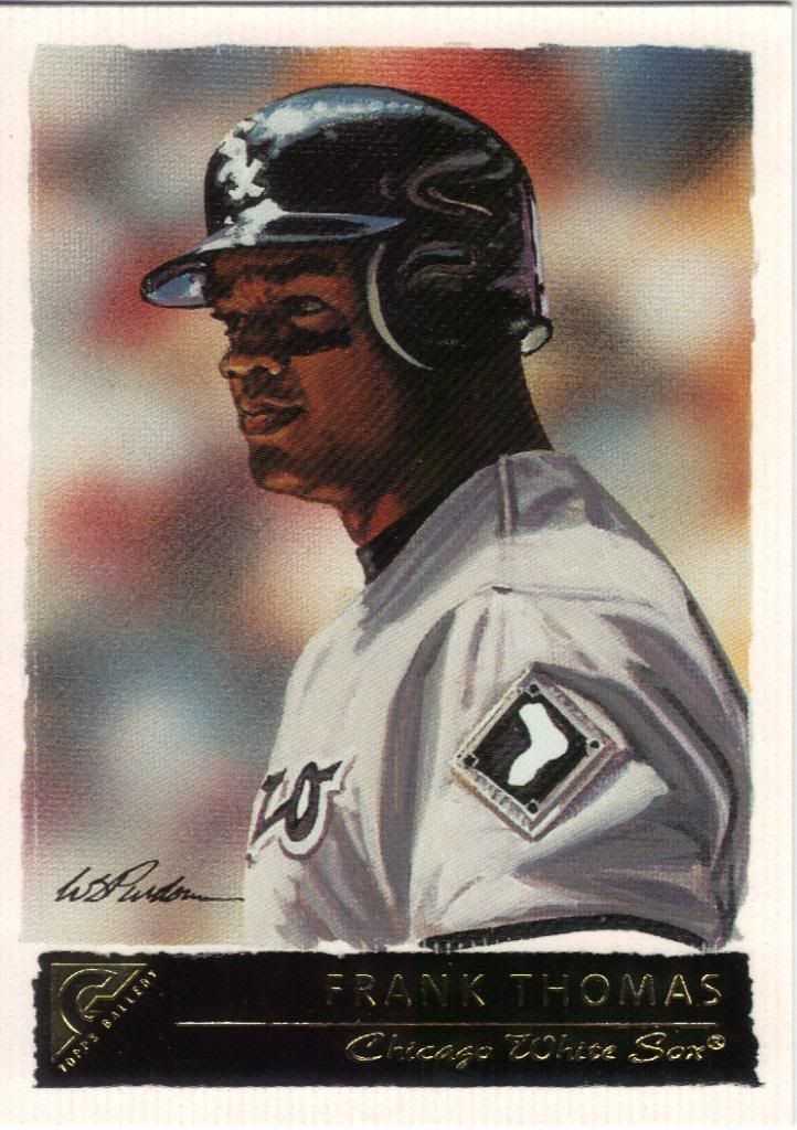
Another card from the same artist. This looks better, I’m going to nitpick a tad and say the letter coming before the “O” on the jersey doesn’t look anything like a “G.” What do I care. I can’t paint like this.
Prominent jersey number
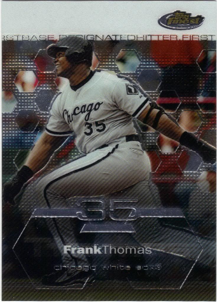
The 2003 Finest set is nice. It may not be the nicest, but it’s certainly better than what we’ve seen from the brand in the past few years. The other nice thing is that refractors were still relatively rare back then. What a difference a decade makes.
Go, blue bees!
I don’t know why some cards (see previous) have background images behind the beehive and others (see immediately above) do not. Good choice going with team colors, though.
Not amused
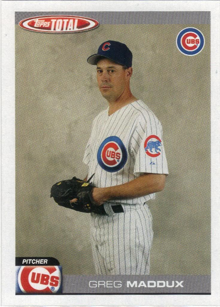
I’ve said it before, and I’ll say it again. I’m not a Topps Total supporter. It ain’t a budget brand when you need 3 boxes to have a chance to complete the set. I’m glad the run is over. So is Greg.
Somewhere in the middle of Arizona
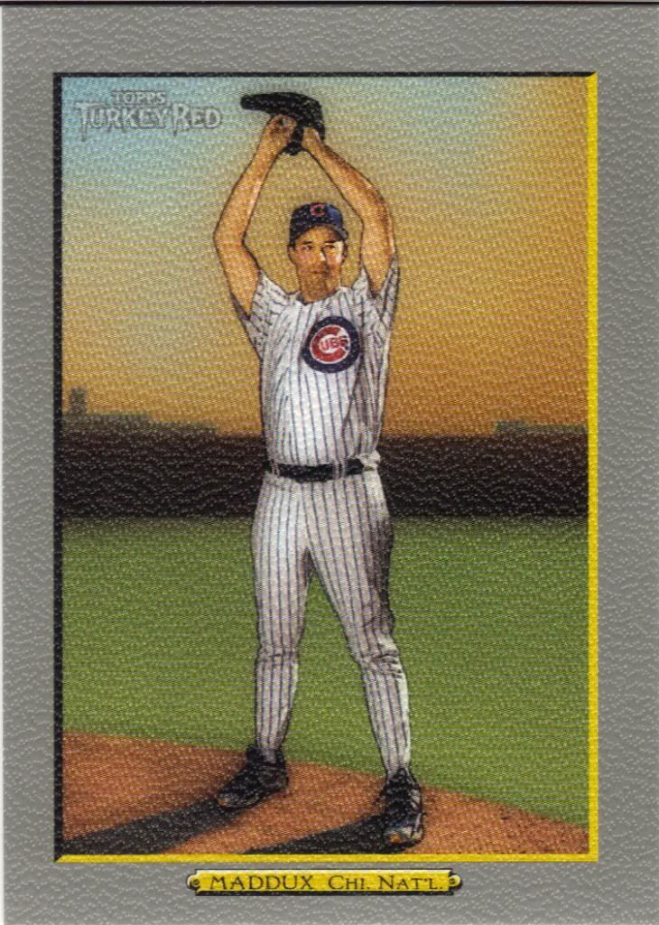
I’m also glad the Turkey Red inserts are done (Not thrilled they were replaced by minis). This isn’t one of those inserts. This is from the actual set. A set that incorporates several levels of parallels. Blah. At least the card stock is decent.
Somewhere inthe middle of the Sahara
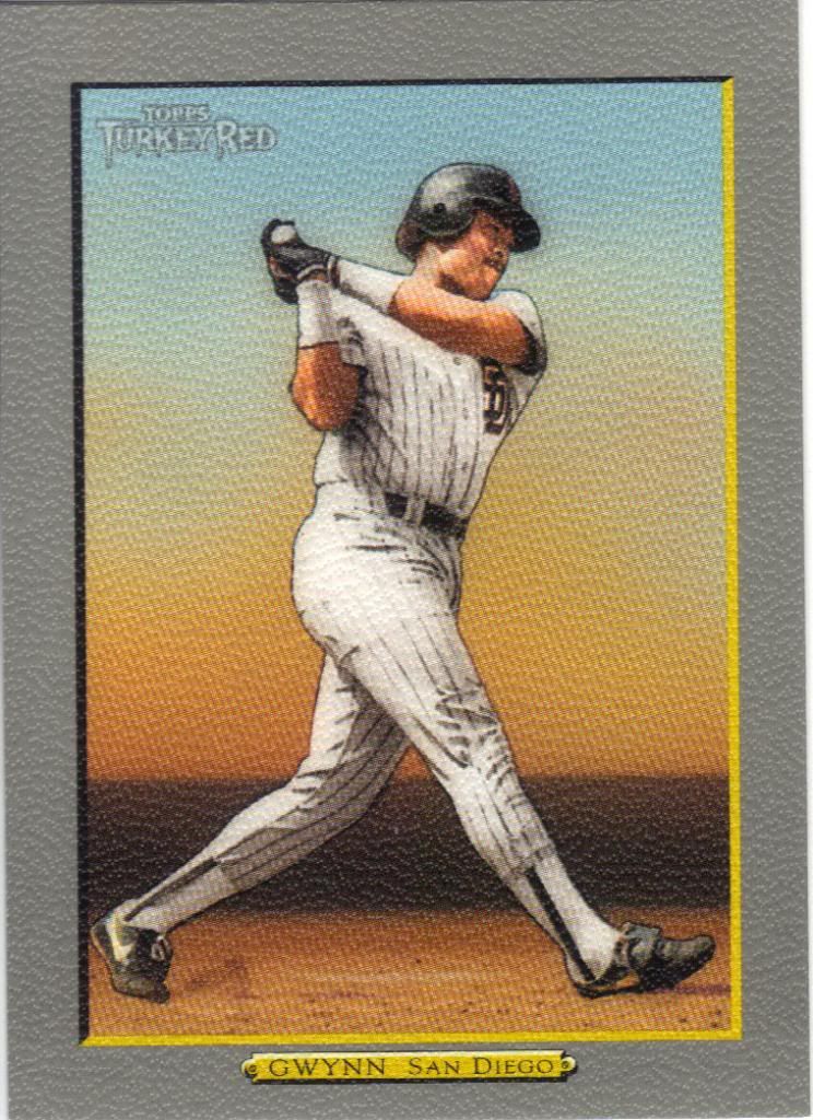
The set also loaded itself with all kinds of short prints and variations with no labels. They would never do that these days…. As far as I can tell, I dodged that bullet with all my player collections. Gwynn is a retired player, so that may make him an SP as well.

I guess that's Chicago?
What. The. Hell. Is that windup? Look, I’m just glad he didn’t have to hold that pose for an artist.
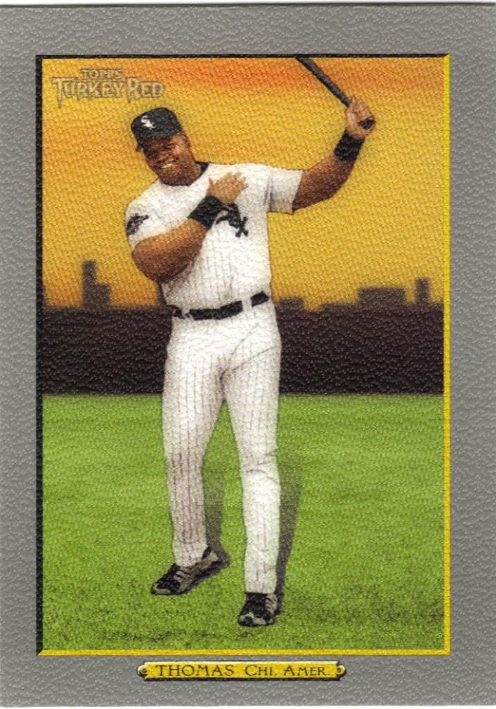
Also chicago?
Four players means a lot of parallels to chase down, but I don’t need all of them, because…
Here's the white, now where's the Sox?
I got me a white border. These look much better than that nasty gray. The more common red border version also looks nice. Maybe one day I’ll have a black or gold to show off and compare side-by-side.
There. I think that’s a sufficiently long-winded post, don’t you? (If you thought this was long, just wait until my next post. That may take a couple days to finish up.) Three group breaks. All different. All great examples of what makes collecting fun. Thanks a lot to the two break hosts above and let me know if you’re interested in anything from those first two images.
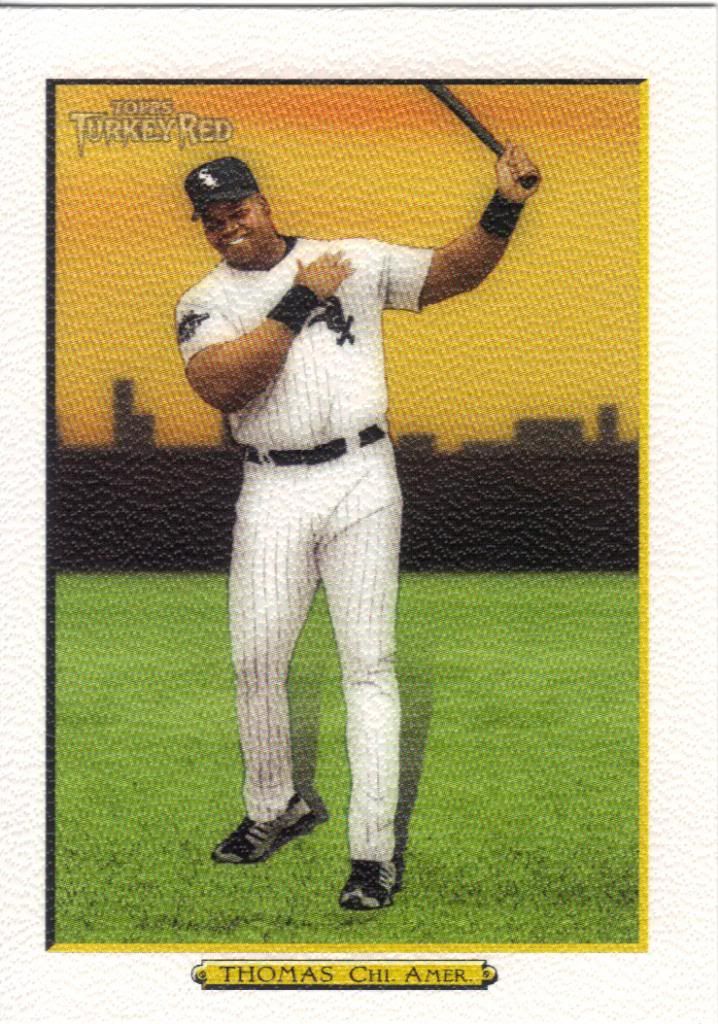
Awesome cards. I just added The Big Hurt to my collection. He’s one of those guys you just couldn’t ignore during the 90’s.