How long has it been since we last left my gigantic trade with reader Fred. If you missed the first part, and I imagine at this point most of you did, check out that post here. When you’re done with that, the second part can be seen here.
To conclude this particular trade (we’ll catch up with Fred again in the near future) we’re going to continue with the 1999s. Going in alphabetical order and seeing that Topps card below to kick things off, you must be thinking that there can’t possibly be that many more cards to show off.
You shouldn’t underestimate Fred, my friends.
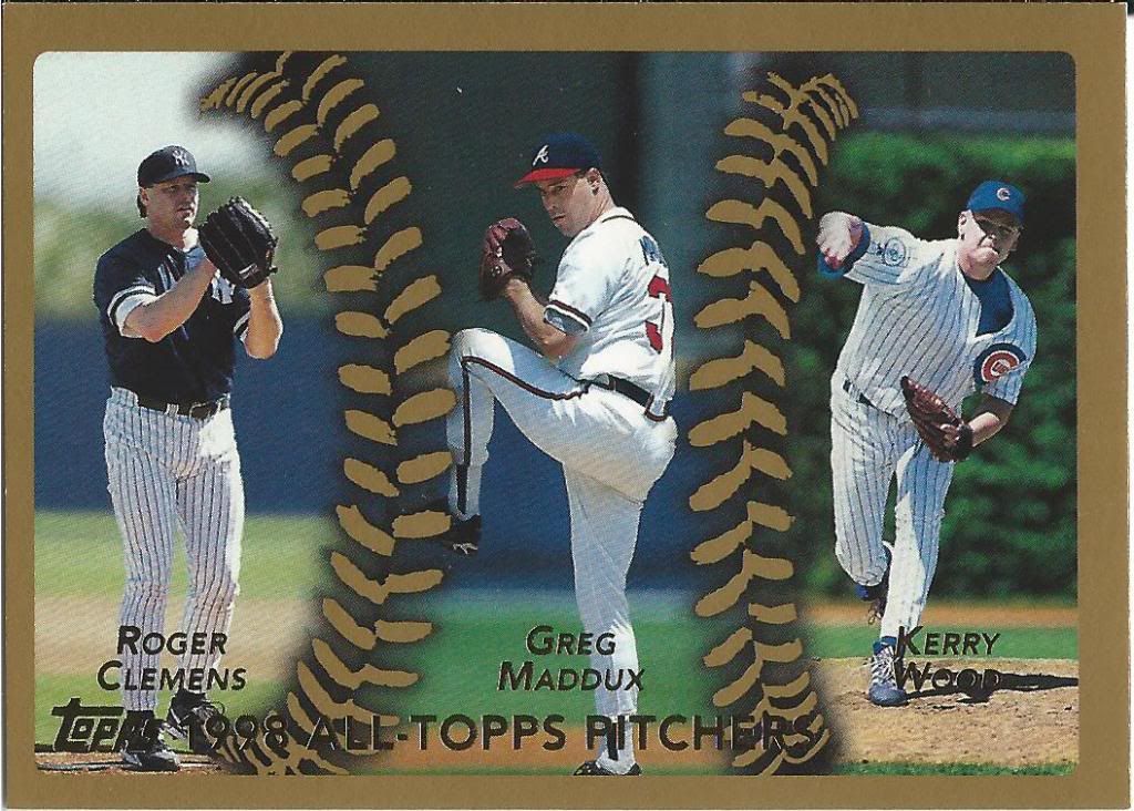
Not a league leader card, per se
Consecutive Cy Youngs; Consecutive Cy Youngs; What could have been.
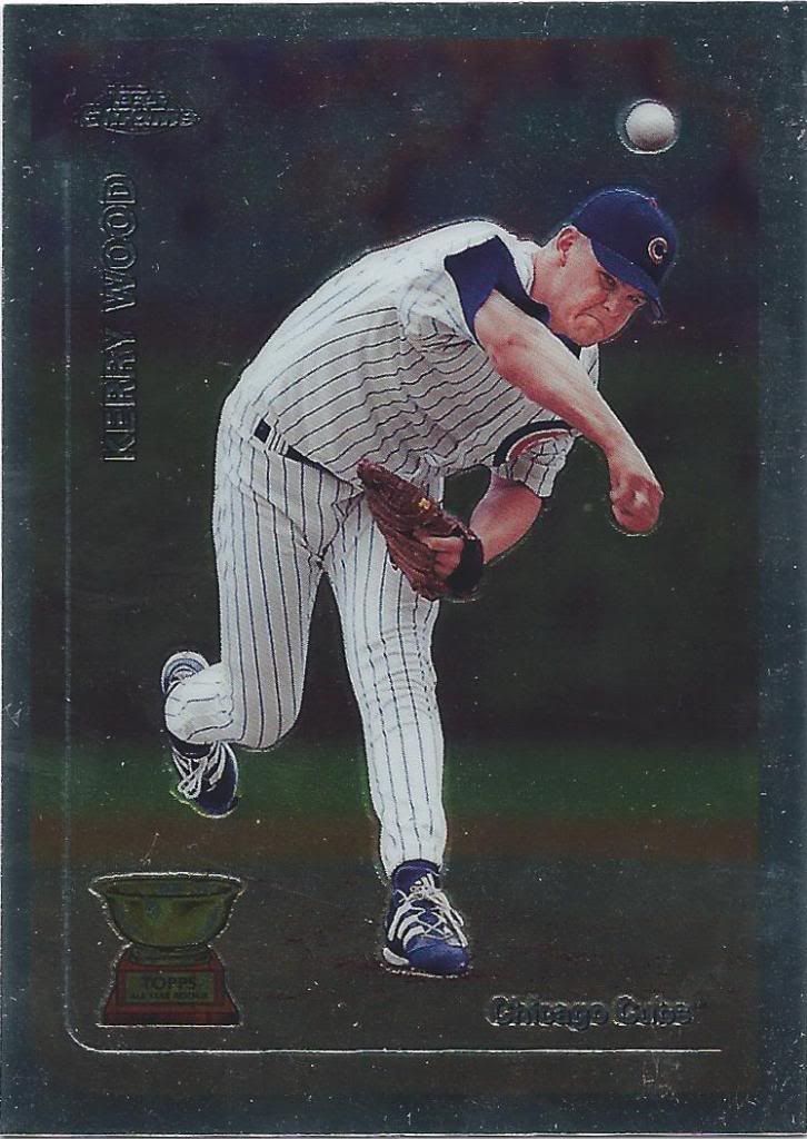
Metal just makes him angry
Did you know that there was a time when the chrome set was a full parallel?
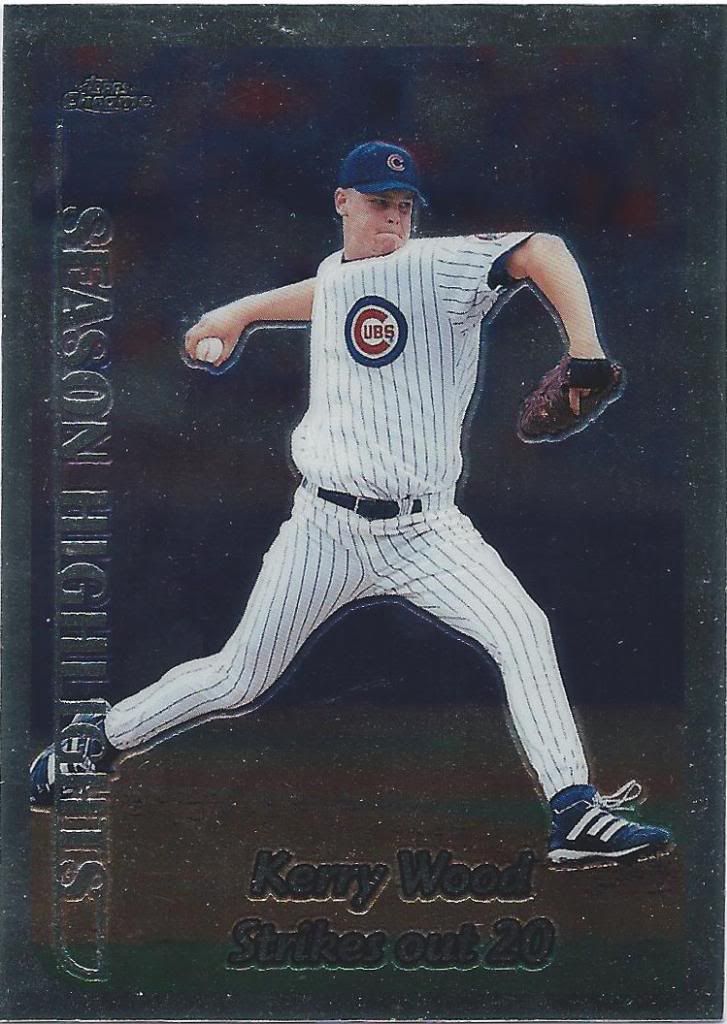
Little known fact
That includes the insert sets and everything. I don’t have any of the chrome inserts. This is a subset. From back when those existed, too.
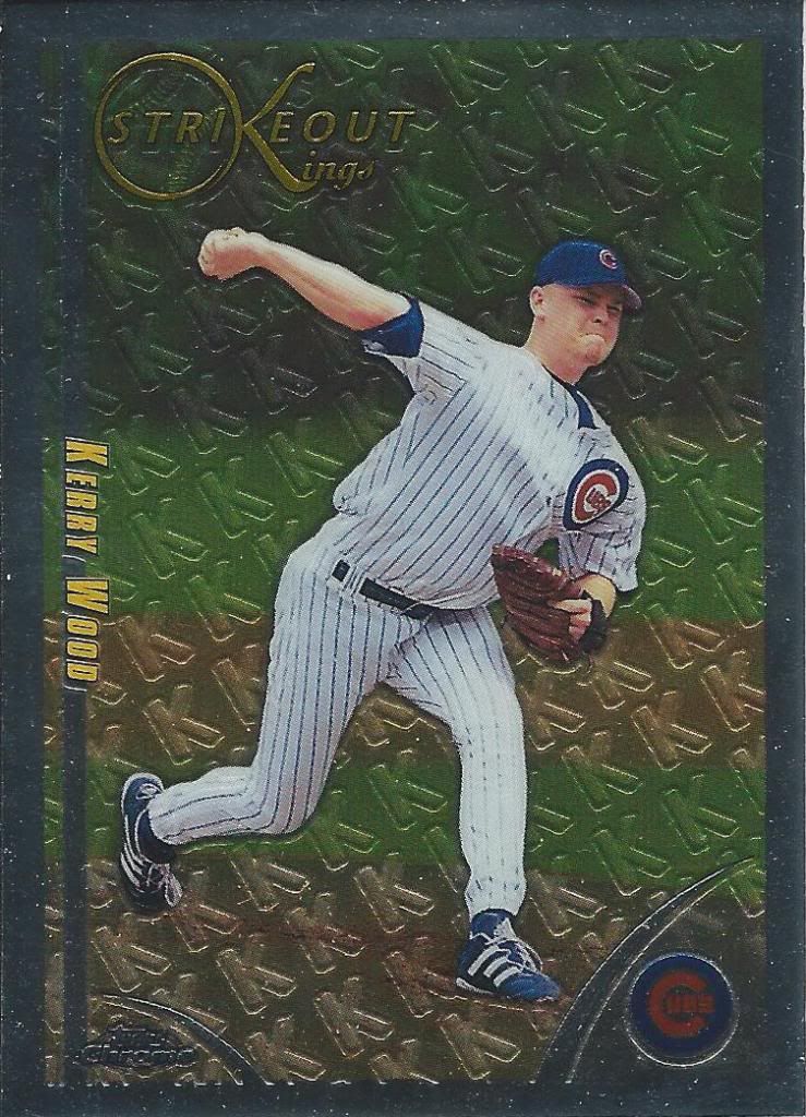
That’s a whole lotta “K”s
I also don’t have any of the refractors, but they’ll come some day. I’m happy to start off with the chrome.
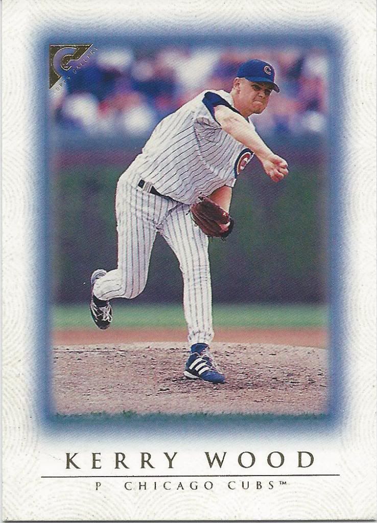
That’s some wrist snapping action
I wonder if Topps is going to bring Gallery back at any point. I’d love to have that as another mid-level style set like A&G or GQ.
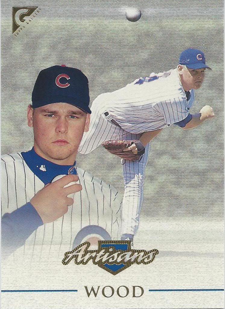
That’s the face of a tortured artist
I bet you can’t guess what particular event is cited in describing Wood as an “artisan.” It starts with “20” and ends with “strikeouts.”
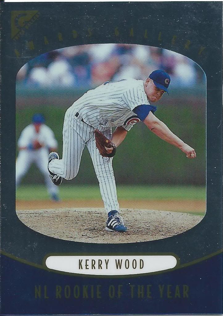
This looks more like a TV thing than a museum thing
I think this is the wrong way to do the arm pump after winning an award. Could be wrong. Not like I’ve ever won rookie of the year.
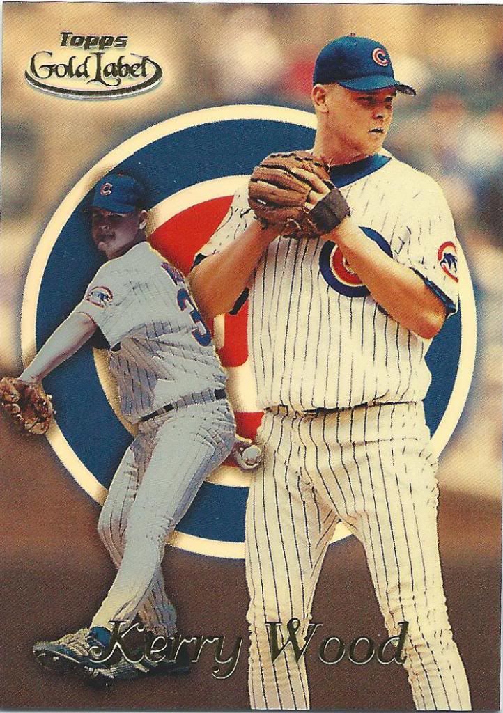
This would be class 1, for those interested in knowing
Gold Label is a very confusing set for me (and I assume for other collectors). I prefer to go to card stores and shows without a list, when possible. I go off of memory, but I can’t visualize these sets. And the parallels make it tougher.
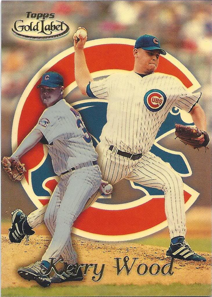
Class 2 – love the way the foil board scans
What makes it tougher is that with bigger sets like Tek or Moments & Milestones, it’s easy to take a flier and buy a a duplicate card, but with only 3 classes, I can’t risk it even though I could be missing something I need.
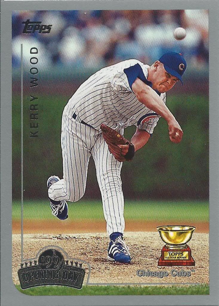
You can tell it’s different, because it’s silver instead of gold bordered
I really like Opening Day for some reason. I would also like another budget set with an original design, but these are usually nice.
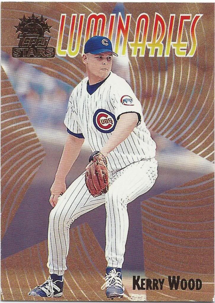
Swirly hypnotic star
Topps Stars is something of the opposite of Gold Label. It’s pretty easy to keep track of which ones I have.
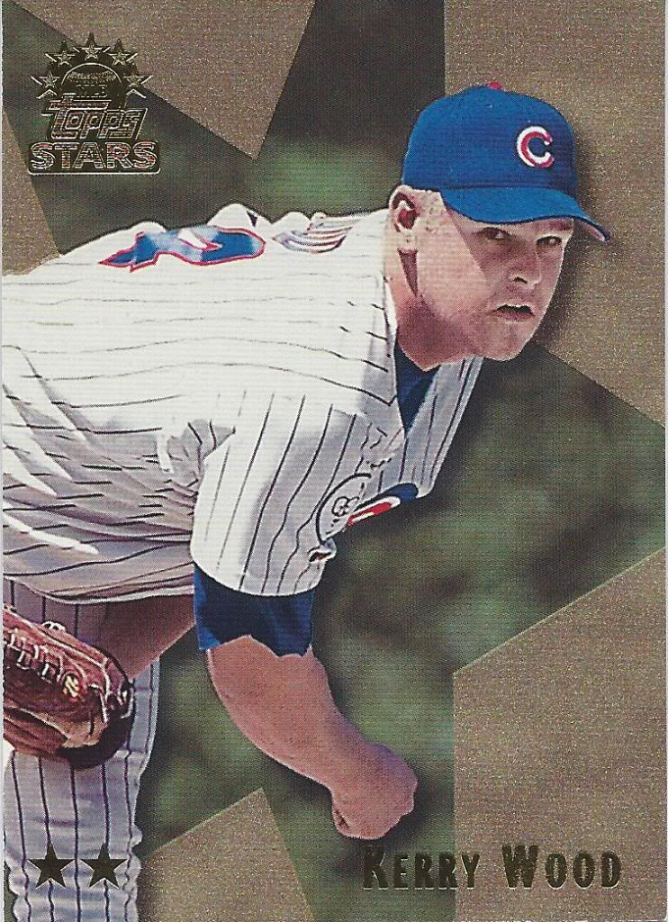
Getting closer
Unlike the various picture combinations, I only have to keep track of the number of tiny stars at the bottom. And they increase in rarity.
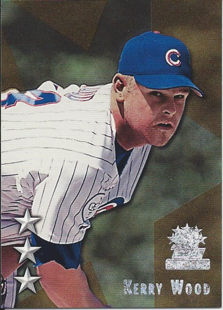
Almost too close
And there’s also this fancy sample version. Promo cards are neat. Most of them aren’t that different than the final product, but the real ones ended up with horizontal foil stars and a less sparkly logo.
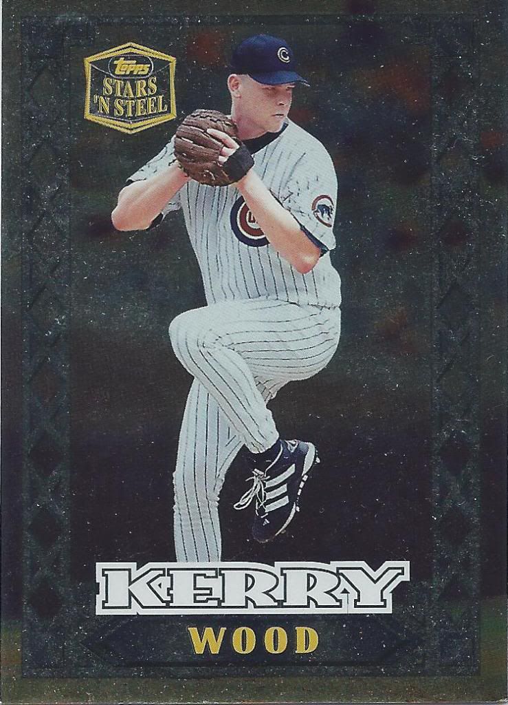
This is the closest we’ve come to a smile so far, I think
Oh man, I love the quirky stuff. Like cards made of metal. I guess that probably means it’s not technically a “card,” huh?
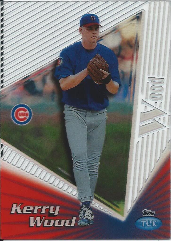
These cards can be so hard to find
For those that don’t remember, I’m trying to come up with a name for each Tek Pattern. I’ve previously named this one “1920’s Business Card” but I’m open to other thoughts.
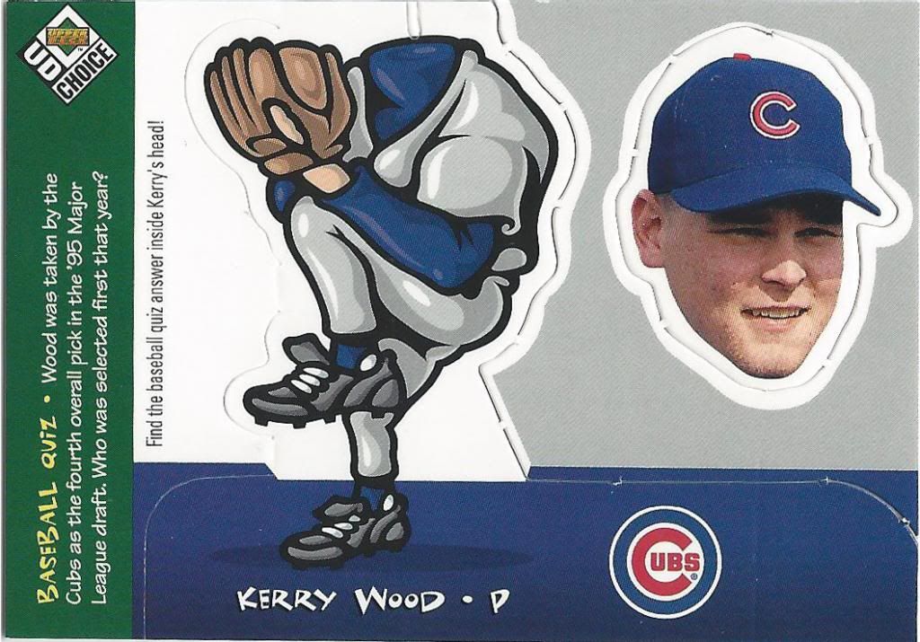
Fire up the sirens! Flash the lights! Activate all the little geocities swirly light graphics! We have a smile alert. Repeat. Full smile alert. And all it took was to separate Kerry Wood’s head from his body. He’s more goth than we thought.
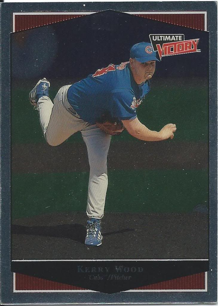
Ultimate Victory. Sub Zero Wins.
Okay, we’re back to glum, dreary, frowny face. But the fact that we found a smile at all is my own personal “Ultimate Victory.”
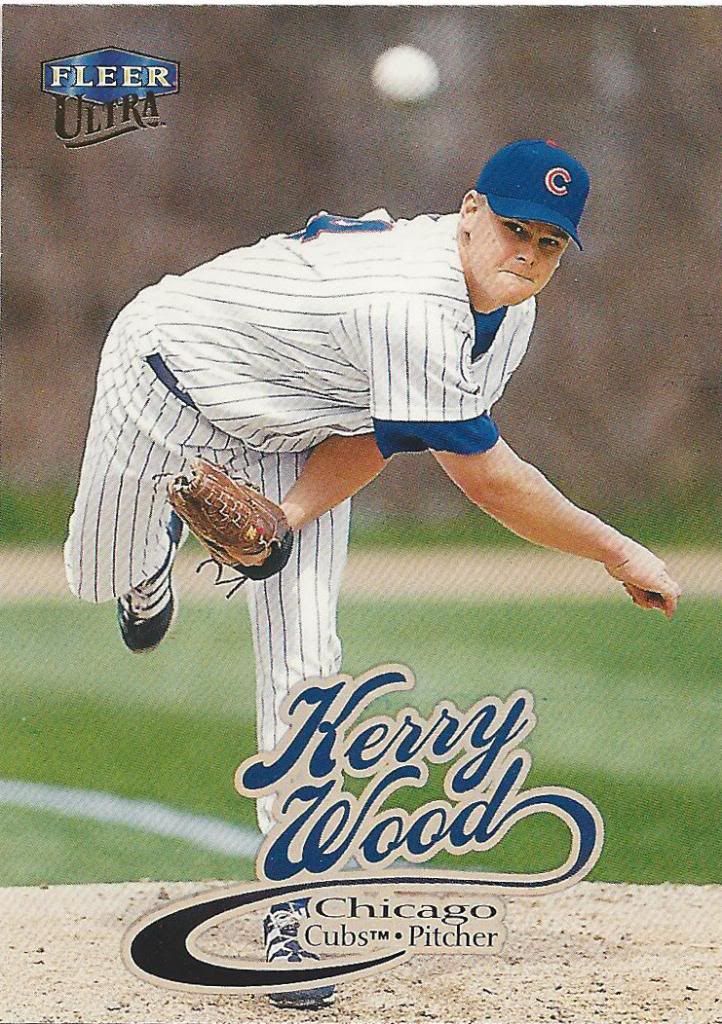
Cursive = ultra fancy
The only reason I know this is a 1999 Ultra card is because all of these scans are from 1999. Otherwise, this falls into that range of years that looks almost completely identical. I guess 92 & 93 did too.
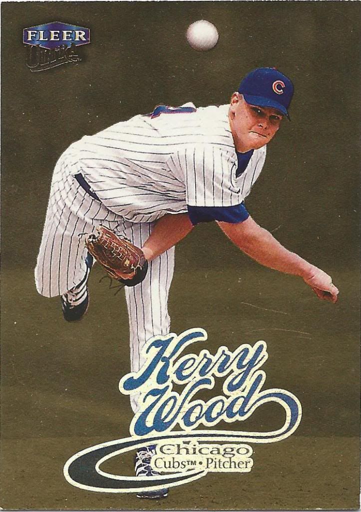
Gold cursive = ultra ultra fancy
It’s nice of them to avoid hiding the ball on the gold parallel, because that’s the most interesting part of the picture.
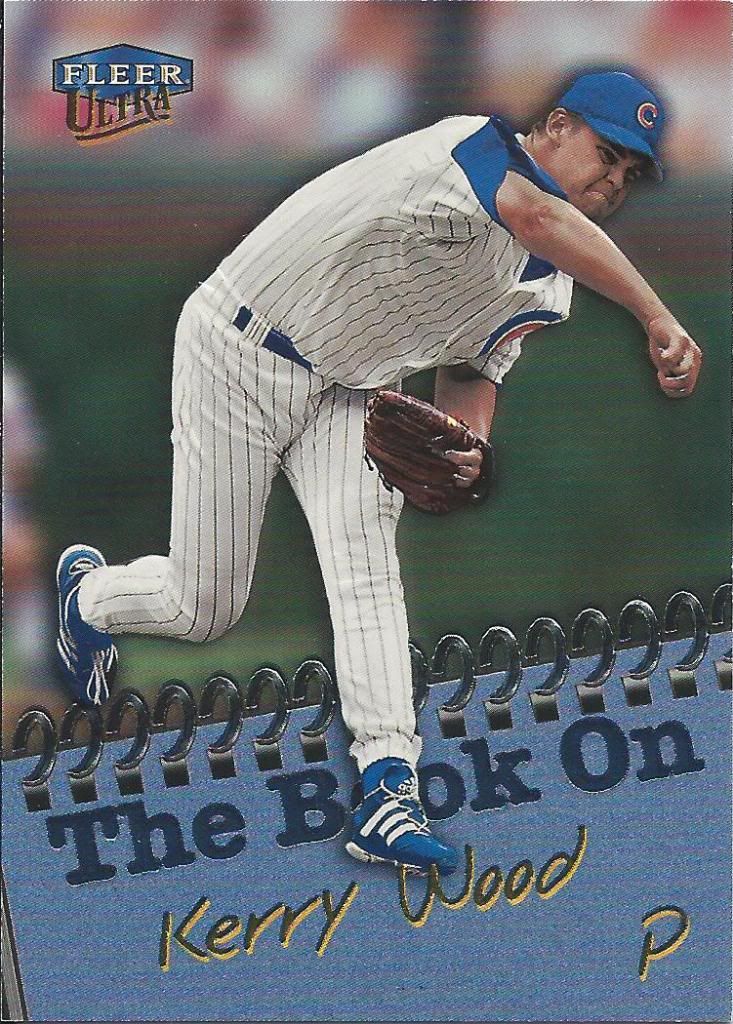
Don’t judge a “Bok” by it’s cover, but judge away on cards
Early and mid-90s Ultra inserts were really interesting to me. As you can see, they began to drop off a tad. This does have a textual (pun not intended) component to it with a little bit of embossing. Still, that feels like a late addition to jazz the card up.
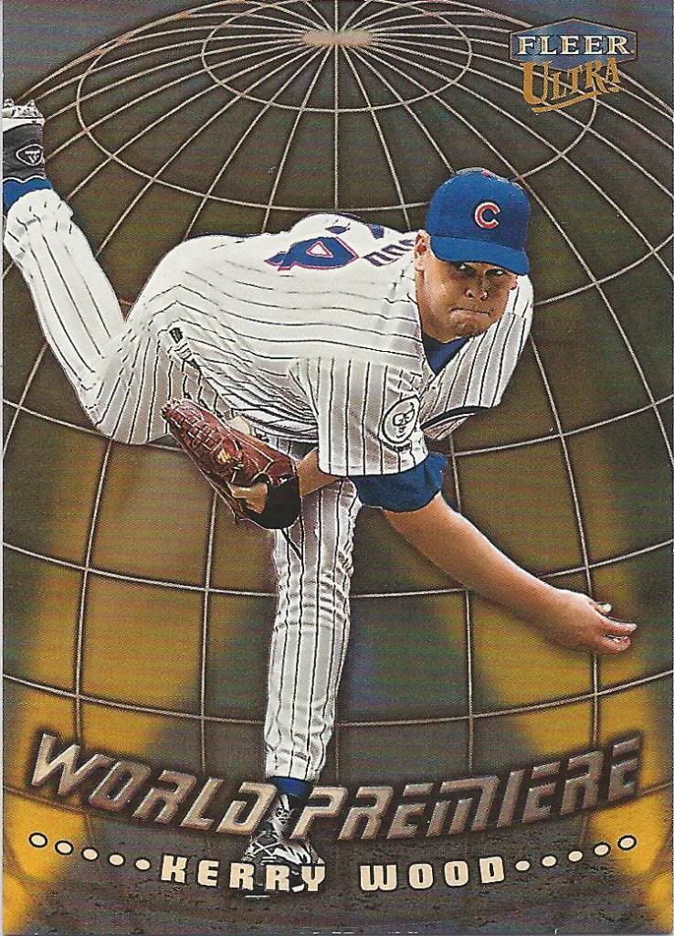
This just in
I feel like I know what they’re going for, but the execution is off. You can sort of tell there are spot lights on this globe like thing. Maybe a red carpet theme would be better. Or more of a lifelike globe and a bigger newscast feel? I’m no card designer, but this feels unfinished.
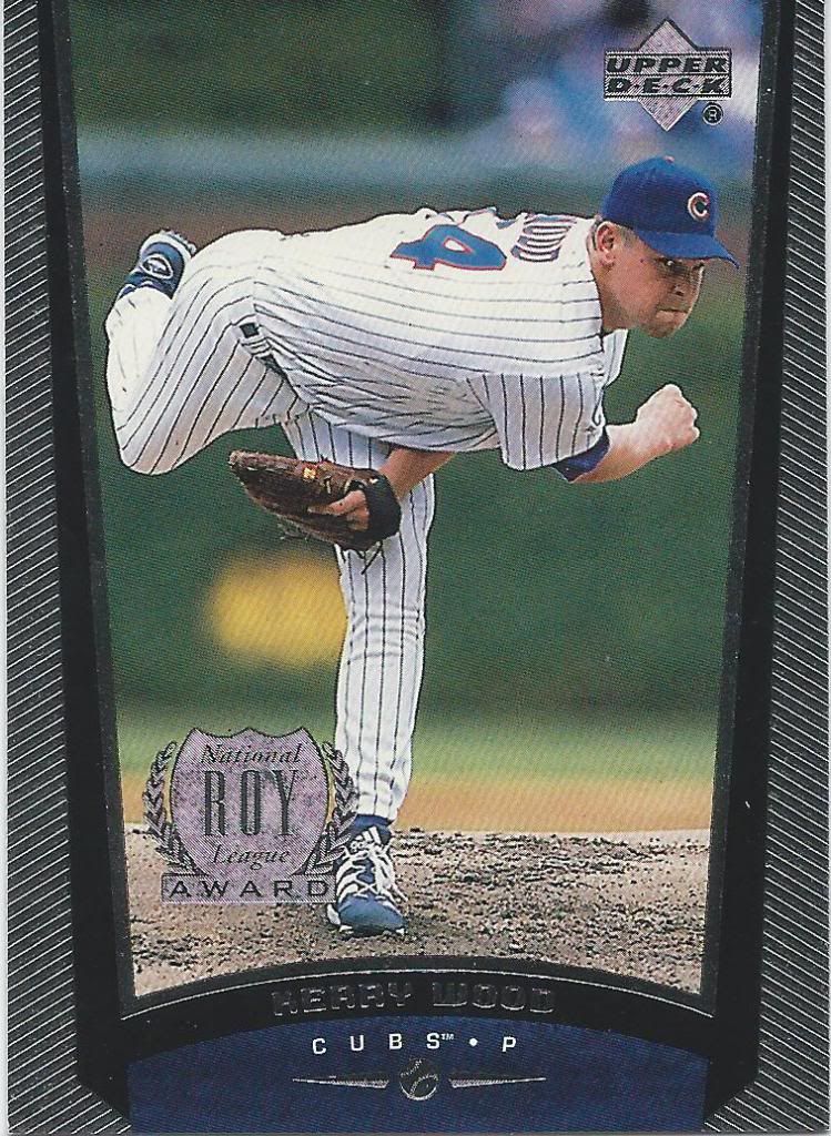
One of the fanciest flagship designs ever
While I appreciate acknowledging awards on the base cards, the foil stamps immediately trigger the “parallel” alarm in my head. Modern cards have trained me to be skeptical of older stuff like this that’s just trying to be fancy for the players that deserve it. The foil sides scream “parallel” to me, too. I had a tough time locating this very simple card on my checklist.
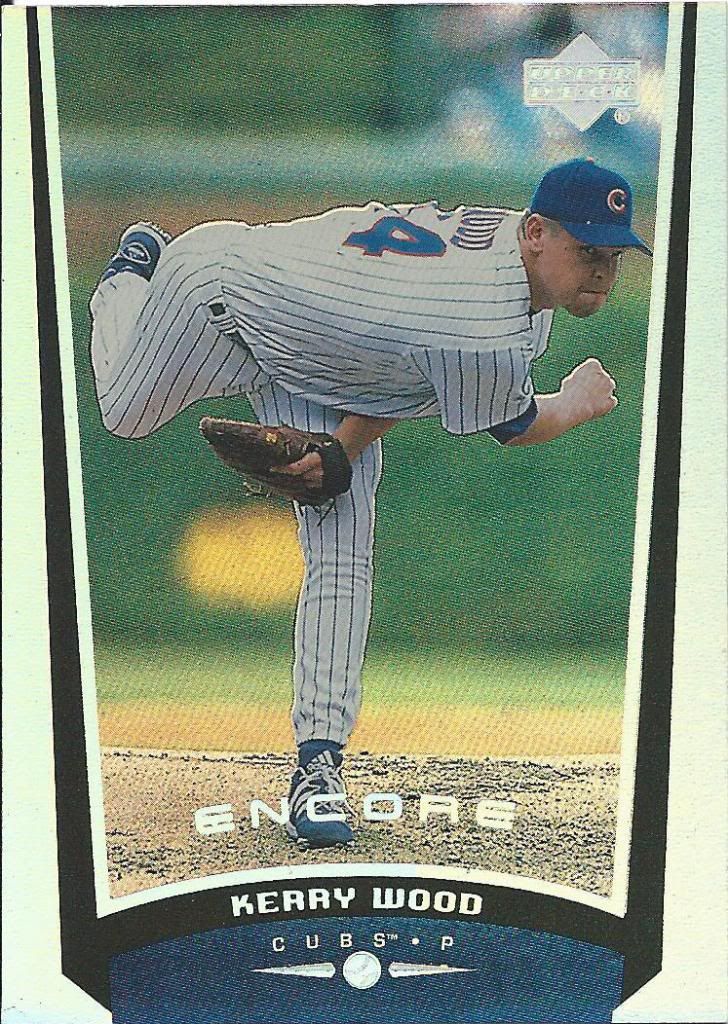
Bravo
Now, this is a parallel of sorts. Not a full set, but Encore is clearly a shinier version of the above. It’s also a little odd that the ROY stamp is missing.
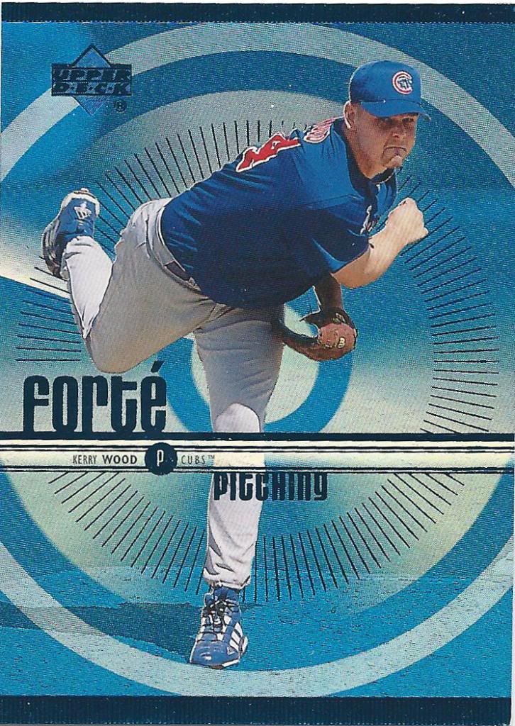
We just saw another version of this card in the last post.
If you still had doubts about 1999 being fancy, here’s your proof. Ooh la la! Forte. Kerry’s Forte is “pitching.” Which I think is french for “throw tha ball hard.”
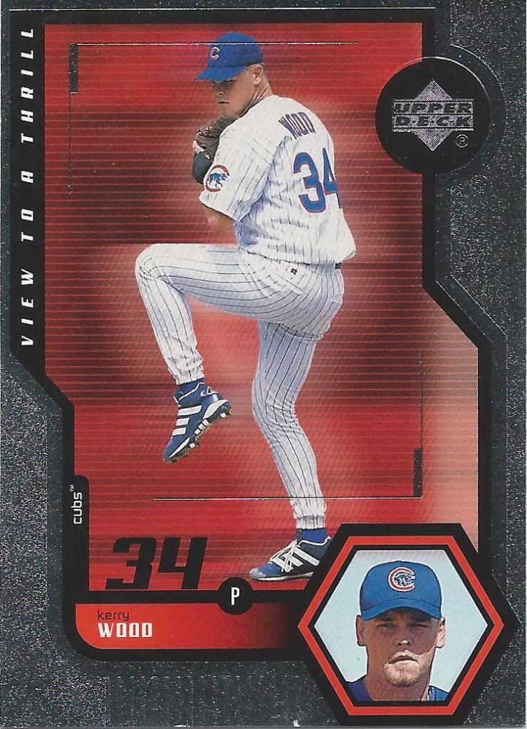
Maybe some day you’ll see more of this card, but not soon.
With a name like “View to a Thrill” I should either be getting an espionage vibe, or something like the Terminator visor graphic. Instead, it’s a weird hybrid.
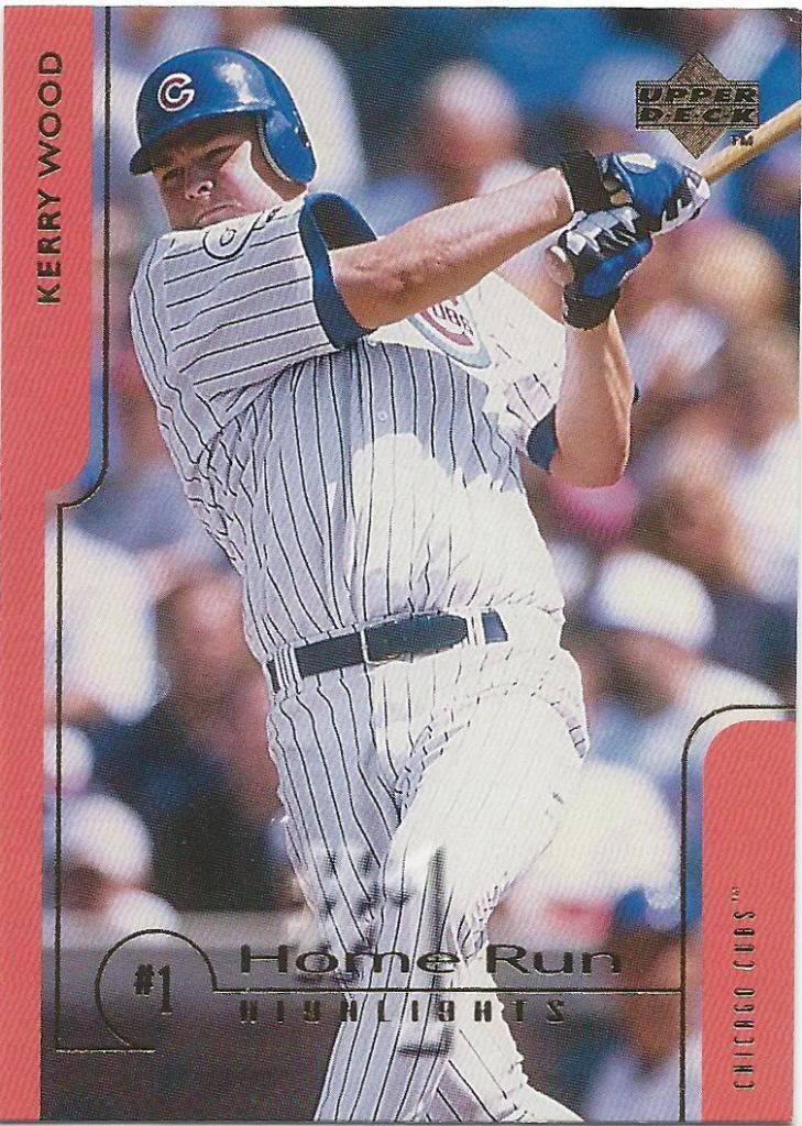
This looks more like a ground out or foul ball to me
I bet you didn’t expect to see Kerry Wood in a home run set, did you? This is a set called “Challengers for 70,” which means it’s just a stupid ploy to wedge another Kerry Wood card into packs due to his superstar status at the time. He hit 2 home runs in 1998, and 7 in his career. 8 when you count the 2003 NLCS homer, which you should. But obviously not a challenger for 70.
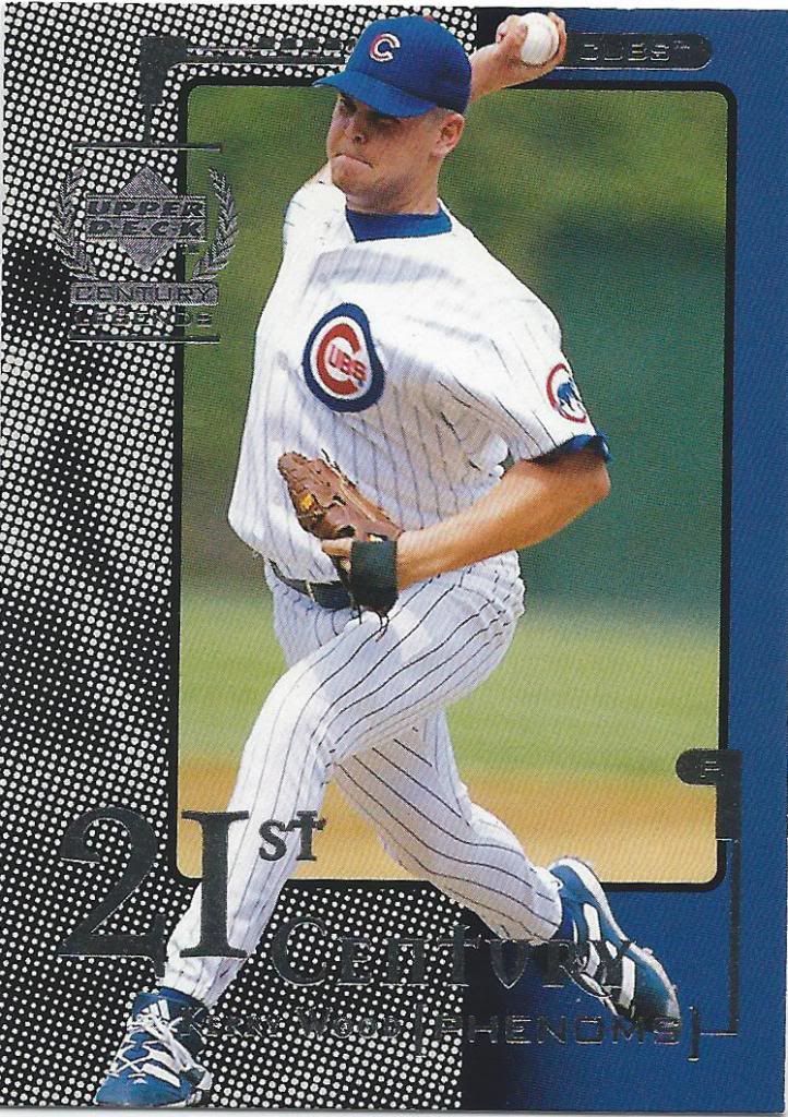
This is a card. For some reason.
Oh my god, my eyes. Let’s just mention that the subset called 21st Century Phenoms has 14th or 15th century lettering and move on.
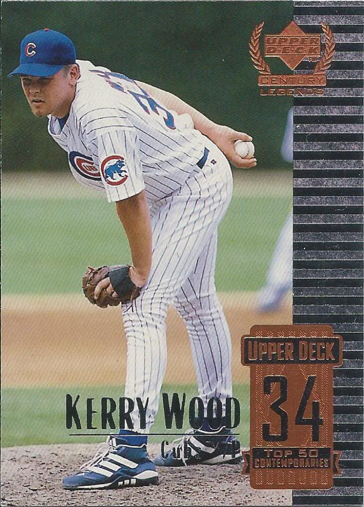
Is he #34 out of 50, or are they only referencing the jersey number? or both.
From the same set, we have a much more normal looking piece of cardboard. Sure, it’s bland, but a least my senses weren’t assaulted this time.
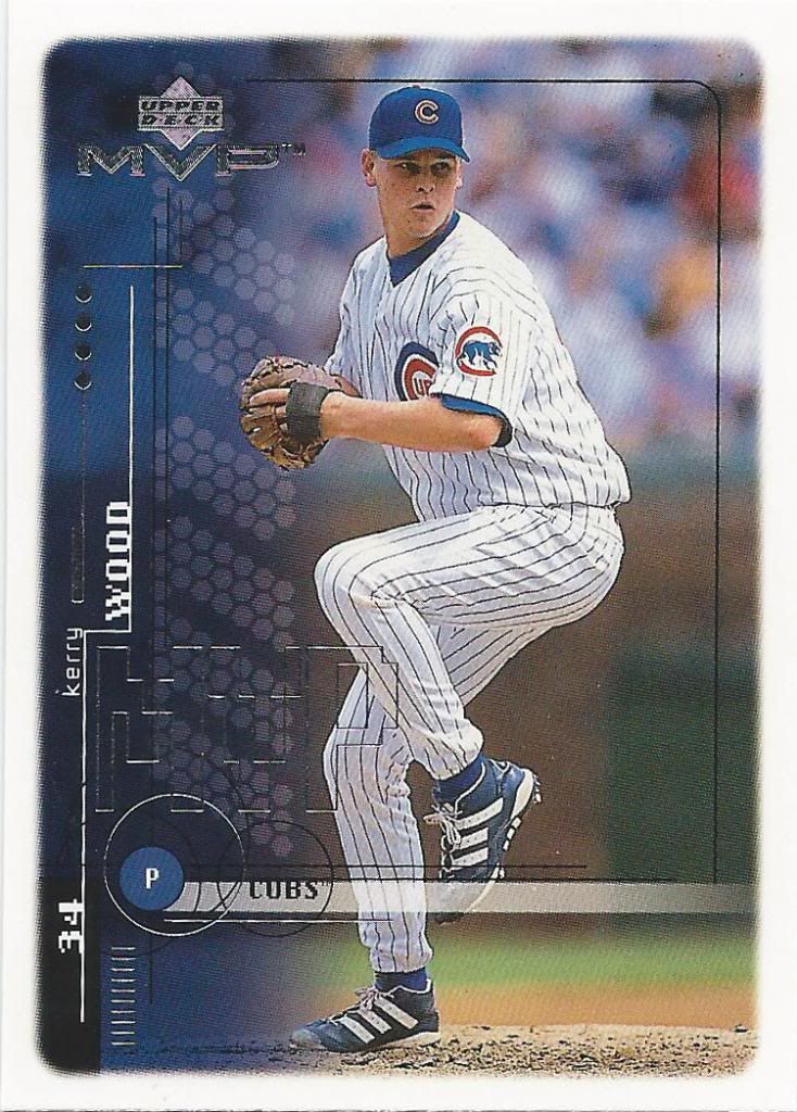
Kids like shapes. Dump a bunch of shapes on the thing.
I wasn’t collecting in 1999, which is probably evident by my lack of knowledge of the Upper Deck flagship look, so I’ll need some help. MVP looks like a budget product geared towards kids. Is that accurate? I also think it’s geared towards kids because of the stupid pixelation and the “Poochy-esque” radical font choices.
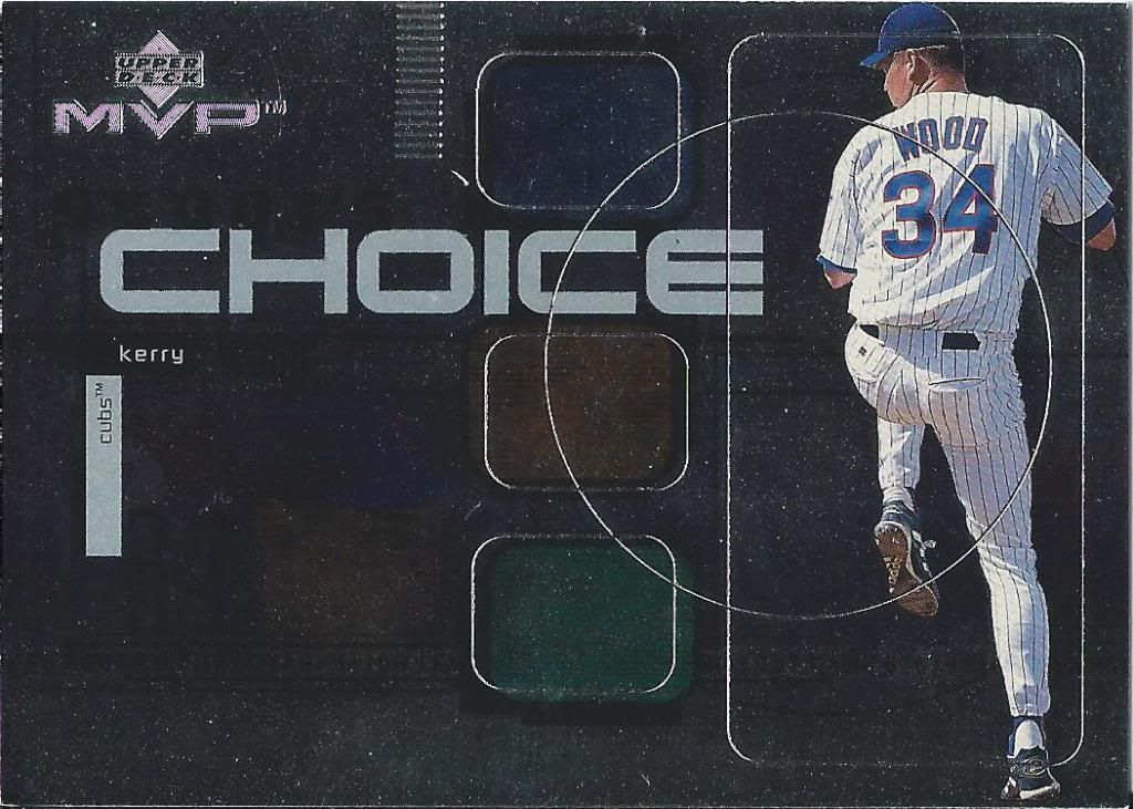
Clearly not “Framer’s choice”
Choice is not intended to be a slang term as heard in “Ferris Bueller.” No, what the scan didn’t pick up is the word “Scout’s.” It did pick up that odd, unnerving circle on the right hand side, though. Things like that bother me, because it’s bisecting everything. Nothing is intended to fit inside that circle. It’s just there cutting through stuff.
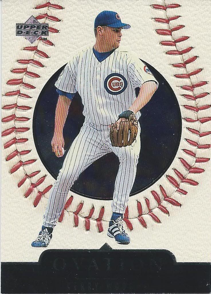
Stand up!
To finish it all off, we come to Ovation. Once again, we have some texture — with context! Perhaps this is a precursor to Sweet Spot.
I think it’s a great way to end the trade, because I was figuratively standing and applauding Fred after going though all of these cards. And I think you should too. It’s great people like him that make the collecting community so fun and reminds us that happiness is more important than book value.
Thank you again Fred. Sorry for the long hiatus (and I still have more cards from our other trade to show), but as you can see, you were not forgotten.

You are right on MVP. It replaced Collector’s Choice/UD Choice in the UD roster.
Awesome. Appreciate the knowledge. Between 94 and 09 is a collecting dead zone for me. So much history passed me by. Thanks for reading!
[…] of Marmol, this A&G back mini came from Fred, who you may remember from my mini-series For the Greater Wood. This is a small piece in another package from Fred that I still haven’t showcased on the […]