
1999.
The Denver Broncos repeat as NFL champions, taking out the Atlanta Falcons.
The San Antonio Spurs take advantage of a Jordan-less NBA and deny the New York Knicks a championship. On the WNBA side, the Houston Comets continue to dominate with their third straight title (also over New York).
Michael Johnson set a new world record in the 400 meters.
The world of golf saw Payne Stewart winning the U.S. Open before tragically dying in a plane accident later that year.
The Dallas Stars top the Buffalo Sabres to win the Stanley Cup.
The Yankees win another World Series title, this time over the Braves. They swept Atlanta, but at least Chipper Jones won NL MVP.
And in 1999, card manufacturers released 409 cards of Greg Maddux that I deemed worthy of my collecting efforts.
Thanks to the generosity of reader Jeremy, originally mentioned in our landmark 500th post (and in my 1993 Overload post, and 1994 post, and 1995 post, and 1996 post and 1997 post and 1998 post), I now have 40 more of those cards as I did before.
1999 Before Jeremy – 27/409 cards – 7%
1999 After Jeremy – 75/409 cards (including two upgrades) – 18%
1999 is the first year to reduce the number of cards, going down by 250. Who would have thought we’d see such a huge drop off? That’s quite alright with me, though.
Since Jeremy’s package, I’ve acquired 24 more 1999 cards, bringing my total to 99 for the year ’99. Still, as always, there’s plenty of progress yet to be made. For now, let’s focus on what Jeremy sent.
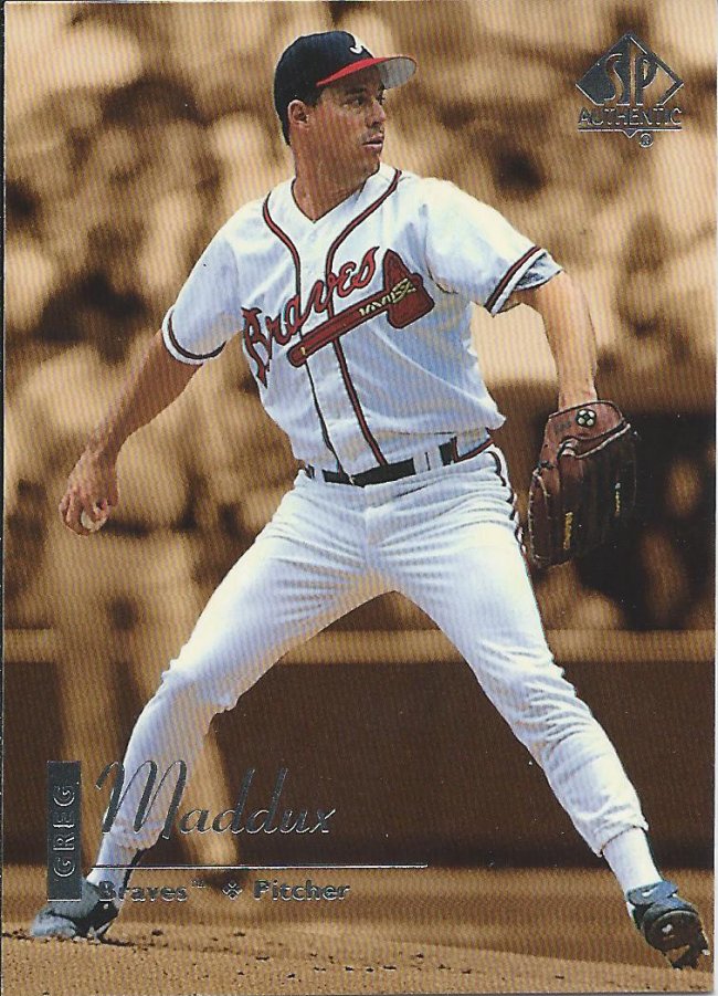
Devil or angel on the shoulder
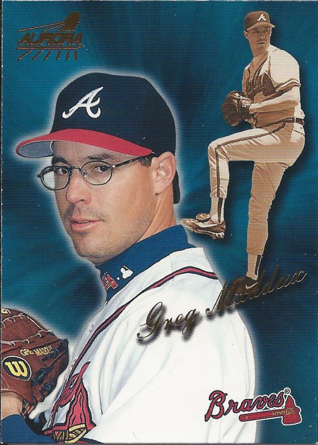
As always, we start at the top of the alphabet and work our way down. 1999 wasn’t the first year for Aurora, but this is the first card I have. There will be a couple challenges in getting the rest with low numbered stuff, but hopefully they look better.
Sides need more wood
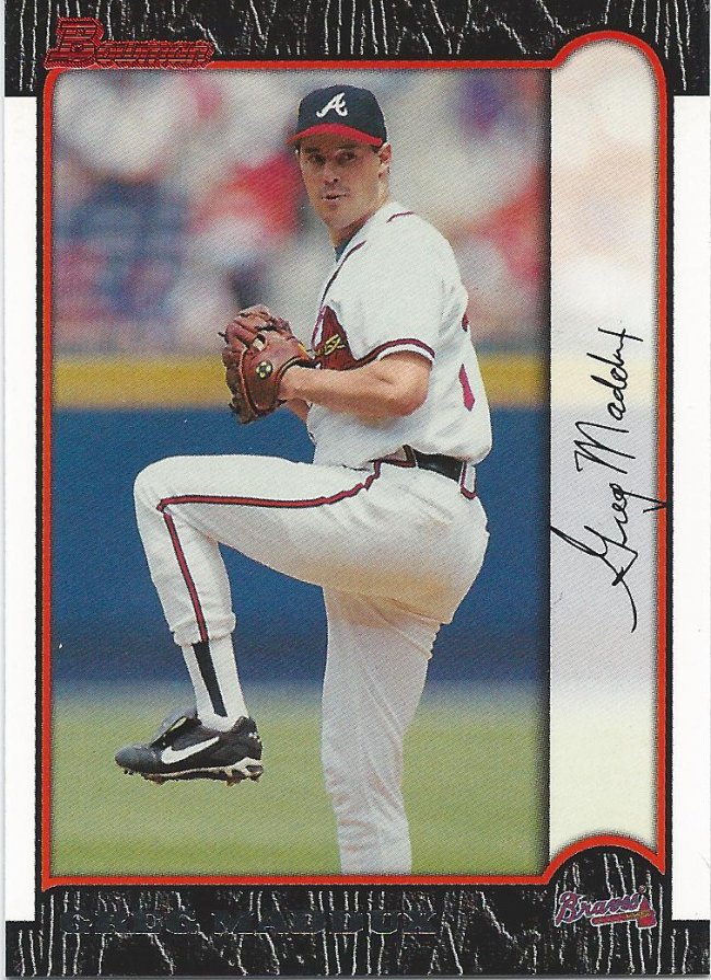
I like the wood border look. Of course, I’m also one of the few that enjoys 1987 Topps (possibly solely due to nostalgia). Paper Bowman is once again light (only need two more – one is /99).
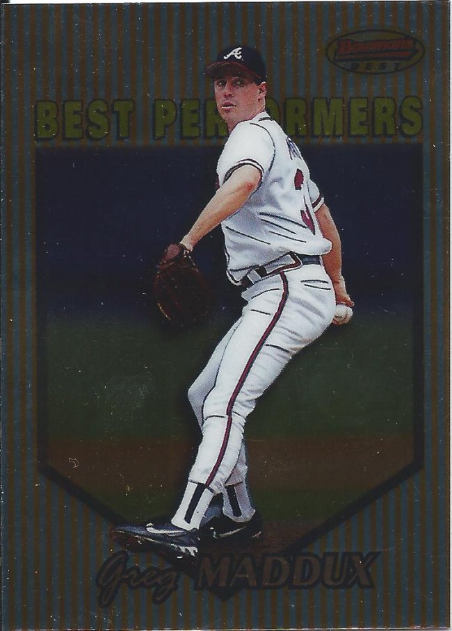
More like Bowman’s Worst
I do not like this 1950s candy packaging look of Bowman’s Best, though. Man, is that ugly. To think that this is going to be reused over and over as a “classic” look.
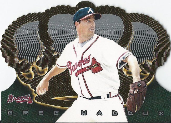
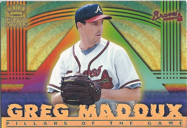
Forest green doesn’t seem very royal to me
Crown Royale is still cool, though. This year’s design isn’t that great, and they all blur together, but I can’t stay mad at that die cut.
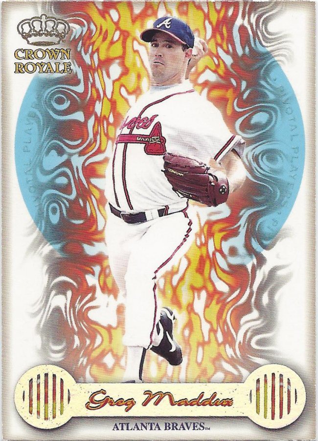
Illuminati confirmed
Of course, their inserts are still pretty laughable. Windows ’95 screensavers come to life.
What is the purpose of this?
Geocities meets print shop and shat out a toilet baby card. Can you tell that I don’t hold Pacific cards in high regard?
Xnaayw
Acetate cards, on the other hand, I love. I wish there was more to this set. It’s pretty light on inserts and, thankfully, parallels. There is one tough one to chase, but I can’t say I know what it looks like.
I will not free the Finest
Finest, however, was filled with inserts and parallels. We’re not quite into rainbow territory yet, but that doesn’t mean it won’t be tough.
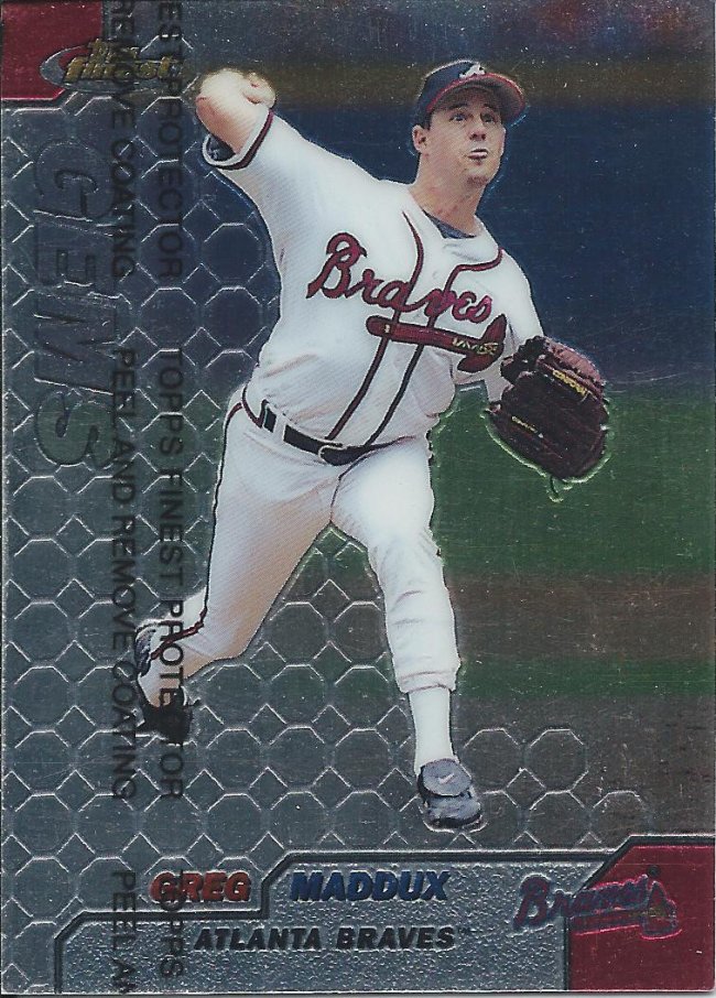
I will never free the Finest
Adding to the challenge is the inclusion of subsets, each with regular and gold refractors.
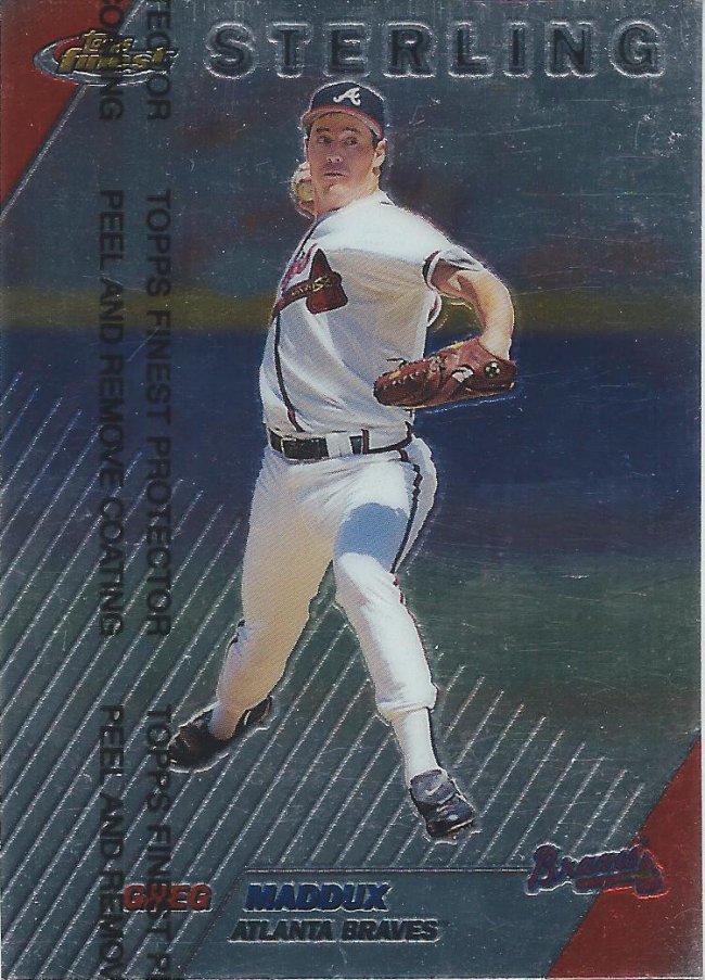
You can’t make me free the Finest
Sadly, they aren’t even interesting subsets. If it weren’t for that little text, you’d be hard pressed to tell which is which.
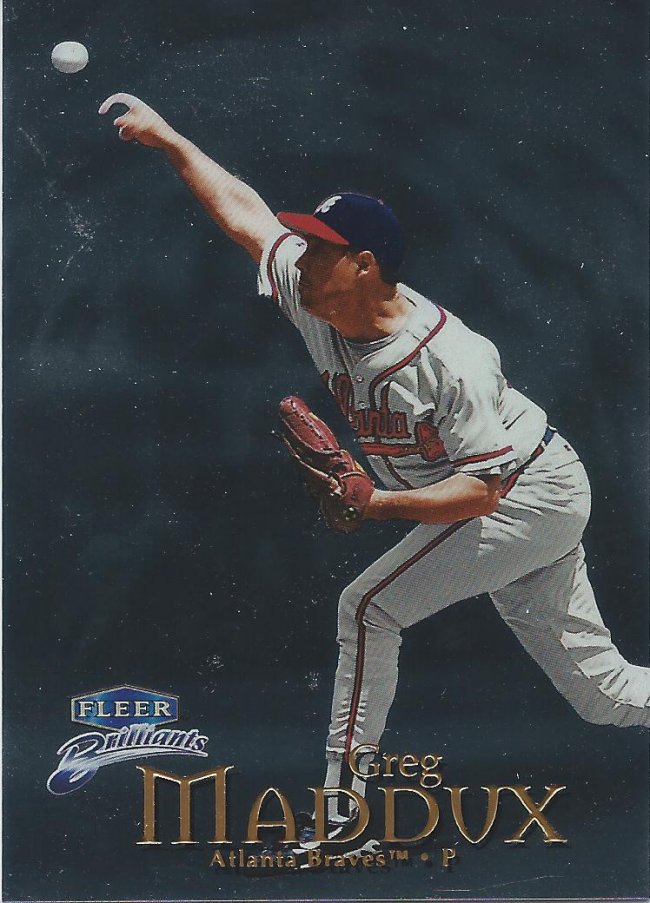
What’s with the middle ages fonts?
In what is possibly Fleer’s answer to Finest, we have something that’s not so brilliant. I think the colored versions are, but this is pretty standard, unscannable foil.
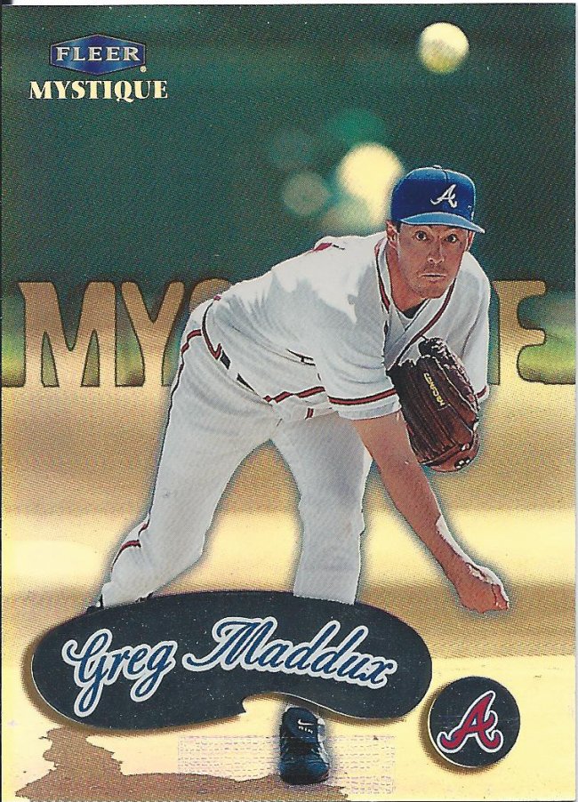
Don’t like the weird rectangle at the bottom that’s only used for numbered cards
I’ve opened a box of this stuff, and it’s pretty fun. They have these kind of scratch off like inserts, which is the heart of the Mystique name.
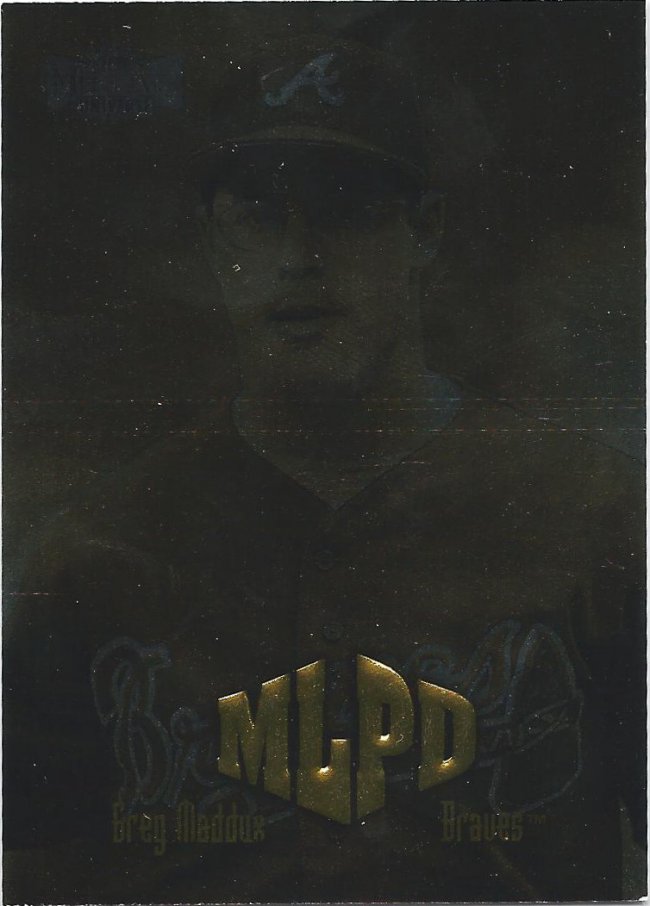
Spooky scan
Stop! It’s the MLPD! Do not attempt to re-scan the card. Step away from the Metal stuff, and put your hands in the air in frustration.
Yeah, you try to knock that logo down!
Oh, good. More Pacific cards.
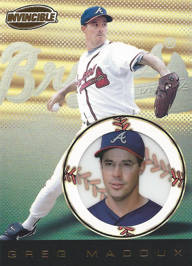
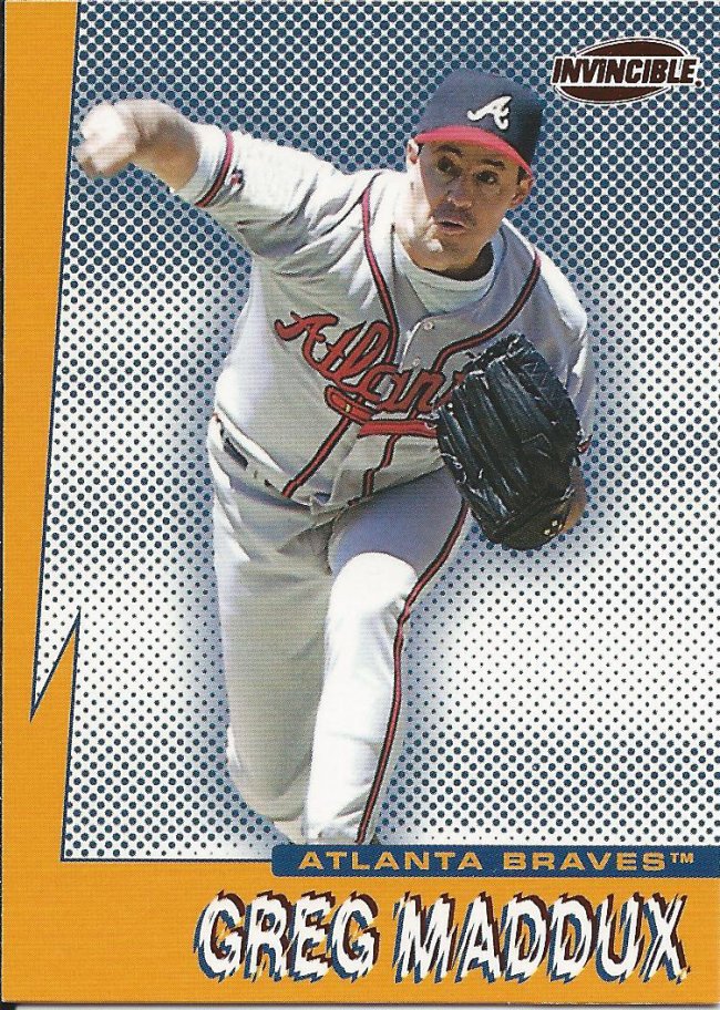
Certainly not invisible
These Invincible cards aren’t too bad, but they still suffer from that intangible shoddy quality.
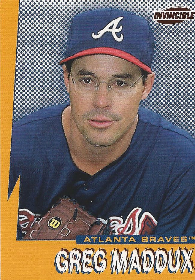
Yup, that expression has me shaking in my boots
Then they go and pull this crap. Worse than 1991 Fleer in terms of eye sores.
Make it stop
And they thought it was a good idea to make two versions.
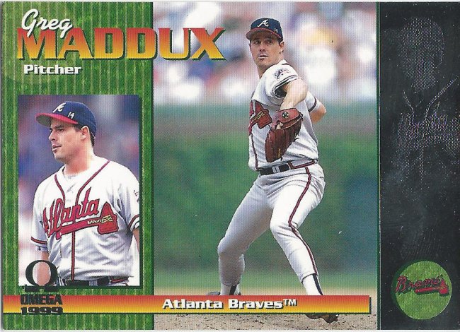
I still 7 more cards from this garbage set
I can only assume they call it Omega because this was the last idea they had, but still had to produce a card set.
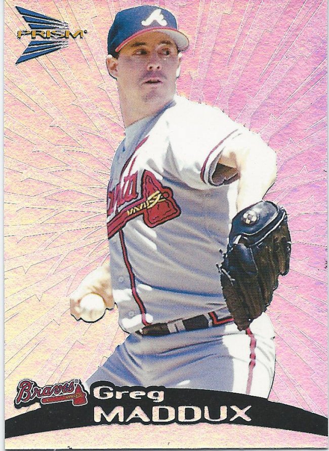
Cool ray effect
Out of all of the Pacific products, Prism is my favorite. Shiny cards are more fun than poorly printed pictures. Besides, the variations look interesting too. This is the non-variant.
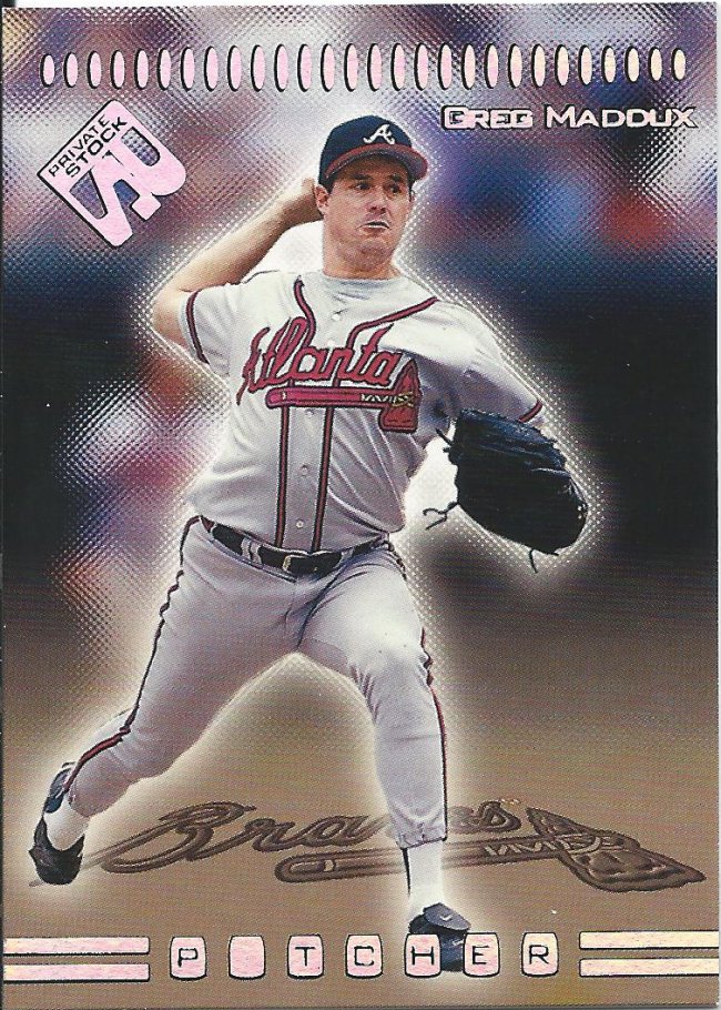
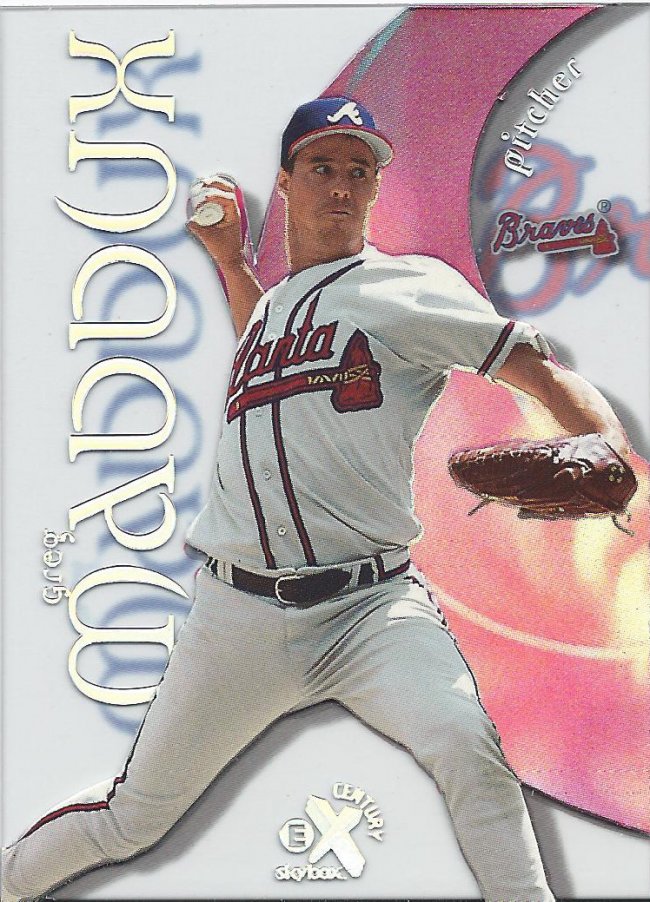
P tcher
Here’s another set that’s not terrible, but also not great. It’ll look better one year later when this same concept is called Vanguard.
Nice to see the different picture used on top of the stamp
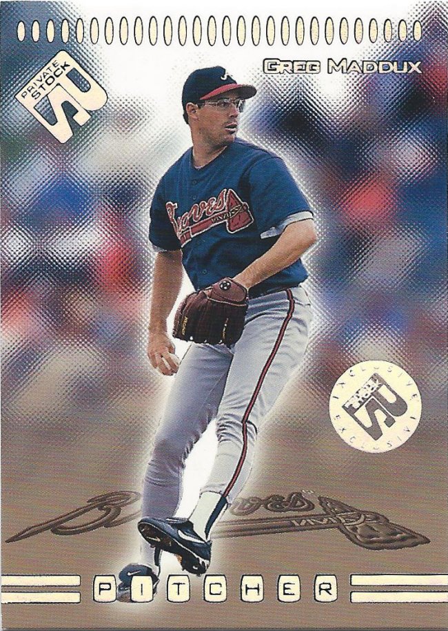
The boxes from Jeremy were full of great surprises, but to get a numbered card is highly unexpected. Yet, here is the “Exclusive” #/299. How cool is that?
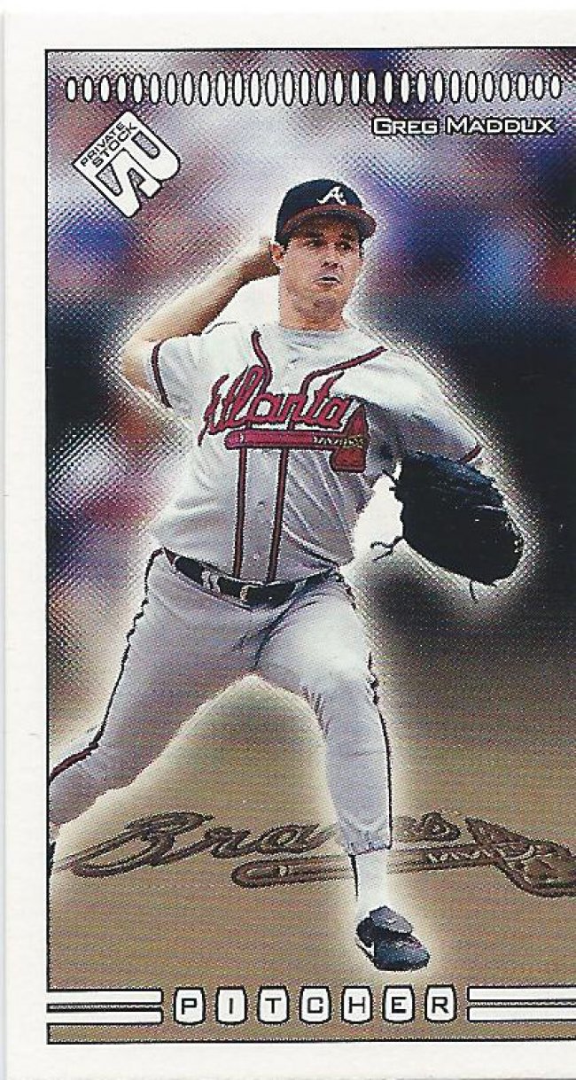
short pitcher
He also sent along this mini, which forgoes the foil and….shrinks things down. I don’t know what else to say, really. There’s also a red mini, I hear.

Bunch of parallels needed
We’ve already seen the Fleer Metal Universe. Now it’s Skybox’s turn with Molten Metal. Which was also owned by Fleer, I think. Both scan terribly.
Ladies…
Holy crap is this a creepy facial expression. That is not a happy magazine cover. Not one bit.
Skybox Thunder. More like Skybox Purple
I loved Skybox in the basketball world, but I was done collecting by this time. Probably for the best, because these seem like a steep drop off of their previous quality.
Pleasantville: the card
I actually have this card autographed as well. It’s one of those buyback autos with pretty faded ink, but it does look legit. This one came into my position well before.
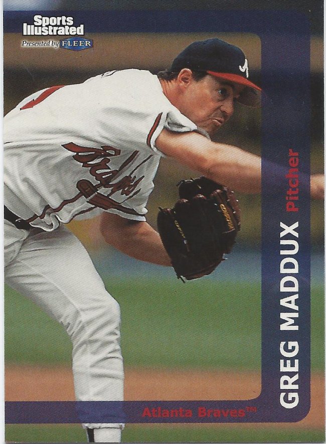
Graphic designer took some time off
Sports Illustrated is known for illustrating sports via pictures. It seems like a perfect fit for a card set. And then, we end up here.
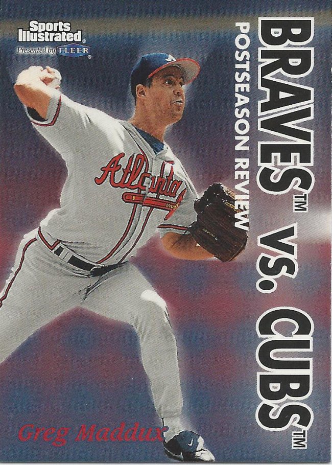
New versus old
I’d much rather have a card illustrated by crayon or pencils than this.
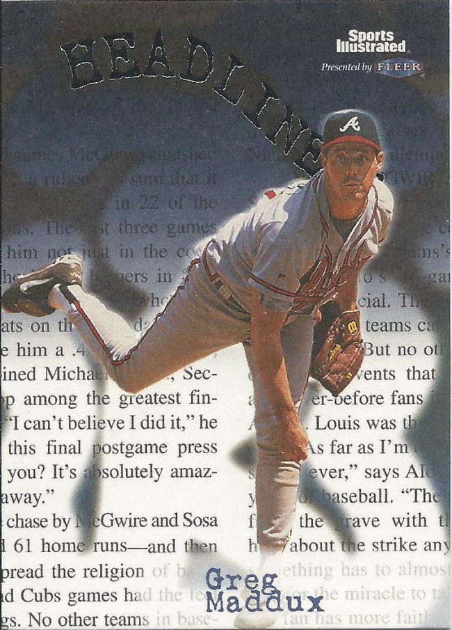
Matte > Glossy
This is much better. It looks like effort was made. Although, it also looks very familiar to an earlier Fleer Headlines insert from a couple years back.
Safe or out? Who cares?
Now, this is how you illustrate sports! I imagine this slide might be considered illegal by now. But still makes for a cool card.
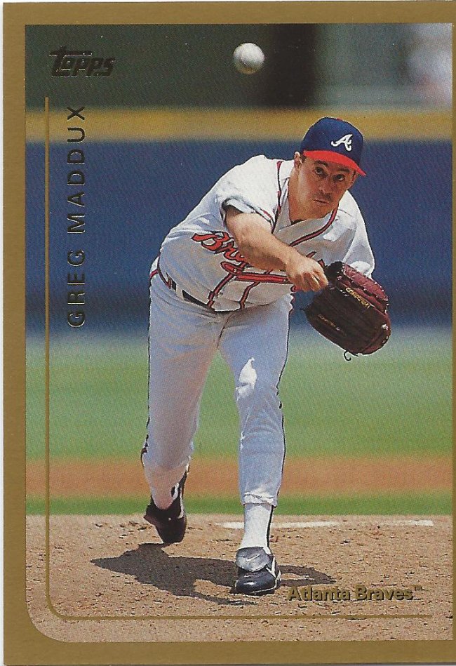
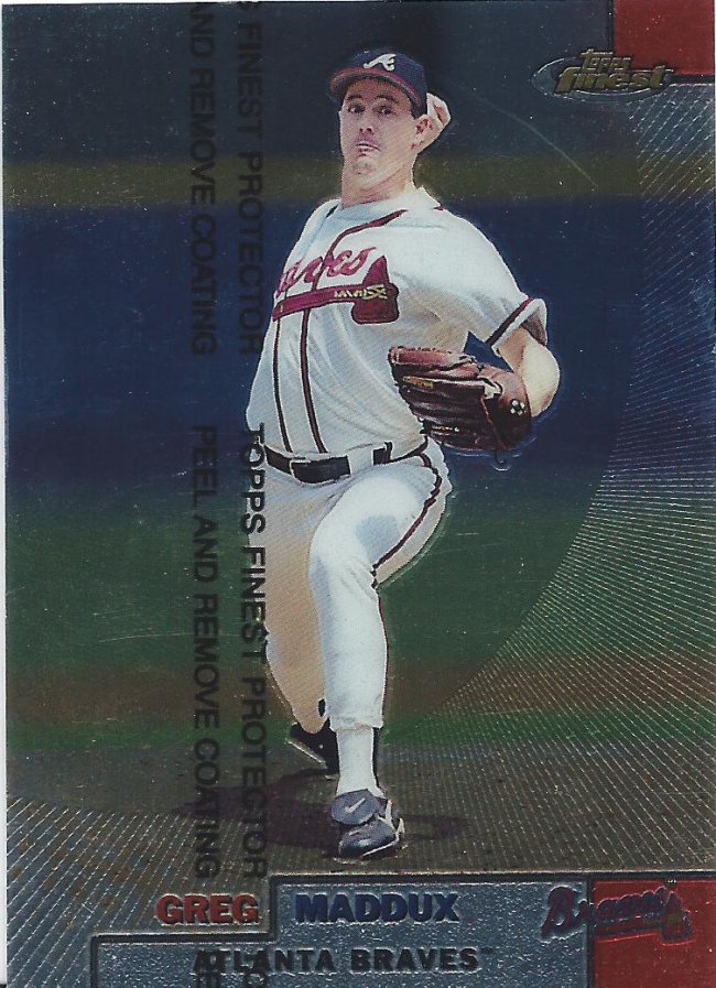
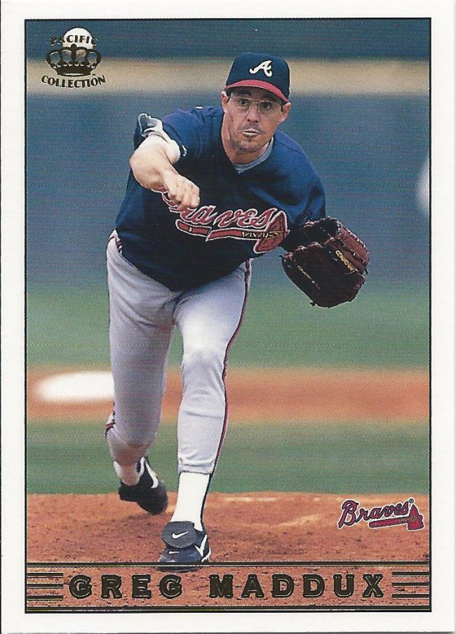
Card isn’t miscut, my scanner lopped it off
Now we’re entering Topps territory. Thanks for sticking with me so far, if you have. Pretty bland as designs go, with the gold border being the only minor saving grace.
Super common to find these
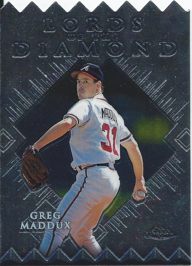
Some of the inserts were cool, though. This is the Chrome version of the serrated knife die cut.
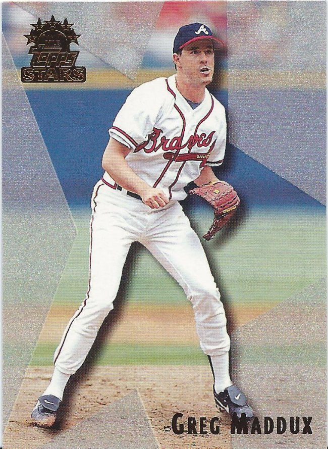
I should have started a doofy face counter
Topps Stars was a fun set as well with it’s silver glittery thing. I opened a box of this for a group break I did.
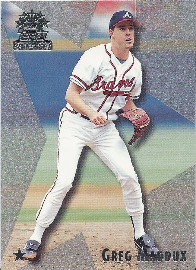
Slowly closing in
No, it’s not the same card. That little star in the bottom right means the picture is pushed in ever so slightly. The two, three, and four stars zoom in even more obviously.

Steel of a Deel
Here’s a set that doesn’t need a come back, but I wouldn’t be surprised if it happened. I mean, metal cards? Who doesn’t want metal cards? It’s a neat oddball, at least.
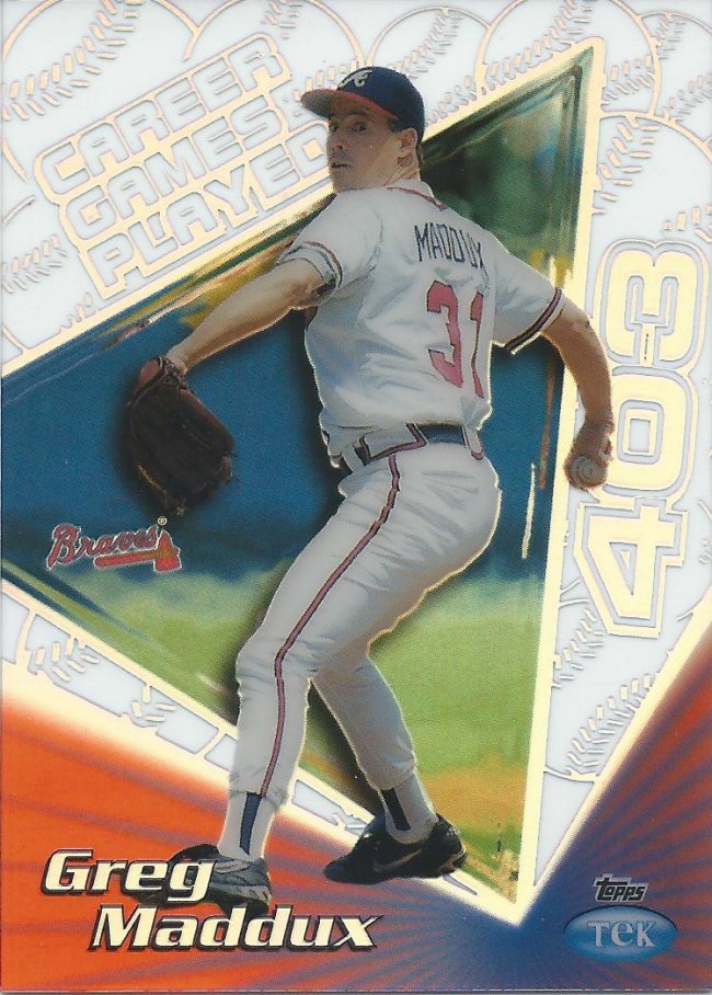
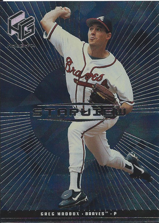
Time for Name the Tek Pattern
Pattern #27A – Career Games Played
The triumphant return of the Tek naming game is immediately deflated by having a card that names itself.
One of my favorite brands winding down
I’m so used to seeing the preview cards, that the actual set feels like a rarity.
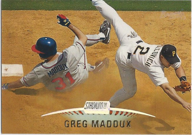
Tough to pitch with a name on your leg
The way Stadium Club has been borrowing from Ultra and Fleer lately, don’t be surprised if this shows up as 2018 SC.
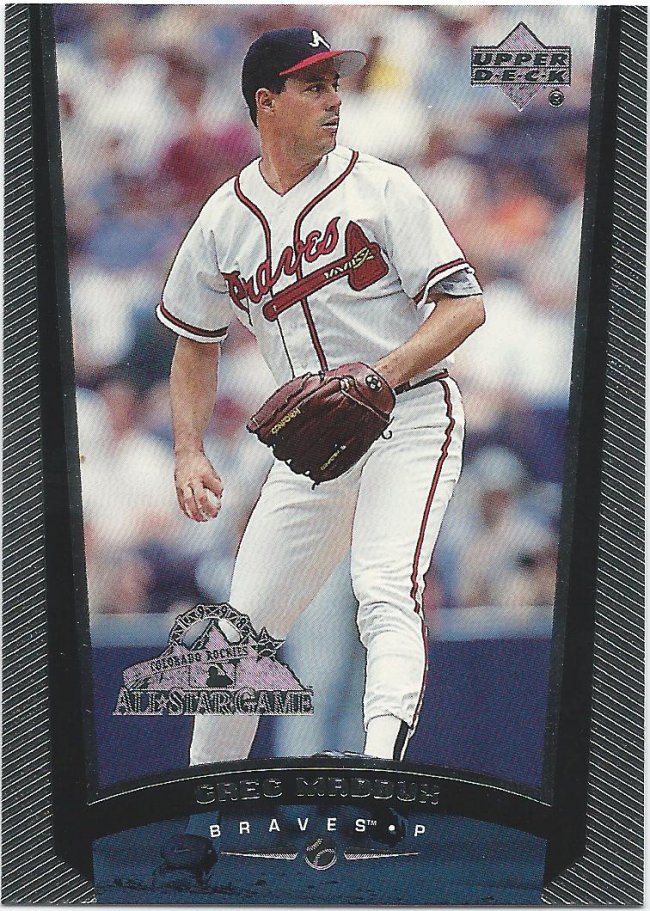
Foil stamps on base cards like this ASG one confuse me
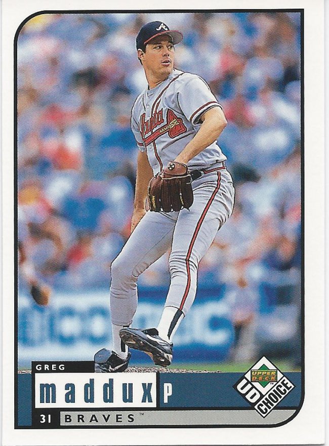
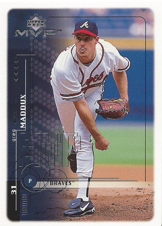
By the way, that Topps run was pretty short. We’re already in the home stretch with Upper Deck cards. Another lackluster design where the border feels like it’s taking up more space than it actually is.
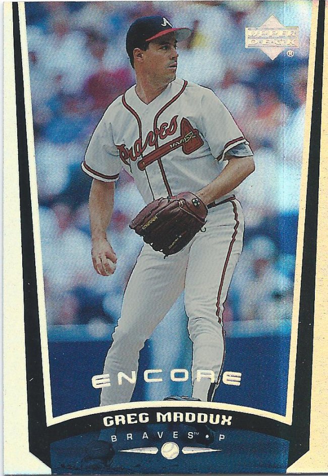
Makes me think its a parallel like this kinda is
Well, if you didn’t like it the first time, how about an Encore? The extra shine actually does help. Now it’s bright and roomy.
Not very holo to me
I don’t understand the point of this card set. If there were holograms or worth while graphics, then sure. But this is what they consider to be worthy of an insert.
LVP
There is just too much going on here to even begin commenting on.
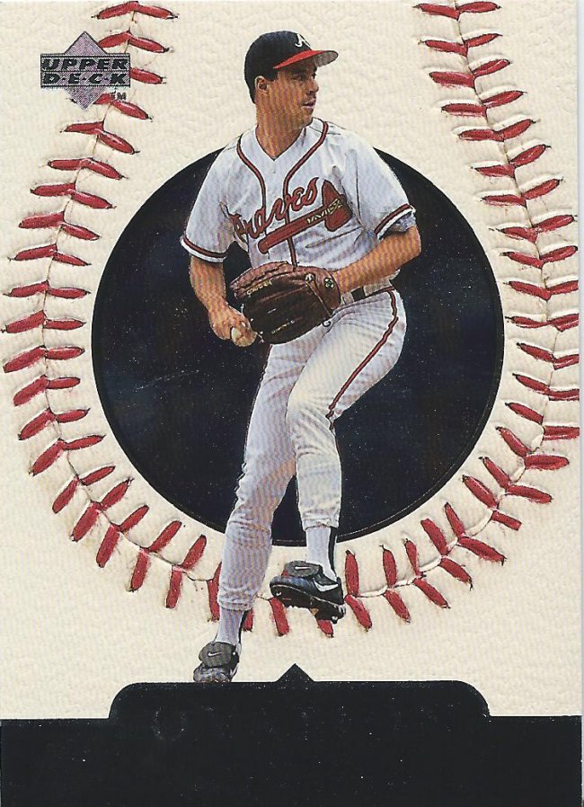
Leaving in stitches
Alright, here is a good one. Texture is here to save the day. Texture makes most cards better. Too bad it’s not used more frequently.
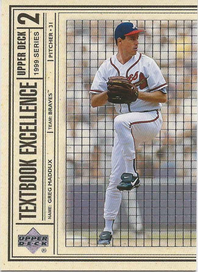
Need the Double and Triple
Upper Deck missed an opportunity by not printing out textbook covers like this. My school mandated we use some sort of paper cover. Get those kids young.
I remember those days, kinda.
Man, 1999 was a pretty rough year for cards overall (at least based on my comments). Time was not kind to these. Well, when I get around to 2000, we’ll see if the tide turns back.
Recent Comments