Second post in a row with a preamble. You may have noticed that there’s no blogroll on the side anymore. We did some wordpress updating and moved our hosting and it didn’t port over. I’m slowly working to find a good plugin to create a new blogroll, and hope to have it back up shortly.
And now our feature presentation.
I mentioned back in September that this blog was about to see a flood of Kerry Wood cards. Well it turns out the flood is so large I can’t wade through it all at once.
Reader Fred contacted me about a trade a few months back. He said he had a bunch of doubles he could send my way for nothing and would I trade for some others as well? Of course I would.
In fact, in order to complete the trade, I did something I haven’t done since I was a kid. I traded cards without having extras. I took cards out of my binders and off my have list to send to Fred. There may be some older posts with missing pictures now because I deleted those as well now that the cards are gone.
That was the only way to do it in the early days. I would go to my neighbor’s house with my binders and we would take out the cards we wanted and then work out a swap and then re-binder everything. It’s refreshing in a way. Especially when you get a lot more than you give up.
Sure, I’ll give up a few unique (to me) cards for the greater good. Or greater “Wood” in this case.
By the way, any Kerry Wood collectors that want to trade with Fred, let me know and I’ll make that connection.
Let’s dig in to part 1 of this madness.
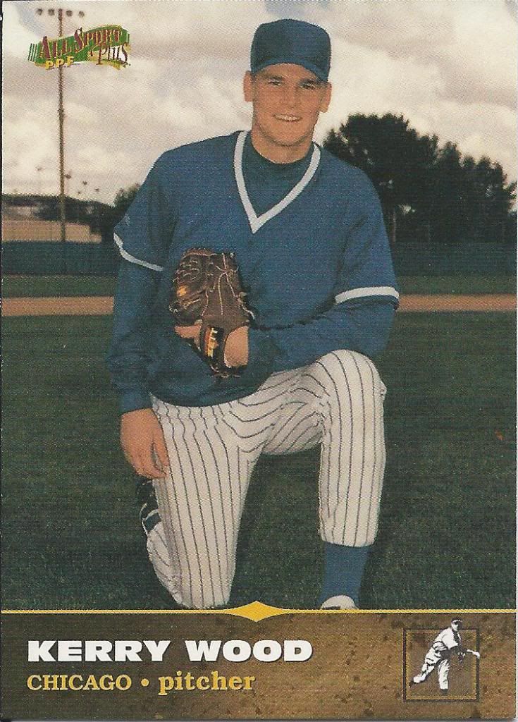
The storm clouds are brewing behind him – get ready for the storm
We start off with the current second oldest card Kerry Wood card in my collection. It’s a sort-of generic minor league-type issue. And also possibly one of the last to showcase him smiling.
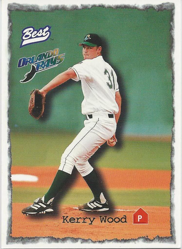
Why is there a monopoly hotel on my baseball card?
Woah. Wood’s sporting Maddux numbers. Can’t wear that in the bigs, son.
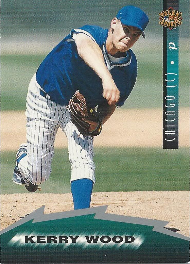
Horizontal lightning bolt – part of the storm.
Talk N’ Sports: combining phone cards with cards cards since…I don’t know when. Also putting apostrophes in awkward places. Or is it omitting them? Technically there should be one on the other side to take the place of the “I.”
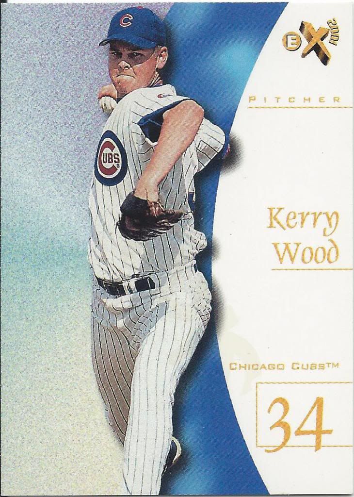
1 in 50 pack pull
Hmmm…an acetate card that’s not see-through. What gives? Well, it turns out that Kerry Wood was the Puig/Strasburg/Harper of 1998. Fleer shoehorned a redemption card into packs to take advantage of the fever. You send this bad boy in and receive…
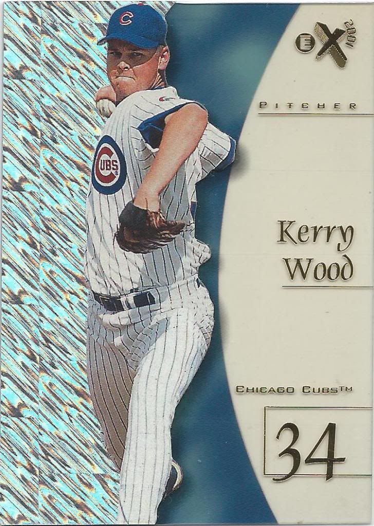
The real deal
this bad boy. Or, shiny clear card of a man. Seeing the redemption card was a nice surprise, especially since I didn’t know it existed. Getting the before and after is even better.
Again, the non-close-up close-up version
We’ve seen these cards before. Well, not these cards, but versions of these cards. Redder versions. These are the regs and I’m afraid I don’t have much else to say about them.
big honkin’ logo.com
Yep. I got nothing.
WEB SITES!!!!!!
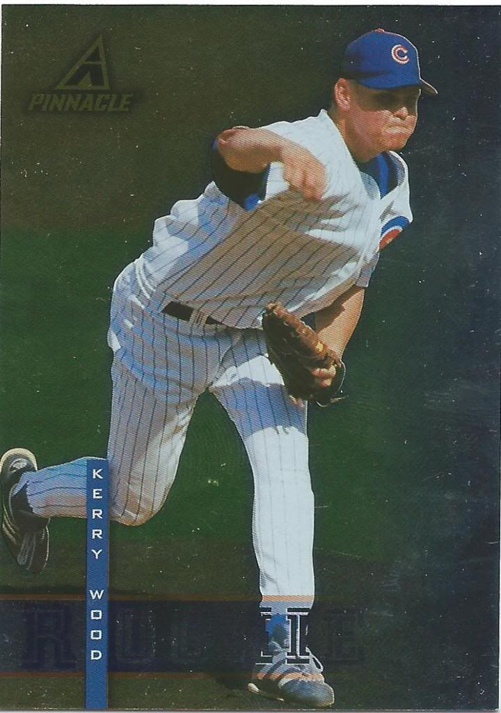
The Plus stands for more foil.
Hooray for shiny rookie cards! I promise that’s what it says.
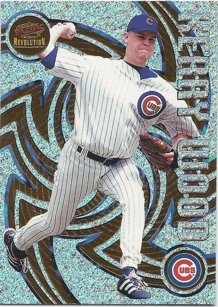
Someone went crazy with the glitter gun
Hooray for much, much shinier cards.
Even the rivets are on fire!
So, the name of this insert is “Major League Icons.” But what I see is a pitcher burning in flames, so I would probably use that little feature. Hot Stove. Spittin’ Fire. Burning Alive. Something like that.
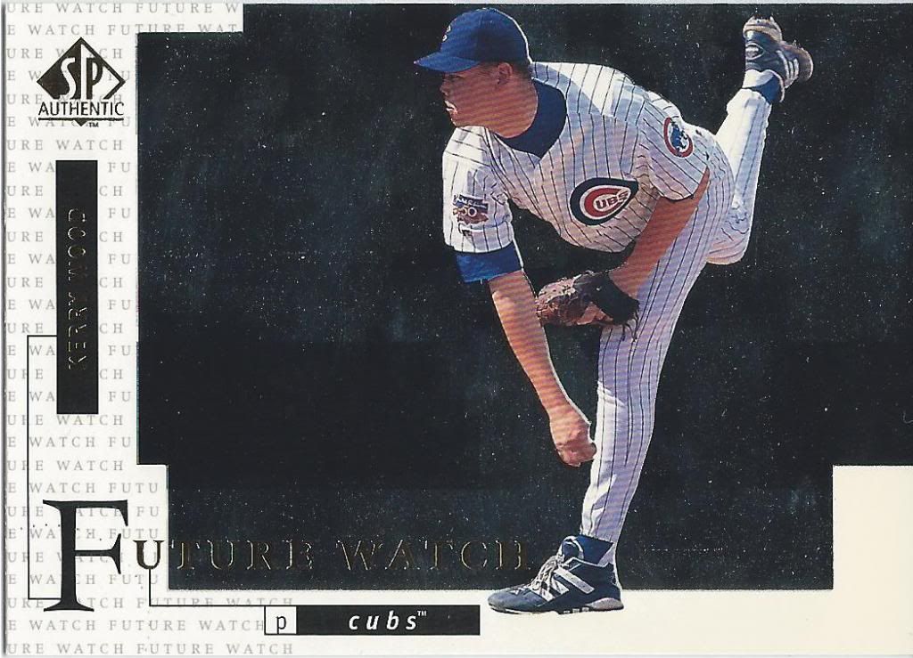
Watch yo self
Future Watch? Is that like that google phone watch thing? Can I make calls on this card? oOOOOOOooo, is this a Talk N’ Sports card?
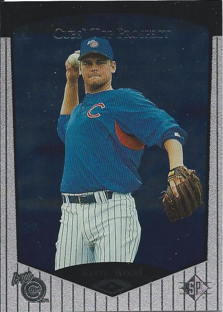
Very shiny AAA card
Upper Deck minor league cards. SP Top Prospects looks a lot better than Bowman.
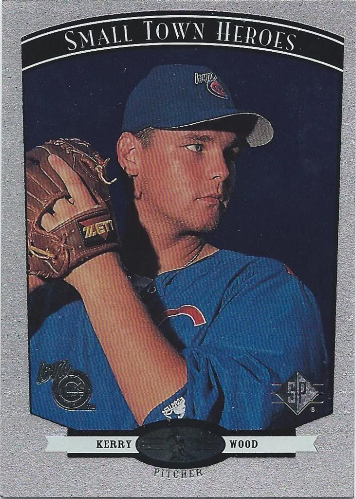
Small town hero, big time spotlight
This is an insert card. It would be nice if there were more separation in style from the rest of the set.
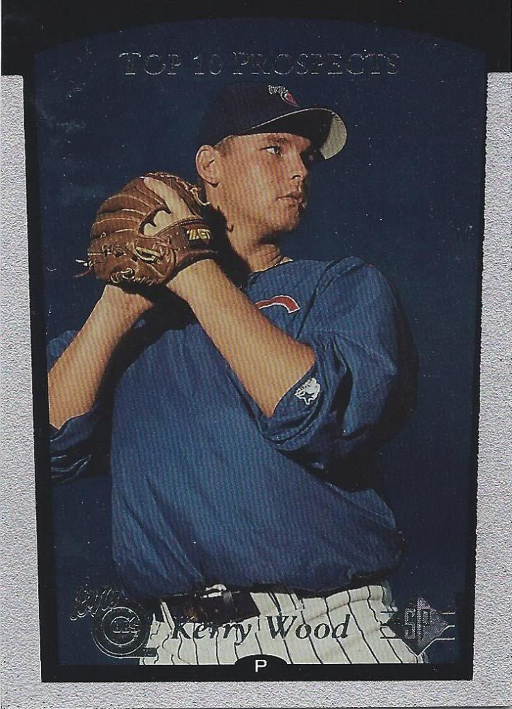
Should have taken this about an hour earlier
Especially when you have a subset card like this that looks nearly identical.
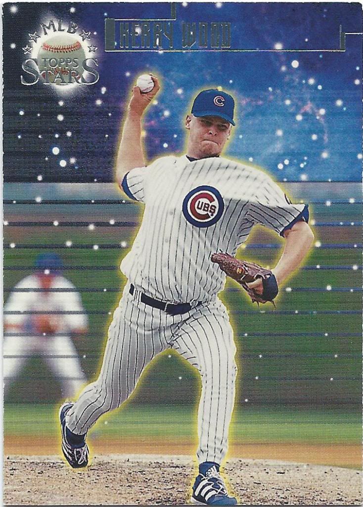
Different foil colors means it’s different.
You all remember this card. Within a very short period of time, I got 4 versions of the Topps Stars card after never seeing it previously. This here’s the silver version. There are still 4 more versions to track down. My guess is I won’t see them for a long time.
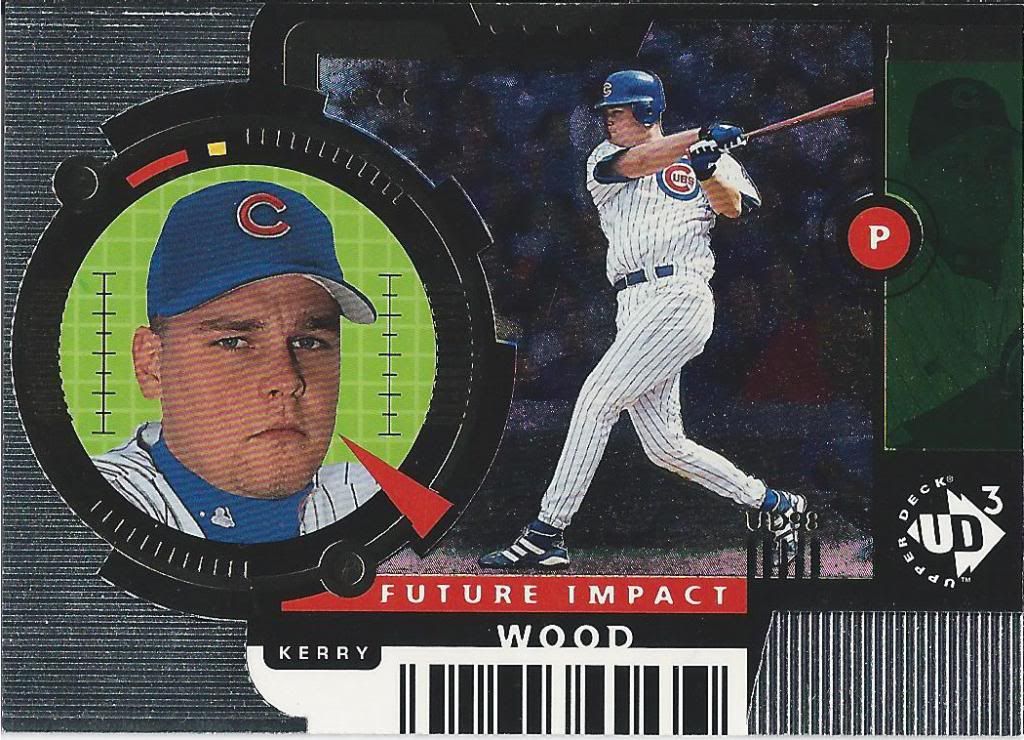
I have Droopy in the crosshairs
We’ve seen these recently, too. I don’t understand UD3, but I do know that there are 3 regular versions of this card and this is more silvery. The versions don’t have specific names, which drives me nuts.
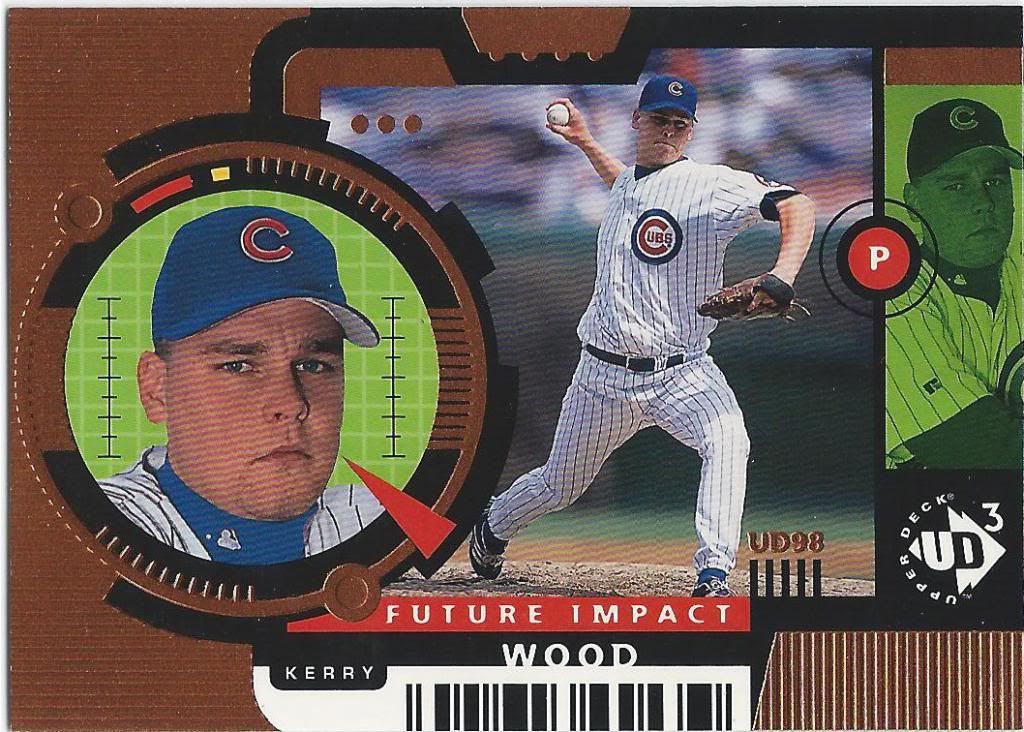
Goose! Maverick! Take the shot!
I mean, the colors are different, and it’s a different “main” picture, but it’s still tough to label these suckers. All I need now are the die cut versions of the three and I can put the set behind me. Oh, except for when it comes to Maddux, Thomas, and Gwynn.
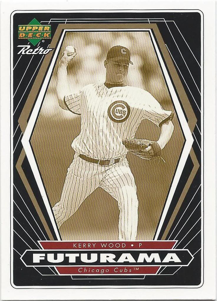
Drink Slurm
If Upper Deck wanted to really make this card the right way, it would be Kerry’s head in a jar. Of course, they’d have to wait a year for the cartoon show to start airing, but c’mon! They’re supposed to be innovators!
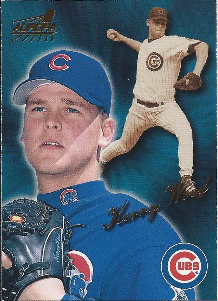
No, it’s Iowa
Woah. Is it just me, or does this card give you a whole “other side” feel. There’s the tunnel of light, the aura surrounding him, the ghost in the sky, the look of awe and wonder and the bright light shining on him.
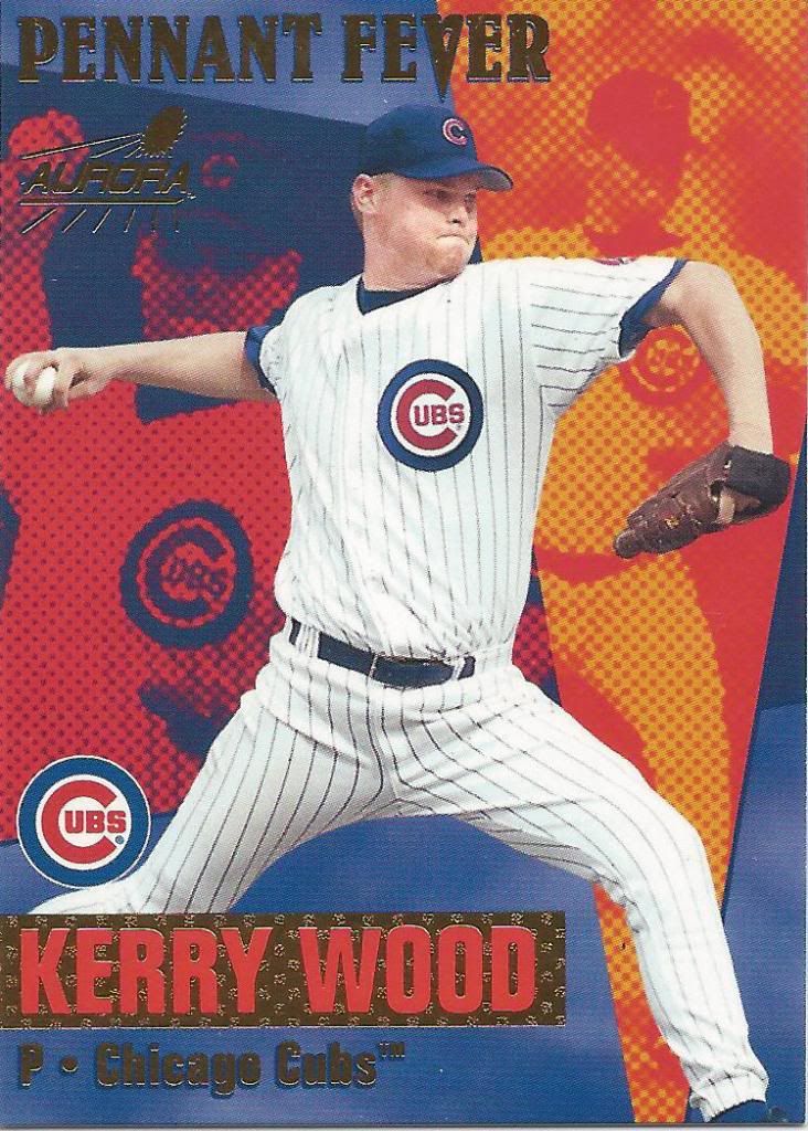
Like a serial killer’s wall collage
And then we’re sent straight to hell, like Kenny in the South Park Movie.
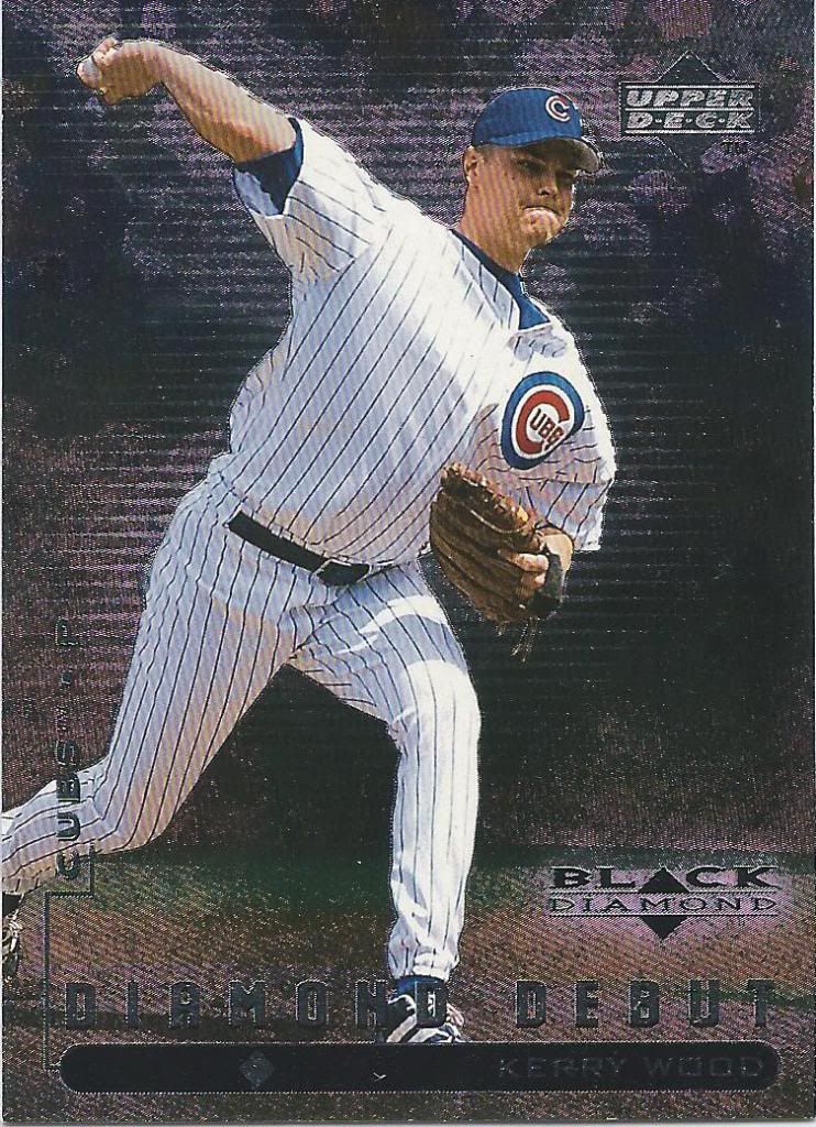
Let the second year card barrage begin
I come into Black Diamond cards semi-regularly and they always look nice. I’m not sure if they were meant to be more high-end back then or what. They could be. They’re better than Sweet Spot base cards.
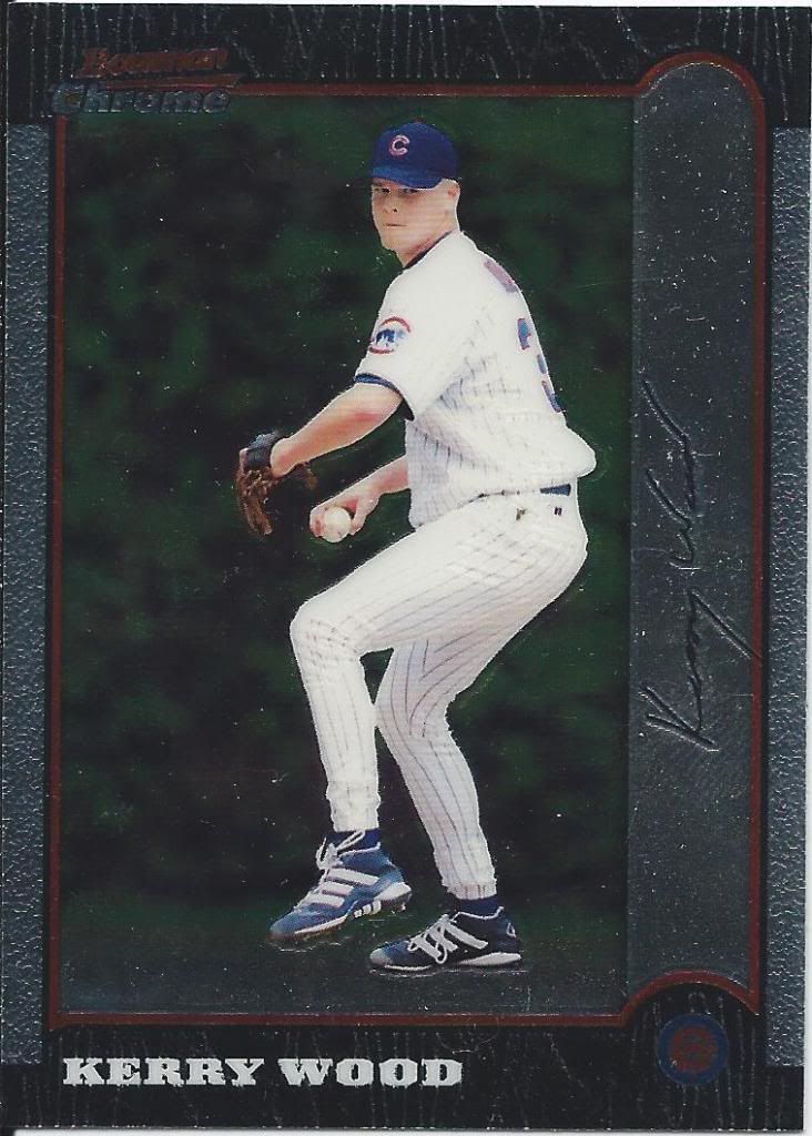
Better than Best
Bowman chrome! I hate what the brand has become, but I always feel like I’m getting something special when one shows up in my mailbox.
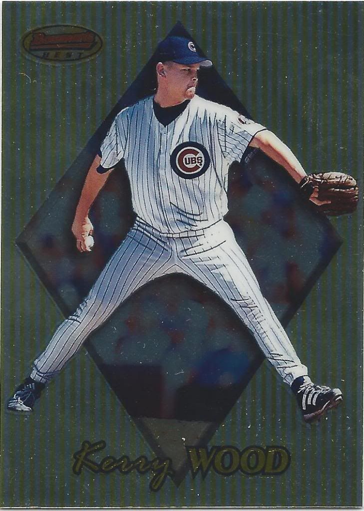
Exhibit A
Bowman’s Best aren’t as special to me, but I still appreciate anything chrome-like. I’m just not too keen on the design is all. It’s like looking at a package of 1950’s butter.
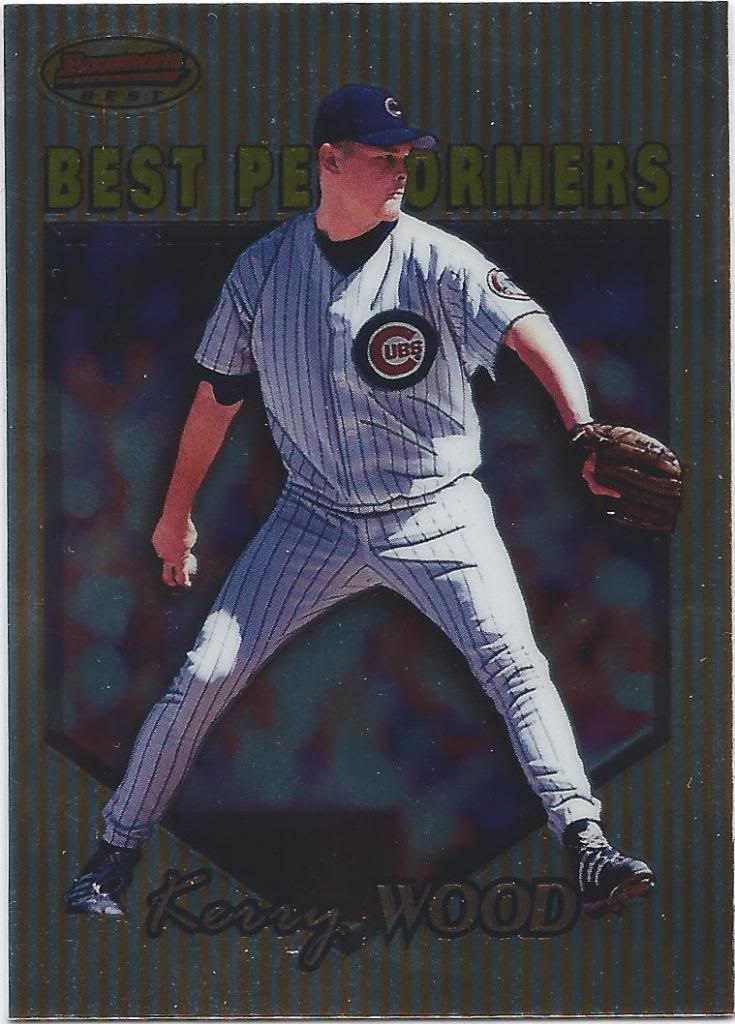
Exhibit B
Boy, I had to do a few double takes to make sure it wasn’t the same picture. My verdict is they are different, but it shouldn’t have been this close. Damn lazy Topps and their monopoly back in 1999.
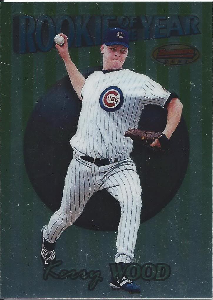
Circle gets the square…er…ROY trophy
You know, after looking at these three cards, I’ve decided that this is actually Bowman for Kids. Why else would it be covered in blinding primary colors and have basic shapes in the background? You can use them for flashcards for your toddlers.
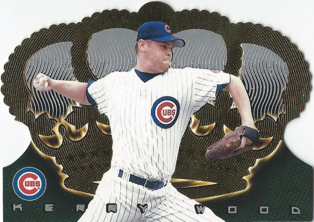
Not pictured: the flames
I cannot tell the difference between the Crown Royale years. That should be a test for anyone wanting to work at Check Out My Cards. Put these Crown Royale cards in chronological order WITHOUT looking at the back. You have 30 seconds. Go!
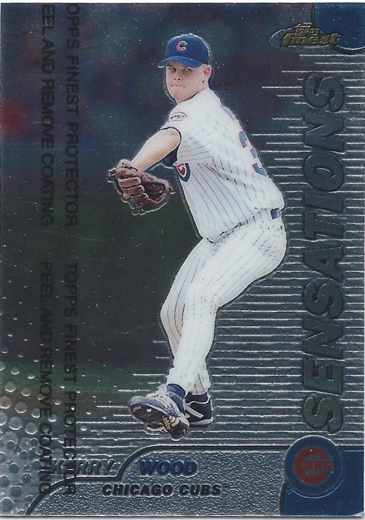
To Peel and protect
This card is fine. I don’t know if I would call it “Finest.” Sorry, that’s all I got.
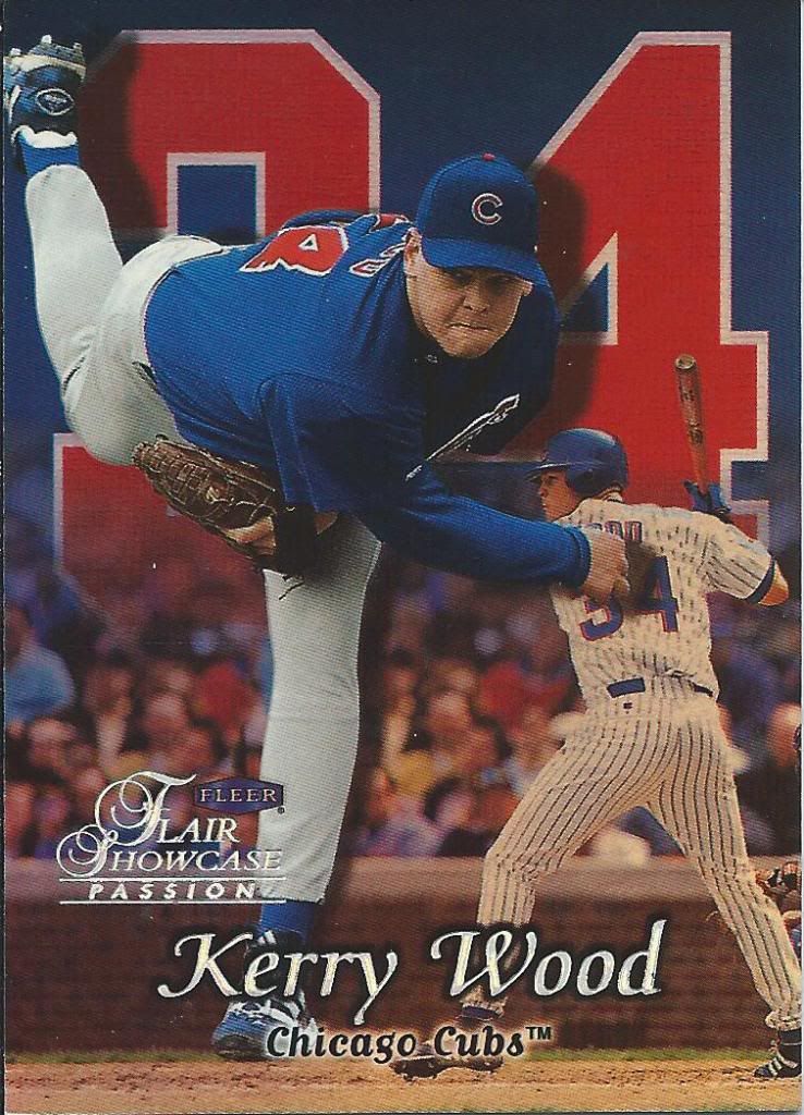
Nice touch on the jersey number. Subtle.
Love the pitcher’s batting stuff. Love it. But that in the foreground, Flair! Showcase that!
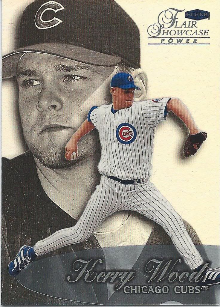
Why can’t my yearbook photo be this cool?
I don’t know how this showcases power. It showcases disinterest from what I can see.
Sort of like the disinterest I can feel glaring through the computer screen, so I’m cutting this off here for now. Oh, but Fred and his monster trade will be back. This isn’t even a third of what was sent my way. Not even a third! We’ve got plenty of greater Woods still to come.

Man, you weren’t kidding about the smiling.
I’m always really thrown off when I see Kerry Wood in a “Rays” uniform.
[…] second installment of my giant trade with Fred. If you missed the first part, check out that post here. There’s some pretty fascinating stuff in there. Of course, there’s some […]
[…] If you missed the first part, and I imagine at this point most of you did, check out that post here. When you’re done with that, the second part can be seen […]