Autographs.
There used to be a time when opening a pack of cards and finding an autograph inside was something you only heard about on the playground. It never really happened, even if Tomothy’s brother’s best-friend’s cousin’s neighbor swears he saw it with his own eyes.
When I left the hobby, autographs were starting to become slightly more prominent. It was still impossibly rare, but just a little less so at that point. I, myself, only ever found one autograph in a pack of cards, but that’s a different story for a different time.
Now that I’m back into collecting, one of the biggest surprises greeting me at the door was that signatures on cardboard (or on stickers placed on cardboard) are now a regular part of the hobby. In fact, it’s basically expected at this point. I know there are plenty of people who feel that if their box doesn’t have an auto – or even the RIGHT auto – then it’s a waste of money. Hell, I’m still not completely jaded by relics (as my last post somewhat showed), so I can’t understand this theory.
I know that most of the autos aren’t all that valuable, but seeing that blue, red, and sometimes black ink on a card in your hands still holds significance to me. It still makes for some of the most enjoyable moments in collecting.
That’s why I’m starting a series that will analyze the signatures we see. It’s common to see people lump them into “good” and “bad” categories, but I want to take it farther than that. This player took the time to sign your card (although some of them don’t take tons of time). I’m going to take the time to inspect it.
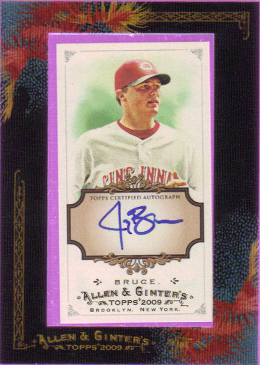
First up is the first autograph I pulled after coming back to the hobby. Before I decided to be a player collector, I toyed around with collecting sets. Allen & Ginter obviously appealed to me quite a bit, so I bought myself a couple of blasters. This happened to be one of them. Overall I found two hits in my retail A&G buying – this and a Rich Hill auto (which definitely deserves its own Card-ography post).
Literal:
If you didn’t know his name, what would you think this said? “4-tiny paw B-line.”
Style points:
The pronounced point at the top of the J is quite unusual and goes against your standard cursive teachings. My guess is he started with the vertical straight line and swooped around to the left to complete the J. The B has a lot of moving parts to it, giving the appearance of elaborateness. If it weren’t for that small line, it could easily be misconstrued as a Z or a 3. The loop back on the bottom is a nice touch and leads the eye nicely. Unfortunately it leads it to nothing.
Space Usage:
Minis are tough. It’s practically the same amount of space as a sticker, if not less. Jay’s name is short enough that he doesn’t have much of an opportunity or a need to take up more space on the sides. Top to bottom, the J saves the day. Otherwise, I would claim he could go bigger.
Laziness:
I’d be lying if I said the “ruce” part looks fine. I do think that style overtakes laziness here as some effort has been taken to make the autograph look nice and unique. Besides, ending in a squiggle is a common technique that even I employ.
Intangibles:
Player selection is pretty decent considering it’s from a retail pack. The initial thrill of seeing this in person is something that I won’t forget for quite a while as well. Oh yeah, and it’s on-card.
Overall:
I really like this autograph. It has style. It has substance. It hits the key points with the initials in big, elaborate letters. It’s smooth and eye-catching. Well done, Mr. 4-tiny paw B-line!


I love this posts. As a person who’s just getting back into collecting I feel the same way. I pulled a Team USA auto out of 3 packs of Bowman Chrome on friday and was ecstatic!
I’d love to be added to your blog roll if you would!
[…] let’s delve into the world of Autographed cards with this episode of Card-ography, the second in a series. Now that I’m back into collecting, one of the biggest surprises greeting […]