
Whether you like it or not (and the answer is probably not), reprints are a part of the hobby these days and they don’t show signs of leaving anytime soon.
It’s understandable that card companies want to celebrate their history and take advantage of what’s already well known to potentially draw interest. I imagine it may also be somewhat cost effective as they don’t have to spend money working on new designs. That’s how we get popular products like Heritage and Archives and the like.
Reprints take it one step further in that they don’t have to find new pictures either. I have no idea if they’d have to re-license the photo or not, but if so it’s probably an easier task since reprints are so prevalent.
And Stretch
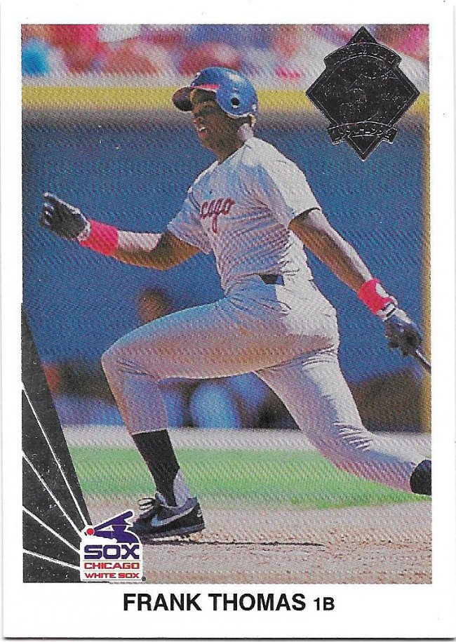
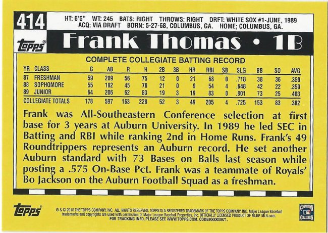
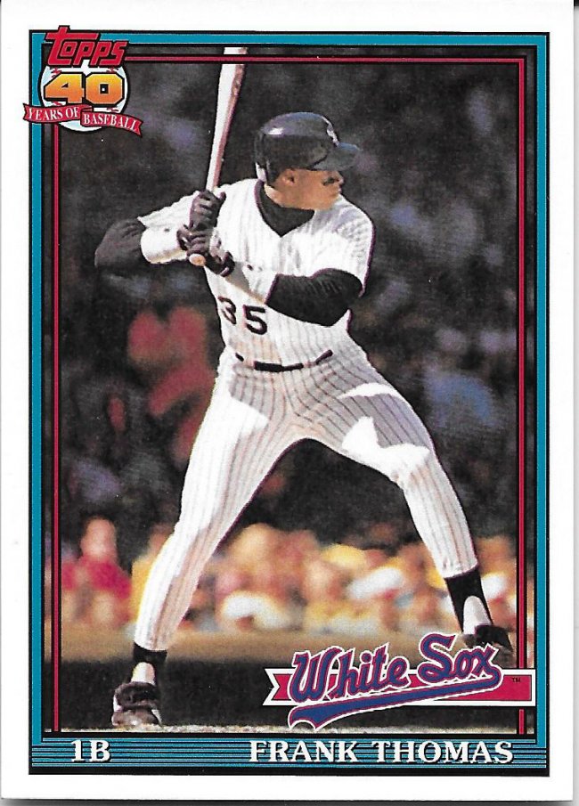
Reprints aren’t exactly a new trend either. This first example is from 1994 and Leaf’s 5th anniversary set. This Thomas card quickly became iconic because of the scarcity and popularity of the player. It was (and still is) the card to get from 1990 Leaf. That’s worth celebrating, I’m sure.
And hold…
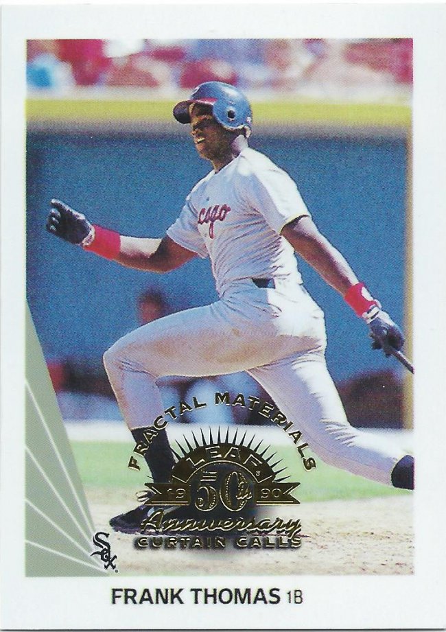
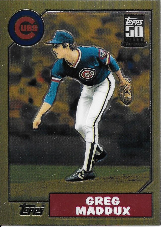
4 years later, they chose a different year for their anniversary and gave us the multi-tiered 1998 Leaf Fractal, complete with a bunch of reprints. These first two aren’t that bad because they at least did a little something different with the photos. It’s tough to tell, but this is on plastic. There’s no mistaking it for the real thing.
And release
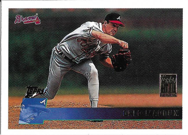
Even a simple stamp is okay. I can’t say I understand the reasoning behind picking this 1996 card. Maybe they chose one from each year for these 2001 reprints but there has to be a better picture in the set.
The font is close but not exact
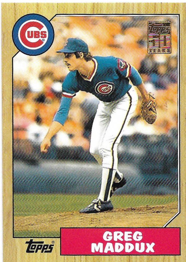
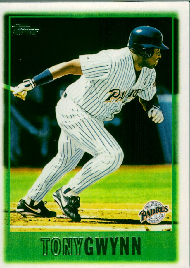
Also from 2001, this is more well known. Not a great picture, but it is his XRC, so that lends itself to being reprinted.
Not exactly Tiffany
The chrome versions are possibly the best way to do reprints, if they have to be made. Of course, they don’t have to be made.
Sure it was thrown out by some, but not an iconic 1994 card
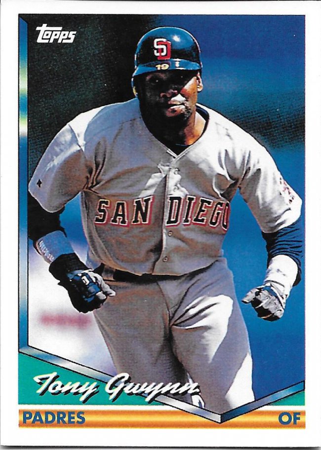
Reprints aren’t part of every product, but around 2010 they came back in droves as Topps gave us the Cards Your Mom Threw Out marathon insert. That one was full of weird choices and ugly printing, like this Gwynn.

Font is way off
This is from the same set, but a better choice of card. Sadly, they did both the name and the NNOF version of Frank.
No insert # on back – NINOB
They also took the terrible step of making an original back parallel of each one. This is for the non-NNOF.
What’s so special
What makes matters worse is that they did it again the next year, to celebrate their 60th year, complete with original back versions. I think back to back massive inserts really, and rightly, got on people’s nerves. Check that fine print! This wasn’t the first time the Gwynn 1997 has been used, and I can’t understand why.
Far from second year card
The last one I’ll show today is from the 2016 Berger’s Best insert, which is basically the same crap but after a 5 year gap. I could show some newer sets as well if I had the cards in hand, but these are all the previously un-seen ones I own. Give it another year or two and I’m sure I can do another round. Whether you like it or not.
I have a love/hate relationship with all of the reprints Topps has produced over the years. On one hand… it’s fun to collect different versions of a card I really love (like the 83T Gwynn rookie). But sometimes it’s annoying and a sign of their lack of creativity.
Reprints are the one thing I just don’t collect at all. To me, they aren’t baseball cards.
I can see the appeal of getting a reprint of a rare vintage item you’ll never really own, but I’ll never understand why someone wants a reprint of a junk wax card where the original is easily had for a couple bucks or less (sometimes much less).