
Hey everybody! Happy Cinco de Mayo! This post has absolutely nothing to do with that.
I’m here with the review of our box of 2010-11 Panini Classics Basketball. The box once again comes courtesy of the one and only Tracy Hackler over at Panini America. We’d be remissed if we didn’t thank him. And as we like to say, “If it’s free for us, it’s free for you.” Check out the rules of the contest after I make you trudge through my hoity-toity review.
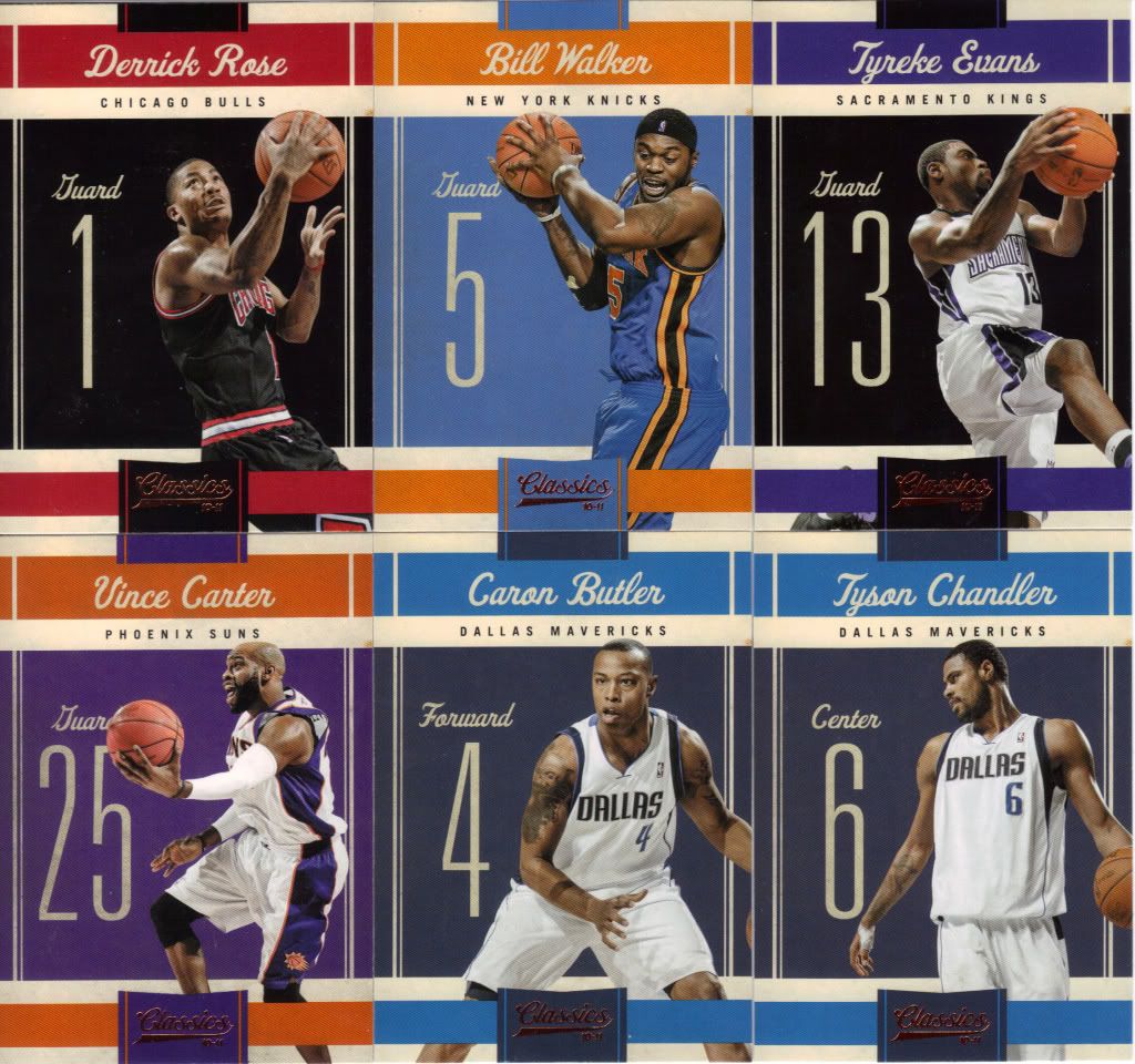
Look at all the pretty colors
Main Set
First off, I should mention that the box ended up containing a full 100 card non-SP set. That’s not only great, but also pretty dang rare. I know at least one other blogger experienced the same thing, so odds are you would too if you picked a box up. If you’re looking to complete the set with SPs, however, you better be prepared to drop some serious duckets. The Legends, which we’ll get to later, are cards 101-140 and we got a whopping 2 of them. That’s either a lot of boxes or a lot of online singles purchases. You’re best bet is to think of the Legends as oddly numbered inserts instead and enjoy the regular set. I honestly don’t think many basketball collectors go after sets, and Panini collectors especially don’t typically want sets, so maybe the entire paragraph is moot. Still, I was pleasantly surprised to find all 100 cards while organizing.
The set itself is about 50-50 for me. I love the coloring. The team colors are slightly muted, which means they catch the eye and stand out, but they don’t “pop” in an obnoxious way. It’s also cool to fan them out a little bit and get some ROYGBIV action going. The overall feel and look of the set is un-Panini to me. By that I mean it doesn’t feel like the same old thing we’ve been seeing in set after set, year after year, even though various crumbs of bread and pats of butter remain sprinkled throughout (mmmm, mixed metaphor sprinkles).
Sure, there’s no background image. Sure you can slap a jersey swatch or auto on those things without changing the design a smidge. Yet, it has…color. I think that’s really the determining factor. Too many Panini sets seem bland, because they are bland. White or foil board backgrounds with smatterings of goings-ons and various lines gets repetitive and honestly isn’t that appealing. This has that extra little bit that makes you want to look at the cards longer, before discarding them for the hits as so many Panini-ites do.
Unfortunately, while the design makes you want to look at it more, the photos don’t accommodate your desires. Remember I all 100 non-SPs to pick from. The 3 on the top row and the Vince Carter were the only ones worthy of being shown off. Most of the time, you get cards that look like the Caron Butler and Tyson Chandler. Although I could have picked out a good three dozen cards where the player looks like he’s reacting to the gigantic number next to them. What the hell is with that, anyway? I don’t understand why the player’s uniform number should get space equal to the player himself. It’s too off-putting. Still…the colors. That’s not sarcasm. Something about the blocks of colors legitimately appeals to me in a way that makes the other problems less problematic.
MVP! MVP!
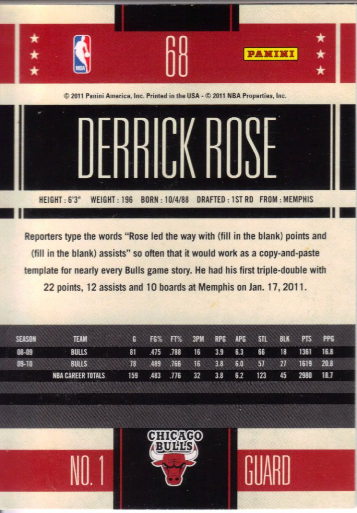
The jersey number isn’t the only thing prominently featured. Check out that massive name on the back. I guess they needed to fill up the space somehow. The backs don’t have the same coloring appeal, so the typical Panini card back strategy can’t be saved. I wish this would be changed at least a little to fit the fronts of the cards. A picture every once in a while. Something. But how about that Derrick Rose, eh? I have to tell you, he is getting me quite interested in basketball again. If you have any sort of interest in basketball, you should honestly watch this guy play the game. He is becoming as unstoppable as a Denzel Washington engineered train.
That Durant insert is just mean...sorry, Seattle.
Inserts
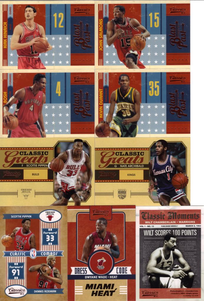
I complained about this in our box break video, but those Blast From the Past inserts are terrible. I’m talking “Blast From the Past” starring Brendon Fraser terrible. I could understand if it were all older veterans with their first team (a la Shaq in a Magic jersey), or Legends in an older uniform they aren’t known for (no great example comes to mind, but that’s only because I’m not very knowledgeable). Instead, we get semi-stars that were traded against their will for the most part shown in a uniform they wore just a few games ago. It’s hardly anything to reminisce about.
The inserts as a whole form a nice cohesive whole. One look at the image above and you can see the template and a color scheme running throughout. And in general, the inserts make sense for what they are. For instance, Classic Moments replicates a newspaper (try to ignore the sad boring picture associated with one of the most amazing feats in basketball history). Classic Combos replicates a non-twisty barbers pole, obviously commenting on Rodman’s myriad hair changes. But, I don’t get Dress Code. How does that represent anything? All I can think of is that it includes a nice big circle to include a piece of dress. I dunno.
Parallels and SPs
And now we come to the parallels section of our program. Here’s my problem….I don’t like parallels to begin with. Very rarely will I tolerate them. I’ll collect them for my player collections, but I do so under protest. These parallels in this product are especially annoying.
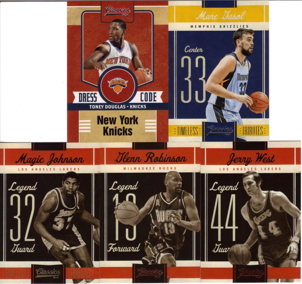
If there must be parallels, they must be noticeable. Can you tell me what the difference is between the Wade Dress Code and the Toney Douglas Dress Code? The foil on the brand name is silver instead of gold…….Obviously that means it must be serial numbered to 250. The Marc Gasol just has a Timeless Tributes stamp on the front (as does the Magic Johnson). I’ll assume that there are different colors of stamps as well. You know why this is a horrible concept? If I’m at a card store or shop looking through singles, I’m not going to be able to tell if I have these cards or not. It will be too easy to pass over a parallel version without even realizing it. Give me some distinction!
I also want to mention the checklist here. I’m sorry Glenn Robinson (or..Big Dog, as our loyal viewers so kindly reminded me), but you are hardly a legend. Neither are about half of the other so called legends found in cards 101-140. Most are local stars or the best player on their respective teams at that specific time. Not legendary types like Magic and Jerry West.
Sorta like a Members Only jacket, right?
Hits
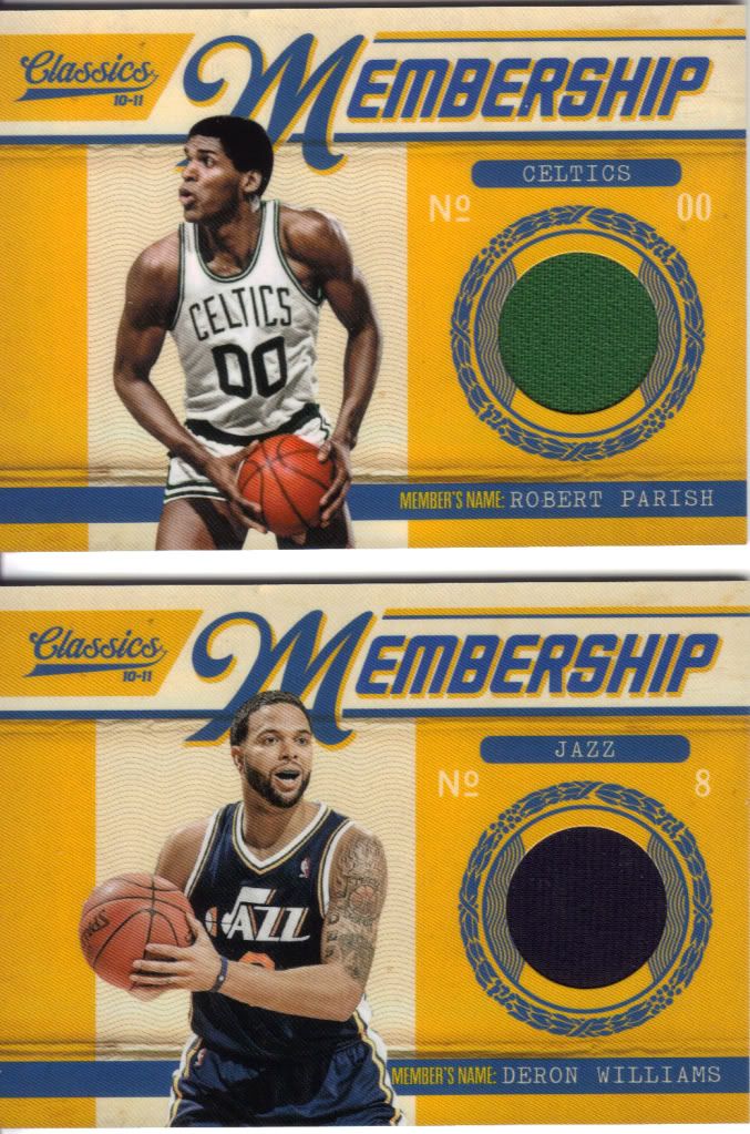
The hits are the main draw of most Panini products, even in a lower cost option such as this. Boxes go for about $100, and you get 4 hits, although you wouldn’t know from the box. 2 of them are autos, and the two above are the relics. Not too bad, really. We got Robert Parish, aka The Chief. When he’s not breaking windows of mental institutions, he’s pounding the boards and compiling an impressive, very long successful career. The other guy made Jerry Sloan quit coaching the Jazz. Oh, and then got traded. Dumb. But he is a good player. I think the Membership cards could have gone a little bit further to make it actually look like a membership card.
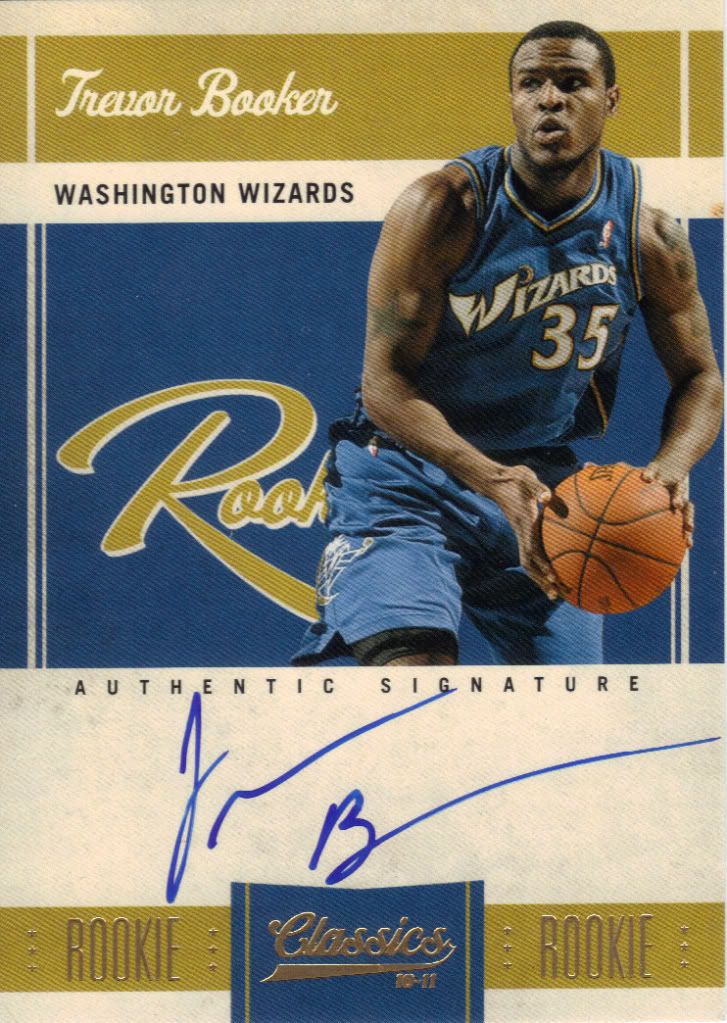
Hey Tracy, you accidentally gave us Trevor Booker instead of John Wall
I know a lot of people like to complain about lazy signatures, but I have to tell you. This looks eerily like my actual signature. And I don’t even have to sign 699 things in a row to warrant my laziness. People also like to complain about sticker autos. Well, this ain’t one of those. On-card baby! Oops, forgot the comma. On-card, baby! That’s better. Delete key be damned. Not all the autos are on-card, however as you will soon see.
See!
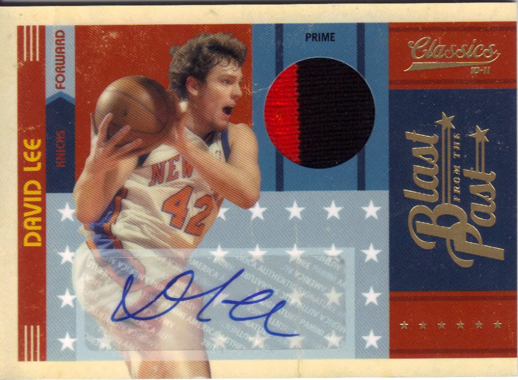
This David Lee prime patch auto is numbered to 25 and clearly the best hit of the box. I incorrectly said that David Lee was part of the Carmelo trade and went to the Nuggets. He’s with the Warriors. They even have his Warrior card in the set. I was thinking of Gallinari. All those white players look the same to me. The sticker could be less intrusive, but it also could have turned out gaudier. The patch looks pretty nice, too. Even Lee is staring in open-mouthed awe.
Conclusion
Design – ***
Set Collecting – *****
Inserts – **
Hits – ***
Overall – *** out of 5
Still with me? Okay, cool. It’s PEANUT BUTTER CONTEST TIME!
We’re giving away all four hits to one lucky person. And as a *special bonus*, if we get more than 25 entries, we’ll also give away the complete 100 card set! What do you have to do win? Simple.
The product is Classics. I want you to tell us which of our previous video box breaks is the most “classic” and why. I know I have my personal favorite. Feel free to use the category on the left sidebar or our YouTube channel to revisit if you need a refresher. Of course, I don’t know why you would. After all, you have them all committed to memory by now, don’t you?
EDIT: I forgot to mention the deadline. Let’s just go ahead and say it’s 11:59PM Tuesday May 10. How does that sound?
I liked the Crown Royale break. Perhaps that’s because I won one of the cards. Perhaps.
My favorite video was by far the one where Jon (long black hair is Jon, right?) stuffed all the big league chew in his mouth. That one is definitely a classic.
Your most classic break is definitely the 2010 Topps Allen and Ginter box break. The reason I say this is because everything about the look of the video screams classy. Jon with his John Lennon-type hair and glasses, Andy with his cache-style shorts, a very old-antique looking box of baseball cards, two old plush sofa-seats, and filmed in front of an old library-bookshelf sort of thing.
I like all of them, but the 2010 A&G had some fun moments. I laughed when Jon said the box didn’t guarantee an auto and Andy said “Why’d I buy this?”. Andy’s disgust at pulling the David Blaine card was pretty funny too.
I’d have to say that my favorite “classic” is the more recent 10/11 Panini Crown Royale break video. Love the look of that set as it is classic, and you two provided many classic moments with your readings of the players names (not that I would do much better). Thanks for another cool contest!
If I had to pick, I’d have to say crown royale as well, classic break as always and you guys made me feel better about my lack
If I had to pick, I’d have to say crown royale as well, classic break as always and you guys made me feel better about my lack of ability to pronounce hockey players names 🙂 keep up the good work guys, and thanks for contest
i’m thinkink the crown royale break because the design is very unique!
My favorite classic is the 2010 Donruss basketball because they brought back the old school Donruss logo and the famous Rated Rookie. I love how the card feel and the back of the card have a classic look.
I really liked the absolute memorabilia break. A fan of the stargazing inserts and the rookie patch cards!
Not interested in the contest, but man that’s an ultra-generic font for ‘New York Knicks’ on the Douglas Dress Code card…
First.. I wanted to thank you again for the last contest – Which also happens to by my favorite “Classic” break by Community Gum for OBVIOUS reasons (i won) – The 2010-2011 Absolute Break. I do enjoy the honesty and humor you bring to the breaks you guys do… If you aren’t into a sport or aren’t an expert on it, you don’t hesitate to say so. The same goes for if you see something that detracts from a card… You don’t b.s. like many others do.
Now I just cross my fingers that I can REPEAT as contest winner. I wanna go Back to Back!
My favorite video has to be Blake Griffin Breaks Boxes with Panini America CEO Mark Warsop. the reason why is because you see the reaction on Blake, for the first time he open’s a pack with his card patch in it. People dream to be on a sports card,and Blake got the satisfaction on becoming a member of the Panini family. Contenders and absolute and classics are the best in the market hands down….
Is the winner for this ever going to be announced??? Just curious…
Absolutely! I’ll do that today. Apologies for the delay, but Jon’s wedding this past weekend siphoned off a great deal of our time, as you might expect. Thanks for your patience!
[…] congrats to the winner of our 2010-11 Panini Classics contest winner, announced in this here video below. We had 9 proper entries and all the videos you guys […]