
One of the side effects of being away from the blog for over a year is that when you go back to trade posts, you completely forget what the trade was or what you sent.
That’s just a side effect. I don’t really care what I sent over. If the cards were that important to me, I’d still have them. I’m sure it was Phillies or Ryan Howard related since it went over to Brad’s Blog. Possibly my Moments & Milestones, among (hopefully) others.
What’s most unfortunate about this work-induced hibernation is that it meant it took a year longer to pay tribute to Brad. Good bloggers and good traders deserve their due and I feel bad that it’s taken so incredibly long to write my gratitude for the below cards.
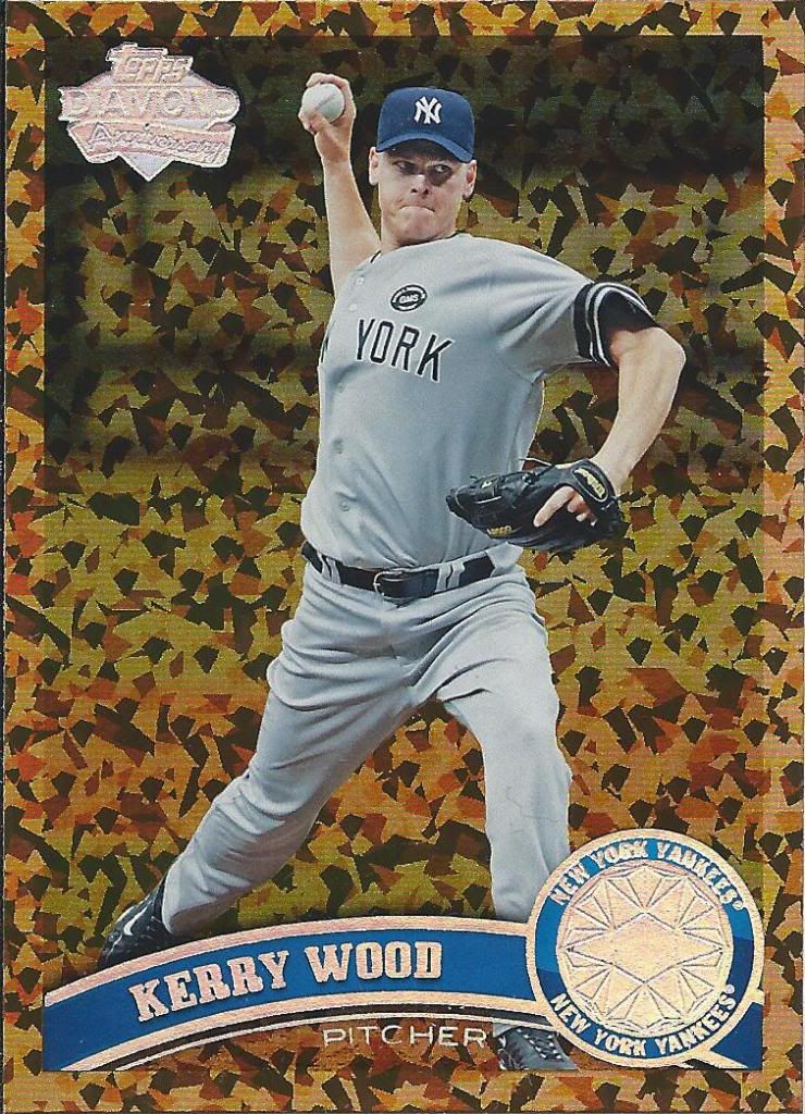
Instead of Liquorfractor, I see more of a camouflage pattern on this scan.
Even though it wasn’t that long ago, it’s easy to forget that Kerry Wood played for the Yankees. But, because it was so close to the end of his career, it’s also easy to hide them in the back of my chronologically ordered binder.
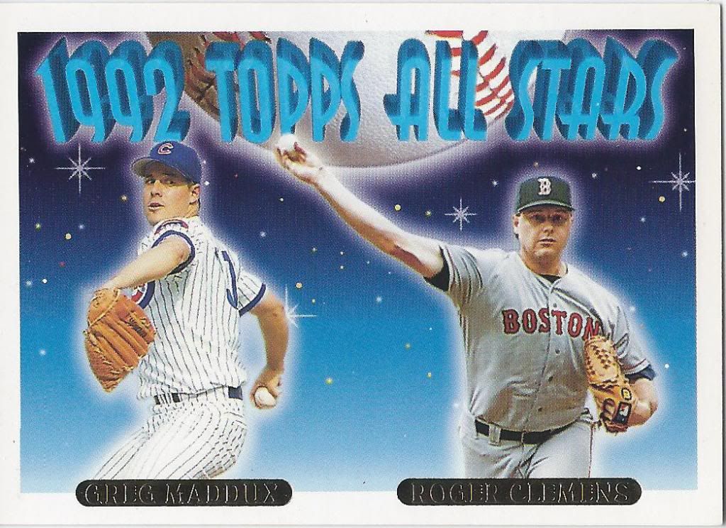
Clemens is encroaching on Maddux’s personal space and Greg ain’t happy.
Along with an upgrade to my 1994 Donruss Special Edition, Brad sent this little gold nugget westward. This would have been a big time card in 1993. Internet and mass availability have killed that notion for most people (along with the downfall of Clemens’ collector base), but it’s still a big time card for me.

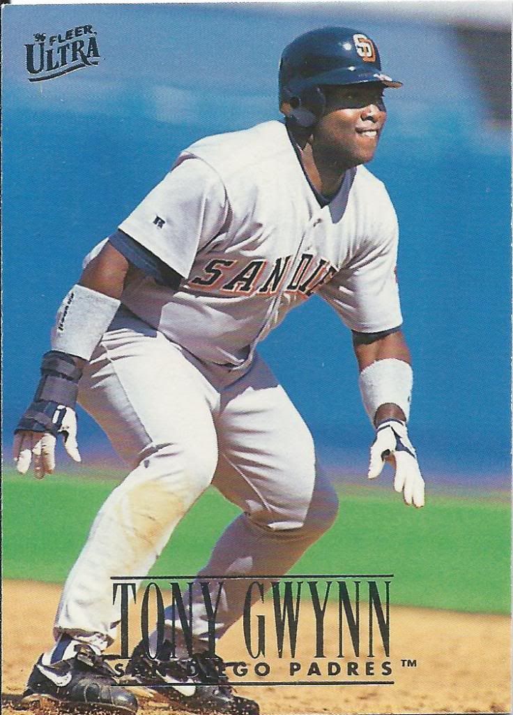
Great photo “Select”ion
How can anyone hate this card? The border tells you it’s a score product. The player is Tony Gwynn. More than that, he’s land surfing into third base, creating a kick ass dirt cloud. See also: THOSE SHADES.

Yeah, I’d say that’s accurate
I’ve said before that I really enjoy these earlier Ultra inserts. There are some exceptions, but this isn’t one of them. Yes, I know it’s busy and the colors could stand out a bit more. I don’t care. Sweet horizontal design with great picture framing = happy.

One of my least favorite ’90s Topps designs
It’s surprising that a lot of the junk wax era stuff still eludes me. It shouldn’t. After ’92, I transitioned heavily into basketball collecting. Still, I guess I assume that the easy to obtain stuff will magically appear in my hands.

Pinnacle. Pyramid. Get it?
No, it’s not a Studio brand card, but the photo may have been taken at a mall. That’s some pretty harsh lighting. The reflection on his skin is stronger than that from the foil.

Not enough foil
Is anyone else thinking of The Price is Right yodeling game right now? The “S” in “Heroes” is about to fall off the cliff.
Get them jazz hands ready
If Tony had the shades on, I could imagine this was the prequel to the Select card I showed earlier. Instead it’s just a mildly dutch angle of a mildly interesting Ultra card.

Aaaaand…scene.
Get ready for a minor rant. I really hate it when companies use this fake film strip effect. Actually, it’s not the concept of the film strip alone. But, for those that don’t know, each frame on a real film strip is a different picture, albeit slightly different. When you see 5 of the same image like this, there will be no motion in that picture. It will be an awkward freeze frame. Now, I know that licensing 5 sort of different pictures would not be good monetarily, but it still bugs me.

How about that border?
I’m sure it seemed innocuous at the time, but now this Padres uniform looks very off-putting. It looks photoshopped. That blue text with no outline or shading or something else comes off as fake. I’d rather have the brown and yellow.

Can you spot the difference?
I’m not sure if Brad knew this when he sent it, but the card above is the tough to spot SP Variation where a little bit more of Tony’s leg is showing. That saucy young mink. I’m talking about Tony, not Brad. I’m sure Brad knows to keep that dress down to the ankles.

From series 1, for the record
Gwynn was featured on a Chasing History card in all 3 series of 2013 Topps. When you add in the retail holofoils, relic, and autos into the mix, it adds up to 10 cards from one year, from one insert set to chase. I think I’ll make history if it actually happens.
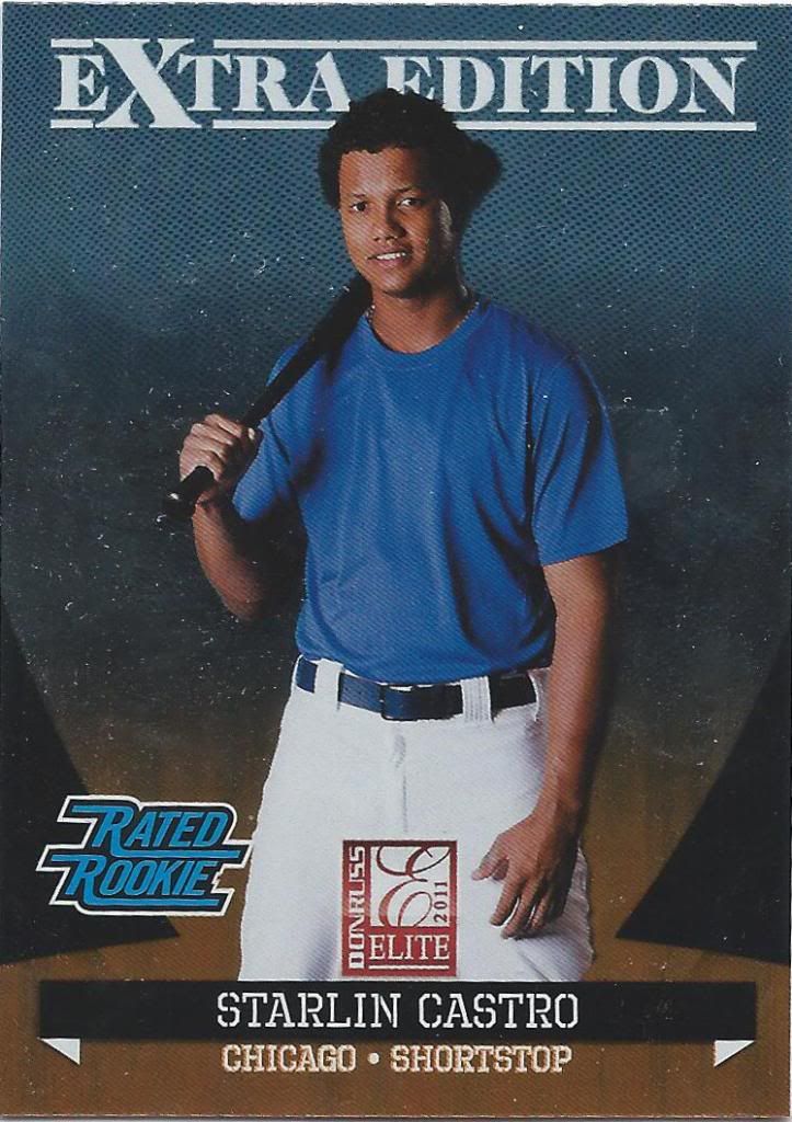
eXtra blue, am I right?
I think Panini has made great strides in a couple years in terms of creating collectible, interesting baseball sets without a logo. I know that not everyone feels that way, but all I can say is that this kind of hideous thing is no longer the norm.

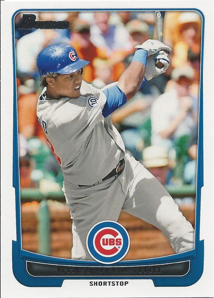
Leaps and bounds better than the previous card
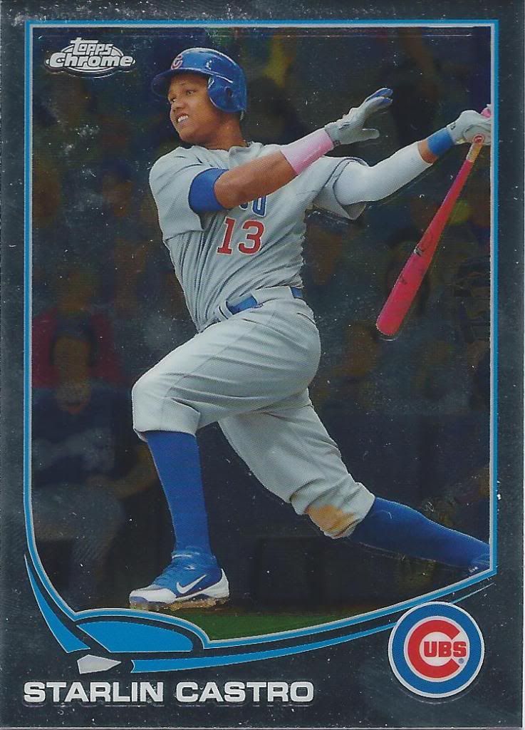
I really like this picture. Assuming I maintain my Castro collection, this will be a fun chrome rainbow to chase.
Not so thrilled with this rainbow
This picture is not so hot. The only positive I see is the Santo patch on his sleeve. The Bowman border isn’t too terrible, though. It has a car hood thing going on.

I’ll never tire of die cuts
Ouch. This kid doesn’t photograph all that well, does he? A die cut can’t save that face. You know what would make this die cut even more badass, though? If that silver thing in the background was see-through.
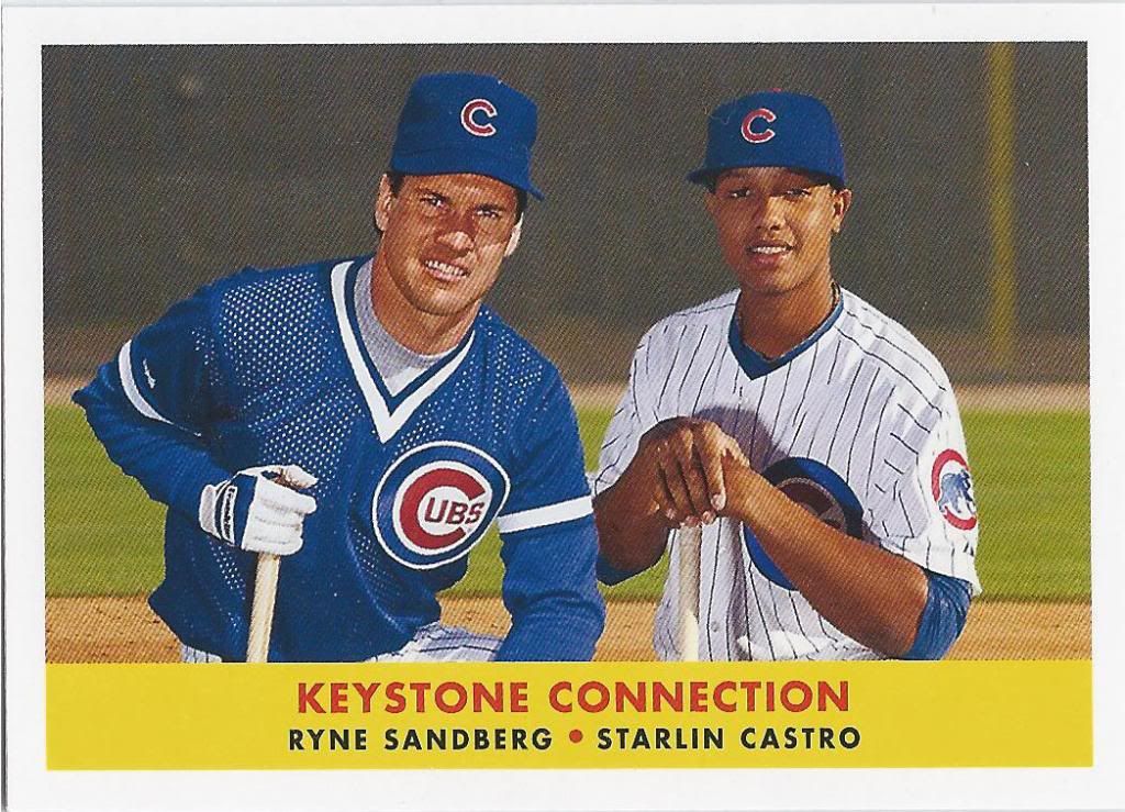
They did not pose together
I’m glad to have this sucker. It’s from Archives, but it was a retail only insert set. I wasn’t about to go buying retail packs of Archives with my fingers crossed, so a trade or card show find were my only options. Turns out that trade won the race.
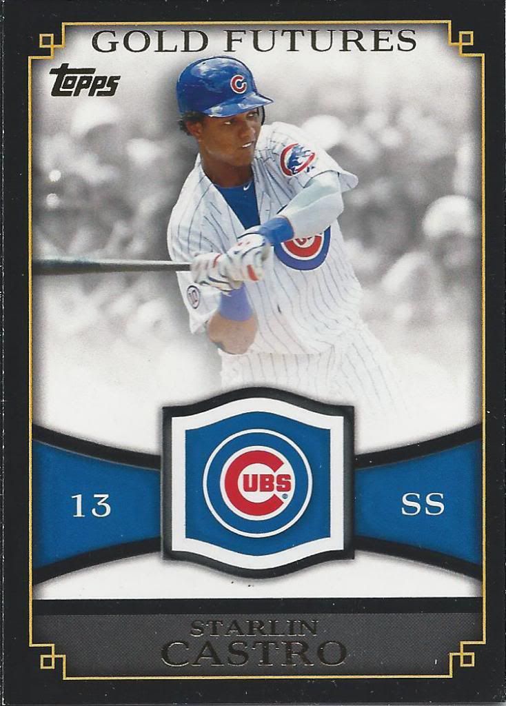
Let’s squeeze the player a little more next time, guys
From our cases upon cases of Topps, I’m sure we had this card for sale. I don’t know if we sold them all or if I never pulled one from our inventory after the business dissolved. No matter. The chip-prone, relic-window-in-waiting card is mine.
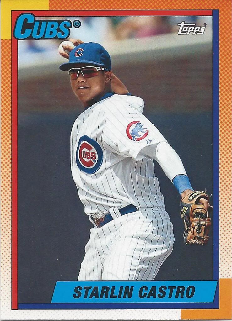
Glad they didn’t do a NNOF variation for anyone
Hey, look. It’s another Archives card. 2013 revived the 1990 style for their Heritage-lite product. I know 90 was a polarizing year, but I enjoy it quite a bit. I’m sure a large part of that is nostalgia and experiencing a colorful border for virtually the first time.
Lights off
Oh, I can identify this game! I may have said that before, but that was over a year ago, so cut me some slack. Pink bat plus pink arm band equals mother day game. Maybe on the next card from this picture, I’ll actually look up the details. Maybe.

Lights on
Well, since the last card is a refractor version of the same image, I might as well look it up now. The Brewers bat boy tells me that it should be the May 13, 2012 game. The Cubs won the game 8-2, avoiding the sweep. Castro went 2 for 5 with an RBI. I’m not sure if this would be one of those hits, but we can hope.
Thanks again to Brad for the great trade. If we get the chance to do it again, I’ll make sure it doesn’t take a year to show my side.
All good! Thanks for the post. Always fun to see what I’ve sent out to people! Glad I hit on a few of the PCs. and Welcome back!
The Real Person!
Author Jon acts as a real person and passed all tests against spambots. Anti-Spam by CleanTalk.
Thanks a lot! Hope we can trade again sometime once I get my bearings back.