
If you’re wondering why I haven’t posted in a week, maybe what you’re about to see will explain it. You’re going to be treated to a very short introduction this time, because I’m writing 3,000 words or so overall on this doozy of a trade. Things like this take time you know.
The cards below come courtesy of The Diamond King. He burst on to the scene around the same time I started my Frank Thomas and Tony Gywnn collections and he offered up a bunch of them. In total he sent 114 cards between the 2 players. 48 Thomas cards and 66 Gwynns. Absolutely massive! He also sent a few 1995-1996 Basketball inserts for my collection, which marks the first time a blogger has helped out on that front, but I’m saving those for a basketball exclusive post later on.
I’m only going to show off a third of these, but that’s still 38 cards coming your way. Buckle up. For safety.
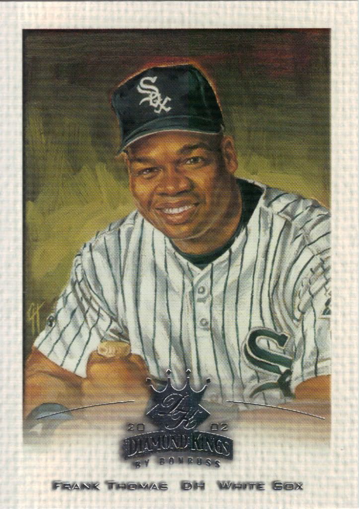
First comes Franky baby!
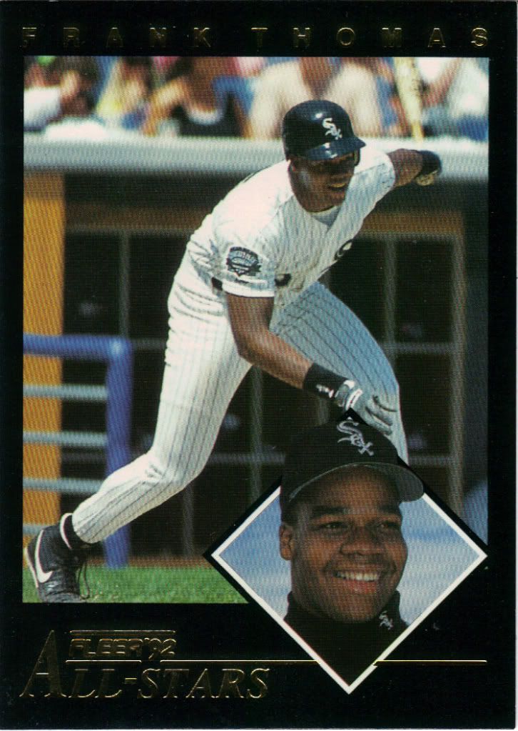
Black (border) Magic
I know it may not look like much by today’s standards, but in 1992, this card was the shit. Fleer knew how to put together a quality insert. Part of the appeal was opening a pack of green borders and seeing a hint of contrasting black elegance, which instantly got me excited. Just like some do with their hits today, I would do the slow reveal to see which All-Star I got. In all honesty it didn’t matter, because I was happy with any of them. Love these cards.
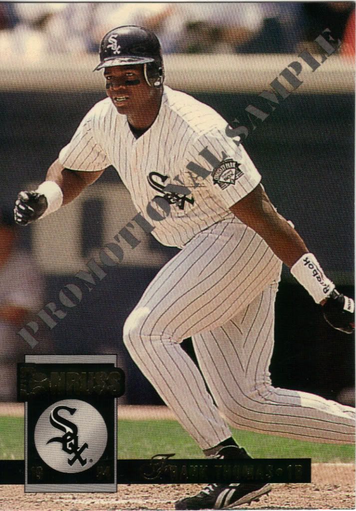
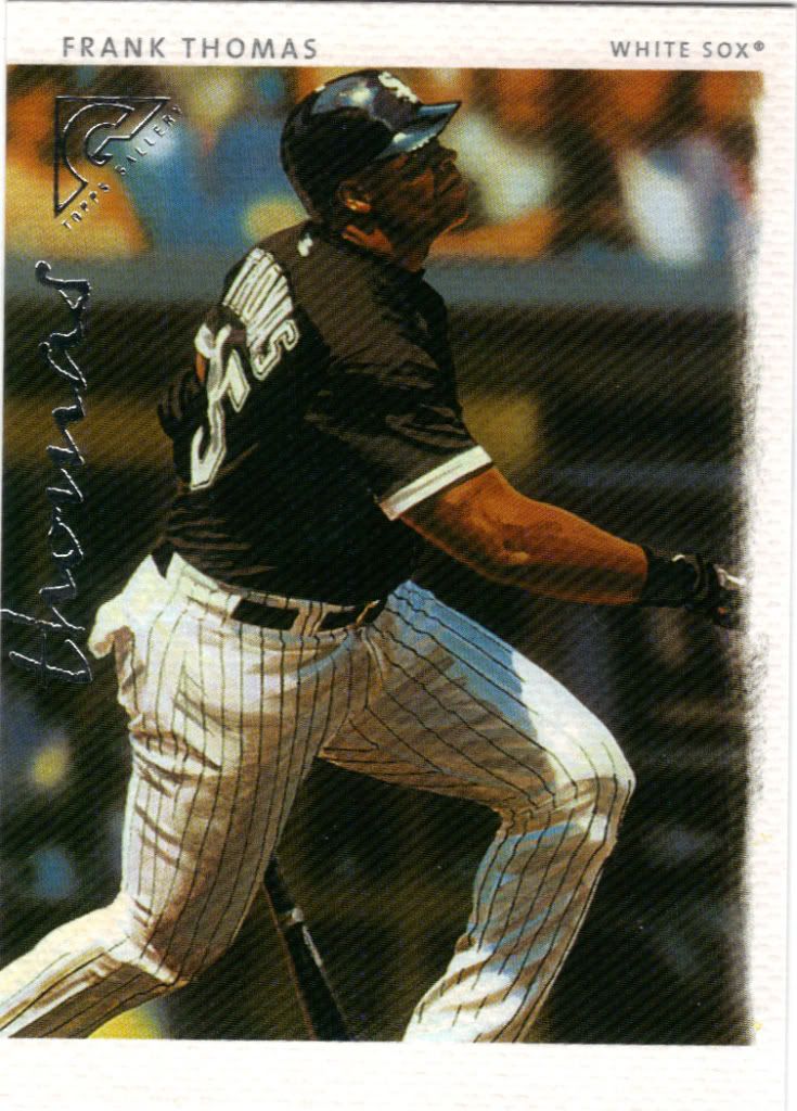
Not for resale
This is the first of several promo cards in the package. The Big Hurt was the poster boy for a lot of products. Maybe one of these days I’ll get out to a card show again, because I’m sure I’ll be able to find a few promos there — maybe even the gold version of this one. The sample you see looks identical to the real deal on the front. The back is slightly different in that it uses 1992 stats instead of ’93 and a line of text is aligned differently.
Wrigley count: 1
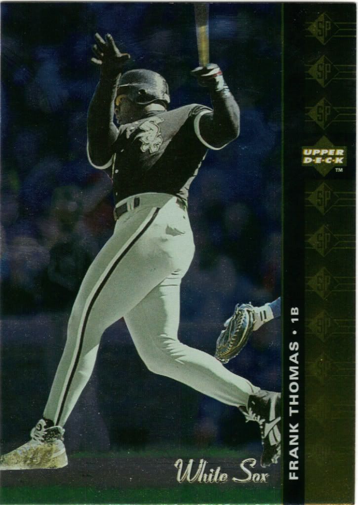
I know the foil makes it tough to see, but it’s hard to mistake Wrigley. Since interleague play didn’t start until 1997, we can only assume that this was a Cubs/Sox exhibition game. I could be wrong about this, but I’m pretty sure this is the first 1994 SP card I’ve ever owned. This stuff was too rich for my young no job having teenage blood. I bought a couple packs of basketball, but that was rare.
Eye is not on the ball
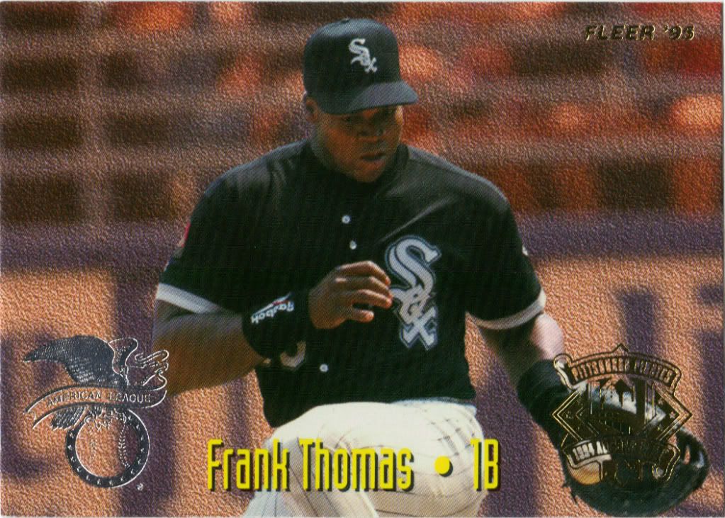
When compared to 1992 these all-star cards are a big step down, but honestly 1995 Fleer in general was a big step down. You could probably call these the best looking cards from 1995 Fleer and I wouldn’t debate you much. 1992 Fleer had 24 cards in its insert set. 1995 has 25 but features 50 players – one on each side. On the back of Frank Thomas is the NL’s 1B counterpart Gregg Jefferies of the Cardinals. I think the AL fielded the better player that year.
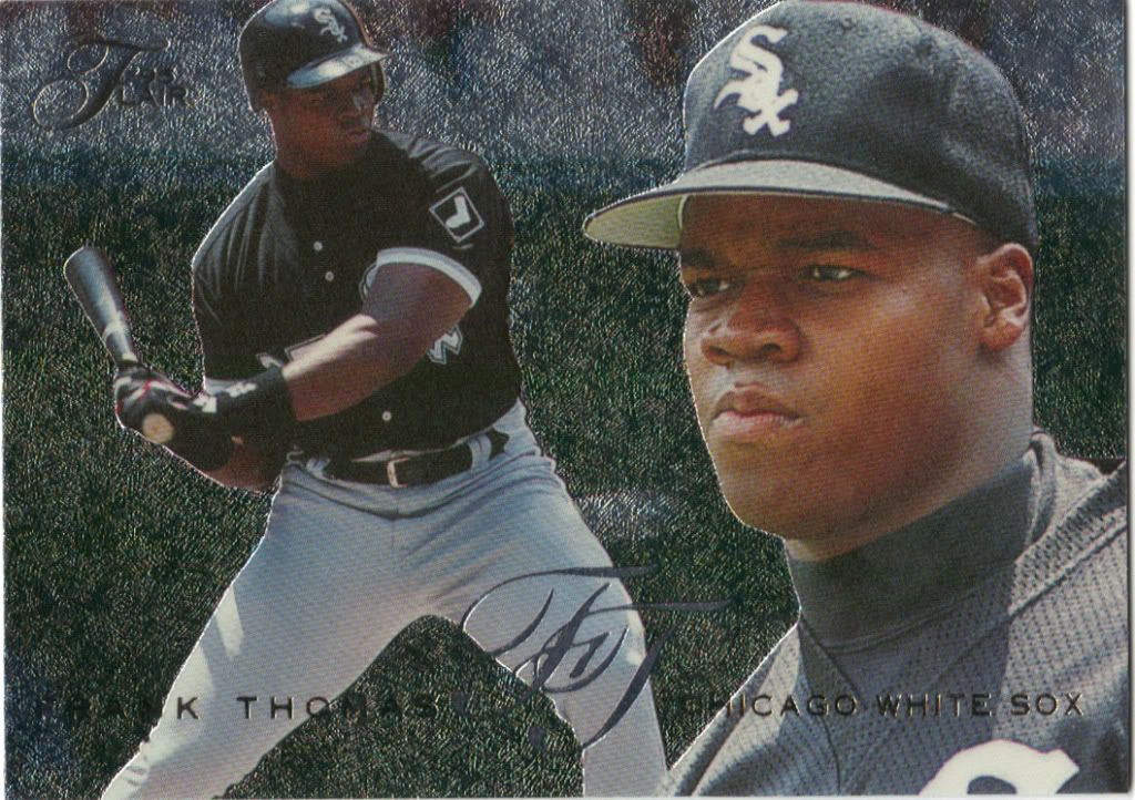
15 pieces of...you know where I'm going with this
How is it that THIS came from the same company that gave us 1995 Fleer…in the same year, no less? What’s not to love about Flair? It kind of has the same background effect as that All-star card, except glittery and etched. The back is full bleed with gold foil (pretty rare to see foil on the backs still) and stats that don’t obstruct the photo. The card stock is nice and thick. The packaging was ridiculous but it made you feel special opening it. Great all around.
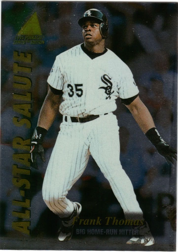
He seems worried about that ball
Another all-star card and another all foil. This salute is for Frank’s Home Run Derby win followed-up with a 2-run blast in the actual ASG. I can’t be 100% sure, but I think the picture is from the game based on the non MLB logo patch on his right sleeve. If so, then good job Zenith for capturing the moment in multiple ways.
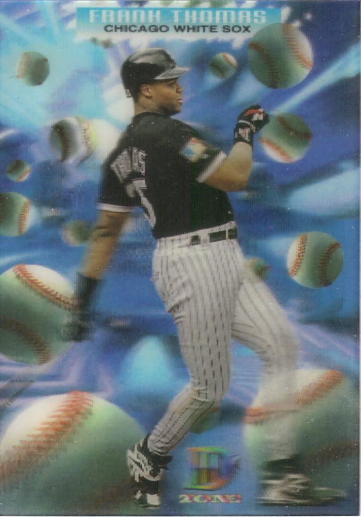
More fuzzy than 3D
My biggest complaint is that the picture doesn’t move, only the background. Even then, it’s only part of the background. The blue part. In the very back. And it’s not really a movement but rather a tiny perspective shift. It’s an effort, I guess, but not much of one.
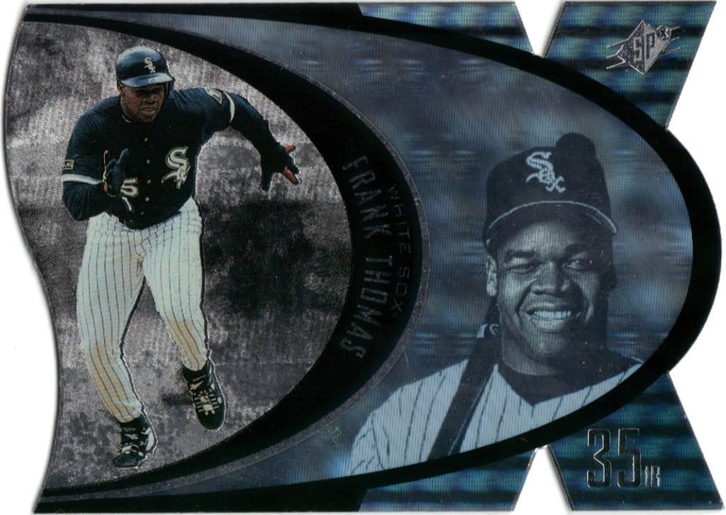
Die-Cut! Hologram!
I had a hell of a time figuring out which version of this card I had. The checkoutmycards scans I referenced couldn’t tell either since some of those scanned under the same heading were clearly different parallels. It turns out this is the normal one, which I would naturally assume, but I needed to double check since there are also Silver and Steel variants. That’s edging on Masterpieces type confusion there. Still SPx cards from this era are badass die-cut sweetness. The hologram is a garbled mess (I think Sox logos are floating behind him, but I can’t find a good angle to tell for sure), but that’s a small gripe overall for a card from the future.
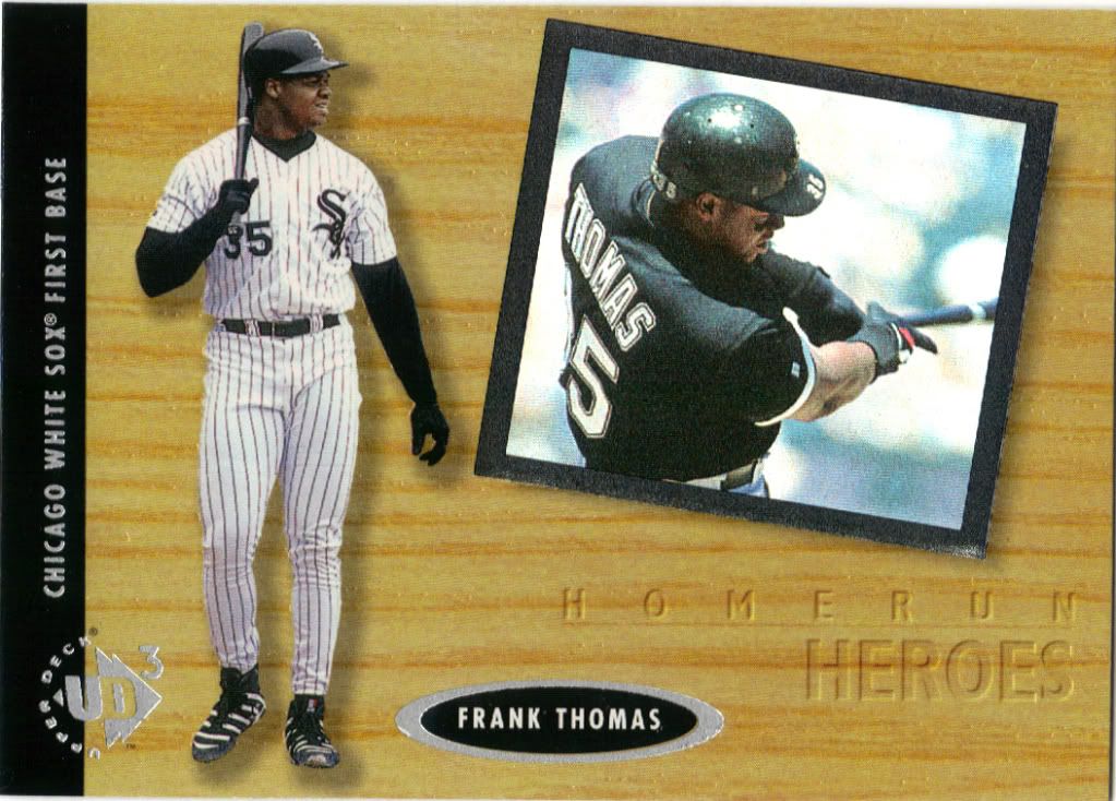
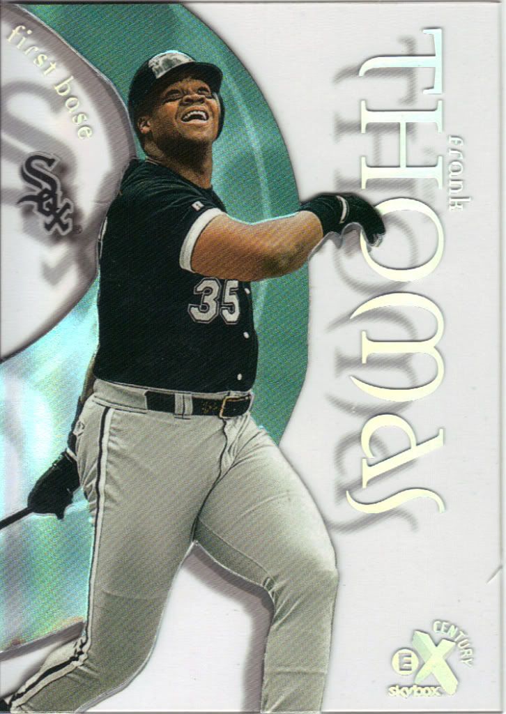
Frank admiring Frank
Upper Deck was all about higher-end stuff. UD3 was a 3 card pack type of product (back when that was still out of the norm) priced above my range. The cards, like SPx, did at least accomplish the feeling of higher-end. You can’t tell as easily from the scan but the wood grain is slightly indented for a slick faux finish. Solid all around.
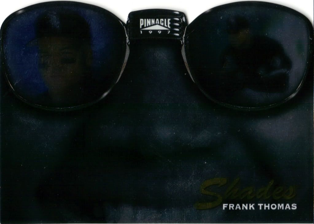
Boo!
Sorry for the creepy scan. Foil works well in person, but not always on the computer. I appreciate them trying to bring back one of my favorite Pinnacle subsets in the form of a die cut insert, but it is a little off-putting. Must be the Cheshire smile.
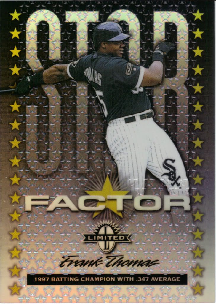
Even shinier than advertised
Here’s another promo card. This time there’s nothing to compare it to, because the actual set was never made. The sample looks really nice, don’t you think? Super shiny, the clear stars are raised, sleek design. I like it. Too bad they went under before it could come out for real.
Less shadowy than advertised
I’ve professed my love for these before. Kind of. I want more clear plastic cards. Give me the durability of the plastic and mix in the child-like appeal of seeing my hand through my card and I will purchase these things. It’s just that simple. Plastic see-through = open invitation to my wallet.
Looks like a Splitting Image puppet
Boy, it sure does look like this card should have some texture on it. Boy, it sure don’t. There’s the thinnest canvas coating that is so thin that it feels like normal gloss. I want rough and groovy. Anyway, the painting isn’t so bad. It has a slight Mad Magazine parody caricature look to it, and I don’t know why his cap is glowing red, but I’ll allow it.
Just looks badass here
See! This is rough and groovy. I feel texture here. Good stuff. If I’m nitpicking on the painting (and I might as well), I think the forearm and wrist is a bit too slim, although I don’t have the original to reference. Otherwise, I love the detail in the shadows and clothing. Very well done by Bill Purdom.
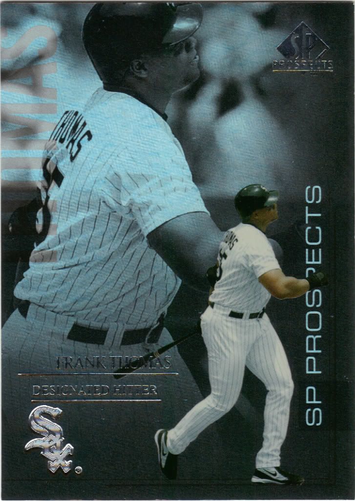
Big Hurt and Little Hurt
You see the name on the upper left hand side? It’s not naturally red, that’s my scanner. I’m glad it did, otherwise I would have missed that little detail. As for the set, I don’t like the licensing rules sometimes. Companies shouldn’t be forced to include 15 year veterans in a product labeled Prospects. People are only buying it for the set’s namesake. Perhaps Upper Deck could have taken the concept a little further and showed Frank as a prospect in one of the pictures instead of using the same recent one twice.
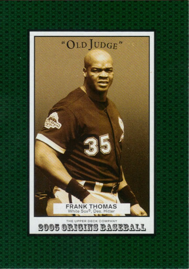
Where's the "Old Executioner?"
I know pretty much nothing about this set, but if the rest is like this I’ll pass. Wow is that green obtrusive, gaudy and ugly. I’m tempted to cut around the border and make my own mini. And I hate minis. Still, I’m glad to have one more card in my collection, and especially through a trade so I don’t have to pony up cash for it.
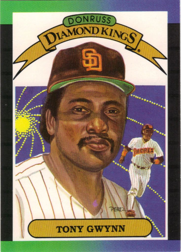
Tony Gwynn
People didn't draw with computers back then. Crazy.
I don’t have much reason to own many 1985 Donruss cards, so it should come to no surprise that this is my first one. Everyone loved Diamond Kings. Since I’m part of everyone, it’s great to be able say I have one from before I started collecting the first time.
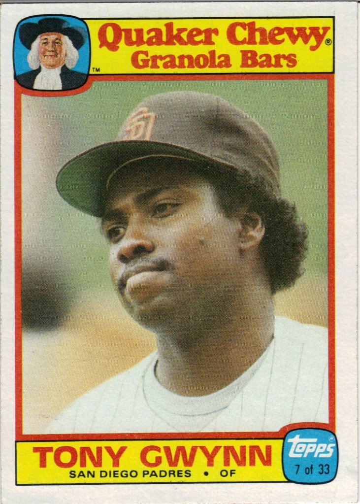
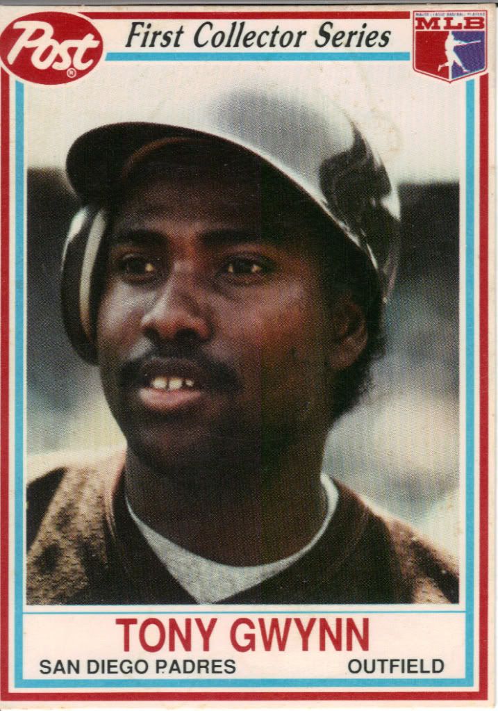
"Did you really just eat the last granola bar?"
Sweet oat-y oddball! This is from the “1st Annual Collector’s Edition.” I don’t know if the promotion was successful enough to warrant a 2nd, but I know I would have bought them. Sort of like clear plastic cards, if a grocery product were to put cards in their cereals/cereal bars/canned tuna, I would buy that product. Fair warning and easy access to consumer money.
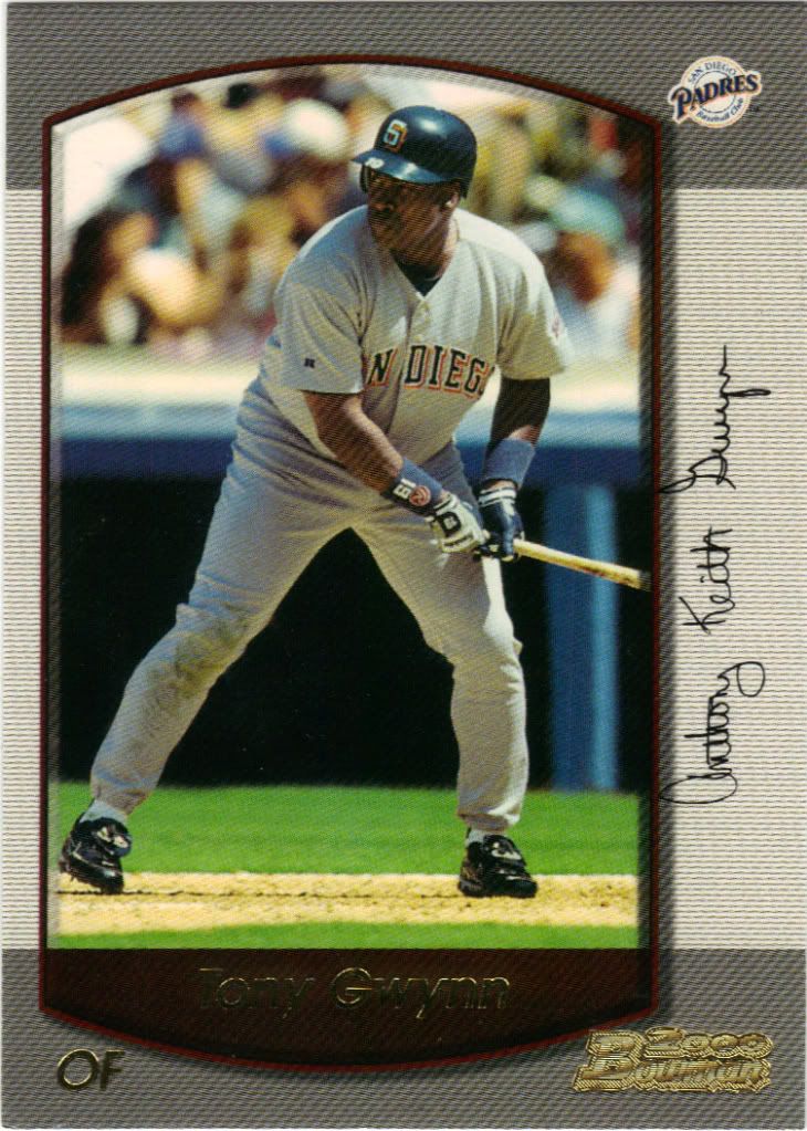
Everyone's familiar with the motif of the Tiny Gwynn and Fireworks on each shoulder, right?
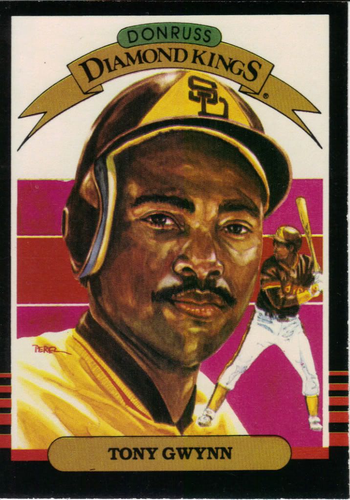
my how he’s aged. I’m trading with the Diamond King, did you really think I wasn’t going to get any more? 4 years had passed since the ’85 shown above and somehow he didn’t make another Diamond King set until now. Damn you Garvey and whomever else!
Trying to see through the fog
I have vivid memories of opening packs of topps minis in restaurants while waiting for our food. Of course I also have vivid memories of a 1986 Chris Sabo card that apparently doesn’t actually exist. The lesson here: minis stink. I didn’t like them back then and I still don’t. Why are the borders so huge? There’s not much space to work with, we don’t need to shrink it with your little fantasy cloud dreamscape border.
So colorful
I may jump around the timeline a little. That signature still looks crazy to me, even though I know it’s his rookie contract signature. Be patient and I’ll show what it looks like now. Probably later this month. Also not digging the shrunken borders on this card either. The Parallelloval is cool, but could easily be wider and the signature placed elsewhere.
Jumping out of the frame
Being a film school grad, I have to take issue with the realism of this film strip. That is way too many sprocket holes for one frame, my friends. Way too many. They also could have put a frame on the top or bottom to drive home the feel. Still, it’s a subset and not an insert, and I applaud such a thing appearing in 2000. Especially one with raised text.
Not a real rookie card
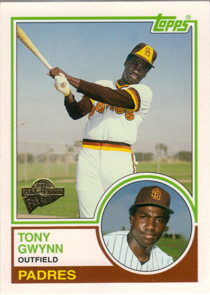
I hear this is a popular set and I understand why. If this were a straight-up reprint set, no one would go for it, but when you take the 1983 Tony Gwynn rookie design and switch it up with a different picture, the circle on the opposite side and finished with a very light gloss, it feels warm and familiar but different enough to be new and cool.
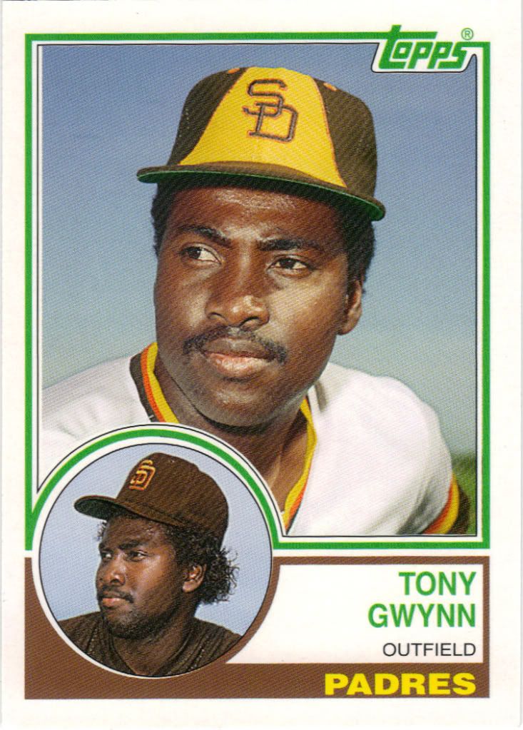
Please see above
Look familiar? Topps never has qualms with going back to the well, and as long as they change things up enough they can keep doing it. This is a Rookie of the Week promotional card given out by HTA shops. It’s really tough to find that information, but it’s there in fine print on the back. Once again, we have the rookie 1983 design, and once again we have a different set of pictures from that era. That’s how you do it.
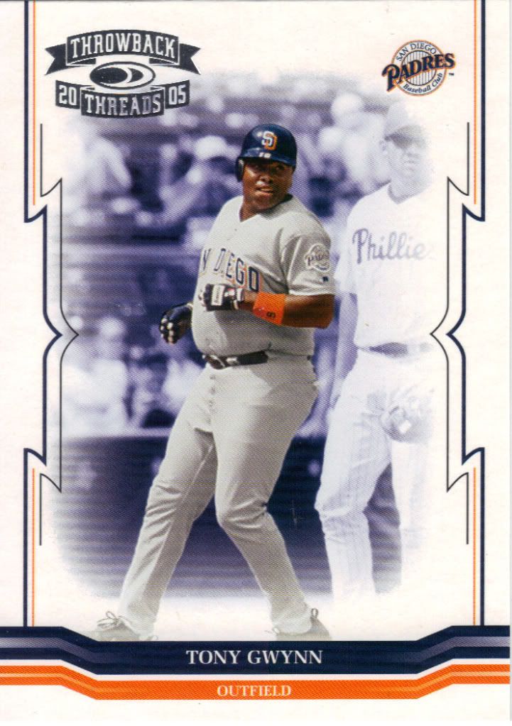
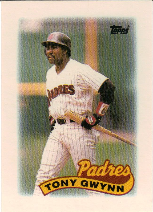
Far from the rookie season
2005 Donruss products may be the death of me. There are just so many parallels and hits and hit parallels and insert parallels. It’ll be very difficult to keep track of. You’d think a guy like Gwynn, who had retired by then, would be immune, but no. This is one of the easiest cards to obtain. Anyone with some Polo Grounds or anything else 2005, let me know.
Boo Berry is back?
Skipping back in time now. We have another cereal premium. Unlike the Quaker Oats card, this one is only licensed by MLBPA, so the logos are gone. I think the Panini cards for 2012 will look a little nicer than this. Oh, and to clarify, I would still by cereal specifically for unlicensed baseball cards if made today.
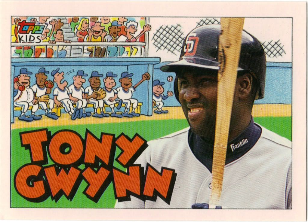
I like the cartoons more than Tony does evidently.
Why aren’t there products like this anymore? It probably didn’t sell well, but I still like it. It’s no Diamond Kings, but cartoony is good too. I think it’s worth a shot, don’t you? Come on Topps. Let’s try replacing Opening Day for just one year. If it doesn’t work, you can go back.
Wrigley Count: 2
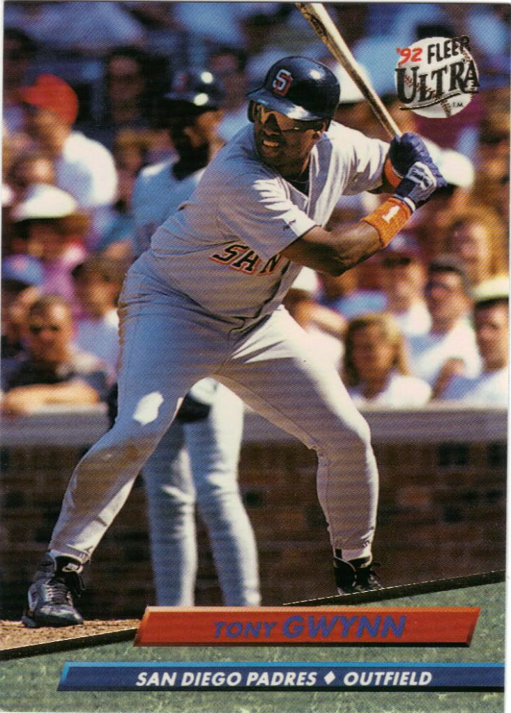
1992 Ultra is a huge quality jump from 1991. I will never tire of this design. 1992 was also the year of the Gwynn for Ultra as you’ll see. Get ready for some Marble Madness.
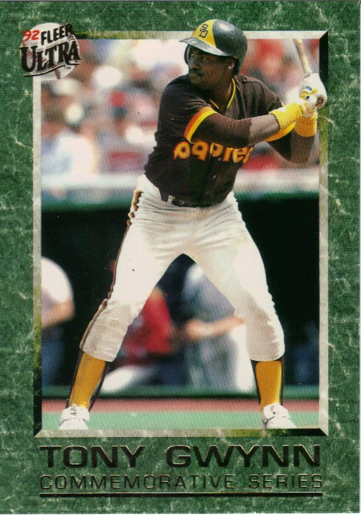
Never liked the Padres uniforms, but I prefer these to their current ones
Diamond King was nice enough to send over the entire 10 card commemorative series. I won’t subject you to them all this time, but I have to cover a few. #1 in the insert set was talked about here in case you’re curious. Card 2 details his college days as a two-sport star. I’m not sure if he still does, but as of 1992 he still held the all time Assists record for the basketball team. His skills got him drafted in both sports (on the same day, no less), both by San Diego teams, but he ended up choosing baseball instead. Kind of worked out.
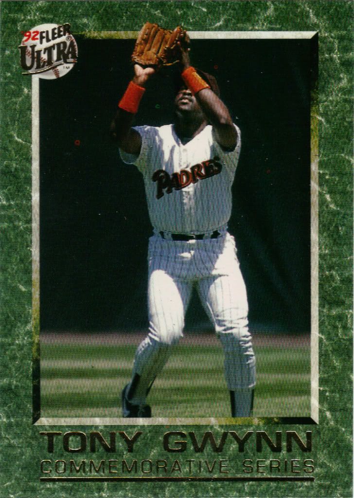
Ahem..the ball is to your left Tony. Follow the foil
Card 3 talks about his brief minor league experience. Simply put, dude raked from the jump and it earned him a quick call-up after only 2 years climbing the ladder. It also talks about how he broke both wrists over the course of a year. Well, what doesn’t kill you….
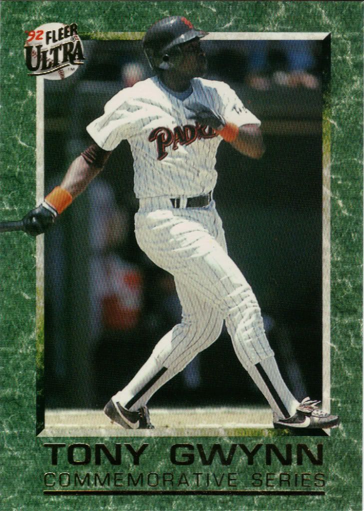
Base hit. Guaranteed
I like that these are telling a complete story. Sort of like the backs of movie or TV show cards that are “continued” on the next one. Card 4 goes on to say that Gwynn came back from wrist injury and slumped a little with a .233 average, but picked it up later through tons of hard work and research. Speaking of to be continued, we’ll pick up cards 5-10 another time.
Wonder where this autographed jersey is now. What a COE, eh?
Add this to the list of sets I wish would come back. Even though there were too many parallels (2), I still enjoyed the structure and layouts and designs each year. They were budget, but didn’t come off as budget releases to me. I’m probably in the minority here.
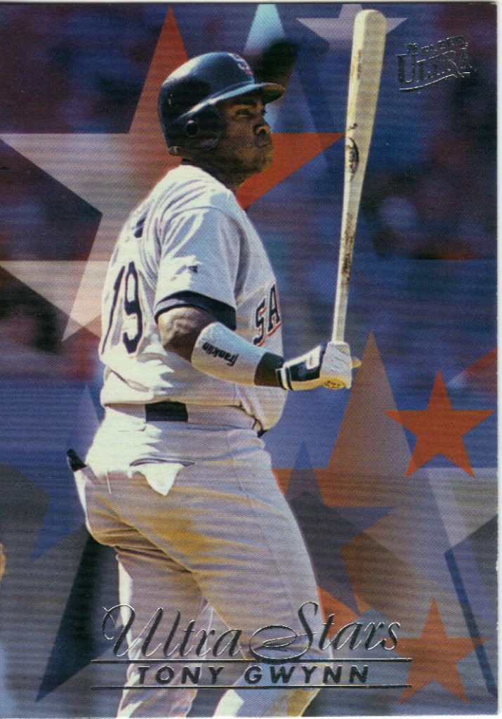
I'm seeing stars, but should I be?
As an insert set, this card fails. Luckily, it’s a subset so it gets a C+. You don’t expect razzle dazzle from subsets, but I expect either better picture choice or a little more substance to design. Ultra, you were better than this. Quit bothering your classmates and try again.
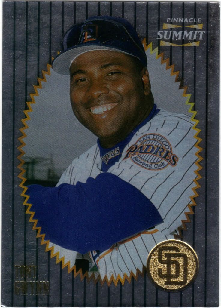
Summit: It's all downhill from here
Pinnacle was going in this whole new direction. They were all about foil everything and making things as shiny and crazy as humanly possible. They succeeded. How else do you explain Tony Gwynn emerging from a smoldering explosion hole through a future jail wall? I would like to take that Padres token and buy a different pack, though.
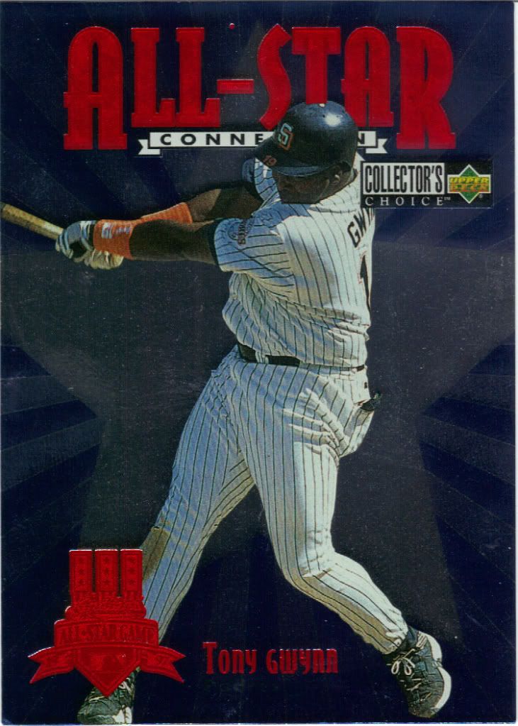
I think the dot between All-Star is a mistake
Collector’s Choice kept the foil limited to inserts and parallels. It gives it a little more weight, don’t you think? The star with shooting rays behind it may be cliched, but complimenting red foil looks good. The back is interesting because it gives his All-Star game and Playoff stats. Surprisingly, in 11 games up to this time, Gwynn was batting only .250. World Series, .263 in 5 games.
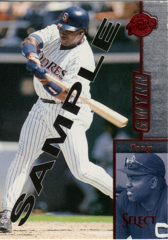
Tony watching Tony's knees
I chose another card with red foil on it. I guess I’m a sucker for the red foil. Perhaps that’s another note for card companies to make in their “how to get Jon’s money” notebook. These apparently came in 3-card cello packs, but I don’t know how they were distributed. I haven’t seen the final product in person, but my guess is it’s pretty similar. I’ll compare when I get it.
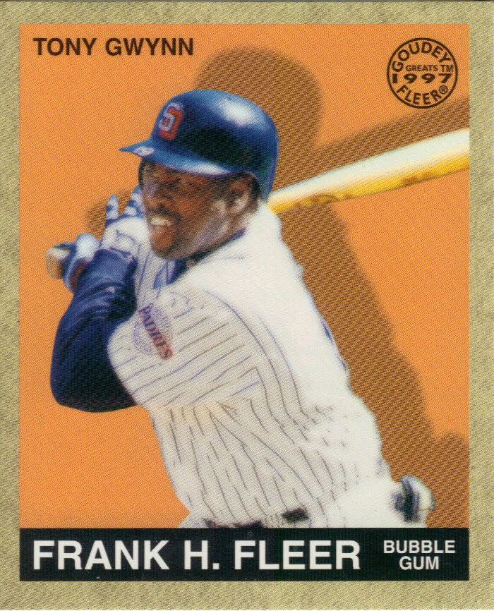
Another mini down
These Goudey Greats cards were a surprise to me when I opened my box of 1997 Fleer. They’re cool and all, but they are still minis (for good reason). I didn’t find Gwynn in my box, so it’s great to be able to add this without exerting any effort. It’s also nice to get something from my non-collecting days that I don’t have to look up.
You made it to the end!
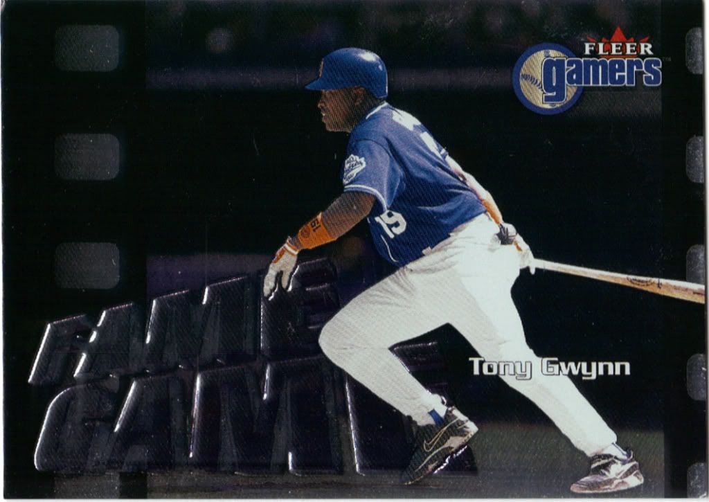
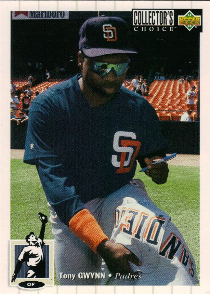
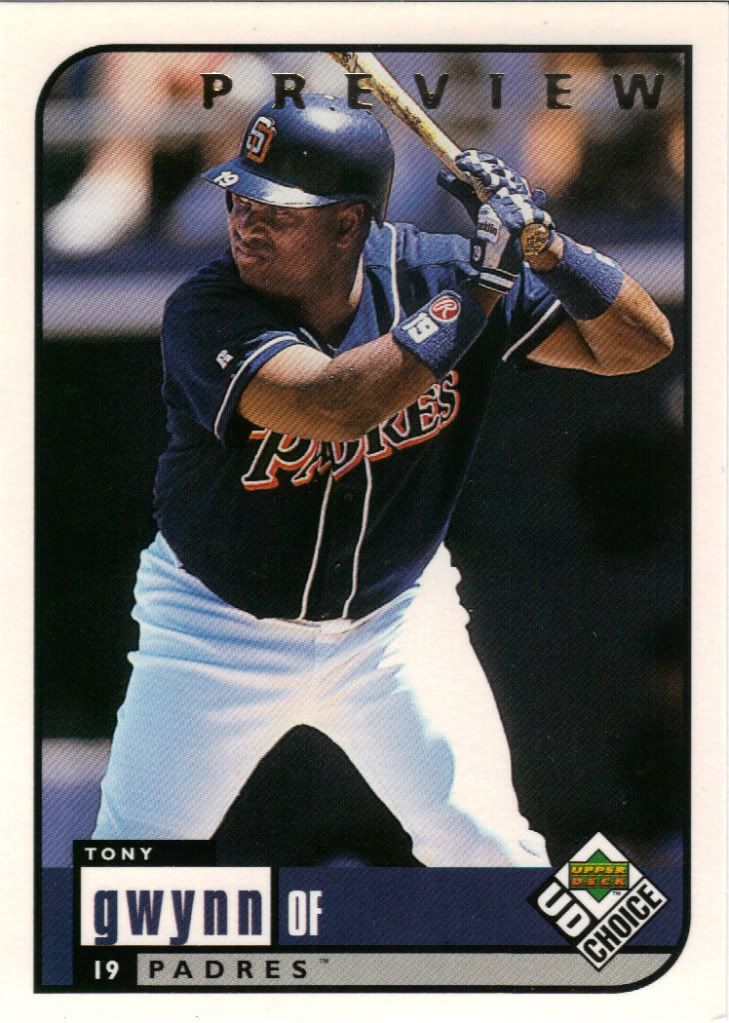
I got out of the game by the time Collector’s Choice became UD Choice. I don’t know if that was a wise choice by them since the brand didn’t last much longer. Here’s another sample card. I told you the trade was loaded with them. Unlike other previews, these were packed out and sold at retail, but I still think it’s special.
What also makes this card special is that it’s the last one I’m going to feature today. Remember, this is just a third of what was sent to me. I’ll sprinkle the rest into other posts sometime in the future.
A big thank you to Kevin of The Diamond King. Please visit his blog and trade with the guy. You won’t regret it. And a big thank you to anyone that actually read all of this. If I had time for a contest right now, I’d reward you with one.
I’m spent.
I’m spent too. That’s a lot of cards.
Holy crap, look at that tags list!
What can I say, I try to stay organized (with cards, not so much anything else). Every card featured is listed as year, product, year & product. I can see people wanting to search for any of those combos, so I try to accommodate those hypothetical people.
Holy crap! (to echo the Owl) Well, I’m glad you enjoyed the cards enough to put that much into a post!!!!
I just SEO’d myself over that tags list.
[…] […]