
Why am I so excited about college basketball? A few reasons.
1) My Chicago Bulls aren’t likely to be too fun to watch until Derrick Rose returns from injury.
2) I think the college game is simultaneously infinitely more fun and infinitely more frustrating to watch due to the raw passion and hustle and lack of ability to accompany that passion and hustle.
3) Our freshman year of college was the first year our SIUC Salukis made it to the Sweet 16. I’ve been following our team’s progress ever since. By the way, they’re 2-0 with a resounding wins over New Orleans and Benedictine Springfield (who probably put together a basketball team just for this game). No losing record for us! Until at least the fifth game of the year!
4) The sooner college basketball starts, the sooner March Madness can begin
5) The sooner March Madness begins, the closer we are to spring training
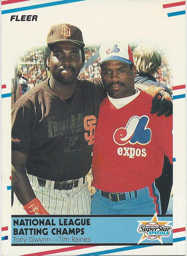
6) March Madness also usually means contest time over at Cards on Cards!
Each year, Madding holds a college tournament bracket contest. Prizes were awarded to the top three bracket-fillers, and somehow I won third (I think). This feat is even more amazing considering a nearly identical bracket just about got me last place in my office pool. In fact, I just assumed it was dead and left it for the zombies to eat like so much Rick in the hospital. But damned if it didn’t come out of its coma and roar back just to find me sleeping with its best friend.
Okay, that metaphor kind of lost its way somewhere. Kind of like when Rick lost…ah forget it. This basketball post is going to lose its way, too, because from basketball pickings come baseball winnings.
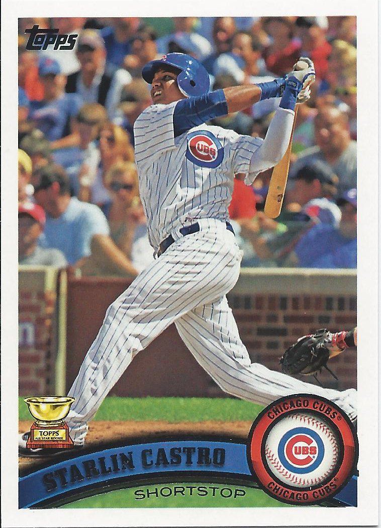
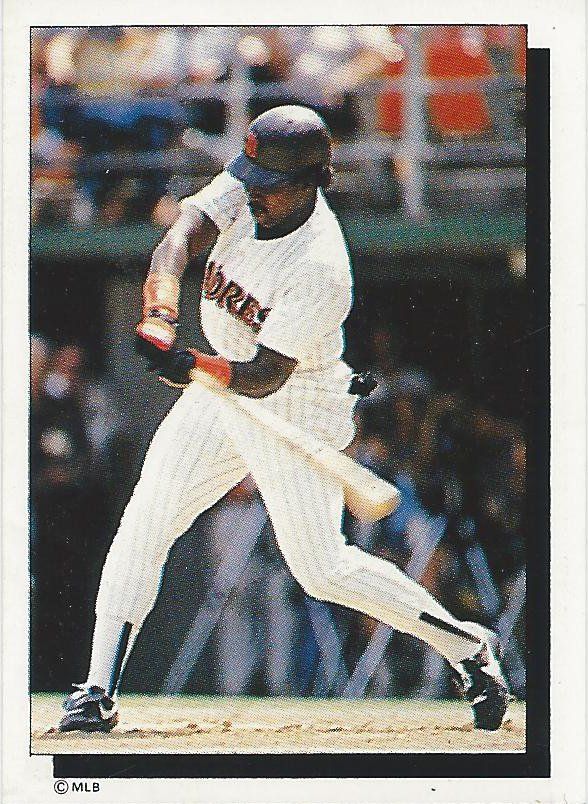
Rookie Cups can be the kiss of death sometimes. So far so good.
When you’re a card seller like we are, and you decide to start a new player collection somewhat randomly after you’ve sold most of their cards like I did, the simple things like a 2011 Topps card hits the spot. My lofty goals and basement budget mean I depend on the kindness of others to pad the want list stats. Anything I buy for myself is usually going to be a little on the uncommon side.
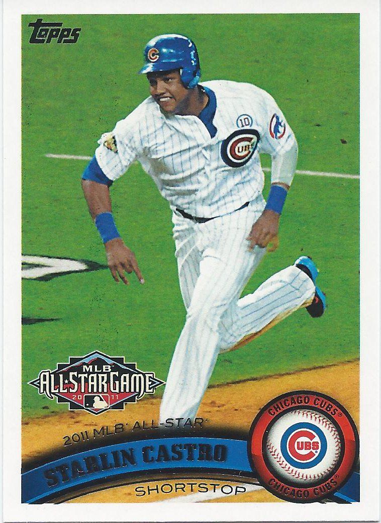
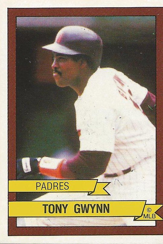
Hopefully the first of many All-Star games
And with these two cards, I’ve now doubled the amount of Starlin Castros I’ve posted. He may be the newest addition and the sparsest, but that doesn’t mean I don’t have other good Castro cards to show off. In fact, I recently acquired a pretty big one that I’m excited about. I’ll leave that for another time.
The worst Fourth of July caps MLB ever used.
Yeah, I know we opened 5 cases of the stuff, but I usually don’t keep much of anything for my personal collections. I do buy a few cards from our breaks, but the rest has to go to sale. This saved me a few cents!
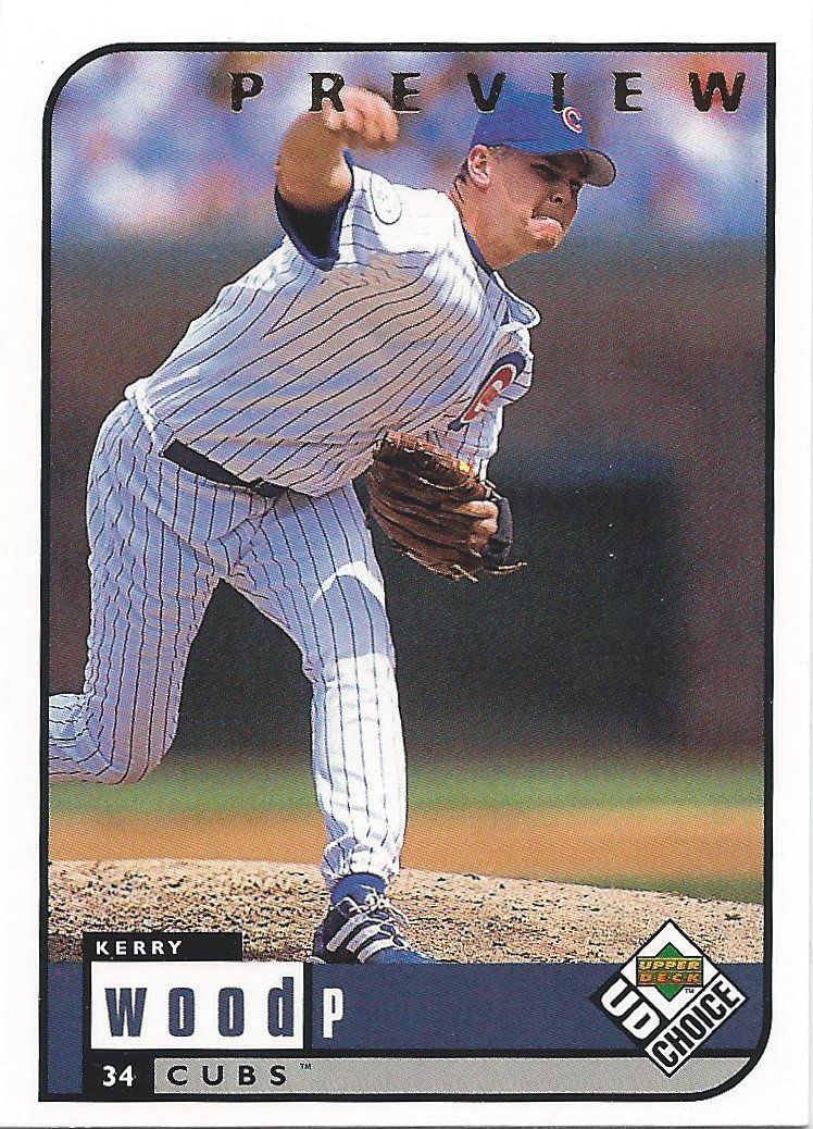
UD Choice Preview, because the customer...demanded it?
Preview: He’s probably going to be injured. Hmm, that made me think. Why doesn’t a card company try to do some sort of predictor insert set? Not the contest predictor things that UD did in the 90s where you won if the player led the league in some stat. I’m talking about pre-2013 season cards that predict 2013 performance. Maybe base it off of one of the organizations that piss off fans every year. Predict some trades and really get people talking about cards. Too much?
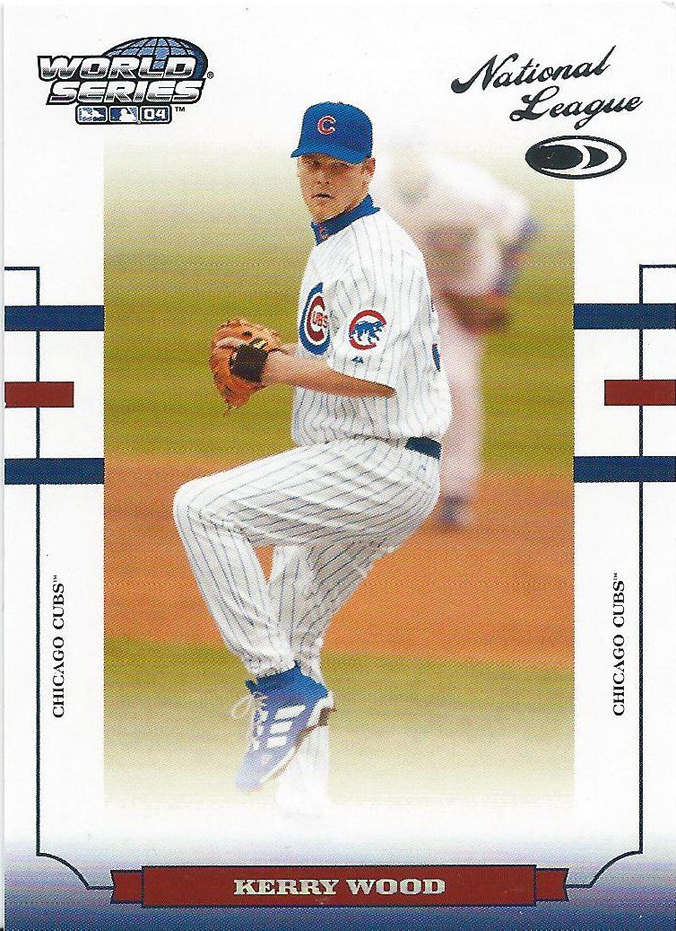
That's something you don't see too often: World Series and Cubs on the same card
Forget the Billy Goat. Forget Bartman. Donruss jinxed us with this World Series card. Thanks a lot, DLP!
Kinda looks a little dead
Okay, I’m just going to assume that this is the normal version. I’ve tried several times to figure out a good way to tell the difference between this and the “White” parallel, but I got nothing. It seems like it may be slightly lighter and the background is a tad more pink than red, but then I see other ones not labeled “white” and they look the same. I’m convinced that this is one of the top 10 worst parallels ever executed.
What was the final name? Camera shutter set? Logo fan set?
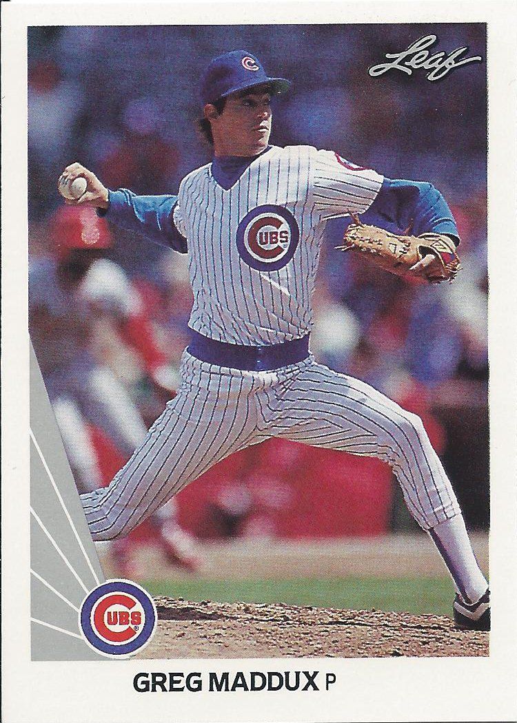
In my last post, I showed off the newly acquired 1991 & 1992 Leaf cards. This would have been featured too had Madding not shipped it just a couple weeks earlier. Let it be known to all that he had the all-important Firsties! <banners and balloons and Fleetwood Mac songs>
Sweet angle, guys
Some may say this is a terrible picture on a terrible set. Nay! This is a terrible picture on an iconic set. 1986 Topps may have been my first cards, but 1987 was the first set I actually tried to put together through packs. The border was so unique and cool and fancy to a 6-7 year old kid I had to try for the whole thing. Also, Future Stars! I’m pretty sure between me and my brother, we would have completed it.
Nope. Not forced at all.
Pre-season or All-Star game? No matter, it’s still awkward and weird. The worst part? I can’t think of a good “Rock,” Paper, Scissors joke!
Stickers!!
Look at all the photographers set up so close to the field with basically no protection. That’s kind of crazy to me. Also a little strange to not see fan seating there. Enh, who cares? It’s a sticker! One of two from this album that I need. The other is a straight-up portrait.
More stickers!
Is it sad that I get so excited over 25 year old stickers? Madding really hit virtually every aspect of my collecting with this prize package and I love it. This sticker is from the next year of Panini stickers and I need the more action-y shot of Gwynn from this set now.
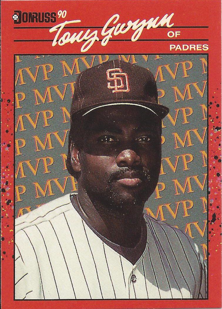
I didn't use this in my Friday MVP post, because I thought I'd get this one up first
1990 Donruss. It kind of amazes me that there are people out there collecting all the small printing variations from sets like this. Period after “INC” or not. Slightly different splattered paint pattern. On one hand, I get it, but on the other I can’t bring myself to bust out the magnifying glass on a one-cent piece of cardboard. Maybe when I finish collecting everything else, I’ll go back.
Who did the White Sox trade to get that bag of balls?
I think Topps meant to put this in their 1991 or Stadium Club sets and mixed their signals. I know that 1992 had a few outside-the-box photos, and they’re much appreciated, but I’d be lying if they didn’t stick out.
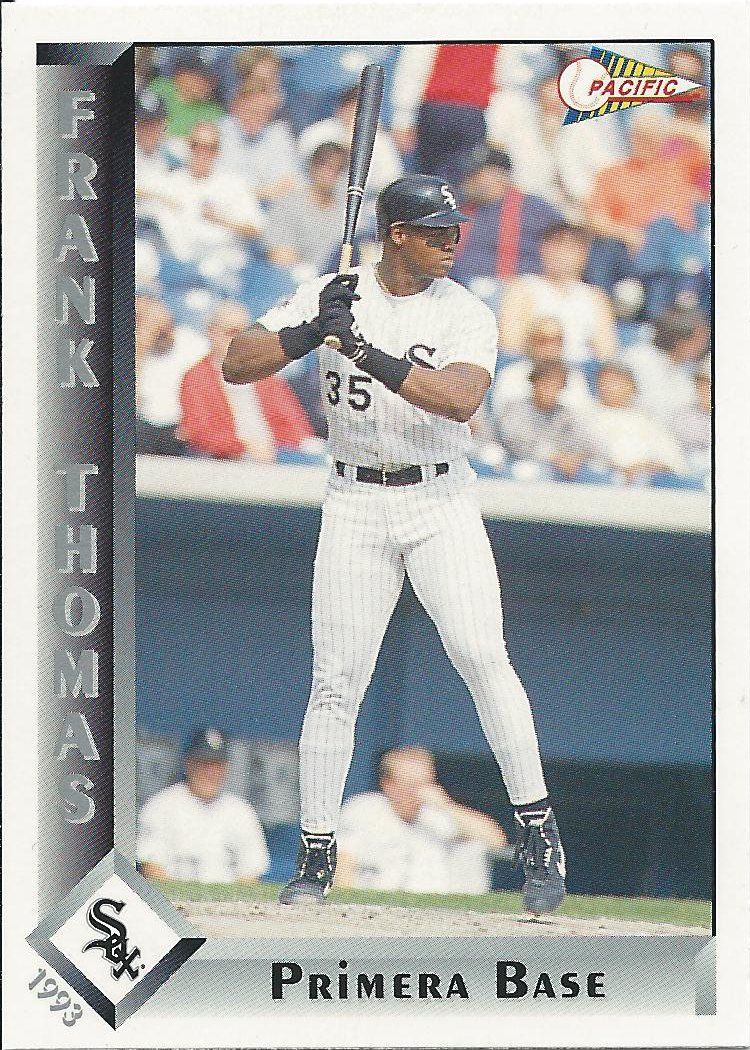
El Dolor Grande - Did I get that right?
If I knew enough Spanish to comment on this card entirely in that language, I would. Instead, I’ll just say that even upon their release Pacific cards have always felt technologically behind the times. I’ve seen better graphics on my Commodore 64. This is the SNES era, man! Get with it!
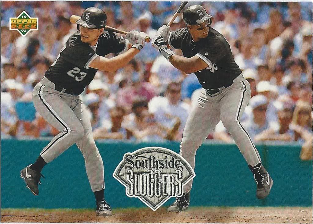
Did anyone ever make that patch?
You know, I don’t think this batting arrangement is legal. I’d also like to point out that they will surely club each other on the head if they swing. Robin’s taken enough blows to the head courtesy of Nolan Ryan, he doesn’t need more.
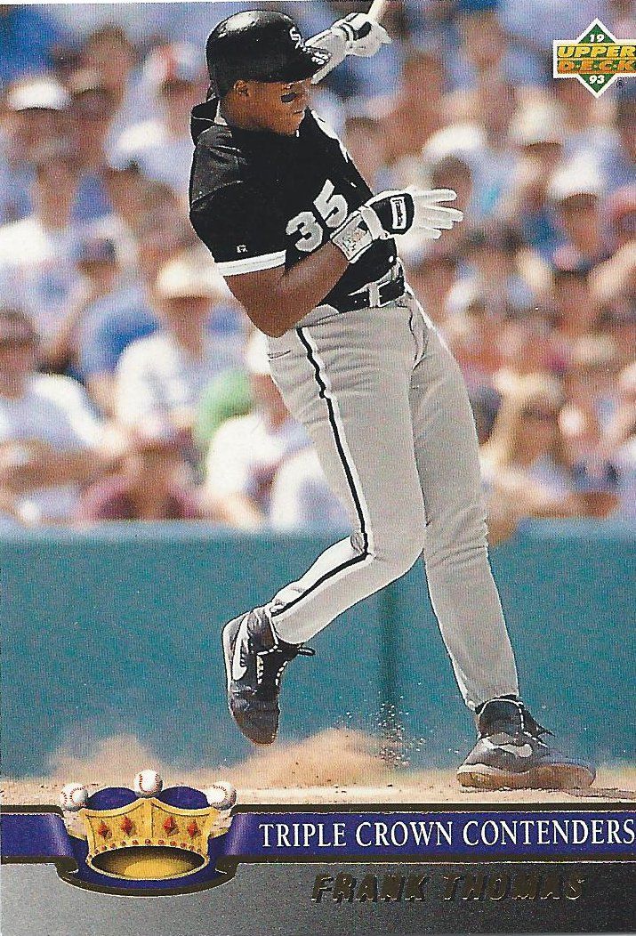
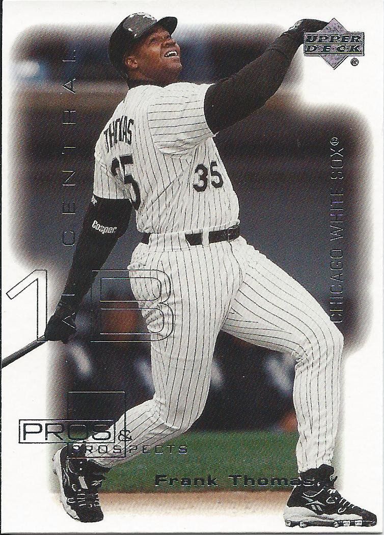
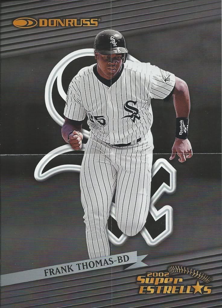
I hope Miguel Cabrera gets to wear that actual crown next year
This picture is awesome if only for the fact that it looks like Frank pulled a Billy Madison. All of that dirt flying? He definitely ran up and slide into that home run swing. No other explanation accepted.
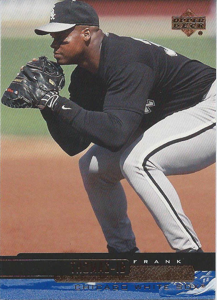
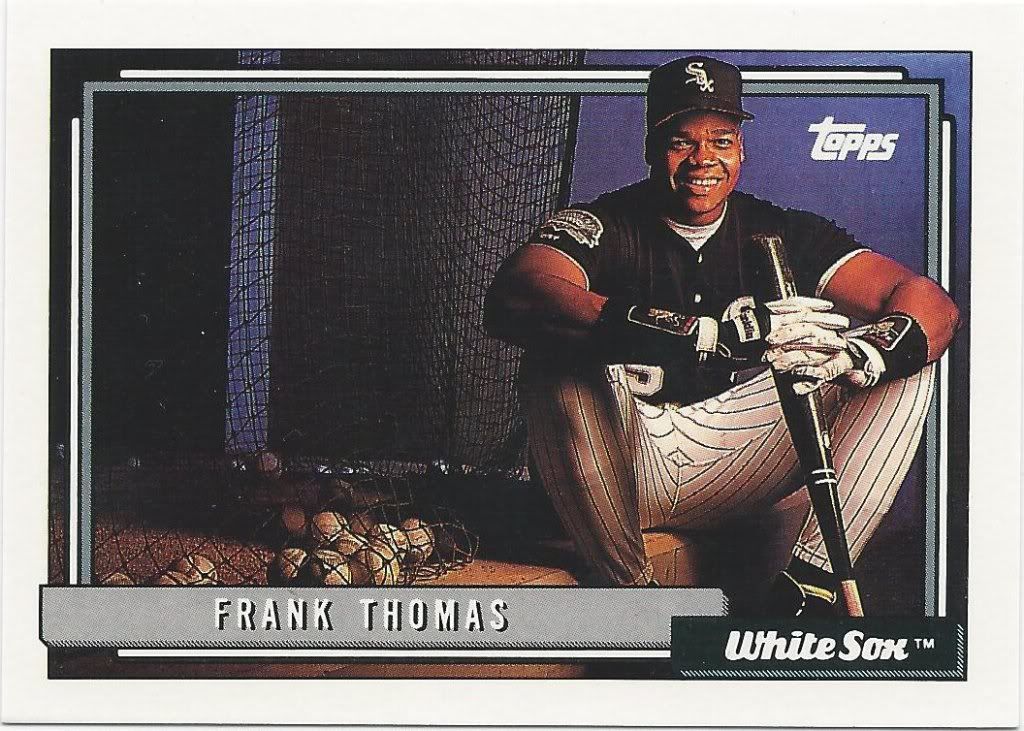
Now Frank, we're going to need you to squat into frame for us, okay?
I don’t know what to think of this picture. If Beckett still had the “Fun Cards” feature, kids could have a field day captioning this one. Still, I guess it’s nice to switch it up every once in a while with a fielding shot. Too bad it had to look like this.
So happy about that foul-out to first base
This is more like it, I guess. Actually, it’s more like every other Big Hurt card. This set confuses me, much like the majority of Upper Deck’s SP line. I don’t know what they’re trying to accomplish with this design. Why is his position so much larger than everything else? Why is the division foil on here at all, let alone foil stamped and breaking up other elements? What’s with the blocks? How can a card so full of stuff feel so empty?
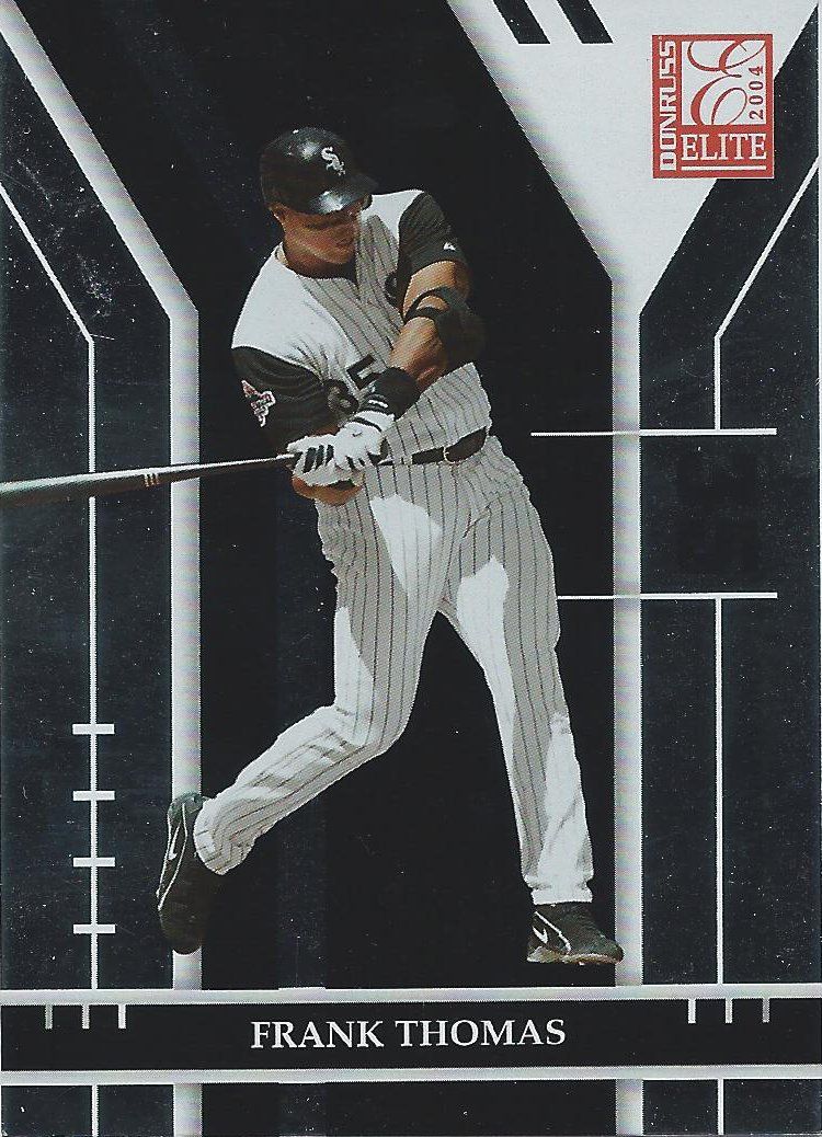
Looks better in person, if you like close-ups of subway maps
There must be collectors that like the SP stuff as well as the Elite brand. They’ve been around for a long time and never have they distinguished themselves from the previous year. Take away the logo at the top, and I bet you’d never be able to tell me what year you’re looking at on the first try. Even the design itself is asking “Y.”
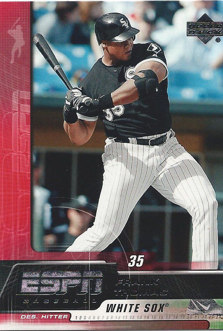
Remember when ESPN had a Gatorade flavor?
Sometimes ESPN reminds me of Spaceballs. They’ll put their name on any product they can think of. Baseball cards make sense in theory, but don’t you feel like its an awkward overreach? I don’t why, exactly. I do know that CNN Sports didn’t have a card line. Maybe that was their problem.
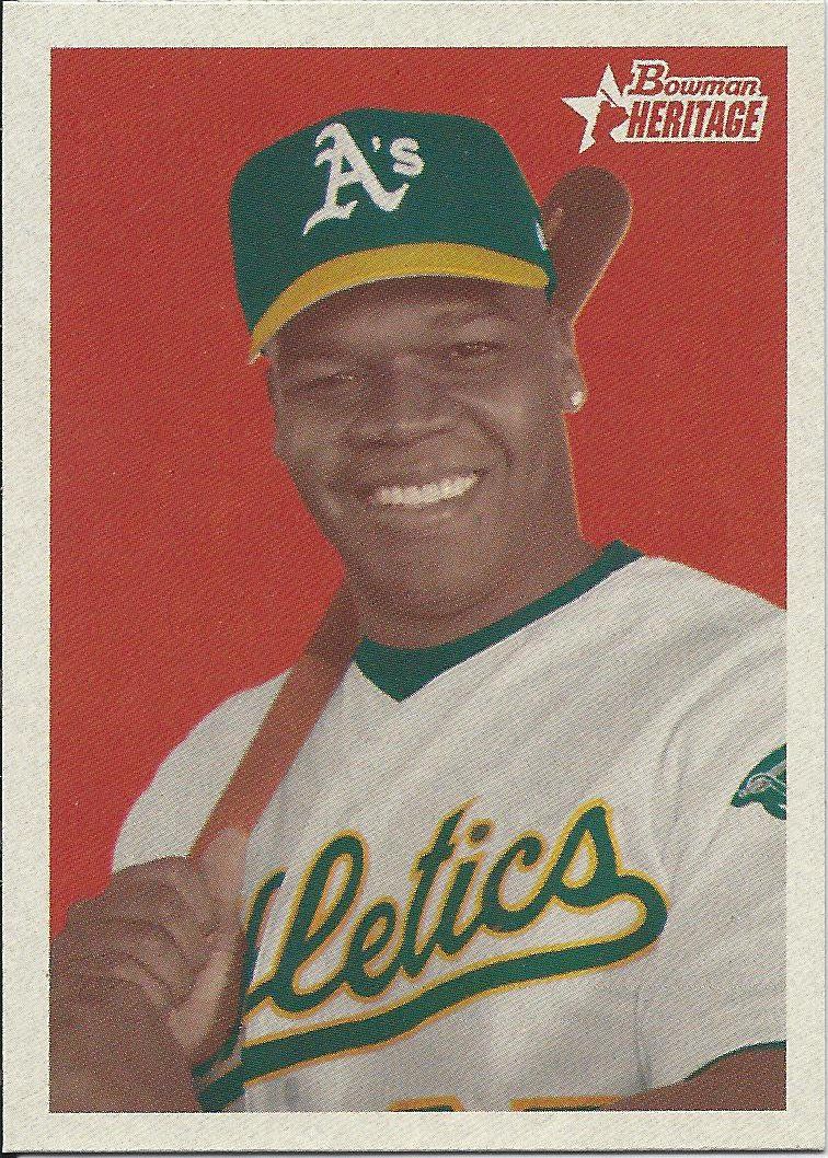
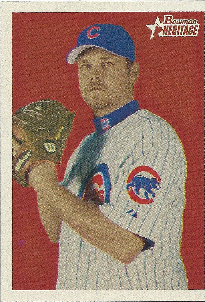
Still an odd sight
Here’s another Bowman Heritage. Again, please let me know if you have a trick to tell the “White” parallels apart. Is the back bleached? Should Frank’s pearly whites actually be that?
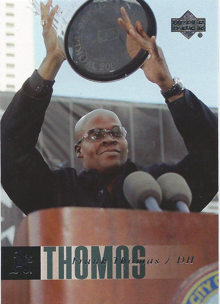
That's cold, Upper Deck
What a bittersweet card for a Chicago Frank Thomas collector. Here he is holding up the World Series trophy that he won with the White Sox, but oh…what’s this? DH for the Athletics. Thanks and good bye.
Small ball?
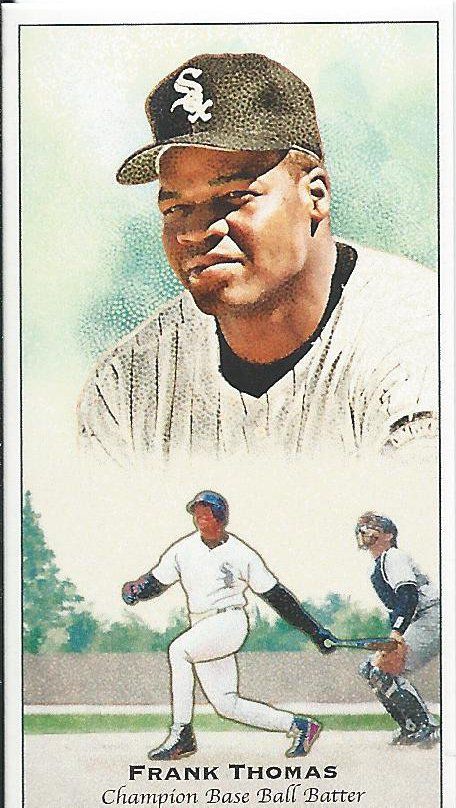
Madding also found a few minis to toss in the prize package for me. These are always appreciated since I rarely seek them out on my own. You see, I’m not a fan of the minis like most are, although I’ve said that several times before. These Kimball Champions, however, are a fantastic design from the tobacco card era. Topps did good bringing that one back.
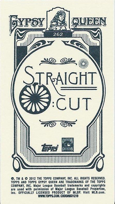
Straight Cut, but...
Sorry you don’t get to see the fronts of these next two. How else will I prove that they’re the Straight Cut variation backs? I bought very little Gypsy Queen this year. It may have only been one blaster. I probably should have picked up more considering there’s so much I still need.
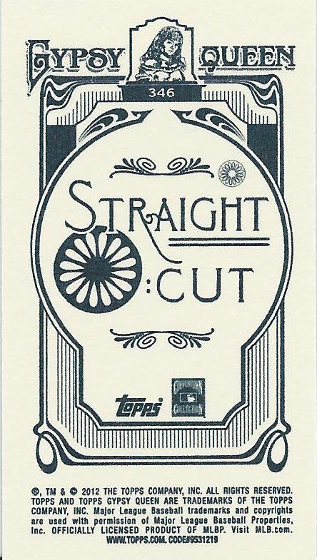
...not straight forward
But when most of it is mini variations, that’s not a very effective use of my money. Then to top it off, Topps has to include 50 more minis that aren’t in the full-sized card set, which duplicates some players like Frank Thomas. It’s a cool retro uniform picture on front, but man if I don’t hate having two mini rainbows to chase.
Run! Run from the minis!
Forget the minis, let’s end with a BIG hurt. This is my favorite “card” in the package. It’s a foldout poster that came one per pack, so it’s not too uncommon or rare, but it’s still pretty cool and oddball nonetheless. The best part is I can still fold it back up and put it into my binder. No special storage required. Thanks a lot, DLP!
And thanks again to Madding from Cards on Cards for the very generous prize package. Hopefully, everything will fall into place and I’ll be back again next year with another one. Hey, maybe the Salukis will even make the tournament. 2-0! Who’s excited?
Recent Comments