
Look, I ain’t no Harper Lee, but it sure feels like I’ve been making Cards on Cards wait a long time for the sequel to our trade post. For a refresher, here’s the first section with the oh so clever title. That post covered my other player collections. This one will be all Gwynn all the time. As I mentioned at the end of the previous post, Madding accounted for 1/7th of my Gwynn collection through this single package. Surely you want me to “harp” on that a little bit, right?
Starters Only jacket
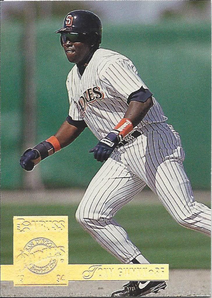
How many of you knew that Donruss also had a set called Opening Day once upon a time? I know I didn’t, but here it stands. Interesting that it too is basically just a parallel as Topps sets are.
Objects may be bigger or smaller than they appear in the scan
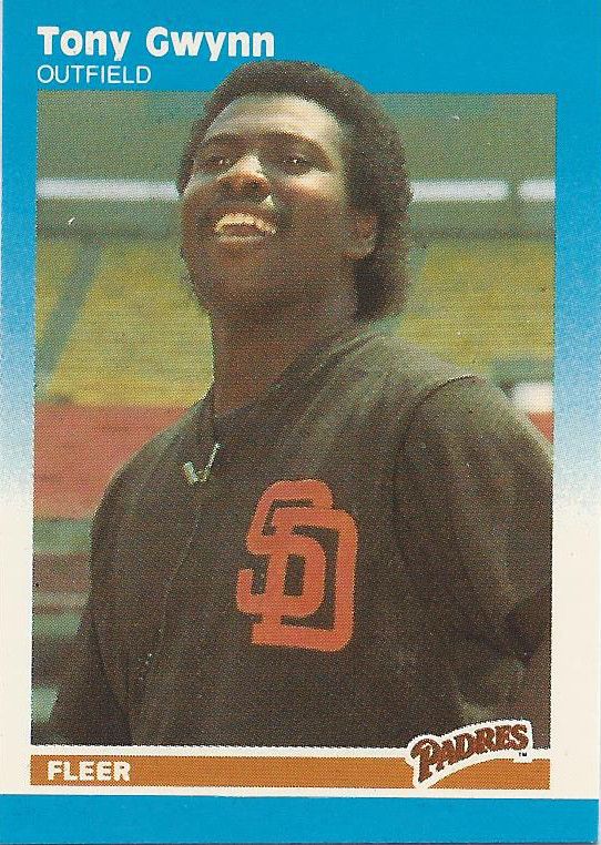
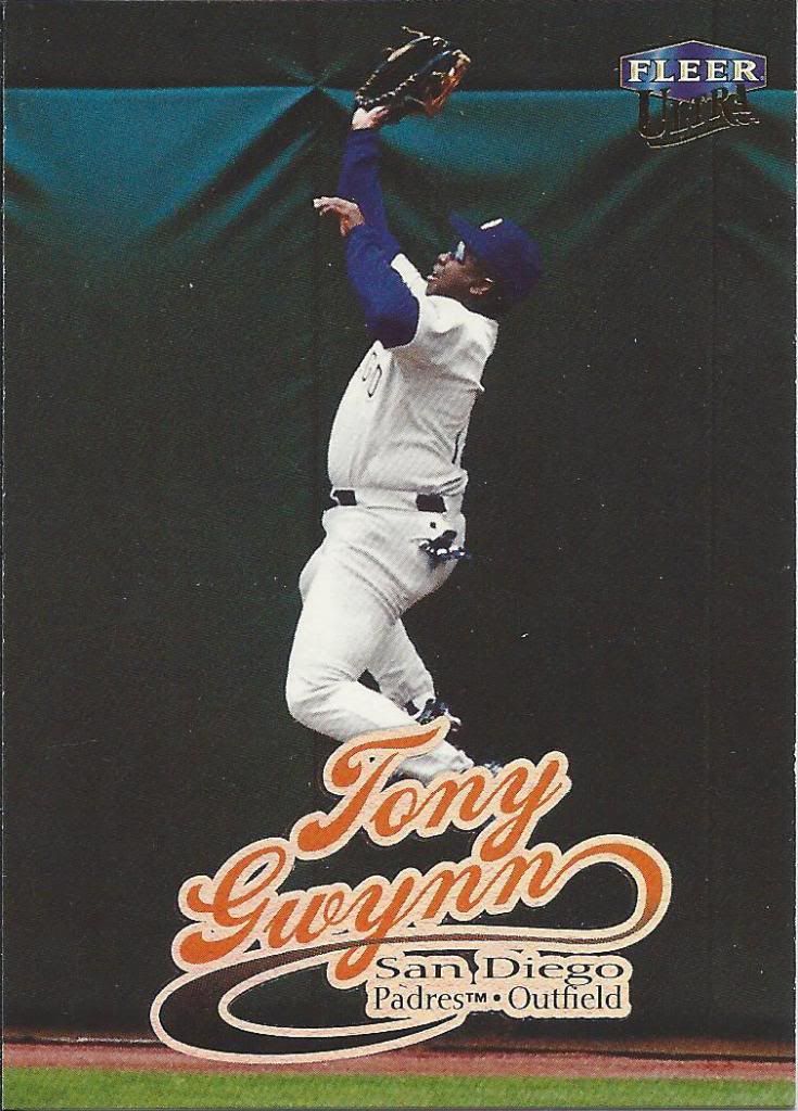
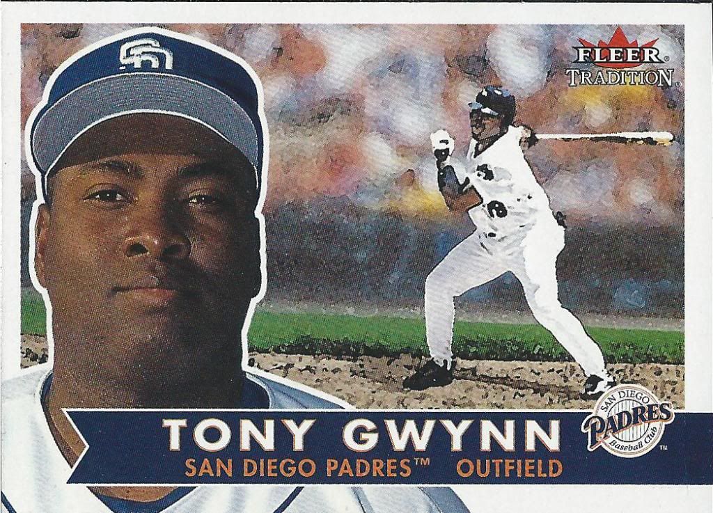
Hey, over there! Check it out, it’s a mini Fleer. What’s that? I don’t need to shout because I’m wearing a mic? Oh. Okay. Back to you in the studio.
That font makes me want to watch Saturday Morning Cartoons.
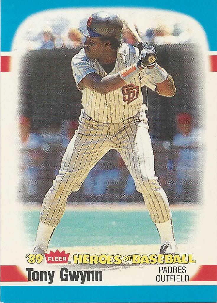
This Heroes of Baseball set is like a mix between Topps Leaders and 1987 Fleer.
Companies loved that segmented side border
I’m assuming that this is actually a licensed card. I’m also assuming that it was created by pausing the VHS and taking the Kodak roll to Walgreens.
Speaking of Kodak
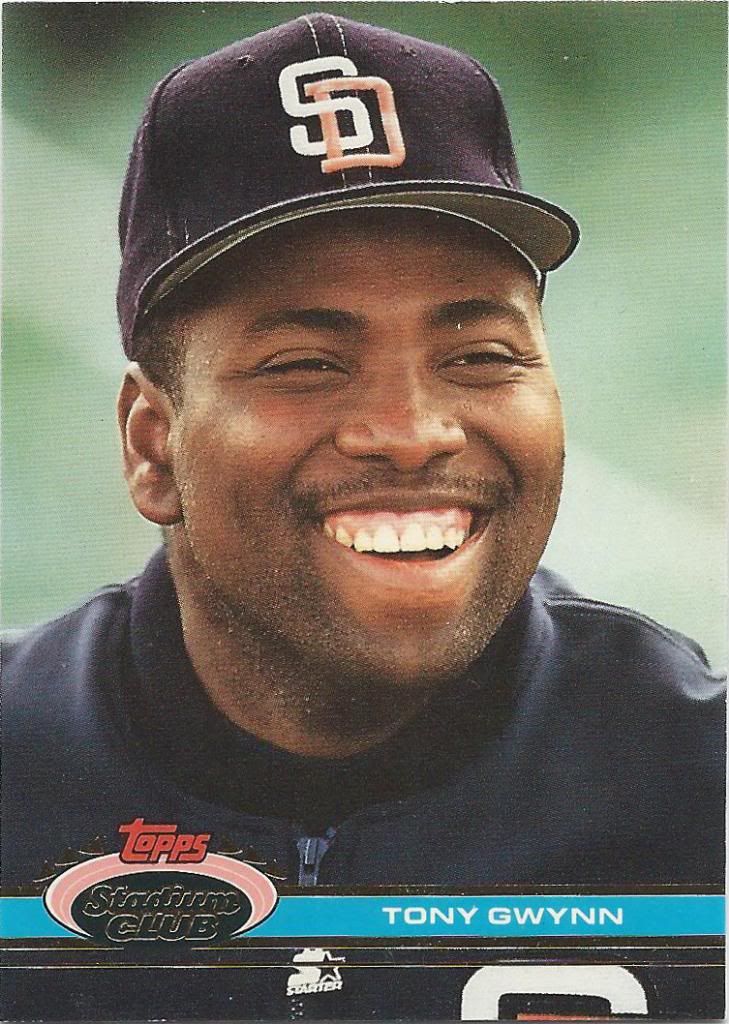
I know that Stadium Club was and is revered, but this isn’t usually one of the supporting examples. Look at that full bleed, though! You can see all the way to the edge of this close-up portrait.
More dust than in Interstellar
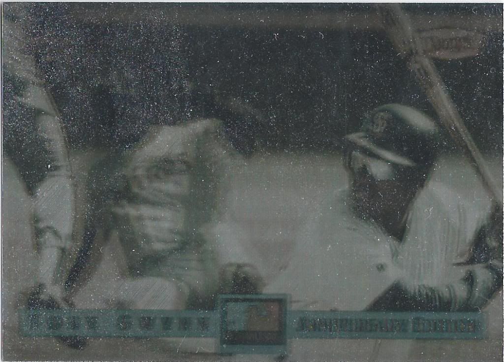
Yikes. Sorry about the scan. Still, if you don’t know how awesome holograms are by now then allow me to welcome you to 90s card collecting. May I suggest you pick one up.
It starts with one
Although if you’re new to the world of collecting, let me also explain that the 1990s were also responsible for the deluge of parallels we have today. It’s not a product unless there are 17 different increasingly rare, arbitrarily colored variants. It was cool at the time, I promise.
Look at that coat of arms. So cool.
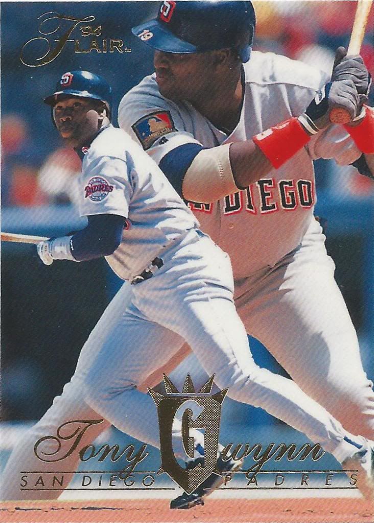
Flair gets forgotten a lot when talking about cardboard history. I’m guilty of it myself, but cards like this remind me of how great and simple the set was. I worry about what would happen if the product was resurrected, but I’m willing to find out.
When foil was still pretty rare
How can you hate a good dugout picture? I guess some people don’t like off-the-field photos, but I’m a fan of anything outside of the ordinary. Baseball is a fun game, and Tony Gwynn was a fun-loving guy. It’s great to see that reflected.
I do not prefer that border
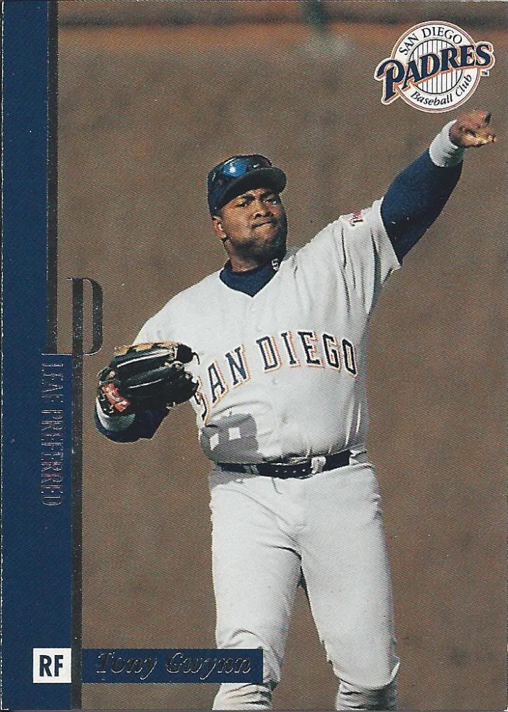
See, this is one of those more boring on-the-field photographs. Which would you rather have?
Blinded by the lightning
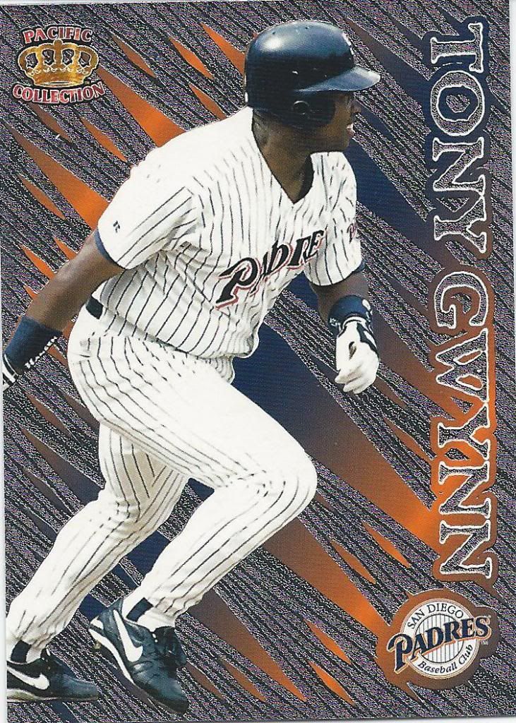
Pacific made some wonderfully gaudy cards. They were the company that tried to hold on tight to as much of the 1990s as humanly possible. This is what passed for a “Prism” card back in the day. The team colors in the background are a nice touch.
The wood grain has no special attributes
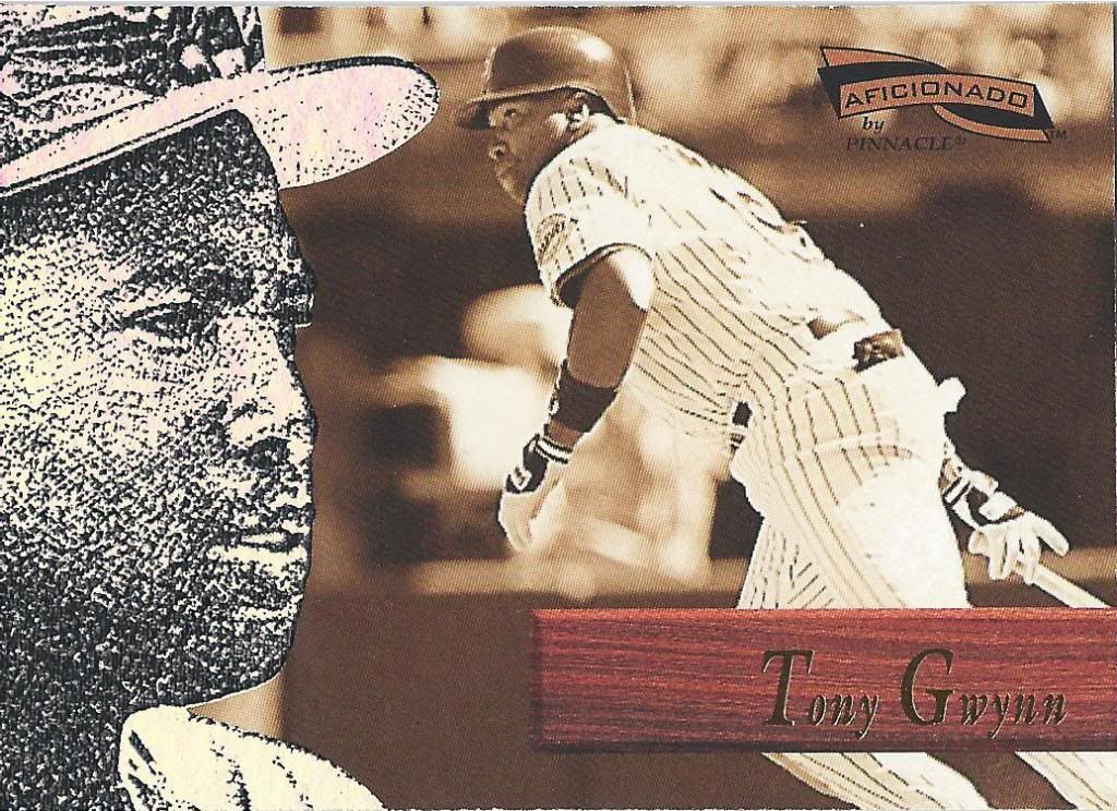
The best part of these cards is the texture. That black and white photo on the left is slightly raised and bumpy and is not only visually interesting but also physically.
I could make a chair now
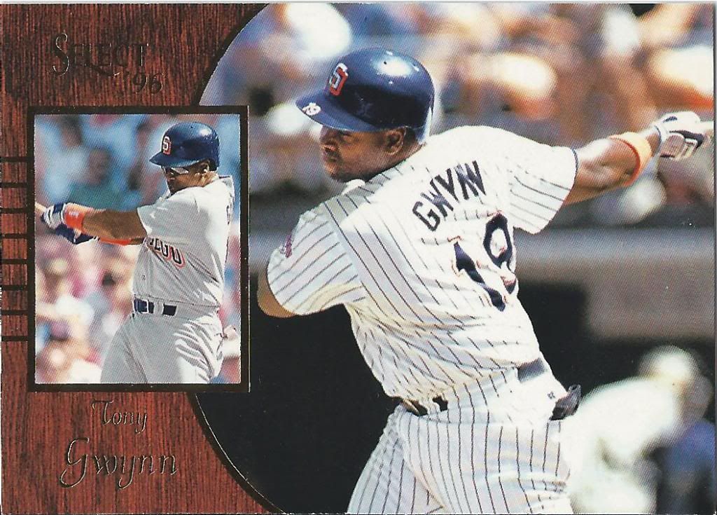
Card #2 in a row with some wood. Select made some decent cards, didn’t they? I don’t know if the whole set is horizontal, but this particular card works well. Either way, I love trades like this because it helps catch me up on products I missed.
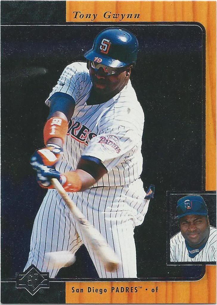
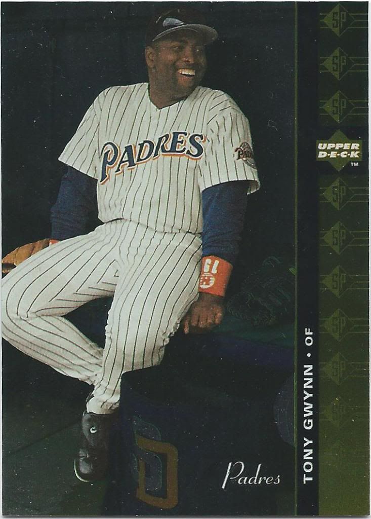
Better make that a table
You’d think I was showing off 1987 cards with all the wood borders instead of 1996. Like the dugout shot above, this is from SP, which was a more expensive pack. I bought a small handful of the basketball version of this year, but the best player I found there was Karl Malone I think.
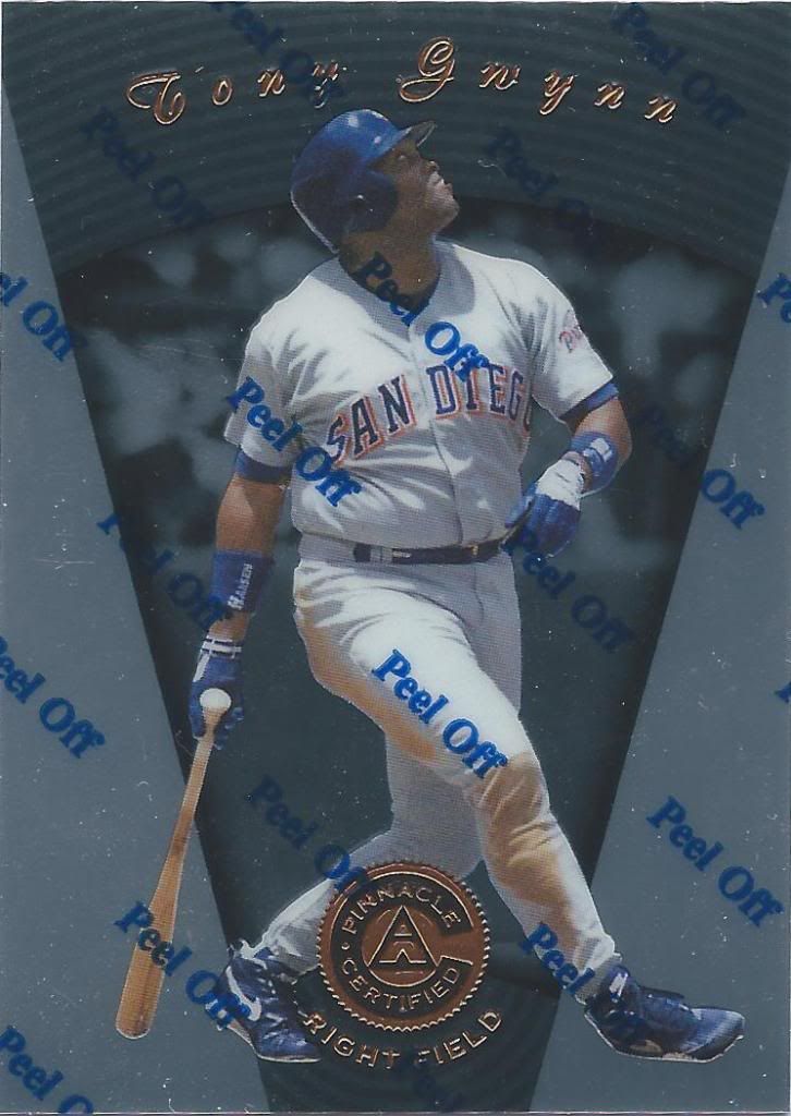
I will not peel off
I’m a sucker for the cards with the protective coating. I know that in reality they aren’t all that fancy, but at one time they were. Certified cards are actually still pretty fancy in comparison, even if they are a bit more boring design-wise these days. Just wait until you see some colored parallels. I need to own them first, though.
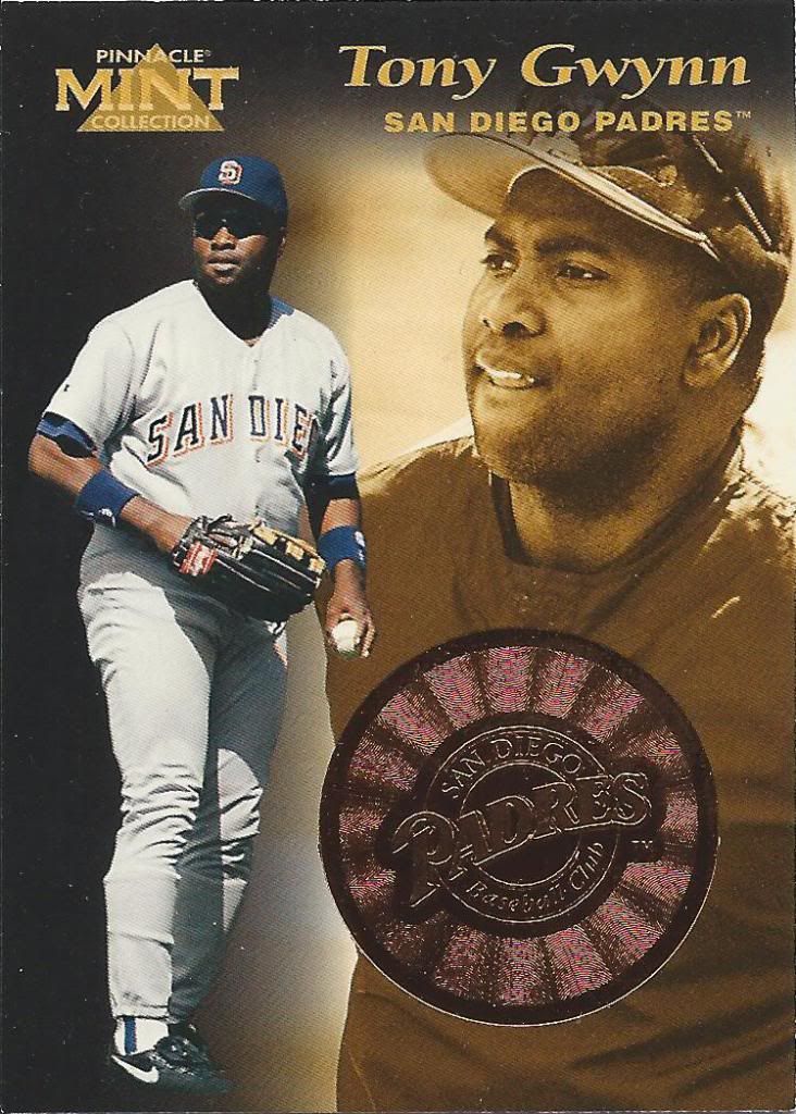
Like an Iron Man chest power core thing
I would love to open a box of the Pinnacle Mint cards one day. I don’t really care which year, I just think the idea and gimmick behind the product is really cool. I’ve slowly acquired a few of the coins which can be inserted into a different version of this card, where that big honkin’ circle shows up.
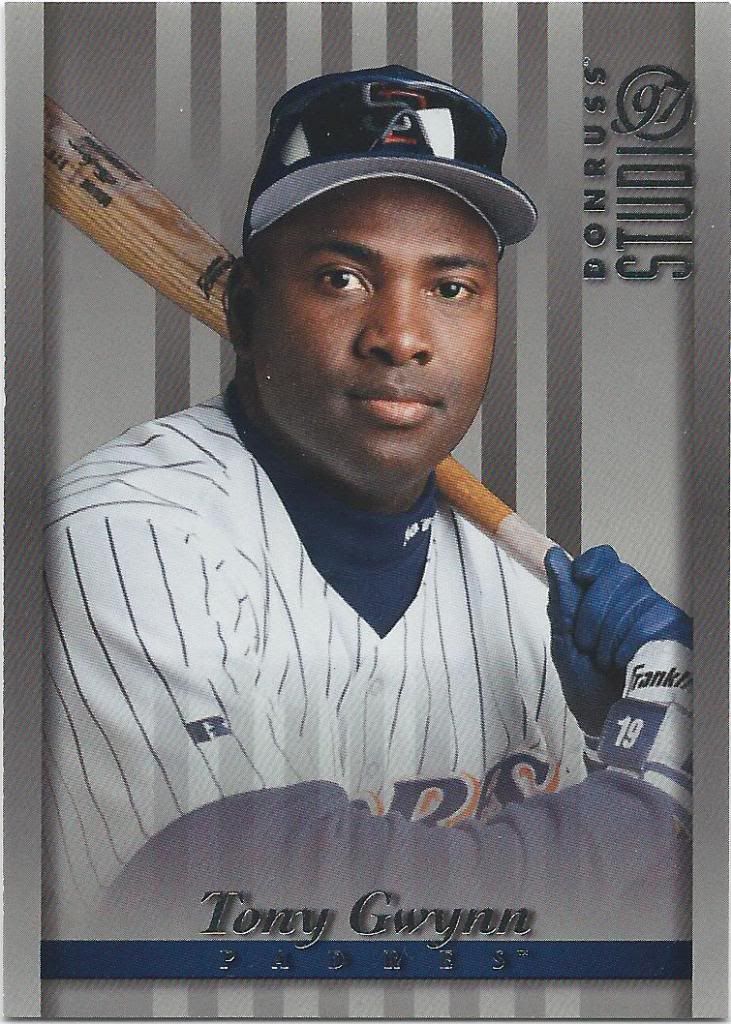
The hot new club, Studio 97
Studio started out well back in 1992 and 1993. Then it got dumb. I need more high school portraits and less posed baseball players.
Minty fresh
This could be one of the biggest surprises of the trade package. I’m not sure Madding even knew this was a parallel, but what you see is the Always Mint version of a 1997 Topps Stars card. I had to do my research to figure that out.
Gold standard. Actually a gold parallel
Who’s got Pennant Fever? I do now! Let’s hope the Cubs will too one day soon.
Can’t wait to get the shiny ones
Has this set been given a nickname yet? If not, can we call it the “baseball eyeball” set? No matter where you are, the baseball eye follows you.
You call that a bat? THIS is a bat
Why don’t baseball cards do things like this much anymore? I will say that 2014 Stadium Club and 2015 Topps photos seem to be heading in the right direction, but it may be tough if no company has on-staff photographers anymore.
Whelp, I’m going to need another copy of this card
I’m the type of guy who expects the theme/design to match the title. So, why is this more like a high school yearbook page instead of a chart?
I didn’t subscribe to this
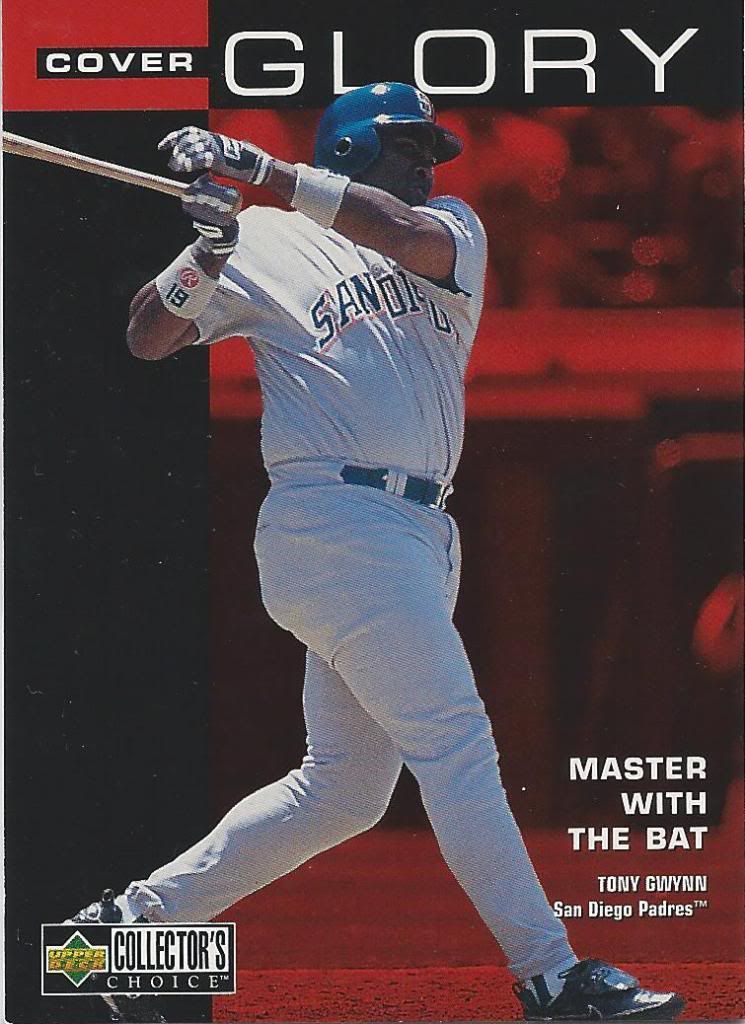
This is better. You say the word “cover” and it sorta looks like a magazine cover. Not sure I would have gone with the same color scheme or font, but okay.
Sorry, Tony, but they need to widen out that base a bit more for you
Oh, man. I love these mini bobbing head cards. I want another one to put together. Look at that face! If I had to guess, I would say that’s a running face and not a post-swing face scrunch.
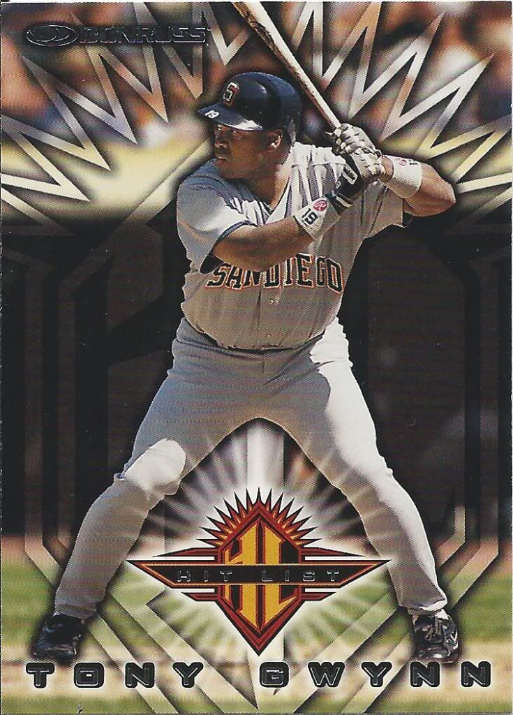
Keep them legs spread
How can you not look at this and think that he’s being forced to straddle this pointy, glowing logo? One false move could be very painful. Hit list indeed.
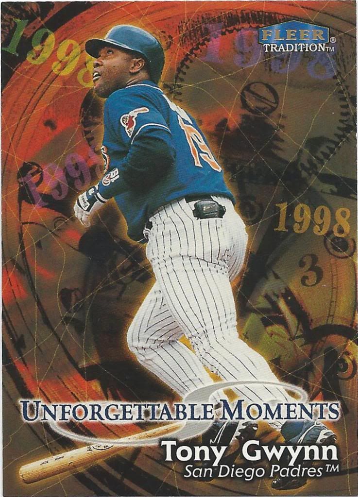
Where’d the Time go? Oh, there it is.
That was a pretty unforgettable moment when Tony Gwynn fell into the “Ozzie Smith memorial temporal vortex” and met Bill and Ted. I’m glad they had a camera on it.
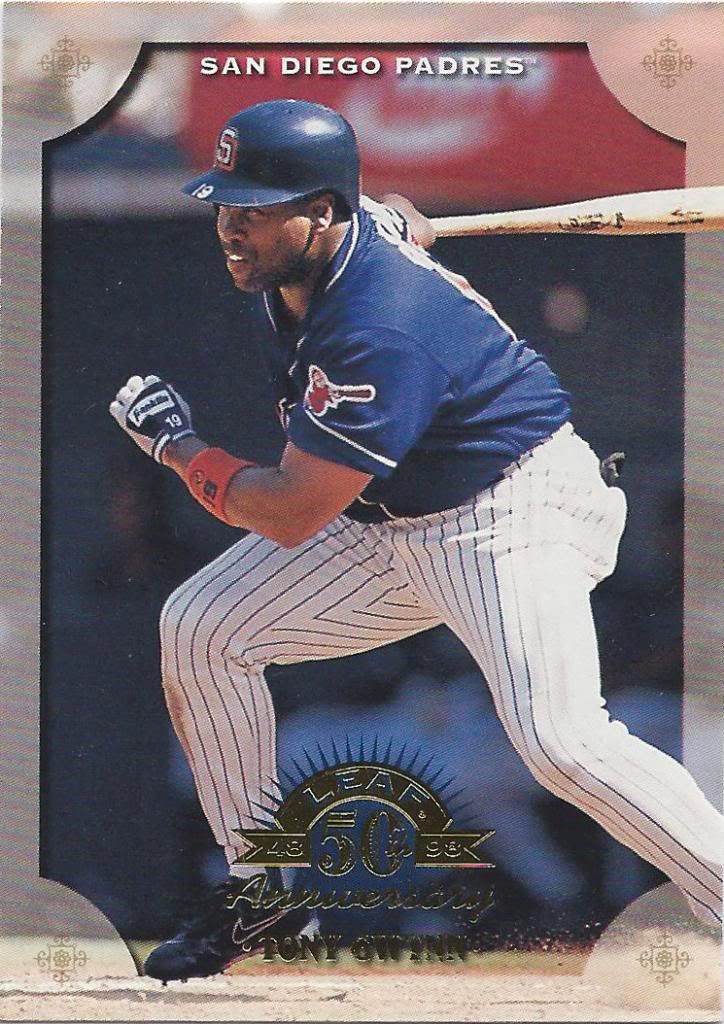
50th anniversary with a pretty significant baseball gap in there.
Another pointy logo under Tony’s crotch. Donruss/Leaf is a masochistic bunch.
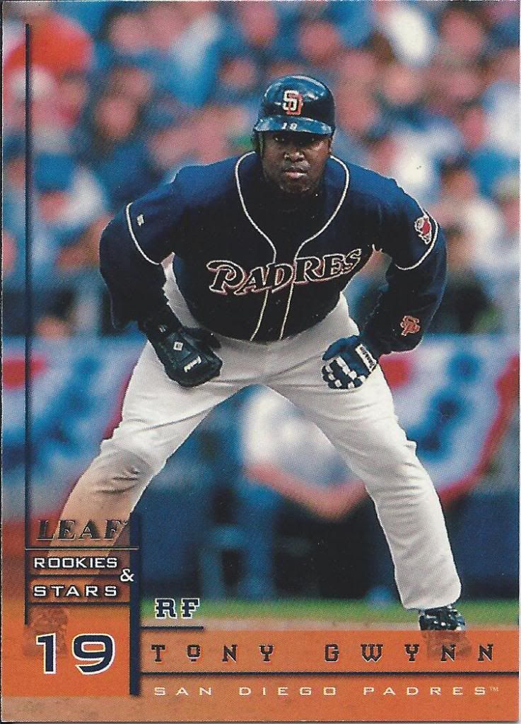
Oh, man. How boring. I’m bored now.
I didn’t know Tony Gwynn was foreign. How else do you explain the accent underneath the “O?”
Is that the Star Trek font?
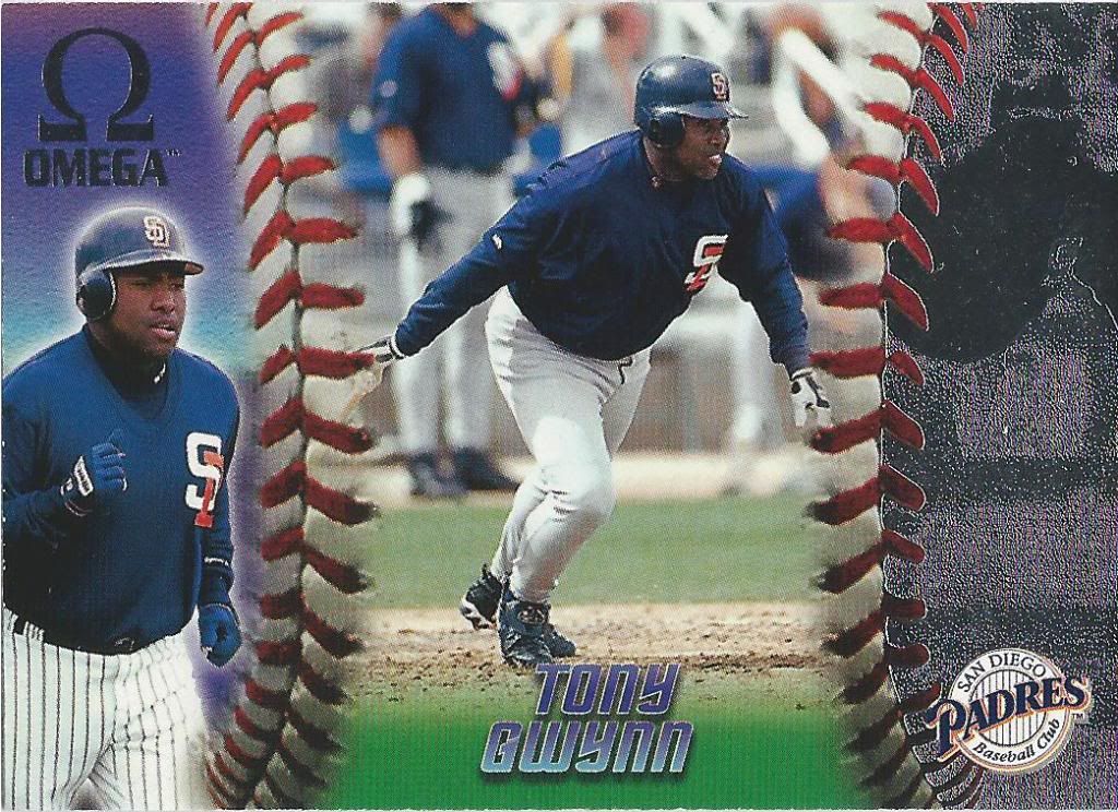
Omega’s an interesting looking set. The foil on the right is a tad tacky, but adds some pop at the same time. I like the idea of using the ball to split the card into thirds.
I should know this, but is that Wrigley?
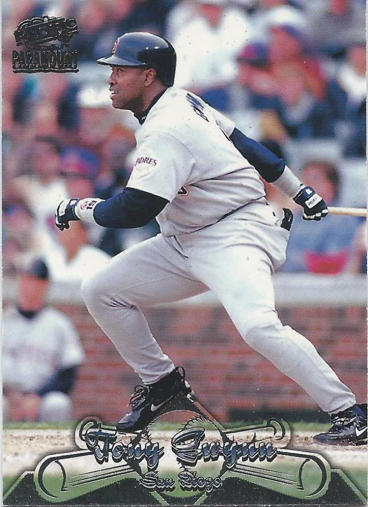
Maybe I’m crazy, but I could easily see this being a Fleer Ultra set design. Maybe the foil is more complex than what you’d typically see, but it’s not too terribly far off. What I’m trying to say is that I like it.
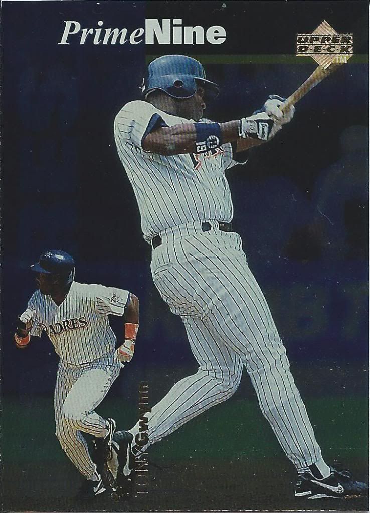
Prime Seven?
I’m not a big fan of inserts where you have multiple cards of the same player. Let’s go ahead an multiply the disdain when the insert is called “Prime Nine” but the players only have seven cards. Only six more to go, I guess?
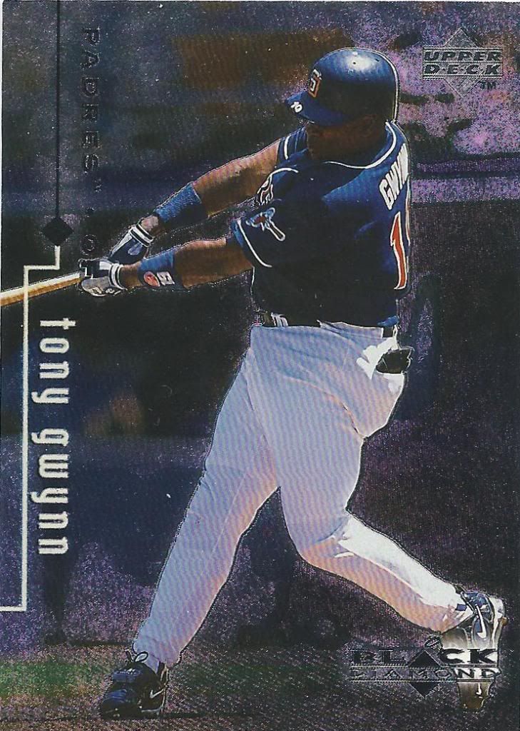
More like Foil Diamond
How many of you have gone skiing? Personally, I have no intention of ever trying skiing. I value my bones and don’t plan to volunteer them for breaking. Black Diamond is supposed to be the hardest slope, right? I’ll stick with the card version. It’s also much warmer this way.
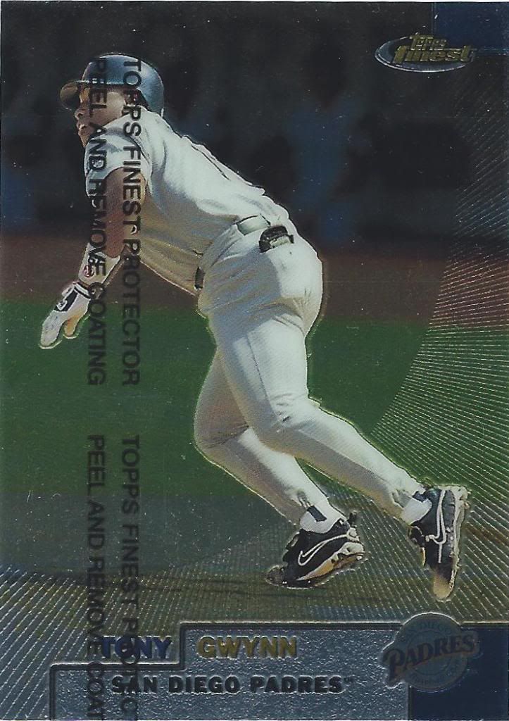
Stop asking me to remove the coating. Ain’t happening.
The second unpeeled card of the day. I’ve opened a few boxes of Finest at this point, and they’re always incredibly enjoyable. 1999 is one of those years I haven’t ripped yet. Might have to rectify that pretty soon.
Field’s out that way!
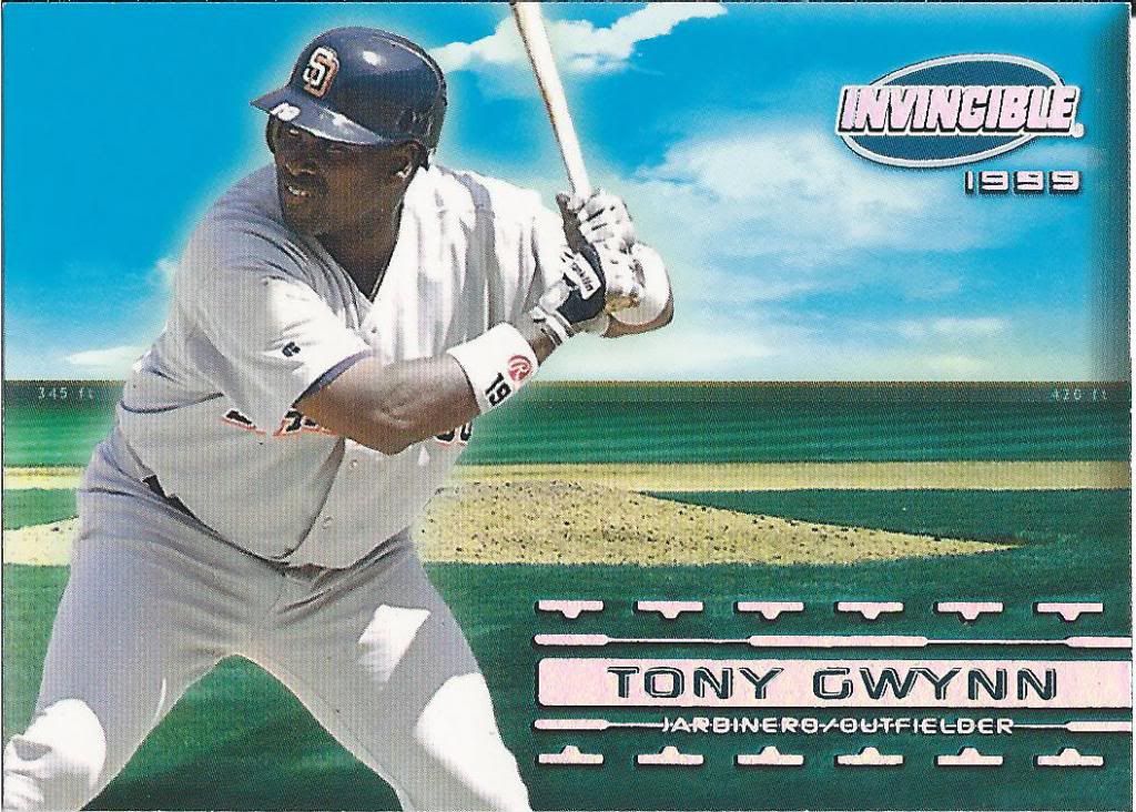
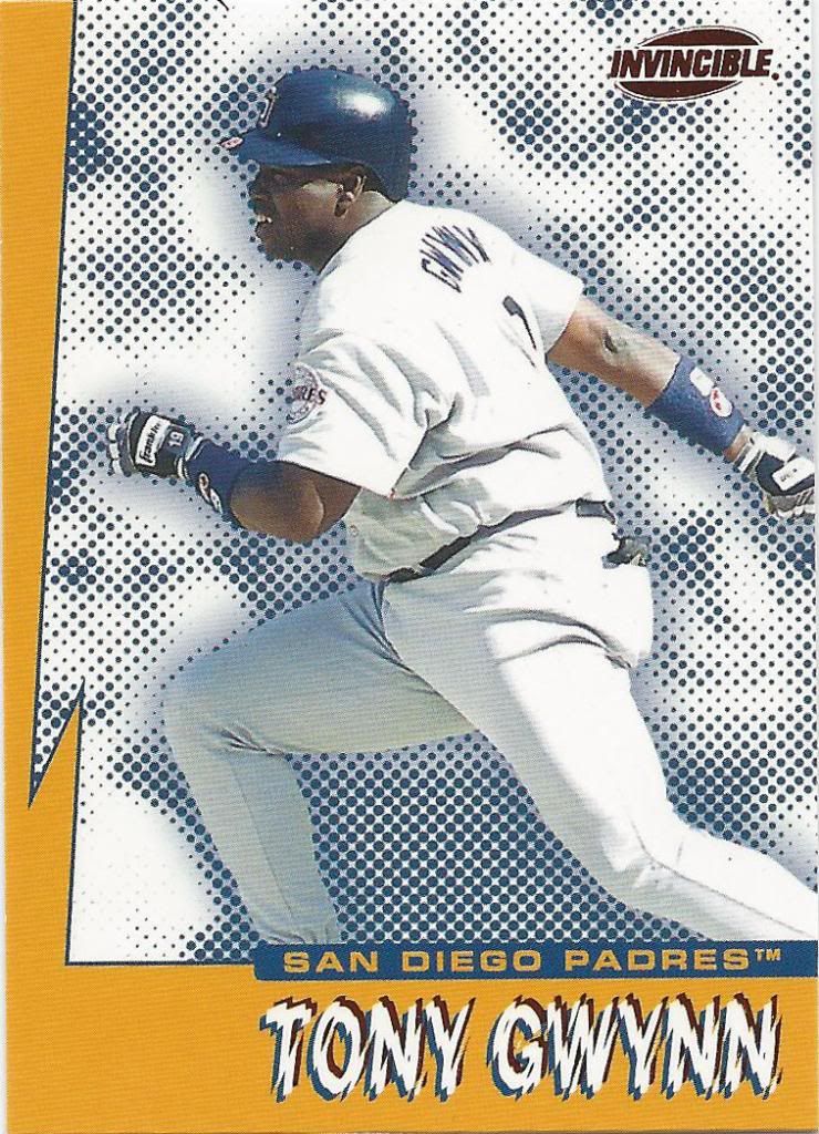
Invincible is a box I don’t plan to open. Not only are they pretty prevalent, but they’re also pretty hideous. It’s a shame there are two versions of each card.
Aggro Crag
Yup, two versions of this, too.
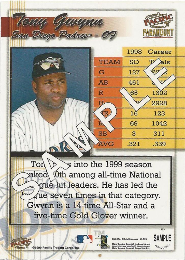
If Costco gave out sample cards instead of food, I’d go more often
I love getting promo/sample cards. I don’t know how they got distributed, but I know it’s not usually through packs, so it’s fun to imagine the journey.
I think he got it?
Raise your hand if you still write in cursive aside from signing your own name. I can’t see if you’re actually doing it, but I’m going to assume that no one raised their hand. I personally stopped as soon as school stopped forcing me to do so. My non-cursive letters all run together as it is, so it’s sort of like a form of cursive.
I don’t even have the non-sample one yet
Hey, alright! It’s another sample card. Don’t you dare try to pass this off as being part of the regular set. You’re not going to get that sucker past the discerning set builder’s eye.
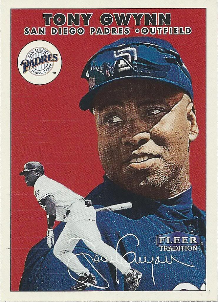
“And you think it’s okay to rip off a Topps design and claim it’s part of your tradition?”
Appropriating other company’s work aside, I think it’s interesting that both pictures have their eye on the same ball. Very appropriate for Tony.
Let’s squeeze the picture with more white borders next time, guys. I think you’re slipping.
Foul ball or pop-up? He’s not running, so I’ll guess foul. I have a feeling Gwynn didn’t hit a ton of either of those in any given year, so this may be something of a rare shot.
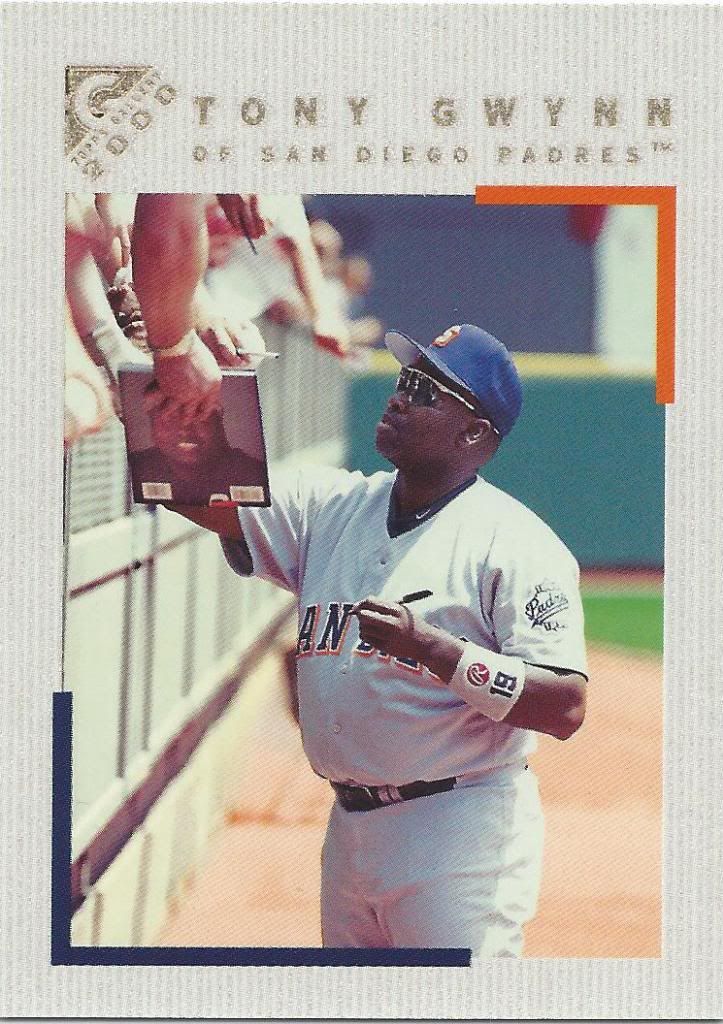
What is that book? I think I want it.
As previously mentioned, I love non-action photos. Pictures of players signing for fans have to be near the top of that list. Tony signed a lot of actual baseball cards, and he’s seen signing here following the tradition of 1991 Upper Deck Final Edition and 1994 Collector’s Choice cards previously featured on this blog. I wonder who has the most signing picture cards.
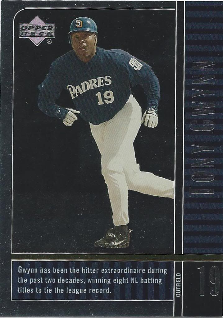
UD Legend, indeed
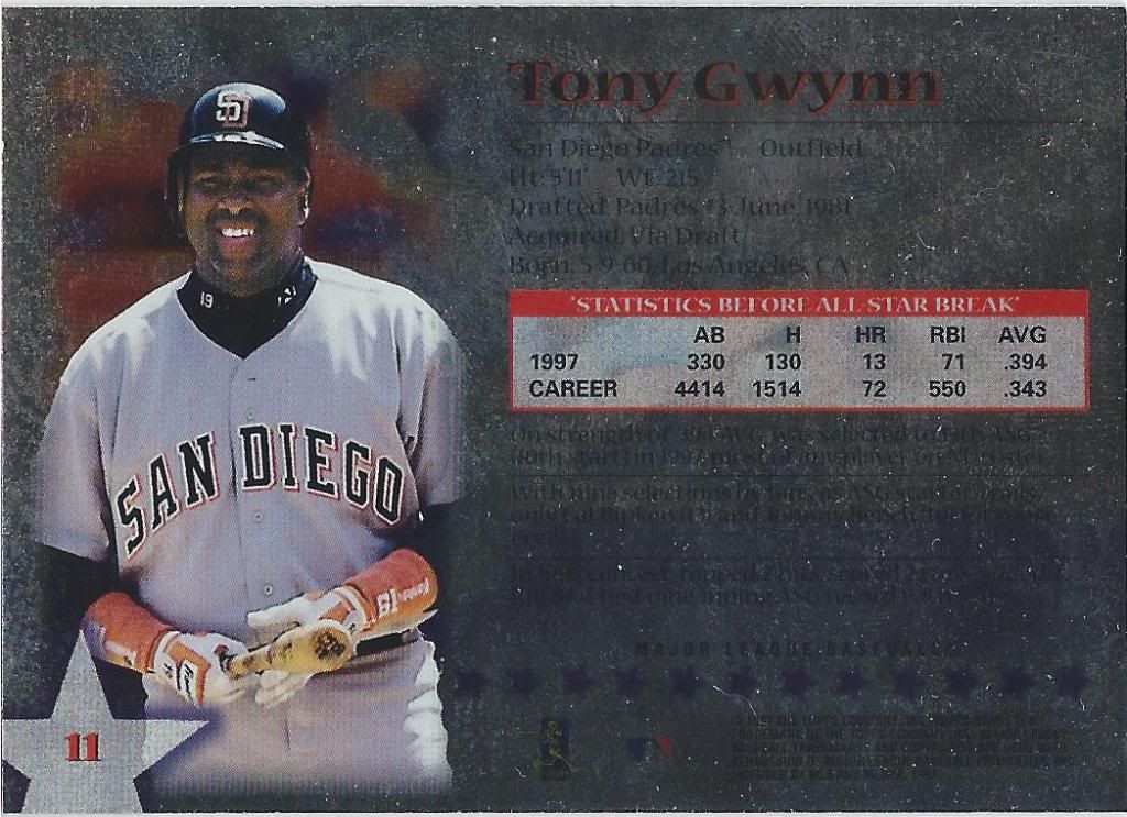
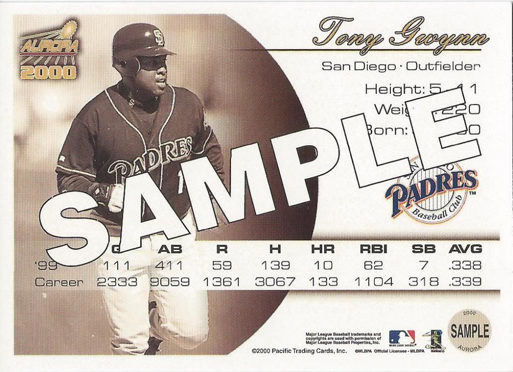
I know I tend to ignore card backs on this blog (as most of us do). Part of the reason is convenience and time (easier and quicker to just scan and show the fronts). The other part is that most backs are pretty dang boring. Just look at this flavor text pasted on the front here. It’s so clunky and awkward, you’d think that I wrote it.
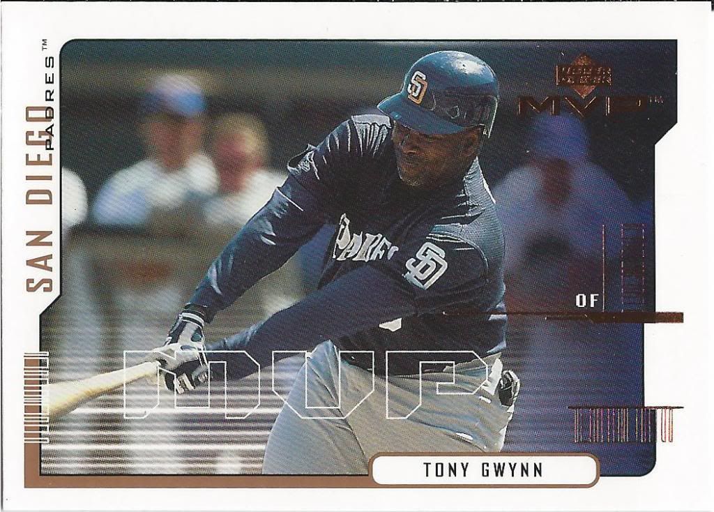
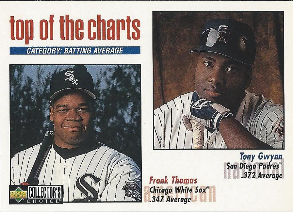
Never actually won an MVP. Take solace Mike Trout supporters.
Oh, we’re switching it up with a horizontal card. Interesting. The horizontal part, not the actual card.
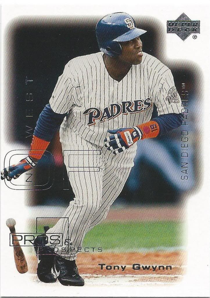
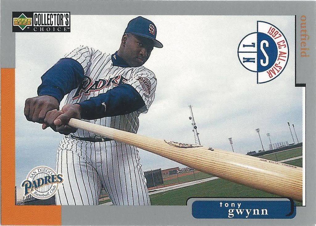
Telling you that he’s an OUTFIELDER is the most important thing, I see
What was Upper Deck’s obsession with obnoxious white borders? I think they also went a little etch-a-sketch crazy with their foil designs
You again
Okay, so this vintage design is less of a blatant rip off, but I still can’t say that I understand the need to do this in the first place. That fake painting effect is grotesque.
His JERSEY NUMBER is 19. You needed to know that.
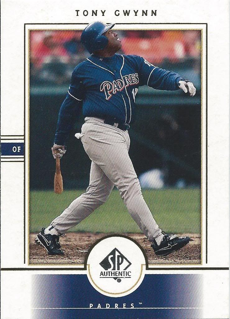
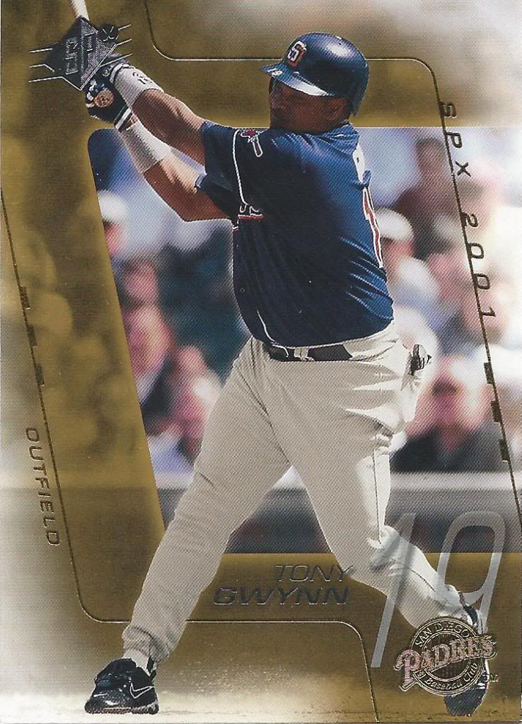
As the years went on, the SP and SPx sets became less and less fancy. Back when the brands started, they had a high-end feel to them. Now they’re a throw away in almost every sense.
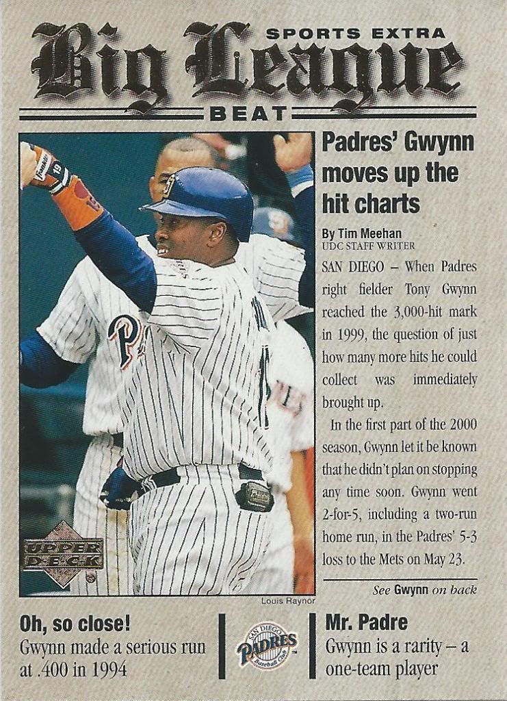
Before print media started dying
We end the post (yes, really) with a fake newspaper insert from 2001 Upper Deck. It commemorates Gwynn’s 3,000th career hit (from 1999). Interesting that it gives credit to the card writer. Overall, I like the design and concept a lot. It’s cohesive and carries the theme throughout, unlike others we’ve seen today.
Once again, I have to give a big thanks to Madding from Cards on Cards for the amazing trade. I’m sure you can tell why I needed to separate this out into a couple posts. I just wish it wouldn’t have taken this long to finish it up. Here’s hoping the next one will go quicker.
Recent Comments