
A little over a month ago, I posted the first part of a very large trade package I received from reader Nick M. It’s taken a while to find the drive to finish this post as work is picking up again, my house is still experiencing issues that need attention, and holiday stuff is starting to happen, but it’s finally here. You’ll only see two players in this whole thing, but you’ll see tons of cards. I love having tons of cards.
Braves Braves
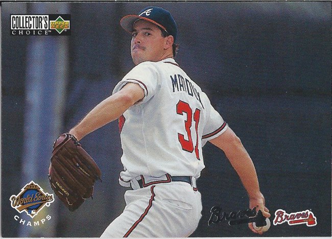
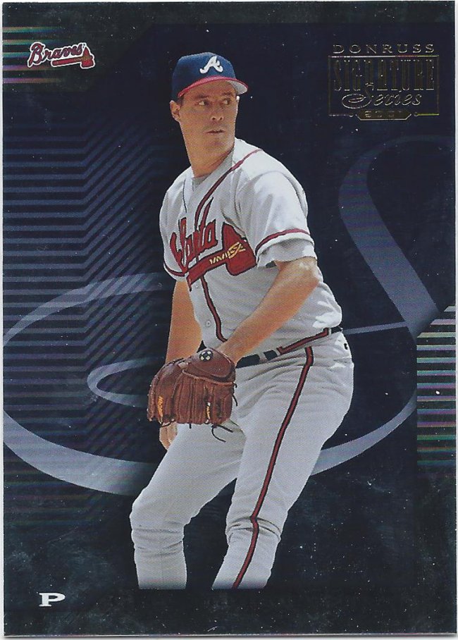
We’ll start with a quick attention to detail test. Did you notice that this is the Silver Signature version? I did. Did you know that Maddux changed his signature to look like the Braves logo? I did not.
Foil is not connecting to my scanner
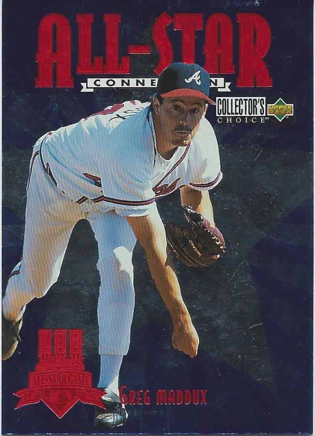
I like All-Star inserts. I wish that were more common. I think it would be more fun to have a non-base, kind of easy insert set to chase that has the full rosters from both sides.
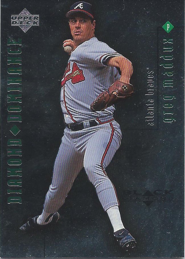
Trade dominance
This is a crazy, happy addition. Black Diamond cards aren’t too uncommon, but it’s not everyday you get an insert #/1500 sent out of the blue.
Not exactly the same as the old skybox orange glow
I bet you didn’t know that Maddux’ other, other nickname was “The Flash.” He zooms to the mound and then throws a high-80s fastball.
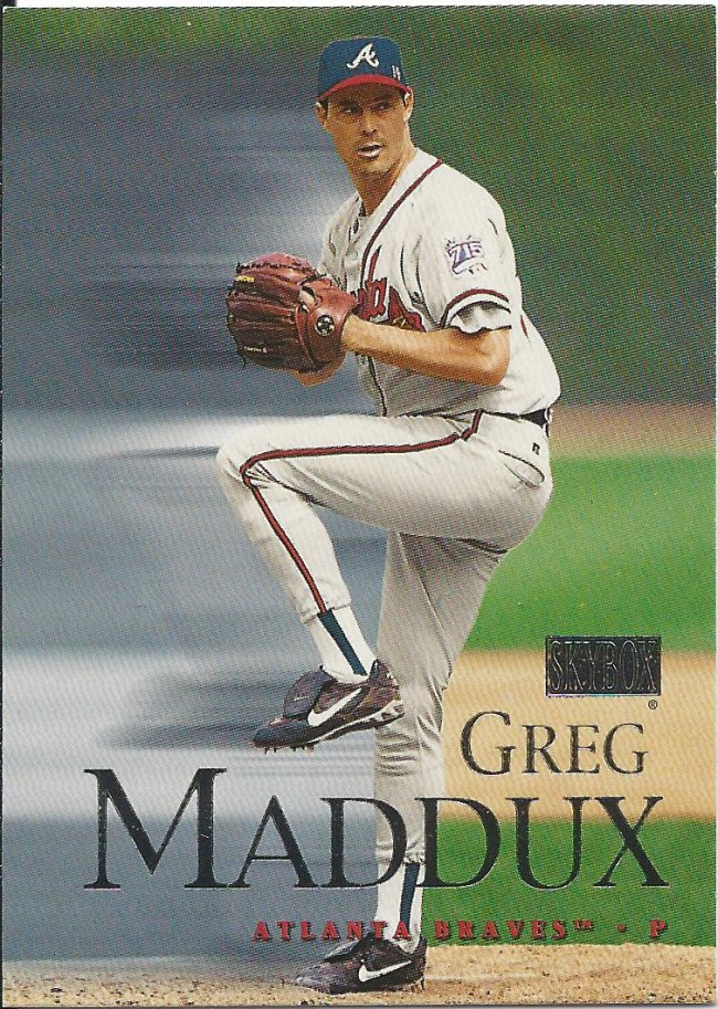
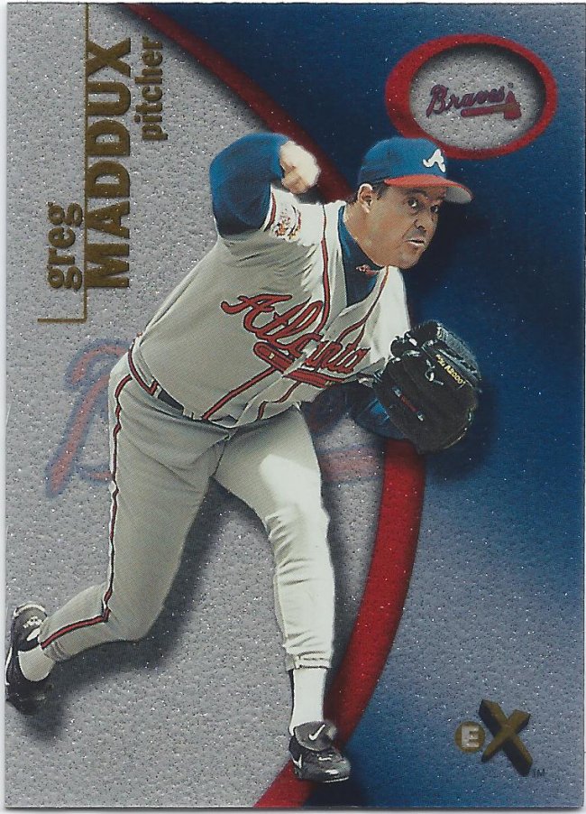
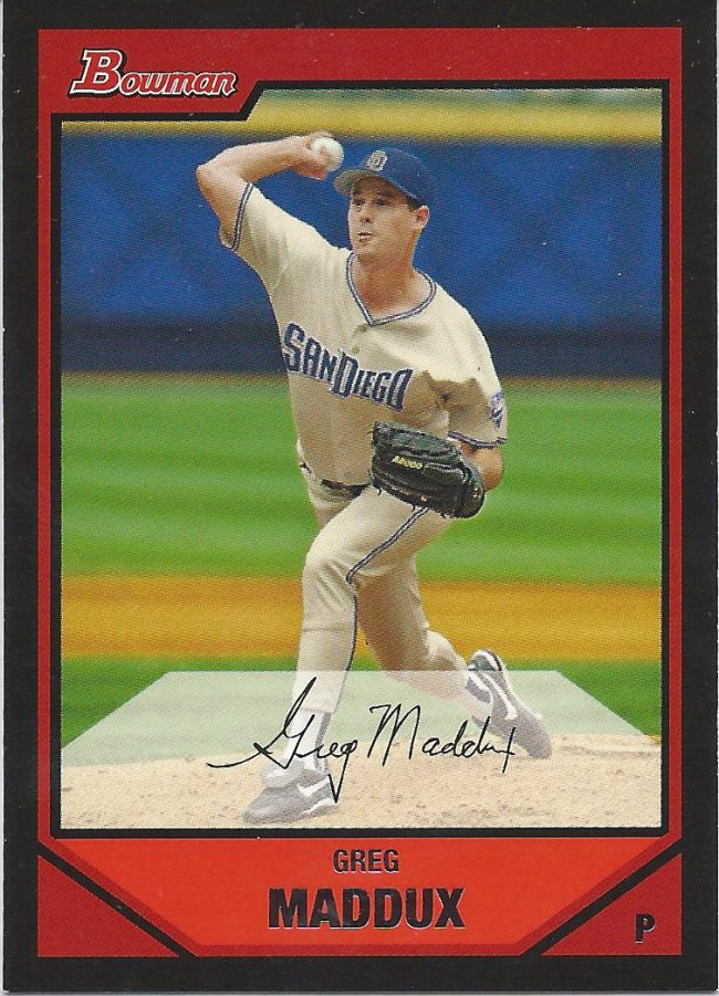
Non-signature edition
Oddly enough, in a product named Signature Series, there are no Maddux autographs to chase for this year. Good.
Not insanely exciting, but cool because it’s acetate
We need more non-cardboard cards. I love these plastic suckers.
I have no idea what’s supposed to be going on
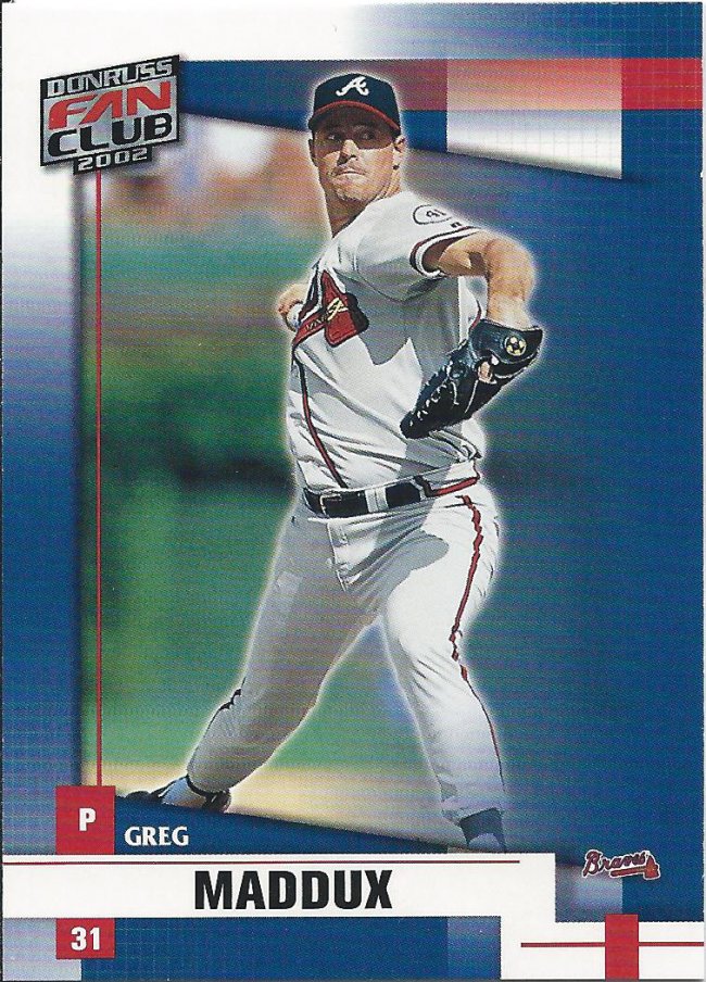
How would one become part of this so called “Fan Club?” Do we get to pick the designs if we’re a member?
Dirty balls
Very odd choice to separate the jersey number like that. How did they handle single digits?
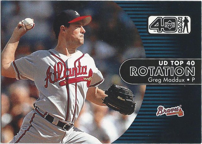
Top 40 rotation? That’s like every damn starting pitcher!
40-Man is such a daunting set. I would hate to be a team collector with stuff like this and the tough to get foil parallels. It’s bad enough looking for cards for 5 people.
Orange is an odd choice
Does anyone else remember Tangrams? Here are some random geometric shapes and you get to make a random, nondescript design.

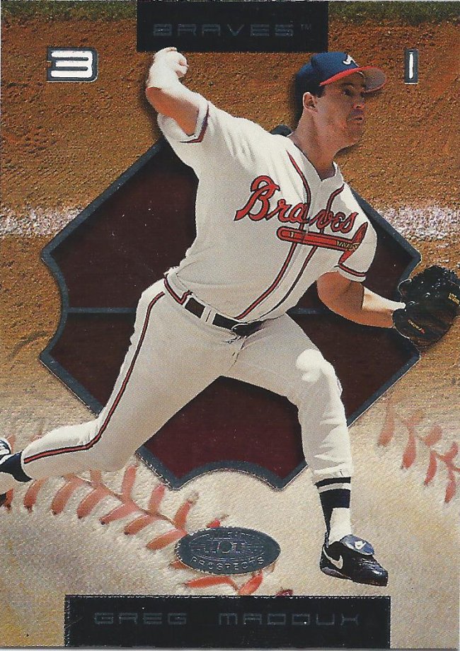
Red is an odd choice
I’m really surprised that it’s taken me this long to see the picture window as a big “H.” Not that it means anything, but I don’t think it can be unseen.
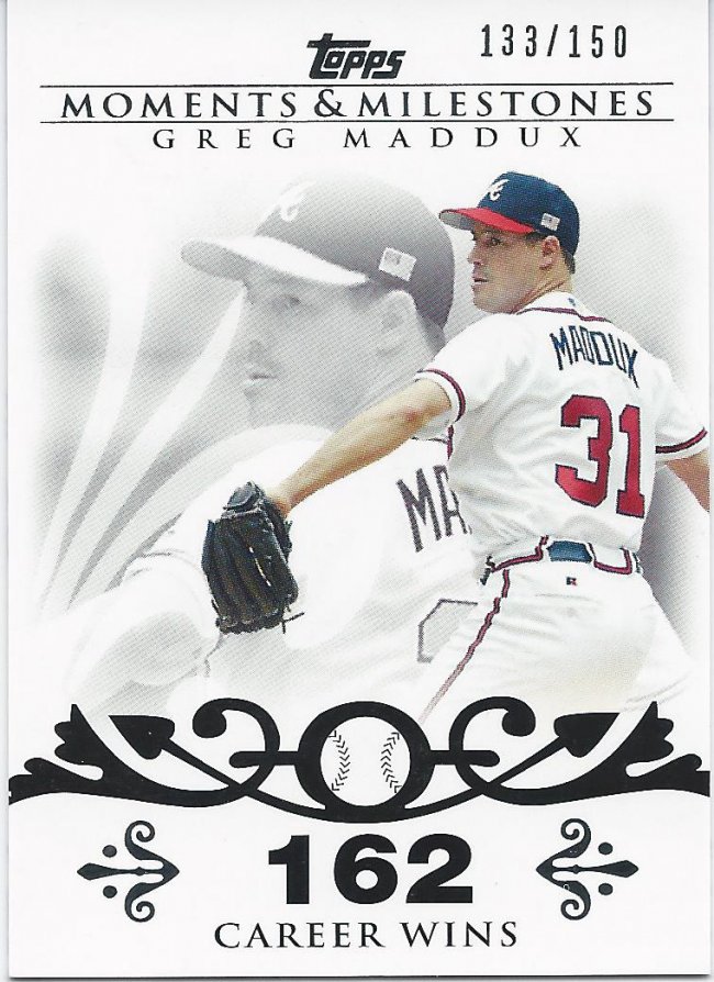
A little more than half way to the win total
Win #162
August 23, 1996 – Atlanta Braves vs. Chicago Cubs
Maddux earned his 12th win of the year over Steve Trachsel with 7 strikeouts over 7 innings. He wasn’t as sharp as he usually is, giving up 2 homers, but the Braves provided just enough run support as Chipper Jones hit 2 of his own. Greg also batted for a single, one of Atlanta’s 10 hits in the 4-3 victory.
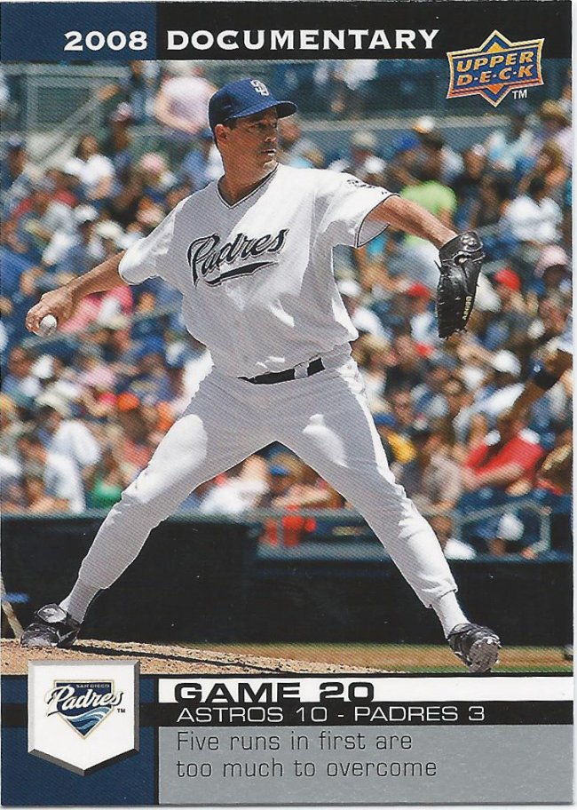
Game 9 in my little adventure
For those that don’t remember or didn’t see this previously, I’ll remind you that for 08 Documentary, I’m compiling the record for all the cards featuring my player collections. Follow along by clicking the set-based tag at the bottom of the post.
You’ll also likely remember that the game has nothing to do with the player on the card. No matter who pitched, the Padres still lost big, which puts them in a big hole in this exercise.
Padres card record: 2-7
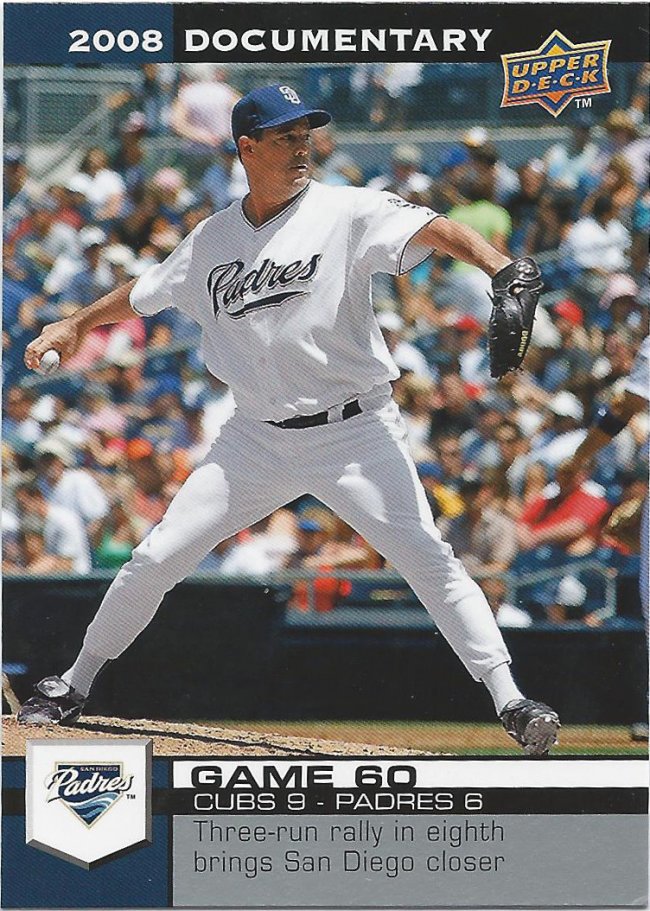
Same picture, same result
Double-dipping into this game, and it’s virtually another rout. The Cubs knock in 9 and put the Padres in a bad position in their quest to have a winning record on cards featuring Maddux.
Padres card record: 2-8
Don’t leave home without it
Is anyone else a little surprised that baseball players haven’t been featured on real credit cards? I mean they were on phone cards, after all.
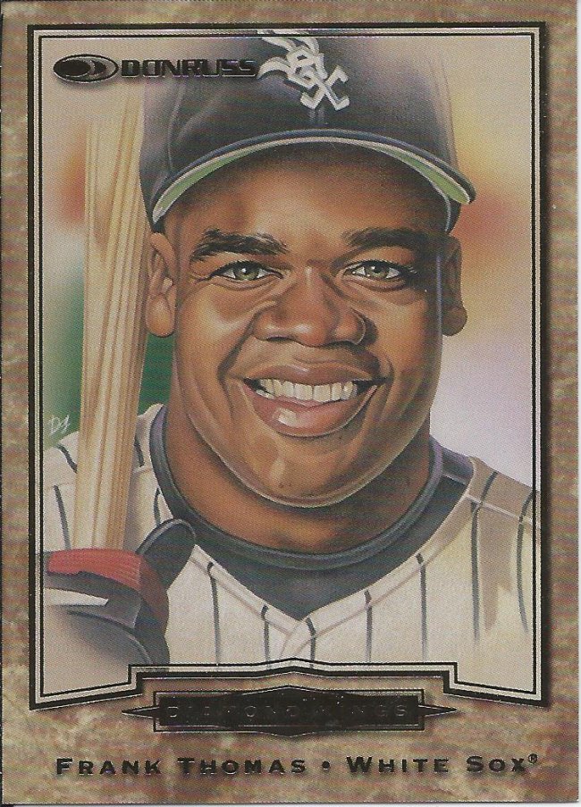
Mad Magazine artists make baseball cards sometimes
This caricature is a Diamond king #/10000 – back when that still kind of meant something, but sorta stopped meaning things at the same time. – The first 500 of them are the “canvas” parallel, so this version ONLY has 9500 copies.
Yeeesh
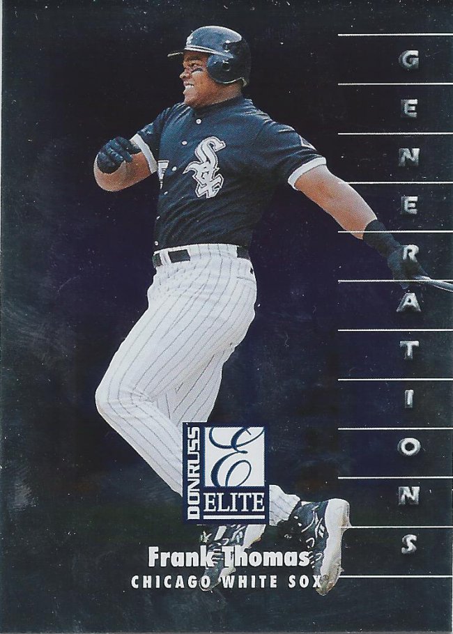
I’m not sure what the Generations label is about. He’s not paired with anyone. He isn’t part of a family that played the game. Looks like just another excuse to make another Frank Thomas card.
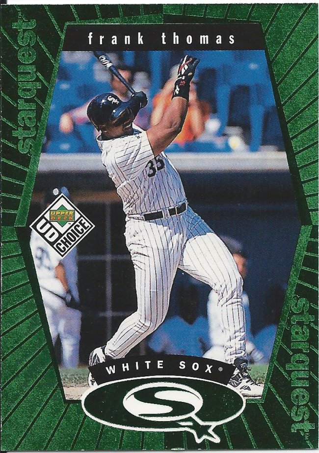
That’s a nice Yoda-Foil parallel
Are you guys excited about the new StarQuest movie? I’m personally trying to stay spoiler-free, but the internet makes it really tough.
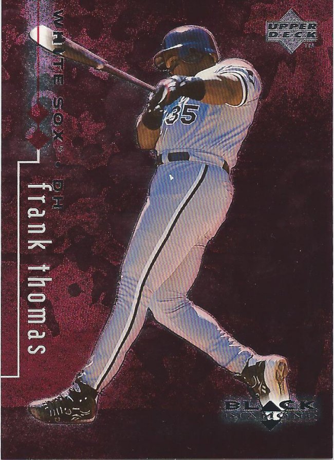
Double the foil
Nick snuck in some real nice gems. Gems like this Black Diamond card #/3000. Get it. Gems. Diamond. You get it.

Topps for a new millennium
That’s not to say that cards like this aren’t appreciated, too, because they certainly are.

Font by Print Shop for C64
It’s just that some cards happen to carry a little extra prestige or “oomph” when they’re revealed. This card is needed, but gives off the wrong kind of “oomph.”

That’s focus if I ever saw it
And some are just a little boring. Early 2000s Fleer had a lot of drab, filler sets.
Check Swing
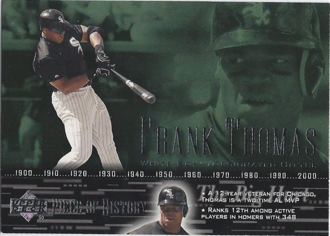
I think I prefer the newer Piece of History sets. This one’s fine, but the Quantum Leap timeline is a little busy.
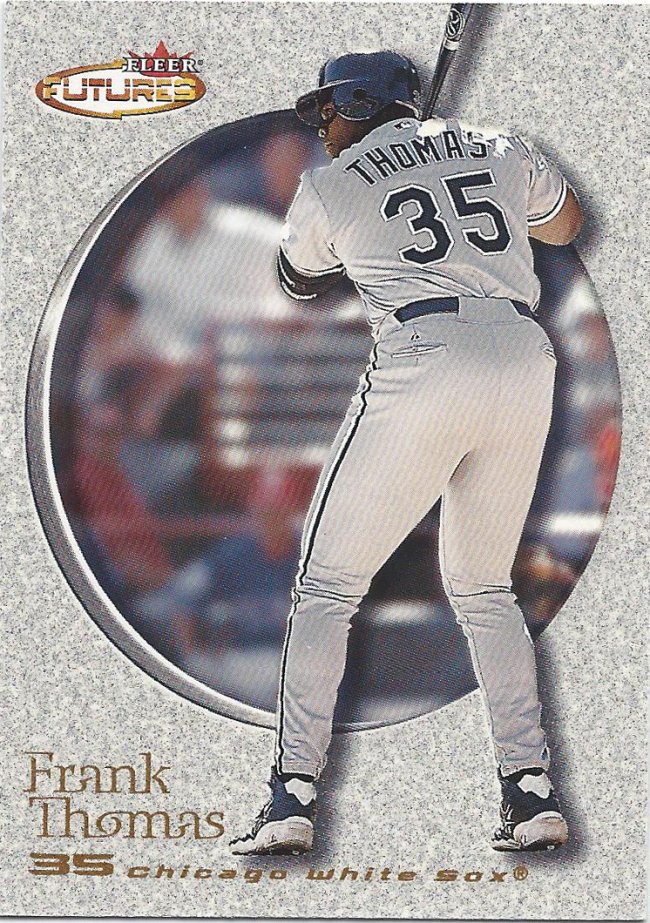
The Futures are now
If you ever wanted a flashy version of Baseball Heroes, then this is the set for you. But I don’t know why you would want that.
Spirograph in action
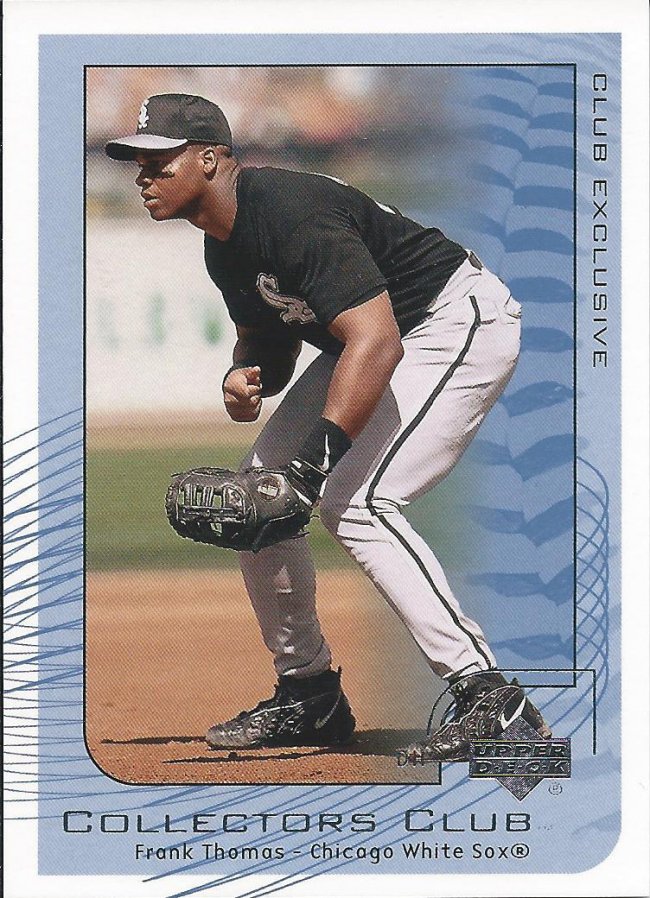
What is this “club” you speak of, and how would one go about joining? Is that one of those, spend 50k/year and you’re in type of things?
Boy does that look like a terrible photoshop job.
2007 and 2008 Topps are still confusing to me. I know that there are parallels and that they look very similar to the originals, so it’s hard to make myself care enough to hunt for them. I imagine most people feel the same about sparkles from a year or more ago.
Probably not photoshopped
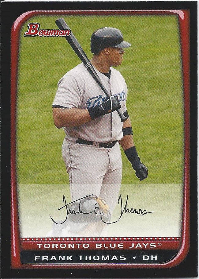
Don’t even get me started about how confusing Bowman is. How many of you can actually identify a Bowman set without flipping it over and looking at the year?
Is that Slenderman in the bottom right corner?
Inserts that don’t look any different than the regular set do not make for a good product, especially when the product looks like this to begin with.
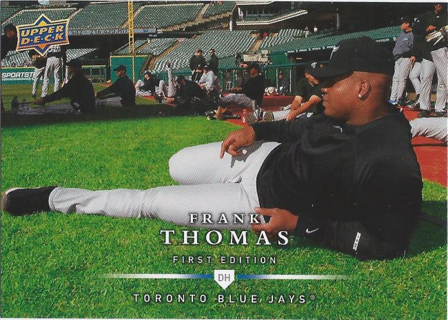
I’m stretching, I’m stretching.
Who needs spring training? Just let me out on the field and I’ll hit a couple dozen taters. You know the drill.
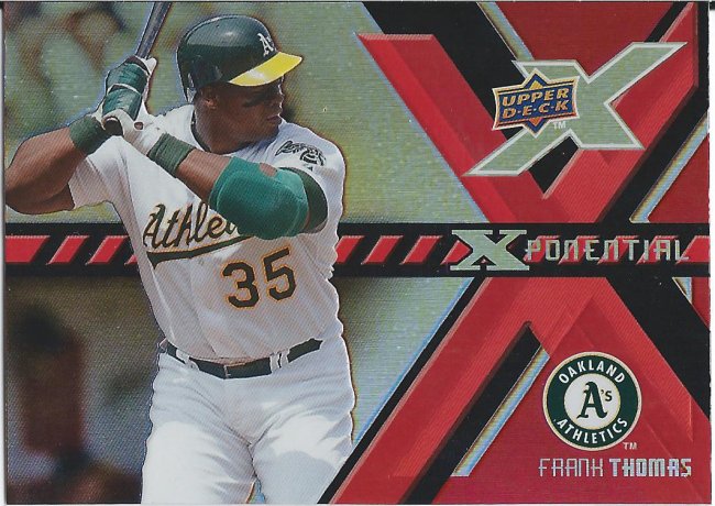
An X of an A
The only good thing to come from Upper Deck X were these inserts. A die cut version of these would have been pretty nice, too.

See, doesn’t this look better than the other Piece of History card?
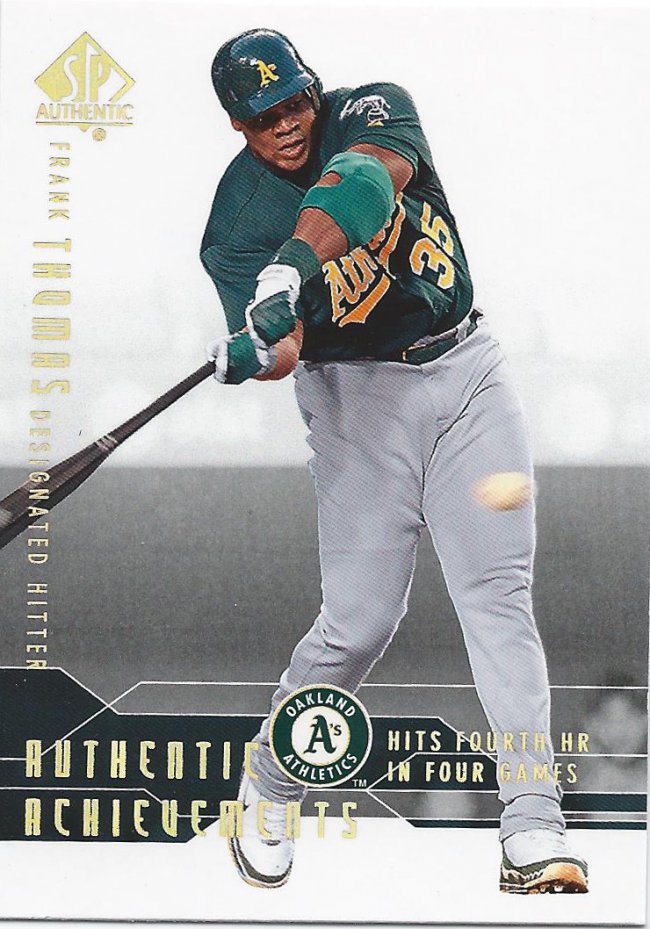
I don’t know how many As cards I had before, but this package significantly increased the percentage owned.
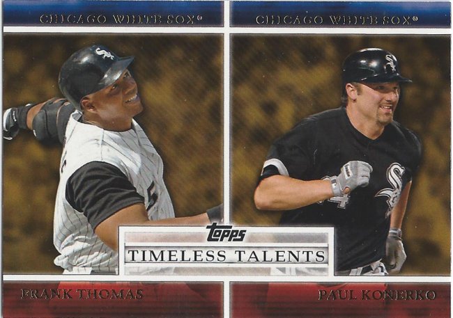
Not a bad combo at all.
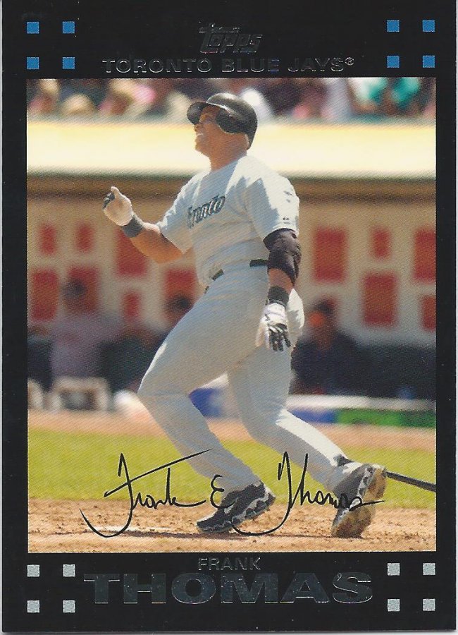
It also certainly boosted by more modern Thomas collection. Plenty of good late 2000s cards.
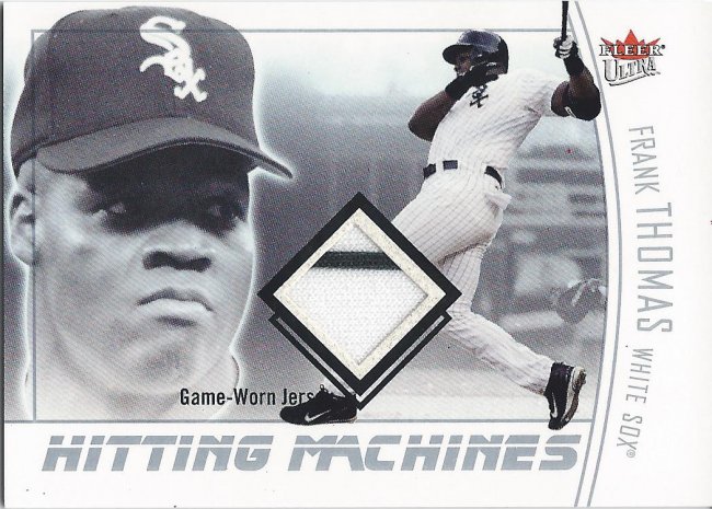
Frank is sad, reminiscing over his lost jersey
You know I had to save the hit for last, right? This is actually the second Ultra Hitting Machines jersey card I own, but both are from different years, and the other doesn’t have a pinstripe. This was a really nice surprise.
Thanks very much again to Nick for the great trade, but can you believe this still isn’t everything? After two very long posts, there was yet another package that needs to be shown. And show it I eventually should. I hope.
Hey bud, how are you?!
Hey! Thanks for asking. Been some long months, but I think I’m allowed to show myself in public again.